Table of Contents for
Responsive Web Design with HTML5 and CSS3 - Second Edition
 Responsive Web Design with HTML5 and CSS3 - Second Edition
Published by
Packt Publishing, 2015
Responsive Web Design with HTML5 and CSS3 - Second Edition
Published by
Packt Publishing, 2015
- Cover
- Table of Contents
- Responsive Web Design with HTML5 and CSS3 Second Edition
- Responsive Web Design with HTML5 and CSS3 Second Edition
- Credits
- About the Author
- About the Reviewers
- www.PacktPub.com
- Preface
- What you need for this book
- Who this book is for
- Conventions
- Reader feedback
- Customer support
- 1. The Essentials of Responsive Web Design
- Defining responsive web design
- Setting browser support levels
- Our first responsive example
- The shortcomings of our example
- Summary
- 2. Media Queries – Supporting Differing Viewports
- Media query syntax
- Combining media queries
- Using media queries to alter a design
- Considerations for organizing and authoring media queries
- Combine media queries or write them where it suits?
- The viewport meta tag
- Media Queries Level 4
- Summary
- 3. Fluid Layouts and Responsive Images
- Introducing Flexbox
- Getting Flexy
- Responsive images
- Summary
- 4. HTML5 for Responsive Web Designs
- Starting an HTML5 page the right way
- Easy-going HTML5
- New semantic elements in HTML5
- HTML5 text-level semantics
- Obsolete HTML features
- Putting HTML5 elements to use
- WCAG and WAI-ARIA for more accessible web applications
- Embedding media in HTML5
- Responsive HTML5 video and iFrames
- A note about 'offline first'
- Summary
- 5. CSS3 – Selectors, Typography, Color Modes, and New Features
- Anatomy of a CSS rule
- Quick and useful CSS tricks
- Word wrapping
- Facilitating feature forks in CSS
- New CSS3 selectors and how to use them
- CSS3 structural pseudo-classes
- CSS custom properties and variables
- CSS calc
- CSS Level 4 selectors
- Web typography
- New CSS3 color formats and alpha transparency
- Summary
- 6. Stunning Aesthetics with CSS3
- Box shadows
- Background gradients
- Repeating gradients
- Background gradient patterns
- Multiple background images
- High-resolution background images
- CSS filters
- A warning on CSS performance
- Summary
- 7. Using SVGs for Resolution Independence
- The graphic that is a document
- Creating SVGs with popular image editing packages and services
- Inserting SVGs into your web pages
- Inserting an SVG inline
- What you can do with each SVG insertion method (inline, object, background-image, and img)
- Extra SVG capabilities and oddities
- Animating SVG with JavaScript
- Optimising SVGs
- Using SVGs as filters
- A note on media queries inside SVGs
- Summary
- 8. Transitions, Transformations, and Animations
- CSS3 2D transforms
- CSS3 3D transformations
- Animating with CSS3
- Summary
- 9. Conquer Forms with HTML5 and CSS3
- Understanding the component parts of HTML5 forms
- HTML5 input types
- How to polyfill non-supporting browsers
- Styling HTML5 forms with CSS3
- Summary
- 10. Approaching a Responsive Web Design
- View and use the design on real devices
- Embracing progressive enhancement
- Defining a browser support matrix
- Tiering the user experience
- Linking CSS breakpoints to JavaScript
- Avoid CSS frameworks in production
- Coding pragmatic solutions
- Use the simplest code possible
- Hiding, showing, and loading content across viewports
- Validators and linting tools
- Performance
- The next big things
- Summary
- Index
If you've worked with applications like Flash, Final Cut Pro or After Effects, you'll have an instant advantage when working with CSS3 animations. CSS3 employs animation keyframing conventions found in timeline-based applications.
Animations are widely implemented; supported in Firefox 5+, Chrome, Safari 4+, Android (all versions), iOS (all versions), and Internet Explorer 10+. There are two components to a CSS3 animation; firstly a keyframes declaration and then employing that keyframes declaration in an animation property. Let's take a look.
In a previous example, we made a simple flip effect on elements that combined transforms and transitions. Let's bring together all the techniques we have learned in this chapter and add an animation to that previous example. In this next example, example_08-05, let's add a pulsing animation effect once the element has flipped.
Firstly we will create a keyframes at-rule:
@keyframes pulse {
  100% {
    text-shadow: 0 0 5px #bbb;
    box-shadow: 0 0 3px 4px #bbb;
  }
}
As you can see, after writing at @keyframes to define a new keyframes at-rule we name this particular animation (pulse in this instance).
It's generally best to use a name that represents what the animation does, not where you intend to use the animation, as a single @keyframes rule can be used as many times as you need throughout a project.
We have used a single keyframe selector here: 100%. However, you can set as many keyframe selectors (defined as percentage points) as you like within a keyframes rule. Think of these as points along a timeline. For example, at 10%, make the background blue, at 30% make the background purple, at 60%, make the element semi-opaque. On and on as you need. There is also the keyword from which is equivalent to 0% and to which is equivalent to100%. You can use them like this:
@keyframes pulse {
  to {
    text-shadow: 0 0 5px #bbb;
    box-shadow: 0 0 3px 4px #bbb;
  }
}
Be warned, however, that WebKit browsers (iOS, Safari) don't always play happily with from and to values (preferring 0% and 100%) so I'd recommend sticking with percentage keyframe selectors.
You'll notice here that we haven't bothered to define a starting point. That's because the starting point is the state each of those properties is already at. Here's the part of the specification that explains that: http://www.w3.org/TR/css3-animations/
Note
If a 0% or from keyframe is not specified, then the user agent constructs a 0% keyframe using the computed values of the properties being animated. If a 100% or to keyframe is not specified, then the user agent constructs a 100% keyframe using the computed values of the properties being animated. If a keyframe selector specifies negative percentage values or values higher than 100%, then the keyframe will be ignored.
In this keyframes at-rule we've added a text-shadow and box-shadow at 100%. We can then expect the keyframes, when applied to an element to animate the text-shadow and box-shadow to the defined amount. But how long does the animation last? How do we make it repeat, reverse, and other eventualities I hope to have the answer for? This is how we actually apply a keyframes animation:
.flipper:hover .flipper-horizontal {
    transform: rotateY(180deg);
    animation: pulse 1s 1s infinite alternate both;
}
The animation property here is being used as a shorthand for a number of animation related properties. In this example, we are actually declaring (in order), the name of the keyframes declaration to use (pulse), the animation-duration (1 second), the delay before the animation begins (1 second, to allow time for our button to first flip), the amount of times the animation will run (infinitely), the direction of the animation (alternate, so it animates first one way and then back the other) and that we want the animation-fill-mode to retain the values that are defined in the keyframes whether going forwards or backwards (both).
The shorthand property can actually accept all seven animation properties. In addition to those used in the preceding example, it's also possible to specify animation-play-state. This can be set to running or paused to effectively play and pause an animation. Of course, you don't need to use the shorthand property; sometimes it can make more sense (and help when you revisit the code in the future) to set each property separately. Below are the individual properties and where appropriate, alternate values separated with the pipe symbol:
.animation-properties {
    animation-name: warning;
    animation-duration: 1.5s;
    animation-timing-function: ease-in-out;
    animation-iteration-count: infinite;
    animation-play-state: running | paused;
    animation-delay: 0s;
    animation-fill-mode: none | forwards | backwards | both;
    animation-direction: normal | reverse | alternate | alternate-reverse;
}
Note
You can read the full definition for each of these animation properties at http://www.w3.org/TR/css3-animations/.
As mentioned previously, it's simple to reuse a declared keyframes on other elements and with completely different settings:
.flipper:hover .flipper-vertical {
    transform: rotateX(180deg);
    animation: pulse 2s 1s cubic-bezier(0.68, -0.55, 0.265, 1.55) 5 alternate both;
}
Here the pulse animation would run over 2 seconds and uses an ease-in-out-back timing function (defined as a cubic-bezier curve). It runs five times in both directions. This declaration has been applied to the vertically flipping element in the example file.
This is just one very simple example of using CSS animations. As virtually anything can be key-framed, the possibilities are pretty endless. Read about the latest developments on CSS3 animations at http://dev.w3.org/csswg/css3-animations/.
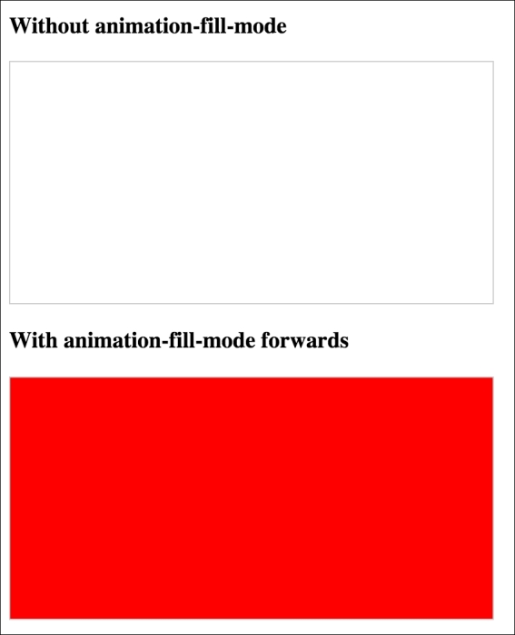
The animation-fill-mode property is worthy of a special mention. Consider an animation that starts with a yellow background and animates to a red background over 3 seconds. You can view this in example_08-08.
We apply the animation like this:
.background-change {
  animation: fillBg 3s;
  height: 200px;
  width: 400px;
  border: 1px solid #ccc;
}

@keyframes fillBg {
  0% {
    background-color: yellow;
  }
  100% {
    background-color: red;
  }
}
However, once the animation completes, the background of the div will return to nothing. That's because by default 'what happens outside of animations, stays outside of animations'! In order to override this behavior, we have the animation-fill-mode property. In this instance we could apply this:
animation-fill-mode: forwards;
This makes the item retain any values that have been applied at the animation end. In our case, the div would retain the red background color that the animation ended on. More on the animation-fill-mode property here: http://www.w3.org/TR/css3-animations/#animation-fill-mode-property