Table of Contents for
Responsive Web Design with HTML5 and CSS3 - Second Edition
 Responsive Web Design with HTML5 and CSS3 - Second Edition
Published by
Packt Publishing, 2015
Responsive Web Design with HTML5 and CSS3 - Second Edition
Published by
Packt Publishing, 2015
- Cover
- Table of Contents
- Responsive Web Design with HTML5 and CSS3 Second Edition
- Responsive Web Design with HTML5 and CSS3 Second Edition
- Credits
- About the Author
- About the Reviewers
- www.PacktPub.com
- Preface
- What you need for this book
- Who this book is for
- Conventions
- Reader feedback
- Customer support
- 1. The Essentials of Responsive Web Design
- Defining responsive web design
- Setting browser support levels
- Our first responsive example
- The shortcomings of our example
- Summary
- 2. Media Queries – Supporting Differing Viewports
- Media query syntax
- Combining media queries
- Using media queries to alter a design
- Considerations for organizing and authoring media queries
- Combine media queries or write them where it suits?
- The viewport meta tag
- Media Queries Level 4
- Summary
- 3. Fluid Layouts and Responsive Images
- Introducing Flexbox
- Getting Flexy
- Responsive images
- Summary
- 4. HTML5 for Responsive Web Designs
- Starting an HTML5 page the right way
- Easy-going HTML5
- New semantic elements in HTML5
- HTML5 text-level semantics
- Obsolete HTML features
- Putting HTML5 elements to use
- WCAG and WAI-ARIA for more accessible web applications
- Embedding media in HTML5
- Responsive HTML5 video and iFrames
- A note about 'offline first'
- Summary
- 5. CSS3 – Selectors, Typography, Color Modes, and New Features
- Anatomy of a CSS rule
- Quick and useful CSS tricks
- Word wrapping
- Facilitating feature forks in CSS
- New CSS3 selectors and how to use them
- CSS3 structural pseudo-classes
- CSS custom properties and variables
- CSS calc
- CSS Level 4 selectors
- Web typography
- New CSS3 color formats and alpha transparency
- Summary
- 6. Stunning Aesthetics with CSS3
- Box shadows
- Background gradients
- Repeating gradients
- Background gradient patterns
- Multiple background images
- High-resolution background images
- CSS filters
- A warning on CSS performance
- Summary
- 7. Using SVGs for Resolution Independence
- The graphic that is a document
- Creating SVGs with popular image editing packages and services
- Inserting SVGs into your web pages
- Inserting an SVG inline
- What you can do with each SVG insertion method (inline, object, background-image, and img)
- Extra SVG capabilities and oddities
- Animating SVG with JavaScript
- Optimising SVGs
- Using SVGs as filters
- A note on media queries inside SVGs
- Summary
- 8. Transitions, Transformations, and Animations
- CSS3 2D transforms
- CSS3 3D transformations
- Animating with CSS3
- Summary
- 9. Conquer Forms with HTML5 and CSS3
- Understanding the component parts of HTML5 forms
- HTML5 input types
- How to polyfill non-supporting browsers
- Styling HTML5 forms with CSS3
- Summary
- 10. Approaching a Responsive Web Design
- View and use the design on real devices
- Embracing progressive enhancement
- Defining a browser support matrix
- Tiering the user experience
- Linking CSS breakpoints to JavaScript
- Avoid CSS frameworks in production
- Coding pragmatic solutions
- Use the simplest code possible
- Hiding, showing, and loading content across viewports
- Validators and linting tools
- Performance
- The next big things
- Summary
- Index
Historically, whenever elements needed to be moved or animated around the screen, it was the sole domain of JavaScript. Nowadays, CSS can handle the majority of motion jobs via three principal agents: CSS transitions, CSS transforms, and CSS animations. In fact, only transitions and animations are directly related to motion, transforms simply allow us to change elements, but as we shall see, they are often integral to successful motion effects.
To clearly understand what each of these things is responsible for, I will offer this, perhaps overly simplistic summary:
- Use a CSS transition when you already have the beginning and end state of the things you want to apply motion to, and need a simple way to 'tween' from one state to another.
- Use a CSS transform if you need to visually transform an item, without affecting the layout of the page.
- Use a CSS animation if you want to perform a series of changes to an element at various key points over time.
Right, so we had better crack on and get our heads around how we can wield all these capabilities. In this chapter, we'll cover:
- What CSS3 transitions are and how we can use them
- How to write a CSS3 transition and its shorthand syntax
- CSS3 transition timing functions (
ease,cubic-bezier, and so on) - Fun transitions for responsive websites
- What CSS3 transforms are and how we can use them
- Understanding different 2D transforms (
scale,rotate,skew,translate, and so on) - Understanding 3D transforms
- How to animate with CSS3 using
keyframes
Transitions are the simplest way to create some visual 'effect' between one state and another with CSS. Let's consider a simple example, an element that transitions from one state to another when hovered over.
When styling hyperlinks in CSS, it's common practice to create a hover state; an obvious way to make users aware that the item they are hovering over is a link. Hover states are of little relevance to the growing number of touch screen devices but for mouse users, they're a great and simple interaction between website and user. They're also handy for illustrating transitions, so that's what we will start with.
Traditionally, using only CSS, hover states are an on/off affair. There is one set of properties and values on an element as the default, and when a pointer is hovered over that element, the properties and values are instantly changed. However, CSS3 transitions, as the name implies, allow us to transition between one or more properties and values to other properties and values.
Tip
A couple of important things to know up front. Firstly, you can't transition from display: none;. When something is set to display: none; it isn't actually 'painted' on the screen so has no existing state you can transition from. In order to create the effect of something fading in, you would have to transition opacity or position values. Secondly, not all properties can be transitioned. To ensure you're not attempting the impossible, here is the list of transitionable (I know, it's not even a word) properties: http://www.w3.org/TR/css3-transitions/
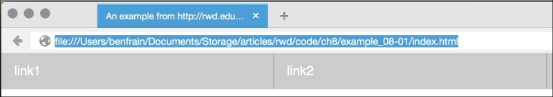
If you open up example_08-01 you'll see a few links in a nav. Here's the relevant markup:
<nav>
    <a href="#">link1</a>
    <a href="#">link2</a>
    <a href="#">link3</a>
    <a href="#">link4</a>
    <a href="#">link5</a>
</nav>
And here's the relevant CSS:
a {
    font-family: sans-serif;
    color: #fff;
    text-indent: 1rem;
    background-color: #ccc;
    display: inline-flex;
    flex: 1 1 20%;
    align-self: stretch;
    align-items: center;
    text-decoration: none;
    transition: box-shadow 1s;
}

a + a {
    border-left: 1px solid #aaa;
}

a:hover {
    box-shadow: inset 0 -3px 0 #CC3232;
}
And here are the two states, first the default:
And then here's the hover state:
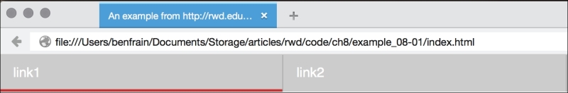
In this example, when the link is hovered over, we add a red box-shadow at the bottom (I chose a box-shadow as it won't affect the layout of the link like a border might). Ordinarily, hovering over the link snaps from the first state (no red line) to the second (red line); it's an on/off affair. However, this line:
transition: box-shadow 1s;
Adds a transition to the box-shadow from the existing state to the hover state over 1 second.
Tip
You'll notice in the CSS of the preceding example we're using the adjacent sibling selector +. This means if a selector (an anchor tag in our example) directly follows another selector (another anchor tag) then apply the enclosed styles. It's useful here as we don't want a left border on the first element.
Note that the transition property is applied in the CSS to the original state of the element, not the state the element ends up as. More succinctly, apply the transition declaration on the 'from' state, not the 'to' state. This is so that different states such as :active can also have different styles set and enjoy the same transition.
A transition can be declared using up to four properties:
transition-property: The name of the CSS property to be transitioned (such asbackground-color,text-shadow, orallto transition every possible property).transition-duration: The length of time over which the transition should occur (defined in seconds, for example.3s,2s, or1.5s).transition-timing-function: How the transition changes speed during the duration (for exampleease,linear,ease-in,ease-out,ease-in-out, orcubic-bezier).transition-delay: An optional value to determine a delay before the transition commences. Alternatively, a negative value can be used to commence a transition immediately but part way through its transition 'journey'. It's defined in seconds, for example,.3s,1s, or2.5s.
Used separately, the various transition properties can be used to create a transition like this:
.style {
    /*...(more styles)...*/
    transition-property: all;
    transition-duration: 1s;
    transition-timing-function: ease;
    transition-delay: 0s;
}We can roll these individual declarations into a single, shorthand version:
transition: all 1s ease 0s;
One important point to note when writing the shorthand version is that the first time related value is given is always taken to be the transition-duration. The second time related value is taken to be the transition-delay. The shorthand version is the one I tend to favor as I generally only need to define the duration of the transition and the properties that should be transitioned.
It's a minor point, but only define the property or properties you actually need to transition. It's really handy to just set all but if you only need to transition the opacity, then only define the opacity as the transition property. Otherwise you're making the browser work harder than necessary. In most cases this isn't a big deal but if you're hoping to have the best performing site possible, especially on older devices, then every little helps.
Tip
Transitions are very well supported but, as ever, ensure you have a tool like Autoprefixer set up to add any vendor prefixes relevant to the browsers you need to support. You can also check which browsers support the various capabilities at caniuse.com.
The short version:
Transitions and 2D transforms work everywhere apart from IE9 and below, 3D transforms work everywhere except IE9 and below, Android 2.3 and below, and Safari 3.2 and below.
Where a rule has multiple properties declared you don't have to transition all of them in the same way. Consider this rule:
.style {
    /* ...(more styles)... */
    transition-property: border, color, text-shadow;
    transition-duration: 2s, 3s, 8s;
}
Here we have specified with the transition-property that we'd like to transition the border, color, and text-shadow. Then with the transition-duration declaration, we are stating that the border should transition over 2 seconds, the color over 3 seconds, and the text-shadow over 8 seconds. The comma-separated durations match the comma-separated order of the transition properties.
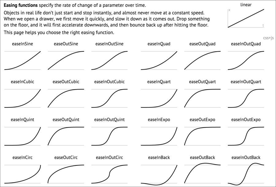
When you declare a transition, the properties, durations, and delays are relatively simple to understand. However, understanding what each timing function does can be a little trickier. Just what do ease, linear, ease-in, ease-out, ease-in-out, and cubic-bezier actually do? Each of them is actually a pre-defined cubic-bezier curve, essentially the same as an easing function. Or, more simplistically, a mathematical description of how the transition should look. It's generally easier to visualize these curves so I recommend you head over to http://cubic-bezier.com/ and http://easings.net/.
Both these sites let you compare timing functions and see the difference each one makes. Here is a screenshot of http://easings.net—you can hover over each line for a demonstration of the easing function.
However, even if you can write your own cubic-bezier curves blindfolded, the likelihood is, for most practical situations, it makes little difference. The reason being that, like any enhancement, it's necessary to employ transition effects subtly. For 'real world' implementations, transitions that occur over too great a period of time tend to make a site feel slow. For example, navigation links that take 5 seconds to transition are going to frustrate, rather than wow your users. The perception of speed is incredibly important for our users and you and I must concentrate on making websites and applications feel as fast as possible.
Therefore, unless there is a compelling reason to do so, using the default transition (ease) over a short interval is often best; a maximum of 1 second is my own preference.
Did you ever have one of those occasions growing up when one parent was out for the day and the other parent said something to the effect of, "OK, while your mom/dad are out we're going to put sugar all over your breakfast cereal but you have to promise not to tell them when they come back"? I'm certainly guilty of that with my little ankle biters. So here's the thing. While no one is looking, let's have a bit of fun. I don't recommend this for production, but try adding this to your responsive project.
* {
    transition: all 1s;
}
Here, we are using the CSS universal selector * to select everything and then setting a transition on all properties for 1 second (1s). As we have omitted to specify the timing function, ease will be used by default and there will be no delay as again, a default of 0 is assumed if an alternative value is not added. The effect? Well, try resizing your browser window and most things (links, hover states, and the like) behave as you would expect. However, because everything transitions, it also includes any rules within media queries, so as the browser window is resized, elements sort of flow from one state to the next. Is it essential? Absolutely not! Is it fun to watch and play around with? Certainly! Now, remove that rule before your mom sees it!