Table of Contents for
Responsive Web Design with HTML5 and CSS3 - Second Edition
 Responsive Web Design with HTML5 and CSS3 - Second Edition
Published by
Packt Publishing, 2015
Responsive Web Design with HTML5 and CSS3 - Second Edition
Published by
Packt Publishing, 2015
- Cover
- Table of Contents
- Responsive Web Design with HTML5 and CSS3 Second Edition
- Responsive Web Design with HTML5 and CSS3 Second Edition
- Credits
- About the Author
- About the Reviewers
- www.PacktPub.com
- Preface
- What you need for this book
- Who this book is for
- Conventions
- Reader feedback
- Customer support
- 1. The Essentials of Responsive Web Design
- Defining responsive web design
- Setting browser support levels
- Our first responsive example
- The shortcomings of our example
- Summary
- 2. Media Queries – Supporting Differing Viewports
- Media query syntax
- Combining media queries
- Using media queries to alter a design
- Considerations for organizing and authoring media queries
- Combine media queries or write them where it suits?
- The viewport meta tag
- Media Queries Level 4
- Summary
- 3. Fluid Layouts and Responsive Images
- Introducing Flexbox
- Getting Flexy
- Responsive images
- Summary
- 4. HTML5 for Responsive Web Designs
- Starting an HTML5 page the right way
- Easy-going HTML5
- New semantic elements in HTML5
- HTML5 text-level semantics
- Obsolete HTML features
- Putting HTML5 elements to use
- WCAG and WAI-ARIA for more accessible web applications
- Embedding media in HTML5
- Responsive HTML5 video and iFrames
- A note about 'offline first'
- Summary
- 5. CSS3 – Selectors, Typography, Color Modes, and New Features
- Anatomy of a CSS rule
- Quick and useful CSS tricks
- Word wrapping
- Facilitating feature forks in CSS
- New CSS3 selectors and how to use them
- CSS3 structural pseudo-classes
- CSS custom properties and variables
- CSS calc
- CSS Level 4 selectors
- Web typography
- New CSS3 color formats and alpha transparency
- Summary
- 6. Stunning Aesthetics with CSS3
- Box shadows
- Background gradients
- Repeating gradients
- Background gradient patterns
- Multiple background images
- High-resolution background images
- CSS filters
- A warning on CSS performance
- Summary
- 7. Using SVGs for Resolution Independence
- The graphic that is a document
- Creating SVGs with popular image editing packages and services
- Inserting SVGs into your web pages
- Inserting an SVG inline
- What you can do with each SVG insertion method (inline, object, background-image, and img)
- Extra SVG capabilities and oddities
- Animating SVG with JavaScript
- Optimising SVGs
- Using SVGs as filters
- A note on media queries inside SVGs
- Summary
- 8. Transitions, Transformations, and Animations
- CSS3 2D transforms
- CSS3 3D transformations
- Animating with CSS3
- Summary
- 9. Conquer Forms with HTML5 and CSS3
- Understanding the component parts of HTML5 forms
- HTML5 input types
- How to polyfill non-supporting browsers
- Styling HTML5 forms with CSS3
- Summary
- 10. Approaching a Responsive Web Design
- View and use the design on real devices
- Embracing progressive enhancement
- Defining a browser support matrix
- Tiering the user experience
- Linking CSS breakpoints to JavaScript
- Avoid CSS frameworks in production
- Coding pragmatic solutions
- Use the simplest code possible
- Hiding, showing, and loading content across viewports
- Validators and linting tools
- Performance
- The next big things
- Summary
- Index
Our form is now fully functional across browsers so now we need to make it a little more appealing across different viewport sizes. Now, I don't consider myself a designer, but by applying some of the techniques we've learned throughout the previous chapters, I still think we can improve the aesthetics of our form.
Note
You can view the styled form at example_09-02, and remember, if you don't already have the example code, you can grab it at http://rwd.education.
In this example, I've also included two versions of the style sheet: styles.css is the version that includes vendor prefixes (added via Autoprefixer) and styles-unprefixed.css is the CSS as written. The latter is probably easier to look at if you want to see how anything is being applied.
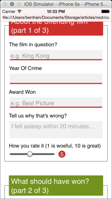
Here's how the form looks in a small viewport with some basic styling applied:
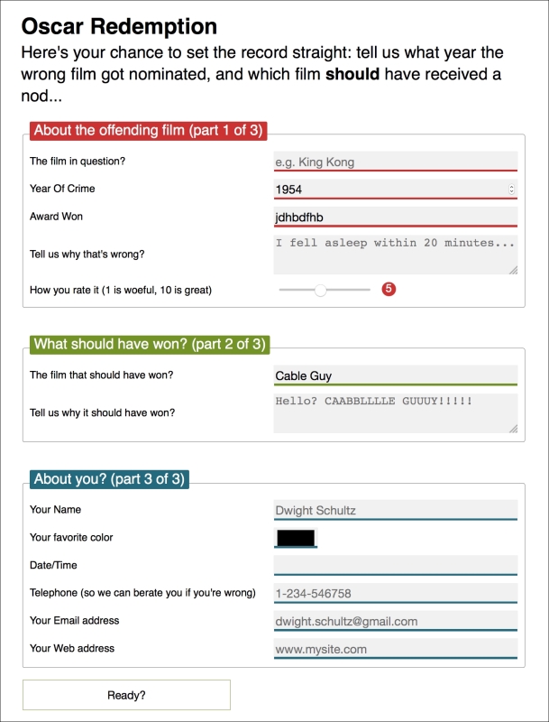
And here it is at a larger viewport:
If you look at the CSS you'll see many of the techniques we've looked at throughout previous chapters applied. For example, Flexbox (Chapter 3, Fluid Layouts and Responsive Images) has been used to create uniform spacing and flexibility for elements; transforms and transitions (Chapter 8, Transitions, Transformations, and Animations) so that the focused input fields grow and the ready/submit button flips vertically when it gains focus. Box-shadows and gradients (Chapter 6, Stunning Aesthetics with CSS3) are used to emphasize different areas of the form. Media queries (Chapter 2, Media Queries – Supporting Differing Viewports) are being used to switch the Flexbox direction for different viewport sizes and CSS Level 3 selectors (Chapter 5, CSS3 – Selectors, Typography, Color Modes, and New Features) are being used for selector negation.
We won't go over those techniques in detail here again. Instead, we will focus on a couple of peculiarities. Firstly, how to visually indicate required fields (and for bonus points indicate a value has been entered) and secondly, how to create a 'fill' effect when a field gets user focus.
We can indicate required input fields to a user using CSS alone. For example:
input:required {
  /* styles */
}
With that selector we could add a border or outline to the required fields or add a background-image inside the field. Basically the sky's the limit! We could also use a specific selector to target an input field that is required, only when it gains focus. For example:
input:focus:required {
  /* styles */
}
However, that would apply styles to the input box itself. What if we want to amend styles on the associated label element? I've decided I'd like to indicate required fields with a little asterisk symbol to the side of the label. But this presents a problem. Generally, CSS only lets us affect a change on elements if they are children of an element, the element itself, or a general or adjacent sibling of an element that receives 'state' (when I say state I'm talking about hover, focus, active, checked, and so on). In the following examples I'm using :hover but that would obviously be problematic for touch based devices.
.item:hover .item-child {}With the preceding selector, styles are applied to item-child when item is hovered over.
.item:hover ~ .item-general-sibling {}With this selector, when the item is hovered over, styles are applied to item-general-sibling if it is at the same DOM level as item and follows it.
.item:hover + .item-adjacent-sibling {}Here, when the item is hovered over, styles are applied to item-adjacent-sibling if it is the adjacent sibling element of item (straight after it in the DOM).
So, back to our issue. If we have a form with labels and fields like this, with the label above the input (to give us the requisite basic layout), it leaves us a little stuck:
<div class="form-Input_Wrapper">
  <label for="film">The film in question?</label>
  <input id="film" name="film" type="text" placeholder="e.g. King Kong" required/>
</div>
In this situation, using just CSS, there is no way to change the style of the label based upon whether the input is required or not (as it comes after the label in the markup). We could switch the order of those two elements in the markup but then we would end up with the label underneath the input.
However, Flexbox gives us the ability to visually reverse the order of elements (read all about that in Chapter 3, Fluid Layouts and Responsive Images, if you haven't already) with ease. That allows us to use this markup:
<div class="form-Input_Wrapper">
  <input id="film" name="film" type="text" placeholder="e.g. King Kong" required/>
  <label for="film">The film in question?</label>
</div>
And then simply apply flex-direction: row-reverse or flex-direction: column-reverse to the parent. These declarations reverse the visual order of their child elements, allowing the desired aesthetic of the label above (smaller viewports), or to the left (larger viewports) of the input. Now we can get on with actually providing some indication of required fields and when they have received input.
Thanks to our revised markup, the adjacent sibling selector now makes this possible.
input:required + label:after { }This selector essentially says, for every label that follows an input with a required attribute, apply the enclosed rules. Here is the CSS for that section:
input:required + label:after {
  content: "*";
  font-size: 2.1em;
  position: relative;
  top: 6px;
  display: inline-flex;
  margin-left: .2ch;
  transition: color, 1s;
}

input:required:invalid + label:after {
  color: red;
}

input:required:valid + label:after {
  color: green;
}
Then, if you focus on a required input and enter a relevant value, the asterisk changes color to green. It's a subtle but helpful touch.
Note
There are more selectors (both implemented and being specified) alongside all the ones we have already looked at. For the most up to date list, take a look at the latest editors draft of the Selectors Level 4 specification: http://dev.w3.org/csswg/selectors-4/
Back in Chapter 6, Stunning Aesthetics with CSS3, we learned how to generate linear and radial gradients as background-images. Sadly, it isn't possible to transition between two background-images (which makes sense as the browser effectively rasterizes the declaration into an image). However, we can transition between values of associated properties like background-position and background-size. We'll use this factor to create a fill effect when an input or textarea receives focus.
Here are the properties and values added to the input:
input:not([type="range"]),
textarea {
  min-height: 30px;
  padding: 2px;
  font-size: 17px;
  border: 1px solid #ebebeb;
  outline: none;
  transition: transform .4s, box-shadow .4s, background-position .2s;
  background: radial-gradient(400px circle,  #fff 99%, transparent 99%), #f1f1f1;
  background-position: -400px 90px, 0 0;
  background-repeat: no-repeat, no-repeat;
  border-radius: 0;
  position: relative;
}

input:not([type="range"]):focus,
textarea:focus {
  background-position: 0 0, 0 0;
}
In the first rule, a solid white radial gradient is being generated but positioned offset out of view. The background color that sits behind (the HEX value after the radial-gradient) is not offset and so provides a default color. When the input gains focus, the background position on the radial-gradient is set back to the default and because we have a transition on the background-image set, we get a nice transition between the two. The result being the appearance that the input is 'filled' with a different color when it gains focus.
Note
Different browsers each have their own proprietary selectors and capabilities when it comes to styling parts of the native UI. For a handy list of lots of the specific selectors, Aurelius Wendelken compiled an impressive list. I made my own copy of it (or 'fork' in Git version control speak) for prosperity, which you can find at https://gist.github.com/benfrain/403d3d3a8e2b6198e395