Table of Contents for
Responsive Web Design with HTML5 and CSS3 - Second Edition
 Responsive Web Design with HTML5 and CSS3 - Second Edition
Published by
Packt Publishing, 2015
Responsive Web Design with HTML5 and CSS3 - Second Edition
Published by
Packt Publishing, 2015
- Cover
- Table of Contents
- Responsive Web Design with HTML5 and CSS3 Second Edition
- Responsive Web Design with HTML5 and CSS3 Second Edition
- Credits
- About the Author
- About the Reviewers
- www.PacktPub.com
- Preface
- What you need for this book
- Who this book is for
- Conventions
- Reader feedback
- Customer support
- 1. The Essentials of Responsive Web Design
- Defining responsive web design
- Setting browser support levels
- Our first responsive example
- The shortcomings of our example
- Summary
- 2. Media Queries – Supporting Differing Viewports
- Media query syntax
- Combining media queries
- Using media queries to alter a design
- Considerations for organizing and authoring media queries
- Combine media queries or write them where it suits?
- The viewport meta tag
- Media Queries Level 4
- Summary
- 3. Fluid Layouts and Responsive Images
- Introducing Flexbox
- Getting Flexy
- Responsive images
- Summary
- 4. HTML5 for Responsive Web Designs
- Starting an HTML5 page the right way
- Easy-going HTML5
- New semantic elements in HTML5
- HTML5 text-level semantics
- Obsolete HTML features
- Putting HTML5 elements to use
- WCAG and WAI-ARIA for more accessible web applications
- Embedding media in HTML5
- Responsive HTML5 video and iFrames
- A note about 'offline first'
- Summary
- 5. CSS3 – Selectors, Typography, Color Modes, and New Features
- Anatomy of a CSS rule
- Quick and useful CSS tricks
- Word wrapping
- Facilitating feature forks in CSS
- New CSS3 selectors and how to use them
- CSS3 structural pseudo-classes
- CSS custom properties and variables
- CSS calc
- CSS Level 4 selectors
- Web typography
- New CSS3 color formats and alpha transparency
- Summary
- 6. Stunning Aesthetics with CSS3
- Box shadows
- Background gradients
- Repeating gradients
- Background gradient patterns
- Multiple background images
- High-resolution background images
- CSS filters
- A warning on CSS performance
- Summary
- 7. Using SVGs for Resolution Independence
- The graphic that is a document
- Creating SVGs with popular image editing packages and services
- Inserting SVGs into your web pages
- Inserting an SVG inline
- What you can do with each SVG insertion method (inline, object, background-image, and img)
- Extra SVG capabilities and oddities
- Animating SVG with JavaScript
- Optimising SVGs
- Using SVGs as filters
- A note on media queries inside SVGs
- Summary
- 8. Transitions, Transformations, and Animations
- CSS3 2D transforms
- CSS3 3D transformations
- Animating with CSS3
- Summary
- 9. Conquer Forms with HTML5 and CSS3
- Understanding the component parts of HTML5 forms
- HTML5 input types
- How to polyfill non-supporting browsers
- Styling HTML5 forms with CSS3
- Summary
- 10. Approaching a Responsive Web Design
- View and use the design on real devices
- Embracing progressive enhancement
- Defining a browser support matrix
- Tiering the user experience
- Linking CSS breakpoints to JavaScript
- Avoid CSS frameworks in production
- Coding pragmatic solutions
- Use the simplest code possible
- Hiding, showing, and loading content across viewports
- Validators and linting tools
- Performance
- The next big things
- Summary
- Index
In days gone by, to achieve a background gradient on an element, it was necessary to tile a thin graphical slice of the gradient. As graphics resources go, it's quite an economical trade-off. An image, only a pixel or two wide, isn't going to break the bandwidth bank and on a single site it can be used on multiple elements.
However, if we need to tweak the gradient it still requires round-trips to the graphics editor. Plus, occasionally, content might 'break out' of the gradient background, extending beyond the images' fixed size limitations. This problem is compounded with a responsive design, as sections of a page may increase at different viewports.
With a CSS background-image gradient however, things are far more flexible. As part of the CSS Image Values and Replaced Content Module Level 3, CSS enables us to create linear and radial background gradients. Let's look how we can define them.
Tip
The specification for CSS Image Values and Replaced Content Module Level 3 can be found at http://www.w3.org/TR/css3-images/.
The linear-gradient notation, in its simplest form, looks like this:
.linear-gradient {
    background: linear-gradient(red, blue);
}
This will create a linear gradient that starts at red (the gradient starts from the top by default) and fades to blue.
Now, if you want to specify a direction for the gradient, there are a couple of ways. The gradient will always begin in the opposite direction to where you are sending it. However, when no direction is set, a gradient will always default to a top to bottom direction. For example:
.linear-gradient {
    background: linear-gradient(to top right, red, blue);
}
In this instance, the gradient heads to the top right. It starts red in the bottom-left corner and fades to blue at the top right.
If you're more mathematically minded, you may believe it would be comparable to write the gradient like this:
.linear-gradient {
    background: linear-gradient(45deg, red, blue);
}
However, keep in mind that on a rectangular box, a gradient that heads 'to top right' (always the top right of the element it's applied to) will end in a slightly different position than 45deg (always 45 degrees from its starting point).
It's worth knowing you can also start gradients before they are visible within a box. For example:
.linear-gradient {
    background: linear-gradient(red -50%, blue);
}
This would render a gradient as if it had started before it is even visible inside the box.
We've actually used a color stop in that last example to define a place where a color should begin and end so let's look at those more fully.
Perhaps the handiest thing about background gradients is color stops. They provide the means to set which color is used at which point in a gradient. With color stops you can specify something as complex as you are likely to need. Consider this example:
.linear-gradient {
  margin: 1rem;
  width: 400px;
  height: 200px;
  background: linear-gradient(#f90 0, #f90 2%, #555 2%, #eee 50%, #555 98%, #f90 98%, #f90 100%);
}
Here's how that linear-gradient renders:
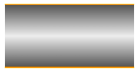
In this example (example_06-03), a direction has not been specified so the default top to bottom direction applies.
Color stops inside a gradient are written comma separated and defined by giving first the color, and then the position of the stop. It's generally advisable not to mix units in one notation but you can. You can have as many color stops as you like and colors can be written as a keyword, HEX, RGBA, or HSLA value.
Tip
Note that there have been a number of different background gradient syntaxes over the years so this is one area that is particularly difficult to write fallbacks for by hand. At the risk of sounding like a broken record (kids, if you don't know what a 'record' is, ask mom or dad), make your life easier with a tool such as Autoprefixer. This lets you write the current W3C standard syntax (as detailed earlier) and it will automatically create the prior versions for you.
Read the W3C specification for linear background gradients at http://www.w3.org/TR/css3-images/.
As a simple fallback for older browsers that don't support background gradients, just define a solid background color first. That way older browsers will at least render a solid background if they don't understand the gradient that's defined afterwards. For example:
.thing {
  background: red;
  background: linear-gradient(45deg, red, blue);
}It's equally simple to create a radial gradient in CSS. These typically begin from a central point and spread out smoothly in an elliptical or circular shape.
Here's the syntax for a radial background gradient (you can play with it in example_06-04):
.radial-gradient {
    margin: 1rem;
    width: 400px;
    height: 200px;
    background: radial-gradient(12rem circle at bottom,  yellow, orange, red);
}After specifying the property (background:) we begin the radial-gradient notation. To start with, before the first comma, we define the shape or size of the gradient and the position. We have used 12rem circle for the shape and size above but consider some other examples:
5emwould be a circle 5em in size. It's possible to omit the 'circle' part if giving just a size.circlewould be a circle the full size of the container (the size of a radial gradient defaults to 'farthest corner' if omitted—more on sizing keywords shortly)40px 30pxwould be a ellipse as if drawn inside a box 40px wide by 30px tallellipsewould create an ellipse shape that would fit within the element
Next, after the size and/or shape, we define the position. The default position is center but let's look at some other possibilities and how they can be defined:
- at top right starts the radial gradient from the top right
- at right 100px top 20px starts the gradient 100px from the right edge and 20px from the top edge
- at center left starts it halfway down the left side of the element
We end our size, shape, and position 'parameters' with a comma and then define any color stops; which work in exactly the same manner as they do with linear-gradient.
To simplify the notation: size, shape, and position before the first comma, then as many color stops as needed after it (with each stop separated with commas).
For responsive work, you may find it advantageous to size gradients proportionally rather than using fixed pixel dimensions. That way you know you are covered (both literally and figuratively) when the size of elements change. There are some handy sizing keywords that can be applied to gradients. You would write them like this, in place of any size value:
background: radial-gradient(closest-side circle at center, #333, blue);
Here is what each of them does:
closest-side: The shape meets the side of the box nearest to the center (in the case of circles), or meets both the horizontal and vertical sides that are closest to the center (in the case of ellipses)closest-corner: The shape meets exactly the closest corner of the box from its centerfarthest-side: The opposite ofclosest-side, in that rather than the shape meeting the nearest size, it's sized to meet the one farthest from its center (or both the furthest vertical and horizontal side in the case of an ellipse)farthest-corner: The shape expands to the farthest corner of the box from the centercover: Identical tofarthest-cornercontain: Identical toclosest-side
Read the W3C specification for radial background gradients at http://www.w3.org/TR/css3-images/.
Tip
The cheat's way to perfect CSS3 linear and radial gradients
If defining gradients by hand seems like hard work, there are some great online gradient generators. My personal favorite is http://www.colorzilla.com/gradient-editor/. It uses a graphics editor style GUI, allowing you to pick your colors, stops, gradient style (linear and radial gradients are supported), and even the color space (HEX, RGB(A), HSL(A)) you'd like the final gradient in. There are also loads of preset gradients to use as starting points. If that wasn't enough, it even gives you optional code for fixing up Internet Explorer 9 to show the gradient and a fallback flat color for older browsers. Still not convinced? How about the ability to generate a CSS gradient based on upon the gradient values in an existing image? Thought that might swing it for you.