Table of Contents for
Responsive Web Design with HTML5 and CSS3 - Second Edition
 Responsive Web Design with HTML5 and CSS3 - Second Edition
Published by
Packt Publishing, 2015
Responsive Web Design with HTML5 and CSS3 - Second Edition
Published by
Packt Publishing, 2015
- Cover
- Table of Contents
- Responsive Web Design with HTML5 and CSS3 Second Edition
- Responsive Web Design with HTML5 and CSS3 Second Edition
- Credits
- About the Author
- About the Reviewers
- www.PacktPub.com
- Preface
- What you need for this book
- Who this book is for
- Conventions
- Reader feedback
- Customer support
- 1. The Essentials of Responsive Web Design
- Defining responsive web design
- Setting browser support levels
- Our first responsive example
- The shortcomings of our example
- Summary
- 2. Media Queries – Supporting Differing Viewports
- Media query syntax
- Combining media queries
- Using media queries to alter a design
- Considerations for organizing and authoring media queries
- Combine media queries or write them where it suits?
- The viewport meta tag
- Media Queries Level 4
- Summary
- 3. Fluid Layouts and Responsive Images
- Introducing Flexbox
- Getting Flexy
- Responsive images
- Summary
- 4. HTML5 for Responsive Web Designs
- Starting an HTML5 page the right way
- Easy-going HTML5
- New semantic elements in HTML5
- HTML5 text-level semantics
- Obsolete HTML features
- Putting HTML5 elements to use
- WCAG and WAI-ARIA for more accessible web applications
- Embedding media in HTML5
- Responsive HTML5 video and iFrames
- A note about 'offline first'
- Summary
- 5. CSS3 – Selectors, Typography, Color Modes, and New Features
- Anatomy of a CSS rule
- Quick and useful CSS tricks
- Word wrapping
- Facilitating feature forks in CSS
- New CSS3 selectors and how to use them
- CSS3 structural pseudo-classes
- CSS custom properties and variables
- CSS calc
- CSS Level 4 selectors
- Web typography
- New CSS3 color formats and alpha transparency
- Summary
- 6. Stunning Aesthetics with CSS3
- Box shadows
- Background gradients
- Repeating gradients
- Background gradient patterns
- Multiple background images
- High-resolution background images
- CSS filters
- A warning on CSS performance
- Summary
- 7. Using SVGs for Resolution Independence
- The graphic that is a document
- Creating SVGs with popular image editing packages and services
- Inserting SVGs into your web pages
- Inserting an SVG inline
- What you can do with each SVG insertion method (inline, object, background-image, and img)
- Extra SVG capabilities and oddities
- Animating SVG with JavaScript
- Optimising SVGs
- Using SVGs as filters
- A note on media queries inside SVGs
- Summary
- 8. Transitions, Transformations, and Animations
- CSS3 2D transforms
- CSS3 3D transformations
- Animating with CSS3
- Summary
- 9. Conquer Forms with HTML5 and CSS3
- Understanding the component parts of HTML5 forms
- HTML5 input types
- How to polyfill non-supporting browsers
- Styling HTML5 forms with CSS3
- Summary
- 10. Approaching a Responsive Web Design
- View and use the design on real devices
- Embracing progressive enhancement
- Defining a browser support matrix
- Tiering the user experience
- Linking CSS breakpoints to JavaScript
- Avoid CSS frameworks in production
- Coding pragmatic solutions
- Use the simplest code possible
- Hiding, showing, and loading content across viewports
- Validators and linting tools
- Performance
- The next big things
- Summary
- Index
There is a glaring problem with box-shadow. As the name implies, it is limited to the rectangular CSS box shape of the element it is applied to. Here's a screen grab of a triangle shape made with CSS (you can view the code in example_06-08) with a box shadow applied:

Not exactly what I was hoping for. Thankfully, we can overcome this issue with CSS filters, part of the Filter Effects Module Level 1 (http://www.w3.org/TR/filter-effects/). They are not as widely supported as box-shadow, but work great with a progressive enhancement approach. If a browser doesn't understand what to do with the filter it simply ignores it. For supporting browsers, the fancy effects are rendered.
Here is that same element with a CSS drop-shadow filter applied instead of a box-shadow:

Here is the format for CSS filters:
.filter-drop-shadow {
    filter: drop-shadow(8px 8px 6px #333);
}
After the filter property we specify the filter we want to use, drop-shadow in this example, and then pass in the arguments for the filter. The drop-shadow follows a similar syntax to box-shadow so this one is easy; x and y offset, blur, then spread radius (both optional), and finally color (also optional, although I recommend specifying a color for consistency).
Tip
CSS filters are actually based upon SVG filters which have a wider support. We'll look at the SVG based equivalent in Chapter 7, Using SVGs for Resolution Independence.
There are a few filters to choose from. We will look at each. While images of most of the filters follow, readers reading a hard copy of this book (with monochrome images) may struggle to notice the differences. If you're in that situation, remember you can still view the various filters in the browser by opening example_06-08. I'm going to list each out now with a suitable value specified. As you might imagine, more of a value means more of the filter applied. Where images are used, the image is shown after the relevant code.
filter: url ('./img/filters.svg#filterRed'): Lets you specify an SVG filter to use.filter: blur(3px): Use a single length value (but not as a percentage).
filter: brightness(2): Use a value from 0 to 1 or 0% to 100%. 0/0% is black, 1/100% is 'normal,' and anything beyond brightens the element further.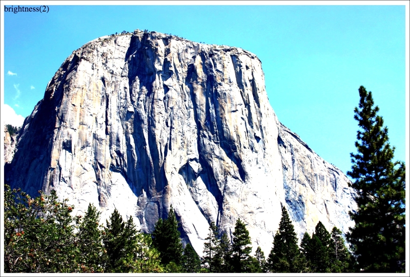
filter: contrast(2): Use a value from 0 to 1 or 0% to 100%. 0/0% is black, 1/100% is 'normal,' and anything beyond raises the color contrast.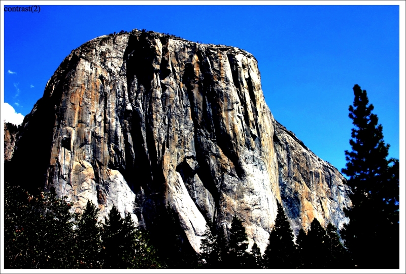
filter: drop-shadow(4px 4px 6px #333): We looked atdrop-shadowin detail earlier.filter: grayscale(.8): Use a value from 0 to 1, or 0% to 100% to apply varying amounts of grayscale to the element. A value of 0 would be no grayscale while a value of 1 would be fully grayscale.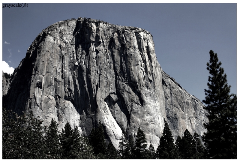
filter: hue-rotate(25deg): Use a value between 0 and 360 degrees to adjust the colors around the color wheel.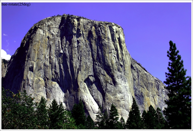
filter: invert(75%): Use a value from 0 to 1, or 0% to 100% to define the amount the element has its colors inverted.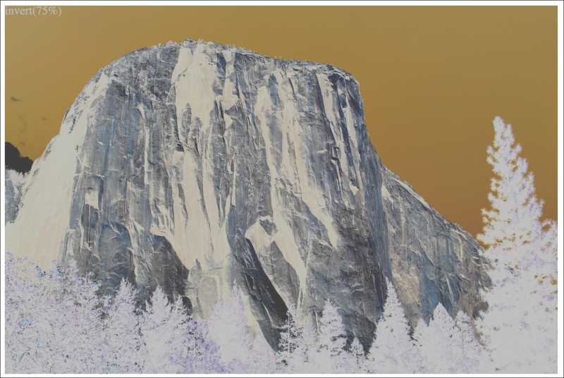
filter: opacity(50%): Use a value from 0 to 1, or 0% to 100% to alter the opacity of the element. This is similar to theopacityproperty you will already be familiar with. However, filters, as we shall see, can be combined and this allows opacity to be combined with other filters in one go.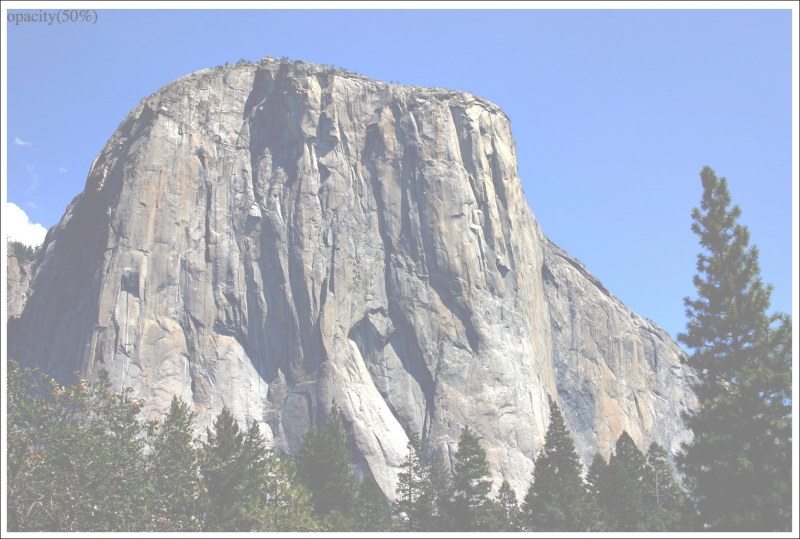
filter: saturate(15%): Use a value from 0 to 1, or 0% to 100% to de-saturate an image and anything above 1/100% to add extra saturation.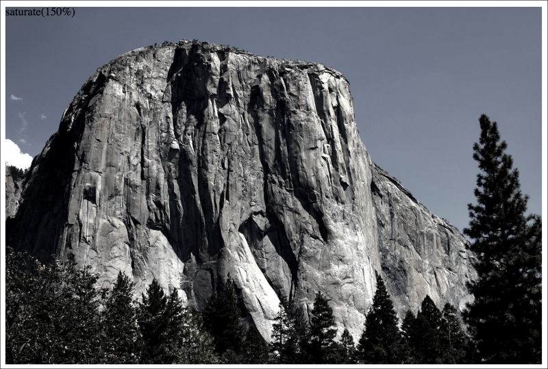
filter: sepia(.75): Use a value from 0 to 1, or 0% to 100% to make the element appear with a more sepia color. 0/0% leaves the element 'as is' while anything above that applies greater amounts of sepia up to a maximum of 1/100%.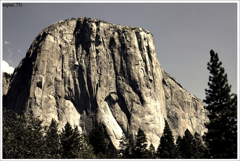
You can also combine filters easily; simply space separate them. For example, here is how you would apply opacity, blur, and sepia filters at once:
.MultipleFilters {
    filter: opacity(10%) blur(2px) sepia(35%);
}I think you'll agree, CSS filters offer some pretty powerful effects. They are also effects we can transition and transform from situation to situation. We'll look at how to do that in Chapter 8, Transitions, Transformations, and Animations.
However, before you go crazy with these new toys, we need to have a grown up conversation about performance.