Table of Contents for
Responsive Web Design with HTML5 and CSS3 - Second Edition
 Responsive Web Design with HTML5 and CSS3 - Second Edition
Published by
Packt Publishing, 2015
Responsive Web Design with HTML5 and CSS3 - Second Edition
Published by
Packt Publishing, 2015
- Cover
- Table of Contents
- Responsive Web Design with HTML5 and CSS3 Second Edition
- Responsive Web Design with HTML5 and CSS3 Second Edition
- Credits
- About the Author
- About the Reviewers
- www.PacktPub.com
- Preface
- What you need for this book
- Who this book is for
- Conventions
- Reader feedback
- Customer support
- 1. The Essentials of Responsive Web Design
- Defining responsive web design
- Setting browser support levels
- Our first responsive example
- The shortcomings of our example
- Summary
- 2. Media Queries – Supporting Differing Viewports
- Media query syntax
- Combining media queries
- Using media queries to alter a design
- Considerations for organizing and authoring media queries
- Combine media queries or write them where it suits?
- The viewport meta tag
- Media Queries Level 4
- Summary
- 3. Fluid Layouts and Responsive Images
- Introducing Flexbox
- Getting Flexy
- Responsive images
- Summary
- 4. HTML5 for Responsive Web Designs
- Starting an HTML5 page the right way
- Easy-going HTML5
- New semantic elements in HTML5
- HTML5 text-level semantics
- Obsolete HTML features
- Putting HTML5 elements to use
- WCAG and WAI-ARIA for more accessible web applications
- Embedding media in HTML5
- Responsive HTML5 video and iFrames
- A note about 'offline first'
- Summary
- 5. CSS3 – Selectors, Typography, Color Modes, and New Features
- Anatomy of a CSS rule
- Quick and useful CSS tricks
- Word wrapping
- Facilitating feature forks in CSS
- New CSS3 selectors and how to use them
- CSS3 structural pseudo-classes
- CSS custom properties and variables
- CSS calc
- CSS Level 4 selectors
- Web typography
- New CSS3 color formats and alpha transparency
- Summary
- 6. Stunning Aesthetics with CSS3
- Box shadows
- Background gradients
- Repeating gradients
- Background gradient patterns
- Multiple background images
- High-resolution background images
- CSS filters
- A warning on CSS performance
- Summary
- 7. Using SVGs for Resolution Independence
- The graphic that is a document
- Creating SVGs with popular image editing packages and services
- Inserting SVGs into your web pages
- Inserting an SVG inline
- What you can do with each SVG insertion method (inline, object, background-image, and img)
- Extra SVG capabilities and oddities
- Animating SVG with JavaScript
- Optimising SVGs
- Using SVGs as filters
- A note on media queries inside SVGs
- Summary
- 8. Transitions, Transformations, and Animations
- CSS3 2D transforms
- CSS3 3D transformations
- Animating with CSS3
- Summary
- 9. Conquer Forms with HTML5 and CSS3
- Understanding the component parts of HTML5 forms
- HTML5 input types
- How to polyfill non-supporting browsers
- Styling HTML5 forms with CSS3
- Summary
- 10. Approaching a Responsive Web Design
- View and use the design on real devices
- Embracing progressive enhancement
- Defining a browser support matrix
- Tiering the user experience
- Linking CSS breakpoints to JavaScript
- Avoid CSS frameworks in production
- Coding pragmatic solutions
- Use the simplest code possible
- Hiding, showing, and loading content across viewports
- Validators and linting tools
- Performance
- The next big things
- Summary
- Index
If I check the definition of the word 'semantics' in the dictionary of OS X, it is defined as:
"the branch of linguistics and logic concerned with meaning".
For our purposes, semantics is the process of giving our markup meaning. Why is this important? Glad you asked.
Most websites follow fairly standard structural conventions; typical areas include a header, a footer, a sidebar, a navigation bar, and so on. As web authors we will often name the divs we use to more clearly designate these areas (for example, class="Header"). However, as far as the code itself goes, any user agent (web browser, screen reader, search engine crawler, and so on) looking at it couldn't say for sure what the purpose of each of these div elements is. Users of assistive technology would also find it difficult to differentiate one div from another. HTML5 aims to solve that problem with new semantic elements.
Note
For the full list of HTML5 elements, get yourself (very) comfy and point your browser at http://www.w3.org/TR/html5/semantics.html#semantics.
We won't cover every one of the new elements here, merely those I feel are the most beneficial or interesting in day-to-day responsive web design use. Let's dig in.
For a long time, HTML5 had no element to demarcate the main content of a page. Within the body of a web page, this would be the element that contains the main block of content.
At first, it was argued that the content that wasn't inside one of the other new semantic HTML5 elements would, by negation, be the main content. Thankfully, the spec changed and we now have a more declarative way to group the main content; the aptly named <main> tag.
Whether you're wrapping the main content of a page or the main section of a web-based application, the main element is what you should be grouping it all with. Here's a particularly useful line from the specification:
"The main content area of a document includes content that is unique to that document and excludes content that is repeated across a set of documents such as site navigation links, copyright information, site logos and banners and search forms (unless the document or applications main function is that of a search form)."
It's also worth noting that there shouldn't be more than one main on each page (after all, you can't have two main pieces of content) and it shouldn't be used as a descendent as some of the other semantic HTML5 elements such as article, aside, header, footer, nav, or header. They can live within a main element however.
Note
Read the official line on the main element at: http://www.w3.org/TR/html5/grouping-content.html#the-main-element
The <section> element is used to define a generic section of a document or application. For example, you may choose to create sections round your content; one section for contact information, another section for news feeds, and so on. It's important to understand that it isn't intended for styling purposes. If you need to wrap an element merely to style it, you should continue to use a div as you would have before.
When working on web-based applications I tend to use section as the wrapping element for visual components. It provides a simple way to see the beginning and end of components in the markup.
You can also qualify for yourself whether you should be using a section based upon whether the content you are sectioning has a natural heading within it (for example an h1). If it doesn't, it's likely you'd be better off opting for a div.
Note
To find out what the W3C HTML5 specification says about <section> go to the following URL:
http://www.w3.org/TR/html5/sections.html#the-section-element
The <nav> element is used to wrap major navigational links to other pages or parts within the same page. It isn't strictly intended for use in footers (although it can be) and the like, where groups of links to other pages are common.
If you usually markup your navigational elements with an un-ordered list (<ul>) and a bunch of list tags (li), you may be better served with a nav and a number of nested a tags instead.
The <article> element, alongside <section> can easily lead to confusion. I certainly had to read and re-read the specifications of each before it sank in. Here's my re-iteration of the specification. The <article> element is used to wrap a self-contained piece of content. When structuring a page, ask whether the content you're intending to use within a <article> tag could be taken as a whole lump and pasted onto a different site and still make complete sense? Another way to think about it is, would the content that you are considering wrapping in an <article> actually constitute a separate article in a RSS feed? Obvious examples of content that should be wrapped with an <article> element would be blog posts or news stories. Be aware that if nesting <article> elements, it is presumed that the nested <article> elements are principally related to the outer article.
Note
To see what the W3C HTML5 specification says about <article> visit http://www.w3.org/TR/html5/sections.html#the-article-element.
The <aside> element is used for content that is tangentially related to the content around it. In practical terms, I often use it for sidebars (when it contains suitable content). It's also considered suitable for pull quotes, advertising, and groups of navigation elements. Basically anything not directly related to the main content would work well in an aside. If it was an e-commerce site, I'd consider areas like 'customers who bought this also bought' as prime candidates for an <aside>.
Note
For more on what the W3C HTML5 specification says about <aside> visit http://www.w3.org/TR/html5/sections.html#the-aside-element.
The specification relates that the figure element:
"...can thus be used to annotate illustrations, diagrams, photos, code listings, etc."
Here's how we could use it to revise a portion of markup from the first chapter:
<figure class="MoneyShot">
  <img class="MoneyShotImg" src="img/scones.jpg" alt="Incredible scones" />
  <figcaption class="ImageCaption">Incredible scones, picture from Wikipedia</figcaption>
</figure>
You can see that the <figure> element is used to wrap this little self-contained block. Inside, the <figcaption> is used to provide a caption for the parent <figure> element.
It's perfect when images or code need a little caption alongside (that wouldn't be suitable in the main text of the content).
Note
The specification for the figure element can be found at http://www.w3.org/TR/html5/grouping-content.html#the-figure-element.
The specification for the figcaption is at http://www.w3.org/TR/html5/grouping-content.html#the-figcaption-element.
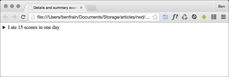
How many times have you wanted to create a simple open and close 'widget' on your page? A piece of summary text that when clicked, opens a panel with additional information. HTML5 facilitates this pattern with the details and summary elements. Consider this markup (you can open example3.html from this chapter's code to play with it for yourself):
<details>
    <summary>I ate 15 scones in one day</summary>
    <p>Of course I didn't. It would probably kill me if I did. What a way to go. Mmmmmm, scones!</p>
</details>
Opening this in Chrome, with no added styling, shows only the summary text by default:
Clicking anywhere on the summary text opens the panel. Clicking it again toggles it shut. If you want the panel open by default you can add the open attribute to the details element:
<details open>
    <summary>I ate 15 scones in one day</summary>
    <p>Of course I didn't. It would probably kill me if I did. What a way to go. Mmmmmm, scones!</p>
</details>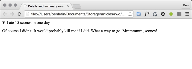
Supporting browsers typically add some default styling to indicate the panel can be opened. Here in Chrome (and also Safari) that's a dark disclosure triangle. To disable this, you need to use a WebKit specific proprietary pseudo selector:
summary::-webkit-details-marker {
  display: none;
}
You can of course use that same selector to style the marker differently.
Currently, there is no way of animating the open and close. Neither is there a (non JavaScript) way of toggling other details panels closed (at the same level) when a different one is open. I'm not sure either of these desires will (or should) ever be addressed. You should think of it more as a way to facilitate what you would have done with a display: none; toggle with the help of JavaScript.
Sadly, as I write this (mid 2015), there is no support for this element in Firefox or Internet Explorer (they just render the two elements as inline elements). Polyfills exist (https://mathiasbynens.be/notes/html5-details-jquery) and hopefully will be fully implemented soon.
Practically, the <header> element can be used for the "masthead" area of a site's header. It can also be used as an introduction to other content such as a section within an <article> element. You can use it as many times on the same page as needed (you could have a <header> inside every <section> on your page for example).
The <footer> element should be used to contain information about the section it sits within. It might contain links to other documents or copyright information for example. Like the <header> it can be used multiple times withina page if needed. For example, it could be used for the footer of a blog but also a footer section within a blog post article. However, the specification explains that contact information for the author of a blog post should instead be wrapped by an <address> element.
The <address> element is to be used explicitly for marking up contact information for its nearest <article> or <body> ancestor. To confuse matters, keep in mind that it isn't to be used for postal addresses and the like (unless they are indeed the contact addresses for the content in question). Instead postal addresses and other arbitrary contact information should be wrapped in good ol' <p> tags.
I'm not a fan of the <address> element as in my experience it would be far more useful to markup a physical address in its own element, but that's a personal gripe. Hopefully it makes more sense to you.
Note
For more on what the W3C HTML5 specification says about <address> check out:
http://www.w3.org/TR/html5/sections.html#the-address-element
Something that I hadn't realized until very recently is that using h1-h6 tags to markup headings and sub-headings is discouraged. I'm talking about this kind of thing:
<h1>Scones:</h1>
<h2>The most resplendent of snacks</h2>
Here's a quote from the HTML5 specification:
h1–h6 elements must not be used to markup subheadings, subtitles, alternative titles and taglines unless intended to be the heading for a new section or subsection.
That's certainly one of the less ambiguous sentences in the specification! Ooops!
So, how should we author such eventualities? The specification actually has a whole section, (http://www.w3.org/TR/html5/common-idioms.html#common-idioms) dedicated to this. Personally, I preferred the old <hgroup> element but sadly that ship has sailed (more information in the Obsolete HTML features section). So, to follow the advice of the specification, our prior example could be rewritten as:
<h1>Scones:</h1>
<p>The most resplendent of snacks</p>