Table of Contents for
Responsive Web Design with HTML5 and CSS3 - Second Edition
 Responsive Web Design with HTML5 and CSS3 - Second Edition
Published by
Packt Publishing, 2015
Responsive Web Design with HTML5 and CSS3 - Second Edition
Published by
Packt Publishing, 2015
- Cover
- Table of Contents
- Responsive Web Design with HTML5 and CSS3 Second Edition
- Responsive Web Design with HTML5 and CSS3 Second Edition
- Credits
- About the Author
- About the Reviewers
- www.PacktPub.com
- Preface
- What you need for this book
- Who this book is for
- Conventions
- Reader feedback
- Customer support
- 1. The Essentials of Responsive Web Design
- Defining responsive web design
- Setting browser support levels
- Our first responsive example
- The shortcomings of our example
- Summary
- 2. Media Queries – Supporting Differing Viewports
- Media query syntax
- Combining media queries
- Using media queries to alter a design
- Considerations for organizing and authoring media queries
- Combine media queries or write them where it suits?
- The viewport meta tag
- Media Queries Level 4
- Summary
- 3. Fluid Layouts and Responsive Images
- Introducing Flexbox
- Getting Flexy
- Responsive images
- Summary
- 4. HTML5 for Responsive Web Designs
- Starting an HTML5 page the right way
- Easy-going HTML5
- New semantic elements in HTML5
- HTML5 text-level semantics
- Obsolete HTML features
- Putting HTML5 elements to use
- WCAG and WAI-ARIA for more accessible web applications
- Embedding media in HTML5
- Responsive HTML5 video and iFrames
- A note about 'offline first'
- Summary
- 5. CSS3 – Selectors, Typography, Color Modes, and New Features
- Anatomy of a CSS rule
- Quick and useful CSS tricks
- Word wrapping
- Facilitating feature forks in CSS
- New CSS3 selectors and how to use them
- CSS3 structural pseudo-classes
- CSS custom properties and variables
- CSS calc
- CSS Level 4 selectors
- Web typography
- New CSS3 color formats and alpha transparency
- Summary
- 6. Stunning Aesthetics with CSS3
- Box shadows
- Background gradients
- Repeating gradients
- Background gradient patterns
- Multiple background images
- High-resolution background images
- CSS filters
- A warning on CSS performance
- Summary
- 7. Using SVGs for Resolution Independence
- The graphic that is a document
- Creating SVGs with popular image editing packages and services
- Inserting SVGs into your web pages
- Inserting an SVG inline
- What you can do with each SVG insertion method (inline, object, background-image, and img)
- Extra SVG capabilities and oddities
- Animating SVG with JavaScript
- Optimising SVGs
- Using SVGs as filters
- A note on media queries inside SVGs
- Summary
- 8. Transitions, Transformations, and Animations
- CSS3 2D transforms
- CSS3 3D transformations
- Animating with CSS3
- Summary
- 9. Conquer Forms with HTML5 and CSS3
- Understanding the component parts of HTML5 forms
- HTML5 input types
- How to polyfill non-supporting browsers
- Styling HTML5 forms with CSS3
- Summary
- 10. Approaching a Responsive Web Design
- View and use the design on real devices
- Embracing progressive enhancement
- Defining a browser support matrix
- Tiering the user experience
- Linking CSS breakpoints to JavaScript
- Avoid CSS frameworks in production
- Coding pragmatic solutions
- Use the simplest code possible
- Hiding, showing, and loading content across viewports
- Validators and linting tools
- Performance
- The next big things
- Summary
- Index
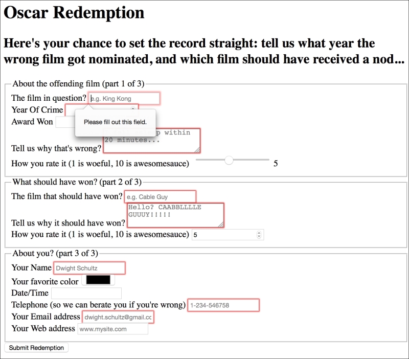
There's a lot going on in our HTML5 powered form, so let's break it down. The three sections of the form are each wrapped in a fieldset with a legend:
<fieldset>
<legend>About the offending film (part 1 of 3)</legend>
<div>
  <label for="film">The film in question?</label>
  <input id="film" name="film" type="text" placeholder="e.g. King Kong" required>
</div>
You can see from the previous code snippet that each input element of the form is also wrapped in a div with a label associated with each input (we could have wrapped the input with the label element if we wanted to too). So far, so normal. However, within this first input we've just stumbled upon our first HTML5 form feature. After common attributes of ID, name, and type, we have placeholder.
The placeholder attribute looks like this:
placeholder="e.g. King Kong"
Placeholder text within form fields is such a common requirement that the folks creating HTML5 decided it should be a standard feature of HTML. Simply include the placeholder attribute within your input and the value will be displayed by default until the field gains focus. When it loses focus, if a value has not been entered it will re-display the placeholder text.
You can style the placeholder attribute with the :placeholder-shown pseudo selector. Be aware that this selector has been through a number of iterations so ensure you have the prefixer tool set up to provide the fallback selectors for already implemented versions.
input:placeholder-shown {
  color: #333;
}
After the placeholder attribute, in the previous code snippet, the next HTML5 form feature is the required attribute.
The required attribute looks like this:
required
In supporting HTML5 capable browsers, by adding the Boolean (meaning you simply include the attribute or not) attribute required within the input element, it indicates that a value is required. If the form is submitted without the field containing the requisite information, a warning message should be displayed. The message displayed is specific (both in content and styling) to both the browser and the input type used.
We've already seen what the required field browser message looks like in Chrome. The following screenshot shows the same message in Firefox:
The required value can be used alongside many input types to ensure a value is entered. Notable exceptions are the range, color, button, and hidden input types as they almost always have a default value.
The HTML5 autofocus attribute allows a form to have a field already focused, ready for user input. The following code is an example of an input field wrapped in a div with the autofocus attribute added at the end:
<div>
  <label for="search">Search the site...</label>
  <input id="search" name="search" type="search" placeholder="Wyatt Earp" autofocus>
</div>
Be careful when using this attribute. Cross browser confusion can reign if multiple fields have the autofocus attribute added. For example, if multiple fields have autofocus added, in Safari, the last field with the autofocus attributed is focused on page load. However, Firefox and Chrome do the opposite with the first autofocus field selected.
It's also worth considering that some users use the spacebar to quickly skip down the content of a web page once it's loaded. On a page where a form has an autofocused input field, it prevents this capability; instead it adds a space into the focused input field. It's easy to see how that could be a source of frustration for users.
If using the autofocus attribute, be certain it's only used once in a form and be sure you understand the implications for those who scroll with the spacebar.
By default, most browsers aid user input by auto-completing the value of form fields where possible. While the user can turn this preference on and off within the browser, we can now also indicate to the browser when we don't want a form or field to allow auto-completion. This is useful not just for sensitive data (bank account numbers for example) but also if you want to ensure users pay attention and enter something by hand. For example, for many forms I complete, if a telephone number is required, I enter a 'spoof' telephone number. I know I'm not the only one that does that (doesn't everyone?) but I can ensure that users don't enter an autocompleted spoof number by setting the autocomplete attribute to off on the relevant input field. The following is a code example of a field with the autocomplete attribute set to off:
<div>
  <label for="tel">Telephone (so we can berate you if you're wrong)</label>
  <input id="tel" name="tel" type="tel" placeholder="1-234-546758" autocomplete="off" required>
</div>
We can also set entire forms (but not fieldsets) to not autocomplete by using the attribute on the form itself. The following is a code example:
<form id="redemption" method="post" autocomplete="off">
This list attribute and the associated datalist element allow a number of selections to be presented to a user once they start entering a value in the field. The following is a code example of the list attribute in use with an associated datalist, all wrapped in a div:
<div>
  <label for="awardWon">Award Won</label>
  <input id="awardWon" name="awardWon" type="text" list="awards">
  <datalist id="awards">
    <select>
      <option value="Best Picture"></option>
      <option value="Best Director"></option>
      <option value="Best Adapted Screenplay"></option>
      <option value="Best Original Screenplay"></option>
    </select>
  </datalist>
</div>
The value given in the list attribute (awards) refers to the ID of the datalist. Doing this associates the datalist with the input field. Although wrapping the options with a <select> element isn't strictly necessary, it helps when applying polyfills for browsers that haven't implemented the feature.
Note
Amazingly, in mid-2015, the datalist element still isn't supported natively in iOS, Safari, or Android 4.4 and below (http://caniuse.com/)
You can read the specification for datalist at http://www.w3.org/TR/html5/forms.html.
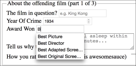
While the input field seems to be just a normal text input field, when typing in the field, a selection box appears below it (in supporting browsers) with matching results from the datalist. In the following screenshot, we can see the list in action (Firefox). In this instance, as B is present in all options within the datalist, all the values are shown for the user to select from:
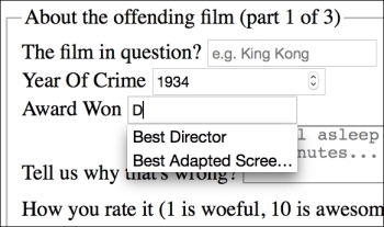
However, when typing D instead, only the matching suggestions appear as shown in the following screenshot:
The list and datalist don't prevent a user entering different text in the input box but they do provide another great way of adding common functionality and user enhancement through HTML5 markup alone.