Table of Contents for
Responsive Web Design with HTML5 and CSS3 - Second Edition
 Responsive Web Design with HTML5 and CSS3 - Second Edition
Published by
Packt Publishing, 2015
Responsive Web Design with HTML5 and CSS3 - Second Edition
Published by
Packt Publishing, 2015
- Cover
- Table of Contents
- Responsive Web Design with HTML5 and CSS3 Second Edition
- Responsive Web Design with HTML5 and CSS3 Second Edition
- Credits
- About the Author
- About the Reviewers
- www.PacktPub.com
- Preface
- What you need for this book
- Who this book is for
- Conventions
- Reader feedback
- Customer support
- 1. The Essentials of Responsive Web Design
- Defining responsive web design
- Setting browser support levels
- Our first responsive example
- The shortcomings of our example
- Summary
- 2. Media Queries – Supporting Differing Viewports
- Media query syntax
- Combining media queries
- Using media queries to alter a design
- Considerations for organizing and authoring media queries
- Combine media queries or write them where it suits?
- The viewport meta tag
- Media Queries Level 4
- Summary
- 3. Fluid Layouts and Responsive Images
- Introducing Flexbox
- Getting Flexy
- Responsive images
- Summary
- 4. HTML5 for Responsive Web Designs
- Starting an HTML5 page the right way
- Easy-going HTML5
- New semantic elements in HTML5
- HTML5 text-level semantics
- Obsolete HTML features
- Putting HTML5 elements to use
- WCAG and WAI-ARIA for more accessible web applications
- Embedding media in HTML5
- Responsive HTML5 video and iFrames
- A note about 'offline first'
- Summary
- 5. CSS3 – Selectors, Typography, Color Modes, and New Features
- Anatomy of a CSS rule
- Quick and useful CSS tricks
- Word wrapping
- Facilitating feature forks in CSS
- New CSS3 selectors and how to use them
- CSS3 structural pseudo-classes
- CSS custom properties and variables
- CSS calc
- CSS Level 4 selectors
- Web typography
- New CSS3 color formats and alpha transparency
- Summary
- 6. Stunning Aesthetics with CSS3
- Box shadows
- Background gradients
- Repeating gradients
- Background gradient patterns
- Multiple background images
- High-resolution background images
- CSS filters
- A warning on CSS performance
- Summary
- 7. Using SVGs for Resolution Independence
- The graphic that is a document
- Creating SVGs with popular image editing packages and services
- Inserting SVGs into your web pages
- Inserting an SVG inline
- What you can do with each SVG insertion method (inline, object, background-image, and img)
- Extra SVG capabilities and oddities
- Animating SVG with JavaScript
- Optimising SVGs
- Using SVGs as filters
- A note on media queries inside SVGs
- Summary
- 8. Transitions, Transformations, and Animations
- CSS3 2D transforms
- CSS3 3D transformations
- Animating with CSS3
- Summary
- 9. Conquer Forms with HTML5 and CSS3
- Understanding the component parts of HTML5 forms
- HTML5 input types
- How to polyfill non-supporting browsers
- Styling HTML5 forms with CSS3
- Summary
- 10. Approaching a Responsive Web Design
- View and use the design on real devices
- Embracing progressive enhancement
- Defining a browser support matrix
- Tiering the user experience
- Linking CSS breakpoints to JavaScript
- Avoid CSS frameworks in production
- Coding pragmatic solutions
- Use the simplest code possible
- Hiding, showing, and loading content across viewports
- Validators and linting tools
- Performance
- The next big things
- Summary
- Index
CSS3 gives us more power to select elements based upon where they sit in the structure of the DOM.
Let's consider a common design treatment; we're working on the navigation bar for a larger viewport and we want to have all but the last link over on the left.
Historically, we would have needed to solve this problem by adding a class name to the last link so that we could select it, like this:
<nav class="nav-Wrapper">
  <a href="/home" class="nav-Link">Home</a>
  <a href="/About" class="nav-Link">About</a>
  <a href="/Films" class="nav-Link">Films</a>
  <a href="/Forum" class="nav-Link">Forum</a>
  <a href="/Contact-Us" class="nav-Link nav-LinkLast">Contact Us</a>
</nav>
This in itself can be problematic. For example, sometimes, just getting a content management system to add a class to a final list item can be frustratingly difficult. Thankfully, in those eventualities, it's no longer a concern. We can solve this problem and many more with CSS3 structural pseudo-classes.
CSS 2.1 already had a selector applicable for the first item in a list:
div:first-child {
  /* Styles */
}
However, CSS3 adds a selector that can also match the last:
div:last-child {
  /* Styles */
}
Let's look how that selector could fix our prior problem:
@media (min-width: 60rem) {
  .nav-Wrapper {
    display: flex;
  }
  .nav-Link:last-child {
    margin-left: auto;
  }
}
There are also useful selectors for when something is the only item: :only-child and the only item of a type: :only-of-type.
The nth-child selectors let us solve even more difficult problems. With the same markup as before, let's consider how nth-child selectors allow us to select any link(s) within the list.
Firstly, what about selecting every other list item? We could select the odd ones like this:
.nav-Link:nth-child(odd) {
  /* Styles */
}
Or, if you wanted to select the even ones:
.nav-Link:nth-child(even) {
  /* Styles */
}For the uninitiated, nth-based selectors can look pretty intimidating. However, once you've mastered the logic and syntax you'll be amazed what you can do with them. Let's take a look.
CSS3 gives us incredible flexibility with a few nth-based rules:
nth-child(n)nth-last-child(n)nth-of-type(n)nth-last-of-type(n)
We've seen that we can use (odd) or (even) values already in an nth-based expression but the (n) parameter can be used in another couple of ways:
As an integer; for example, :nth-child(2) would select the second item
As a numeric expression; for example, :nth-child(3n+1) would start at 1 and then select every third element
The integer based property is easy enough to understand, just enter the element number you want to select.
The numeric expression version of the selector is the part that can be a little baffling for mere mortals. If math is easy for you, I apologize for this next section. For everyone else, let's break it down.
Let's consider 10 spans on a page (you can play about with these by looking at example_05-05):
<span></span>
<span></span>
<span></span>
<span></span>
<span></span>
<span></span>
<span></span>
<span></span>
<span></span>
<span></span>
By default they will be styled like this:
span {
  height: 2rem;
  width: 2rem;
  background-color: blue;
  display: inline-block;
}
As you might imagine, this gives us 10 squares in a line:

OK, let's look at how we can select different ones with nth-based selections.
For practicality, when considering the expression within the parenthesis, I start from the right. So, for example, if I want to figure out what (2n+3) will select, I start with the right-most number (the three here indicates the third item from the left) and know it will select every second element from that point on. So adding this rule:
span:nth-child(2n+3) {
  color: #f90;
  border-radius: 50%;
}
Results in this in the browser:
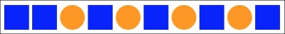
As you can see, our nth selector targets the third list item and then every subsequent second one after that too (if there were 100 list items, it would continue selecting every second one).
How about selecting everything from the second item onwards? Well, although you could write :nth-child(1n+2), you don't actually need the first number 1 as unless otherwise stated, n is equal to 1. We can therefore just write :nth-child(n+2). Likewise, if we wanted to select every third element, rather than write :nth-child(3n+3), we can just write :nth-child(3n) as every third item would begin at the third item anyway, without needing to explicitly state it. The expression can also use negative numbers, for example, :nth-child(3n-2) starts at -2 and then selects every third item.
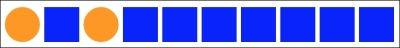
You can also change the direction. By default, once the first part of the selection is found, the subsequent ones go down the elements in the DOM (and therefore from left to right in our example). However, you can reverse that with a minus. For example:
span:nth-child(-2n+3) {
  background-color: #f90;
  border-radius: 50%;
}
This example finds the third item again, but then goes in the opposite direction to select every two elements (up the DOM tree and therefore from right to left in our example):
Hopefully, the nth-based expressions are making perfect sense now?
The nth-child and nth-last-child differ in that the nth-last-child variant works from the opposite end of the document tree. For example, :nth-last-child(-n+3) starts at 3 from the end and then selects all the items after it. Here's what that rule gives us in the browser:

Finally, let's consider :nth-of-type and :nth-last-of-type. While the previous examples count any children regardless of type (always remember the nth-child selector targets all children at the same DOM level, regardless of classes), :nth-of-type and :nth-last-of-type let you be specific about the type of item you want to select. Consider the following markup (example_05-06):
<span class="span-class"></span>
<span class="span-class"></span>
<span class="span-class"></span>
<span class="span-class"></span>
<span class="span-class"></span>
<div class="span-class"></div>
<div class="span-class"></div>
<div class="span-class"></div>
<div class="span-class"></div>
<div class="span-class"></div>
If we used the selector:
.span-class:nth-of-type(-2n+3) {
  background-color: #f90;
  border-radius: 50%;
}
Even though all the elements have the same span-class, we will only actually be targeting the span elements (as they are the first type selected). Here is what gets selected:

We will see how CSS4 selectors can solve this issue shortly.
Tip
CSS3 doesn't count like JavaScript and jQuery!
If you're used to using JavaScript and jQuery you'll know that it counts from 0 upwards (zero index based). For example, if selecting an element in JavaScript or jQuery, an integer value of 1 would actually be the second element. CSS3 however, starts at 1 so that a value of 1 is the first item it matches.
Just to close out this little section I want to illustrate a real life responsive web design problem and how we can use nth-based selection to solve it.
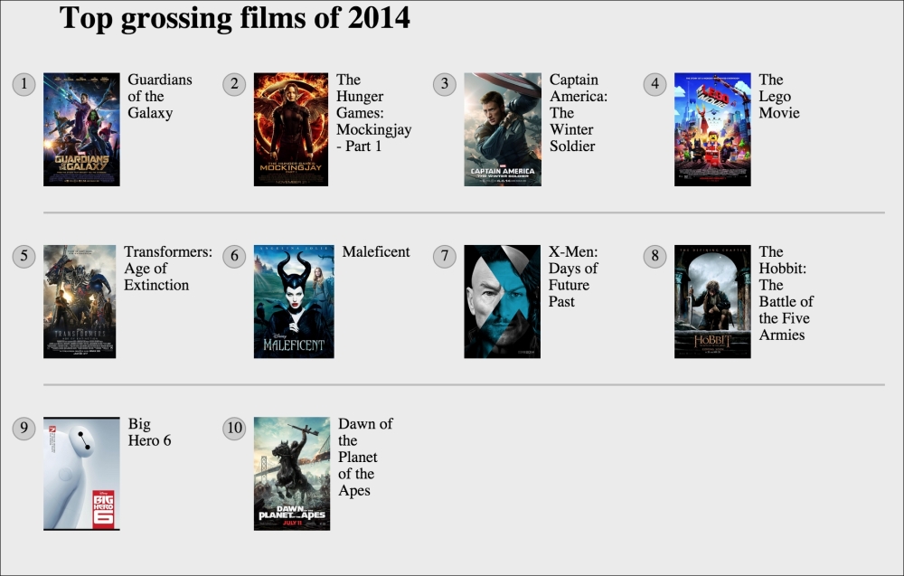
Remember the horizontal scrolling panel from example_05-02? Let's consider how that might look in a situation where horizontal scrolling isn't possible. So, using the same markup, let's turn the top 10 grossing films of 2014 into a grid. For some viewports the grid will only be two items wide, as the viewport increases we show three items and at larger sizes still we show four. Here is the problem though. Regardless of the viewport size, we want to prevent any items on the bottom row having a border on the bottom. You can view this code at example_05-09.
Here is how it looks with four items wide:
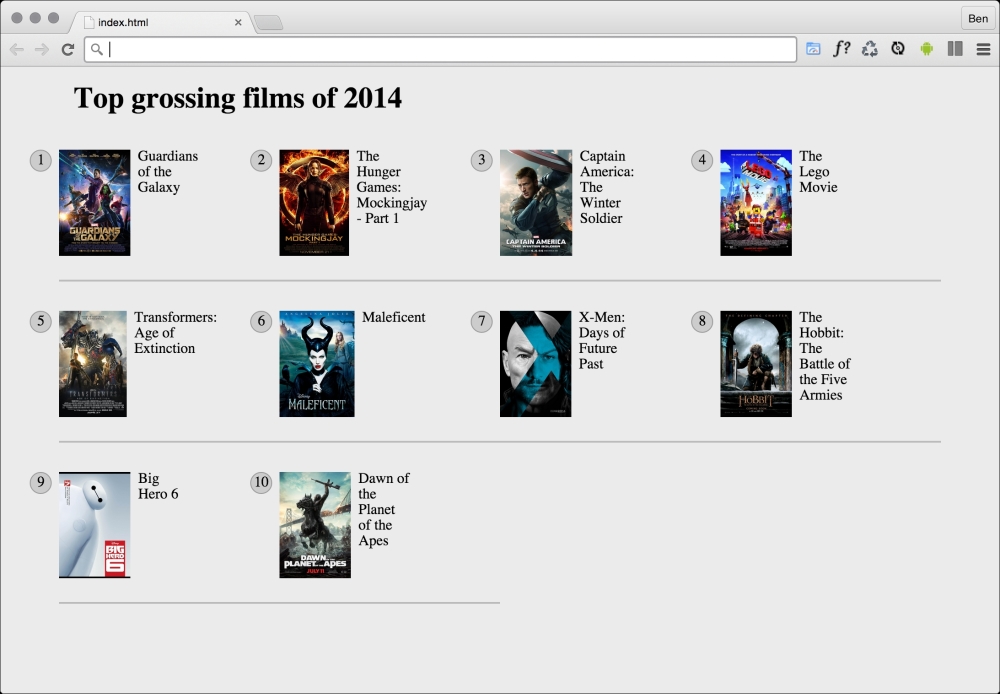
See that pesky border below the bottom two items? That's what we need to remove. However, I want a robust solution so that if there were another item on the bottom row, the border would also be removed on that too. Now, because there are a different number of items on each row at different viewports, we will also need to change the nth-based selection at different viewports. For the sake of brevity, I'll show you the selection that matches four items per row (the larger of the viewports). You can view the code sample to see the amended selection at the different viewports.
@media (min-width: 55rem) {
  .Item {
    width: 25%;
  }
  /*  Get me every fourth item and of those, only ones that are in the last four items */
  .Item:nth-child(4n+1):nth-last-child(-n+4),
  /* Now get me every one after that same collection too. */
  .Item:nth-child(4n+1):nth-last-child(-n+4) ~ .Item {
    border-bottom: 0;
  }
}
Note
You'll notice here that we are chaining the nth-based pseudo-class selectors. It's important to understand that the first doesn't filter the selection for the next, rather the element has to match each of the selections. For our preceding example, the first element has to be the first item of four and also be one of the last four.
Nice! Thanks to nth-based selections we have a defensive set of rules to remove the bottom border regardless of the viewport size or number of items we are showing.
Another handy selector is the negation pseudo-class selector. This is used to select everything that isn't something else. Consider this:
<div class="a-div"></div>
<div class="a-div"></div>
<div class="a-div"></div>
<div class="a-div not-me"></div>
<div class="a-div"></div>
And then these styles:
div {
  display: inline-block;
  height: 2rem;
  width: 2rem;
  background-color: blue;
}

.a-div:not(.not-me) {
  background-color: orange;
  border-radius: 50%;
}
Our final rule will make every element with a class of .a-div orange and round, with the exception the div that also has the .not-me class. You can find that code in the example_05-07 folder of the code samples (remember, you can grab them all at http://rwd.education/).
Tip
So far we have looked primarily at what's known as structural pseudo-classes (full information on this is available at http://www.w3.org/TR/selectors/). However, CSS3 has many more selectors. If you're working on a web application, it's worth looking at the full list of UI element states pseudo-classes (http://www.w3.org/TR/selectors/), as they can, for example, help you target rules based on whether something is selected or not.
I've encountered situations where I have an element that includes some padding on the inside and gets content dynamically inserted. Sometimes it gets content, sometimes it doesn't. The trouble is, when it doesn't include content, I still see the padding. Consider the HTML and CSS in example_05-08:
<div class="thing"></div>
.thing {
  padding: 1rem;
  background-color: violet;
}
Without anything content in that div I still see the background-color. Thankfully, we can easily hide it like this:
.thing:empty {
  display: none;
}
However, just be careful with the :empty selector. For example, you might think this is empty:
<div class="thing"> </div>
It isn't! Look at the whitespace in there. Whitespace is not no space!
However, just to confuse matters, be aware that a comment doesn't affect whether an element has whitespace or not. For example, this is still considered empty:
<div class="thing"><!--I'm empty, honest I am--></div>
Tip
Amendments to pseudo-elements
Pseudo-elements have been around since CSS2 but the CSS3 specification revises the syntax of their use very slightly. To refresh your memory, until now, p:first-line would target the first line in a <p> tag. Or p:first-letter would target the first letter. Well, CSS3 asks us to separate these pseudo-elements with a double colon to differentiate them from pseudo-classes (such as nth-child()). Therefore, we should write p::first-letter instead. Note, however, that Internet Explorer 8 and lower versions don't understand the double colon syntax, they only understand the single colon syntax.
One thing that you may find particularly handy about the :first-line pseudo-element is that it is specific to the viewport. For example, if we write the following rule:
p::first-line {
  color: #ff0cff;
}
As you might expect, the first line is rendered in an awful shade of pink. However, on a different viewport, it renders a different selection of text.
So, without needing to alter the markup, with a responsive design, there's a handy way of having the first visual line of text (as the browser renders it, not as it appears in the markup) appear differently than the others.