Table of Contents for
Responsive Web Design with HTML5 and CSS3 - Second Edition
 Responsive Web Design with HTML5 and CSS3 - Second Edition
Published by
Packt Publishing, 2015
Responsive Web Design with HTML5 and CSS3 - Second Edition
Published by
Packt Publishing, 2015
- Cover
- Table of Contents
- Responsive Web Design with HTML5 and CSS3 Second Edition
- Responsive Web Design with HTML5 and CSS3 Second Edition
- Credits
- About the Author
- About the Reviewers
- www.PacktPub.com
- Preface
- What you need for this book
- Who this book is for
- Conventions
- Reader feedback
- Customer support
- 1. The Essentials of Responsive Web Design
- Defining responsive web design
- Setting browser support levels
- Our first responsive example
- The shortcomings of our example
- Summary
- 2. Media Queries – Supporting Differing Viewports
- Media query syntax
- Combining media queries
- Using media queries to alter a design
- Considerations for organizing and authoring media queries
- Combine media queries or write them where it suits?
- The viewport meta tag
- Media Queries Level 4
- Summary
- 3. Fluid Layouts and Responsive Images
- Introducing Flexbox
- Getting Flexy
- Responsive images
- Summary
- 4. HTML5 for Responsive Web Designs
- Starting an HTML5 page the right way
- Easy-going HTML5
- New semantic elements in HTML5
- HTML5 text-level semantics
- Obsolete HTML features
- Putting HTML5 elements to use
- WCAG and WAI-ARIA for more accessible web applications
- Embedding media in HTML5
- Responsive HTML5 video and iFrames
- A note about 'offline first'
- Summary
- 5. CSS3 – Selectors, Typography, Color Modes, and New Features
- Anatomy of a CSS rule
- Quick and useful CSS tricks
- Word wrapping
- Facilitating feature forks in CSS
- New CSS3 selectors and how to use them
- CSS3 structural pseudo-classes
- CSS custom properties and variables
- CSS calc
- CSS Level 4 selectors
- Web typography
- New CSS3 color formats and alpha transparency
- Summary
- 6. Stunning Aesthetics with CSS3
- Box shadows
- Background gradients
- Repeating gradients
- Background gradient patterns
- Multiple background images
- High-resolution background images
- CSS filters
- A warning on CSS performance
- Summary
- 7. Using SVGs for Resolution Independence
- The graphic that is a document
- Creating SVGs with popular image editing packages and services
- Inserting SVGs into your web pages
- Inserting an SVG inline
- What you can do with each SVG insertion method (inline, object, background-image, and img)
- Extra SVG capabilities and oddities
- Animating SVG with JavaScript
- Optimising SVGs
- Using SVGs as filters
- A note on media queries inside SVGs
- Summary
- 8. Transitions, Transformations, and Animations
- CSS3 2D transforms
- CSS3 3D transformations
- Animating with CSS3
- Summary
- 9. Conquer Forms with HTML5 and CSS3
- Understanding the component parts of HTML5 forms
- HTML5 input types
- How to polyfill non-supporting browsers
- Styling HTML5 forms with CSS3
- Summary
- 10. Approaching a Responsive Web Design
- View and use the design on real devices
- Embracing progressive enhancement
- Defining a browser support matrix
- Tiering the user experience
- Linking CSS breakpoints to JavaScript
- Avoid CSS frameworks in production
- Coding pragmatic solutions
- Use the simplest code possible
- Hiding, showing, and loading content across viewports
- Validators and linting tools
- Performance
- The next big things
- Summary
- Index
When it comes to CSS performance, I would like you to remember this one thing:
"Architecture is outside the braces, performance is inside." | ||
| --Ben Frain | ||
Let me expand on my little maxim:
As far as I am able to prove, worrying about whether a CSS selector (the part outside the curly braces), is fast or slow is pointless. I set out to prove this at http://benfrain.com/css-performance-revisited-selectors-bloat-expensive-styles/.
However, one thing that really can grind a page to a halt, CSS wise, is 'expensive' properties (the parts inside the curly braces). When we use the term 'expensive', in relation to certain styles, it simply means it costs the browser a lot of overhead. It's something that the browser finds overly taxing to do.
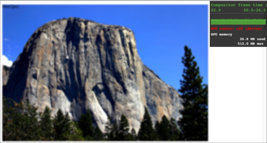
It's possible to take a common sense guess about what will likely cause the browser extra work. It's basically anything it would have to compute before it can paint things to the screen. For example, compare a standard div with a flat solid background, against a semi-opaque image, on top of a background made up of multiple gradients, with rounded corners and a drop-shadow. The latter is more expensive; it will result in far more computational work for the browser and subsequently cause more overhead.
Therefore, when you apply effects like filters, do so judiciously and, if possible, test whether the page speed suffers on the lowest powered devices you are hoping to support. At the least, switch on development tool features such as continuous page repainting in Chrome and toggle any affects you think may cause problems. This will provide you with data (in the form of a millisecond reading of how long the current viewport is taking to paint) to make a more educated decision on which effects to apply. The lower the figure, the faster the page will perform (although be aware that browsers/platforms vary so, as ever, test on real devices where possible).
For more on this subject I recommend the following resource:
https://developers.google.com/web/fundamentals/performance/rendering/
In the near future, CSS will be able to offer masks and clipping as part of the CSS Masking Module Level 1. These features will enable us to clip an image with a shape or arbitrary path (specified via SVG or a number of polygon points). Sadly, despite the specification being at the more advanced CR stage, as I write this, the browser implementations are just too buggy to recommend. However, it's a fluid situation so by the time you are reading this, there's every chance the implementations will be solid. For the curious, I'll therefore refer you to the specification at http://www.w3.org/TR/css-masking/.
I also think Chris Coyier does a great job of explaining where things are at support wise in this post:
http://css-tricks.com/clipping-masking-css/
Finally, a good overview and explanation of what will be possible is offered by Sara Soueidan in this post: