Table of Contents for
Responsive Web Design with HTML5 and CSS3 - Second Edition
 Responsive Web Design with HTML5 and CSS3 - Second Edition
Published by
Packt Publishing, 2015
Responsive Web Design with HTML5 and CSS3 - Second Edition
Published by
Packt Publishing, 2015
- Cover
- Table of Contents
- Responsive Web Design with HTML5 and CSS3 Second Edition
- Responsive Web Design with HTML5 and CSS3 Second Edition
- Credits
- About the Author
- About the Reviewers
- www.PacktPub.com
- Preface
- What you need for this book
- Who this book is for
- Conventions
- Reader feedback
- Customer support
- 1. The Essentials of Responsive Web Design
- Defining responsive web design
- Setting browser support levels
- Our first responsive example
- The shortcomings of our example
- Summary
- 2. Media Queries – Supporting Differing Viewports
- Media query syntax
- Combining media queries
- Using media queries to alter a design
- Considerations for organizing and authoring media queries
- Combine media queries or write them where it suits?
- The viewport meta tag
- Media Queries Level 4
- Summary
- 3. Fluid Layouts and Responsive Images
- Introducing Flexbox
- Getting Flexy
- Responsive images
- Summary
- 4. HTML5 for Responsive Web Designs
- Starting an HTML5 page the right way
- Easy-going HTML5
- New semantic elements in HTML5
- HTML5 text-level semantics
- Obsolete HTML features
- Putting HTML5 elements to use
- WCAG and WAI-ARIA for more accessible web applications
- Embedding media in HTML5
- Responsive HTML5 video and iFrames
- A note about 'offline first'
- Summary
- 5. CSS3 – Selectors, Typography, Color Modes, and New Features
- Anatomy of a CSS rule
- Quick and useful CSS tricks
- Word wrapping
- Facilitating feature forks in CSS
- New CSS3 selectors and how to use them
- CSS3 structural pseudo-classes
- CSS custom properties and variables
- CSS calc
- CSS Level 4 selectors
- Web typography
- New CSS3 color formats and alpha transparency
- Summary
- 6. Stunning Aesthetics with CSS3
- Box shadows
- Background gradients
- Repeating gradients
- Background gradient patterns
- Multiple background images
- High-resolution background images
- CSS filters
- A warning on CSS performance
- Summary
- 7. Using SVGs for Resolution Independence
- The graphic that is a document
- Creating SVGs with popular image editing packages and services
- Inserting SVGs into your web pages
- Inserting an SVG inline
- What you can do with each SVG insertion method (inline, object, background-image, and img)
- Extra SVG capabilities and oddities
- Animating SVG with JavaScript
- Optimising SVGs
- Using SVGs as filters
- A note on media queries inside SVGs
- Summary
- 8. Transitions, Transformations, and Animations
- CSS3 2D transforms
- CSS3 3D transformations
- Animating with CSS3
- Summary
- 9. Conquer Forms with HTML5 and CSS3
- Understanding the component parts of HTML5 forms
- HTML5 input types
- How to polyfill non-supporting browsers
- Styling HTML5 forms with CSS3
- Summary
- 10. Approaching a Responsive Web Design
- View and use the design on real devices
- Embracing progressive enhancement
- Defining a browser support matrix
- Tiering the user experience
- Linking CSS breakpoints to JavaScript
- Avoid CSS frameworks in production
- Coding pragmatic solutions
- Use the simplest code possible
- Hiding, showing, and loading content across viewports
- Validators and linting tools
- Performance
- The next big things
- Summary
- Index
In Chapter 6, Stunning Aesthetics with CSS3, we looked at the CSS filter effects. However, they are not currently supported in Internet Explorer 10 or 11. That can be frustrating if you want to enjoy filter effects in those browsers. Luckily, with help from SVG, we can create filters that work in Internet Explorer 10 and 11 too but as ever, it's perhaps not as straight forward as you might imagine. For example, in example_07-05, we have a page with the following markup inside the body:
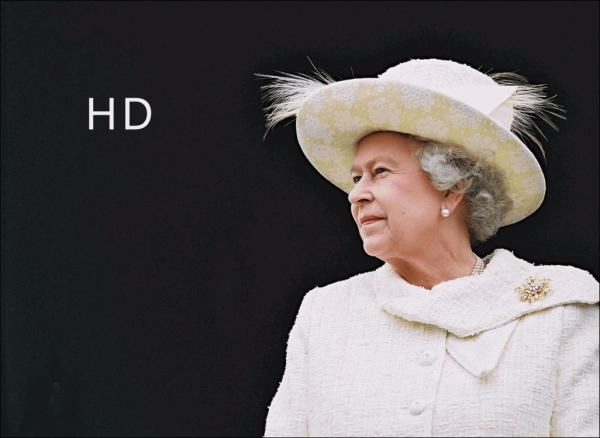
<img class="HRH" src="queen@2x-1024x747.png"/>
It's an image of the Queen of England. Ordinarily, it looks like this:
Now, also in that example folder, is an SVG with a filter defined in the defs elements. The SVG markup looks like this:
<svg xmlns="http://www.w3.org/2000/svg" version="1.1">
<defs>
<filter id="myfilter" x="0" y="0">
<feColorMatrix in="SourceGraphic" type="hueRotate" values="90" result="A"/>
<feGaussianBlur in="A" stdDeviation="6"/>
</filter>
</defs>
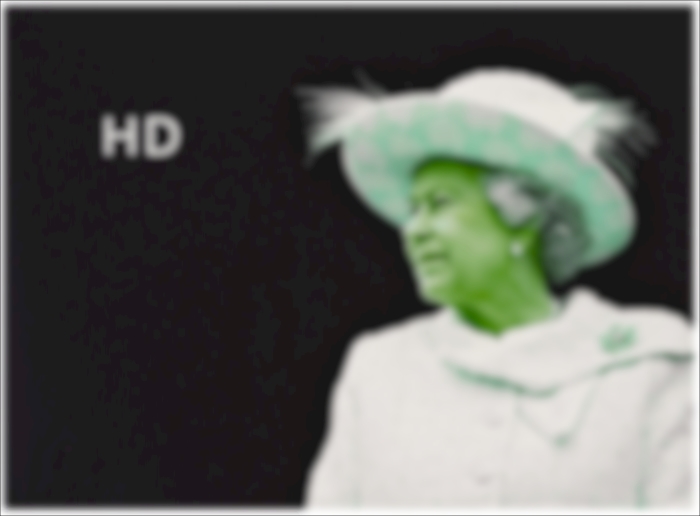
</svg>Within the filter, we are first defining a hue rotation of 90 (using the feColorMatrix, and then passing that effect, via the result attribute, to the next filter (the feGaussianBlur) with a blur value of 6. Be aware that I've been deliberately heavy handed here. This doesn't produce a nice aesthetic, but it should leave you in no doubt that the effect has worked!
Now, rather than add that SVG markup to the HTML, we can leave it where it is and reference it using the same CSS filter syntax we saw in the last chapter.
.HRH {
    filter: url('filter.svg#myfilter');
}
In most evergreen browsers (Chrome, Safari, Firefox) this is the effect:
Sadly, this method doesn't work in IE 10 or 11. However, there is another way to achieve our goal, and that's using SVGs own image tag to include the image within the SVG. Inside example_07-06, we have the following markup:
<svg height="747px" width="1024px" viewbox="0 0 1024 747" xmlns="http://www.w3.org/2000/svg" version="1.1">
     <defs>
          <filter id="myfilter" x="0" y="0">
                <feColorMatrix in="SourceGraphic" type="hueRotate" values="90" result="A"/>
                <feGaussianBlur in="A" stdDeviation="6"/>
          </filter>
     </defs>
     <image x="0" y="0" height="747px" width="1024px" xmlns:xlink="http://www.w3.org/1999/xlink" xlink:href="queen@2x-1024x747.png" filter="url(#myfilter)"></image>
</svg>
The SVG markup here is very similar to the external filter.svg filter we used in the previous example but height, width, and viewbox attributes have been added. In addition, the image we want to apply the filter to is the only content in the SVG outside of the defs element. To link to the filter, we are using the filter attribute and passing the ID of the filter we want to use (in this case from within the defs element above).
Although this approach is a little more involved, it means you can get the many and varied filter effects that SVG affords, even in versions 10 and 11 of Internet Explorer.