Table of Contents for
Responsive Web Design with HTML5 and CSS3 - Second Edition
 Responsive Web Design with HTML5 and CSS3 - Second Edition
Published by
Packt Publishing, 2015
Responsive Web Design with HTML5 and CSS3 - Second Edition
Published by
Packt Publishing, 2015
- Cover
- Table of Contents
- Responsive Web Design with HTML5 and CSS3 Second Edition
- Responsive Web Design with HTML5 and CSS3 Second Edition
- Credits
- About the Author
- About the Reviewers
- www.PacktPub.com
- Preface
- What you need for this book
- Who this book is for
- Conventions
- Reader feedback
- Customer support
- 1. The Essentials of Responsive Web Design
- Defining responsive web design
- Setting browser support levels
- Our first responsive example
- The shortcomings of our example
- Summary
- 2. Media Queries – Supporting Differing Viewports
- Media query syntax
- Combining media queries
- Using media queries to alter a design
- Considerations for organizing and authoring media queries
- Combine media queries or write them where it suits?
- The viewport meta tag
- Media Queries Level 4
- Summary
- 3. Fluid Layouts and Responsive Images
- Introducing Flexbox
- Getting Flexy
- Responsive images
- Summary
- 4. HTML5 for Responsive Web Designs
- Starting an HTML5 page the right way
- Easy-going HTML5
- New semantic elements in HTML5
- HTML5 text-level semantics
- Obsolete HTML features
- Putting HTML5 elements to use
- WCAG and WAI-ARIA for more accessible web applications
- Embedding media in HTML5
- Responsive HTML5 video and iFrames
- A note about 'offline first'
- Summary
- 5. CSS3 – Selectors, Typography, Color Modes, and New Features
- Anatomy of a CSS rule
- Quick and useful CSS tricks
- Word wrapping
- Facilitating feature forks in CSS
- New CSS3 selectors and how to use them
- CSS3 structural pseudo-classes
- CSS custom properties and variables
- CSS calc
- CSS Level 4 selectors
- Web typography
- New CSS3 color formats and alpha transparency
- Summary
- 6. Stunning Aesthetics with CSS3
- Box shadows
- Background gradients
- Repeating gradients
- Background gradient patterns
- Multiple background images
- High-resolution background images
- CSS filters
- A warning on CSS performance
- Summary
- 7. Using SVGs for Resolution Independence
- The graphic that is a document
- Creating SVGs with popular image editing packages and services
- Inserting SVGs into your web pages
- Inserting an SVG inline
- What you can do with each SVG insertion method (inline, object, background-image, and img)
- Extra SVG capabilities and oddities
- Animating SVG with JavaScript
- Optimising SVGs
- Using SVGs as filters
- A note on media queries inside SVGs
- Summary
- 8. Transitions, Transformations, and Animations
- CSS3 2D transforms
- CSS3 3D transformations
- Animating with CSS3
- Summary
- 9. Conquer Forms with HTML5 and CSS3
- Understanding the component parts of HTML5 forms
- HTML5 input types
- How to polyfill non-supporting browsers
- Styling HTML5 forms with CSS3
- Summary
- 10. Approaching a Responsive Web Design
- View and use the design on real devices
- Embracing progressive enhancement
- Defining a browser support matrix
- Tiering the user experience
- Linking CSS breakpoints to JavaScript
- Avoid CSS frameworks in production
- Coding pragmatic solutions
- Use the simplest code possible
- Hiding, showing, and loading content across viewports
- Validators and linting tools
- Performance
- The next big things
- Summary
- Index
Eons ago, in the mists of time (well the late 1990s), websites were typically built with their widths defined as percentages. These percentage-based widths fluidly adjusted to the screen viewing them and became known as fluid layouts.
In the years shortly after, in the mid to late 2000s, there was an intervening fixation on fixed width designs (I blame those pesky print designers and their obsession with pixel perfect precision). Nowadays, as we build responsive web designs we need to look back to fluid layouts and remember all the benefits they offer.
In Chapter 2, Media Queries – Supporting Differing Viewports, we ultimately conceded that while media queries allowed our design to adapt to changing viewport sizes, by snapping from one set of styles to another, we needed some ability to flex our design between the 'break points' that media queries provided. By coding a 'fluid' layout, we can facilitate this need perfectly; it will effortlessly stretch to fill the gaps between our media query break points.
In 2015, we have better means to build responsive web sites than ever. There is a new CSS layout module called Flexible Box (or Flexbox as it is more commonly known) that now has enough browser support to make it viable for everyday use.
It can do more than merely provide a fluid layout mechanism. Want to be able to easily center content, change the source order of markup, and generally create amazing layouts with relevant ease? Flexbox is the layout mechanism for you. The majority of this chapter deals with Flexbox, covering all the incredible capabilities it has to offer.
There is another key area to responsive web design we can address better now than ever before and that's responsive images. There are now specified methods and syntax for sending devices the most relevant version of an image for their viewport. We will spend the last section of this chapter understanding how responsive images work and how we can make them work for us.
In this chapter we will cover:
- How to convert fixed pixel sizes to proportional sizes
- Consider existing CSS layout mechanisms and their shortfalls
- Understand the Flexible Box Layout Module and the benefits it offers
- Learn the correct syntax for resolution switching and art direction with responsive images
Graphic composites made in a program like Photoshop, Illustrator, Fireworks (RIP), or Sketch all have fixed pixel dimensions. At some point, the designs need to be converted to proportional dimensions by a developer when recreating the design as a fluid layout in a browser.
There is a beautifully simple formula for making this conversion that the father of responsive web design, Ethan Marcotte, set down in his 2009 article, Fluid Grids (http://alistapart.com/article/FLUIDGRIDS):
target / context = result
If anything resembling math makes you quiver, think of it this way: divide the units of the thing you want, by the thing it lives in. Let's put that into practice as understanding it will enable you to convert any fixed dimension layouts into responsive/fluid equivalents.
Consider a very basic page layout intended for desktop. In an ideal world we would always be moving to a desktop layout from a smaller screen layout, but for the sake of illustrating the proportions we will look at the two situations back to front.
Here's an image of the layout:
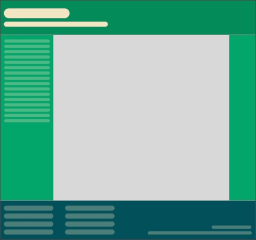
The layout is 960px wide. Both header and footer are the full width of layout. The left hand side area is 200px wide, the right hand area is 100px wide. Even with my mathematically challenged brain I can tell you the middle section will be 660px wide. We need to convert the middle and side sections to proportional dimensions.
First up, the left hand side. It's 200 units wide (target). Divide that size by 960 units (the context) and we have a result: .208333333. Now, whenever we get our result with that formula we need to shift the decimal point two to the right. That would give us 20.8333333%. That's 200px described as a percentage of 960px.
OK, what about the middle section? 660 (target) divided by 960 (context) gives us .6875. Move the decimal two points to the right and we have 68.75%. Finally, the right hand section. 100 (target) divided by 960 (context) gives us .104166667. Move the decimal point and we have 10.4166667%. That's as difficult as it gets. Say it with me: target, divided by context, equals result.
To prove the point, let's quickly build that basic layout as blocks in the browser. You can view the layout as example_03-01. Here is the HTML:
<div class="Wrap">
    <div class="Header"></div>
    <div class="WrapMiddle">
        <div class="Left"></div>
        <div class="Middle"></div>
        <div class="Right"></div>
    </div>
    <div class="Footer"></div>
</div>
And here is the CSS:
html,
body {
    margin: 0;
    padding: 0;
}

.Wrap {
    max-width: 1400px;
    margin: 0 auto;
}

.Header {
    width: 100%;
    height: 130px;
    background-color: #038C5A;
}

.WrapMiddle {
    width: 100%;
    font-size: 0;
}

.Left {
    height: 625px;
    width: 20.8333333%;
    background-color: #03A66A;
    display: inline-block;
}

.Middle {
    height: 625px;
    width: 68.75%;
    background-color: #bbbf90;
    display: inline-block;
}

.Right {
    height: 625px;
    width: 10.4166667%;
    background-color: #03A66A;
    display: inline-block;
}

.Footer {
    height: 200px;
    width: 100%;
    background-color: #025059;
}
If you open the example code in a browser and resize the page you will see the dimensions of the middle sections remain proportional to one another. You can also play around with the max-width of the .Wrap values to make the bounding dimensions for the layout bigger or smaller (it's set in the example to 1400px).
Tip
If you're looking at the markup and wondering why I haven't used semantic elements like header, footer, and aside, then worry not. Chapter 4, HTML5 for Responsive Web Designs, deals with those semantic HTML5 elements in detail.
Now, let's consider how we would have the same content on a smaller screen that flexes to a point and then changes to the layout we have already seen. You can view the final code of this layout in example_03-02.
The idea is that for smaller screens we will have a single 'tube' of content. The left hand side area will only be viewable as an 'off canvas' area; typically an area for a menu area or similar, that sits off the viewable screen area and slides in when a menu button is pressed. The main content sits below the header, then the right hand section below that, and finally the footer area. In our example, we can expose the left hand menu area by clicking anywhere on the header. Typically, when making this kind of design pattern for real, a menu button would be used to activate the side menu.
As you would expect, when combining this with our newly mastered media query skills we can adjust the viewport and the design just 'responds'—effortlessly moving from one layout to another and stretching between the two.
I'm not going to list out all the CSS here, it's all in example_03-02. However, here's an example—the left hand section:
.Left {
    height: 625px;
    background-color: #03A66A;
    display: inline-block;
    position: absolute;
    left: -200px;
    width: 200px;
    font-size: .9rem;
    transition: transform .3s;
}

@media (min-width: 40rem) {
    .Left {
        width: 20.8333333%;
        left: 0;
        position: relative;
    }
}
You can see that up first, without a media query, is the small screen layout. Then, at larger screen sizes, the width becomes proportional, the positioning relative and the left value is set to zero. We don't need to re-write properties such as the height, display, or background-color as we aren't changing them.
This is progress. We have combined two of the core responsive web design techniques we have covered; converting fixed dimensions to proportions and using media queries to target CSS rules relevant to the viewport size.
Tip
There are two important things to note in our prior example. Firstly, you may be wondering if it's strictly necessary to include all the digits after the decimal point. While the widths themselves will ultimately be converted to pixels by the browser, their values are retained for future calculations (for example, more accurately computing the width of nested elements). Subsequently, I always recommend leaving the numbers after the decimals in.
Secondly, in a real project we should be making some provision for if JavaScript isn't available and we need to view the content of the menu. We deal with this scenario in detail in Chapter 8, Transitions, Transformations, and Animations.
We are now going to get into the detail of using CSS Flexible Box Layouts, or Flexbox as it is more commonly known.
However, before we do that, I think it will be prudent to first consider the shortfalls of existing layout techniques such as inline-block, floats and tables.
The biggest issue with using inline-block as a layout mechanism is that it renders space in-between HTML elements. This is not a bug (although most developers would welcome a sane way to remove the space) but it does mean a few hacks to remove the space when it's unwanted, which for me is about 95% of the time. There are a bunch of ways to do this, in the previous example we used the 'font-size zero' approach; an approach not without its own problems and limitations. However, rather than list each possible workaround for removing the whitespace when using inline-block, check out this article by the irrepressible Chris Coyier: http://css-tricks.com/fighting-the-space-between-inline-block-elements/.
It's also worth pointing out that there no simple way to vertically center content within an inline-block. Using inline-blocks, there is also no way of having two sibling elements where one has a fixed width and another fluidly fills the remaining space.
I hate floats. There I said it. In their favor they work everywhere fairly consistently. However, there are two major irritations.
Firstly, when specifying the width of floated elements in percentages, their computed widths don't get rounded consistently across browsers (some browsers round up, some down). This means that sometimes sections will drop down below others when it isn't intended and other times they can leave an irritating gap at one side.
Secondly you usually have to 'clear' the floats so that parent boxes/elements don't collapse. It's easy enough to do this but it's a constant reminder that floats were never intended to be used as a robust layout mechanism.
Don't confuse display: table and display: table-cell with the equivalent HTML elements. These CSS properties merely mimic the layout of their HTML based brethren. They in no way affect the structure of the HTML.
I've found enormous utility in using CSS table layouts. For one, they enable consistent and robust vertical centring of elements within one another. Also, elements set to be display: table-cell inside an element set as display: table space themselves perfectly; they don't suffer rounding issues like floated elements. You also get support all the way back to Internet Explorer 7!
However, there are limitations. Generally, it's necessary to wrap an extra element around items (to get the joys of perfect vertical centring, a table-cell must live inside an element set as a table). It's also not possible to wrap items set as display: table-cell onto multiple lines.
In conclusion, all of the existing layout methods have severe limitations. Thankfully, there is a new CSS layout method that addresses these issues and much more. Cue the trumpets, roll out the red carpet. Here comes Flexbox.