Table of Contents for
Responsive Web Design with HTML5 and CSS3 - Second Edition
 Responsive Web Design with HTML5 and CSS3 - Second Edition
Published by
Packt Publishing, 2015
Responsive Web Design with HTML5 and CSS3 - Second Edition
Published by
Packt Publishing, 2015
- Cover
- Table of Contents
- Responsive Web Design with HTML5 and CSS3 Second Edition
- Responsive Web Design with HTML5 and CSS3 Second Edition
- Credits
- About the Author
- About the Reviewers
- www.PacktPub.com
- Preface
- What you need for this book
- Who this book is for
- Conventions
- Reader feedback
- Customer support
- 1. The Essentials of Responsive Web Design
- Defining responsive web design
- Setting browser support levels
- Our first responsive example
- The shortcomings of our example
- Summary
- 2. Media Queries – Supporting Differing Viewports
- Media query syntax
- Combining media queries
- Using media queries to alter a design
- Considerations for organizing and authoring media queries
- Combine media queries or write them where it suits?
- The viewport meta tag
- Media Queries Level 4
- Summary
- 3. Fluid Layouts and Responsive Images
- Introducing Flexbox
- Getting Flexy
- Responsive images
- Summary
- 4. HTML5 for Responsive Web Designs
- Starting an HTML5 page the right way
- Easy-going HTML5
- New semantic elements in HTML5
- HTML5 text-level semantics
- Obsolete HTML features
- Putting HTML5 elements to use
- WCAG and WAI-ARIA for more accessible web applications
- Embedding media in HTML5
- Responsive HTML5 video and iFrames
- A note about 'offline first'
- Summary
- 5. CSS3 – Selectors, Typography, Color Modes, and New Features
- Anatomy of a CSS rule
- Quick and useful CSS tricks
- Word wrapping
- Facilitating feature forks in CSS
- New CSS3 selectors and how to use them
- CSS3 structural pseudo-classes
- CSS custom properties and variables
- CSS calc
- CSS Level 4 selectors
- Web typography
- New CSS3 color formats and alpha transparency
- Summary
- 6. Stunning Aesthetics with CSS3
- Box shadows
- Background gradients
- Repeating gradients
- Background gradient patterns
- Multiple background images
- High-resolution background images
- CSS filters
- A warning on CSS performance
- Summary
- 7. Using SVGs for Resolution Independence
- The graphic that is a document
- Creating SVGs with popular image editing packages and services
- Inserting SVGs into your web pages
- Inserting an SVG inline
- What you can do with each SVG insertion method (inline, object, background-image, and img)
- Extra SVG capabilities and oddities
- Animating SVG with JavaScript
- Optimising SVGs
- Using SVGs as filters
- A note on media queries inside SVGs
- Summary
- 8. Transitions, Transformations, and Animations
- CSS3 2D transforms
- CSS3 3D transformations
- Animating with CSS3
- Summary
- 9. Conquer Forms with HTML5 and CSS3
- Understanding the component parts of HTML5 forms
- HTML5 input types
- How to polyfill non-supporting browsers
- Styling HTML5 forms with CSS3
- Summary
- 10. Approaching a Responsive Web Design
- View and use the design on real devices
- Embracing progressive enhancement
- Defining a browser support matrix
- Tiering the user experience
- Linking CSS breakpoints to JavaScript
- Avoid CSS frameworks in production
- Coding pragmatic solutions
- Use the simplest code possible
- Hiding, showing, and loading content across viewports
- Validators and linting tools
- Performance
- The next big things
- Summary
- Index
Typically, with something web-based involving any sort of interaction, JavaScript will be involved. When you're developing a responsive project, it's likely you will want to do different things at different viewport sizes. Not just in CSS but also in JavaScript.
Let's suppose we want to invoke a certain JavaScript function when we reach a certain breakpoint in the CSS (remember that 'breakpoint' is the term used to define the point in which a responsive design should change significantly). Let's suppose that breakpoint is 47.5rem (with a 16px root font size that would equate to 760px) and we only want to run the function at that size. The obvious solution would be to simply measure the screen width and invoke the function if the value matched the same value you had decided for your CSS breakpoint.
JavaScript will always return the value of widths as pixels rather than REM values so that's the first complication. However, even if we set the breakpoints in CSS as pixel values, it would still mean two places to update and change those values when we are changing viewport sizes.
Thankfully, there is a better way. I first came across this technique on Jeremy Keith's website: http://adactio.com/journal/5429/
You can find the full code for this at example_10-01. However, the basic idea is that in CSS we insert something that can be easily read and understood by JavaScript.
Consider this in the CSS:
@media (min-width: 20rem) {
    body::after {
        content: "Splus";
        font-size: 0;
    }
}
@media (min-width: 47.5rem) {
    body::after {
        content: "Mplus";
        font-size: 0;
    }
}
@media (min-width: 62.5rem) {
    body::after {
        content: "Lplus";
        font-size: 0;
    }
}
For each breakpoint that we want to communicate to JavaScript, we use the after pseudo element (you could use before too, either is just as good) and set the content of that pseudo element to be the name of our breakpoint. In our preceding example, I am using Splus for small screens and above, Mplus for medium screens and above, and Lplus for large screens and above. You can use whatever name makes sense to you and change the value whenever it makes sense to you (different orientations, different heights, different widths, and so on).
With that CSS set, we can browse the DOM tree and see our ::after pseudo element.
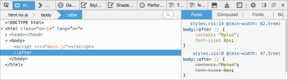
Then in our JavaScript, we can read this value. Firstly, we assign the value to a variable:
var size = window.getComputedStyle(document.body,':after').getPropertyValue('content');And then once we have it we can do something with it. To prove this concept I have made a simple self-invoking function (self-invoking simply means it is executed as soon as the browser parses it) that alerts a different message on page load depending upon the viewport size:
;(function alertSize() {
    if (size.indexOf("Splus") !=-1) {
        alert('I will run functions for small screens');
    }
    if (size.indexOf("Mplus") !=-1) {
        alert('At medium sizes, a different function could run');
    }
    if (size.indexOf("Lplus") !=-1) {
        alert('Large screen here, different functions if needed');
    }
})();
I'd hope you do something a little more interesting than alert a message in your projects but I think you will find great benefit in approaching the problem this way. You'll never be in danger of your CSS media queries and your width dependent JavaScript functions getting out of sync again.