Table of Contents for
Responsive Web Design with HTML5 and CSS3 - Second Edition
 Responsive Web Design with HTML5 and CSS3 - Second Edition
Published by
Packt Publishing, 2015
Responsive Web Design with HTML5 and CSS3 - Second Edition
Published by
Packt Publishing, 2015
- Cover
- Table of Contents
- Responsive Web Design with HTML5 and CSS3 Second Edition
- Responsive Web Design with HTML5 and CSS3 Second Edition
- Credits
- About the Author
- About the Reviewers
- www.PacktPub.com
- Preface
- What you need for this book
- Who this book is for
- Conventions
- Reader feedback
- Customer support
- 1. The Essentials of Responsive Web Design
- Defining responsive web design
- Setting browser support levels
- Our first responsive example
- The shortcomings of our example
- Summary
- 2. Media Queries – Supporting Differing Viewports
- Media query syntax
- Combining media queries
- Using media queries to alter a design
- Considerations for organizing and authoring media queries
- Combine media queries or write them where it suits?
- The viewport meta tag
- Media Queries Level 4
- Summary
- 3. Fluid Layouts and Responsive Images
- Introducing Flexbox
- Getting Flexy
- Responsive images
- Summary
- 4. HTML5 for Responsive Web Designs
- Starting an HTML5 page the right way
- Easy-going HTML5
- New semantic elements in HTML5
- HTML5 text-level semantics
- Obsolete HTML features
- Putting HTML5 elements to use
- WCAG and WAI-ARIA for more accessible web applications
- Embedding media in HTML5
- Responsive HTML5 video and iFrames
- A note about 'offline first'
- Summary
- 5. CSS3 – Selectors, Typography, Color Modes, and New Features
- Anatomy of a CSS rule
- Quick and useful CSS tricks
- Word wrapping
- Facilitating feature forks in CSS
- New CSS3 selectors and how to use them
- CSS3 structural pseudo-classes
- CSS custom properties and variables
- CSS calc
- CSS Level 4 selectors
- Web typography
- New CSS3 color formats and alpha transparency
- Summary
- 6. Stunning Aesthetics with CSS3
- Box shadows
- Background gradients
- Repeating gradients
- Background gradient patterns
- Multiple background images
- High-resolution background images
- CSS filters
- A warning on CSS performance
- Summary
- 7. Using SVGs for Resolution Independence
- The graphic that is a document
- Creating SVGs with popular image editing packages and services
- Inserting SVGs into your web pages
- Inserting an SVG inline
- What you can do with each SVG insertion method (inline, object, background-image, and img)
- Extra SVG capabilities and oddities
- Animating SVG with JavaScript
- Optimising SVGs
- Using SVGs as filters
- A note on media queries inside SVGs
- Summary
- 8. Transitions, Transformations, and Animations
- CSS3 2D transforms
- CSS3 3D transformations
- Animating with CSS3
- Summary
- 9. Conquer Forms with HTML5 and CSS3
- Understanding the component parts of HTML5 forms
- HTML5 input types
- How to polyfill non-supporting browsers
- Styling HTML5 forms with CSS3
- Summary
- 10. Approaching a Responsive Web Design
- View and use the design on real devices
- Embracing progressive enhancement
- Defining a browser support matrix
- Tiering the user experience
- Linking CSS breakpoints to JavaScript
- Avoid CSS frameworks in production
- Coding pragmatic solutions
- Use the simplest code possible
- Hiding, showing, and loading content across viewports
- Validators and linting tools
- Performance
- The next big things
- Summary
- Index
How many times have you had to add a big URL into a tiny space and, well, despaired? Take a look at http://rwd.education/code/example_05-04. The problem can also be seen in the following screenshot; notice that the URL is breaking out of its allocated space.

It's easy to fix this issue with a simple CSS3 declaration, which as chance would have it, also works in older versions of Internet Explorer as far back as 5.5! Just add:
word-wrap: break-word;
to the containing element, which gives an effect as shown in the following screenshot.

Hey presto, the long URL now wraps perfectly!
Text truncation used to be the sole domain of server side technology. Nowadays we can do text ellipsis/truncation with CSS alone. Let's consider how.
Consider this markup (you can view this example online at rwd.education/code/ch5/example_05-03/):
<p class="truncate">OK, listen up, I've figured out the key eternal happiness. All you need to do is eat lots of scones.</p>
But we actually want to truncate the text at 520px wide. So it looks like this:

Here is the CSS to make that happen:
.truncate {
  width: 520px;
  overflow: hidden;
  text-overflow: ellipsis;
  white-space: no-wrap;
}
Tip
You can read the specification for the text-overflow property at http://dev.w3.org/csswg/css-ui-3/.
Whenever the width of the content exceeds the width defined (the width can just as happily be set as a percentage such as 100% if it's inside a flexible container) it will be truncated. The white-space: no-wrap property/value pair is used to ensure that the content doesn't wrap inside the surrounding element.
Hopefully you know the kind of thing I mean? Horizontal scrolling panels are common on the iTunes store and Apple TV for showing panels of related content (movies, albums, and so on). Where there is enough horizontal space, all the items are viewable. When space is limited (think mobile devices) the panel is scrollable from side to side.
The scrolling panels work particularly well on modern Android and iOS devices. If you have a modern iOS or Android device to hand, take a look at this next example on that, alongside a desktop browser like Safari or Chrome: http://rwd.education/code/ch5/example_05-02/.
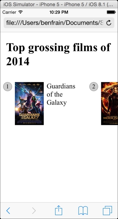
I've created a scrolling panel of the top-grossing films of 2014. It looks something like this on an iPhone:
I'm actually cheating a little. The key to this technique is the white-space property, which has actually been around since CSS 2.1 (http://www.w3.org/TR/CSS2/text.html). However, I'm going to use it alongside the new Flexbox layout mechanism, so hopefully you'll indulge me regardless?
To get the basics of this technique working we just need a wrapper narrower than the sum of its contents and to set it's width to auto in the x axis. This way, it won't scroll if there is enough space but it will if there isn't.
.Scroll_Wrapper {
  width: 100%;
  white-space: nowrap;
  overflow-x: auto;
  overflow-y: hidden;
}

.Item {
  display: inline-flex;
}
By using white-space: nowrap we are saying 'do not wrap these elements when you find white space'. Then to keep everything in a single line, we set all the first children of that container to display inline. We're using inline-flex here but it could just as easily be inline, inline-block, or inline-table.
Tip
::before and ::after pseudo-elements
If viewing the sample code you will notice that the ::before pseudo element is used to display the number of the item. If using pseudo-elements, remember that for ::before or ::after to display, they must have a content value, even if just whitespace. When these pseudo-elements are displayed, they then behave like the first and last child of that element respectively.
To make things a little more aesthetically pleasing I'm going to hide the scroll bar where I can. Unfortunately these are browser specific so you will need to add these by hand (an Autoprefixer tool won't add them as they are proprietary properties). I'm also going to add touch style inertia scrolling for WebKit browsers (typically iOS devices). Now the updated .Scroll_Wrapper rule looks like this:
.Scroll_Wrapper {
  width: 100%;
  white-space: nowrap;
  overflow-x: auto;
  overflow-y: hidden;
  /*Give us inertia style scrolling on WebKit based touch devices*/
  -webkit-overflow-scrolling: touch;
  /*Remove the scrollbars in supporting versions of IE*/
  -ms-overflow-style: none;
}

/*Stops the scrollbar appearing in WebKit browsers*/
.Scroll_Wrapper::-webkit-scrollbar {
  display: none;
}
Where space is limited, we get a nice scrollable horizontal panel. Otherwise, the content just fits.
There are, however, a couple of caveats to this pattern. Firstly, at the time of writing, Firefox has no property that allows you to hide the scroll bars. Secondly, older Android devices can't perform horizontal scrolling (no, really). I therefore tend to qualify this pattern with the help of feature detection. We'll look at how that works next.