Table of Contents for
Responsive Web Design with HTML5 and CSS3 - Second Edition
 Responsive Web Design with HTML5 and CSS3 - Second Edition
Published by
Packt Publishing, 2015
Responsive Web Design with HTML5 and CSS3 - Second Edition
Published by
Packt Publishing, 2015
- Cover
- Table of Contents
- Responsive Web Design with HTML5 and CSS3 Second Edition
- Responsive Web Design with HTML5 and CSS3 Second Edition
- Credits
- About the Author
- About the Reviewers
- www.PacktPub.com
- Preface
- What you need for this book
- Who this book is for
- Conventions
- Reader feedback
- Customer support
- 1. The Essentials of Responsive Web Design
- Defining responsive web design
- Setting browser support levels
- Our first responsive example
- The shortcomings of our example
- Summary
- 2. Media Queries – Supporting Differing Viewports
- Media query syntax
- Combining media queries
- Using media queries to alter a design
- Considerations for organizing and authoring media queries
- Combine media queries or write them where it suits?
- The viewport meta tag
- Media Queries Level 4
- Summary
- 3. Fluid Layouts and Responsive Images
- Introducing Flexbox
- Getting Flexy
- Responsive images
- Summary
- 4. HTML5 for Responsive Web Designs
- Starting an HTML5 page the right way
- Easy-going HTML5
- New semantic elements in HTML5
- HTML5 text-level semantics
- Obsolete HTML features
- Putting HTML5 elements to use
- WCAG and WAI-ARIA for more accessible web applications
- Embedding media in HTML5
- Responsive HTML5 video and iFrames
- A note about 'offline first'
- Summary
- 5. CSS3 – Selectors, Typography, Color Modes, and New Features
- Anatomy of a CSS rule
- Quick and useful CSS tricks
- Word wrapping
- Facilitating feature forks in CSS
- New CSS3 selectors and how to use them
- CSS3 structural pseudo-classes
- CSS custom properties and variables
- CSS calc
- CSS Level 4 selectors
- Web typography
- New CSS3 color formats and alpha transparency
- Summary
- 6. Stunning Aesthetics with CSS3
- Box shadows
- Background gradients
- Repeating gradients
- Background gradient patterns
- Multiple background images
- High-resolution background images
- CSS filters
- A warning on CSS performance
- Summary
- 7. Using SVGs for Resolution Independence
- The graphic that is a document
- Creating SVGs with popular image editing packages and services
- Inserting SVGs into your web pages
- Inserting an SVG inline
- What you can do with each SVG insertion method (inline, object, background-image, and img)
- Extra SVG capabilities and oddities
- Animating SVG with JavaScript
- Optimising SVGs
- Using SVGs as filters
- A note on media queries inside SVGs
- Summary
- 8. Transitions, Transformations, and Animations
- CSS3 2D transforms
- CSS3 3D transformations
- Animating with CSS3
- Summary
- 9. Conquer Forms with HTML5 and CSS3
- Understanding the component parts of HTML5 forms
- HTML5 input types
- How to polyfill non-supporting browsers
- Styling HTML5 forms with CSS3
- Summary
- 10. Approaching a Responsive Web Design
- View and use the design on real devices
- Embracing progressive enhancement
- Defining a browser support matrix
- Tiering the user experience
- Linking CSS breakpoints to JavaScript
- Avoid CSS frameworks in production
- Coding pragmatic solutions
- Use the simplest code possible
- Hiding, showing, and loading content across viewports
- Validators and linting tools
- Performance
- The next big things
- Summary
- Index
In my day-to-day work, I've found I use some CSS3 features constantly and others hardly ever. I thought it might be useful to share those I've used most often. These are CSS3 goodies that can make life easier, especially in responsive designs. They solve problems that used to be minor headaches with relative ease.
Ever needed to make a single piece of text appear in multiple columns? You could solve the problem by splitting the content into different markup elements and then styling accordingly. However, altering markup for purely stylistic purposes is never ideal. The CSS multi-column layout specification describes how we can span one or more pieces of content across multiple columns with ease. Consider the following markup:
<main>
    <p>lloremipsimLoremipsum dolor sit amet, consectetur
<!-- LOTS MORE TEXT -->
</p>
    <p>lloremipsimLoremipsum dolor sit amet, consectetur
<!-- LOTS MORE TEXT -->
</p>
</main>
With CSS multi-columns you can make all that content flow across multiple columns in a number of ways. You could make the columns a certain column width (for example, 12em) or instead you could specify that the content needs to span a certain number of columns (for example, 3).
Let's look at the code needed to achieve each of those scenarios. For columns of a set width, use the following syntax:
main {
column-width: 12em;
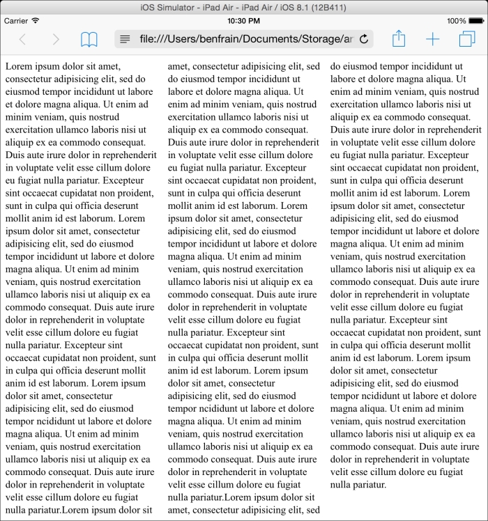
}This will mean, no matter the viewport size, the content will span across columns that are 12em in width. Altering the viewport will adjust the number of columns displayed dynamically. You can view this in the browser by looking at example_05-01 (or at the GitHub repository: https://github.com/benfrain/rwd).
Consider how the page renders on an iPad in portrait orientation (768px wide viewport):
And then on Chrome in the desktop (approximately 1100px wide viewport):
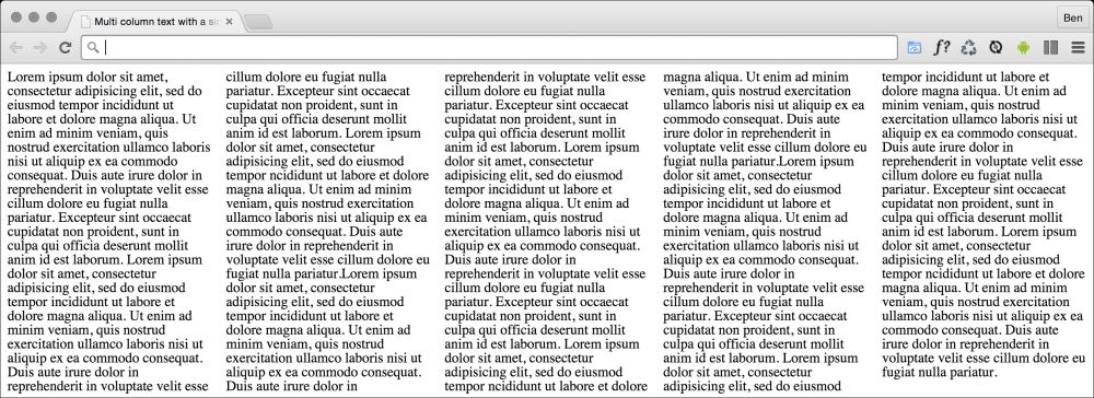
Simple responsive text columns with minimum work; I like it!
If you'd rather keep a fixed number of columns and vary the width, you can write a rule like the following:
main {
  column-count: 4;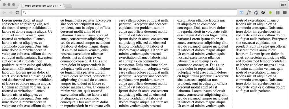
}We can take things even further by adding a specified gap for the columns and a divider:
main {
  column-gap: 2em;
  column-rule: thin dotted #999;
  column-width: 12em;
}
This gives us a result like the following:
To read the specification on the CSS3 Multi-column Layout Module, visit http://www.w3.org/TR/css3-multicol/.
For the time being, despite being at CR status at the W3C, you'll likely still need vendor prefixes on the column declarations for maximum compatibility.
The only caveat I would place on using CSS multi-column is that for longer spans of text it can lead to a flawed user experience. In these instances the user will have to scroll up and down the page to read the columns of text, which can become a little laborious.