Table of Contents for
Responsive Web Design with HTML5 and CSS3 - Second Edition
 Responsive Web Design with HTML5 and CSS3 - Second Edition
Published by
Packt Publishing, 2015
Responsive Web Design with HTML5 and CSS3 - Second Edition
Published by
Packt Publishing, 2015
- Cover
- Table of Contents
- Responsive Web Design with HTML5 and CSS3 Second Edition
- Responsive Web Design with HTML5 and CSS3 Second Edition
- Credits
- About the Author
- About the Reviewers
- www.PacktPub.com
- Preface
- What you need for this book
- Who this book is for
- Conventions
- Reader feedback
- Customer support
- 1. The Essentials of Responsive Web Design
- Defining responsive web design
- Setting browser support levels
- Our first responsive example
- The shortcomings of our example
- Summary
- 2. Media Queries – Supporting Differing Viewports
- Media query syntax
- Combining media queries
- Using media queries to alter a design
- Considerations for organizing and authoring media queries
- Combine media queries or write them where it suits?
- The viewport meta tag
- Media Queries Level 4
- Summary
- 3. Fluid Layouts and Responsive Images
- Introducing Flexbox
- Getting Flexy
- Responsive images
- Summary
- 4. HTML5 for Responsive Web Designs
- Starting an HTML5 page the right way
- Easy-going HTML5
- New semantic elements in HTML5
- HTML5 text-level semantics
- Obsolete HTML features
- Putting HTML5 elements to use
- WCAG and WAI-ARIA for more accessible web applications
- Embedding media in HTML5
- Responsive HTML5 video and iFrames
- A note about 'offline first'
- Summary
- 5. CSS3 – Selectors, Typography, Color Modes, and New Features
- Anatomy of a CSS rule
- Quick and useful CSS tricks
- Word wrapping
- Facilitating feature forks in CSS
- New CSS3 selectors and how to use them
- CSS3 structural pseudo-classes
- CSS custom properties and variables
- CSS calc
- CSS Level 4 selectors
- Web typography
- New CSS3 color formats and alpha transparency
- Summary
- 6. Stunning Aesthetics with CSS3
- Box shadows
- Background gradients
- Repeating gradients
- Background gradient patterns
- Multiple background images
- High-resolution background images
- CSS filters
- A warning on CSS performance
- Summary
- 7. Using SVGs for Resolution Independence
- The graphic that is a document
- Creating SVGs with popular image editing packages and services
- Inserting SVGs into your web pages
- Inserting an SVG inline
- What you can do with each SVG insertion method (inline, object, background-image, and img)
- Extra SVG capabilities and oddities
- Animating SVG with JavaScript
- Optimising SVGs
- Using SVGs as filters
- A note on media queries inside SVGs
- Summary
- 8. Transitions, Transformations, and Animations
- CSS3 2D transforms
- CSS3 3D transformations
- Animating with CSS3
- Summary
- 9. Conquer Forms with HTML5 and CSS3
- Understanding the component parts of HTML5 forms
- HTML5 input types
- How to polyfill non-supporting browsers
- Styling HTML5 forms with CSS3
- Summary
- 10. Approaching a Responsive Web Design
- View and use the design on real devices
- Embracing progressive enhancement
- Defining a browser support matrix
- Tiering the user experience
- Linking CSS breakpoints to JavaScript
- Avoid CSS frameworks in production
- Coding pragmatic solutions
- Use the simplest code possible
- Hiding, showing, and loading content across viewports
- Validators and linting tools
- Performance
- The next big things
- Summary
- Index
Box shadows allow you to create a box-shaped shadow around the outside or inside of the element it is applied to. Once text shadows are understood, box shadows are a piece of cake; principally, they follow the same syntax: horizontal offset, vertical offset, blur, spread (we will get to spread in a moment), and color.
Only two of the possible four length values are required (in the absence of the last two, the value of color defines the shadow color and a value of zero is used for the blur radius). Let's look at a simple example:
.shadow {
box-shadow: 0px 3px 5px #444;
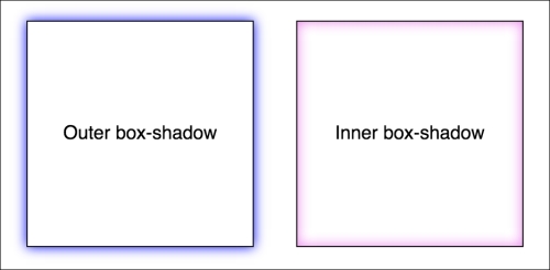
}The default box-shadow is set on the outside of the element. Another optional keyword, inset allows the box-shadow to be applied inside the element.
The box-shadow property can also be used to create an inset shadow. The syntax is identical to a normal box shadow except that the value starts with the keyword inset:
.inset {
    box-shadow: inset 0 0 40px #000;
}
Everything functions as before but the inset part of the declaration instructs the browser to set the effect on the inside. If you look at example_06-01 you'll see an example of each type:
Like text-shadow, you can apply multiple box-shadow. Separate the box-shadow with a comma and they are applied bottom to top (last to first) as they are listed. Remind yourself of the order by thinking that the declaration nearest to the top in the rule (in the code) appears nearest to the 'top' of the order when displayed in the browser. As with text-shadow, you may find it useful to use whitespace to visually stack the different box-shadow:
box-shadow: inset 0 0 30px hsl(0, 0%, 0%),
inset 0 0 70px hsla(0, 97%, 53%, 1);I'll be honest, for literally years I didn't truly understand what the spread value of a box-shadow actually did. I don't think the name 'spread' is useful. Think of it more as an offset. Let me explain.
Look at the box on the left in example_06-02. This has a standard box-shadow applied. The one on the right has a negative spread value applied. It's set with the fourth value. Here is the relevant code:
.no-spread {
  box-shadow: 0 10px 10px;
}

.spread {
  box-shadow: 0 10px 10px -10px;
}
Here is the effect of each (element with spread value on the right):
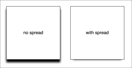
The spread value lets you extend or contract the shadow in all directions by the amount specified. In this example, a negative value is pulling the shadow back in all directions. The result being that we see the shadow at the bottom, only instead of seeing the blur 'leak' out on all sides (as the blur is being counter-balanced by the negative spread value).
Note
You can read the W3C specification for the box-shadow property at http://www.w3.org/TR/css3-background/.