Table of Contents for
Responsive Web Design with HTML5 and CSS3 - Second Edition
 Responsive Web Design with HTML5 and CSS3 - Second Edition
Published by
Packt Publishing, 2015
Responsive Web Design with HTML5 and CSS3 - Second Edition
Published by
Packt Publishing, 2015
- Cover
- Table of Contents
- Responsive Web Design with HTML5 and CSS3 Second Edition
- Responsive Web Design with HTML5 and CSS3 Second Edition
- Credits
- About the Author
- About the Reviewers
- www.PacktPub.com
- Preface
- What you need for this book
- Who this book is for
- Conventions
- Reader feedback
- Customer support
- 1. The Essentials of Responsive Web Design
- Defining responsive web design
- Setting browser support levels
- Our first responsive example
- The shortcomings of our example
- Summary
- 2. Media Queries – Supporting Differing Viewports
- Media query syntax
- Combining media queries
- Using media queries to alter a design
- Considerations for organizing and authoring media queries
- Combine media queries or write them where it suits?
- The viewport meta tag
- Media Queries Level 4
- Summary
- 3. Fluid Layouts and Responsive Images
- Introducing Flexbox
- Getting Flexy
- Responsive images
- Summary
- 4. HTML5 for Responsive Web Designs
- Starting an HTML5 page the right way
- Easy-going HTML5
- New semantic elements in HTML5
- HTML5 text-level semantics
- Obsolete HTML features
- Putting HTML5 elements to use
- WCAG and WAI-ARIA for more accessible web applications
- Embedding media in HTML5
- Responsive HTML5 video and iFrames
- A note about 'offline first'
- Summary
- 5. CSS3 – Selectors, Typography, Color Modes, and New Features
- Anatomy of a CSS rule
- Quick and useful CSS tricks
- Word wrapping
- Facilitating feature forks in CSS
- New CSS3 selectors and how to use them
- CSS3 structural pseudo-classes
- CSS custom properties and variables
- CSS calc
- CSS Level 4 selectors
- Web typography
- New CSS3 color formats and alpha transparency
- Summary
- 6. Stunning Aesthetics with CSS3
- Box shadows
- Background gradients
- Repeating gradients
- Background gradient patterns
- Multiple background images
- High-resolution background images
- CSS filters
- A warning on CSS performance
- Summary
- 7. Using SVGs for Resolution Independence
- The graphic that is a document
- Creating SVGs with popular image editing packages and services
- Inserting SVGs into your web pages
- Inserting an SVG inline
- What you can do with each SVG insertion method (inline, object, background-image, and img)
- Extra SVG capabilities and oddities
- Animating SVG with JavaScript
- Optimising SVGs
- Using SVGs as filters
- A note on media queries inside SVGs
- Summary
- 8. Transitions, Transformations, and Animations
- CSS3 2D transforms
- CSS3 3D transformations
- Animating with CSS3
- Summary
- 9. Conquer Forms with HTML5 and CSS3
- Understanding the component parts of HTML5 forms
- HTML5 input types
- How to polyfill non-supporting browsers
- Styling HTML5 forms with CSS3
- Summary
- 10. Approaching a Responsive Web Design
- View and use the design on real devices
- Embracing progressive enhancement
- Defining a browser support matrix
- Tiering the user experience
- Linking CSS breakpoints to JavaScript
- Avoid CSS frameworks in production
- Coding pragmatic solutions
- Use the simplest code possible
- Hiding, showing, and loading content across viewports
- Validators and linting tools
- Performance
- The next big things
- Summary
- Index
HTML5 adds a number of extra input types, which amongst other things, enable us to limit the data that users input without the need for extraneous JavaScript code. The most comforting thing about these new input types is that by default, where browsers don't support the feature, they degrade to a standard text input box. Furthermore, there are great polyfills available to bring older browsers up to speed, which we will look at shortly. In the meantime, let's look at these new HTML5 input types and the benefits they provide.
You can set an input to the email type like this:
type="email"
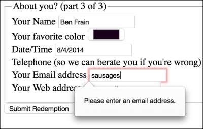
Supporting browsers will expect a user input that matches the syntax of an e-mail address. In the following code example type="email" is used alongside required and placeholder:
<div>
  <label for="email">Your Email address</label>
  <input id="email" name="email" type="email" placeholder="dwight.schultz@gmail.com" required>
</div>
When used in conjunction with required, submitting a non-conforming input will generate a warning message:
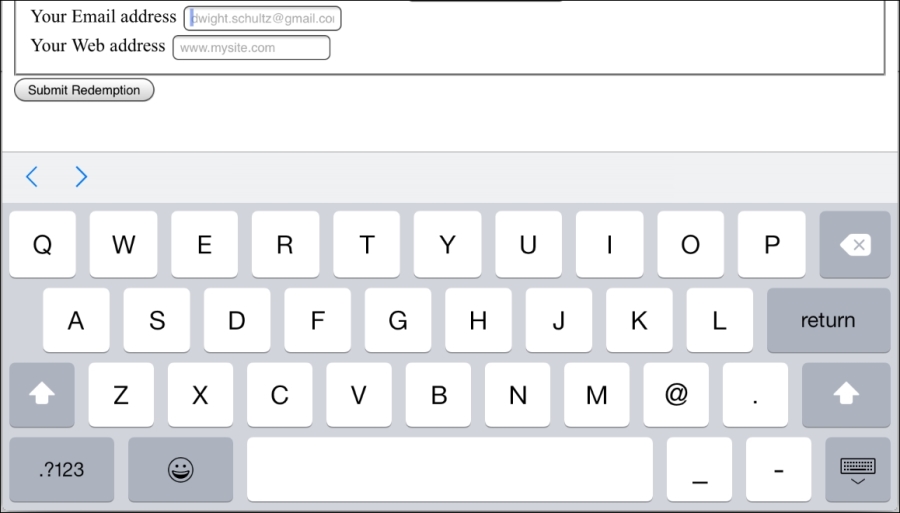
Furthermore, many touch screen devices (for example, Android, iPhone, and so on) change the input display based upon this input type. The following screenshot shows how an input type="email" screen looks on the iPad. Notice the @ symbol for been added to the software keyboard for easy email address completion:
You can set an input field to a type of number like this:
type="number"
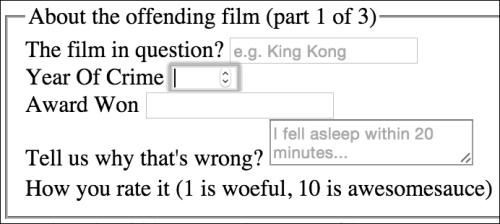
A supporting browser expects a number to be entered here. Supporting browsers also provide what's called spinner controls. These are tiny pieces of user interface that allow users to easily click up or down to alter the value input. The following is a code example:
<div>
  <label for="yearOfCrime">Year Of Crime</label>
  <input id="yearOfCrime" name="yearOfCrime" type="number" min="1929" max="2015" required>
</div>
And the following screenshot shows how it looks in a supporting browser (Chrome):
Implementation of what happens if you don't enter a number varies. For example, Chrome and Firefox do nothing until the form is submitted, at which point they pop up a warning above the field. Safari on the other hand, simply does nothing, and merely lets the form be submitted. Internet Explorer 11 simply empties the field as soon as focus leaves it.
You'll notice in the previous code example, we have also set a minimum and maximum allowed range, similar to the following code:
type="number" min="1929" max="2015"
Numbers outside of this range (should) get special treatment.
You probably won't be surprised to learn that browser implementation of min and max ranges is varied. For example, Internet Explorer 11, Chrome, and Firefox, display a warning while Safari does nothing.
You can set an input field to expect a URL like this:
type="url"
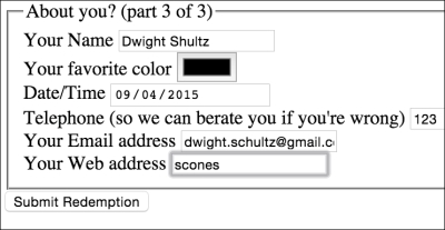
As you might expect, the url input type is for URL values. Similar to the tel and email input types; it behaves almost identically to a standard text input. However, some browsers add specific information to the warning message provided when submitted with incorrect values. The following is a code example including the placeholder attribute:
<div>
  <label for="web">Your Web address</label>
  <input id="web" name="web" type="url" placeholder="www.mysite.com">
</div>
The following screenshot shows what happens when an incorrectly entered URL field is submitted in Chrome:
Like type="email", touch screen devices often amend the input display based upon this input type. The following screenshot shows how an input type="url" screen looks on the iPad:
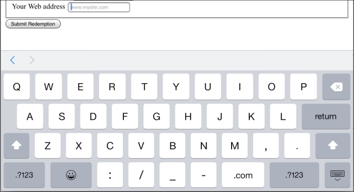
Notice the .com key? Because we've used a URL input type they are presented by the device for easy URL completion (on iOS, if you're not going to a .com site you can press and hold for a few other popular top level domains).
Set an input field to expect a telephone number like this:
type="tel"
Here's a more complete example:
<div>
  <label for="tel">Telephone (so we can berate you if you're wrong)</label>
  <input id="tel" name="tel" type="tel" placeholder="1-234-546758" autocomplete="off" required>
</div>
Although, a number format is expected on many browsers, even modern evergreen ones such as Internet Explorer 11, Chrome, and Firefox, it merely behaves like a text input field. When an incorrect value is input, they fail to provide a suitable warning message when the field loses focus or on form submission.
However, better news is that, like the email and url input types, touch screen devices often thoughtfully accommodate this kind of input with an amended input display for easy completion; here's the tel input when accessed with an iPad (running iOS 8.2):
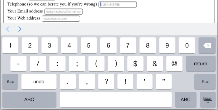
Notice the lack of alphabet characters in the keyboard area? This makes it much faster for users to enter a value in the correct format.
You can set an input as a search type like this:
type="search"
The search input type works like a standard text input. Here's an example:
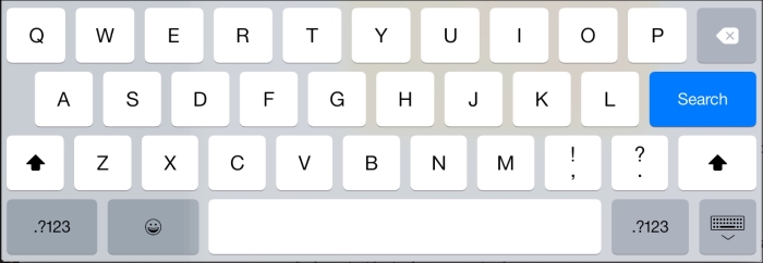
<div>
  <label for="search">Search the site...</label>
  <input id="search" name="search" type="search" placeholder="Wyatt Earp">
</div>
However, software keyboards (such as those found on mobile devices) often provided a more tailored keyboard. Here's the iOS 8.2 keyboard that appears when a search input type gets focus:
You can set an input to expect a certain pattern input like this:
pattern=""
The pattern attribute allows you to specify, via a regular expression, the syntax of data that should be allowed in a given input field.
Note
Learn about regular expressions
If you've never encountered regular expressions before, I'd suggest starting here: http://en.wikipedia.org/wiki/Regular_expressions
Regular expressions are used across many programming languages as a means of matching possible strings. While the format is intimidating at first, they are incredibly powerful and flexible. For example, you could build a regular expression to match a password format, or select a certain style CSS class naming pattern. To help build up your own regex pattern and get a visual understanding of how they work, I'd recommend starting with a browser based tool like http://www.regexr.com/.
The following code is an example:
<div>
  <label for="name">Your Name (first and last)</label>
  <input id="name" name="name" pattern="([a-zA-Z]{3,30}\s*)+[a-zA-Z]{3,30}" placeholder="Dwight Schultz" required>
</div>
Such is my commitment to this book, I searched the Internet for approximately 458 seconds to find a regular expression that would match a first and last name syntax. By entering the regular expression value within the pattern attribute, it makes supporting browsers expect a matching input syntax. Then, when used in conjunction with the required attribute, incorrect entries get the following treatment in supporting browsers. In this instance, I tried submitting the form without providing a last name.
Again, browsers do things differently. Internet Explorer 11 requests that the field is entered correctly, Safari, Firefox, and Chrome do nothing (they just behave like a standard text input).
Want to set an input field to receive a hexadecimal color value? You can do this:
type="color"
The color input type invokes a color picker in supporting browsers (currently just Chrome and Firefox), allowing users to select a color value in a hexadecimal value. The following code is an example:
<div>
  <label for="color">Your favorite color</label>
  <input id="color" name="color" type="color">
</div>
The thinking behind the new date and time input types is to provide a consistent user experience for choosing dates and times. If you've ever bought tickets to an event online, chances are that you have used a date picker of one sort or another. This functionality is almost always provided via JavaScript (typically jQuery UI library) but the hope is to make this common necessity possible merely with HTML5 markup.
The following code is an example:
<input id="date" type="date" name="date">
Similar to the color input type, native browser support is thin on the ground, defaulting on most browsers to a standard text input box. Chrome and Opera are the only two of the modern browsers to have implemented this functionality. That's not surprising as they both use the same engine (known as Blink in case you were interested).
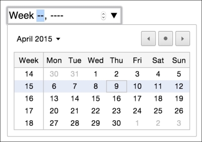
There are a variety of different date and time related input types available. What follows is a brief overview of the others.
The following code is an example:
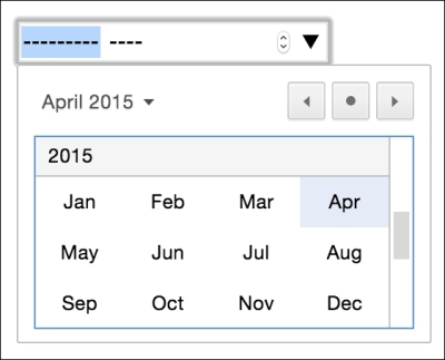
<input id="month" type="month" name="month">
The interface allows the user to select a single month and provides the input as a year and month for example 2012-06. The following screenshot shows how it looks in the browser:
The range input type creates a slider interface element. Here's an example:
<input type="range" min="1" max="10" value="5">
And the following screenshot shows how it looks in Firefox:

The default range is from 0 to 100. However, by specifying a min and max value in our example we have limited it to between 1 and 10.
One big problem I've encountered with the range input type is that the current value is never displayed to the user. Although the range slider is only intended for vague number selections, I've often wanted to display the value as it changes. Currently, there is no way to do this using HTML5. However, if you absolutely must display the current value of the slider, it can be achieved easily with some simple JavaScript. Amend the previous example to the following code:
<input id="howYouRateIt" name="howYouRateIt" type="range" min="1" max="10" value="5" onchange="showValue(this.value)"><span id="range">5</span>
We've added two things, an onchange attribute and also a span element with the ID of range. Now, we'll add the following tiny piece of JavaScript:
<script>
  function showValue(newValue)
  {
    document.getElementById("range").innerHTML=newValue;
  }
</script>
All this does is get the current value of the range slider and display it in the element with an ID of range (our span tag). You can then use whatever CSS you deem appropriate to change the appearance of the value.
There are a few other form related features that are new in HTML5. You can read the full specification at http://www.w3.org/TR/html5/forms.html.