In this chapter, you look at how to work with CSS that allows you to make your site more mobile and allows pages to float or stretch on the page, depending on what device you are viewing your website on.
Note
This chapter does not have any actual projects; however, you can use the files in the Part 6 folder to practice opening and viewing for this lesson. They are at https://github.com/Apress/graphics-multimedia-web-adobe-creative-cloud .
This last section on working with images <img> or the background images in CSS concerns how to work with images that may be viewed in other browser devices, like a tablet or smartphone, or even printed by the viewer. CSS and CSS3 have a variety of options that you can use to improve your layout for these situations. In Chapter 35, you look at using a library called Bootstrap, a front-end framework that is free and open source, which allows you to easily construct a mobile site and uses much of the CSS that has been discussed so far in Part 6.
CSS Floats
Sometimes you want images or a group of images to appear to float over the top of the text. This could be when you click over an image and you want to see it as a larger size (also called a light box or modal image ). Or maybe a menu bar that has thumbnails with links that float along the side as you scroll down the page. There are many combinations that you can create; some of the more advanced ones may use JavaScript or jQuery along with the CSS and HTML to accomplish this. You look at JavaScript in Chapter 34; for now let’s see how CSS can help with a float.
The float is a property that specifies an element’s placement alongside its container; it allows text and inline elements to wrap around it.
Like Photoshop CC and its layers, for a <div> or semantic element to float, it needs to be above the other <div> elements.
But none of these properties moves the element above the other elements.
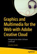
Properties to position a div so that it floats above other divs in the CSS Designer panel when applied to a class
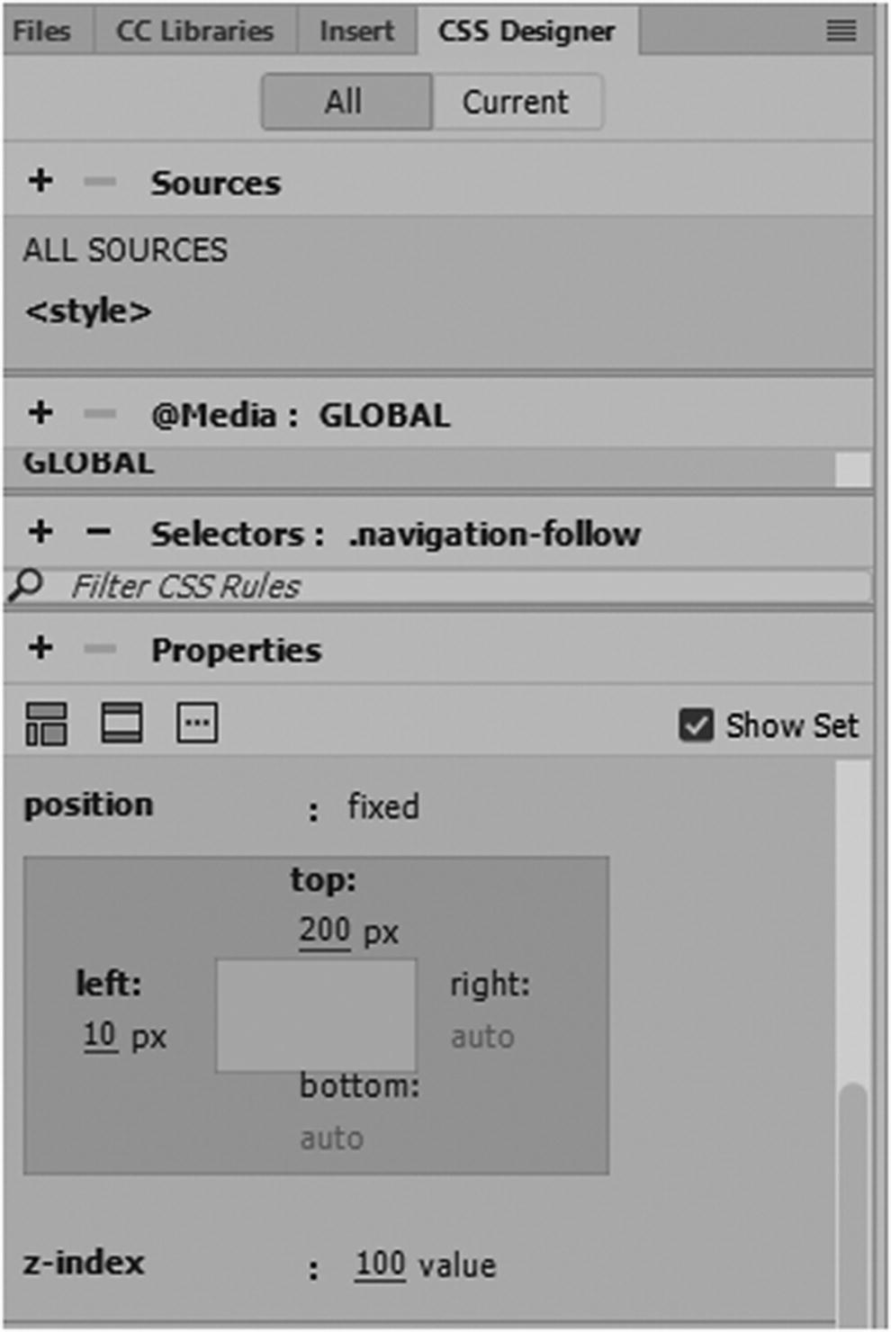
Position : A position can have a value of static, relative, fixed, absolute, or sticky.
Static : Elements are static by default and they are not affected by top, left, bottom, or right properties, so the element moves to the normal flow of the page in the browser if it is made larger or smaller.
Relative : Positioned normal to its relative position. If you add top, left, bottom, or right properties, it moves away from its relative position in whatever offset direction you set. And other elements may not fill the gap that is left unless they have additional CSS properties of their own.
Fixed : As you see in the previous code example, it is positioned relative to the viewport of your browser. Viewport is important in mobile design, as you see in the next section of this chapter. Fixed means it always stays in the same place, even if the page is scrolled. The top, right, bottom, and left properties are used to position the element. Also, unlike relative, it does not leave a gap in the page where it normally would be located. In most cases, you do not need to add a z-index when you work with fixed, but you will see why that property is useful.
Absolute : Positioned relative to the nearest positioned ancestor or parent element. If there are no parent elements, the <body> tag becomes the default and moves along with the scrolling page.
Sticky : A relatively new CSS3 value that only the most modern browsers support. And it is positioned based on the user’s scroll position. A sticky element could be relative or fixed, depending on the position of the scroll. It is positioned relative until a given offset position is met in the viewport—then it “sticks” into that place (like position:fixed). You must also specify at least one top, right, bottom, or left property for it to work.
Note
In Dreamweaver’s CSS Designer version 2019, sticky does not show up in the options; however, if you type in Code view, then it appears. Refer to Figure 33-2.
Properties to position a div so that it floats above other divs in the CSS Designer panel when applied to a class, from the list you can choose fixed or change to another value. You can also type in Code view to get the option of sticky.
Just remember that not all older browsers support the sticky value; make sure to check out the current vendor prefixes on W3Schools.
To learn more about positioning margins with top, bottom, left, and right check out www.w3schools.com/css/css_positioning.asp .
z-index
If you want to ensure that an element overlaps whether you are using the fixed, absolute, or relative position, use a z-index. The z-index only works with positioned elements. The z-index property specifies the stack order of an element (which element should be placed in front of, or behind, the others), just like layers in Photoshop CC or Illustrator CC.
An element can have a positive or negative stack order; a –1 places the <div> tag or element in the back, while a value of 1 places it in front. Be aware that because your website may have many elements, you may need to set a relatively high number, like 100. I find this ensures that the element is in the foreground.
One other item that is useful for cropping the image is the clip property.
Clip
Trims parts of an absolutely positioned element that contains an image in the top, right, bottom, and left; for example, clip: rect(20px,60px,200px,0px);
Other than fixed or absolute, it does not work with other position values or if an overflow property is set to visible.
Using the four rectangle coordinates, you can decide which areas of your image appear or do not appear. This is helpful when an image is larger than the containing element. The cropping of the image is nondestructive and is a better alternative than using Dreamweaver’s Quick Edit tool in the Properties panel, as you saw in Chapter 31.
Note
With model images or light boxes, an image that floats is often initially hidden, so it may require an additional property of display none. Also, to call up the image, you need to use additional JavaScript or jQuery. You can see many easy-to-create examples on W3Schools:
www.w3schools.com/howto/howto_js_lightbox.asp
Later, on the Hot Glass Tango website, you see how you can use jQuery with Bootstrap to create a basic gallery.
Responsive Media Queries and the View Port
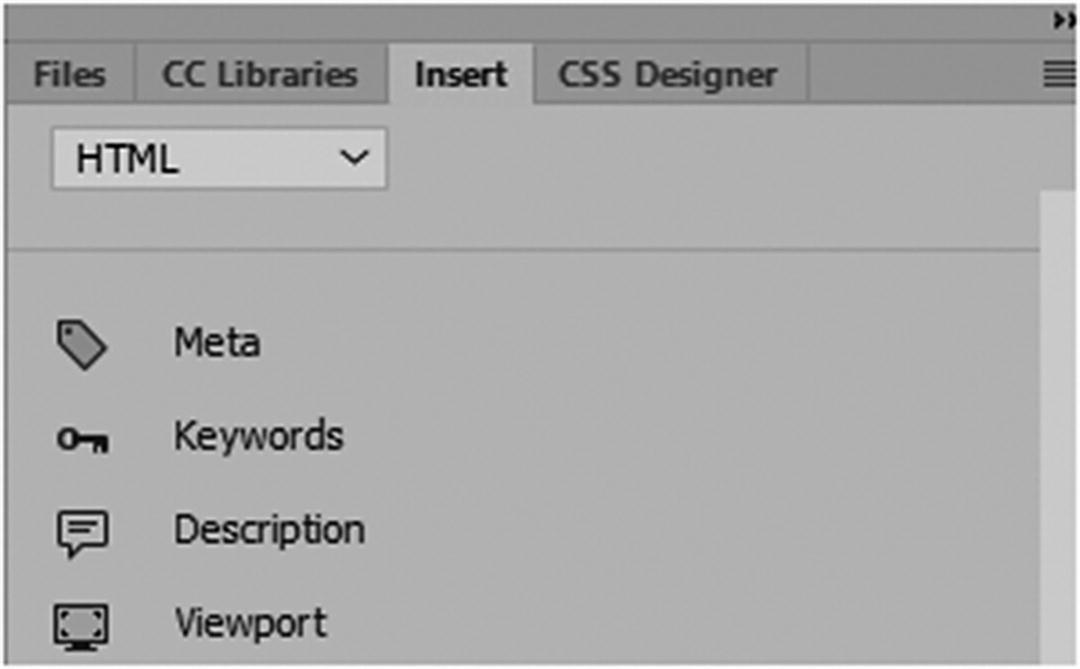
Use the Insert panel to add metadata and viewport tags
Meta : Gives the browser instructions on how to control the page’s dimensions and scaling. In this case, its name attribute is viewport.
Content : Sets the width of the page to follow the screen-width of the device. This can vary based on devices, but the setting to use is width=device-width.
Initial-scale=1 : Sets the initial zoom level when the page is first loaded by the browser. It can also be written as initial-scale=1.0; either way is OK. Figure 33-4 shows how it appears in the Properties panel.
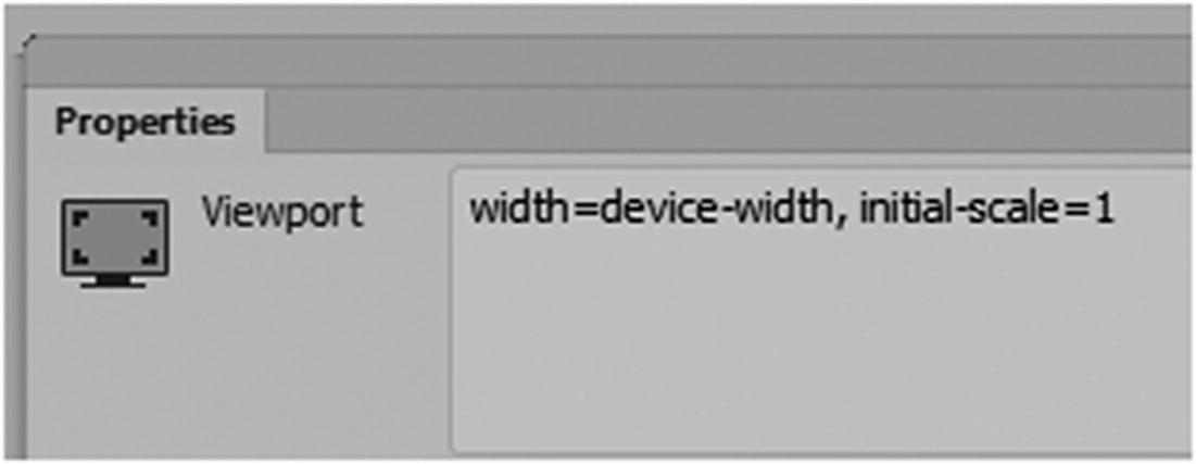
The viewport tag in the Properties panel
Whether you are using a laptop, tablet, or smartphone, and regardless of the screen orientation, users prefer to scroll vertically on a webpage. So, you want your pages to neatly fit and match within the screen size. While the viewport is helpful, you still need to take time to create CSS media queries for several devices. To explore media queries thoroughly requires a totally separate book. In Chapter 35, you see how to add media queries quickly using Bootstrap. In the following section you will find basics of how you can link your CSS media queries in Dreamweaver. You can also look at the Hot Glass Tango site to help you further your research for your own site, which likely has many similar media queries.
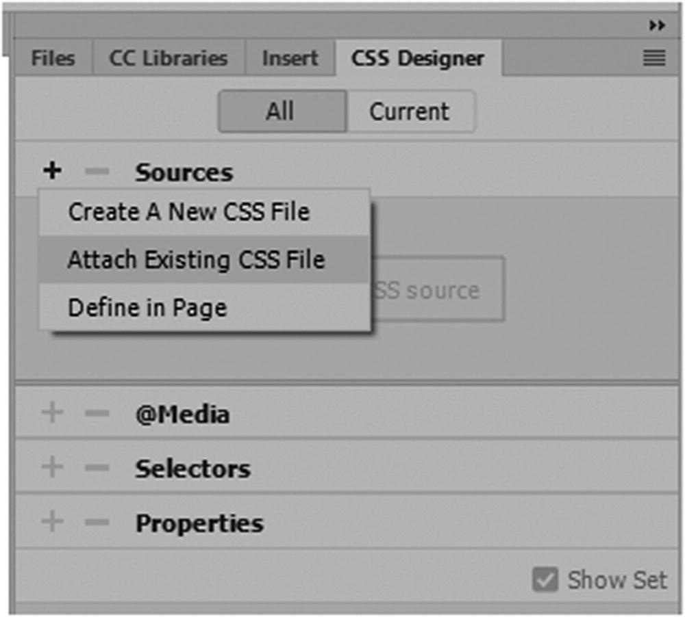
Use the CSS Designer panel to add CSS and media queries
You can see how to locate these files and attach them in Chapter 32.
Set how you use the CSS for your website
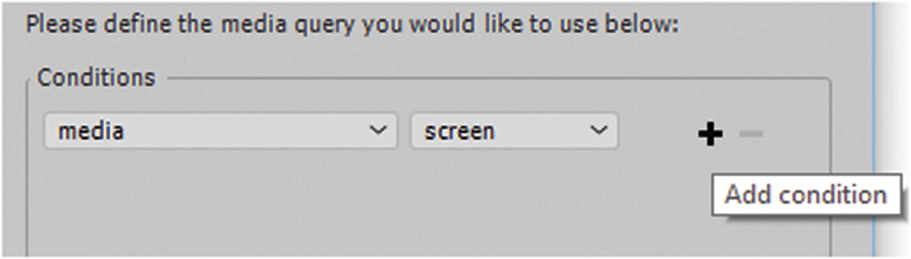
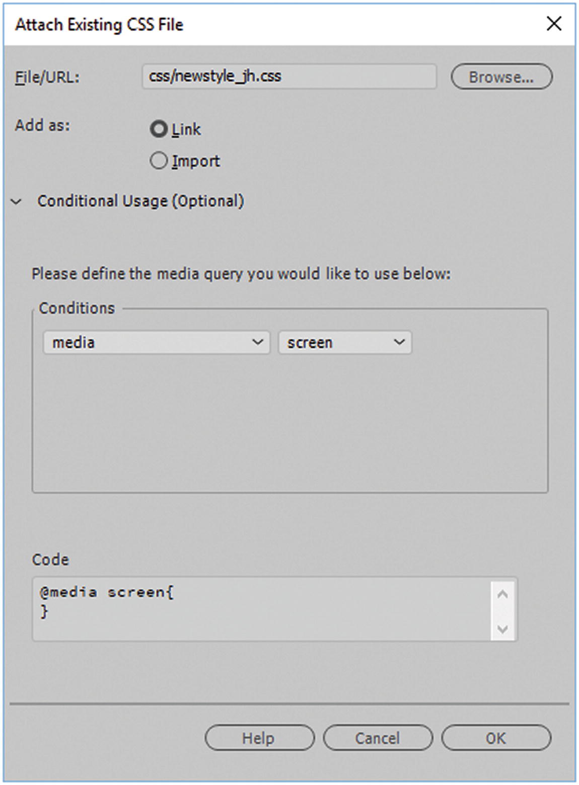
Set the CSS to be used only for screen
Notice how an attribute of media="screen" was added to the <link> tag in the <head> section.
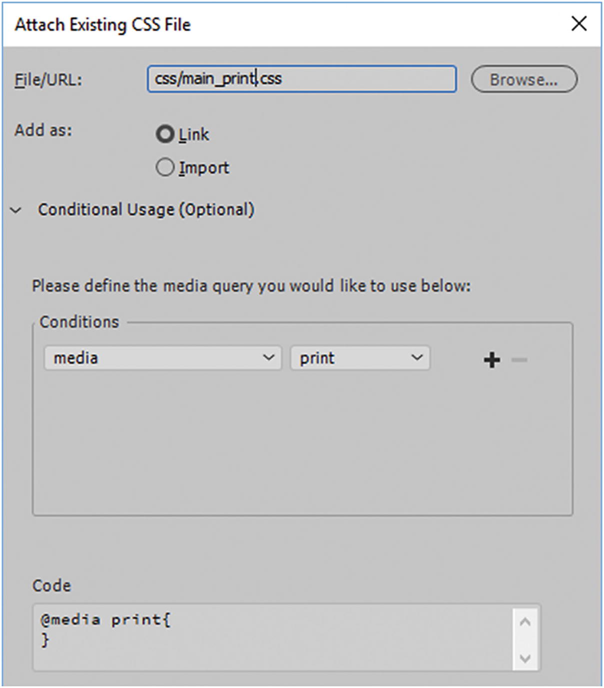
Set the CSS to be used only for print and not for screen
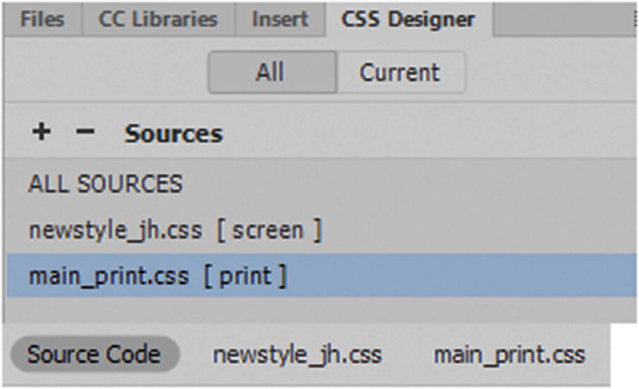
Adding print and screen CSS to a page
For the moment, you focus on the screen CSS.
Before you begin adding media queries, it’s important that you take time in the early planning stages to decide what types of devices and browsers you are going to target. You may not want the exact same layout for each device. This can become apparent in files that have backgrounds or slices. Suddenly, you’ll notice items don’t fit correctly in the same location for each device.
Image Slices and Mobile Devices
As we saw in Photoshop (Part2) and Illustrator (Part3), you can add slices as background images to divs. While this may be OK for images viewed on desktop computers, you must scale in the browser for a tablet or smartphone the images can get really jumbled because the <div> order may change and move around in the device’s browser.
In designing a website, it is critical to see how your background images perform in different browser sizes. For tablets and smartphones, it is better to have repeatable background patterns or a solid color rather than have photographic background images scale accurately at all sizes. In addition, it uses less processing power for those devices and your site loads quicker. For mobile devices, a better use of photographic images is for a gallery or an informational how-to page.
So regardless of whether you are using background images or not, the first thing to do is use grids or columns to show how your basic layout is going to flow.
W3Schools ( www.w3schools.com/css/css_rwd_grid.asp ) has a good example of this type of layout. Another good program to work with is the Gridulator ( www.gridulator.com ) if you need a background to work with in your Photoshop or Illustrator layouts.
box-sizing: border-box; makes sure that the padding and border are included in the total width and height of the elements when you work with percentages of width.
Bootstrap has much of this layout predesigned in the CSS, so all you need to do is make modifications to the layout, which you look at in more detail in Chapter 35.
Once you have designed a rough idea of what you want each layout to look like, the next step is to add media queries.
Media Queries (Mobile-First)
Media queries are useful when modifying your site for a device that has specific screen resolution parameters. They are very similar to the conditions media="screen" that you set up in the HTML page, except that you can set multiple ones inside one external CSS rather than have to write alternate conditions and attach several external CSS files for the screen.
The @media only screen and (max-width: 500px) could be considered a break point; if you use this code, the background suddenly changes color when a max-width or maximum width reaches 500 pixels. In this case, there the default or base and the breakpoint which is within its own brackets. Using one media query works OK for two changes; however, you want to design for three. When working with mobile design, it is better to think about the mobile-first approach and then work your way down in the CSS to larger sizes.
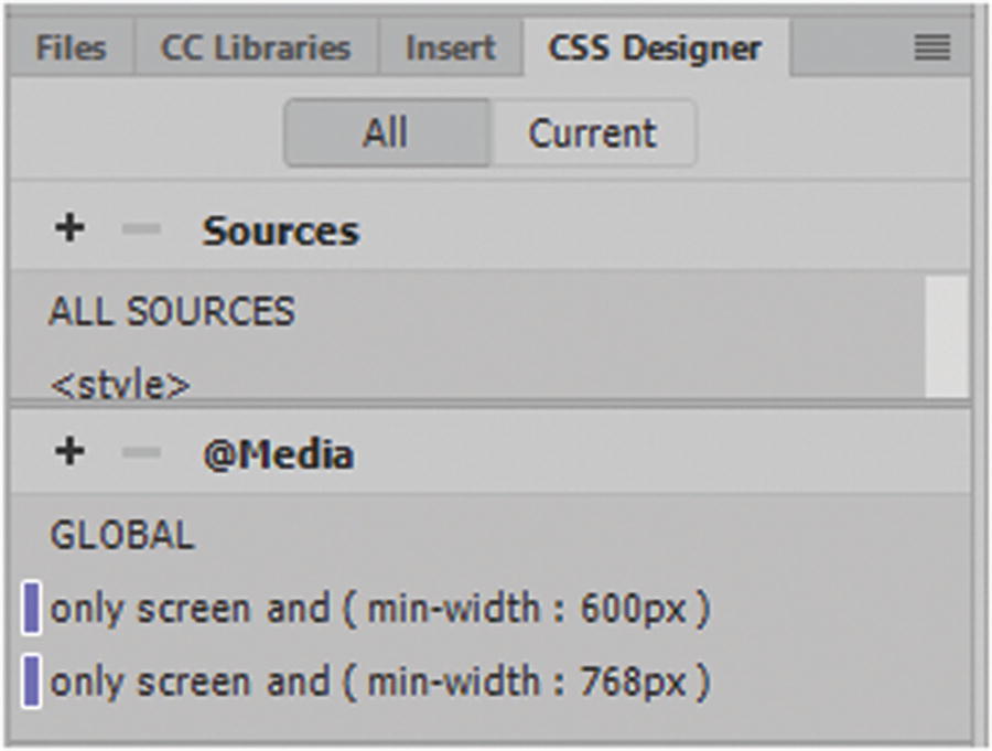
View and add media queries to CSS Designer
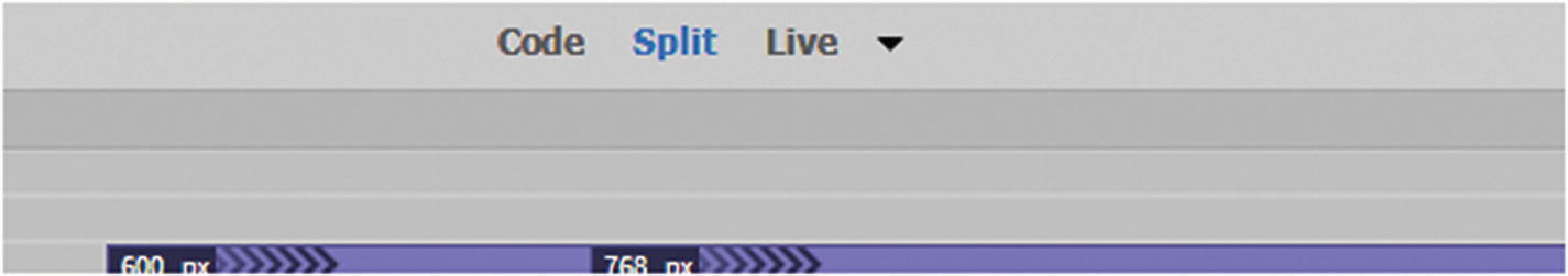
How media queries appear in the Preview panel
This time I used min-width or minimum width to alert at what breakpoint the changes occur.
You do this because rather than changing styles when the width gets smaller than 768 pixels (max-width), you should change the design when the width gets larger than 768 pixels (min-width). This makes it a mobile-first design.
You can add as many breakpoints as you require for each device. Sometimes your layout may need some intermediate breaks, but most times, four or five media queries may be all you need, depending on your target audience.
This might be an option if the tablet or smartphone is turned horizontally.
Again, the base (global) and mobile settings are taken care of first; followed by the tablet, which is the next largest; and finally, the desktop computer.
Using media queries, you can see how a webpage on the Hot Glass Tango site changes when the browser window is compressed and expanded. With Bootstrap, additional sizes of even larger screens were added.
For more information, visit www.w3schools.com/css/css_rwd_mediaqueries.asp .
Scaling Images
This way, the image scales up or down and the height scales proportionately along with it. If it scales upward too much, the image loses its quality, which is not what you want.
Max-width stops the image from scaling beyond 100%, but it can be scaled down, which is OK when it comes to quality.
Scaling a div with a Background Image
Setting the size to "contain" lets the background image scale and tries to fit the content area while maintaining the aspect ratio.
Loading a Different Image Based on Media Queries
Remember to keep using the mobile-first method and test your images in different browsers and devices to make sure that they are changing and shifting correctly.
Note
Another option is to use min-device-width, which checks the width of the actual device rather than the width of the browser (min-width). Keep in mind that if you are doing testing on your desktop computer, min-width shows you the changes as you expand and contract your browser; but with min-device-width, you not see the contraction unless you are testing on specific devices of that size.
This is optional; for now, just stick with min-width as I did for Hot Glass Tango.
Another option with mobile design is the <picture> element, which was discussed in Chapter 31. See www.w3schools.com/css/css_rwd_images.asp .
As with images, you can scale video using a similar process; you look at this in Chapter 36.
Dreamweaver offers Bootstrap, a CSS library, so you do not have to create your entire mobile-first web design from scratch. Dreamweaver offers some helpful examples that you can use in the File ➤ New and Insert panel, which takes away a lot of the labor of building a new layout each time and speeds up the design process. You’ll look at how you can access the Bootstrap framework in Chapter 35.
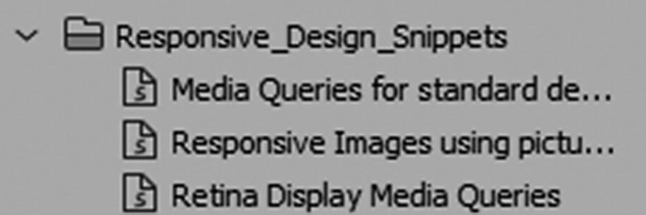
The Snippets panel offers some responsive snippets for the design of mobile sites
In addition, you can use Dreamweaver’s templates to speed up the process of working with mobile design; you look at those in Chapter 35, but first let’s finish up with the CSS.
Column Count
For more information, visit www.w3schools.com/cssref/css3_pr_column-count.asp .
CSS for Print with CSS Designer Panel
As with mobile devices, it is a clever idea to design some CSS so that most people could successfully print your webpages with their home printer on a letter-sized sheet (8.5×11).
As you saw in Figure 33-8, with the CSS Designer panel, you can add another external CSS file to your head section for print, in the Conditions section of the Attach new or existing CSS file dialog box as seen earlier in Figure 33-5.
With print, you don’t have to add various sized media queries; however, make sure that the pages neatly format so that they print successfully on a portrait letter-sized page.
You can look at the example of the CSS in the Hot Glass Tango website’s colorsglass.html and main_print.css. Because it is set to a print media, you never see its effects in the screen or browsers. The only time you preview it is when you choose File ➤ Print Preview in the browser. This gives you an idea of how the layout appears. Now you might think that in a paperless society, web designers should only focus on the mobile design. There may be important records, tables, and even images a person may want to print out from a specific page on a website in color or black and white.
Now that element is completely removed from the page. This might be good for removing banners and navigation that the viewer does not want to print.
I find this property useful if I am concerned about text breaking from the heading or after a specified element. Other related properties are page-break-before:always; (before a specified element) and page-break-inside:avoid; (if possible avoid a break inside of the element).
Choose File ➤ Print Preview from your browser if you need to see if your pages are formatting correctly.
Now that we have finished our main discussion on CSS and images as they relate to mobile design, let’s see how images interact with the third type of coding, known as JavaScript, along with Dreamweaver CC and its panels.
Summary
In this chapter, you looked at mobile-first design and some CSS, such as floats, media queries, and column counts that allow you to scale your images, <div> tags, and semantic elements for the screen. You also saw that CSS can be used for print media so that your images look their best no matter which media queries you use.
In the next chapter, you take a brief look at JavaScript and how it interacts with images in Dreamweaver.