
In this chapter, you look at how to work with CSS, linking CSS, and what you can use to enhance your images and turn them into animations using CSS.
Note
This chapter does not have any actual projects; however, you can use the files in the Part 6 folder to practice opening and viewing for this lesson. They are at https://github.com/Apress/graphics-multimedia-web-adobe-creative-cloud .
While in a file’s <head> tag, you will look at another way to add images or color to the backgrounds of the tags (rather than directly into the <div> tag or semantic element). You can link to internal or external CSS (Cascading Style Sheet) to format and display the tags or “bones” in your HTML files body. Using media queries, these backgrounds are interchangeable when viewed on different browsers or mobile devices.
CSS Inline Internal or External Styles?
While a whole book could be written on CSS itself, and there are many good reference books available formatting properties, the focus of this section of the book is to look at how that formatting (or properties) can be applied to images that appear as a background or boarder within the tag itself.
A good reference to see how CSS works is W3Schools ( www.w3schools.com/css/ ). They have many simple tutorials that you can observer and copy directly into Dreamweaver CC’s Code view and edit yourself.
Let’s briefly review three ways that CSS can be added or linked to an HTML5 webpage.
Inline CSS
Here the color is added as a fallback in case the image becomes unlinked or cannot display for some reason. The viewer at least sees some color. Also, background images do not require alt tags because their purpose is only to enhance the website, not to provide information.
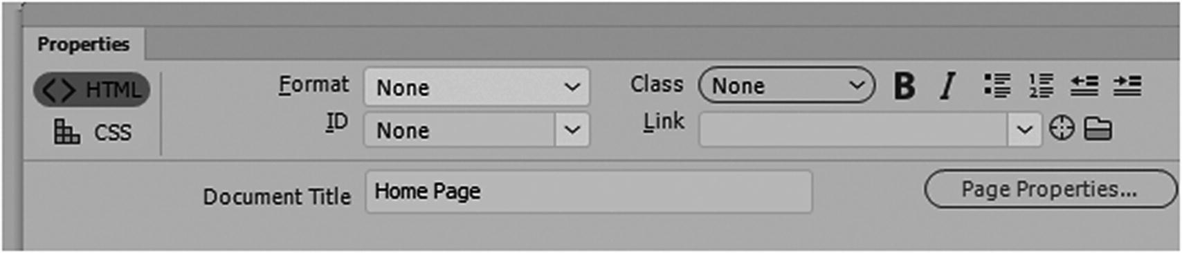
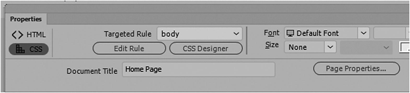
The page properties in the Properties panel allow you to edit some inline CSS
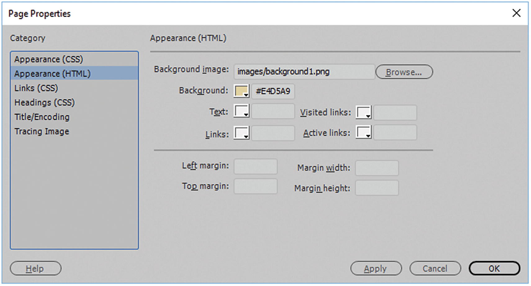
The page properties Appearance HTML dialog box area allows you to add inline CSS
Press OK to confirm these changes.
Note
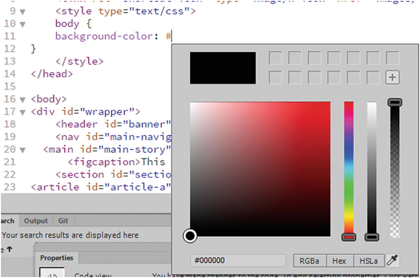
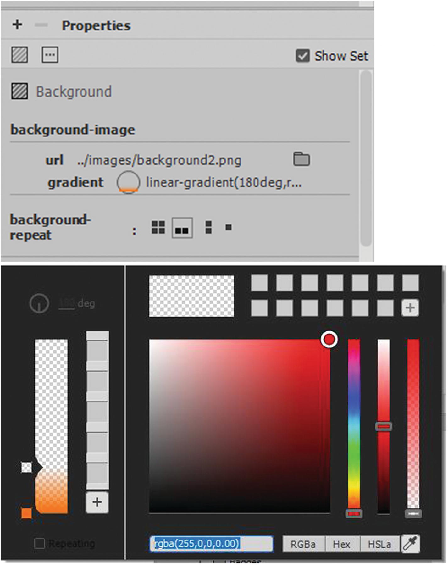
Color in Dreamweaver can be written in three ways: RGBa, hex code, or HSLa, if you don’t know the exact numbers you can use the color picker and eyedropper that appears in any of the color pullouts. Only hex code works with inline CSS; however hex does not allow for transparency or alpha filter (a) as the other color modes do. The other colors modes and hex work internal and external CSS which you look at shortly. Refer to Figure 32-3.
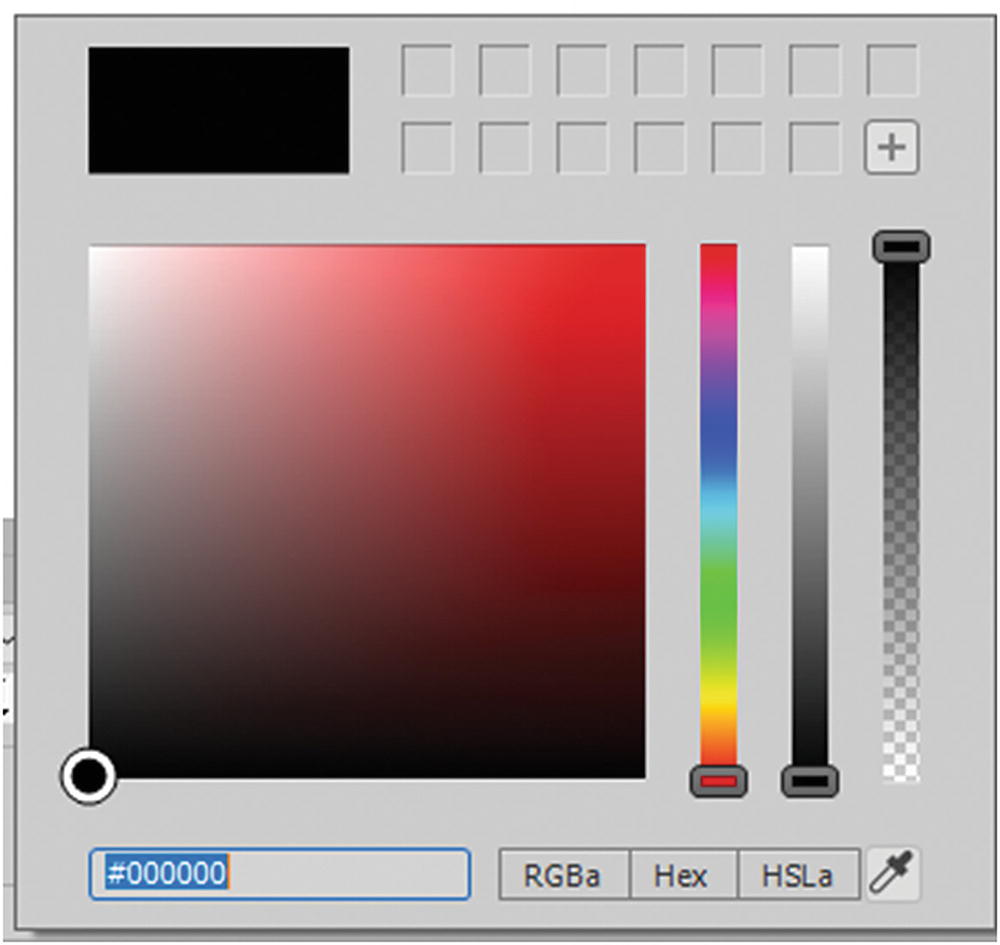
The Color Picker in Dreamweaver is similar to what you saw in the other Adobe programs
The choices are RGBa (red, green, blue and alpha transparency), hex or hex code (written with hashtag number sign (#)), and HSLa (hue, saturation, luminosity, alpha), which also has an alpha channel. You can also enter actual words, like red or green, to get a variety of colors. Most modern browsers accept alpha channels and transparency; however, if you find you’re running into color issues on a browser, stick with hex code, which you can easily find using the color picker.
You must format each tag separately, which can lead to errors if you must type or copy and paste each formatting into each tag.
The amount of formatting in each tag could become quite lengthy once you start adding font colors, margins, padding, or other styling.
If you want to have similar styling on another HTML page, you must copy and paste it into the next document; this wastes time and can lead to errors.
Another issue is scope, which refers to when one CSS style overrides another CSS style because it is closer to the tag itself. Anything inline is as close as you can get to the tag, so any CSS that comes before is overwritten.
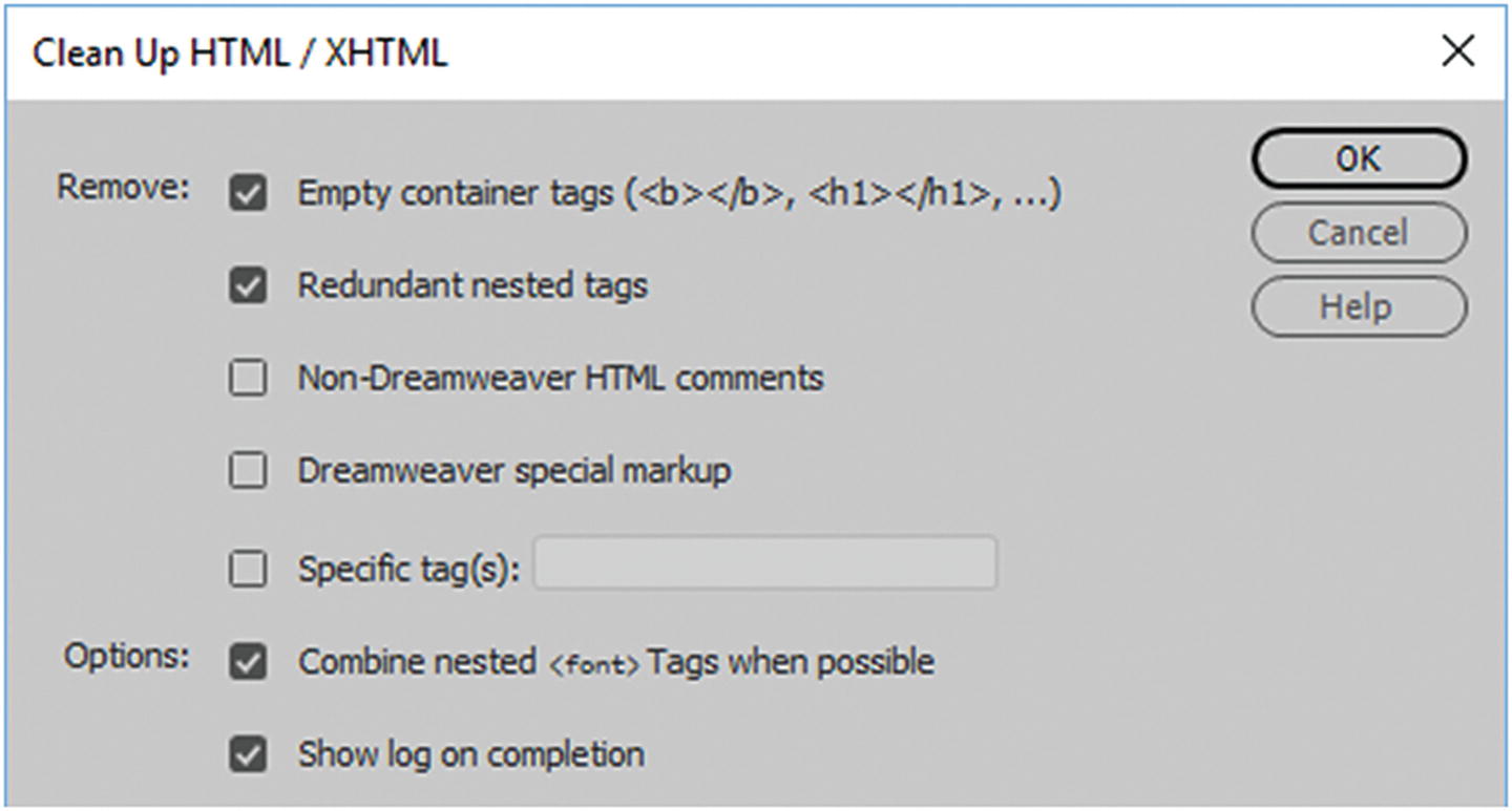
Clean up your HTML or XHTML to remove inline styles or obsolete tags
If you plan to use the CSS more than once on a page, a better option is to use internal or linked external CSS.
Internal CSS
Add inline CSS to a page
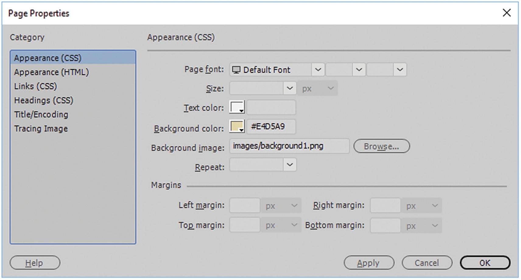
The page properties Appearance CSS dialog box area allows you to add inline CSS
Click OK to apply the changes.
Other CSS that you can affect is found in the Links (CSS) and Headings (CSS) tabs, where you can alter text style and color in the <body> tag.
Tip
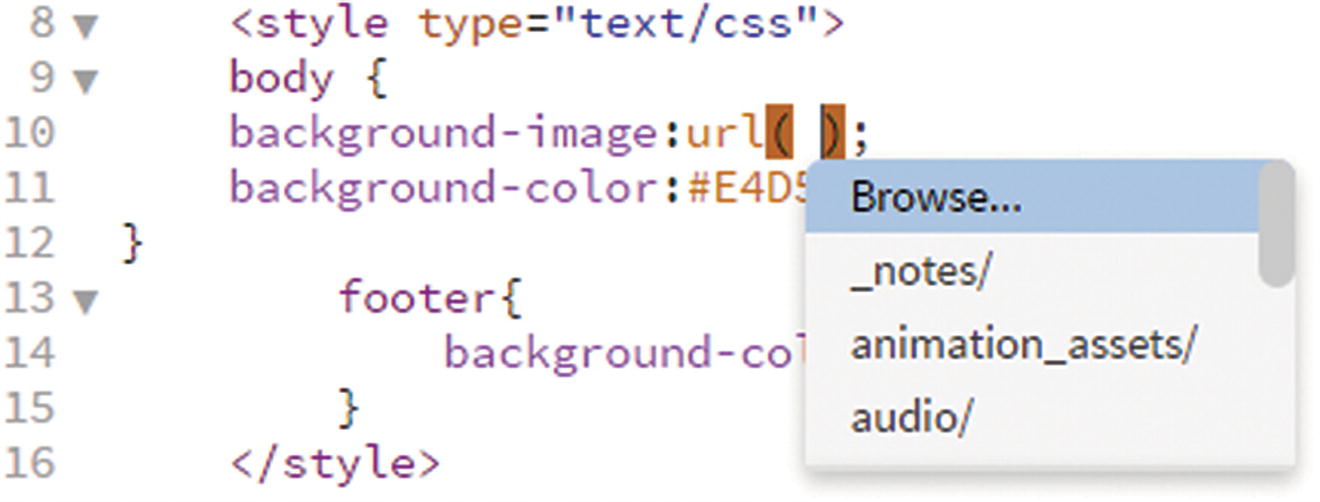
For the background image, the url('images/image.jpg') can either have single, double or no quotes around the link, either way is OK to right in Code view, but make sure the link is correct or you will not see the image.
Note
Trace image is an inline code that is used if you are designing a website and need to use a temporary background image to design or CSS layout over top. Once you are done, remove this information from the <body> tag, as it is only for design purposes. Refer to Figure 32-7.
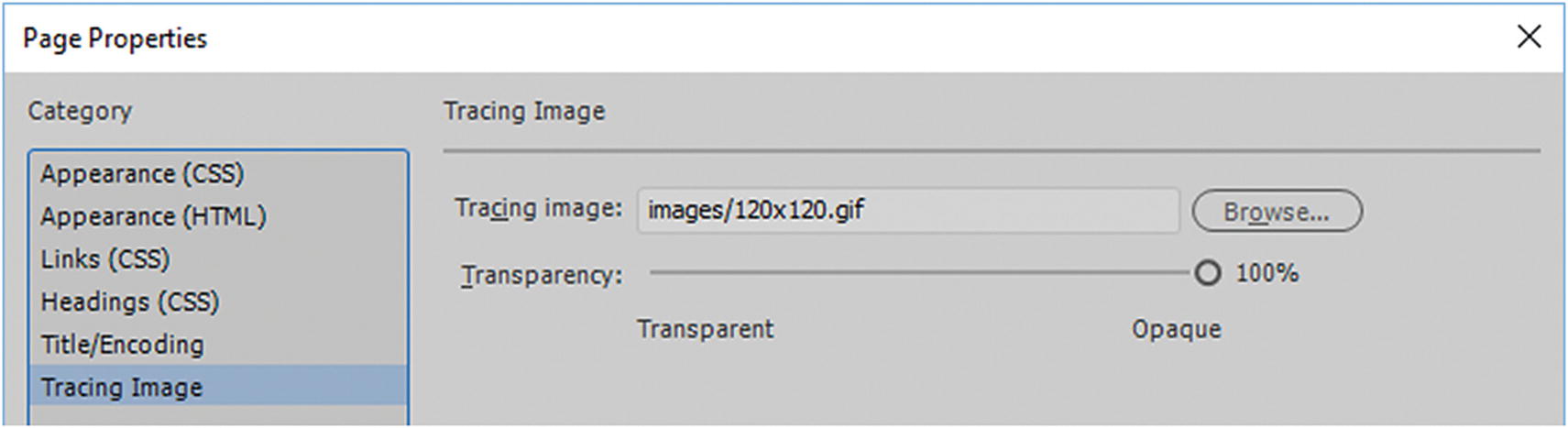
Page Properties allows you to temporarily add an image for tracing and design only while working on your website
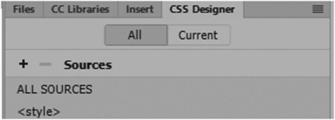
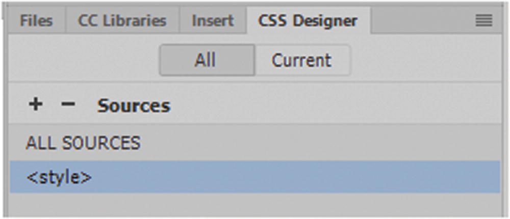
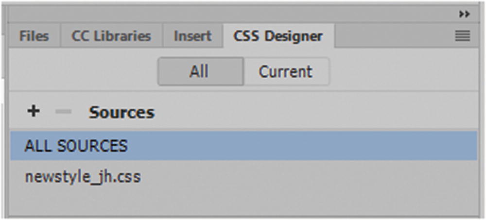
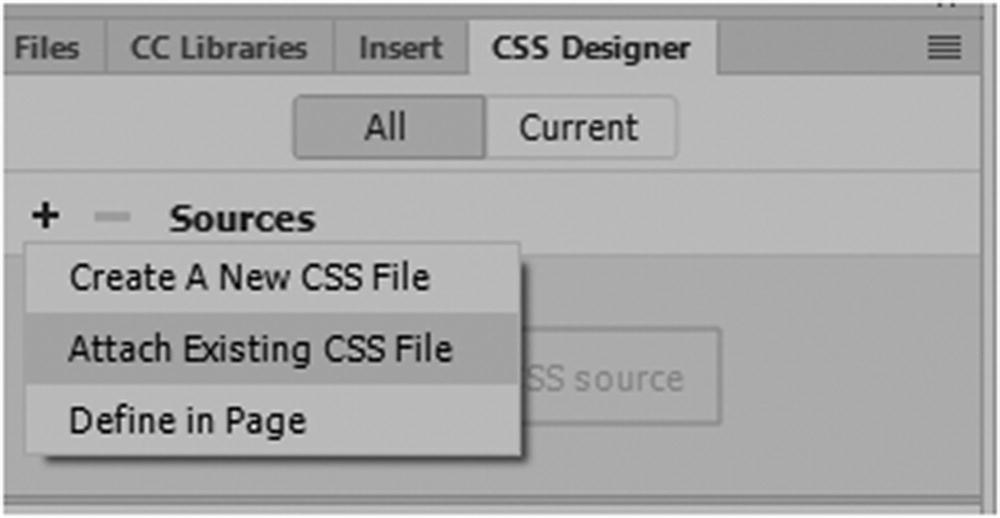
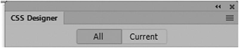
CSS Designer Panel
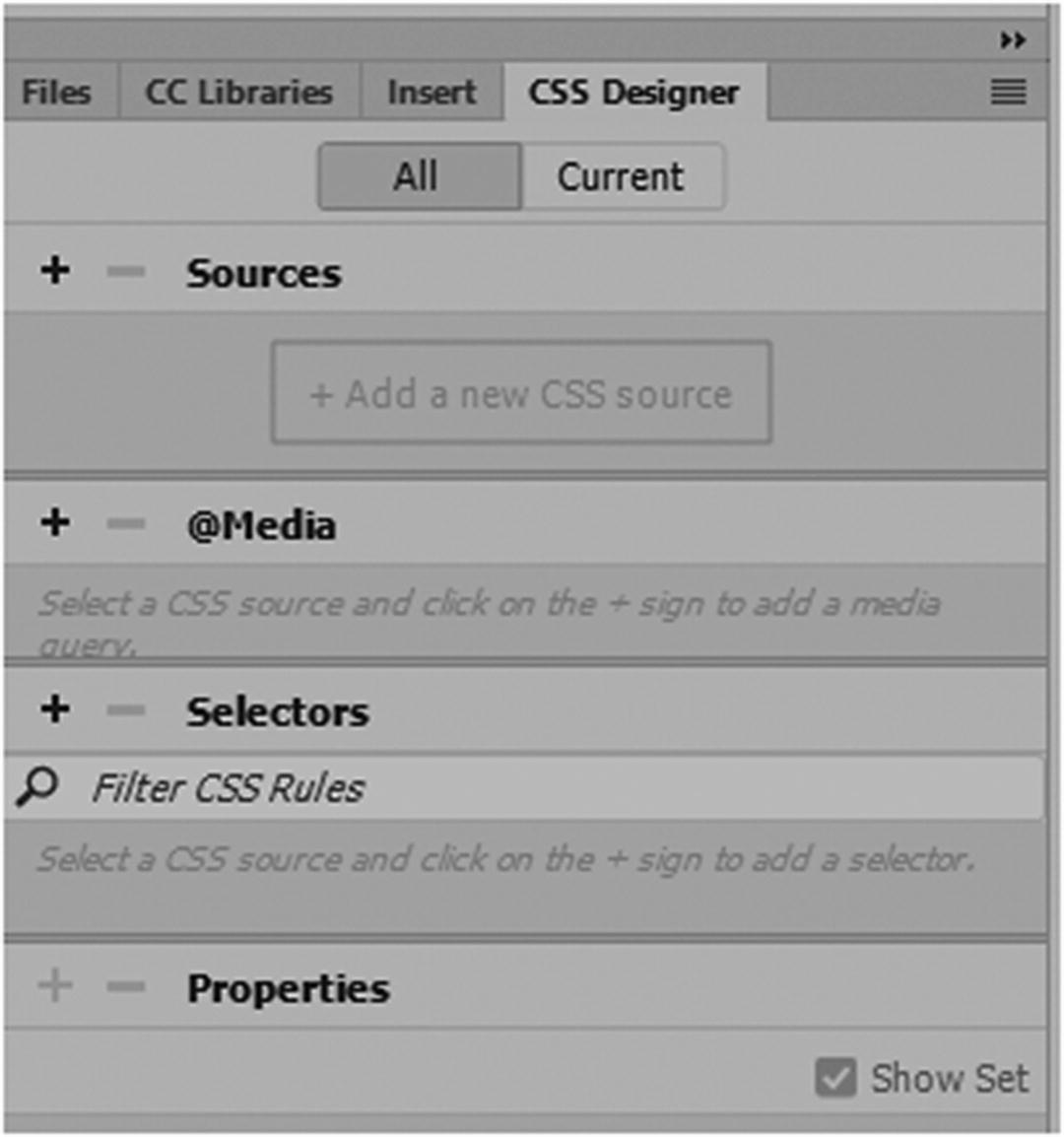
CSS properties panel helps you link and edit the CSS that is attached to your webpages
An internal style sheet is found using the CSS Designer panel
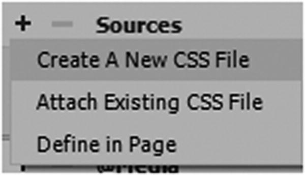
Adding an internal style sheet using Define in Page
Define in Page creates the <style> tags and adds it in the <head> tag in Code view. If there is already an internal style when you choose this option, it does nothing since the <style> tag is in place.
You can see in the CSS Designer panel in Figure 32-9 that a <style> has been added to the Sources section.
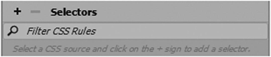
Selectors tab in CSS Designer
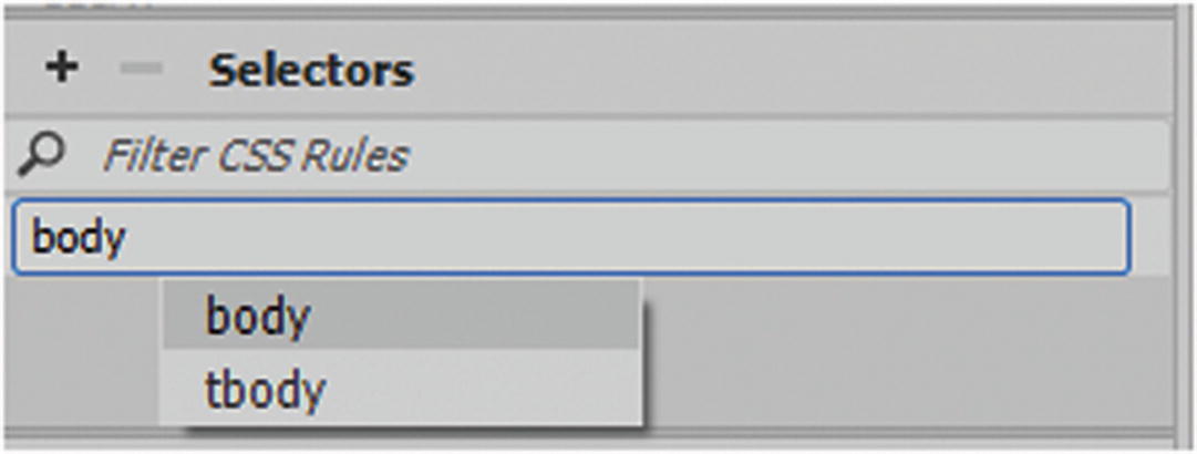
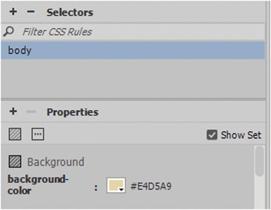
Type in a selector
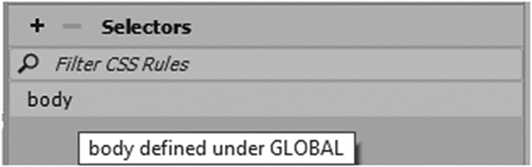
Then select body from the list.
Later, you can filter through the list with the search text box if you have a lot of rules.
The Selector rule now appear in the list and in the <styles> in Code view
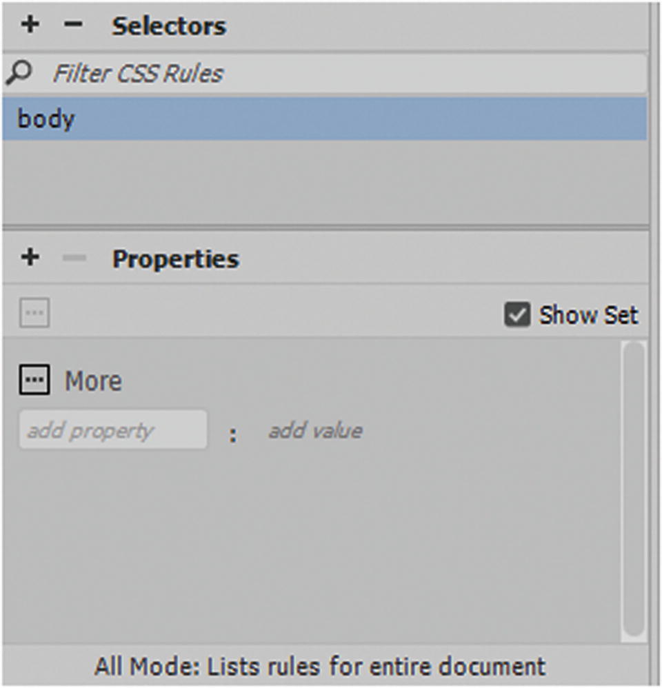
Add properties to the selector in the CS Designer panel
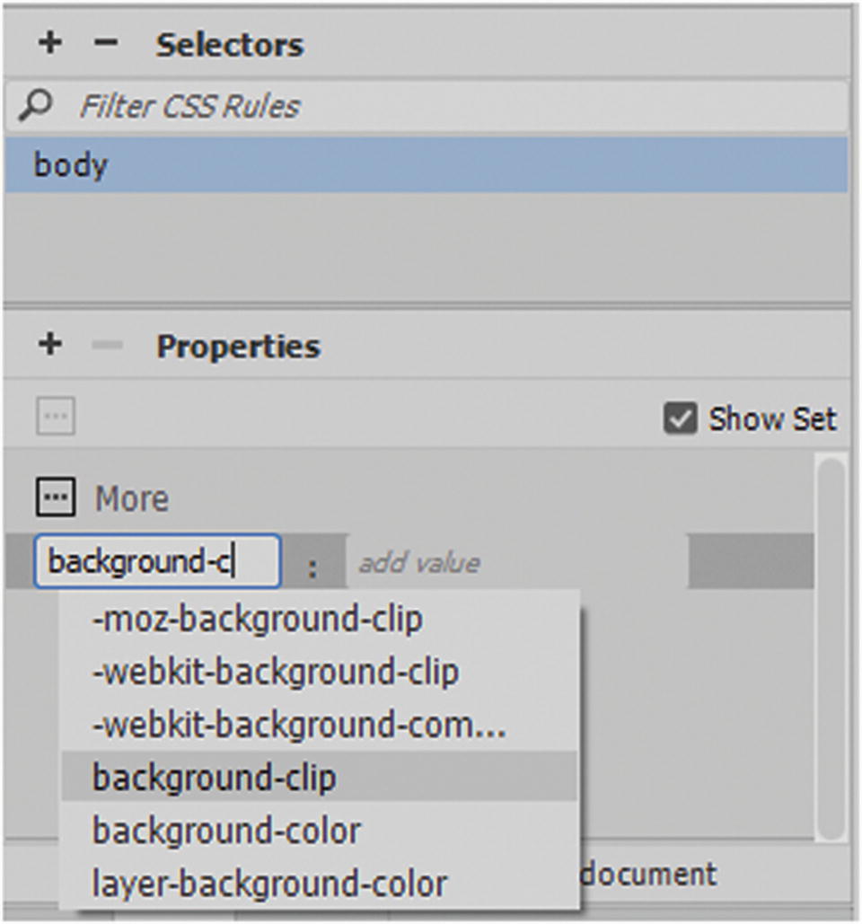
Find the correct properties to add to your body tag
When you find the correct one, "background-color", select it.
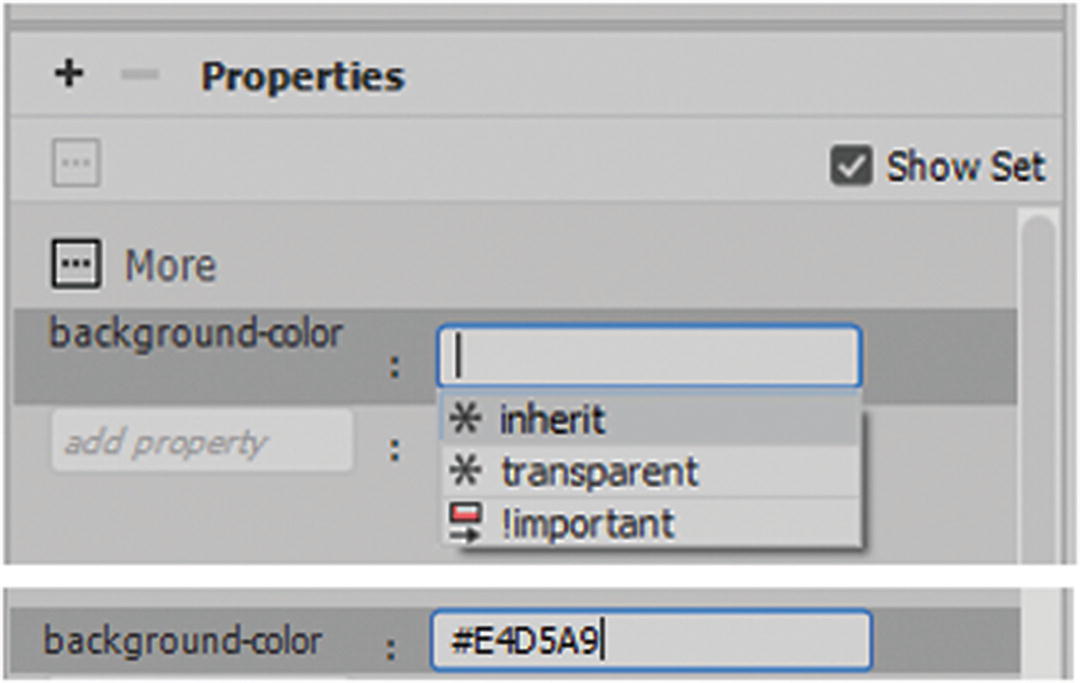
In the Properties tag add in a color for the background value
Note
Dreamweaver does not bring up the color picker at first in the CSS Designer panel, so make sure you know what the color code is before start typing. I find that a clever work-around is to instead type the color value in Code view rather than in the CSS Designer panel as this bring up the color picker and other helpful hints that CSS Designer does not always show. Refer to Figure 32-17.
Certain hints or dialog boxes do not always show up in CSS Designer so sometimes you may find it easier working in Code view
You need to do this before you move on to the next property. The CSS Designer panel does, however, add the semicolon for you.
Only once another tag is created can access the color picker
Add properties to the body tag
Add properties to the body tag
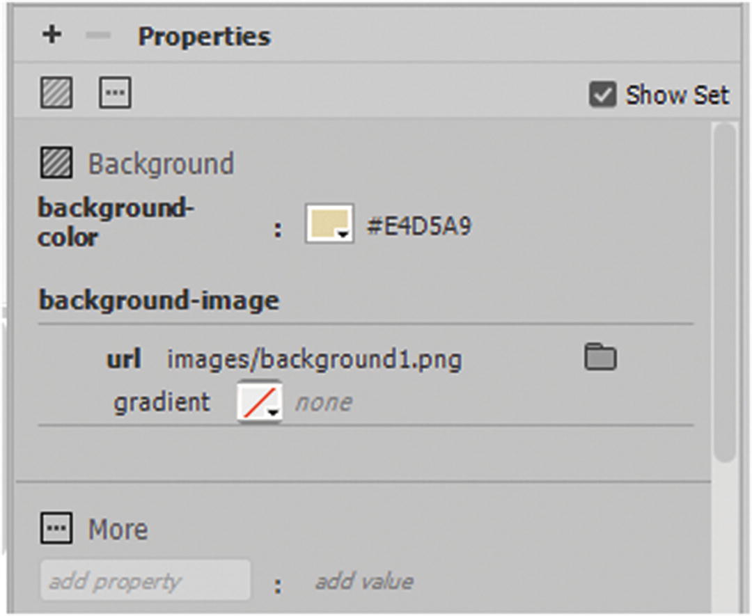
Adding Other Background Properties
Clicking the More button (see Figure 32-19) in the CSS Designer Properties tab reveals more options or properties.
background-repeat: repeat; This is the default and repeats vertically (y) and horizontally (x).
background-repeat: repeat-x; This repeats the background along the x coordinate.
background-repeat: repeat-y; This repeats the background along the y coordinate.
background-repeat: no-repeat; This leaves only one image and it does not repeat.
background-position: right top ; Other placement words are right, bottom, and center. You can also use pixels (2px 2px) or percentages(50% 50%) for placement. The first value is the vertical (x) and the second is the horizontal (y). A shorthand example of this is
background-attachment: fixed; Specifies that the background image should be fixed (does not scroll with the rest of the page). Scroll is the default, and there is the local option that scrolls with the tag’s contents.
background-origin: content-box; The background-origin property specifies the origin position (the background positioning area) of a background image. This property has no effect if background-attachment is fixed. It is often used if one or more images are found in the background. One might be set to value of content box and the other to border box or padding-box.
background-size: 300px 100px; Specifies the size of a background image with "auto" and in pixels or percentages 50%, 50%. You can also set it to a value of contain to keep it visible within a boundary of the element. A value of cover allows the image to resize within the element to cover that area. It is often used when the background is set to no repeat, and it can be used with more than one image in the background. You may need to add vendor extensions to make these run correctly, which you can view at www.w3schools.com/cssref/css3_pr_background-size.asp .
- background-blend-mode: lighten; Defines the blending mode of each background layer (color, image, or both). It is like the blend filters you see in Photoshop, Illustrator, and Animate. These values are not supported by Internet Explorer or Edge. The following are the available options:
normal (the default)
multiply
screen
overlay
darken
lighten
color-dodge
saturation
color
luminosity
background-clip: padding-box; Defines how far the background (color or image) should extend within an element.
Background Image Gradients
A gradient with opacity can be altered in the color picker
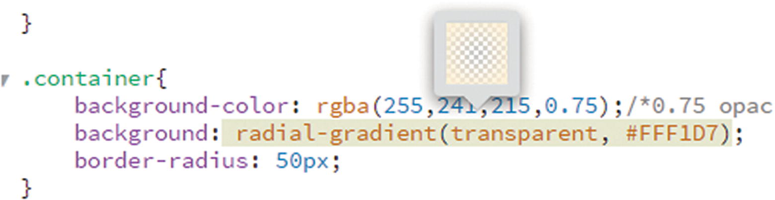
Edit radial gradients in Code view only
More information on gradients is at www.w3schools.com/css/css3_gradients.asp .
Note
There are other settings: initial and inherit. The initial keyword is used to set a CSS property to its default value or override. The inherit keyword specifies that a property should inherit its value from its parent element. Elements are sometimes affected when one or more CSS properties are combined with inline styles in the tag (see reference to scope in Inline CSS section in this chapter) and how it inherits it styling. Initialvalue: is a new setting is CSS3 and this property may not work in older browsers.
Enabling or Disabling CSS Properties
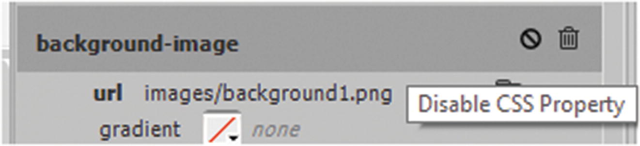
Enable or disable layer properties
Clicking the disable symbol again enables it and returns the CSS onto the page in Design view.
Adding CSS to Other Tags and Elements
In this next section you will look at how CSS can be applied to various HTML tags and semantic elements.
Tags
There are many other CSS properties and values that you could add to the <body> tag that would affect the font or styling of links. However, the body tag is not the only tag that you can add CSS inline styles to.
Combining or separating styles is useful, and you can do this with all tags. In CSS, tags are always written with their full name. However, as you saw with semantic elements in Chapter 31, some tags, like <div>, can be used more than once on a page, like <header>, <footer>, <article>, or <section>.
IDs
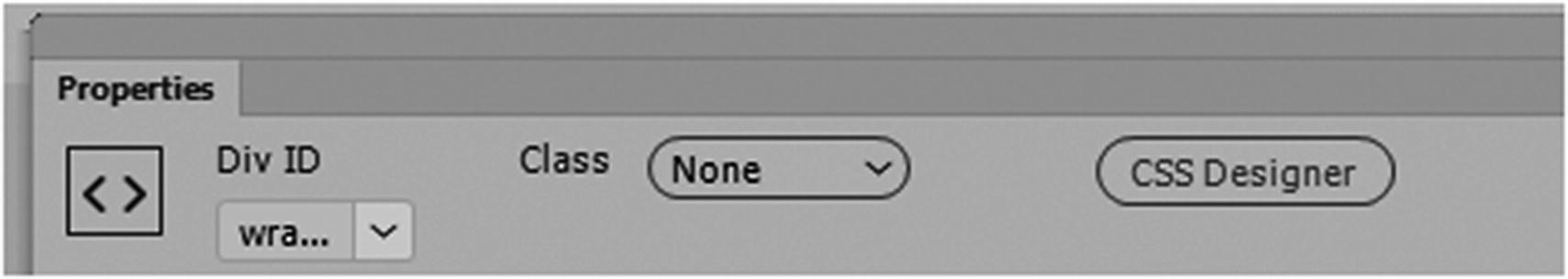
The Properties panel with div ID
Class
Those without the class are never altered by the CSS.
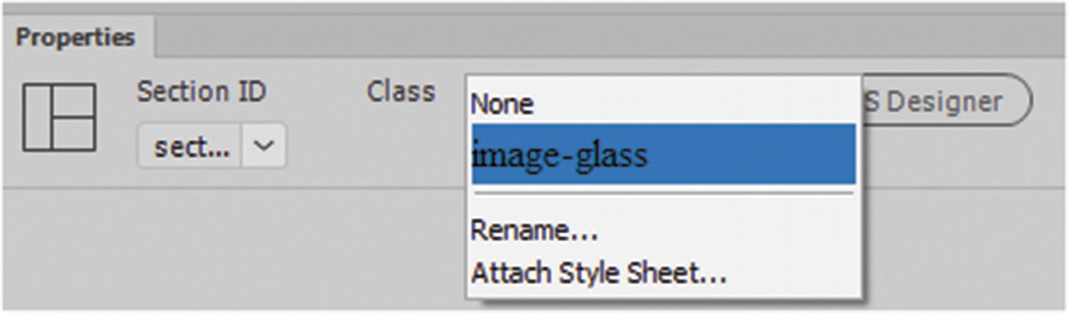
The Properties panel add a class to a div or attach a style sheet
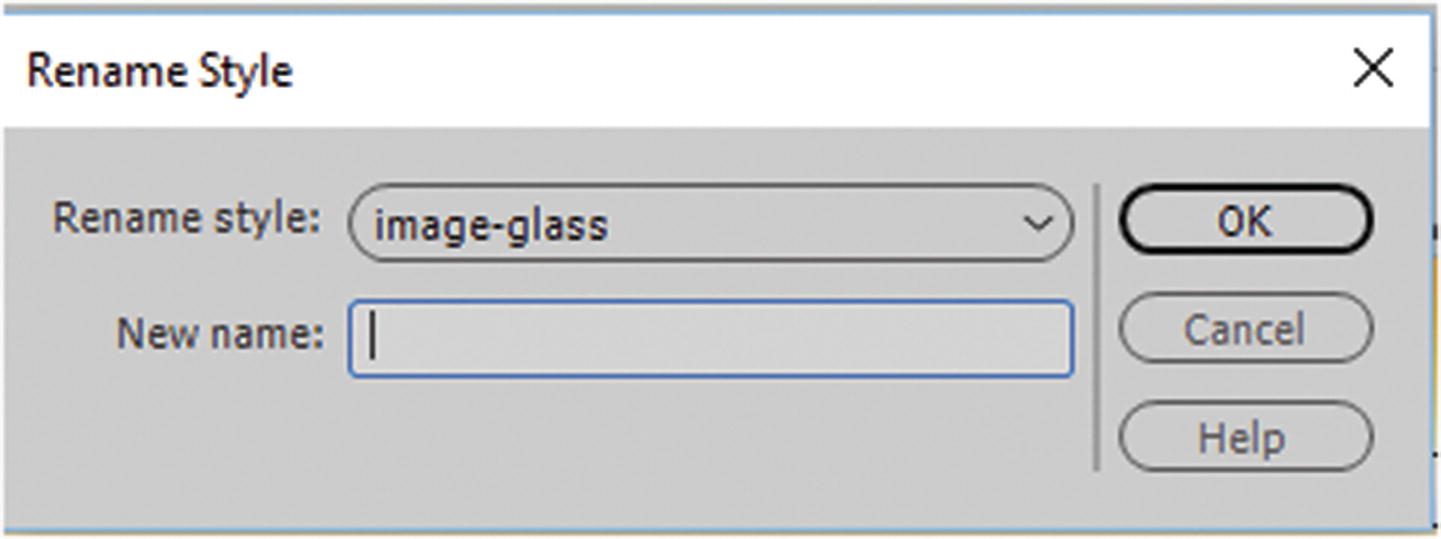
Rename the selected style
Also, you can attach an external style sheet from this area in the Properties panel.
When text is added, it is sized and colored in different ways because of the way the classes target the link.
Pseudo Class Selectors
One final selector that you may come across is the pseudo class, which is a bit more complex or advanced to work with. Essentially, it defines a special state of an element that can be altered by adding a keyword to a selector.
an element when a user mouse hovers over a link, the color alters
an element when it gets focus, like an input tag
If you applied this class (.nav-box) to a <div> tag, when your mouse hovers over it, the image in the background changes. Pseudo classes can be used in some very creative way, which you’ll look at again. For more information, visit www.w3schools.com/css/css_pseudo_classes.asp .
External CSS
The more CSS you add to the page the more room it takes up. It takes the page longer to load.
You want to use the CSS on other HTML pages, so you must copy and paste the CSS into those pages, which wastes time, and some of it you may not want to use on all pages so now you have to spend time removing those lines of code.
If you are going to use CSS in multiple pages, it is far better to create an external style sheet and link it to the page. External stylesheets can define the style for multiple pages on your site. When you edit one linked file, you can change the property values of all linked pages. Bear in mind, however, that any internal CSS left on the page overrides the external CSS because it is closer to the tag. If you do not remove the internal styling first you may wonder, why your new styles do not format correctly.
Use internal CSS only for pages that require a very specific styling, such as overriding the background or a link color just for that page; otherwise, it is best to keep all CSS in a main external file.
To create an external CSS file, you can use Dreamweaver’s CSS Designer panel in the same way that you used it to create your internal style sheet and format it. However, there are some key differences. If you are worried about losing any CSS in the <styles> area, I recommend that you copy, paste, and save this text in a .txt file like Notepad++. Then if you remove the internal styling or need to copy it into the external file at another time, it is not lost.
CSS Designer Panel
Remove internal styles
Your page goes back to base settings. If you saved a backup of the CSS you’re OK; otherwise, Edit ➤ Undo should return it, so you can copy it into a temporary file.
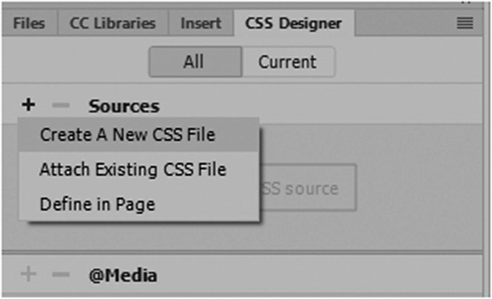
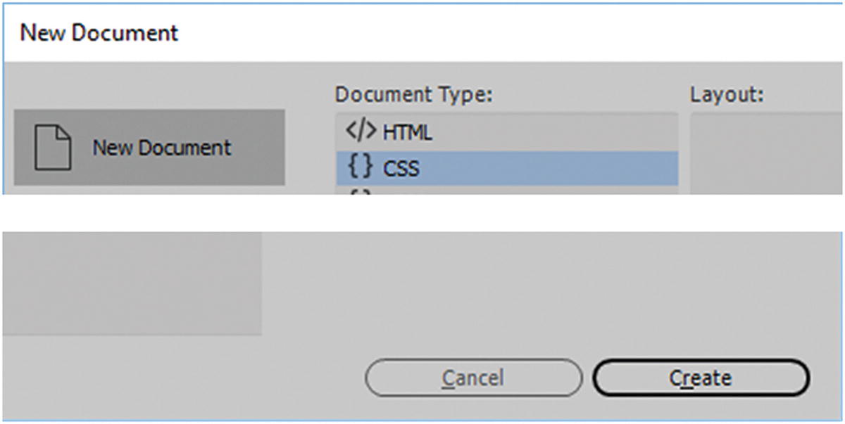
Create or add an existing style sheet
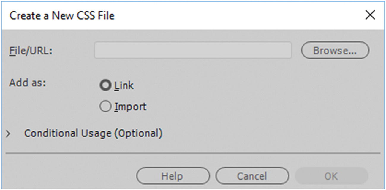
Create a New CSS File dialog box
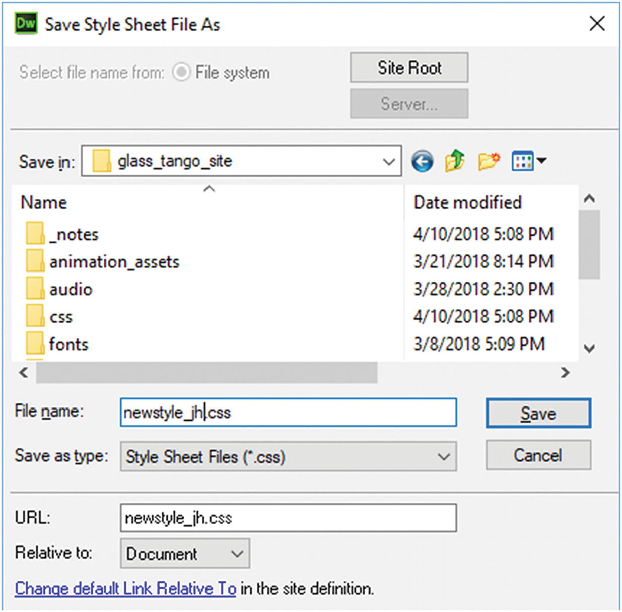
Create a New CSS file and save it in the CSS folder to stay organized
When I built the Hot Glass Tango website, I found that as the CSS became more complicated, I needed to have more than one CSS file. To keep organized, I stored all the CSS in one folder.
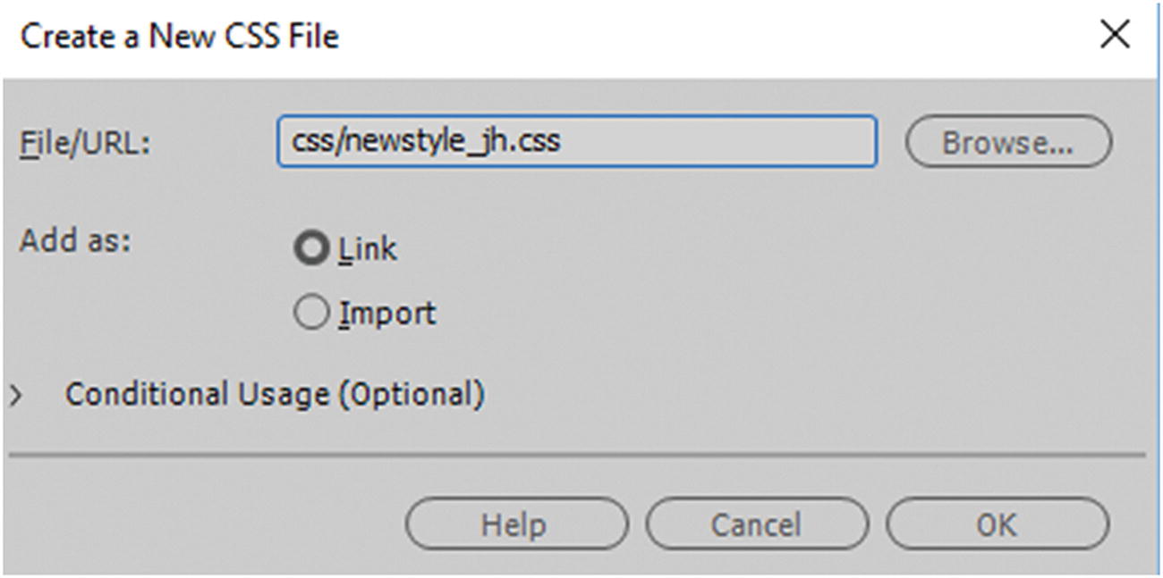
The new CSS file is linked
You now have a location that your new file is saved in a CSS folder. Click OK.
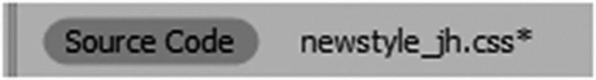
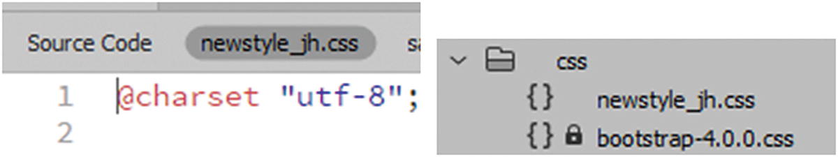
You not see the effects of the new CSS file right away since it is currently empty, however, you know that it linked to you HTML file with three indications.
Attaching an external CSS
Attached an external CSS in the CSS Designers panel
CSS is attached to a webpage as an external file
Either way the external CSS file is blank except for a charset rule.
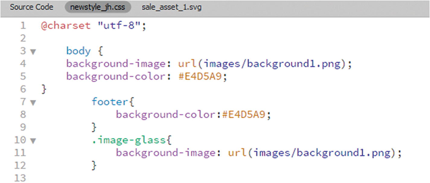
Click line 2; this is the point where you add your CSS or what you have already created. If you want to practice adding the CSS for color and background images using CSS Designer, refer to the section on inline CSS as the process is basically the same except that now you are adding it to an externally linked file, so you do not require the CSS <style> tags anymore. The linking takes place through the <link> tag in the <head> of your document.
Some CSS is added to an external style sheet
As you can see, there are no <style> tags because they are not required. Save the file after each change and then return to the Source Code tab, as seen in Figure 32-43.
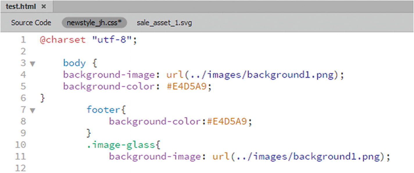
Altering the link of the background image file
Save the CSS and return to the Source Code tab.
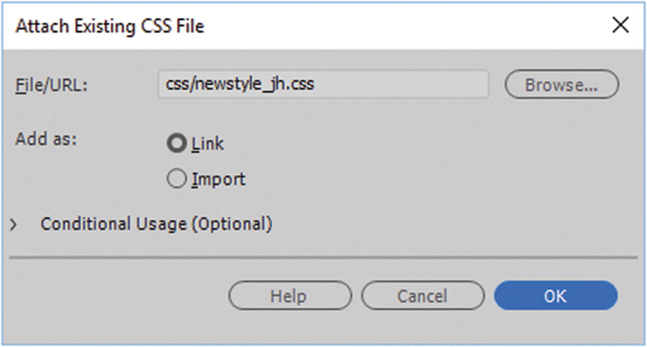
Attach Existing CSS File dialog box
When done, make sure to add as Link and click OK, and the CSS that was created be linked.
You can continue to edit the CSS with Code view or CSS Designer and continue to add background images.
File ➤ New ➤ CSS
Creating a blank CSS document for a new project without attaching it to a file
What Is CSS3?
So far, you have looked at CSS and learned how to attach it to an HTML5 document, and to add background and color images to <div> and semantic elements. I’ve said that some CSS is CSS3, but what does that mean and what other features does CSS3 have to offer?
Like HTML5, the fifth version of HTML, CSS3 is the third version or revision of Cascading Style Sheets. As multimedia changes on the web for different viewing devices, new innovations like animations, transitions, color filters, gradients, and effects like rounded corners have been added. Like HTML5 not all older browsers support the new CSS3 standards, so before using a new feature or property, it is important to check whether it is compatible with the browsers that many of your viewers use. Refer to www.w3schools.com/cssref/css3_browsersupport.asp and https://caniuse.com .
There are also ways to add some backward compatibility to a website, such as an HTML5 shiv or JavaScript to emulate or compensate for how a CSS3 property or HTML5 tag behaves on a website and make it act like the modern version, or at the very least alert the user.
Refer to www.w3schools.com/html/html5_browsers.asp and https://modernizr.com .
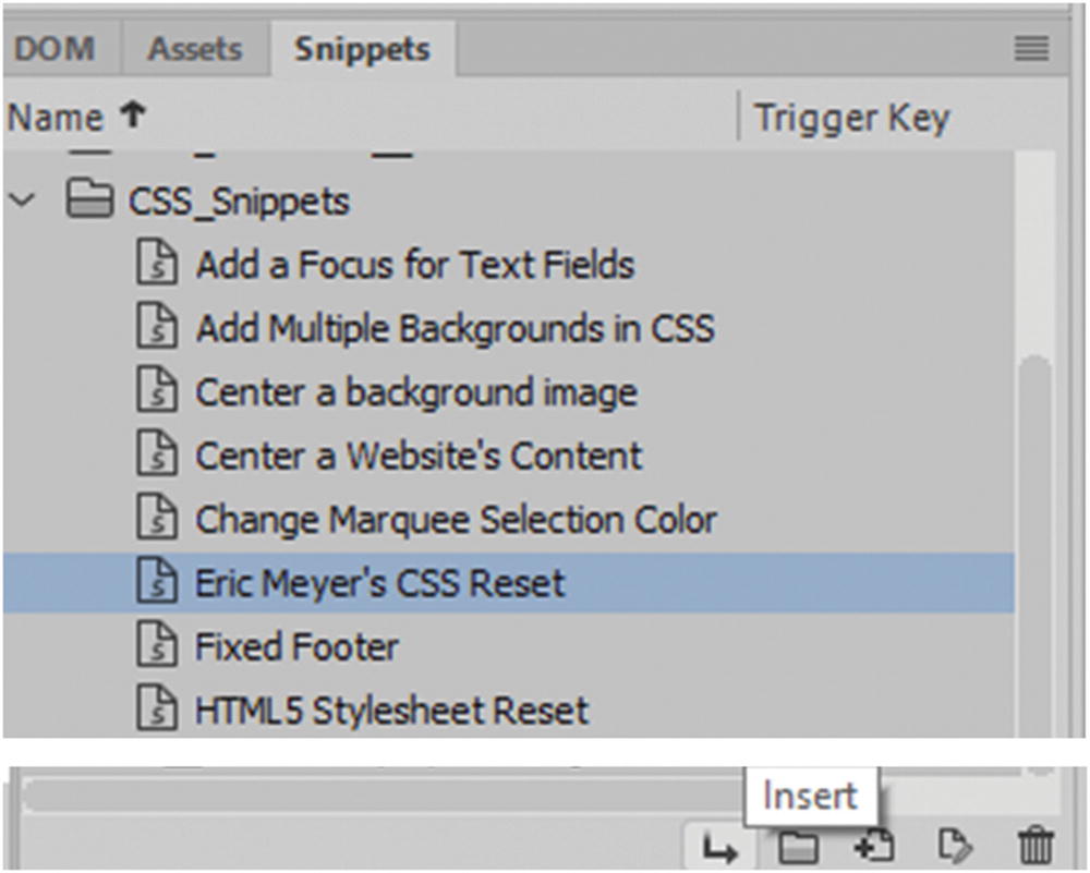
It should be noted that within Dreamweaver CC in CSS Snippets, you can also find a few helpful resources, such as Eric Myers CSS Reset and HTML5 Stylesheet Reset.
Resources in the Snippets panel for working with CSS
Just be aware that some of the snippets are a few years old, so take time to compare them to more recent versions online to see if you should add any other CSS to the file. You may then want to add code as an updated version of the snippet, calling it something like (YourName) CSS Reset. To do so, highlight only the code that you want to be part of your snippet and click the New Snippet button to add it to the library. Also make sure to save a backup elsewhere, in case Dreamweaver CC should every overwrite it during an upgrade.
For the Hot Glass Tango website, I used the built-in resets that came with the Bootstrap files in the CSS folder when I created my layout; you look at this in more detail in Chapter 35.
Having said that, I believe that in backward compatibility there is only so far back you can go, and at some point, you or your clients need to upgrade their browser to embrace the latest changes. From what I have noticed, Internet Explorer, or Edge, is usually the last to accept new CSS3 or HTML5 upgrades, so I would probably not design lower than Internet Explorer 9. Also, if you find that some of your clients’ tablets and smartphones are not accepting some CSS3 when you design your site for responsive media, you may want to leave out CSS3 in that part of the media query and focus on the padding, margins, and text formatting rather than have all queries function the same. You look at media queries in more detail later.
Now let’s continue to look at some CSS examples for working with images in Dreamweaver, some of which involve using CSS3.
Applying CSS to the <img> Tag
These properties have been around for a long time for styling. You can further adjust each side of a border, padding, or margin by value as margin-bottom, margin-left, margin-right, or margin-top.
This order can be applied to padding and borders so that every side is a slightly different thickness, border color, or style.
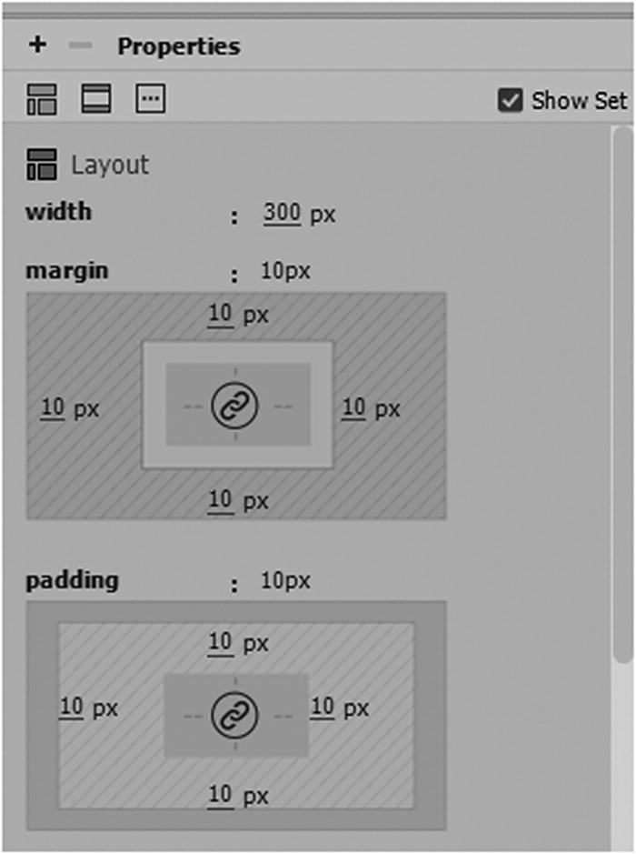
Altering the width, margins and padding in CSS Designer
Border style for each side of and image
Should You Add Background Images to Form Elements?
Alter other tags besides the <div>
These include, but are not limited to, text form fields, button types, and menus/list boxes. All can have a color or a background image added to them. I generally do not add background images (static or animated) to form elements other than maybe a button because with the filling of forms, text is often very detailed and serious work. Having a clashing pattern in an area where a person is trying to fill out text is very distracting and makes the text difficult to read for the viewer. If you do want a color in the background of your field to match your site, stick with solid colors and make sure that the hex code color does not clash with your text.
In Chapter 8 and Chapter 15, I talked about color blindness and how it makes some colors difficult to read. If you are not sure you can always make a screenshot of your form and then bring it into a program like Photoshop and use one of the Color Blindness View ➤ Proof Set Up to see what it looks like and make your CSS adjustments. A similar online example for inspecting color at www.toptal.com/designers/colorfilter .
For now, you focus on the Insert panel’s HTML tab, since most of our work with images and CSS is done here.
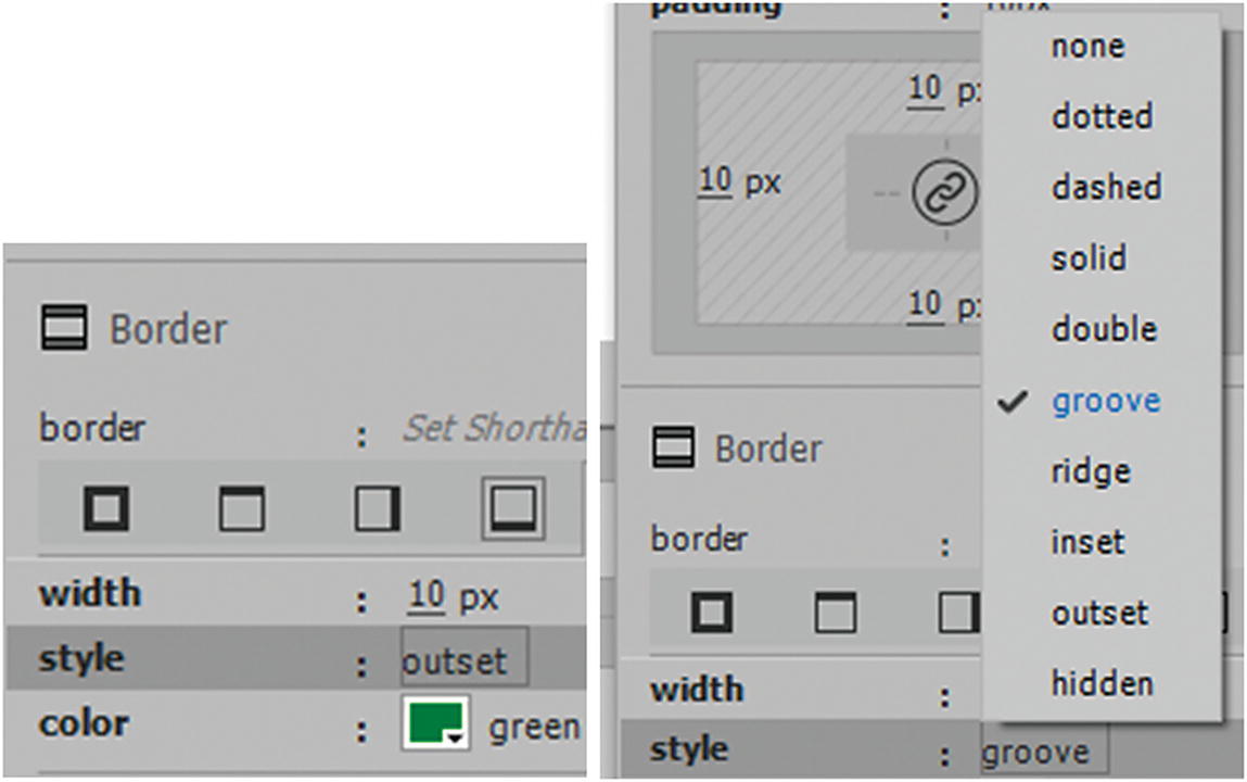
CSS3 Borders
Whether you’re working with a static (JPEG, PNG, GIF, SVG) or animated GIF within a <div> tag or as a CSS background, rather than having a solid-colored border, you can add a border image.
Note
That some older browsers may not support the property border-image, so you can add the vendor extensions -webkit- for safari and -o- for opera. You must add the same URL to each one. In the preceding code example, I used a PNG image in the URL because I found that a GIF did not stretch accurately for some reason. When working with images in CSS3, always run a test of the script in a separate file before adding to the main file. This saves you a lot of headaches if you test new or experimental settings away from the main design.
border-image-source: The path to the image to be used as a border.
border-image-slice: How to slice the border image.
border-image-width: The width of the border image.
border-image-outset: The amount by which the border image area extends beyond the border box or overlaps the actual tag.
border-image-repeat: Whether the border image should be repeated, rounded or stretched (default).
For more information, visit www.w3schools.com/css/css3_border_images.asp .
Rounded CSS3 Borders
For border radius, you can have a background image in your div. This does not appear to work with border-image, so you cannot round your image in the border.
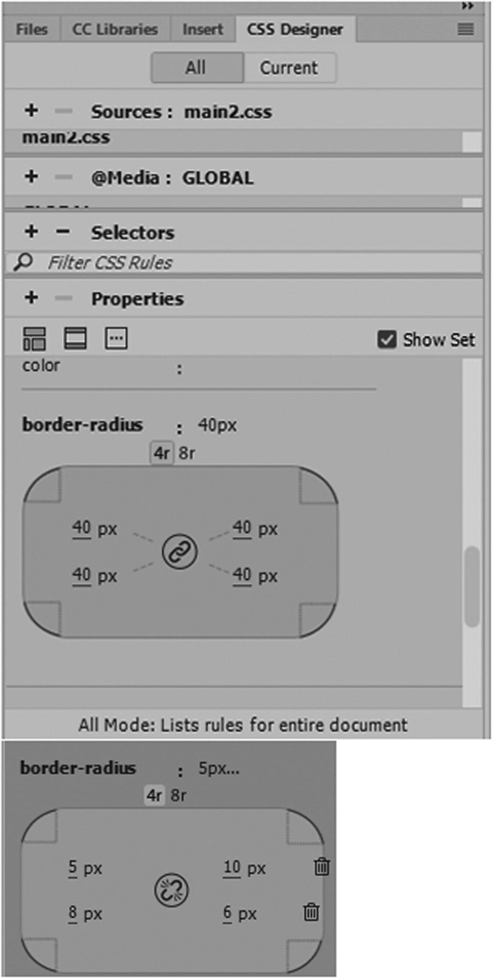
Alter the border radius in CSS Designer
By unlinking, you can set each radius differently.
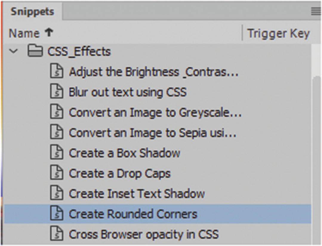
The Snippets panel CSS Effects has further resources for editing your image and div elements
Just make sure when you use this code to check it against the current vendor extensions that are being used.
You can see more examples at www.w3schools.com/cssref/css3_pr_border-radius.asp .
Outline CSS2
There is another way to add a fancy border. You can also add a second stroke, called an outline.
An outline is a line drawn around elements, outside the border edge to make the element stand out.
An outline does not take up space.
An outline is generally rectangular; you cannot adjust each side to be different. It does not allow you to adjust its edge radius independently.
outline-width: by name(thick) or pixel number
outline-style: sets the style, like solid or dotted
outline-color
The outline property is specified as one, two, or three values. The order of the values does not matter. The outline is not a part of the element’s dimensions; therefore, the element’s width and height properties do not contain the width of the outline.
CSS3 box-decoration-break
The box-decoration-break property specifies how the background, padding, border, border-image, box-shadow, margin, and clip-path of an element are applied when the box for the element is fragmented. This is relatively new to CSS3 and is not currently support by Microsoft Edge. It has two settings: slice and clone. You can learn more about it at www.w3schools.com/cssref/css3_pr_box-decoration-break.asp .
Adding CSS3 Filters and Shadows
There are other effects that you can add to your <img> <div> or semantic elements, which don’t have to be added using Photoshop or Illustrator. This makes simple changes easy when you are working with a client on a site.
As you saw in the Snippets panel, there are quite a few CSS3 effects that can be used. The following discusses the CSS that makes this possible.
box-shadow
The values that you can add include horizontal or vertical offset (h-offset and v-offset); this is required to offset the shadow to the right and bottom. This is the default use of the box-shadow property; negative numbers are set to the left and top.
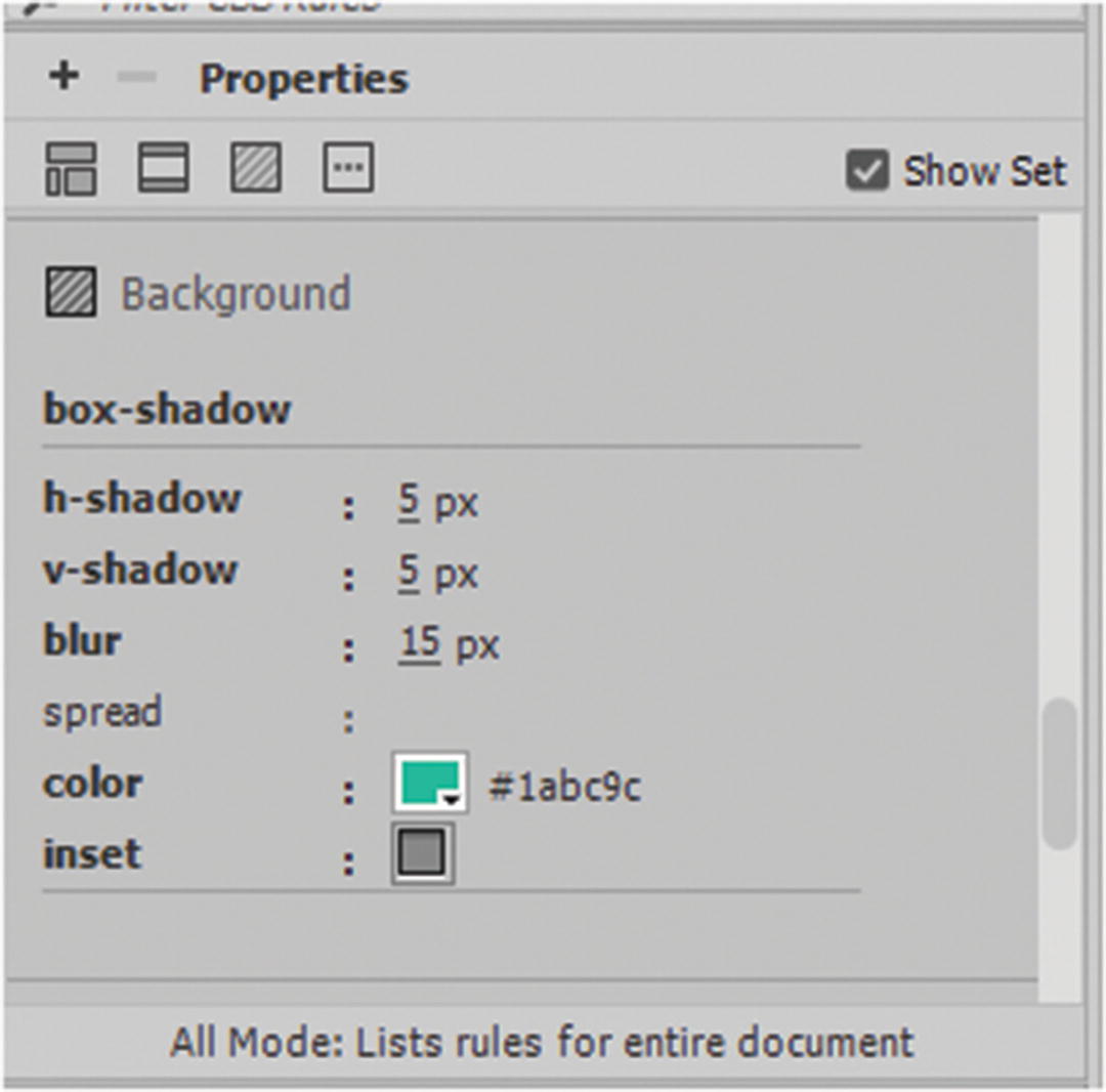
Modify the box shadow using CSS Designer panel’s h-shadow and v-shadow
Box shadows can be used in combination with photos and CSS transform, which you look at in more detail later. For more information, refer to www.w3schools.com/cssref/css3_pr_box-shadow.asp .
text-shadow
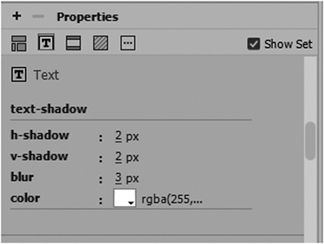
Modify the box shadow using CSS Designer panel
CSS Filters
None : This is default when no filter is applied
blur(px): Applies a blur effect to the image. A larger value creates more blur. If no blur the value is 0.
brightness(%) : Adjusts the brightness of the image. 0% makes the image black while 100% (default of 1) is the original image, if you use a higher value over 100%, like 110% this make the image brighter.
contrast(%): Adjusts the contrast of the image. 0% makes the image black while 100% (default of 1) is the original image, if you use a higher value over 100% this make the image less contrasted.
drop-shadow(h-shadow v-shadow blur spread color) : This filter is very similar to the CSS drop-shadow property; however, be aware that some browsers do not always support the spread values so make sure to compare and test this filter first; for example, filter: drop-shadow(8px 8px 10px gray);.
grayscale(%): Converts the image to grayscale or a desaturation. 0% (0) is default and represents the original image. 100%(1) make the image completely gray (used for black and white images); however, negative values are not allowed.
hue-rotate(deg) : Applies a hue rotation shift on the image. The value defines the number of degrees around the color circle the image samples be adjusted. 0 deg is default, and represents the original image whereas the maximum value is 360 degrees.
invert(%) : Inverts the samples in the image. 0% (0) is default and represents the original image.100%(1) make the image completely inverted, but negative values are not allowed.
opacity(%): Sets an opacity level for the image. The opacity-level describes the transparency-level (alpha), where: 0% is completely transparent. 100% (1) is default and represents the original image (no transparency or alpha).
saturate(%): Saturates the image. 0% (0) make the image completely un-saturated. 100%(1) is default and represents the original image. Values over 100%, like 110% provides super-saturated results; however, negative values are not allowed.
sepia(%) : Converts the image to sepia tone. 0% (0) is default and represents the original image. 100% (1) make the image completely sepia; however, negative values are not allowed.
url() : This is a link to the location of an XML file that specifies an SVG filter and may include an anchor to a specific filter element. You saw SVG filters in Illustrator CC being used; for example, filter: url(svg-url#element-id).
Adjust the brightness and contrast of an image
Convert an image to grayscale
Convert an image to sepia
Cross browser opacity
Invert the colors of an image
Rotate the hue of an image
Saturate an image
Be aware the latest browser Microsoft Edge does allow you to view these filters. Internet Explorer does not. There are some JavaScript syntax alternatives you can insert, so make sure to check W3Schools ( www.w3schools.com/cssref/css3_pr_filter.asp ) if this is a concern.
Also make sure to add the correct vendor extensions for those browsers that require it; for example, -webkit-; otherwise, it would be best to do the blending in Photoshop or Illustrator so that your audience sees the correct image.
Image Masking in CSS3?
Another filter that in the future we might be able to look forward to is Mask this is still in the experimental stages, but allows you to mask an element. In addition, you may be able to work with gradients with the masking.
For more information, visit https://developer.mozilla.org/en-US/docs/Web/CSS/mask-image .
Adding Custom Images to Bullets
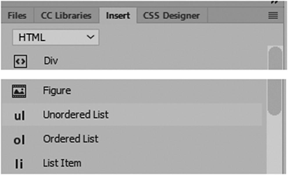
Add list item bullets
As a review, unorder lists <ul> use bullets each part of the list is a list item or <li>. There are about 3 default sets (disk, circle, square) and you have the option of setting the list to none, if you don’t want bullet which can be useful if you are creating some form of navigation.
An ordered list <ol> uses list items <li> as well but rather than being the same bullet or bullet set they are a set of numbers (1,2,3) letters (a,b,c, or A,B,C) or roman numerals (i,ii,iii or I, II, III). These can be added via an attribute of type being added to the tag; for example type="A". For more information on lists, refer to www.w3schools.com/html/html_lists.asp .
However, what if you want custom bullets from an image that is static GIF or PNG, or a GIF animation?
Earlier you looked at pseudo class and pseudo elements. They can be used to target certain elements or the actions of a certain element such as hover. However, you can also target where a custom bullet start and stop. The first thing to do is remove the original default bullets of the unordered list, list-style: none;. Then in the <li>, add the new bullet using the :before content property (pseudo element) before the words of each bullet. The :after pseudo element adds them after each word. If you just plan to use symbols, W3Schools has an entire entity reference chart of choices at www.w3schools.com/cssref/css_entities.asp .
This creates an asterisk bullet. There are many clip-art symbols to choose from in the list. And you can color to a separate color from the text.
However, our main goal here is to add an image not a symbol. To do this, you must make a small symbol 32×32 pixels or less with a transparent background; it can be a GIF or PNG.
This sets the list-style-type, list-style-position, list-style-image.
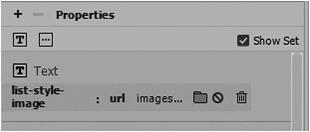
Add an image or GIF animation to a replace a list item bullet using CSS and the CSS Designer panel
As with the content property, you can use pseudo elements (:before and :after) to target placement but you could go even further using [target attributes] and your content properties, as you look at in Chapter 37, for when you need to have thumbnail reference links for images that don’t display.
Creating CSS Animation Transitions and Transforms
So far with CSS, you have looked at some ways to enhance your images and tags using CSS. You also saw that many of these examples are stored in Dreamweaver’s Snippets panel, and you can add your own examples to the Snippet panel library. As you explore the Snippets panel, you may come across a few more CSS3 items that you have never used that relate to animation.
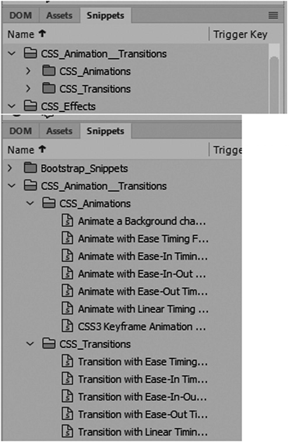
Examples of animation and transitions can be found in the Snippets panel
Let’s look at the main properties of each CSS type of CSS.
Note
While the examples in the Snippets panel do work, I have noticed that in some older version of Dreamweaver CC 2017 the vendor prefixes for the Opera browser show up as a zero rather than a lowercase o; for example, -0-animation should be -o-animation. I did not encounter this in the CC 2018 version, so from what I can see, the Adobe designers have corrected this error in the latest version. Also note that in most cases of backward compatibility, the vendor prefixes that are currently used are -moz- or -webkit-. The most modern browsers, however, don’t require this extension in the properties. Nevertheless, this is useful information to keep in mind depending on what audience you are design for or if you are working with CSS that a client designed a few years ago.
CSS3 Animations
As you saw in Photoshop CC and Animate CC, animations are made up of keyframes and properties that control the direction and duration of the moving object. The same is true with CSS3 in the form of code.
An animation in CSS3 lets an element such as a <div> tag gradually change from one style to another. This can be done using the selectors and properties of To - From or by percentage and their respective values. You can change as many CSS properties as you want for as many times as you want.
@keyframes : Specifies the animation code. Animation happens when the CSS styles change gradually from one to another; during this time you can the set of CSS styles many times. Properties can be found within the brackets {} of the key frame. Examples are: from{starting property: value;), to{ending property: value;} or percent, which lets you be more accurate in your animation changes.
animation: A shorthand property for setting all the animation properties.
animation-delay : Specifies a delay for the start of an animation if you don’t want it to start right away such as animation-delay:2s; which means 2 seconds of delay. Then the animation-duration can begin. Negative duration can be used as well such as animation-delay:-2s; This moves the animation 2 seconds into the animation duration or as if it had already been playing for 2 seconds. It can also be defined in milli-seconds (ms).
animation-direction : Specifies whether an animation should be played forward, backward, or in alternate cycles. The default is animation-direction: normal; This runs the animation in the original order set up. A reverse setting plays the animation backward. Other options include alternate (plays forward then backward) and alternate-reverse (plays backward then forward). In alternate and alternate-reverse, you need to set the animation-iteration-count: 2; otherwise, it does not play both the forward and reverse movements, only one way.
animation-duration : Specifies the time that an animation should take to complete one cycle; for example, 4s means 4 seconds. The default is 0 seconds (0s) if this property is not added. It can also be defined in milliseconds (ms).
animation-fill-mode : Specifies a style for the element when the animation is not playing. It can be before it starts, after it ends, or both times; for example, animation-fill-mode: both;.
none : This is the default value. Animation does not apply any styles to the element before or after it is executing.
forward : The <div> element retains the style values set by the last keyframe (depends on animation-direction and animation-iteration-count).
backward : The <div> element gets the style values set by the first keyframe (depends on animation-direction) and retains this during the animation-delay period.
both : The animation follows the rules for forward and backward, extending the animation properties in both directions or times in the keyframe. (from and to).
animation-iteration-count : Specifies the number of times an animation should be played. You can play as many times as you like. For example, animation-iteration-count:3; means three times, but if you wanted an infinite loop, you could set it to animation-iteration-count: infinite;.
animation-name : Specifies the name of the @keyframes animation. This is the name that is tied to the animation; for example, see how colorchange is referenced as the animation.
animation-play-state : Specifies whether the animation is running (default) or paused; for example, animation-play-state: paused;.
animation-timing-function : Specifies the speed curve of the animation. This effects the movements as to whether they speed up or slow down within the animation, this can make movements fluid and smooth. You saw examples of this in Animate CC in Part 4 and the same concept can be applied to animation of CSS3.
ease : An animation starts slowly start, speeds up, and then ends slowly (this is default setting).
linear : An animation with the same speed from start to end.
ease-in : An animation with a slow start.
ease-out : An animation with a slow end.
ease-in-out : An animation with a slow start and end.
step-start : Equivalent to steps(1, start).
step-end : Equivalent to steps(1, end).
steps(int,start|end) : A stepping function with two parameters. The first parameter specifies the number of intervals in the function. It must be a positive integer (greater than 0). The second parameter is optional; the value "start" or "end", and specifies the point at which the change of values occurs within the interval. If the second parameter is omitted, it is given the value "end".
cubic-bezier(n,n,n,n) : Lets you define your own values in a cubic-bezier function. The values are numeric values from 0 to 1; for example,
If you find additional animations that you like, save them in a file as a backup and add them to the Snippets panel for later use.
CSS Transitions and Transitions Panel
Transitions are in the Snippets panel. Refer to Figure 32-57. Since they are found in the same folder, are they the same as CSS animations?
Transitions allow you to change property values smoothly (from one value to another) over a given duration. For example, when you hover over a <div> tag element, the CSS of transition effect causes the element to grow or shrink.
the CSS property that you want to add an effect to
the duration or time of the effect
This the element changes on the hover state. Its width grows to 300px;. You could also add a height and even a color change for the hover. When the mouse is removed, the shape gradually changes back to its original size.
Like animation, many of the properties are similar except that they have the word transition before instead of animation. For example, animation-delay is now transition-delay.
transition : A shorthand property for setting the four transition properties into a single property; for example,
transition-delay : Specifies a delay in seconds (s) or milliseconds(ms) for the transition effect before starting; for example, transition-delay: 1s;. The default value is 0s.
transition-duration : Specifies the number of many or milliseconds a transition effect takes to complete.
transition-property : Specifies the name of the CSS property the transition effect is for; for example, transition-property: width;. This target the width. If you want to target the height, change it to transition-property: height;.
transition-timing-function : Specifies the speed curve of the transition effect; this is like the animation properties.
ease : A transition effect with a slow start, then speeds up, and then ends slowly (default setting).
linear : A transition effect with the same speed from start to end.
ease-in : A transition effect with a slow start.
ease-out : A transition effect with a slow end.
ease-in-out : A transition effect with a slow start and end.
step-start : Equivalent to steps(1, start).
step-end : Equivalent to steps(1, end).
steps(int,start|end) : This is a stepping function with two parameters. The first parameter specifies the number of intervals in the function. It must be a positive integer (greater than 0). The second parameter, which is optional, is either the value “start” or “end”, and specifies the point at which the change of values occurs within the interval. If the second parameter is omitted, it is given the value “end”.
cubic-bezier(n,n,n,n) : This lets you define your own values in a cubic-bezier function. The values are from 0 to 1; for example,
You would also change your :hover state to something like .linearTransition:hover or whatever name in the CSS.
Unlike the CSS3 animation, Dreamweaver CC has a special panel for transitions called the CSS Transition panel.
CSS Transition Panel
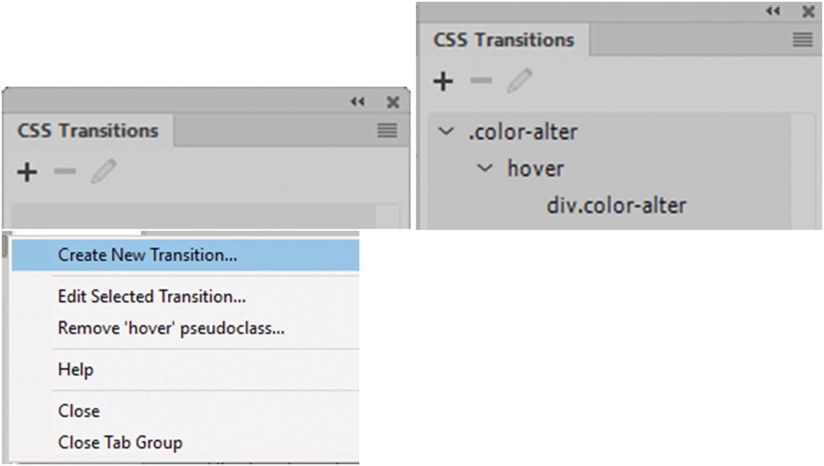
The CSS Transitions panel
To add or apply a new transition to an element, make sure that you select the <div> tag that you want to apply the new transition to, click the plus (+) icon, to remove the code select the transition in the panel and click the minus (–) icon. To edit, select the transition in the panel and then click the Pencil icon. You can also use the submenu to access the same icons found on the panel or by right-clicking the transition in the panel.
Note
For this transition to be viewable in your browser, you need to add the class to a <div> tag either before or after you create the transition with a starting width, height, and background color or background image; otherwise, the animation may not be visible. You can use the CSS Designer panel or enter the information in Code view in your external CSS file as seen in the following code example.
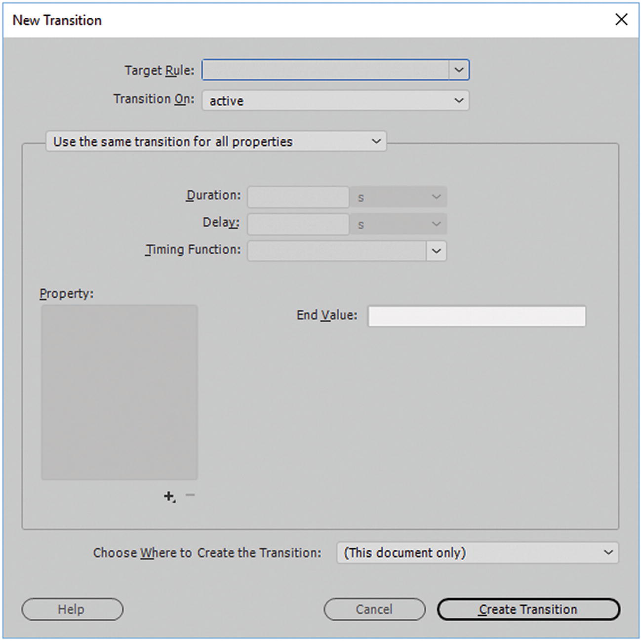
The New Transition dialog box
Target Rule : This is a current class or rule that you have created and can select from the drop-down menu. If there is no current target, then you can enter your own. In this case I chose the class “.color-alter”. Refer to Figure 32-52.
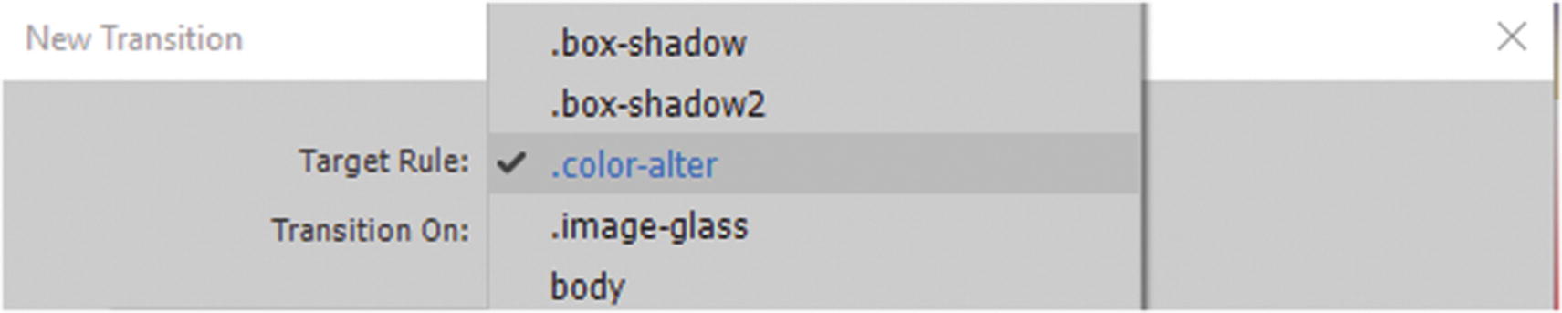
Set a Target rule
Transition On : Allows the user to choose the state the transition is triggered on. There are several pseudo classes to choose from. Active are used with a link like an a:link. Checked, disabled, enabled, focus, and indeterminate are used with various <input> form elements. Hover is used when hovering over a <div> tag element, but it might be used for a link as you would :target with an anchor; for example, #news:target. This area does not allow you to apply the same transition in the same class again. For example, if you already used the :hover pseudo class, when you try to apply it again, it is gone from the list. Only a new class with a different name that never used :hover allows this option to be available again. Refer to Figure 32-53.
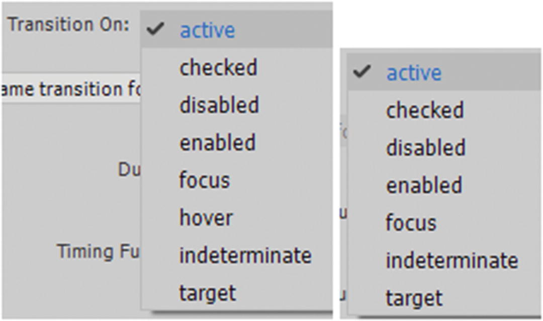
Transition states once used are not available in the list for the current class
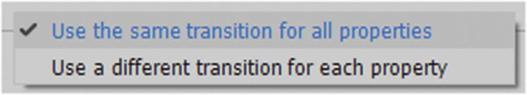
Alter how you want the transition to be applied
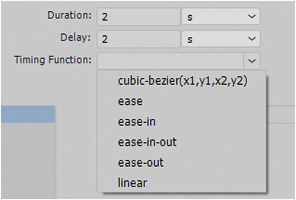
Set duration, delay, and timing function
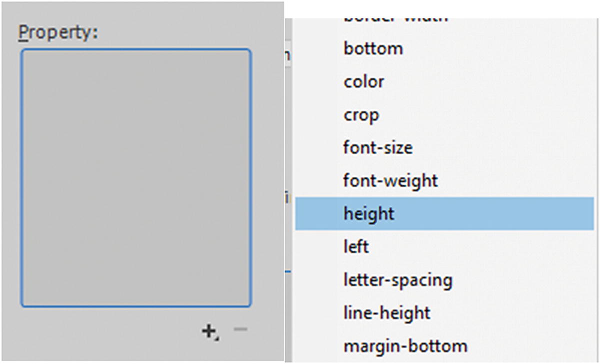
Set the end value properties
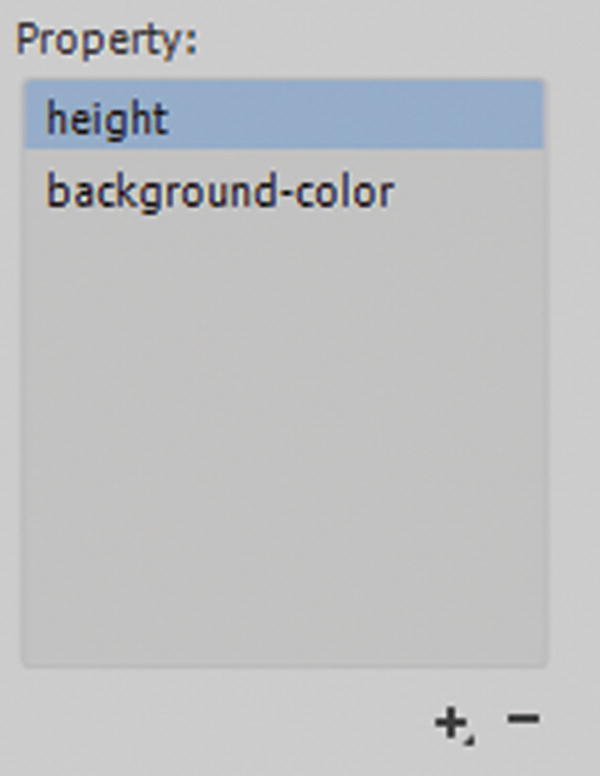
Properties added to the list
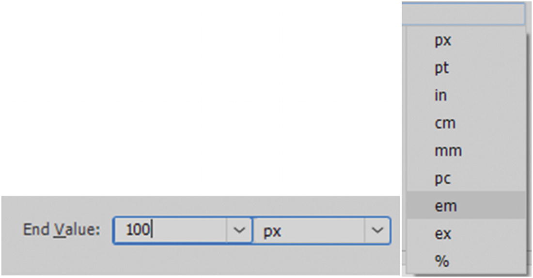
Set the end value
Once the end value is entered, press Enter or Return on your keyboard to confirm it.
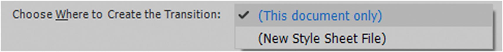
Determine where you want the CSS to appear internal or external
If you are experimenting, I recommend keeping your transition in a new style sheet file. After you have perfected it, copy it into your final CSS file with your other CSS.
You may want to keep all your CSS transitions in a separate CSS file to keep them organized and separate from other CSS; the choice is up to you. Just make sure that the external file links correctly to your document.
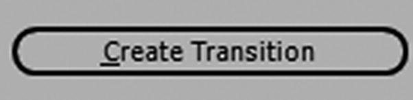
Click the Create Transition button to confirm the transition settings
Once you exit the dialog box, Dreamweaver generates your CSS transition in (short form) based on the setting you provided in the current document or in a new CSS file.
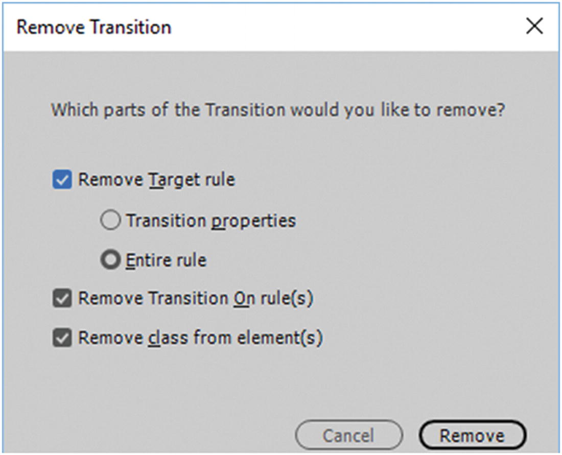
Remove Transition dialog box
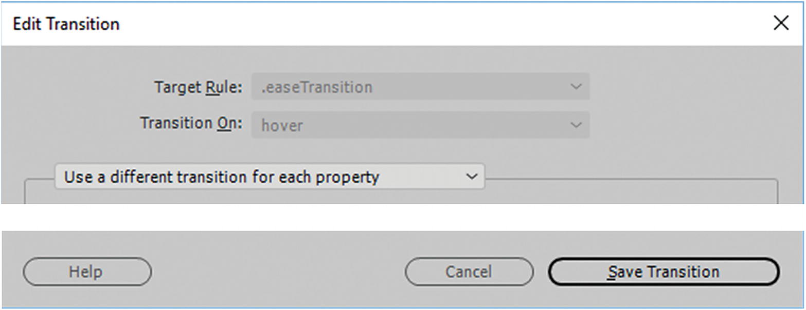
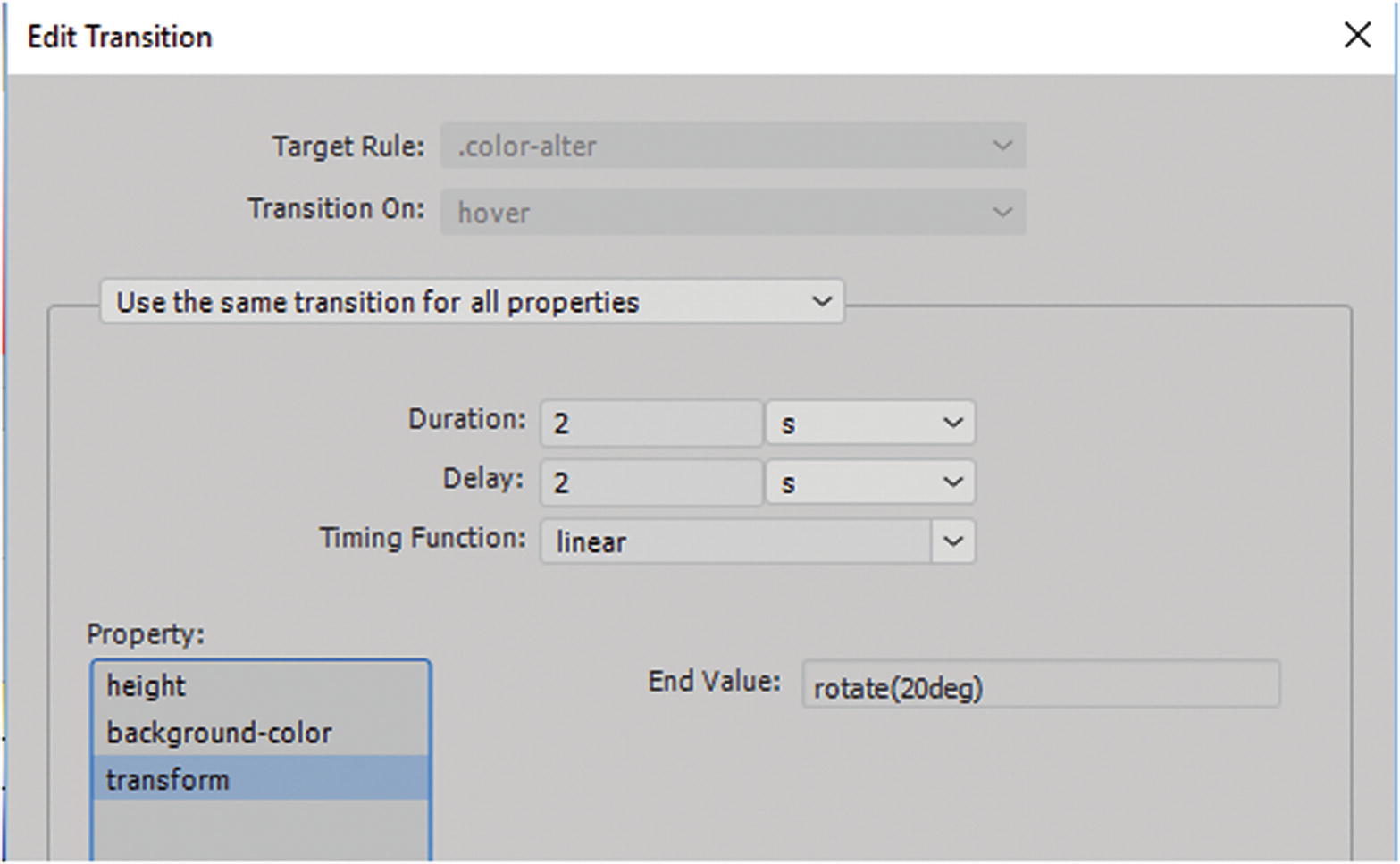
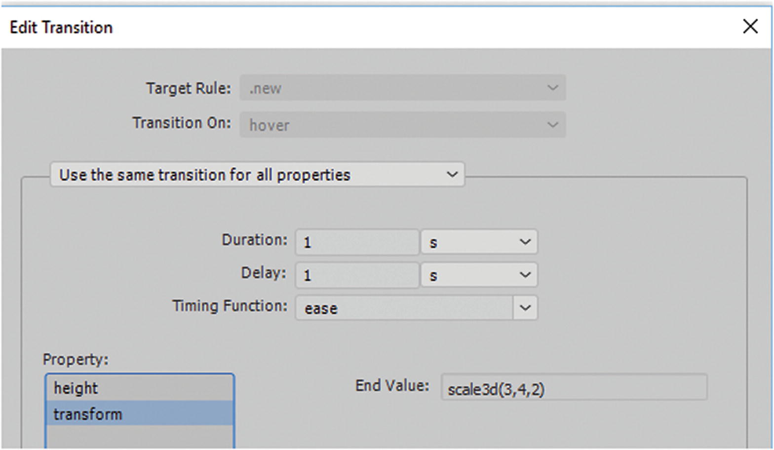
Edit Transition dialog box
When done editing, click Save Transitions to save the changes. When you switch to Live view, the new content should be functioning automatically.
Note
If you noticed that you applied the class to the wrong tag, for instance <body>, you can delete it in Code view. Then select the correct tag, and using the Properties panel, apply the class to the correct <div> tag.
Next, you look at the third type of CSS3 animation: transforms.
CSS Transforms 2D and 3D: It’s All About Perspective
Transforms let us do some amazing things with <div> and semantic elements. In combination with CSS animations (from, to) or CSS transitions that use the :hover pseudo class, you can translate, rotate, scale, and skew elements in two dimensions (x and y) or in three dimensions (x, y and z). The <div> or element changes shape, size, and position. Unfortunately, there are not a lot of examples available in the Snippets panel other than Reverse Text Using CSS and Rotate and Element (3D transform).
You can find more examples on the W3Schools website at www.w3schools.com/css/css3_2dtransforms.asp and www.w3schools.com/css/css3_3dtransforms.asp .
Because transforms are newer, they rely on vendor prefixes for older browsers, such as -webkit-, -ms-, or -o-. Always check which prefixes should be added for any new CSS3 elements to reach the largest audience; for example, as -ms-transform: translate(50px, 100px); for Microsoft Edge users. At some point, when all the modern browsers agree, you just have to write transform: translate(50px, 100px); without the vendor prefix.
2D Transform
transform : Applies a 2D or 3D transformation to an element or <div>.
transform-origin(x%,y%) : Allows you to change the position on transformed elements. It must be used with the transform property. You can use negative and positive presents or values, 0% is the default; for example,
Other values are x (left, center, right and length) and y (top, center, bottom and length).
matrix(n,n,n,n,n,n): A 2D transformation, using a matrix of six values, combines the 2D transform methods into one; for example, matrix(scaleX(),skewY(),skewX(),scaleY(),translateX(),translateY())looks something like transform: matrix(1, –0.3, 0, 1, 0, 0);. Note that rotation appears as a separate property.
translate(x,y) : A 2D translation, moving the element from its current position along the x axis and the y axis; for example, transform: translate(20px, 100px);. Moves 20 pixels right and 100 pixels down.
translateX(n) : A 2D translation moving the element along the x axis.
translateY(n) : A 2D translation moving the element along the y axis.
scale(x,y) : A 2D scale transformation changing the elements width and height or making the <div> larger or smaller; for example, transform: scale(3, 4);. This would make the <div> three times the original width and four times the original height. To decrease a <div> to a quarter of its size you could write, transform: scale(0.25, 0.25);.
scaleX(n) : A 2D scale transformation changing the element’s width.
scaleY(n) : A 2D scale transformation changing the element’s height.
rotate(angle) : A 2D rotation; the angle is specified in the parameter as clockwise or counter-clockwise; for example, transform: rotate(20deg);. If you change to –20deg, this rotates it in a counter-clockwise direction.
skew(x-angle,y-angle) : A 2D skew transformation along the x axis and the y axis; for example, transform: skew(30deg, 10deg);. When a second parameter is not written, it is assumed to be 0 degrees. A negative degree skew the X or Y – axis of the <div> in the opposite direction.
skewX(angle) : A 2D skew transformation along the x axis.
skewY(angle) : A 2D skew transformation along the y axis.
The Transition dialog box
3D Transform
Much of the same properties work with 3D transforms, except you are adding the z axis, or a third dimension. CSS3 makes the transform appear that it has changed in 3D space, and if you apply it to a transition, it makes the <div> element appear as if it is moving in a 3D way. 3D transform works with all modern browsers, but you may need to add vendor prefixes to the properties.
transform : Applies a 2D or 3D transformation to an element or <div>.
transform-origin(x%,y%,z) : Allows you to change the position on transformed elements. It must be used with the transform property. You can use negative and positive presents or values, 0% is the default; for example,
transform-style : The way nested elements are rendered in 3D space. This property must be with the transform to work correctly. The two main options are flat (default: child elements do not preserve the 3D position but are against the parent element) and preserve-3d(child elements preserve 3D position in their own space); for example,
perspective : Specifies the perspective on how 3D elements are viewed, and alters it. When defining the perspective property for an element, the child elements get the perspective view, not the parent element. For example, add perspective: 150px; :
It is the inner class (class2) or child that receives the perspective and not (class1), which in this case is the parent.
perspective-origin(x%,y%) : The bottom position of 3D elements for the x and y axis. The child elements get the positioning, not the parent element. This element must be used with the perspective property and can only be used on 3D transform elements; for example,
backface-visibility : Defines whether or not an element should be visible when not facing the screen. This is an interesting effect that allow you to rotate or reverse an image. You can also determine whether the back be visible or hidden.
matrix3d(n,n,n,n,n,n,n,n,n,n,n,n,n,n,n,n) : Defines a 3D transformation, using a 4x4 matrix of 16 values. This one requires a bit of experimentation to figure out what numbers relate to which functions, but it essentially follows the same order as the 2D transform except that now you have added a z axis. I recommend using the separate functions if you are not sure what each one is for.
translate3d(x,y,z) : A 3D translation or movement of the element from its current position along the x, y and z axis; for example, transform: translate3d(10px, 0, 100px). Positive values move down, right and forward while negative values move up, left and backward or smaller;
translateX(x) : A 3D translation using only the value for the x axis.
translateY(y) : A 3D translation using only the value for the y axis
translateZ(z) : A 3D translation using only the value for the z axis (does not allow a percentage value.)
scale3d(x,y,z) : A 3D scale transformation; for example, transform: scale3d(2, 0.7, 0.2);. One would be the default, but 2 would be twice the size and 0.5 would be equivalent to 50% of the size of any axis. Positive and negative numbers can be used to move the element in a different axis.
scaleX(x) : A 3D scale transformation giving a value for the x axis.
scaleY(y) : A 3D scale transformation giving a value for the y axis.
scaleZ(z): A 3D scale transformation giving a value for the z axis.
rotate3d(x,y,z,angle) : A 3D rotation. The numbers of x, y, and z could be a coordinate of the vector shape describing an axis of rotation. Positive numbers rotate clockwise. Negative numbers are also used of you are rotating counter-clockwise; for example, transform: rotate3d(0, 1, 0, 60deg);.
rotateX(angle): A 3D rotation along the x axis.
rotateY(angle): A 3D rotation along the y axis.
rotateZ(angle): A 3D rotation along the z axis.
perspective(n): Defines a perspective view for a 3D transformed element or elements depth. Zero or lower value give a pronounced perspective while higher value creates a foreshortening; for example,
The Transition dialog box
Summary
In this chapter, you looked at how CSS can affect tags and elements. You looked at various CSS3 properties and learned how they can be edited in various panels in Dreamweaver. You also looked at animations, transitions and transforms.
In the next chapter, you look at how to enhance your site further for mobile web design.