In this chapter, you look at how to add images on a page and how to tag elements. You then discover how to add a logo to your browser’s tab and how to use HTML5 resources in the Snippets panel.
Note
This chapter does not have any actual projects; however, you can use the files in the Part 6 folder to practice opening and viewing for this lesson. They are at https://github.com/Apress/graphics-multimedia-web-adobe-creative-cloud .
Now that you have saved your first HTML5 file, let’s look at where you can insert images and how to interact with them on the page.
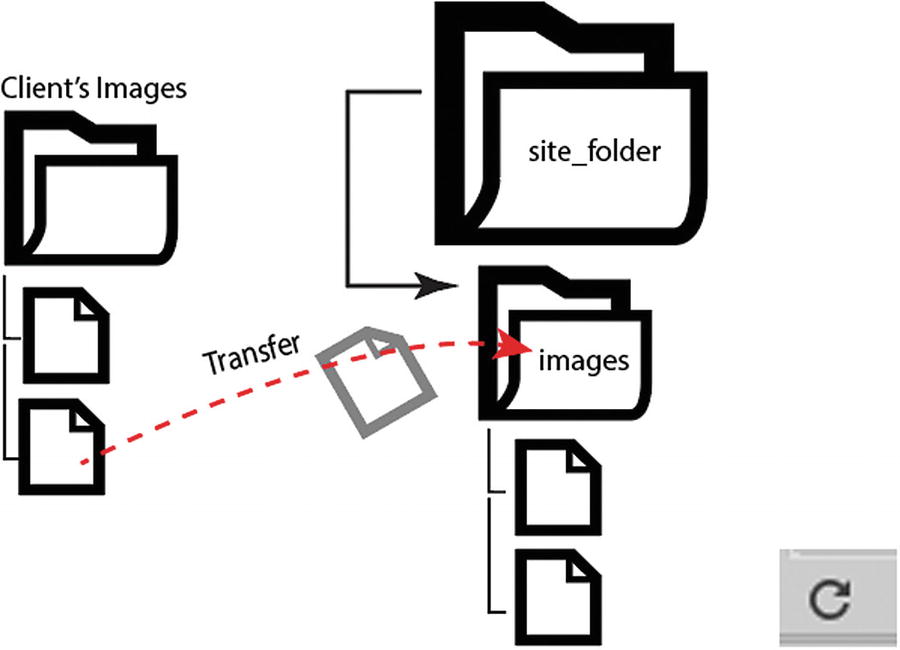
When you first create a new site in Dreamweaver CC, you need to make sure that you have a local site root folder into which you put all of your HTML pages. Along with pages, it is important to store all of your images within the root folder or root directory along with the index.html file.
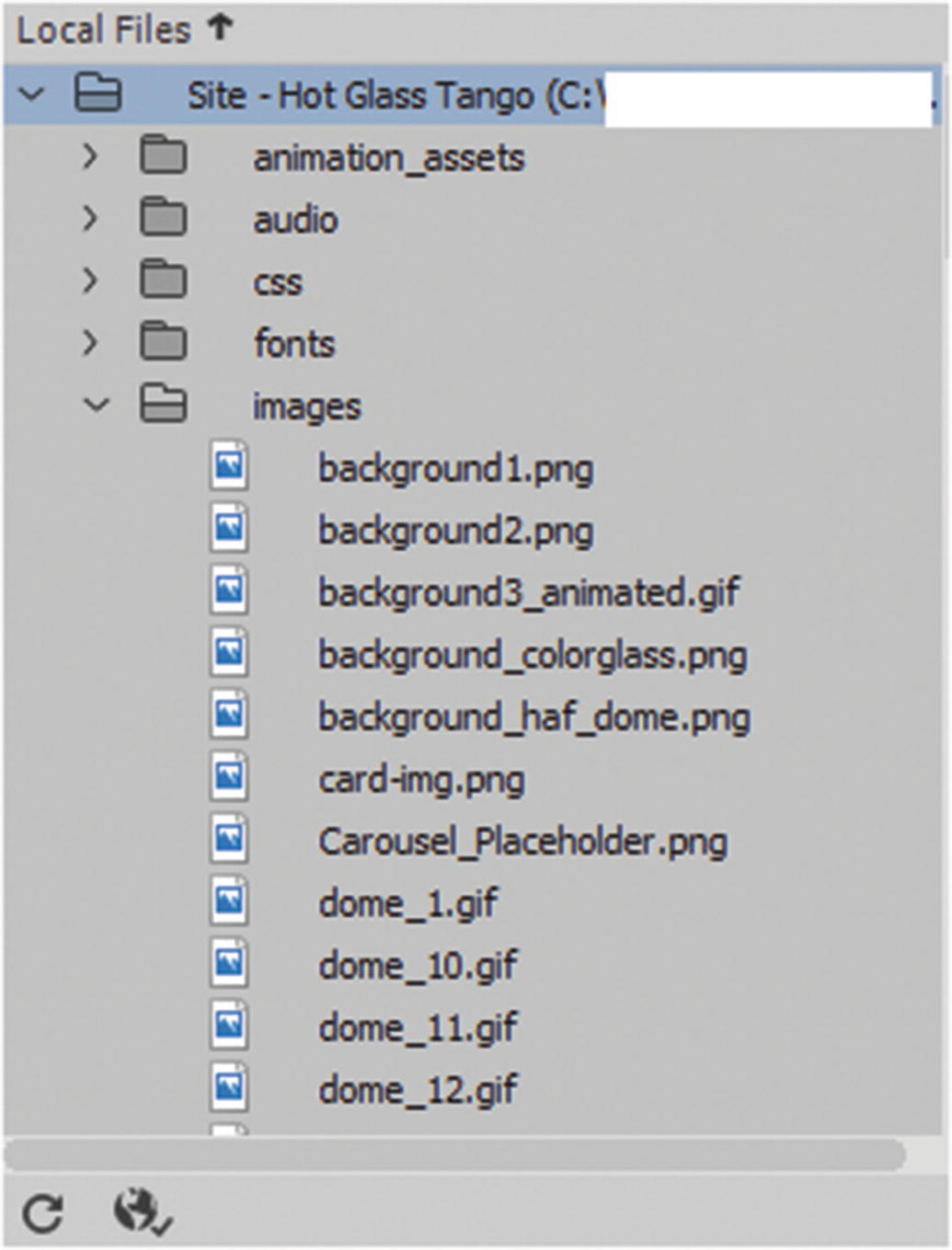
Images for the site are stored in the images folder
Bitmap (.bmp)
JPEG (.jpg)
PNG (.png)
GIF (static and animated) (.gif)
SVG (vector) (.svg)
You could also include PDF files in the images folder if you want to; however, if you have any, I recommend saving them in their own folder (e.g., pdf_documents). Either way, make sure to keep the folder name lowercase because some servers do not like the folders to have uppercase letters.
You can create subfolders within your images folder to keep files separate and organized
You can create subfolders within your images folder to keep files separate and organized
This creates a new folder that you can rename. You can select the images folder and choose File ➤ New folder to create a subfolder, like gif_animations or any name you choose.
Note
When you create a folder or an HTML webpage for your site, you must follow certain naming conventions. Always name the folder or file with lowercase letters and without spaces. Start with a letter. Do not use special characters. You can use numbers, hyphens, underscores, and periods. For instance, you can use an underscore (_) if you require a space for the words. Finally, keep the file names short. Many operating systems are case sensitive. If you have a file called AboutMe.html and another called aboutme.html, the server might become confused about which to display. So proper naming conventions are important. The same is true for image links. There are some folders that Dreamweaver CC creates and allows to be capitalized, which you look at when you review templates and library items in Chapter 35. The names of those folders should not have lowercase letters because corruption of the folder and other files linked to them can occur. If Dreamweaver names or creates the folder, it’s probably best to leave it as it is.
Adding More Images to the Folder
Add images to your site, then use the refresh icon at the bottom on the files panel so that you can see them
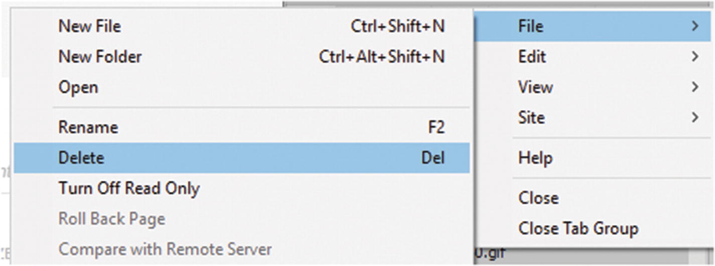
The Files panel has options for editing and deleting files
When you are creating a new site, your first HTML page or homepage, is index.html, which is a common name for sites on servers. This is known as your default page and all sites should have one. When a user types in www.mysite.com, this automatically takes them to the index.html page. Users do not have to type www.mysite.com/index.html.
This is because the browser knows that if it locates the index.html page, it is the website’s homepage and that is the starting point. If you were to call your default page home.html instead of index.html, your browser would become confused and would not be able to locate the main page when www.mysite.com is typed in. The user might receive a message like “Cannot locate this page…”, which is not what you want. The only way to access this page is to type www.mysite.com/home.html,; this just adds length to an already long name. The point is, whatever the first page of your site represents, it should be called index.html to avoid browser confusion. Having said that, any HTML page you create can contain images.
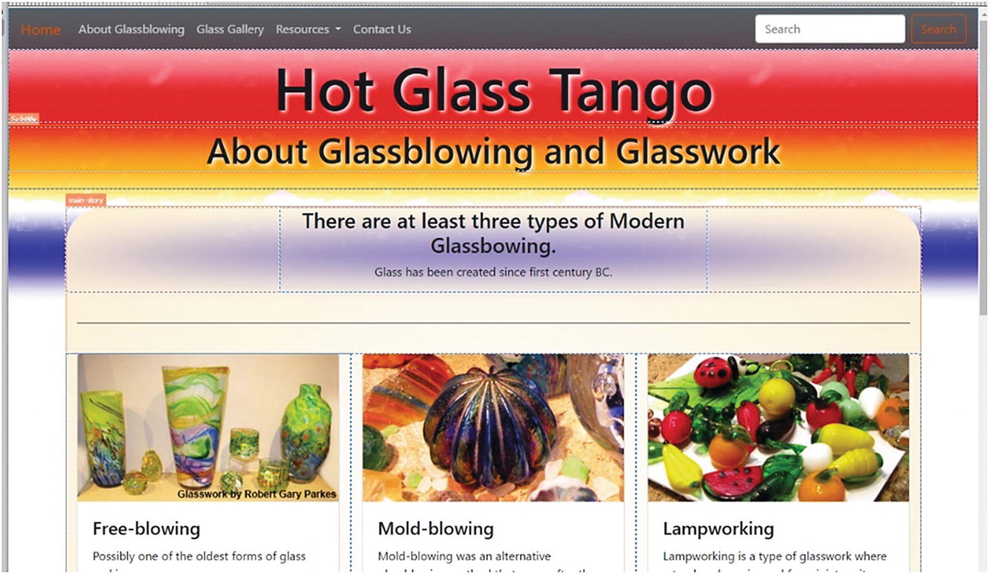
The pages in Hot Glass Tango use a template that I modified with a Bootstrap layout, which uses viewports and makes the site mobile-friendly. If you would like to know more about templates, I discuss them in more detail in Chapter 35. For now, you’ll just focus on the blank page you created in Chapter 30. You can also read Adobe Dreamweaver CC Classroom in a Book by James J. Maivald for a more in-depth review of templates.
Inserting Images on an HTML Page
In Dreamweaver’s Design view, you see what is going on in the <body> </body> tags. Currently, there is no content between the <body> tags, so no content displays on your webpage; the page is white. The Hot Glass Tango about.html page has at least three images within various <div> tags.
To add images to a blank area on a page, you can point your cursor between the body tags (<body> </body>) or <div> tags in Code view, or click the cursor on a blank area of the page in Design view. Either way gets the same result.
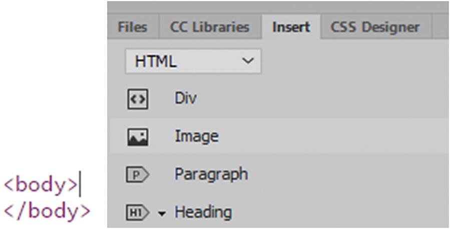
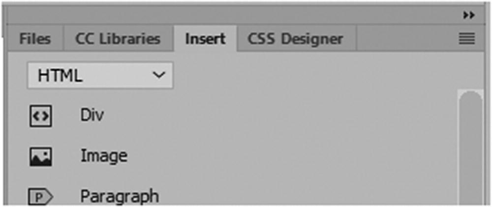
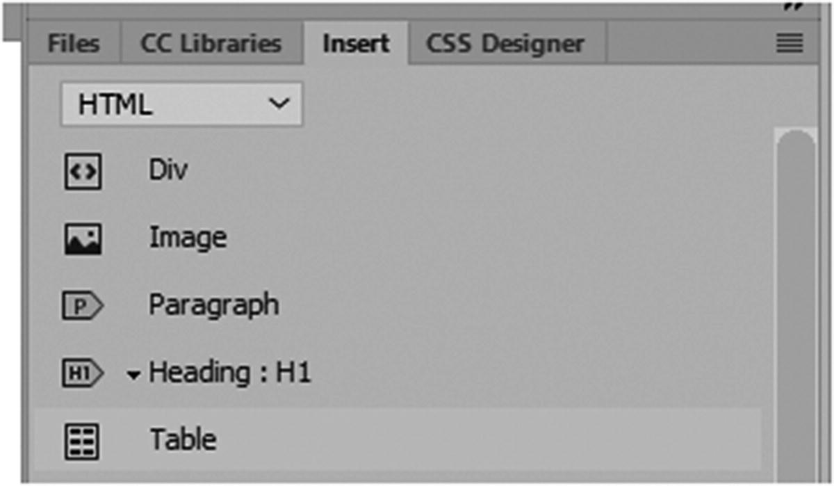
Insert Panel
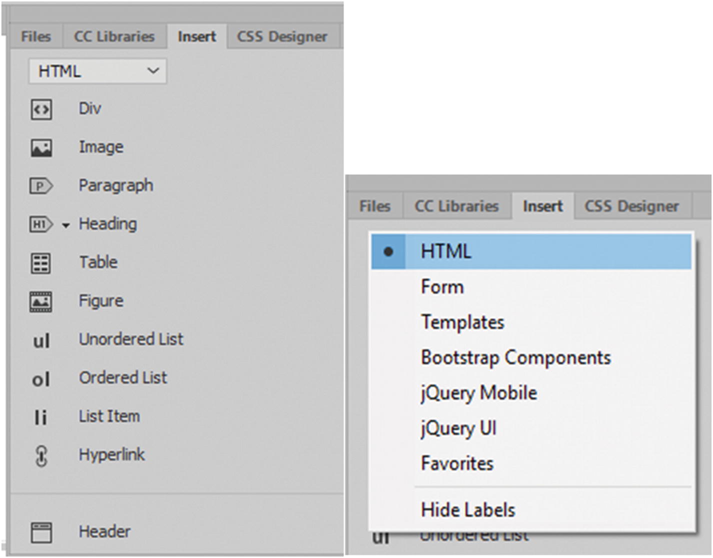
The Insert panel with its tab to display various options
All the items in the Insert panel are also in the main menu Insert drop-down
You choose how to access your images for insertion.
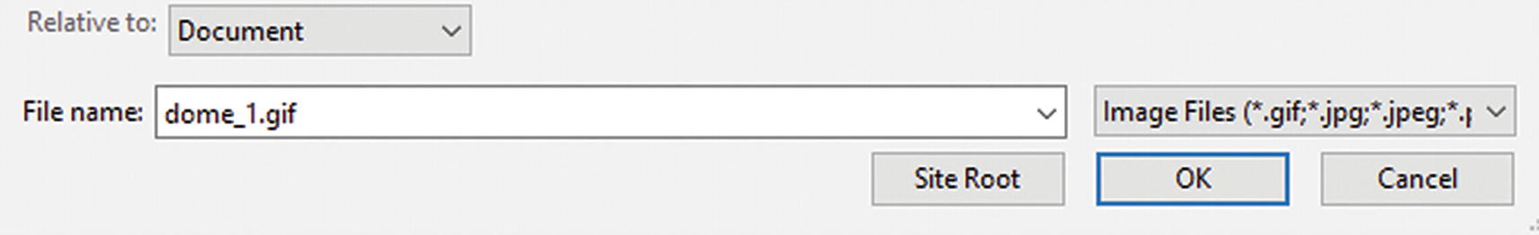
Insert an image using the Insert panel
Locate the image file that you want to insert
JPEG (.jpg, jpeg)
PNG (.png)
GIF (static and animated) (.gif)
SVG (scalable vector graphic) (.svg) can be created and edited within Dreamweaver (File ➤ New SVG document).
PSD (Photoshop Document) (.psd) is used for extraction purposes. When you use this method of inserting, it automatically chooses the import option of JPEG, GIF, or PNG 8, 24, 32; any preset in the preset list; or any format from the format drop-down menu. Refer to Figure 31-11 and Figure 31-12.
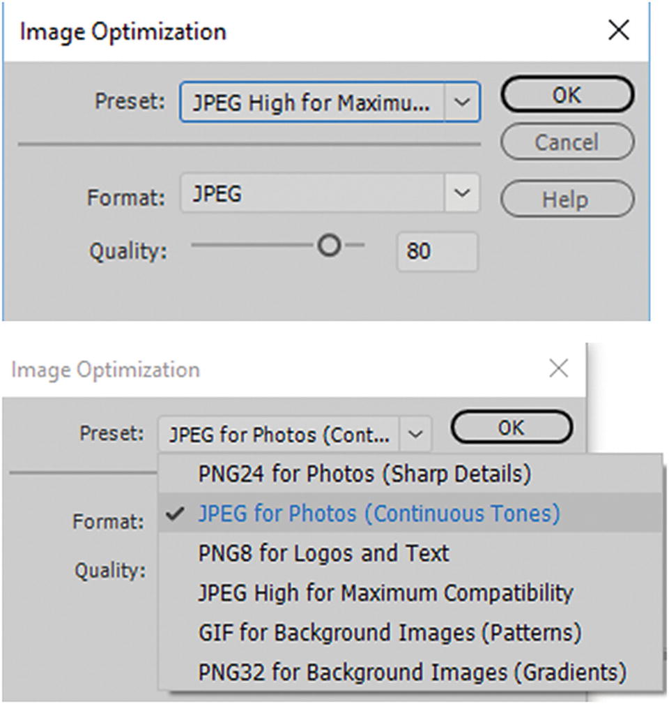
Image Optimization preset options for a JPEG file that was originally a PSD
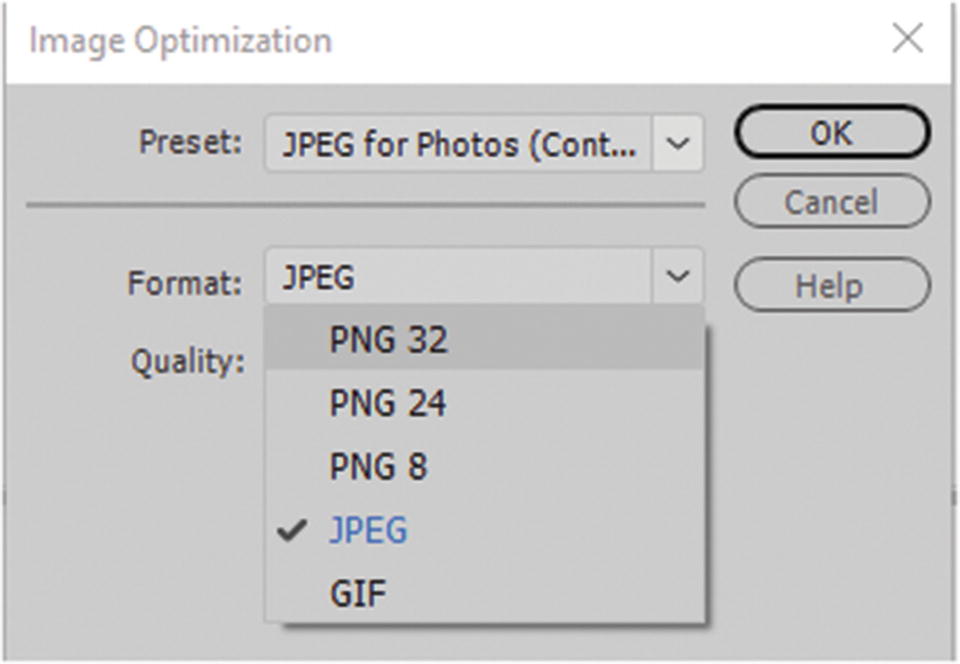
Image Optimization Format options for an image file that was a PSD
This is a wonderful way to quickly import a graphic without reverting to Photoshop; however, in most cases, it is better to work in your native program. To get the ideal setting and decrease load time for your image assets, use your export settings, like Save For Web in Photoshop, Illustrator, Animate, or Media Encoder. Many of these settings are referenced in Chapters 4, 12, 22, and 28.
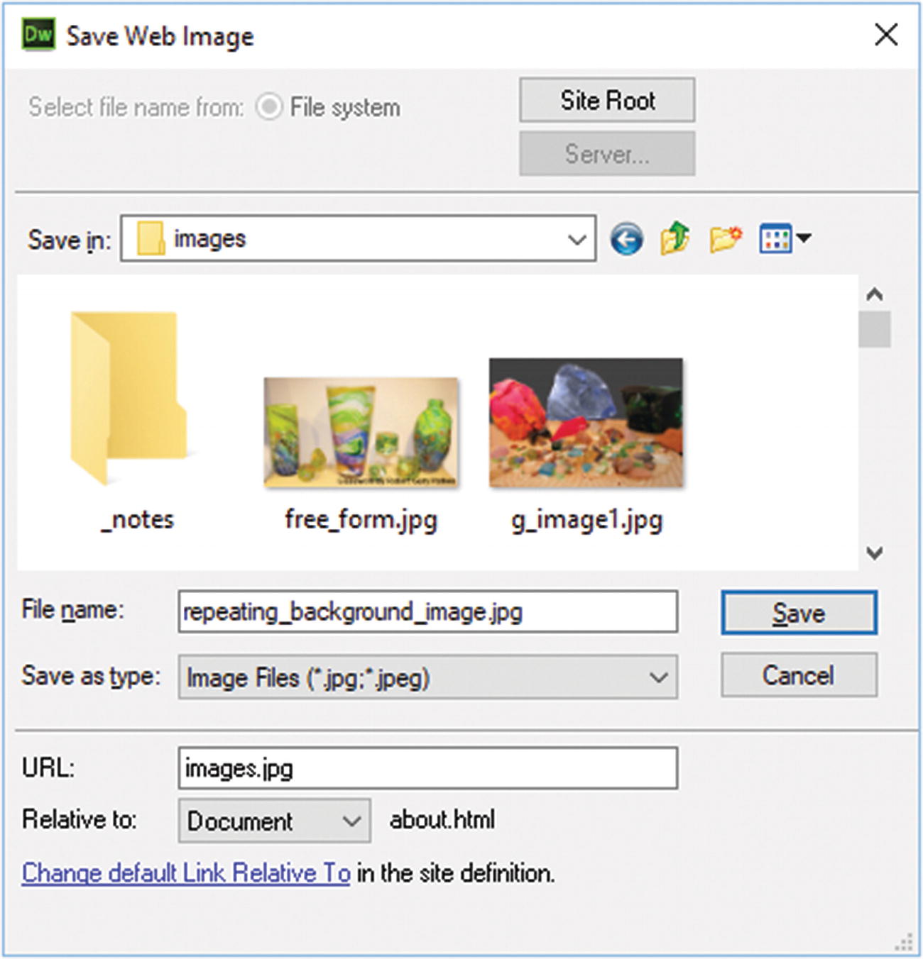
The newly created JPEG image is saved in the images folder
This image is added as a Sync image. If changes are made, Dreamweaver detects them.
Note
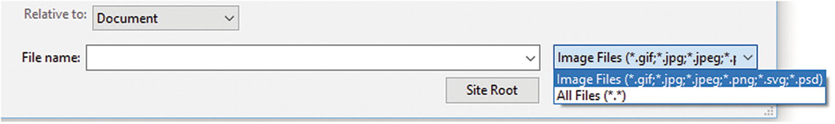
The bitmap or (.bmp) is not included here as an insert option. The bitmap file is quite large, and it is better to use one of the other formats for your project. However, if you want to include this file, select All Files from the drop-down list so that it is viewable in your image search. Width and height are not recorded; you have to enter them manually in Code view or use the Properties panel. And you do not have access to certain image editing features that are available to other formats.
Click OK when you have selected the image you want to insert into the webpage
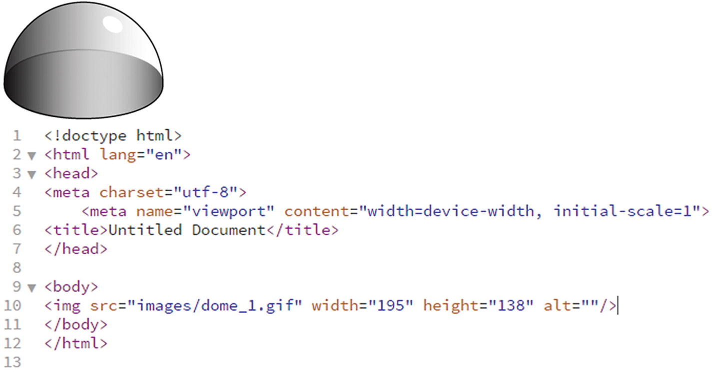
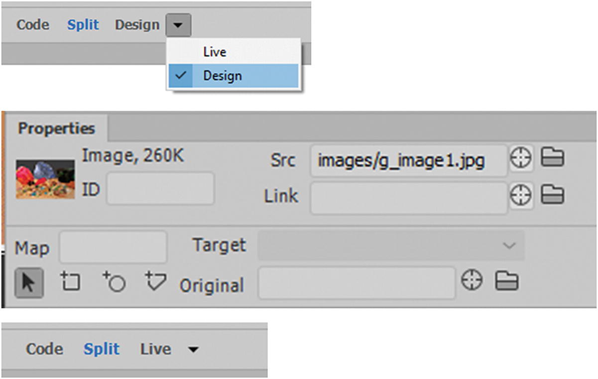
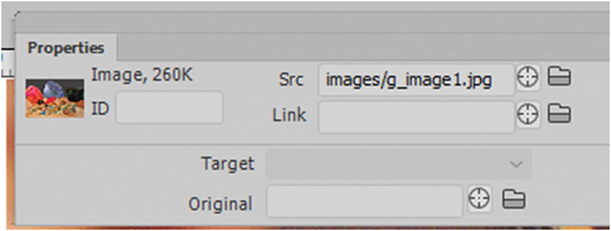
The image in Design view and the resulting code in Code view
src: The source link to the image in the images folder.
width: The width of the image in pixels.
height: The height of the image in pixels.
alt: The alternate text. If the image does not load or people with visual disabilities need to read with a screen reader, this has the text that describes the image.
If you don’t want to add any text, leave this attribute empty. However, do not delete or remove the alt attribute from your image tag or else you get a warning when you validate your page, as you see later. A good practice is to always have alt attributes for your images. Missing alts can affect your site’s rank and make it difficult for search engines to locate keywords that would bring more viewers. You can do the same with a PNG or JPEG.
Working with SVG Images
When you insert SVG files, you do not see a width or height attribute because scalable vector graphics are meant to size to whatever area they are placed into without losing quality. If you have used the setting of responsive within the SVG, then your image is able to scale up or down to fill an area on your page. You cannot simply insert an <svg> tag on a page and expect it to display.

An SVG appear as a broken image in Design view on a webpage
The object tag allows you to keep the interactivity of the SVG. You can apply CSS to adjust scaling. Adding width and height constrains how much the object can scale.
Note
You use the object tag again when you insert an OAM (animated composition) in an HTML5 Canvas file in Chapter 36.
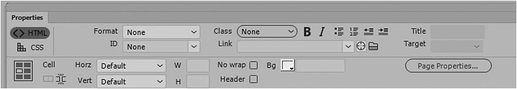
Properties Panel
For the moment, let’s focus on GIF, JPEG, and PNG image formats while working with the Properties panel.
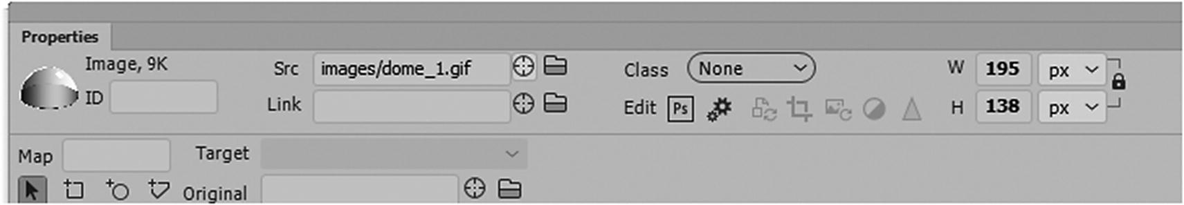
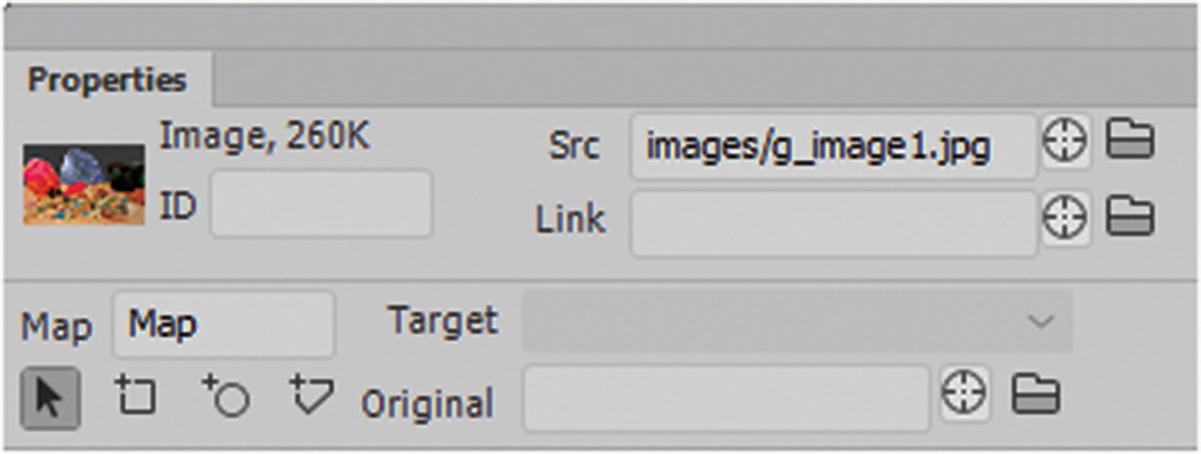
The Properties panel when an image is selected in Design view
ID attribute: Useful for formatting with CSS and JavaScript, which you’ll look at in Chapter 34.
src: Browse for a new source file to replace the old one using the Folder icon or point to it by dragging the target to a file located in the Folder panel. If you are not careful, you could point to the wrong file. I personally like to browse via folder to save time.
Link: Adds a URL to the current file; it can be internal, external, or even an email.
Class: Allows you to format the image further with CSS classes, as you look at in Chapter 32.
Edit: Allows you to edit the image in the program of your choice or do some basic edits using one of six tools. Be aware that not all tools are available to all images. You are editing the actual file and not a copy of it, so any changes made are permanent to that file. It is better to make changes to a copy or go back to the original RAW image (PSD, AI, EPS), and then save a new copy in the same format. That way, if you want to revert, you have not destroyed the original image. Refer to Figure 31-18.
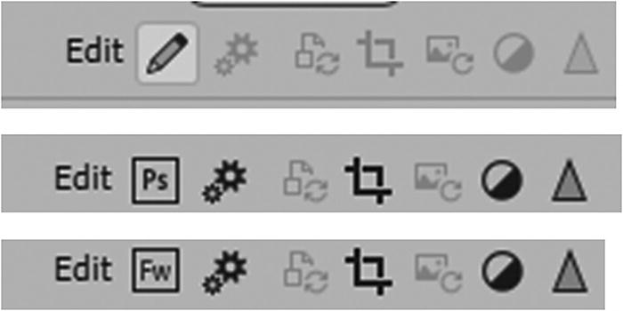
The Properties panel Quick Edit icons for various images
Some quick area tools include going back to the native program to work on the file. When you do this, make sure to keep your files in the correct folder; the editing program will show a warning if it can’t locate the original file because the link was altered.
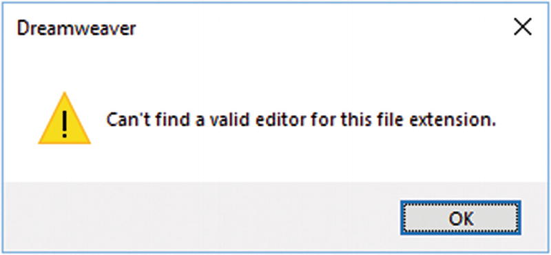
A warning appears when you search for a valid editor and the file extension is not known by Dreamweaver
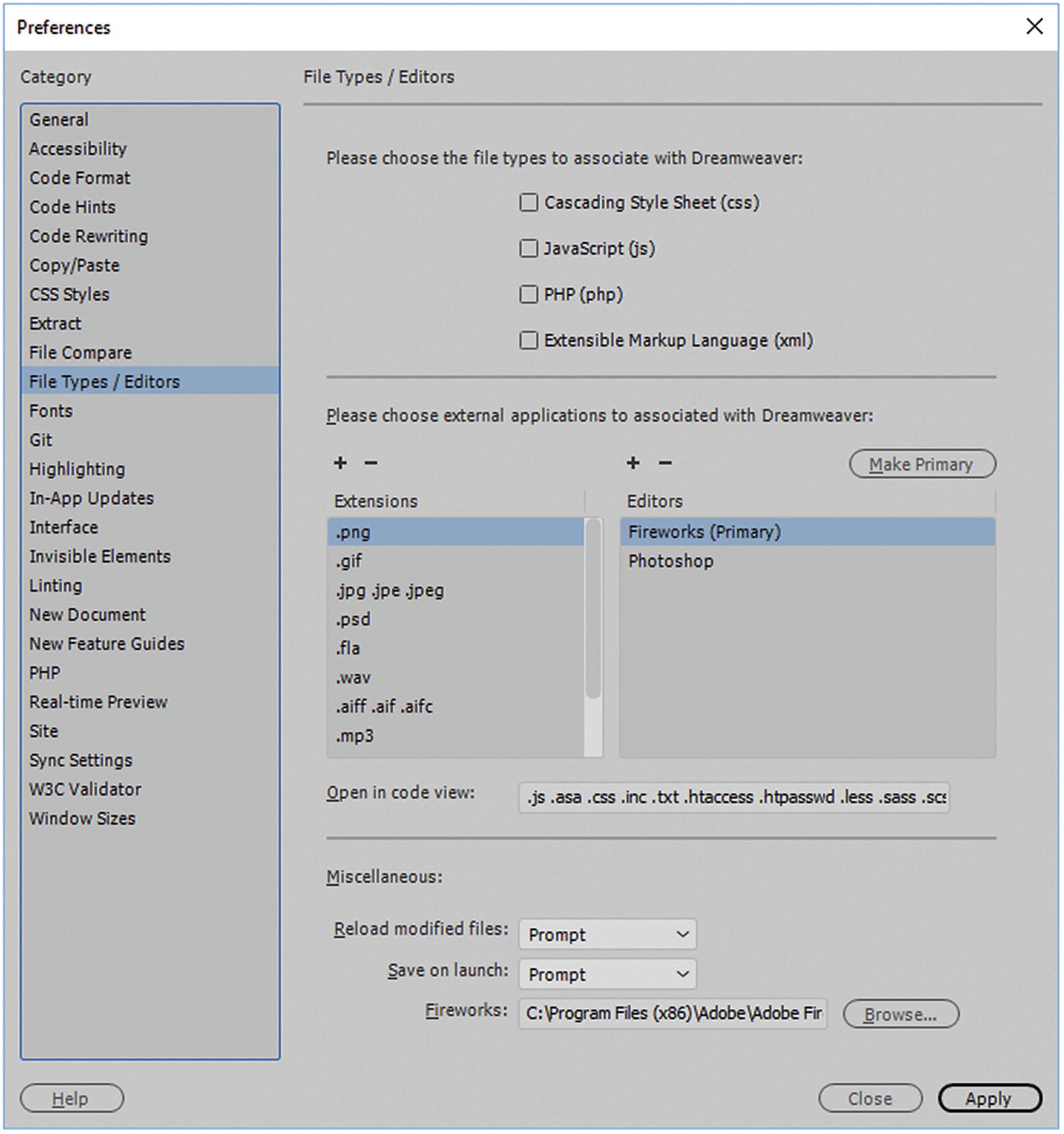
The Preferences allow you to add a new extension and editor to the list or decide what should be the primary editor
You can add extensions that are not listed in this area (using the plus icon) and set your editor for the file format by setting one in the list to Make Primary (editor) or adding a new editor using the plus symbol once done click Apply and then close. With GIFs or JPEGs, Photoshop is your primary editor. However, if you have an older version of Fireworks on your computer, a PNG file might show up instead. You can resolve this in Preferences by making Photoshop the primary editor. If there is no editor for an SVG file, you could add one.
Quick Edit options in the Properties panel
Remember that Quick Edits alter your images permanently; make sure you have a backup of these images in another folder, should you need to revert to an original state.
Image Optimization
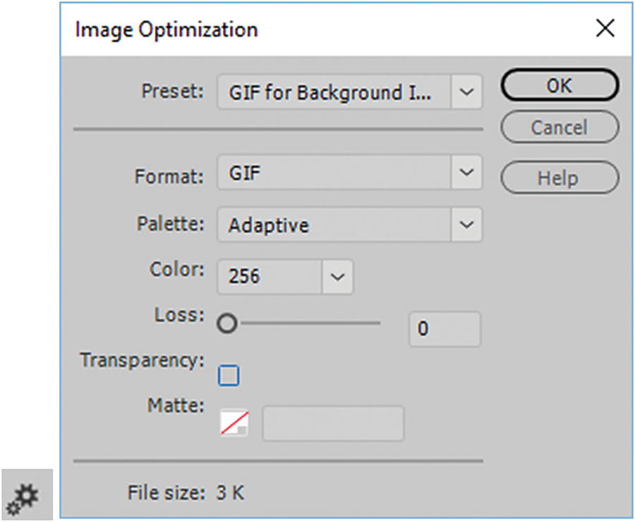
Image Optimization dialog box appears for the selected image from the Properties panel icon
Update From Original

Image Sync icon
Crop
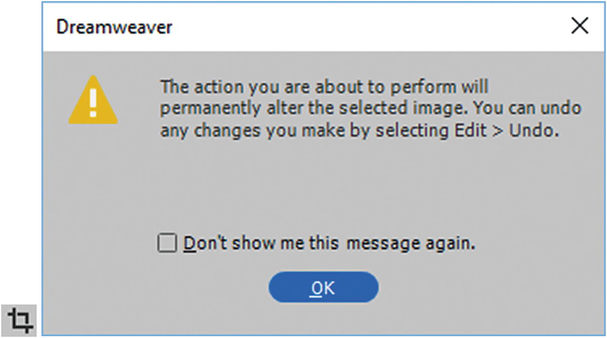
When Crop from the Quick Edits is clicked, a warning appears
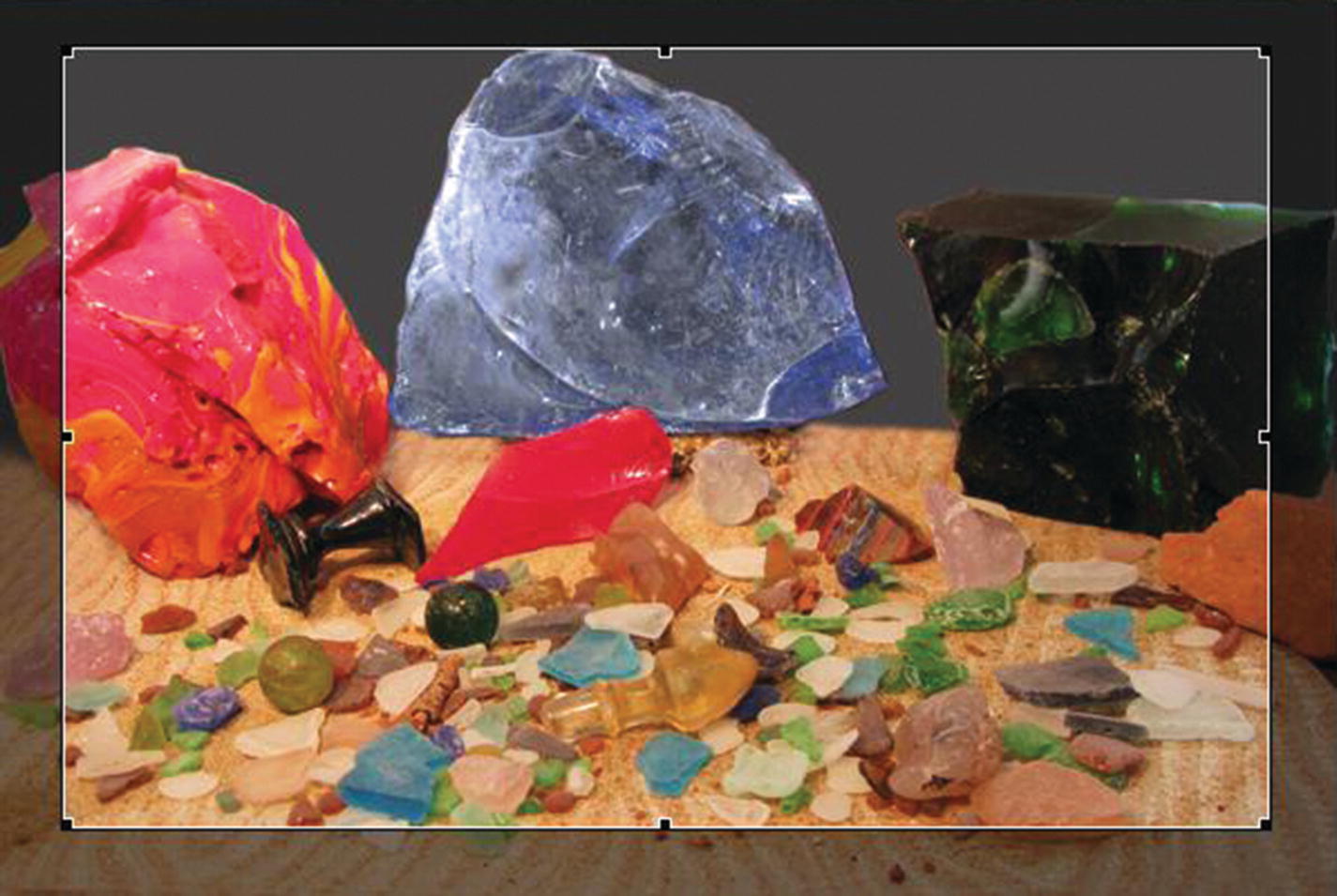
The Crop preview, to revert you must choose Edit ➤ Undo right away
Resample
This setting adds or subtracts pixels from resized JPEG and GIF image files to match the appearance of the original image as closely as possible. Resampling an image reduces its file size and improves download performance, but not quality.
Resample an image
Clicking the Resample icon confirms the resample and sets the new setting. As with cropping, if you realize you made a mistake after you click OK, choose Edit ➤ Undo to restore and revert the image. Be aware that if you scale an image smaller, and then change your mind and make it larger again, the file is degraded, and you likely need to start a new copy of the original.
Brightness/Contrast
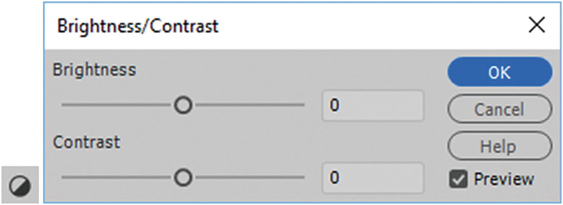
Adjust the brightness and contrast of an image
Sharpen
Adjusts the focus of an image by increasing the contrast of edges found within the image. When you scan an image or take a digital photo, the default action of most image capturing software is to soften the edges of the objects in the image. If softened too much, the image appears blurry. Ideally, the scanning prevents extremely minute details from becoming lost in the pixels from which digital images are composed.
To bring out the details in digital image files, it is often necessary to sharpen the image. The Sharpen option increases the edge contrast, making the image appear sharper. that too much sharpening can make your image appear overly pixilated which may not be what you want. For ideal images, always start your project with high-quality photos from the client.
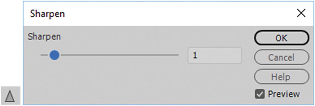
Sharpen an image
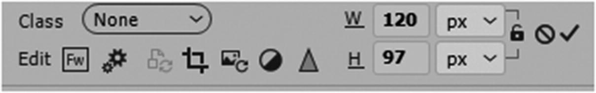
Width and Height
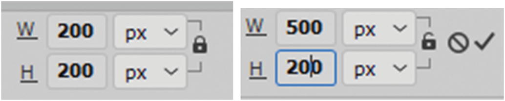
Adjust the width and height of the image and then either revert back to the original size or click the check to confirm the changes
In Part 6, you see how to use CSS to scale an image proportionally to various sizes and make it responsive for different devices in the browser without loss of quality.
Alternate Text
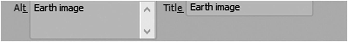
Add alt and title attributes for your images
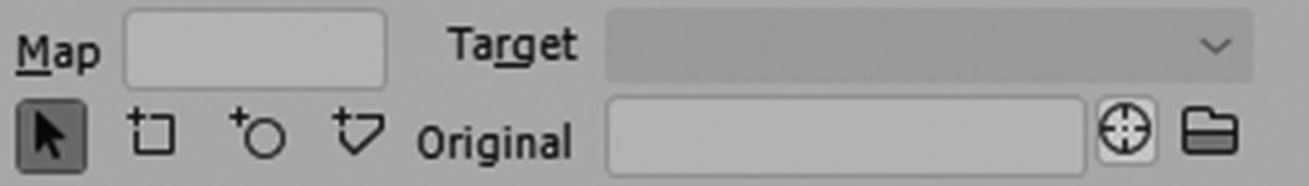
Image map icons
Before you look at that tag in detail, you need to continue exploring other tags that you can add your images to.
Adding Images Inside Various Tags
The Insert panel had text and image tags
You can do this manually by typing in Code view, or by placing your cursor somewhere on the page in Design view or Split view and using the Insert panel to add the tags. For information on whether to use an <hgroup> tag, refer to https://developer.mozilla.org/en-US/docs/Web/HTML/Element/hgroup .
Without basic structures to format where your images are placed, your images move freely and the website has no form. Even from a mobile design point of view, you need to be able to set a point of transition from one size to the next. There must be some way of controlling these points of the website’s transition for various browsers as it expands and contracts. A human body needs bones, or just like the website, it flops around randomly.
In addition to older tags, HTML5 has tags. If you need to review older tags and examples, check out www.w3schools.com/tags/default.asp .
A Bit of HTML History
In the 1990s, when websites were first built, designers used <table> tags to create areas where content and images would go. You could put tables within tables or the other table’s cells, which made the design more complex. At that time, most designers were creating sites for desktop computers only. You would use spacers or transparent GIF images to create space within the table. Most computer monitors were roughly the same size or ratio, and so flexibility was not crucial. When designers thought of mobile, it was a cellphone that was often large and bulky and had a small low-resolution screen that showed who was calling or paging you, and perhaps with some very basic text and ultralow resolution graphics. At that point, most work was done on desktop computers.
The problem with tables is they aren’t flexible when it comes to varying monitor widths. To keep the basic content and structure looking the same, you have to create different webpages to conform to each monitor size.
Fast-forward to the 2000s, where the first modern tablets and smartphones arrived on the market. Instead or carrying a large laptop around, users wanted to see websites and information on smaller devices and be able to go to meetings and show their company’s products on these devices. Tables increasingly became a problem, because websites were too small and barley readable, and their layouts did not format or sit like they should on the page. A solution had to be found. More flexible tags had to be created.
There are now various layout tags that you can add your images to and place the image <img/> tag within.
<div> Tags
To create a structure, you can place divs inside of divs
Add a <div> tag using the Insert panel
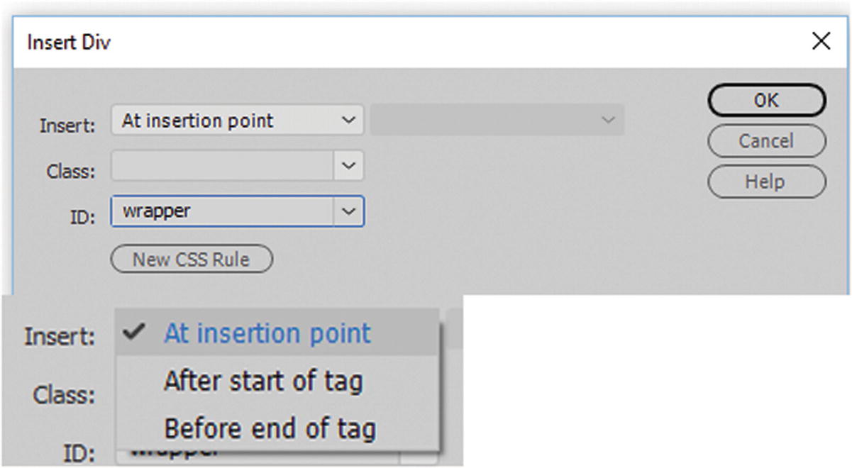
Insert a div and add an ID using the insert div dialog box
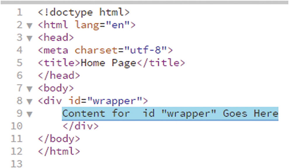
A div is inserted into Code view
Note
There is no rule that you must use a wrapper. You can call the ID whatever you want or only wrap certain areas that you want to contain within the wrapper. However, giving it this name is an effective way to remember what the tag or element does.

A div in Design view
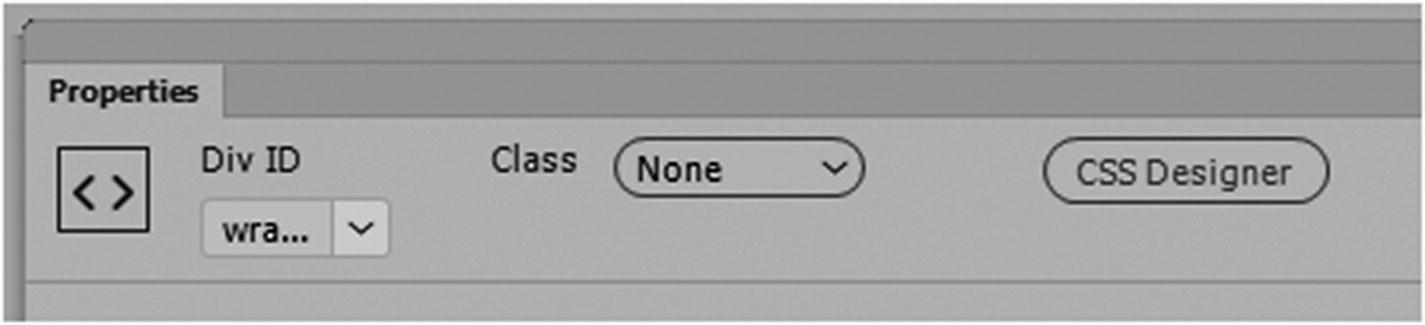
The Properties panel when a div is selected
Insert an image into the div using the Insert panel
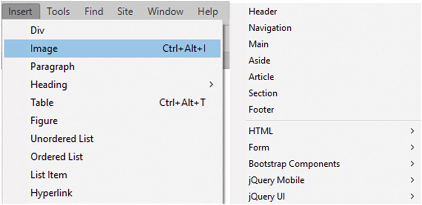
Sematic Elements
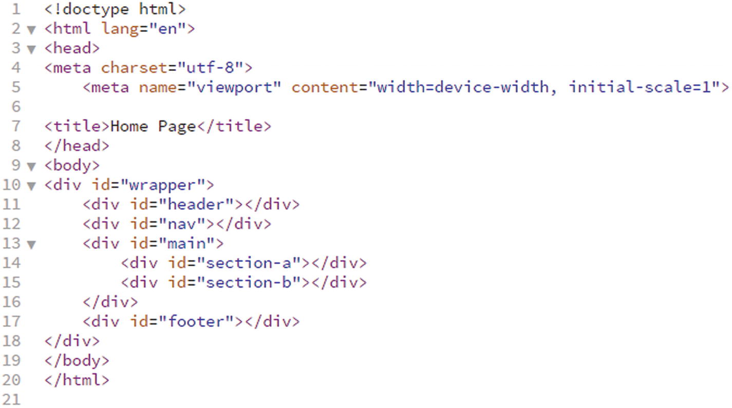
How a beginning structure of a basic website could look; note a viewport was added
If there are a lot of divs on a page, it becomes confusing as to where one starts or stops, especially if they are nested many times, because the closing tags are all the same.
Also, web designers are not always consistent with the names they give their IDs in the structure; some might be id=foot or id=footer, or id=base, and so on. This makes it difficult for people with visual impairments to navigate a site with their screen readers. The web is for everyone, and this is what accessibility is all about. There has to be some sort of consistency. So, HTML5 tags called semantic elements were created.
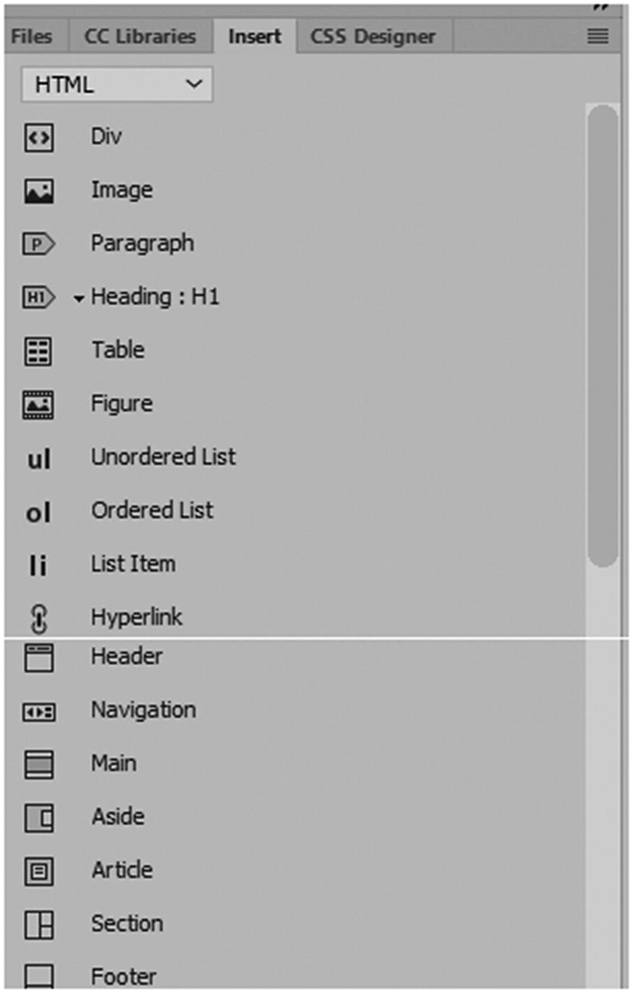
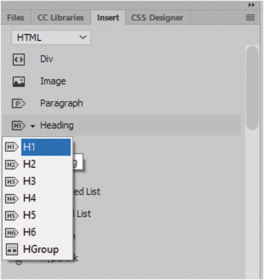
Many of the new semantic elements appear in the Insert panel in the HTML tab
Any of these can have an <img> tag placed inside of it. I briefly describe them next.
Figure and Figure Caption
Adding a figure and figure captions around the image
The Properties panel when figcaption text is selected
Header
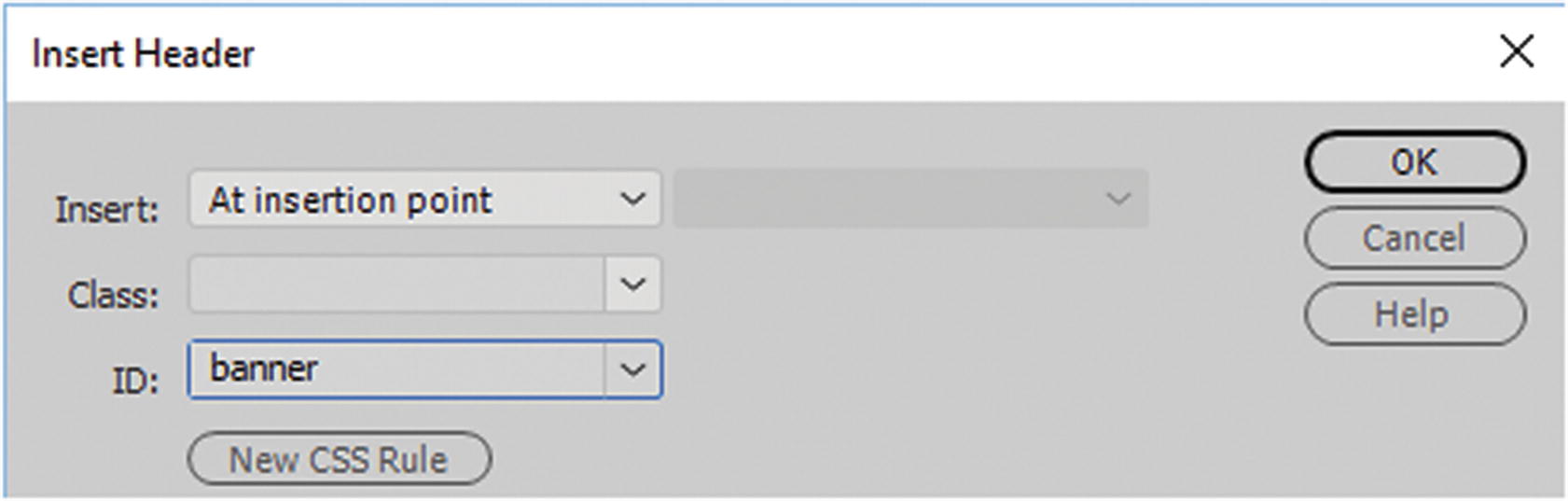
Insert Header dialog box with ID added
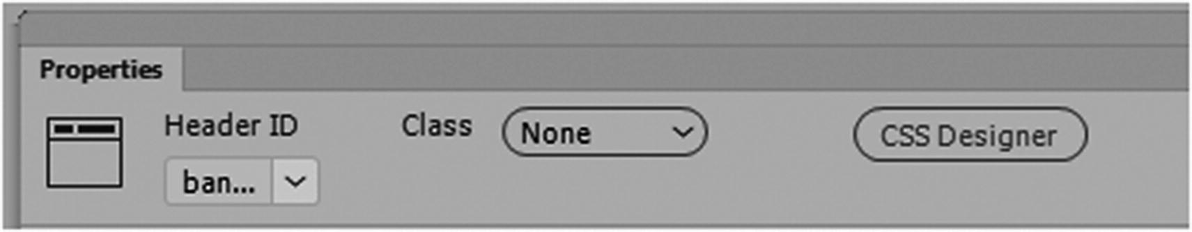
How the Header appears in the Properties panel
Note
A <header> cannot be placed within <footer>, <address>, or another <header> tag.
Navigation
The <nav> tag is useful for an area with navigation hyperlinks modified by CSS or a few images (rollovers). Not all links in a document should be used inside of a <nav> element. A <nav> should only be used for major blocks of navigation links.
This tag is very useful in browsers and in screen readers for disabled users. Browsers can use this element to determine whether to omit the initial rendering of the content.
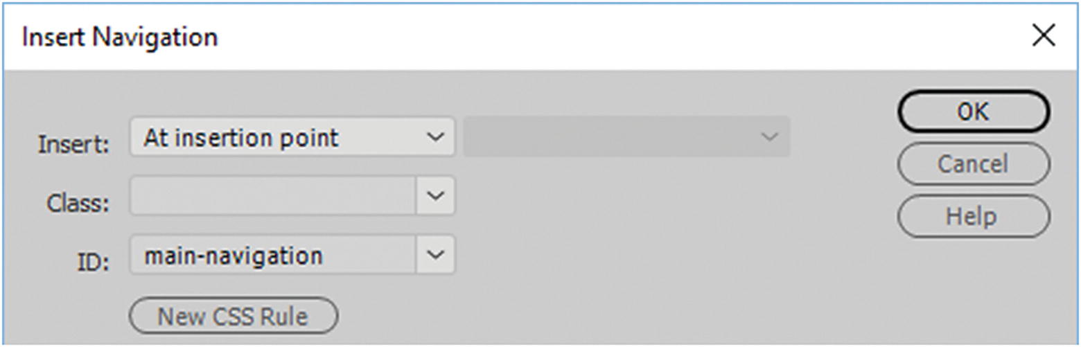
Insert Navigation dialog box with ID added
You could insert your navigation images <img> using CSS or rollover links for the webpage to other webpages.
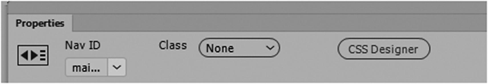
How the nav appears in the Properties panel
Main
The <main> element refers to the main content of the document or the main story. The content inside of the <main> tag should be unique to the document and should not contain any content that is repeated across documents such as sidebars, navigation links, copyright information, site logos, and search forms. It should also be noted that there must not be more than one <main> element in a HTML document. The <main> element must NOT be a descendant or child of an <article>, <aside>, <footer>, <header>, or <nav> element, though it could be the container (parent) for these elements.
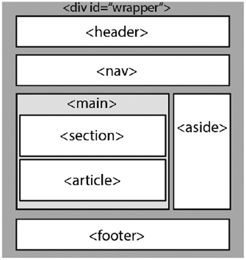
A possible layout for a website using the main tag
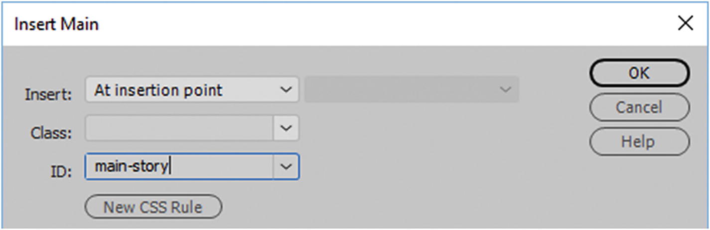
Insert Navigation dialog box with ID added
Then you can insert your images, text, or other semantic elements into the <main> tag.
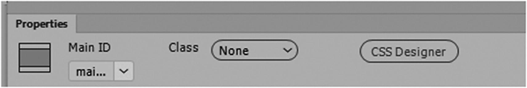
How the main ID appears in the Properties panel
Aside
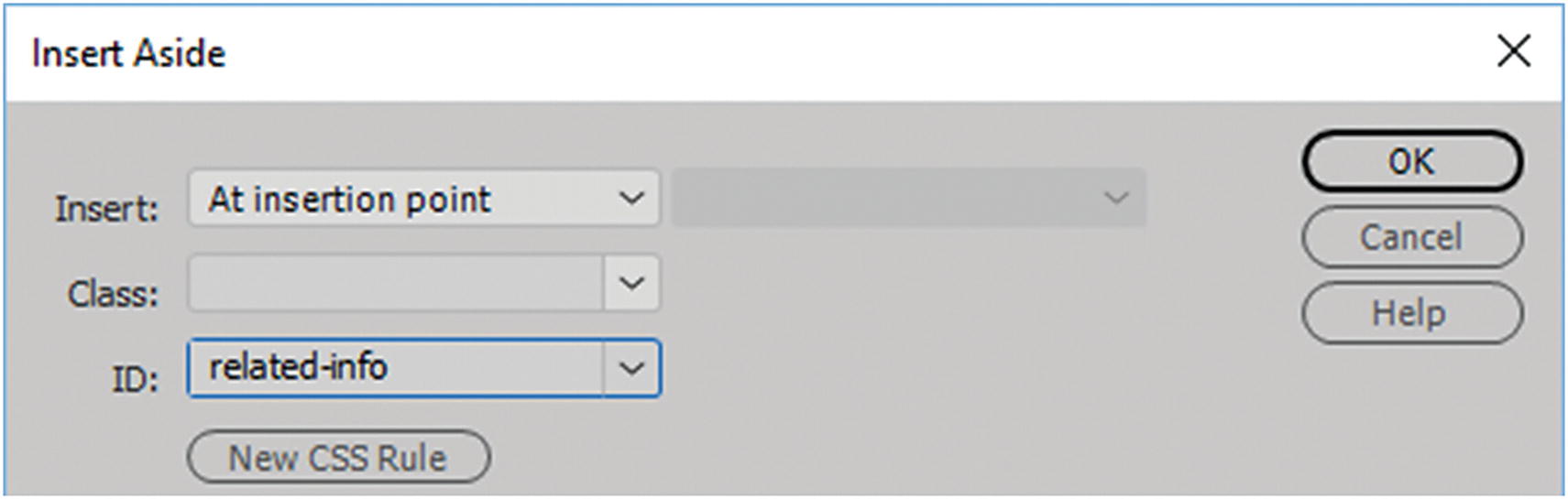
Insert Aside dialog box with ID added
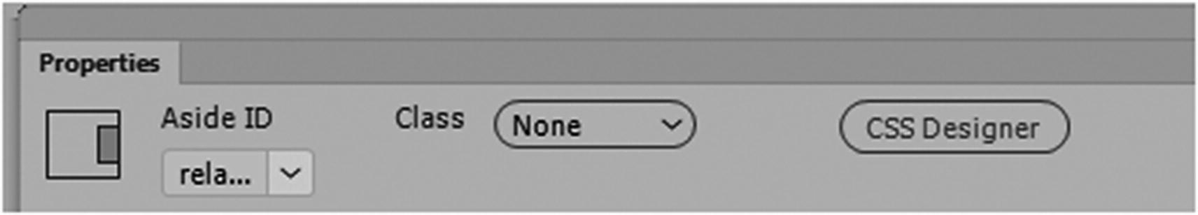
How the aside appears in the Properties panel
Article
Forum posts
Blog posts
News stories
Comments
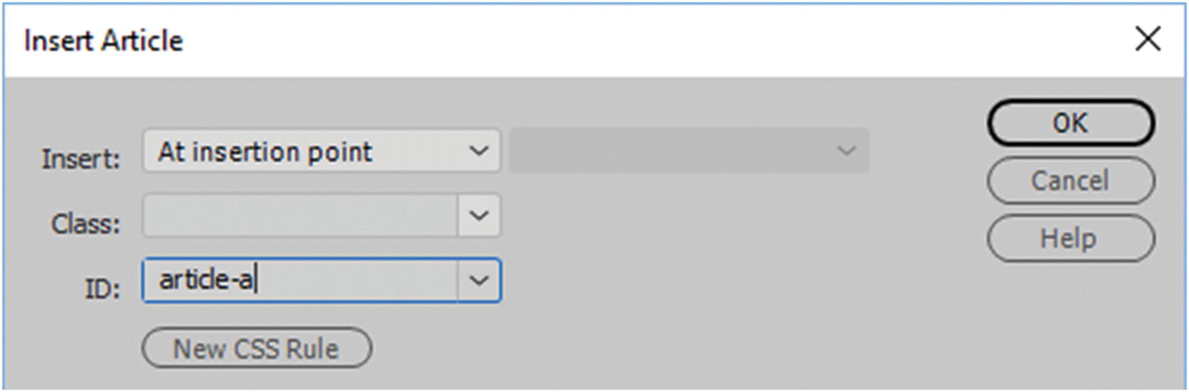
Insert Article dialog box with ID added
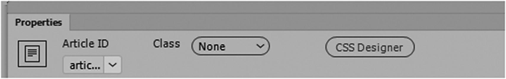
How the Article appears in the Properties panel
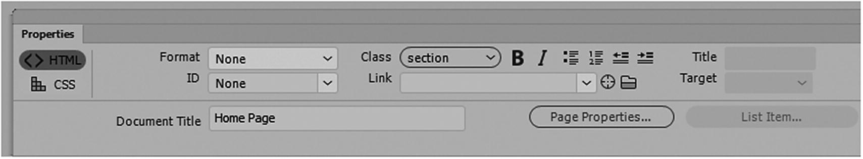
Section
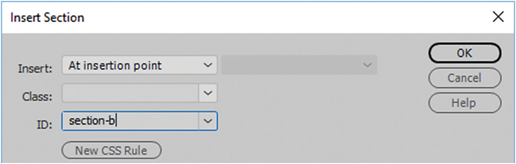
Insert Section dialog box with ID added
You can insert your images and text into the <section> tag.
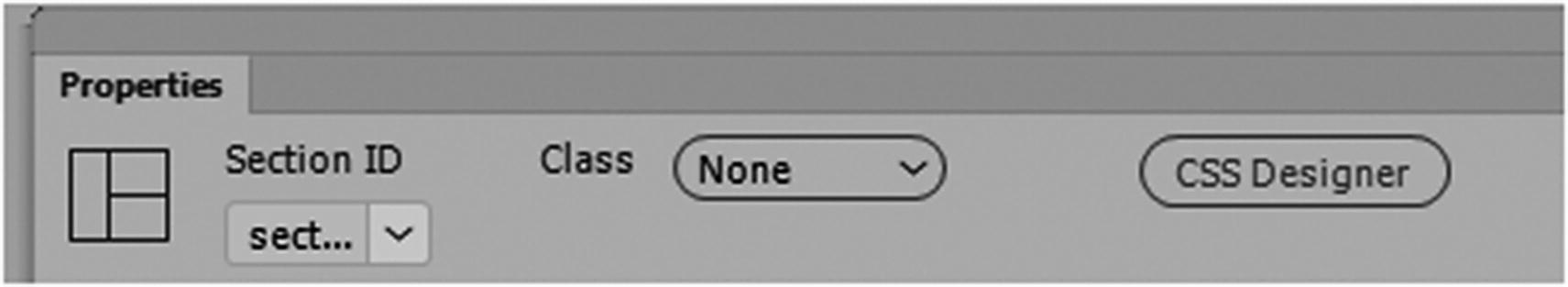
How the section appears in the Properties panel
Footer
The <footer> element defines the footer of a document or section. A section can have more than one footer. A <footer> element should contain information about its containing element or tag.
authorship information
copyright information
contact information (inside an <address> tag)
sitemap
back to top links
related documents
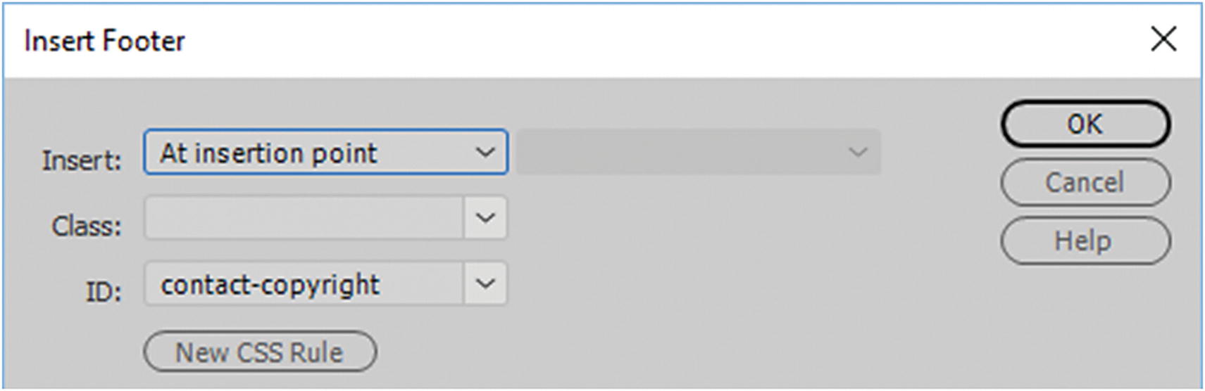
Insert Footer dialog box with ID added
You can insert your images <img> and text into the <footer> tag.
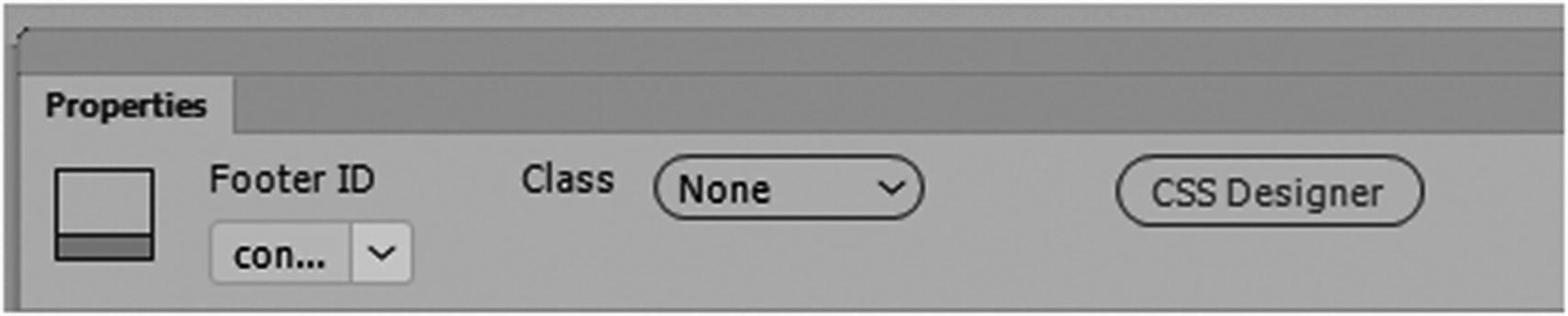
How the footer appears in the Properties panel
While semantic elements are good to use, there may be times when your content does not fall into any other category, or you need to add navigation somewhere else. In these cases, there is nothing wrong with using a <div> tag; perhaps in time, more semantic elements will become available. In the meantime, it is important to practice using them to build your website to make it more accessible to all users. in the next chapter, you look at how these tags can be altered further using CSS.
For more information, on semantic elements make sure to check out www.w3schools.com/html/html5_semantic_elements.asp .
Are Tables Obsolete in Web Design?
Insert a table using the Insert panel
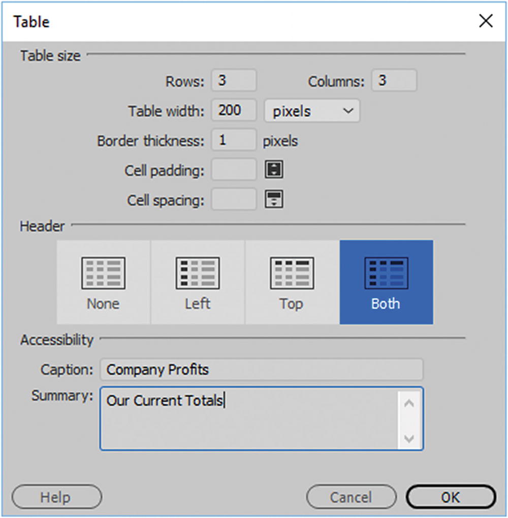
Insert a table settings entered into the table dialog box
Table tags are better manipulated using CSS for a mobile site. You can still run into formatting issues, depending on what is within the table, so you need to take this into account and test the pages for each device size that the table could be viewed on. For example, while rows and columns can get narrower, a row of data needs to be kept on the same row for it to make sense. At some point, the cells might wrap or appear broken. With CSS, you can modify this for smaller screens, but done incorrectly, the table can still look broken. So developers continue to struggle with table formatting for each unique site.
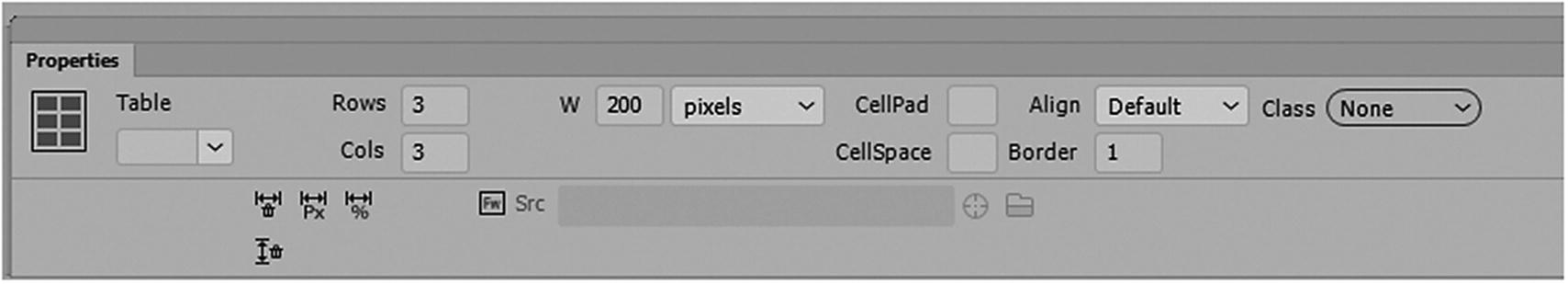
The table settings in the Properties panel
Settings like cellpad, cellspace alignment, and border are better controlled using classes in CSS.
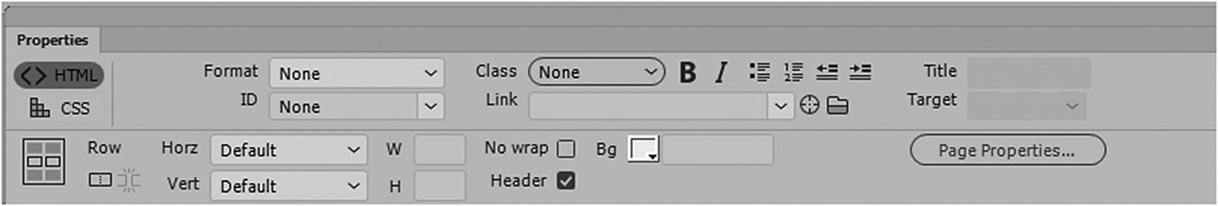
The table row and cell settings in the Properties panel
You can still add images to table cells, but a better idea is to add them to the background using CSS.
Before you look at CSS, let’s look at a few other tags that also work with images.
Image Maps <area> and <map> Tags
Only in Design view do you have access to the Image map options in the Properties panel
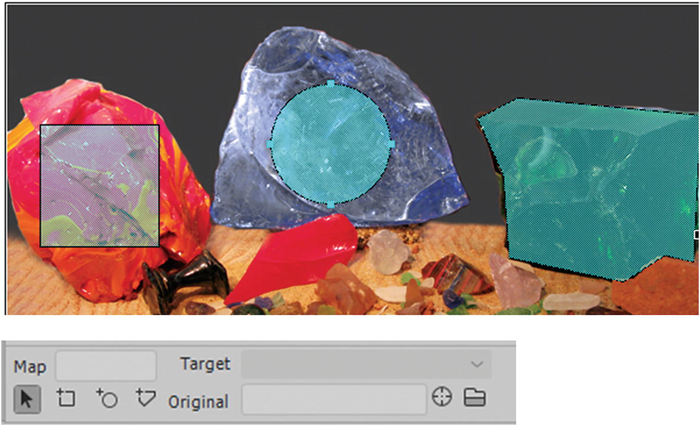
Various types of hotspots in Dreamweaver
Pointer Hotspot tool: Allows you to select, size, and move the hotspot to a new location.
Rectangle Hotspot tool: Lets you create a square or rectangular hotspot.
Circle Hotspot tool: Lets you create a circular or oval hotspot.
Polygon Hotspot tool: Lets you create a hotspot that can contain many points. This is useful if drawing the boundaries of a map.
Once the hotspots are drawn in Design view, they preview on top of the image as light-blue squares. In the actual browser, they are invisible, and only the cursor changes so that you know they are there.
The selected image map with an ID
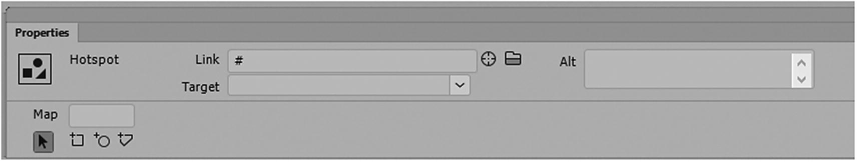
The selected hotspot in the Properties panel
Here you can add a link to another page on the site (local) and/or external site. Use the target or browse folders to locate a page.
_blank: Opens a linked file in a new window or tab and leaves the original webpage open (this is the same as choosing New).
_self: Opens the linked document in the same frame that it was clicked in (this is the same as default or leaving it blank).
_parent: Displays the linked file in its own parent frameset. Do not use this option unless the file contains a frame. The link is considered a child and it appears in the parent frame.
_top: Replaces the entire browser window with the linked file, removing all the current frames. The name must match a frame in the HTML file for this to work. When the link is clicked, the specified file appears in a new frame.
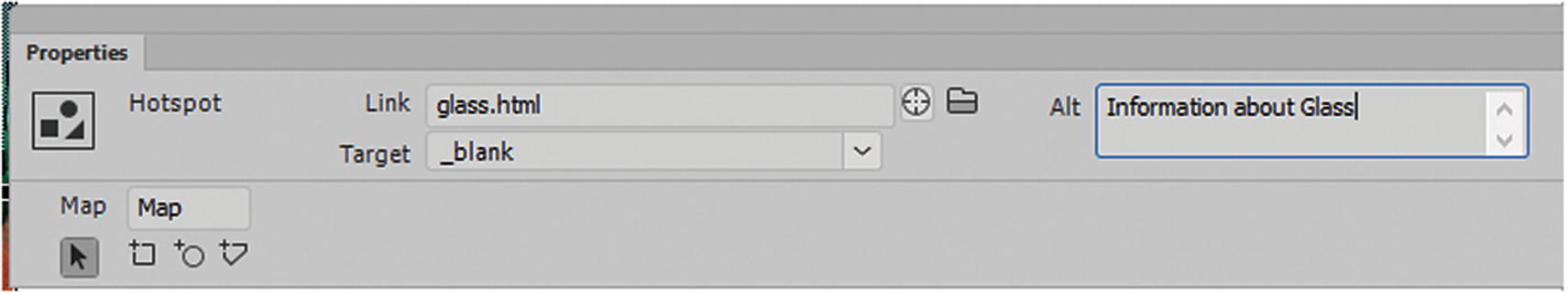
New information added to the hotspot in the Properties panel
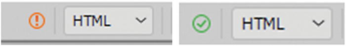
Until all the hotspots are resolved, you may get this yellow warning in Dreamweaver; when resolved, it returns to a green check
After you save the file, the warning disappears and returns to a green check.
Note
you do not need a title attribute as this appear to corrupt the <area> tag.
Recently, HTML5 has added a few more attributes to the <area> tag; they currently do not show up in Dreamweaver’s Properties panel but could be added via Code view. If you would like to look at the new settings for media, you can view them at www.w3schools.com/tags/tag_area.asp .
Be aware that not all new HTML5 features are available for older browsers or your current browser, always read the documentation on the W3Schools website to see if the HTML5 feature is supported by your target browsers.
Another good website to check is Can I Use ( https://caniuse.com ), which provides more information on tags.
Let’s look a few more HTML5 tags you can add images to. Some are supported by most browsers and others are still experimental.
The <picture> and <source> Element
The most common use of the <picture> element is art direction in mobile-responsive designs. Instead of having one image that is scaled up or down based on the viewport width, multiple images can be designed to nicely fill the browser’s viewport; for example, one size for a desktop, another size for a tablet, and a third size for a smartphone.
The <picture> element must hold two different tags: one or more <source> tags and one <img> tag.
srcset (required): Defines the URL of the image.
media: Accepts any valid media query that is normally defined in CSS.
sizes: Defines a single width descriptor, a single media query with width descriptor, or a comma-delimited list of media queries with a width descriptor (min-width: 650px).
type (optional): Defines the MIME type.
The browser uses the attribute values to load the most appropriate image. The browser uses the first <source> element with a matching hint and ignores any following <source> tags.
The <img> element is required as the last child tag of the <picture> declaration block. The <img> element is used to provide backward compatibility for browsers that do not support the <picture> element, or if none of the <source> tags matched.
The <picture> element works like the <video> and <audio> elements, which you look at in Chapter 36. In all cases, you set up various sources, and the first source that fits the preferences is the one being used by the browser.
The <details> and <summary> Elements
The <details> tag is used to create an interactive widget that the user can open and close. Any sort of content can be put inside the <details> tag, including images. Normally, you have to use CSS and JavaScript to create this type of widget, but now you can do it with HTML5. It is currently supported by all modern browsers, except for Microsoft Edge and Internet Explorer.
The content of a <details> element should not be visible unless the open attribute is set; for example, <details open>. For the default closed option, remove the word open.
The <summary> tag is used to specify a visible heading for the details. The heading can be clicked to view or hide the details.
The <dialog> Element
The <dialog> tag defines a dialog box or window.
The <menu> and <menuitem> Elements
The menu item tag is still in the experimental stage for most browsers and has currently been removed from HTML5; it is only supported by Firefox for use in context menus. Its purpose is to define a command/menu item that the user can invoke from a pop-up menu using a combination of HTML and JavaScript.
The <menu> tag defines a list/menu of commands. It is used for context menus, toolbars, and listing form controls and commands.
Perhaps in the future menus will also include images.
Inserting Images Favicons into Your Browser’s Tab
To finish this chapter, let’s look at one last image format that you may not have noticed. If you want your website to have a company logo rather than the default browser icon in the tab, there is a way to alter this by adding an image to the in your <head> tag.
Yes, I know I said that images belong in the <body>, and most of the time, that is where these links should be. In most cases, unless JavaScript code is involved, or you are trying to affect the browser tab icon. With JavaScript, if you do not have references to the image in the <body>, those images never appear in the browser. The browser tab icon appears outside the window. In this case, you need to create a favicon.
So far, you have created images for the web in JPEG (.jpg), GIF (.gif), PNG (.png), SVG (.svg), and bitmap (.bmp) formats. So, what is a favicon and what is its format?

Adding a favicon to the browser tab

Adding a favicon link in the head of a webpage
Only until you upload the webpages will the image in favicon appear in the tab of your browser.
Some newer browsers support the original GIF, PNG, or SVG file formats. A few allow it to be an animated GIF, but not all older browsers. Also, some Macintosh browsers require a format called .icns. For more information on this file format, check out https://en.wikipedia.org/wiki/Favicon .
Note
HTML5 developers are working on a way to display the favicon at assorted sizes for visual media, but this is not available to browsers yet. You can check out the information at www.w3schools.com/tags/att_link_sizes.asp.
HTML5 and the Snippets Panel
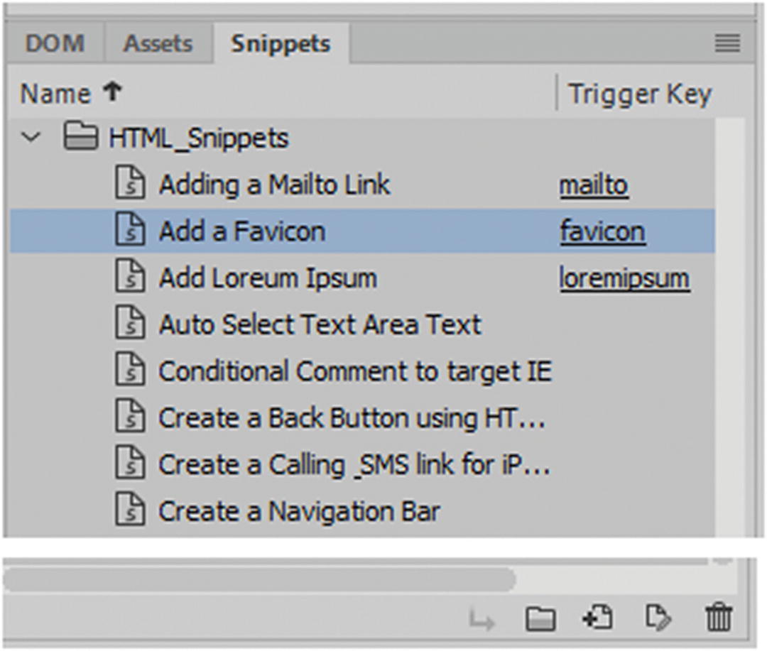
Adding a favicon link using the Snippets panel
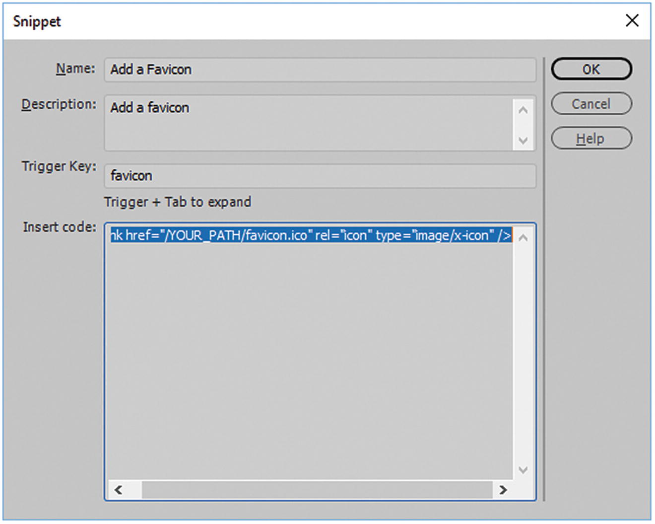
You can review the code in the Snippet dialog box before you insert it using the Snippets panel
Select and highlight the text in the Insert Code field and press Ctrl+C or Cmd+C to copy the text to paste later. Click Cancel so that you don’t save changes.
Alternatively, you could use the arrow Insert icon in the Snippets panel to insert the text on your page. You could then add this link into the head section of your HTML5 file. The Snippets panel offers many options, such as meta tags for mobile and hand-held devices. You look at snippets throughout Part 6.
Summary
In this chapter, you looked at how to insert various types of image formats. You also looked at <div> tags, semantic elements, and some upcoming elements that are new to HTML5. Finally, you looked at favicons and learned how to use the Snippets panel to insert small pieces of text.