Table of Contents for
The Modern Web
 The Modern Web
Published by
No Starch Press, 2013
The Modern Web
Published by
No Starch Press, 2013
- The Modern Web
- Cover
- The Modern Web
- Advance Praise for
- Praise for Peter Gasston’s
- Dedication
- About the Author
- About the Technical Reviewer
- Acknowledgments
- Introduction
- The Device Landscape
- The Multi-screen World
- Context: What We Don’t Know
- What You’ll Learn
- A. Further Reading
- 1. The Web Platform
- A Quick Note About Terminology
- Who You Are and What You Need to Know
- Getting Our Terms Straight
- The Real HTML5
- CSS3 and Beyond
- Browser Support
- Test and Test and Test Some More
- Summary
- B. Further Reading
- 2. Structure and Semantics
- New Elements in HTML5
- WAI-ARIA
- The Importance of Semantic Markup
- Microformats
- RDFa
- Microdata
- Data Attributes
- Web Components: The Future of Markup?
- Summary
- C. Further Reading
- 3. Device-Responsive CSS
- Media Queries
- Media Queries in JavaScript
- Adaptive vs. Responsive Web Design
- Viewport-Relative Length Units
- Responsive Design and Replaced Objects
- Summary
- D. Further Reading
- 4. New Approaches to CSS Layouts
- Multi-columns
- Flexbox
- Grid Layout
- The Further Future
- Summary
- E. Further Reading
- 5. Modern JavaScript
- New in JavaScript
- JavaScript Libraries
- Polyfills and Shims
- Testing and Debugging
- Summary
- F. Further Reading
- 6. Device Apis
- Geolocation
- Orientation
- Fullscreen
- Vibration
- Battery Status
- Network Information
- Camera and Microphone
- Web Storage
- Drag and Drop
- Interacting with Files
- Mozilla’s Firefox OS and WebAPIs
- PhoneGap and Native Wrappers
- Summary
- G. Further Reading
- 7. Images and Graphics
- Comparing Vectors and Bitmaps
- Scalable Vector Graphics
- The canvas Element
- When to Choose SVG or Canvas
- Summary
- H. Further Reading
- 8. New Forms
- New Input Types
- New Attributes
- Datalists
- On-Screen Controls and Widgets
- Displaying Information to the User
- Client-side Form Validation
- The Constraint Validation API
- Forms and CSS
- Summary
- I. Further Reading
- 9. Multimedia
- The Media Elements
- Media Fragments
- The Media API
- Media Events
- Advanced Media Interaction
- Summary
- J. Further Reading
- 10. Web Apps
- Web Apps
- Hybrid Apps
- TV Apps
- Webinos
- Application Cache
- Summary
- K. Further Reading
- 11. The Future
- Web Components
- The Future of CSS
- Summary
- L. Further Reading
- M. Browser Support as of March 2013
- The Browsers in Question
- Enabling Experimental Features
- Chapter 1: The Web Platform
- Chapter 2: Structure and Semantics
- Chapter 3: Device-Responsive CSS
- Chapter 4: New Approaches to CSS Layouts
- Chapter 5: Modern JavaScript
- Chapter 6: Device APIs
- Chapter 7: Images and Graphics
- Chapter 8: New Forms
- Chapter 9: Multimedia
- Chapter 10: Web Apps
- Chapter 11: The Future
- N. Further Reading
- Introduction
- Chapter 1: The Web Platform
- Chapter 2: Structure and Semantics
- Chapter 3: Device-Responsive CSS
- Chapter 4: New Approaches to CSS Layouts
- Chapter 5: Modern JavaScript
- Chapter 6: Device APIs
- Chapter 7: Images and Graphics
- Chapter 8: New Forms
- Chapter 9: Multimedia
- Chapter 10: Web Apps
- Chapter 11: The Future
- Index
- About the Author
- Copyright
Web Components
I don’t think I’m exaggerating when I say that the Web Components specification proposes the most radical changes to HTML since its creation some 20+ years ago. Even the much-hyped HTML5 is a small point-version update that doesn’t really add anything genuinely new.
Web Components is a collective title for a group of additions to HTML and the DOM aimed at making rich interfaces for web applications—a kind of reusable widget specification. As I write this, four main components exist: templates, decorators, custom elements, and the Shadow DOM. I’ll explain what each does in turn, but first let me sum up what they do when combined.
One of the principal problems of building application components in HTML today is that the elements used to build them are part of the DOM and, as such, are open to conflicts from CSS or JavaScript. These could be inheritance conflicts, such as rules applied to parent elements cascading into component elements or, inversely, rules applied to component elements leaking or cascading to elements elsewhere in the DOM.
Another problem results from naming conflicts, where the same class or ID is unknowingly used in different pages of a site, meaning rules intentionally declared on one element are also unintentionally applied to others. This problem is commonly found on large sites that lack a clear naming scheme, and it can be made even worse by conflicts in JavaScript when selectors apply unwanted functional behavior to an element.
The best way to avoid conflicts like these is to separate the component from the rest of the DOM to prevent any inheriting or leaking. This technique is known as encapsulation and is fundamental to object-oriented programming languages.
Web Components attempts to bring encapsulation into the HTML DOM by allowing you to create elements that appear only in the rendering of a page, not in the DOM itself. Web Components will offer a way to build widgets that can be reused across many different pages on a site without having to worry about conflicts with existing CSS and JavaScript, since the widget lives in a parallel DOM.
The Web Components spec is still in the draft stage as I write this, so I won’t explore the concepts in great detail, but I will cover the basics since it could be so significant.
Templates
Probably the easiest way to grasp Web Components is with an understanding of templates. The idea of developing with reusable blocks of code, or templates, has been a staple of web development for quite some time, although we’ve never seen a native implementation in HTML; server-side languages or JavaScript (such as the Mustache library from Chapter 5) have been required in order to use templates.
Think of a Web Component template as a kind of inert block of DOM. The significance of this is that the contents are parsed, but not rendered, by the browser. This means images and other external elements aren’t loaded and included scripts won’t run, which can be a real performance boost compared to hiding elements with CSS, where assets are still loaded.
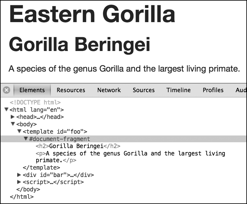
A template is declared with the template element, and any child elements form the content of the template. The following code block shows a template element with the id #foo, which has two child elements (an h2 and a p). Outside of the template is a div with the id #bar, which contains an h1 element.
<template id="foo">
  <h2>Gorilla Beringei</h2>
  <p>A species of the genus Gorilla…</p>
</template>
<div id="bar">
  <h1>Eastern Gorilla</h1>
</div>
If you were to view this page with your browser’s developer tools, you would see the template element with no content inside it because, essentially, the contents of this element are invisible to the DOM.
You access the template through script using the content object, which returns the child elements of the template as an HTML fragment. For example, you can see that the next code snippet assigns the template to the variable tpl and logs its content object to the console:
var tpl = document.getElementById('foo');
console.log(tpl.content);
Once you have the fragment, you can manipulate it as you see fit. The following code uses cloneNode() to create a clone of the content and appendChild() to add it inside #bar:
var bar = document.getElementById('bar'), clone = tpl.content.cloneNode(true);
bar.appendChild(clone);
At this point, you would see this markup if you inspected the DOM:
<template id="foo"></template>
<div id="bar">
  <h1>Eastern Gorilla</h1>
</div>
But the page would be rendered as if it were using this markup:
<div id="bar">
  <h1>Eastern Gorilla</h1>
  <h2>Gorilla Beringei</h2>
  <p>A species of the genus Gorilla…</p>
</div>
You can see it for yourself in the example file templates.html; the output is shown in Figure 11-1 (see Appendix M for information on current browser support). Note that in order for the contents of the template element to show in the DOM, I had to enable the Show Shadow DOM option in my developer tools; if that option wasn’t enabled, the element would appear to be empty.
template element, which exists outside the regular DOM.
Code that was inert inside the template element becomes active once it’s inserted into another DOM element, at which point any external resources will load, scripts will be parsed, and so on.
Decorators
Decorators extend the utility of templates by allowing you to add custom markup through CSS. Decorators use the decorator element, which must have a unique id assigned. Inside the decorator element, you’ll find a template element with some custom markup and the content element, which is where the element that the rule is applied to is rendered. Not clear? It took me a while to get it too.
Let’s break this down into stages. The following code shows an example of a decorator. I gave it the unique id #foo (for a change). Inside is a template that contains a div, with the content element and an h2 inside that.
<decorator id="foo">
  <template>
    <div>
      <content></content>
      <h2>A great ape!</h2>
    </div>
  </template>
</decorator>
Now imagine that in the main document I have an h1 element with the id #bar, as in the following code:
<h1 id="bar">Gorilla</h1>
I apply the decorator using CSS and the new decorator property, which has as its value a url() function containing the decorator’s id.
h1#bar { decorator: url(#foo); }
Once I’ve done this, the markup in the template #foo is added to the markup of the element #bar, with #bar itself replacing the content element of #foo. However, this takes effect only at the point of rendering and doesn’t alter the DOM. Although an inspection of the DOM shows only the element #bar, the element will be rendered as though the markup were this:
<div>
  <h1 id="bar">Gorilla</h1>
  <h2>A great ape!</h2>
</div>
You can do more with templates and decorators, but to show you more, I first need to make a brief digression to talk about scoped styles.
Scoped Styles
One of CSS’s greatest strengths is its use of inheritance—that is, the way that values can cascade through selectors to apply to multiple elements. That strength can also be a drawback, however, if you’re working on large sites with many stylesheets, where experiencing the naming and inheritance conflicts that I mentioned at the start of this section is not uncommon.
Scoped styles are a way to avoid these conflicts. They’re applied in the document using the style element with the attribute scoped, and any rules contained therein are inherited only by the children of the element they’re used in, and won’t be applied anywhere else in the document.
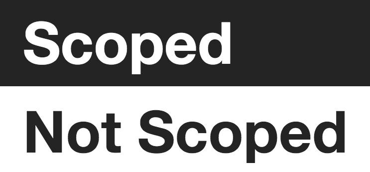
You can see this in action in the following code: A scoped style tag is used inside a div element, and the rules applied to the h1 apply only to the h1 within that element (the one with the id of #foo), and not the one outside the div (with the id #bar). The scope of the rule applies only to the children of the div.
<div>
  <style scoped>
    h1 {
      background-color: #333;
      color: #FFF;
    }
  </style>
  <h1 id="foo">Scoped</h1>
</div>
<h1 id="bar">Not Scoped</h1>
Take a look at the example file scoped-style.html. Here, the h1 with the id #bar follows the one with the id #foo in DOM order, so you would expect the rules inside the style element to apply to both. In fact, the scoped attribute means the rules apply only inside the parent div. You can see the result in Figure 11-2 and in scoped-style.html.
Scoped Styles and Templates
Having the ability to scope styles in this way is ideal for encapsulation, and it combines especially well with templates and decorators. Case in point, if I return to an earlier example using the markup from the first code block in Decorators, I could create a set of rules to be applied to the original h1 element only when the decorator is applied by using a scoped style tag inside the template element:
<decorator id="foo">
  <template>
    <div>
      <style scoped>
      h1 { color: red; }
      </style>
      <content></content>
      <h2>A great ape!</h2>
    </div>
  </template>
</decorator>
In this case, the h1 element is colored red only when the decorator is applied. Even better, that color won’t apply to any subsequent h1 element in the document because of its limited scope—a perfect example of encapsulation.
Custom Elements
Although decorators are handy for adding extra presentational markup to an element, when you want to make more substantial changes, use a custom element. The key difference between custom elements and decorators is that the latter are transitory; they can be applied or removed by changing an attribute or selector. Custom elements, on the other hand, are fixed; they are applied when the DOM is parsed and can be changed or removed only with scripting.
A custom element is like an extended template that replaces or enhances a standard element. You create a custom element with the element element (this paragraph is going for a new record in the number of occurrences of the word “element”), which has some new attributes that I’ll discuss shortly. Inside this element, you can add a template element with new markup, as well as scoped styles and even a script.
If this sounds a bit confusing, consider this illustration. The following code snippet shows a simple example: an element containing a template, which, in turn, contains a div, which itself contains the content element I introduced in Decorators. The element has two attributes: extends, which takes as a value the name of the element that it will extend (in this case, a button element), and name, a user-defined unique identifier value (which must start with x- to avoid conflicting with existing elements).
<element extends="button" name="x-foobutton">
  <template>
    <div id="foo">
      <content></content>
    </div>
  </template>
</element>
Once the custom element has been defined, you can apply it to an existing element with the is attribute. The is attribute is applied to the element to be extended and takes as a value the unique identifier from the name attribute (x-foobutton) defined on the custom element. Actually, this is simpler than it may sound:
<button is="x-foobutton">Go</button>
The resulting effect is the same as that of a decorator: The markup of the custom element extends the markup of the element it’s applied to but only in the rendered view. Although viewing the DOM shows only the button element, it renders like this:
<div id="foo">
  <button>Go</button>
</div>
This example is simple, but you can see how the extensibility of this technique would make it easy to build completely tailor-made widgets that could be reused across many documents. As a result, many of the cumbersome widgets we build today (such as carousels, accordions, and date pickers) could be applied to existing elements without filling the DOM with unnecessary markup, with the added benefit of implementing encapsulation to avoid conflicts.
I mentioned earlier that the core difference between a custom element and a decorator is in the permanence of the markup. One advantage of this is that scripts can be included in a custom element that will always be present (a benefit you can’t rely on for the more impermanent decorators). All this means you could even define an imperative API for each custom element, thereby taking interactivity to a whole new level.
The Shadow DOM
The final piece of the Web Components specification is the Shadow DOM. This is not only a cool-sounding name for a supervillain, but it’s also a way to create and access, with script, the elements that exist in the parallel DOM I’ve shown you in this chapter. Just as decorators use CSS to alter elements and custom elements use HTML, Shadow DOM uses script to achieve the same ends.
The Shadow DOM describes the ability of a browser to create a new, fully encapsulated node tree inside the existing DOM. The browser does this by creating a shadow root inside an element, which can be traversed and manipulated like a regular node tree. (A shadow tree won’t show up in the DOM, but it will be rendered.)
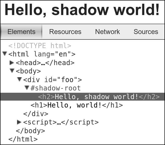
Now for an example. The following code snippet contains some simple markup: a div called #foo, which contains a single h1 element. This is the base markup in the DOM, inside which I’ll add a new shadow root.
<div id="foo">
  <h1>Hello, world!</h1>
</div>
Now I’ll add a new shadow root inside the div, and then create and append a new element to the new root. I explain this code point by point in the discussion that follows.
  var foo = document.getElementById('foo'),
1   newRoot = foo.createShadowRoot(),
2   newH2 = document.createElement('h2');
  newH2.textContent = 'Hello, shadow world!');
3 newRoot.appendChild(newH1);
The first thing to note 1 is the creation of a new shadow root inside #foo, using the createShadowRoot() method. In the following two lines 2, I create a new h2 element with the text content 'Hello, shadow world!‘. And finally 3, I append the new h2 element into my new shadow root.
When this code executes, users see an h2 element with the text 'Hello, shadow world!', but if they viewed the DOM, users would see the original content, 'Hello, world!‘. The h1 element has been completely replaced by the new shadow node tree. The DOM remains unaffected.
Figure 11-3 shows how this renders in the Chrome developer tools, with the contents of the shadow root displayed in a new node tree below the identifier #shadow-root.
If you don’t want to replace the content in the element in which you’ve created a new root, you can once again use the content element (again introduced in Decorators) to include the original elements. I illustrate this in the following code, where I create the content element and then append it to the new shadow root. As a result, the user sees the new shadow h2 first, followed by the original h1, although only the h1 appears in the DOM.
var content = document.createElement(content);
newRoot.appendChild(content);
You can also use templates with shadow node trees. For example, here’s how to append an HTML fragment of the template #foo content into the Shadow DOM:
var foo = document.getElementById('foo');
newRoot.appendChild(foo.content);
The Shadow DOM goes even further than this simple example and is a very powerful and flexible tool. I can’t spend any more time on it here, but see Appendix L for some links to more detailed articles.
Putting It All Together
I’ve only brushed the surface of the Web Components specification, but I hope I’ve offered enough to get you excited by the possibilities. Web Components promises to offer fully reusable code components to enhance existing elements. These components will be fully encapsulated from the rest of the document and rendered by the browser but not accessible through the DOM, although a parallel shadow DOM will allow complete manipulation of and access to the elements inside each component.
If the Web Components specification is implemented, it will revolutionize the way we build applications and websites. And if that doesn’t get you excited, you may be in the wrong business!