Table of Contents for
The Modern Web
 The Modern Web
Published by
No Starch Press, 2013
The Modern Web
Published by
No Starch Press, 2013
- The Modern Web
- Cover
- The Modern Web
- Advance Praise for
- Praise for Peter Gasston’s
- Dedication
- About the Author
- About the Technical Reviewer
- Acknowledgments
- Introduction
- The Device Landscape
- The Multi-screen World
- Context: What We Don’t Know
- What You’ll Learn
- A. Further Reading
- 1. The Web Platform
- A Quick Note About Terminology
- Who You Are and What You Need to Know
- Getting Our Terms Straight
- The Real HTML5
- CSS3 and Beyond
- Browser Support
- Test and Test and Test Some More
- Summary
- B. Further Reading
- 2. Structure and Semantics
- New Elements in HTML5
- WAI-ARIA
- The Importance of Semantic Markup
- Microformats
- RDFa
- Microdata
- Data Attributes
- Web Components: The Future of Markup?
- Summary
- C. Further Reading
- 3. Device-Responsive CSS
- Media Queries
- Media Queries in JavaScript
- Adaptive vs. Responsive Web Design
- Viewport-Relative Length Units
- Responsive Design and Replaced Objects
- Summary
- D. Further Reading
- 4. New Approaches to CSS Layouts
- Multi-columns
- Flexbox
- Grid Layout
- The Further Future
- Summary
- E. Further Reading
- 5. Modern JavaScript
- New in JavaScript
- JavaScript Libraries
- Polyfills and Shims
- Testing and Debugging
- Summary
- F. Further Reading
- 6. Device Apis
- Geolocation
- Orientation
- Fullscreen
- Vibration
- Battery Status
- Network Information
- Camera and Microphone
- Web Storage
- Drag and Drop
- Interacting with Files
- Mozilla’s Firefox OS and WebAPIs
- PhoneGap and Native Wrappers
- Summary
- G. Further Reading
- 7. Images and Graphics
- Comparing Vectors and Bitmaps
- Scalable Vector Graphics
- The canvas Element
- When to Choose SVG or Canvas
- Summary
- H. Further Reading
- 8. New Forms
- New Input Types
- New Attributes
- Datalists
- On-Screen Controls and Widgets
- Displaying Information to the User
- Client-side Form Validation
- The Constraint Validation API
- Forms and CSS
- Summary
- I. Further Reading
- 9. Multimedia
- The Media Elements
- Media Fragments
- The Media API
- Media Events
- Advanced Media Interaction
- Summary
- J. Further Reading
- 10. Web Apps
- Web Apps
- Hybrid Apps
- TV Apps
- Webinos
- Application Cache
- Summary
- K. Further Reading
- 11. The Future
- Web Components
- The Future of CSS
- Summary
- L. Further Reading
- M. Browser Support as of March 2013
- The Browsers in Question
- Enabling Experimental Features
- Chapter 1: The Web Platform
- Chapter 2: Structure and Semantics
- Chapter 3: Device-Responsive CSS
- Chapter 4: New Approaches to CSS Layouts
- Chapter 5: Modern JavaScript
- Chapter 6: Device APIs
- Chapter 7: Images and Graphics
- Chapter 8: New Forms
- Chapter 9: Multimedia
- Chapter 10: Web Apps
- Chapter 11: The Future
- N. Further Reading
- Introduction
- Chapter 1: The Web Platform
- Chapter 2: Structure and Semantics
- Chapter 3: Device-Responsive CSS
- Chapter 4: New Approaches to CSS Layouts
- Chapter 5: Modern JavaScript
- Chapter 6: Device APIs
- Chapter 7: Images and Graphics
- Chapter 8: New Forms
- Chapter 9: Multimedia
- Chapter 10: Web Apps
- Chapter 11: The Future
- Index
- About the Author
- Copyright
Flexbox
If you’re building more of an app than a content-rich website, especially if you’re building an app with lots of buttons and options in the UI, or with lots of form elements or interactive regions, you’ll find the Flexible Box (Flexbox) module extremely useful.
The roots of Flexbox are in XUL, the language used to create the Firefox browser’s layout, which should tell you that it’s aimed at user interfaces. Flexbox makes elements resize flexibly to better fit their available space and reorders them or changes their orientation quickly.
The Flexbox syntax has undergone an awful lot of changes in the past few years, but it’s finally quite stable and well implemented, so we can discuss it without worry!
Declaring the Flexbox Model
The first step to using Flexbox is to create the flex container. The flex container is the parent element that will hold all the flex items (I’ll get to those soon). To declare a flex container, simply use a new value for the display property:
E { display: flex; }
Now you have your flex container, but what is it good for? That becomes apparent when you add child items to the container. Example file flexbox.html has two child items inside the container, using the following markup:
<div id="container">
  <div id="a">…</div>
  <div id="b">…</div>
</div>
In Figure 4-5, notice that the two elements are positioned horizontally inside the container at equal widths, even though I haven’t used any floats or positioning properties. This behavior is the default for flex items (children of a flex container): They are laid out in a row inside the container. Or, rather, they are laid out in the direction of the language of the document—in left-to-right languages, such as English, the direction in a row is from left to right.
You can alter this direction by using the flex-direction property on the container. Its default value is row, which gives the behavior just discussed, whereas a value of column lays the items perpendicular to the direction of text—in this case, into a column. (A few other permitted values are available, which I’ll cover shortly.):
E {
  display: flex;
  flex-direction: column;
}
This syntax makes your flex items look like the page layout default behavior, where one item follows the next in vertical sequence.
Changing the Content Order
One of Flexbox’s other great capabilities is that you can quickly change the order that items are displayed in, regardless of their order in the DOM. For example, in the previous section, I had two items laid out in a row, but what if I wanted to change them around so that #b came before #a?
You can do this quickly with the flex-direction property that I just discussed, using the new value row-reverse. This property reverses the order in which the flex items are displayed, as you can see in Figure 4-6.
E { flex-direction: row-reverse; }
The column-reverse value does the same thing to flex items displayed in columns: They are laid out in reverse order, vertically. Play around with the values of flex-direction in the example file to see their different effects.
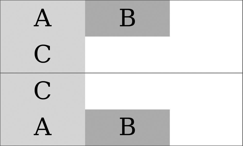
By using the flex-order property, you can go beyond this reverse ordering to make completely bespoke ordering patterns. This property is applied to the flex items, not the container, and the value is a number that creates an ordinal group, so items with the same value are grouped together. The items are ordered by their ordinal group: All items in the lowest numbered group come first, followed by all items in the second-lowest numbered group, and so on. Any items without a declared value are shown first because they have the default value of 0.
Items with the same ordinal group number will subsequently be shown in the order in which they appear in the DOM. This ordinal group ordering may sound confusing at first, so I’ll illustrate using four flex items, marked up like so:
<div id="container">
  <div id="a">…</div>
  <div id="b">…</div>
  <div id="c">…</div>
  <div id="d">…</div>
</div>
Without any explicit values being set, the children are displayed in the order they appear in the DOM: #a, #b, #c, #d. But let’s reorder them by using different values on the flex-order property:
#a { flex-order: 2; }
#b, #d { flex-order: 3; }
#c { flex-order: 1; }
With these rules applied, the items are laid out in this order: #c, #a, #b, #d. Item #c comes first because it has the lowest ordinal group number, followed by #a with the next highest, and then #b and #d—both are in ordinal group 3, and #d comes last because it’s also later in the DOM order.
Alignment Inside the Container
Flex items with explicit dimensions might be smaller than their container, but one of the other benefits of Flexbox is tight control over alignment and placing.
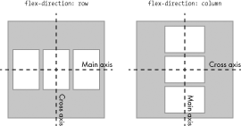
Before getting into this fully, I’ll quickly explain the two different axes used for alignment. The main axis goes in the direction that the items are placed: By default, when the value of flex-direction is row, the main axis is horizontal; when the value is column, the main axis is vertical. The cross axis is the perpendicular: vertical when the flex-direction is row, horizontal when it’s column. Figure 4-7 shows the difference.
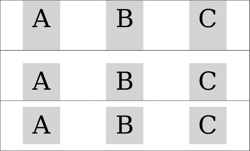
Now on with the alignment properties. Imagine you have a flex container that is 600px wide, with three flex items that are each 150px wide. By default, the three items display in a row, aligned to the left, with 150px of unused space after them (as shown in the first row of Figure 4-8).
You can redistribute this unused space with the justify-content property. This property accepts a series of keyword values that apply differently depending on the direction of the flex parent (row, column, reversed row, and so on). For the purpose of demonstration, let’s presume the standard English left to right row. The default value is flex-start, which aligns all flex items to the left of the parent with the unused space occupying the remaining horizontal width to the right, as I mentioned in the previous paragraph.
The alternative values are: flex-end, which aligns the items to the right of the container with the unused space to the left; center, which distributes the unused space to either side of all items, centering the items in the container; space-between, which adds an equal amount of space between each item but none before the first or after the last item; and space-around, which puts an equal amount of space on both sides of each item.
Have a look at flexbox-alignment.html and try changing the value of justify-content to see its effect. Figure 4-8 shows a few different values for comparison.
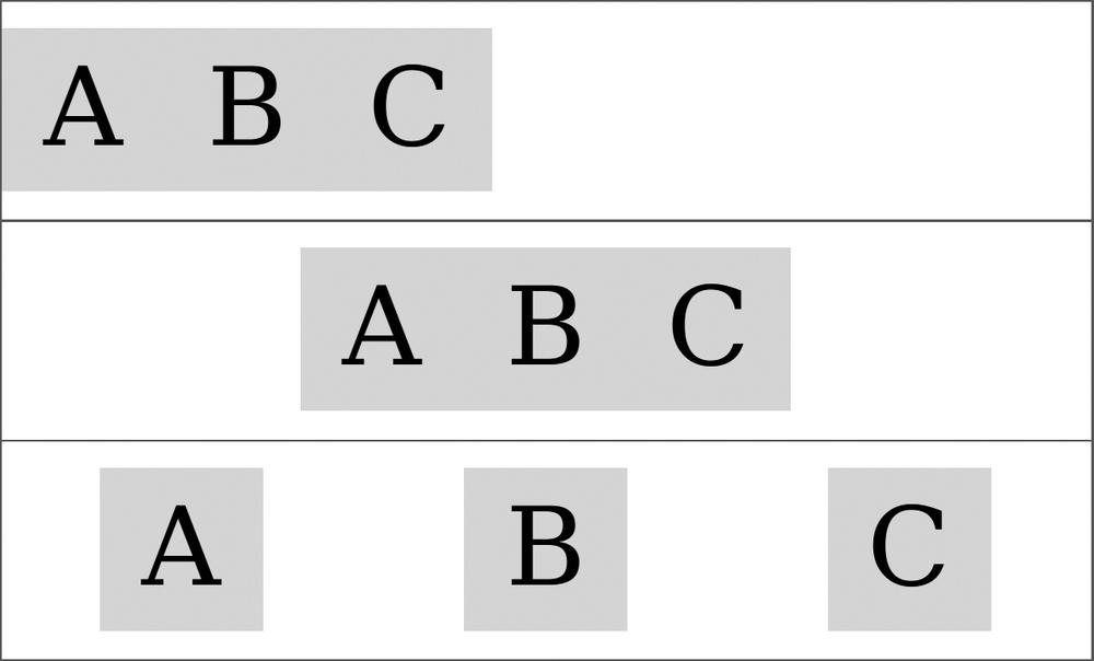
justify-content property: flex-start (top), center (middle), and space-around (bottom)
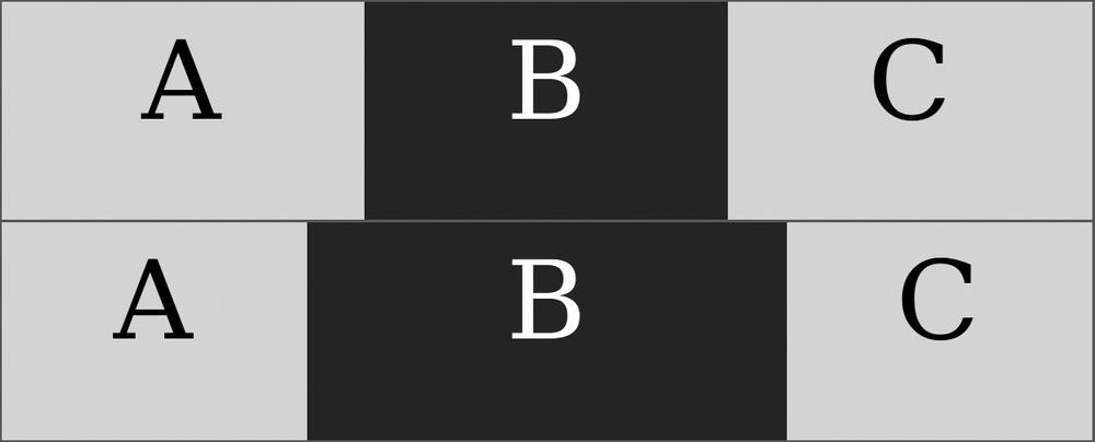
But what about alignment on the cross axis? After all, at times the height of your flex items is less than the height of the flex container. (To avoid repetition, I’ll continue to assume we’re dealing with items in a row.)
The property that applies is align-items, and the values are a little different. The default is stretch, which makes the item the same height as its parent. This value works only when no height has been specified on the items, however; if a height has been specified, the default becomes flex-start, which aligns the items to the top of the container. Of the other values, flex-end aligns items to the bottom of the container; center to the vertical center of the container, with equal unused space above and below; and baseline aligns the items according to the baseline of the first line of their content.
Have a look at flexbox-alignment.html and update the value yourself to see the different effects in action. Figure 4-9 shows some different values at work.
align-items: stretch (top), flex-end (middle), and center (bottom).
To control the alignment of individual items, use the align-self property. This property applies to the item, not the container, but the values are the same as align-items, and they have the same effects (although on the selected item only—sibling items remain unaffected).
Adding Some Flexibility
You’ve seen how items can be aligned and ordered, but so far a better name for the module might be Versatile Box. What about the titular flexibility? This comes in the shape of dynamic growing or shrinking of items to better fit the container and is provided by a new property called flex. This property is applied to items, rather than the container, and takes three values:
E { flex: 1 2 150px; }
The flex property is actually a shorthand, and each of the values are for a further property; in order, they are flex-grow, flex-shrink, and flex-basis. If I wrote the same rule out again using all three properties, it would be:
E {
  flex-grow: 1;
  flex-shrink: 2;
  flex-basis: 150px;
}
But what do these properties actually do? I’ll start by explaining flex-basis, which essentially acts like (and takes precedence over) the value of the width property. The flex-basis property is like a “preferred width” property, meaning these boxes will be flexible, but their flexibility will be based on this number.
In the example code I’ve used so far in this section, I’ve included three flex items, each with a flex-basis of 150px, in a flex container that is 600px wide, leaving 150px of unused width. This is where the other properties come in.
The flex-grow and flex-shrink property values are basically a ratio. Ignore flex-shrink for a moment, and note that each item has a flex-grow value of 1. This value means the 150px of unused width is divided up using the ratio 1:1:1—that is, equally. Fifty pixels are added to each element so they each become 200px wide, filling the container. But what if I changed the flex-grow value for one of the children?
#a, #b { flex: 1 2 150px; }
#c { flex: 3 2 150px; }
Now the ratio has changed to 1:3:1, meaning the 150px will be distributed between the items in that ratio; for every 1px that’s distributed to items #a and #b, 3px is distributed to item #c. Therefore #c becomes 240px wide, and items #a and #b are 180px wide. Changing the flex-grow value alters that ratio and the flexibility of your items.
For example, Figure 4-10 shows the effect of a change to flex-grow; in the upper example, all items have an equal value of 1; in the lower example, item B has a value of 3, meaning it grows proportionally larger.
flex-grow value means item B in the lower example becomes proportionally larger than its siblings.
The flex-shrink property works in reverse. If you keep the same items as in the examples but reduce the width of the container to 300px, the combined width (or flex-basis) of the items creates a 50px-surplus width, which is removed from each of the items in the ratio given by flex-shrink: 2:2:2. Notice this is an equal ratio, so it’s actually the same as 1:1:1 or 5:5:5. The result is the same: each item is reduced in width by 50px to fit the container.
Now what if you change the flex-shrink value of one of the items?
#a, #b { flex: 1 2 150px; }
#c { flex: 3 3 150px; }
Now item #c is reduced by 3px for every 2px from items #a and #b; it flexes to 86px in width, compared to its siblings’ 107px.
This flexibility is really useful when you have a series of elements that must fit into variable spaces, such as a user interface on an app that has to work across multiple devices. Flexbox is also good for those times when you don’t know how many interface elements you’ll have, but you know they should all be proportional regardless.
Wrap and Flow
Even with the extra flexibility provided by Flexbox, at times you will have too many items to fit comfortably into one row (or column) of a container. Should this occur, you can break items onto multiple lines using the flex-wrap property. Its default value is nowrap, which preserves all the items on the same line, but a value of wrap makes the items break onto extra lines if required:
E { flex-wrap: wrap; }
The wrap value makes new lines below the first (or to the right in column view), but an alternative value of wrap-reverse changes the direction of the cross axis so new lines appear above (or to the left) instead. Figure 4-11 compares the two different values.
flex-wrap property. The upper example has a value of wrap, so element C appears in a new line below; whereas in the lower example, the value is wrap-reverse, so element C is on a new line above.
You can combine flex-wrap with flex-direction in the shorthand flex-flow property. To set a column with multiple lines and a reversed cross axis, use this:
E { flex-flow: column wrap-reverse; }
When items wrap over multiple lines, you can control their alignment with the align-content property. This property works like the justify-content property but on the cross axis. It has the same possible values plus one extra, stretch, which resizes the items to fill all unused space. Figure 4-12 compares two different values.
align-content: center (top) and space-between (bottom).
Although you can create entire page layouts with Flexbox, that’s not really what it’s intended for, and you would probably be hacking it around to get the exact layout you want. A better option is to use a dedicated set of page layout properties, and that’s where the Grid Layout module comes in.