Table of Contents for
The Modern Web
 The Modern Web
Published by
No Starch Press, 2013
The Modern Web
Published by
No Starch Press, 2013
- The Modern Web
- Cover
- The Modern Web
- Advance Praise for
- Praise for Peter Gasston’s
- Dedication
- About the Author
- About the Technical Reviewer
- Acknowledgments
- Introduction
- The Device Landscape
- The Multi-screen World
- Context: What We Don’t Know
- What You’ll Learn
- A. Further Reading
- 1. The Web Platform
- A Quick Note About Terminology
- Who You Are and What You Need to Know
- Getting Our Terms Straight
- The Real HTML5
- CSS3 and Beyond
- Browser Support
- Test and Test and Test Some More
- Summary
- B. Further Reading
- 2. Structure and Semantics
- New Elements in HTML5
- WAI-ARIA
- The Importance of Semantic Markup
- Microformats
- RDFa
- Microdata
- Data Attributes
- Web Components: The Future of Markup?
- Summary
- C. Further Reading
- 3. Device-Responsive CSS
- Media Queries
- Media Queries in JavaScript
- Adaptive vs. Responsive Web Design
- Viewport-Relative Length Units
- Responsive Design and Replaced Objects
- Summary
- D. Further Reading
- 4. New Approaches to CSS Layouts
- Multi-columns
- Flexbox
- Grid Layout
- The Further Future
- Summary
- E. Further Reading
- 5. Modern JavaScript
- New in JavaScript
- JavaScript Libraries
- Polyfills and Shims
- Testing and Debugging
- Summary
- F. Further Reading
- 6. Device Apis
- Geolocation
- Orientation
- Fullscreen
- Vibration
- Battery Status
- Network Information
- Camera and Microphone
- Web Storage
- Drag and Drop
- Interacting with Files
- Mozilla’s Firefox OS and WebAPIs
- PhoneGap and Native Wrappers
- Summary
- G. Further Reading
- 7. Images and Graphics
- Comparing Vectors and Bitmaps
- Scalable Vector Graphics
- The canvas Element
- When to Choose SVG or Canvas
- Summary
- H. Further Reading
- 8. New Forms
- New Input Types
- New Attributes
- Datalists
- On-Screen Controls and Widgets
- Displaying Information to the User
- Client-side Form Validation
- The Constraint Validation API
- Forms and CSS
- Summary
- I. Further Reading
- 9. Multimedia
- The Media Elements
- Media Fragments
- The Media API
- Media Events
- Advanced Media Interaction
- Summary
- J. Further Reading
- 10. Web Apps
- Web Apps
- Hybrid Apps
- TV Apps
- Webinos
- Application Cache
- Summary
- K. Further Reading
- 11. The Future
- Web Components
- The Future of CSS
- Summary
- L. Further Reading
- M. Browser Support as of March 2013
- The Browsers in Question
- Enabling Experimental Features
- Chapter 1: The Web Platform
- Chapter 2: Structure and Semantics
- Chapter 3: Device-Responsive CSS
- Chapter 4: New Approaches to CSS Layouts
- Chapter 5: Modern JavaScript
- Chapter 6: Device APIs
- Chapter 7: Images and Graphics
- Chapter 8: New Forms
- Chapter 9: Multimedia
- Chapter 10: Web Apps
- Chapter 11: The Future
- N. Further Reading
- Introduction
- Chapter 1: The Web Platform
- Chapter 2: Structure and Semantics
- Chapter 3: Device-Responsive CSS
- Chapter 4: New Approaches to CSS Layouts
- Chapter 5: Modern JavaScript
- Chapter 6: Device APIs
- Chapter 7: Images and Graphics
- Chapter 8: New Forms
- Chapter 9: Multimedia
- Chapter 10: Web Apps
- Chapter 11: The Future
- Index
- About the Author
- Copyright
New Input Types
In HTML 4.01, a handful of form elements allowed user input, including textarea, checkbox, and radio, but the most common was without a doubt input, most often with a type attribute value of text. This hard-working field (from here on known as the text input) was used in every situation in which a specialized control was unavailable: as a search box, for telephone numbers and email addresses … you name it, the text input did it, with only some client- or server-side validation to give meaning to the different types of data being provided by the user.
When work on HTML5 was underway, with its stated emphasis on standardizing common patterns of existing usage, creating new input types to lift some of the burden from the encumbered text input was really a no-brainer. Now a handful of properties have the appearance of a text input but with different type values to give meaning to the data.
The first new value is search, which is (fairly obviously) used to mark up a search box. It looks like this:
<input type="search">
In some browsers, the appearance of the search box is differentiated from that of a regular text input, sometimes with rounded corners to match the OS it’s running on or perhaps with a button to clear the contents of the field. A few different examples are shown in Figure 8-1. But although its appearance and behavior might differ from a text input, search has no limitation on the type of data that you can enter.
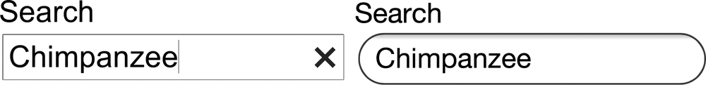
search input rendered in different browsers: Chrome for Ubuntu (left) and Safari for iOS (right)
That’s not the case with the next two values, email and url, which are provided for the user to enter—can you guess? that’s right!—an email address and a URL. The fields look identical to a text input but have a key difference: They limit the data that users can enter into them. Here’s how these values are used:
<input type="email">
<input type="url">
The email type accepts only a well-formatted email address—peter@broken-links.com
, for example—and the url type requires a correctly formatted URL, including the protocol, such as http://broken-links.com. If the user enters a value that doesn’t match the required pattern into either field, the field will be declared invalid. I’ll return to this subject a little later, in Client-side Form Validation.
Another commonly requested piece of information is a telephone number. The new dedicated input for this has a type of tel:
<input type="tel">
The actual format of telephone numbers can vary wildly, including numbers, letters, and symbols, so this field doesn’t have any restrictions as to which characters can be entered.
As many browsers display these new input types mostly identically, what exactly is the point of using them instead of text? Well, I’ve already mentioned that they provide some native validation, which I’ll cover in Client-side Form Validation, but aside from that, they also offer another big advantage: On many devices with on-screen (or soft) keyboards, they provide the user with a sympathetic keyboard layout.
Apple popularized sympathetic soft keyboard layouts when it invented iOS (called iPhone OS back in those heady pre-iPad days), and their implementation is probably still the standard-bearer. If you open the example file input-types.html on an iOS device and put the focus into each input in turn, you’ll see the on-screen keyboard update to display a different layout for each (shown in Figure 8-2 in case you don’t have an iOS device handy): The text input shows a standard keyboard layout; the email input adds an @ and a period, commonly used in email addresses; the url input displays a period, slash, and top-level-domain chooser; and the tel input displays a telephone number pad. All of these inputs help users enter the correct data in a faster and more convenient way.
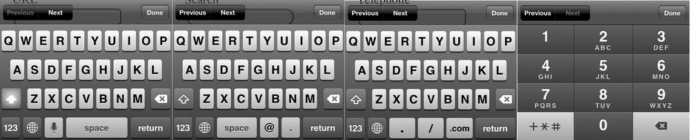
text, email, url, and tel input types
The value of sympathetic layouts becomes really obvious when you use an on-screen keyboard that doesn’t support them; switching among different views for letters, cases, numbers, and symbols becomes a real chore. So help your users out by implementing these new types wherever and whenever you can.