Table of Contents for
The Modern Web
 The Modern Web
Published by
No Starch Press, 2013
The Modern Web
Published by
No Starch Press, 2013
- The Modern Web
- Cover
- The Modern Web
- Advance Praise for
- Praise for Peter Gasston’s
- Dedication
- About the Author
- About the Technical Reviewer
- Acknowledgments
- Introduction
- The Device Landscape
- The Multi-screen World
- Context: What We Don’t Know
- What You’ll Learn
- A. Further Reading
- 1. The Web Platform
- A Quick Note About Terminology
- Who You Are and What You Need to Know
- Getting Our Terms Straight
- The Real HTML5
- CSS3 and Beyond
- Browser Support
- Test and Test and Test Some More
- Summary
- B. Further Reading
- 2. Structure and Semantics
- New Elements in HTML5
- WAI-ARIA
- The Importance of Semantic Markup
- Microformats
- RDFa
- Microdata
- Data Attributes
- Web Components: The Future of Markup?
- Summary
- C. Further Reading
- 3. Device-Responsive CSS
- Media Queries
- Media Queries in JavaScript
- Adaptive vs. Responsive Web Design
- Viewport-Relative Length Units
- Responsive Design and Replaced Objects
- Summary
- D. Further Reading
- 4. New Approaches to CSS Layouts
- Multi-columns
- Flexbox
- Grid Layout
- The Further Future
- Summary
- E. Further Reading
- 5. Modern JavaScript
- New in JavaScript
- JavaScript Libraries
- Polyfills and Shims
- Testing and Debugging
- Summary
- F. Further Reading
- 6. Device Apis
- Geolocation
- Orientation
- Fullscreen
- Vibration
- Battery Status
- Network Information
- Camera and Microphone
- Web Storage
- Drag and Drop
- Interacting with Files
- Mozilla’s Firefox OS and WebAPIs
- PhoneGap and Native Wrappers
- Summary
- G. Further Reading
- 7. Images and Graphics
- Comparing Vectors and Bitmaps
- Scalable Vector Graphics
- The canvas Element
- When to Choose SVG or Canvas
- Summary
- H. Further Reading
- 8. New Forms
- New Input Types
- New Attributes
- Datalists
- On-Screen Controls and Widgets
- Displaying Information to the User
- Client-side Form Validation
- The Constraint Validation API
- Forms and CSS
- Summary
- I. Further Reading
- 9. Multimedia
- The Media Elements
- Media Fragments
- The Media API
- Media Events
- Advanced Media Interaction
- Summary
- J. Further Reading
- 10. Web Apps
- Web Apps
- Hybrid Apps
- TV Apps
- Webinos
- Application Cache
- Summary
- K. Further Reading
- 11. The Future
- Web Components
- The Future of CSS
- Summary
- L. Further Reading
- M. Browser Support as of March 2013
- The Browsers in Question
- Enabling Experimental Features
- Chapter 1: The Web Platform
- Chapter 2: Structure and Semantics
- Chapter 3: Device-Responsive CSS
- Chapter 4: New Approaches to CSS Layouts
- Chapter 5: Modern JavaScript
- Chapter 6: Device APIs
- Chapter 7: Images and Graphics
- Chapter 8: New Forms
- Chapter 9: Multimedia
- Chapter 10: Web Apps
- Chapter 11: The Future
- N. Further Reading
- Introduction
- Chapter 1: The Web Platform
- Chapter 2: Structure and Semantics
- Chapter 3: Device-Responsive CSS
- Chapter 4: New Approaches to CSS Layouts
- Chapter 5: Modern JavaScript
- Chapter 6: Device APIs
- Chapter 7: Images and Graphics
- Chapter 8: New Forms
- Chapter 9: Multimedia
- Chapter 10: Web Apps
- Chapter 11: The Future
- Index
- About the Author
- Copyright
Grid Layout
Grids are a fundamental design element. Simple grids have been used by calligraphers since medieval times and the modern typographic grid since the second half of the 20th century. For a few years now, efforts have been made to bring grid-based design to the Web, with a number of frameworks being created that use floats, padding, and margins to emulate the possibilities of print.
Recently browsers have begun to implement a native CSS Grid Layout system, which provides a series of properties designed specifically to create grids on screen, meaning the developer no longer has to hack them together from existing properties and behaviors. But before I introduce the new grid syntax, I’ll explain some of the terminology used in the Grid Layout module. Even if you’re a designer familiar with using grids, you should take time to understand these terms, as the terminology used in CSS grids is distinct from that used by designers.
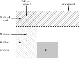
Here I’ve defined the key terms used in the module:
-
Grid element. The container element that acts as the boundary and sets the dimensions of the grid.
-
Grid items. Each child element that is placed onto the grid is known as an item.
-
Grid lines. The dividing lines between rows and columns; these lines are notional, not actual.
-
Grid tracks. The shorthand name for both rows and columns. Each column or row created in the grid is referred to as a track. Tracks are the spaces between lines.
-
Grid areas. Each intersection of a column and a row creates an area. Think of these like cells in a table.
A grid is created by first setting a number of lines on the grid element to create a series of tracks. Grid items are then positioned in the grid using the tracks as coordinates and either fit into an area or span a series of areas, as shown in Figure 4-13.
If you’ve used spreadsheet software such as Excel, a grid should be easy to visualize. The grid lines—the lines between cells—define a series of rows and columns that are numbered for coordinate placement. (If you haven’t used spreadsheet software or you don’t know about typographical grids and are confused about what all this means, don’t worry—I explain it in stages.)
Note
The syntax I’m using in this section is what shipped with Internet Explorer 10; however, the specification has undergone changes since then. The new syntax will be listed later in The September 2012 Grid Layout Syntax.
Declaring and Defining the Grid
The first step in creating a grid is to declare the grid element. As explained in the introduction to this section, this is the container element that is used as the grid’s foundation: Its dimensions will be the limits of the grid, and all the grid properties will be applied to it. The grid element is declared with the existing display property, using the new value grid:
E { display: grid; }
Next, you define the grid tracks with the grid-columns and grid-rows properties. The value for each of these properties is a length unit, which sets the width of the column or height of the row. As a simple first example, here’s how to create two columns, one that is 75 percent of the width of the grid element and one that is 25 percent:
E { grid-columns: 75% 25%; }
You’re not confined to percentages here; any length units are permitted, and a new length unit, fraction (fr), has been created especially for defining grids. One fr means one equal share of the remaining space. In the previous example, you could use the fr unit instead of percentages to achieve the same result:
E { grid-columns: 3fr 1fr; }
But fractions really come into their own when mixed with other units. For example, say you want to have one fixed-width column and two equal and dynamic columns as part of a responsive layout. Using fr is perfect for this. In the following code, three columns are created: one at 15em wide and the remaining two at half of the remaining width each:
E { grid-columns: 15em 1fr 1fr; }
Adding rows is done in the same way, using all of the same possible units. Say, for example, I want to create three rows: The first is 100px high; the second has a value of auto, so it is as high as the content contained within it; and the third is 15em high. Here’s the code to create these rows:
E { grid-rows: 100px auto 15em; }
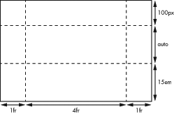
Putting all these properties together lets you fully define your grid. As a simple example, let’s create a basic grid of three columns and three rows, for a total of nine cells. Here’s the code for that:
E {
  display: grid;
  grid-columns: 1fr 4fr 1fr;
  grid-rows: 100px auto 15em;
}
The columns of this grid are distributed in the ratio 1:4:1, and the rows are 100px at the top, 15em at the bottom, with a central row of automatic height to accommodate all the content within it. The grid will look something like Figure 4-14.
Repeating Grid Lines
The simple grids defined in this chapter so far are good for learning and for some real-world situations, but you’ll often want to use quite complex grids for finer control over content. A 12- or 16-column grid is fairly commonplace, and each of those columns usually has a gutter (empty space) between itself and its neighbor. But using the Grid Layout syntax, even a 6-column grid with gutters can be quite repetitive:
E { grid-columns: 1fr 10px 1fr 10px 1fr 10px 1fr 10px 1fr 10px 1fr; }
Now imagine how repetitive that would be with 16 columns! To get around this problem, you can use the repeat() function to manage repetition. This function takes two values: an integer that sets the number of repetitions and then the grid line values to be repeated:
E { grid-columns: 1fr repeat(5, 10px 1fr); }
This defines one track, one fraction wide, and then repeats a pattern alternating 10px and 1fr, five times, matching the code in the previous example.
Internet Explorer 10 uses syntax from an older version of the spec, where the number of repetitions is placed after the parentheses in square brackets. If you’re building apps for the Windows 8 UI, use this syntax:
E { -ms-grid-columns: 1fr repeat(10px 1fr)[5]; }
Placing Items on the Grid
To place an item on the grid, you assign it a cell reference using the grid-column and grid-row properties. Each property takes a single whole number as a value, which refers to a track (either a column or a row). For example, to place an item in the cell positioned in the second column, second row, you would use this code (the result is shown in Figure 4-15):
F {
  grid-column: 2;
  grid-row: 2;
}
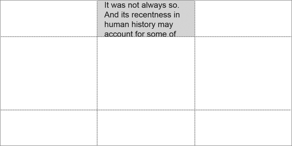
The default value of both grid-column and grid-row is 1, so omitting either would place the item in the first row or column. Given the following code, the item would be placed in the cell in the second column of the first row, as you can see in Figure 4-16.
F { grid-column: 2; }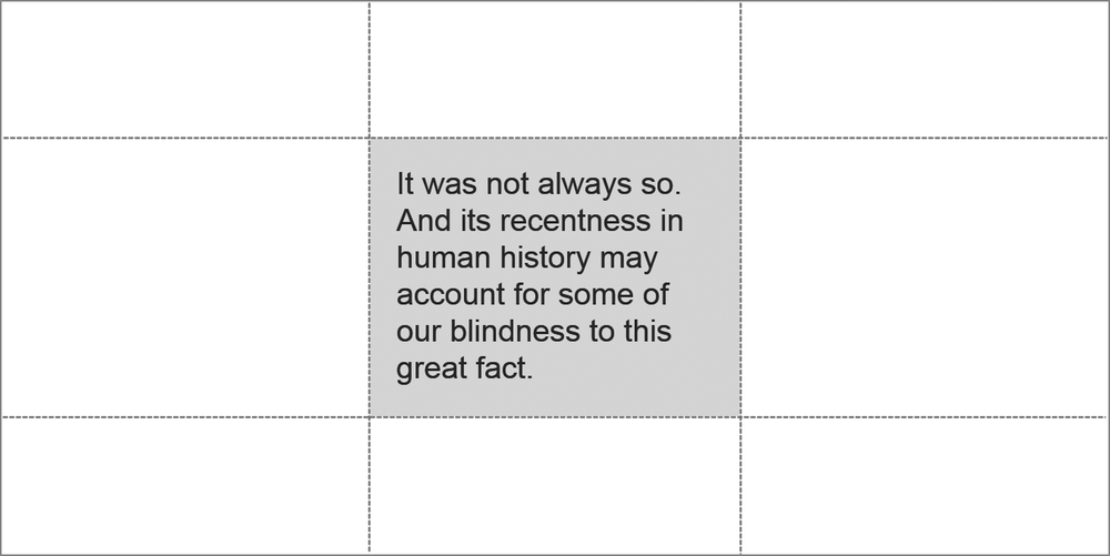
By default, the item is sized into the nominated cell, but you can expand the item’s size by making it span multiple cells in rows or columns. You do this with the grid-column-span and grid-row-span properties, each of which, again, takes a single whole number value that determines how many tracks the item should span. For example, here’s an item that spans the first three rows of the first column:
F { grid-row-span: 3; }
Remember, you don’t need to define grid-column and grid-row in this instance, as they both default to 1. The item is placed in the first column of the first row—right where you want it—and it spans all three rows, as shown in Figure 4-17.
Alignment and Stacking
By default, the items you place on the grid are positioned so their top-left corner is at the top-left corner of the designated cell, but you can change this default positioning with the grid-column-align and grid-row-align properties. These properties each take a series of keyword values (center, end, start, and stretch). These values set the alignment of the item within its cell.
The center value obviously aligns the item to the horizontal or vertical center of the cell, whereas start and end depend on the direction of writing in your document. For those of us using English and other left-to-right languages, start aligns the item to the left or top of the cell, and end to the right or bottom. The stretch value makes the item expand to fill the whole width or height of the cell.
To show how these values work, take a look at the example file grid-align.html. You’ll find a grid of three equal cells with an identical item in each. I’ve positioned each differently, using the following code:
#a { grid-row-align: end; }
#b { grid-row-align: stretch; }
#c { grid-row-align: center; }
As you can see, each item is aligned differently within the row: #a is aligned to the end (bottom), #b stretches to fill the whole cell, and #c is vertically centered. You can compare the results in Figure 4-18.
As you’re placing items into the grid, you may find that items overlap in the same cell. By default, items are stacked in DOM order, with items that appear later in the DOM stacked on top of items that appear earlier, as in the following markup, for example.
<div id="a">…</div>
<div id="b">…</div>
If the div items #a and #b were placed into the same cell, the latter would show above the former because it’s later in the DOM order. You can change this order by using the z-index property (from absolute positioning in CSS2.1). For example, to have item #a appear above #b, you do this:
#a { z-index: 10; }
(I’ll discuss another approach to dealing with stacking conflicts later in Exclusions and Grids.)
The September 2012 Grid Layout Syntax
As I mentioned previously, the syntax of the Grid Layout module was updated after Internet Explorer 10 had implemented its version. The updated specification still has draft status and is a long way from being approved, and as I write this, the new syntax has yet to be implemented in any browser.
The good news is that the core concepts remain the same, and the main changes come in the form of new and updated property names. For example, when defining a grid, the grid-columns and grid-rows properties are now known as grid-definition-columns and grid-definition-rows, respectively. That was easy, but pay attention to the next part.
The roles played by the grid-column and grid-row properties are now filled by grid-column-position and grid-row-position, although the former properties still exist as shorthands: grid-column is shorthand for grid-column-position and grid-column-span, and grid-row is shorthand for grid-row-position and grid-row-span. That makes more sense than it might seem to at first.
Other shorthands include the following: grid-position is shorthand for grid-column-position and grid-row-position; grid-span for grid-column-span and grid-row-span; and grid-area for (deep breath) grid-column-position, grid-row-position, grid-column-span, and grid-row-span (or grid-position and grid-span, if you prefer shorthands of shorthands).
Warning
Remember that because the spec is still draft, this syntax is not necessarily final. Updates will be posted on this book’s companion website, http://modernwebbook.com/.
On the Grid Layout Terminology
The terminology used in the Grid Layout module is really quite distinct from that of the typographic grids used by designers, a fact that has caused some designers to be quite vocal about their displeasure. Mark Boulton, one of the chief instigators in explaining the importance of grid systems on web pages, wrote an open letter to the W3C about the terminology used in the Grid Layout module:
I’m confused as to the need to invent new terminology with regards to grids that have existed for centuries. I’m also a little concerned that the mental model this terminology builds is one more similar to tables and spreadsheets (where these terms could be interchangeable) than to grids and layout.
Tab Atkins, of Google and the CSS Working Group, was forthright about why CSS grids seem to have more in common with tables than typographic grids:
Because Grid Layout is basically just the good parts of table layouts, without the shitty parts, so we reused the same terminology.
Grid Template
The Grid Layout module offers another way to define grids. Though as of this writing no browsers have implemented grid templates or indicated that they will, I think it deserves a brief explanation because it’s such a clever and different approach.
The grid-template property allows you to define grid areas by using a series of unique identifiers in strings of text. Each identifier represents an area, and each string represents a row. For example, to make a grid of one row with three columns, you would use this:
E {
  display: grid;
  grid-template: 'a b c';
}
To make multiple rows, add more strings, and make cells span rows and columns, add an extra instance of the letter in the direction you want to span. For example, in the following code, cell a will span two rows, and cell b will span two columns. I’ve formatted the strings to make it easier for you to visualize how these will appear:
E {
  display: grid;
  grid-template:
    'a b b'
    'a c d';
}
To place an item in a grid declared with a template, just use the letter of the cell as a value for the grid-area property. For example, to place an item in cell b, use this code:
F { grid-area: 'b'; }
As mentioned, I have no idea whether grid templates will ever see the light of day in a browser, but they offer an interesting way to approach the creation of simple grids.