Table of Contents for
The Modern Web
 The Modern Web
Published by
No Starch Press, 2013
The Modern Web
Published by
No Starch Press, 2013
- The Modern Web
- Cover
- The Modern Web
- Advance Praise for
- Praise for Peter Gasston’s
- Dedication
- About the Author
- About the Technical Reviewer
- Acknowledgments
- Introduction
- The Device Landscape
- The Multi-screen World
- Context: What We Don’t Know
- What You’ll Learn
- A. Further Reading
- 1. The Web Platform
- A Quick Note About Terminology
- Who You Are and What You Need to Know
- Getting Our Terms Straight
- The Real HTML5
- CSS3 and Beyond
- Browser Support
- Test and Test and Test Some More
- Summary
- B. Further Reading
- 2. Structure and Semantics
- New Elements in HTML5
- WAI-ARIA
- The Importance of Semantic Markup
- Microformats
- RDFa
- Microdata
- Data Attributes
- Web Components: The Future of Markup?
- Summary
- C. Further Reading
- 3. Device-Responsive CSS
- Media Queries
- Media Queries in JavaScript
- Adaptive vs. Responsive Web Design
- Viewport-Relative Length Units
- Responsive Design and Replaced Objects
- Summary
- D. Further Reading
- 4. New Approaches to CSS Layouts
- Multi-columns
- Flexbox
- Grid Layout
- The Further Future
- Summary
- E. Further Reading
- 5. Modern JavaScript
- New in JavaScript
- JavaScript Libraries
- Polyfills and Shims
- Testing and Debugging
- Summary
- F. Further Reading
- 6. Device Apis
- Geolocation
- Orientation
- Fullscreen
- Vibration
- Battery Status
- Network Information
- Camera and Microphone
- Web Storage
- Drag and Drop
- Interacting with Files
- Mozilla’s Firefox OS and WebAPIs
- PhoneGap and Native Wrappers
- Summary
- G. Further Reading
- 7. Images and Graphics
- Comparing Vectors and Bitmaps
- Scalable Vector Graphics
- The canvas Element
- When to Choose SVG or Canvas
- Summary
- H. Further Reading
- 8. New Forms
- New Input Types
- New Attributes
- Datalists
- On-Screen Controls and Widgets
- Displaying Information to the User
- Client-side Form Validation
- The Constraint Validation API
- Forms and CSS
- Summary
- I. Further Reading
- 9. Multimedia
- The Media Elements
- Media Fragments
- The Media API
- Media Events
- Advanced Media Interaction
- Summary
- J. Further Reading
- 10. Web Apps
- Web Apps
- Hybrid Apps
- TV Apps
- Webinos
- Application Cache
- Summary
- K. Further Reading
- 11. The Future
- Web Components
- The Future of CSS
- Summary
- L. Further Reading
- M. Browser Support as of March 2013
- The Browsers in Question
- Enabling Experimental Features
- Chapter 1: The Web Platform
- Chapter 2: Structure and Semantics
- Chapter 3: Device-Responsive CSS
- Chapter 4: New Approaches to CSS Layouts
- Chapter 5: Modern JavaScript
- Chapter 6: Device APIs
- Chapter 7: Images and Graphics
- Chapter 8: New Forms
- Chapter 9: Multimedia
- Chapter 10: Web Apps
- Chapter 11: The Future
- N. Further Reading
- Introduction
- Chapter 1: The Web Platform
- Chapter 2: Structure and Semantics
- Chapter 3: Device-Responsive CSS
- Chapter 4: New Approaches to CSS Layouts
- Chapter 5: Modern JavaScript
- Chapter 6: Device APIs
- Chapter 7: Images and Graphics
- Chapter 8: New Forms
- Chapter 9: Multimedia
- Chapter 10: Web Apps
- Chapter 11: The Future
- Index
- About the Author
- Copyright
Responsive Design and Replaced Objects
One sticking point I haven’t yet addressed is when you have objects on a page—notably images, but also plug-ins like video and Flash. You can’t do much with the latter (especially as Flash won’t be supported on most of your users’ mobile devices anyway), but images present a unique set of obstacles to building responsively, which I’ll come to shortly.
Resizing most objects with percentages (or viewport-relative units if you go that way) is not a problem; you could quite simply set the max-width property to 100 percent to prevent the object ever being wider than its container:
img {
  height: auto;
  max-width: 100%;
}
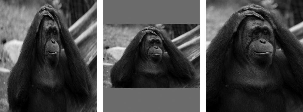
Notice that I also set the auto value on the height property to maintain the object’s original aspect ratio—having a fixed height and a dynamic width (or vice versa) could distort the object displayed. Sometimes preserving the aspect ratio is going to mean empty spaces on your page on either the horizontal or vertical axis, as the object is too small for its container (you can see an example of this in Figure 3-5). If that’s the case, you can take advantage of the object-fit and object-position properties to better control how the object is displayed inside its parent.

The first of those properties, object-fit, controls how the object in question is resized within its container. If you use the contain keyword value, the object is resized so the whole of it shows inside the container, with its aspect ratio preserved and with empty space being added on the horizontal or vertical axis as necessary. Alternatively, using the cover keyword makes the shortest length of the object equal to the shortest length of the container, with the longest length overflowing the container. Using the fill keyword would resize the object to match the container’s dimensions.
In the example file object-fit.html, you can see these three keywords compared. This example has three div elements with an img inside, each of which has a unique id value. To this markup, I apply the following code:
img {
  height: 100%;
  width: 100%;
}
#obj-fill { object-fit: fill; }
#obj-contain { object-fit: contain; }
#obj-cover { object-fit: cover; }
The results, which you can see in Figure 3-6, are as follows: The first element, #obj-fill, has been resized to the same dimensions as its parent, causing it to be squashed horizontally and stretched vertically, and that distortion obviously doesn’t look great; the element in the middle, #obj-contain, has kept its original aspect ratio but been resized so the entire img fits inside its parent, causing the “letterboxing” effect; finally, #obj-cover has also kept its aspect ratio but been resized so the whole of its parent is covered. To achieve this, the image has been scaled up and overflows the parent (I’ve hidden the overflow in this example).
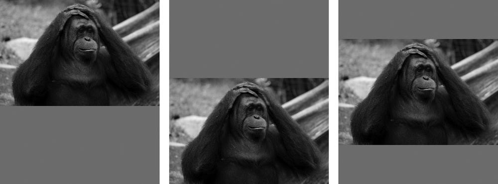
By default, the object sits dead center of its parent when object-fit is applied, but you can change that with the object-position property. This property works like the background-position property in that you can use either two values to specify an offset from the top left of the container or extra positional keywords (top, right, bottom, left, center) to offset from another side. For example:
E { object-position: bottom 10px right 2em; }
The example file object-position.html shows three different values for the object-position property. The markup is essentially the same as in the previous example, but the relevant CSS for this has been updated:
img {
  height: 100%;
  width: 100%;
  object-fit: contain;
}
#obj-1 { object-position: center top; }
#obj-2 { object-position: center bottom; }
#obj-3 { object-position: right; }
The result is shown in Figure 3-7. All three img elements have the contain value applied to the object-fit property, but that’s just for the sake of illustration and not required. The first image, #obj-1, is positioned in the horizontal center of its parent and the vertical top; the next, #obj-2, is still at the horizontal center, but now the vertical bottom; the last image, #obj-3, has been cropped to portrait dimensions to better show it positioned to the right of its parent.
The Image Problem
Although you’ve seen that resizing and positioning objects using responsive techniques is quite straightforward, images are still a source of major problems in responsive design for a number of reasons. Chief among them is the question of file size; although not always the case, the chances are good that someone using a mobile device will be using 3G or 4G and will have reduced bandwidth compared to a desktop user. That being the case, you don’t want to have to serve them a large, heavy image that they have to download over their limited connection.
This is exacerbated by the increase in high-resolution screens. Standard-resolution (1DPR) bitmap images (like JPG and PNG) can look quite low quality on higher-resolution (2DPR) screens. HTML currently offers no way to provide higher-resolution images to devices, and even if it did, you still have the bandwidth problem. What’s the solution?
The HTML5 Responsive Images Solution
Unfortunately there is, as I write this, no native solution. Although a number of proposals have been put forward, none has been officially blessed yet. The proposal that seems to be the most popular is to use a new picture element, like so:
1 <picture alt="Description of image subject.">
2   <source srcset="small.jpg 1x, small-highres.jpg 2x">
3   <img src="small.jpg" alt="Description of image subject.">
  </picture>
Three key activities are at work here: 1 is the new picture element with the alt attribute describing the image (other standard attributes could also be used here); 2 is the source element, which lists different source alternatives using the srcset attribute—what you see here are two alternative image sources, one for standard screens and one for higher-resolution screens, using the number of the screens DPR, which you saw earlier in this chapter; finally, 3 is the current img element, which you use as fallback for older browsers that haven’t implemented picture yet.
Warning
Remember this suggestion is only the most prominent as I write this; it may not be the final syntax.
So this syntax allows for testing device resolution, but what about other media queries? You can add those with further source elements:
<picture alt="Description of image subject.">
  <source srcset="small.jpg 1x, small-hi-res.jpg 2x">
  <source media="(min-width: 481px)" srcset="med.jpg 1x, med-hi-res.jpg 2x">
  <img src="small.jpg" alt="Description of image subject.">
</picture>
In this example, you can see an extra source element using the media attribute to set up a media query and serving a different set of images if that query is true. I have to say that although this syntax works, I don’t like it much; it’s repetitious for a start and, if used on a page with multiple images, leads to maintainability issues. That said, no other simpler suggestion has been proposed.
The WHATWG’s current proposal is to also use the srcset attribute, but only on the img element. This option allows images to be served dependent on screen resolution, but not with any other media query. I want to make this really clear: This is not “official,” only a proposal.
Plenty of third-party solutions have been created, notable among them Matt Wilcox’s Adaptive Images, which uses PHP and Apache to resize images on the server and serve them to users depending on their device’s attributes. But while this option works well, it does depend on a specific server configuration that isn’t available to everyone and also adds a reliance on JavaScript. This problem still waits to be solved natively.