Table of Contents for
The Modern Web
 The Modern Web
Published by
No Starch Press, 2013
The Modern Web
Published by
No Starch Press, 2013
- The Modern Web
- Cover
- The Modern Web
- Advance Praise for
- Praise for Peter Gasston’s
- Dedication
- About the Author
- About the Technical Reviewer
- Acknowledgments
- Introduction
- The Device Landscape
- The Multi-screen World
- Context: What We Don’t Know
- What You’ll Learn
- A. Further Reading
- 1. The Web Platform
- A Quick Note About Terminology
- Who You Are and What You Need to Know
- Getting Our Terms Straight
- The Real HTML5
- CSS3 and Beyond
- Browser Support
- Test and Test and Test Some More
- Summary
- B. Further Reading
- 2. Structure and Semantics
- New Elements in HTML5
- WAI-ARIA
- The Importance of Semantic Markup
- Microformats
- RDFa
- Microdata
- Data Attributes
- Web Components: The Future of Markup?
- Summary
- C. Further Reading
- 3. Device-Responsive CSS
- Media Queries
- Media Queries in JavaScript
- Adaptive vs. Responsive Web Design
- Viewport-Relative Length Units
- Responsive Design and Replaced Objects
- Summary
- D. Further Reading
- 4. New Approaches to CSS Layouts
- Multi-columns
- Flexbox
- Grid Layout
- The Further Future
- Summary
- E. Further Reading
- 5. Modern JavaScript
- New in JavaScript
- JavaScript Libraries
- Polyfills and Shims
- Testing and Debugging
- Summary
- F. Further Reading
- 6. Device Apis
- Geolocation
- Orientation
- Fullscreen
- Vibration
- Battery Status
- Network Information
- Camera and Microphone
- Web Storage
- Drag and Drop
- Interacting with Files
- Mozilla’s Firefox OS and WebAPIs
- PhoneGap and Native Wrappers
- Summary
- G. Further Reading
- 7. Images and Graphics
- Comparing Vectors and Bitmaps
- Scalable Vector Graphics
- The canvas Element
- When to Choose SVG or Canvas
- Summary
- H. Further Reading
- 8. New Forms
- New Input Types
- New Attributes
- Datalists
- On-Screen Controls and Widgets
- Displaying Information to the User
- Client-side Form Validation
- The Constraint Validation API
- Forms and CSS
- Summary
- I. Further Reading
- 9. Multimedia
- The Media Elements
- Media Fragments
- The Media API
- Media Events
- Advanced Media Interaction
- Summary
- J. Further Reading
- 10. Web Apps
- Web Apps
- Hybrid Apps
- TV Apps
- Webinos
- Application Cache
- Summary
- K. Further Reading
- 11. The Future
- Web Components
- The Future of CSS
- Summary
- L. Further Reading
- M. Browser Support as of March 2013
- The Browsers in Question
- Enabling Experimental Features
- Chapter 1: The Web Platform
- Chapter 2: Structure and Semantics
- Chapter 3: Device-Responsive CSS
- Chapter 4: New Approaches to CSS Layouts
- Chapter 5: Modern JavaScript
- Chapter 6: Device APIs
- Chapter 7: Images and Graphics
- Chapter 8: New Forms
- Chapter 9: Multimedia
- Chapter 10: Web Apps
- Chapter 11: The Future
- N. Further Reading
- Introduction
- Chapter 1: The Web Platform
- Chapter 2: Structure and Semantics
- Chapter 3: Device-Responsive CSS
- Chapter 4: New Approaches to CSS Layouts
- Chapter 5: Modern JavaScript
- Chapter 6: Device APIs
- Chapter 7: Images and Graphics
- Chapter 8: New Forms
- Chapter 9: Multimedia
- Chapter 10: Web Apps
- Chapter 11: The Future
- Index
- About the Author
- Copyright
Scalable Vector Graphics
Vector graphics on the Web are created using the Scalable Vector Graphics (SVG) markup language. This language has been around for a long time without too much success, but two factors gave it a new lease on life: implementation in IE9 and the rise of the mobile and multi-device Web. All the major browsers have now implemented it.
The main reason SVG is so useful is its scalability, which I discussed in the previous section. Scalability is a real boon for responsive web design. You can reuse the same image across every platform, avoiding the problems with adaptive images, which I discussed in Chapter 3. In addition, the way that SVGs are made and embedded in a page can enhance accessibility and searchability, as you’ll see in the following sections.
Of course, SVG doesn’t work for everything—photographs, as mentioned, are still better off as bitmaps—but it is a really useful format for multi-screen design.
Anatomy of an SVG Image
Before I explain how you can use SVG in your pages, I want to run briefly through the code behind it. You see, SVG is actually an XML file that marks up the image that it creates; this means you can view it in a text editor and change it manually—something that is basically impossible with bitmap files.
Open an SVG file in your preferred editor, or view the source in a browser window, and inspect the contents. Although the actual markup varies wildly from file to file, you will at least be able to see the many common elements. To begin, all SVG files start with the XML declaration, which holds the version number of XML you’re using, the text encoding method, and the standalone attribute that sets whether the file makes reference to other external files or stands alone (in most cases, just leave this as no):
<?xml version="1.0" encoding="UTF-8" standalone="no"?>
Next, you see the svg element—which is the root—and a series of namespaces with information about the syntax used. The following example is taken from an SVG file I opened at random. It tells me that the file uses Dublin Core metadata terms (see RDFa for more on this), is licensed under Creative Commons, and uses RDF, SVG, and XLink schema to describe its contents:
<svg xmlns:dc="http://purl.org/dc/elements/1.1/" xmlns:cc="http://web.resource.org/cc/" xmlns:rdf="http://www.w3.org/1999/02/22-rdf-syntax-ns#" xmlns:svg="http://www.w3.org/2000/svg" xmlns="http://www.w3.org/2000/svg" xmlns:xlink="http://www.w3.org/1999/xlink">
The simplest form of the svg element requires only the attributes for a link to the SVG namespace and the version of SVG that you’re using:
<svg xmlns="http://www.w3.org/2000/svg" version="1.1">
All of the children of the svg element contain the information used to create the image itself. The bulk of this information is contained in a series of elements based on basic mathematical shapes used to make the drawing: circle, rect, ellipse, polygon, and line. Each of these shape elements also has a series of attributes to describe the shape’s position, size, and color information. For example, here’s how to draw a circle whose center is 50px from the left of the grid (cx) and 75px from the top (cy), has a radius of 25px (r), a black border (stroke) 2px wide (stroke-width), and a background color of silver (fill):
<circle cx="50" cy="50" r="25" stroke="black" stroke-width="2" fill="silver"/>
Note
The element is closed with a trailing slash; SVG is strict XML and all empty elements must be closed.
In comparison to the previous code, here’s a rectangle that is 100px wide (width) and 50px tall (height), is offset 25px from the left (x) and 50px from the top (y) of the grid, and has a blue background (fill):
<rect width="100" height="50" x="25" y="50" fill="blue"/>
I don’t intend to go too much deeper into how an SVG file is made—for two reasons: First, the subject is too complex for a single chapter of a book to hope to cover; and second, I don’t think you’ll use it that often. You are more likely to use a graphical editor (such as Adobe Illustrator or the open source Inkscape) to edit SVG files, perhaps making only small adjustments to the code by hand.
Linked SVG Files
You’ll use SVG on your sites in two main ways. One is to embed the code into the markup itself, which I cover in the next section. The second and easier way is to link to a premade SVG file as an image, in the same way you would a JPG or PNG. This method is great if you want a scalable, decorative image, although you don’t get to access the SVG as part of the DOM.
To use a linked SVG, you must have an image saved with the file extension .svg (or .svgz for a compressed file); then just supply the path to the image at the relevant point in your code. You can use it in the markup with an img element:
<img src="/path/to/foo.svg">
Or you can call it in CSS anywhere that accepts a url() function as an argument, such as background-image:
.foo { background-image: url('path/to/foo.svg'); }Warning
The drawback to using SVG in the img element or CSS is that you lose certain advanced SVG behaviors, such as scripting and animations. If having these is important to you, use an embedding technique (which I cover next) instead.
SVG Sprites
SVG’s scaling capabilities are an especially good fit for using sprites for icons—that is, showing only a selected portion of a single large image to cut down on the number of file downloads and to speed up page load—although a little setup work is required. The way it works is that all of the desired icons are stacked one above the other in a single SVG image and then all except one are hidden using CSS (as illustrated in Figure 7-2).

The code required to do this looks roughly like the following (and because there’s a lot to explain, I’ve annotated it):
1 <svg …>
    <defs>
2     <style><![CDATA[
        .icon { display: none; }
3       .icon:target { display: inline; }
      ]]></style>
    </defs>
4   <svg viewBox="0 0 30 30">
5     <g class="icon" id="icon1">…</g>
    </svg>
    <svg viewBox="0 0 30 30">
      <g class="icon" id="icon2">…</g>
    </svg>
  </svg>
The root element 1 requires no extra namespaces, so it can be the same as in previous examples. CSS can be put inline to the file itself 2, which is handy for this technique as you can reuse the image on multiple pages; note that you must use a CDATA section to let the browser know that this is text, not XML to be parsed. In the style rules, you set all of the .icon elements to not display, except for the one the :target pseudo-class 3 applies to, which is shown (I’ll explain why shortly). Each sprite layer in the stack has a viewBox attribute 4 with four coordinates inside; this attribute sets the limit of the box that will be displayed, using the first two numbers for the x- and y-coordinates of the top left of the box and the second two numbers as the width and height of the area to be displayed. Finally, the g element (used for grouping shapes) for each sprite 5 has the same class name as the others but a unique id.
With this setup completed, you can link directly to the icon you want, using its id value in the URL, as shown here:
.bar { background-image: url('foo.svg#icon1'); }
The :target pseudo-class is applied when the hash of a URL matches the id of an element; in this case the URL hash is #icon1, so the :target selector applies to the svg element #icon1. As all other svg elements are set to not be displayed, #icon1 is shown regardless of its order in the stock. You can see an example of this in svg-icon.html and illustrated in Figure 7-3.

Warning
Changes to the way browsers render SVG may possibly cause the stacking technique to break in the future. See the link in Appendix H for more detail on this.
SVG Sprites with Fragments
An alternative spriting technique uses Fragment Identifiers. This method doesn’t require the icons to be stacked; the SVG sprite sheet can have all of the icons laid out distinctly, with their positions called using the four coordinates of viewBox as part of the URL in the svgView function. Here’s an example:
.bar { background-image: url('foo.svg#svgView(viewBox(0 0 30 30))'); }
The advantage of this approach is that the SVG file isn’t required to have a unique id for each sprite, and you can show multiple sprites or pieces of a sprite, which is more complicated to achieve with the stacking method.
Embedded SVG
If you want to manipulate the SVG, you can embed it directly into a page’s HTML. The SVG then becomes part of the DOM and is, therefore, accessible through JavaScript and potentially CSS.
You can do this in a number of ways, the first of which is to use the embed element. This element has been used across the Web for embedding Flash files, although it was never made standard until the advent of HTML5. You can add SVG to your page with embed by supplying a link to the source file in the src attribute:
<embed src="foo.svg"></embed>
Similarly, you can use the object element, with the path to the SVG file used as a value for the data attribute:
<object data="foo.svg"></object>
With either of these approaches to embedding SVG, you can access the markup through the DOM by using the getSVGDocument() method, which returns an object that you can traverse using standard DOM methods. The following code shows how to get the SVG object from an embed element and then log the number of child nodes it contains, using the activeElement attribute:
var svg = document.querySelector('embed').getSVGDocument();
console.log(svg.activeElement.childNodes.length);
A much simpler and more powerful method of embedding SVG, however, is to put the markup directly into the page—something that is possible in most modern browsers. You can see a simple example of this in svg-embedded.html. Take a look at the code in the file and at what is shown here, and then compare it to the result displayed in the browser (also illustrated in Figure 7-4).
<svg version="1.1" xmlns="http://www.w3.org/2000/svg">
  <rect width="100%" height="100%" fill="#000" />
  <circle cx="150" cy="100" r="80" fill="#FFF" />
  <text x="150" y="125" font-size="60" text-anchor="middle">SVG</text>
</svg>

You should notice that the circle, despite having its fill attribute set to white in the code, actually displays black. This happens because the inline SVG becomes part of the DOM and I’m styling it with CSS. In the style tags in the file header, you find these rules:
rect, text { fill: #FFF; }
circle { fill: #000; }
As the SVG forms part of the DOM, you can manipulate it exactly the same way as any other element. Some of the elements and attributes, such as the fill attributes in this example, are presentational and, therefore, affected by CSS. And as SVG is part of the DOM, no special methods are required to interact with the element through script, meaning you can use standard DOM scripting like this:
var svg = document.querySelector('svg');
console.log(svg.childNodes.length);
This easy access makes direct embedding into the markup an especially useful way to display interactive data that responds to user input—adding, removing, or altering elements as required.
SVG Filters
SVG provides a range of graphical filters that you can apply to elements, letting you adjust color values, add dynamic blurring, and so on. The structure of this is first to create a defs element (immediately after the root), which is a container used for reusable elements, followed by a filter element that is a container for all of the individual filter elements. This probably sounds a little more complicated than it actually is. You can see it’s quite straightforward in the following code sample, which applies a Gaussian Blur effect using the feGaussianBlur element:
<svg version="1.1" xmlns="http://www.w3.org/2000/svg">
  <defs>
    <filter id="filter1">
      <feGaussianBlur stdDeviation="3" in="SourceGraphic"/>
    </filter>
  </defs>
</svg>
You need to pay attention to two things in this code: first, the id attribute on the filter element, which I use to refer to the filter effect later in the markup, and second, the two attributes on the feGaussianBlur element. The two attributes are stdDeviation, which is specific to this element and is a number used to specify the amount of blur, and in, which is common to all filter effects and describes the input for the filter. The SourceGraphic keyword value is the default, so you could actually leave it out in simple cases like this.
The filter has been defined at this point and can be called by referring to its unique id. In the following code, I apply this filter to a bitmap image that is called using an image element and the xlink:href attribute. This is a namespaced attribute, so I need to call that namespace on the root element. Finally, I apply the filter using the filter attribute with the unique id as the argument in the url() function value. You can see this in the file svg-filters.html, and the result is shown in Figure 7-5.
<svg version="1.1" xmlns="http://www.w3.org/2000/svg"  xmlns:xlink="http://www.w3.org/1999/xlink">
  <defs>
    <filter id="filter1">
      <feGaussianBlur stdDeviation="3" in="SourceGraphic"/>
    </filter>
  </defs>
  <image xlink:href="foo.jpg" filter="url(#filter1)"/>
</svg>
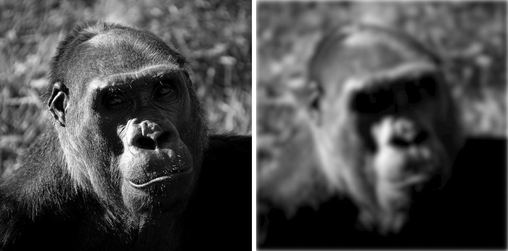
You can combine multiple filter effects into a single filter by stacking them as children of the filter element. In the next code snippet, I apply the Gaussian Blur as before, albeit with a slightly lowered stdDeviation value, but I also add a second filter, feMorphology. This filter is used to erode or dilate the input image, and in this case I want to erode it, so I use the erode value on the operator attribute, with a radius attribute value of 2.
The code for my completed two-stage filter, which you can see for yourself in svg-filters.html (the result is shown in Figure 7-6), looks like this:
<filter id="filter1">
  <feGaussianBlur stdDeviation="2"/>
  <feMorphology operator="erode" radius="2" />
</filter>

You can apply filters to entire blocks of HTML using SVG’s foreignObject element, which acts as a container for snippets of markup as long as the markup is correctly formatted XHTML. The next example shows how this works. There are a few things to note: First, foreignObject has a requiredFeatures attribute that checks to see whether the browser supports the feature of the required object type, in this case, extensions to SVG1.1; second, the same filter is used as in the previous examples; and third, the markup inside the element has the XHTML namespace.
<foreignObject filter="url(#filter1)" requiredFeatures="http://www.w3.org/TR/SVG11/feature#Extensibility">
  <h1 xmlns="http://www.w3.org/1999/xhtml">SVG</h1>
</foreignObject>
Try it for yourself in the file svg-foreignobject.html. You can see the result in Figure 7-7.

The Convergence of SVG and CSS
Work on version 2 of SVG—which goes by the rather clever name of SVG2—is underway at the moment, and one of its goals is better integration with CSS, as many of their features are shared. The new Transforms module, for example, integrates the extremely similar CSS Transforms and SVG Transforms modules. Other new shared features include advanced image techniques such as Masking and Clipping (showing or hiding parts of an SVG image) and Compositing and Blending (combining shapes and colors).
Probably the first to arrive, however, will be Filter Effects. These are already implemented piecemeal in some browsers as I write this and come in two main components. The first is to use defined filters on any element in the page, even outside of the SVG code block; for example, using the filter defined in the previous section natively in CSS would be as easy as this:
.foo { filter: url(#filter1); }
The second component is to use function keywords—essentially, shortcuts to predefined SVG filters. For example, to add Gaussian blur to an element, you could use the blur() function and, for saturation, the saturate() function:
.foo { filter: blur(3) saturate(0.1); }
Like CSS3, SVG2 will be modular, allowing for staggered development and implementation, meaning you could start seeing elements of it sooner rather than later.
A Drawback of SVG
For all the advantages of including SVG in your documents, one of its key strengths—accessibility via the DOM—is also its key weakness: Being part of the page means slower loading times as the more complex page is rendered and more memory consumption as more objects are held in temporary storage.
You should consider this when deciding whether to include complex SVG objects in your page, especially as it might affect people who visit your site using a lower-powered mobile or portable device.