Table of Contents for
The Modern Web
 The Modern Web
Published by
No Starch Press, 2013
The Modern Web
Published by
No Starch Press, 2013
- The Modern Web
- Cover
- The Modern Web
- Advance Praise for
- Praise for Peter Gasston’s
- Dedication
- About the Author
- About the Technical Reviewer
- Acknowledgments
- Introduction
- The Device Landscape
- The Multi-screen World
- Context: What We Don’t Know
- What You’ll Learn
- A. Further Reading
- 1. The Web Platform
- A Quick Note About Terminology
- Who You Are and What You Need to Know
- Getting Our Terms Straight
- The Real HTML5
- CSS3 and Beyond
- Browser Support
- Test and Test and Test Some More
- Summary
- B. Further Reading
- 2. Structure and Semantics
- New Elements in HTML5
- WAI-ARIA
- The Importance of Semantic Markup
- Microformats
- RDFa
- Microdata
- Data Attributes
- Web Components: The Future of Markup?
- Summary
- C. Further Reading
- 3. Device-Responsive CSS
- Media Queries
- Media Queries in JavaScript
- Adaptive vs. Responsive Web Design
- Viewport-Relative Length Units
- Responsive Design and Replaced Objects
- Summary
- D. Further Reading
- 4. New Approaches to CSS Layouts
- Multi-columns
- Flexbox
- Grid Layout
- The Further Future
- Summary
- E. Further Reading
- 5. Modern JavaScript
- New in JavaScript
- JavaScript Libraries
- Polyfills and Shims
- Testing and Debugging
- Summary
- F. Further Reading
- 6. Device Apis
- Geolocation
- Orientation
- Fullscreen
- Vibration
- Battery Status
- Network Information
- Camera and Microphone
- Web Storage
- Drag and Drop
- Interacting with Files
- Mozilla’s Firefox OS and WebAPIs
- PhoneGap and Native Wrappers
- Summary
- G. Further Reading
- 7. Images and Graphics
- Comparing Vectors and Bitmaps
- Scalable Vector Graphics
- The canvas Element
- When to Choose SVG or Canvas
- Summary
- H. Further Reading
- 8. New Forms
- New Input Types
- New Attributes
- Datalists
- On-Screen Controls and Widgets
- Displaying Information to the User
- Client-side Form Validation
- The Constraint Validation API
- Forms and CSS
- Summary
- I. Further Reading
- 9. Multimedia
- The Media Elements
- Media Fragments
- The Media API
- Media Events
- Advanced Media Interaction
- Summary
- J. Further Reading
- 10. Web Apps
- Web Apps
- Hybrid Apps
- TV Apps
- Webinos
- Application Cache
- Summary
- K. Further Reading
- 11. The Future
- Web Components
- The Future of CSS
- Summary
- L. Further Reading
- M. Browser Support as of March 2013
- The Browsers in Question
- Enabling Experimental Features
- Chapter 1: The Web Platform
- Chapter 2: Structure and Semantics
- Chapter 3: Device-Responsive CSS
- Chapter 4: New Approaches to CSS Layouts
- Chapter 5: Modern JavaScript
- Chapter 6: Device APIs
- Chapter 7: Images and Graphics
- Chapter 8: New Forms
- Chapter 9: Multimedia
- Chapter 10: Web Apps
- Chapter 11: The Future
- N. Further Reading
- Introduction
- Chapter 1: The Web Platform
- Chapter 2: Structure and Semantics
- Chapter 3: Device-Responsive CSS
- Chapter 4: New Approaches to CSS Layouts
- Chapter 5: Modern JavaScript
- Chapter 6: Device APIs
- Chapter 7: Images and Graphics
- Chapter 8: New Forms
- Chapter 9: Multimedia
- Chapter 10: Web Apps
- Chapter 11: The Future
- Index
- About the Author
- Copyright
On-Screen Controls and Widgets
The new elements you’ve seen so far are all based on a simple text box, but some form elements also provide richer on-screen controls; in HTML 4.01, for instance, think of select and checkbox. But as I mentioned in the introduction, many other widget types are commonly used by developers and designers—think of date pickers and number range sliders—so HTML5 has adopted and standardized these patterns.
How these controls and widgets appear depends on the browser and platform in which they’ve been implemented; the HTML5 specification notes only that these controls could be used and isn’t prescriptive as to how they appear. If a browser doesn’t support the controls natively, they should fall back to look like a standard text input.
Numbers
The new HTML5 input types discussed so far already cover various text formats. But, of course, many forms require that the user enter a number, for instance, credit card details, an area code, or a quantity.
The number input is the field for inputting numbers. It is often displayed as a text field, but some browsers also add controls—often a pair of arrows, one up, one down—for incrementing or decrementing the value.
Similar to number is the range input, which lets users enter a value without requiring them to be too precise about the exact figure; to allow this, many browsers style this element as a slider.
<input type="number">
<input type="range">
You can compare number and range as they’re displayed in Chrome for Android in Figure 8-4.

Both of these types have some new attributes in common: max and min are number values that set the maximum and minimum (did you work that out for yourself?) permitted values, and step is the number by which the value is incremented or decremented. The following code shows how all three could work; the number input has an initial value of 50 and can be incremented or decremented by 10 at a time to reach a minimum of 10 or a maximum of 100:
<input type="number" max="100" min="10" step="10" value="50">
You can also manipulate these values with JavaScript using the stepUp() and stepDown() methods. Each takes a single integer value, which moves the value of the input by the specified number of steps; for example, this syntax reduces the range input value by 3 steps:
var foo = document.querySelector('input[type=range]');
foo.stepDown(3);
Each method returns an error if the specified number of steps causes the value to exceed the element’s max or min values.
When working with numeric fields, you may want to take advantage of a new DOM property defined in HTML5, valueAsNumber. This property is similar to the existing value property but returns the value as a number rather than a string, meaning you don’t need to convert between types using parseInt(). Using valueAsNumber is simplicity itself:
var foo = document.querySelector('input[type=number]');
bar = foo.valueAsNumber;
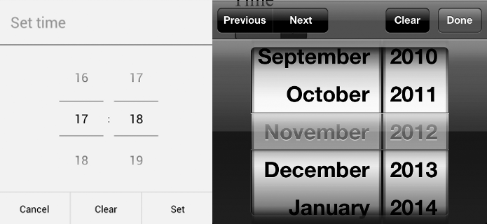
Dates
Another popular data pattern for forms is a date or time field, used in situations such as when asking the user to enter a date of birth or choose a delivery time and date. Often these are rendered using a JavaScript-created date picker, a common widget aimed at helping users choose a date from a range shown on screen so they don’t have to worry about conforming to your chosen date pattern.
HTML5 has a range of new input types for date and form fields, and many browsers have added native date-picker widgets to enhance them. Probably the most commonly implemented is date, which lets the user select a single date from the widget:
<input type="date">
The implementation method varies across browsers, with mobile and tablet devices varying quite significantly from desktop and laptop browsers. You can see some examples of this variety in Figure 8-5.
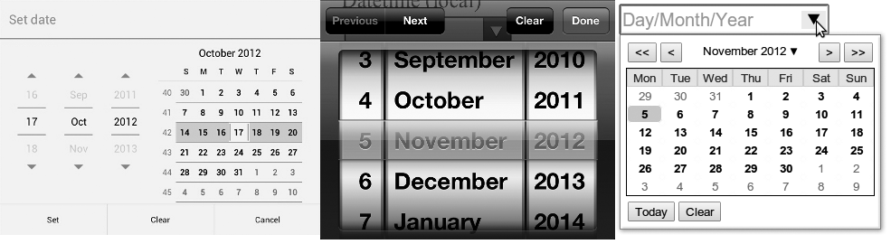
HTML5 also has a series of other date and time inputs: If you need to be more general about dates, you can use month to select an entire month and week for an entire week; or if you require a time without any associated date, you can use time to choose hours and minutes. A couple examples of different time and date pickers are shown in Figure 8-6.
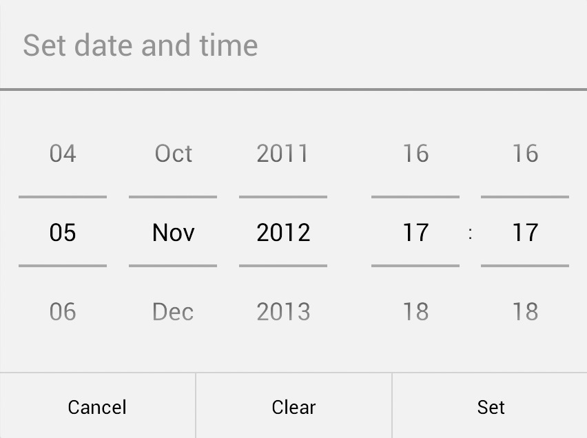
If you require a date and a time, the datetime input requests both. This field requires a value in the format YYYY-MM-DDTHH:MMZ, where the Z is a shorthand code for the UTC time zone. For example, to submit a time of 2 PM on April 1st, 2014, you would use 2014-04-01T14:00Z. If the time zone isn’t required, you could use datetime-local. For both types, the picker widget would have fields for both date and time, as shown in Figure 8-7.
All the date-related input types are demoed in input-types-dates.html; open the page in different browsers and see how they’re displayed.
As with the number input types, the max and min attributes are permitted, but they must use a valid date or time format; a full datetime would require YYYY-MM-DDTHH:MMZ, whereas the month would require only YYYY-MM. The step attribute is also allowed, but its time period depends on the element used: a day, a week, a month, or a time in seconds.
So putting that all together, you could use attributes somewhat like the following, where the month input would allow the user to select only dates between January 2012 and June 2016; the step attribute would be in play only if the stepDown() and stepUp() methods were used:
<input type="month" max="2016-06" min="2012-01" step="3">
Warning
If you have strict limits on required dates, don’t rely on the max and min attributes, as they’re not supported by some user agents; always use JavaScript and server-side validation to ensure dates are in range.
As numbers have the valueAsNumber DOM property, so dates have valueAsDate. This property works in the same way, but returns a date-formatted value; for example, given the date 04/01/2014, the value property would return 2014-04-01, whereas the valueAsDate property would give Tue Apr 01 2014 01:00:00 GMT+0100 (BST) (in my time zone, at least).
var foo = document.querySelector('input[type=date]');
bar = foo.valueAsDate;
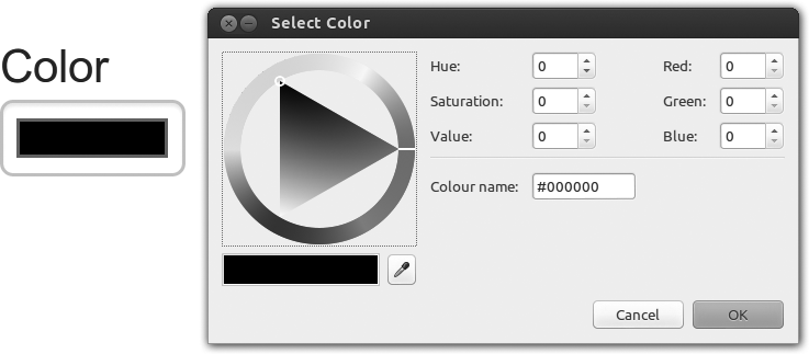
Color
If you’re building an app that allows the user some level of customization, you may be interested to know that HTML5 has a color input, which will, if implemented, show either the system default color picker or a proprietary widget, depending on the browser:
<input type="color">
Try it for yourself in input-types-more.html. Figure 8-8 shows how Chrome implements it for Ubuntu.