Table of Contents for
The Modern Web
 The Modern Web
Published by
No Starch Press, 2013
The Modern Web
Published by
No Starch Press, 2013
- The Modern Web
- Cover
- The Modern Web
- Advance Praise for
- Praise for Peter Gasston’s
- Dedication
- About the Author
- About the Technical Reviewer
- Acknowledgments
- Introduction
- The Device Landscape
- The Multi-screen World
- Context: What We Don’t Know
- What You’ll Learn
- A. Further Reading
- 1. The Web Platform
- A Quick Note About Terminology
- Who You Are and What You Need to Know
- Getting Our Terms Straight
- The Real HTML5
- CSS3 and Beyond
- Browser Support
- Test and Test and Test Some More
- Summary
- B. Further Reading
- 2. Structure and Semantics
- New Elements in HTML5
- WAI-ARIA
- The Importance of Semantic Markup
- Microformats
- RDFa
- Microdata
- Data Attributes
- Web Components: The Future of Markup?
- Summary
- C. Further Reading
- 3. Device-Responsive CSS
- Media Queries
- Media Queries in JavaScript
- Adaptive vs. Responsive Web Design
- Viewport-Relative Length Units
- Responsive Design and Replaced Objects
- Summary
- D. Further Reading
- 4. New Approaches to CSS Layouts
- Multi-columns
- Flexbox
- Grid Layout
- The Further Future
- Summary
- E. Further Reading
- 5. Modern JavaScript
- New in JavaScript
- JavaScript Libraries
- Polyfills and Shims
- Testing and Debugging
- Summary
- F. Further Reading
- 6. Device Apis
- Geolocation
- Orientation
- Fullscreen
- Vibration
- Battery Status
- Network Information
- Camera and Microphone
- Web Storage
- Drag and Drop
- Interacting with Files
- Mozilla’s Firefox OS and WebAPIs
- PhoneGap and Native Wrappers
- Summary
- G. Further Reading
- 7. Images and Graphics
- Comparing Vectors and Bitmaps
- Scalable Vector Graphics
- The canvas Element
- When to Choose SVG or Canvas
- Summary
- H. Further Reading
- 8. New Forms
- New Input Types
- New Attributes
- Datalists
- On-Screen Controls and Widgets
- Displaying Information to the User
- Client-side Form Validation
- The Constraint Validation API
- Forms and CSS
- Summary
- I. Further Reading
- 9. Multimedia
- The Media Elements
- Media Fragments
- The Media API
- Media Events
- Advanced Media Interaction
- Summary
- J. Further Reading
- 10. Web Apps
- Web Apps
- Hybrid Apps
- TV Apps
- Webinos
- Application Cache
- Summary
- K. Further Reading
- 11. The Future
- Web Components
- The Future of CSS
- Summary
- L. Further Reading
- M. Browser Support as of March 2013
- The Browsers in Question
- Enabling Experimental Features
- Chapter 1: The Web Platform
- Chapter 2: Structure and Semantics
- Chapter 3: Device-Responsive CSS
- Chapter 4: New Approaches to CSS Layouts
- Chapter 5: Modern JavaScript
- Chapter 6: Device APIs
- Chapter 7: Images and Graphics
- Chapter 8: New Forms
- Chapter 9: Multimedia
- Chapter 10: Web Apps
- Chapter 11: The Future
- N. Further Reading
- Introduction
- Chapter 1: The Web Platform
- Chapter 2: Structure and Semantics
- Chapter 3: Device-Responsive CSS
- Chapter 4: New Approaches to CSS Layouts
- Chapter 5: Modern JavaScript
- Chapter 6: Device APIs
- Chapter 7: Images and Graphics
- Chapter 8: New Forms
- Chapter 9: Multimedia
- Chapter 10: Web Apps
- Chapter 11: The Future
- Index
- About the Author
- Copyright
The Media Elements
To play either audio or video files, you need to use the audio or video element, respectively. They are similar, sharing the same attributes and child elements, with the type of media they deliver being the key difference. At their most simple, each element requires only a single attribute, src, which is the path to the media file to be played:
<audio src="foo.oga"></audio>
<video src="foo.ogv"></video>
What you see depends on the element: with video, you see the video file at its natural dimensions with the first frame showing; with audio, you see nothing. In either case, you can’t play the file because there are no on-screen controls. You add them using the controls attribute:
<audio src="foo.oga" controls></audio>
<video src="foo.ogv" controls></video>
Now you’ll see on-screen controls for each of the media elements, as illustrated in Figure 9-1, and you can take a look for yourself in the file media-elements.html. I suggest you view this example file in Chrome, Firefox, or Opera, for reasons that will become clear in this chapter.
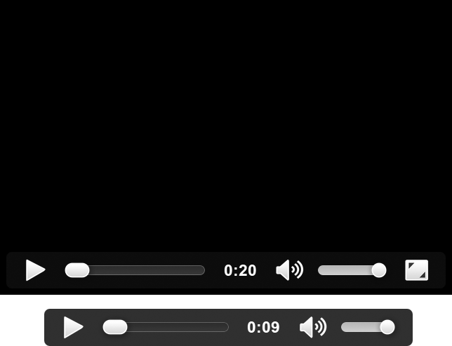
Using these attributes, a media file plays only at the user’s request and only once; if you prefer, you could have the file play as soon as it has loaded by using the autoplay attribute and make it loop indefinitely (until the user pauses it or leaves the page) by using the loop attribute; both are Boolean, so they require no value:
<audio src="foo.oga" autoplay loop></audio>
Warning
Autoplayed sound has accessibility drawbacks; see the WCAG Audio Control advice, listed in Appendix J, for more information on how best to cater to everyone.
On some mobile devices, media files won’t play where they’re embedded in the page; instead, they’re launched and played in the device’s own media player framework. If this happens, the autoplay attribute is ignored.
If you do autoplay or loop a file, keep in mind that the sound can be annoying or confusing to some users and consider muting the volume by default using the Boolean muted attribute:
<video src="foo.ogv" autoplay muted></video>
The full media file isn’t normally downloaded when the page loads, but only when playback is requested; instead, metadata about the file—length, file size, and so on—is loaded into memory (a key exception to this is when the autoplay attribute is applied, which requires the full file to be downloaded). If you prefer to change this behavior, you can use the preload attribute, which has three values: metadata is the default and behaves as mentioned; auto indicates to the browser that it should download and cache the file because the user will probably play it; and none means the file probably won’t be used, so don’t download anything.
<video src="foo.ogv" preload="auto"></video>
Note that these are only hints, not commands; the browser makes the final decision about when to download media files based on variables such as the current network and the device that is running the browser. Mobile browsers will likely ignore the auto value, as downloading a potentially huge video when the user has metered bandwidth is a real no-no. In many cases, metadata is the sole acceptable value.
Extra Attributes for the video Element
Although the audio and video elements share many attributes, the latter, by virtue of it having more of a presence in page layout, also has several extra attributes. Video files will, by default, be displayed on the page at the dimensions in which they were coded. You can change this using the height and width attributes:
<video src="foo.ogv" height="360" width="240"></video>
Note that these attributes set the size of the video element, not the video itself, so if the values you supply aren’t in the same ratio as the file, the video won’t be stretched to fill the space; it maintains its aspect ratio and position in the center of the element, as you can see in video-dimensions.html (and in Figure 9-2). If you prefer to change this behavior, use the object-fit and object-position properties from Chapter 3.
The video element is blank or uses a platform-specific graphic by default, until the first frame of the video has loaded, at which point that first frame is displayed as a still image. If you prefer a different still or image entirely, you can specify your own with the poster attribute:
<video src="foo.ogv" poster="foo.png"></video>
Multiple Source Files
In the examples I’ve shown so far, I’m using the .ogv extension for video files and .oga for audio files, which are extensions of the Ogg format. Ogg is a container format, which means it can hold different video and audio formats within it; for Ogg video, the most common format is Theora, and for audio, Vorbis.
Both Theora and Vorbis are free formats—that is, no licensing fees are involved in using them. This fact would seem to make them ideal for Web use, and indeed, some sites like Wikimedia do encode their media with them. They’re not supported in many browsers, however, for reasons I explain in Format Wars. So what can you do?
Both audio and video elements have provisions for specifying multiple source files. You leave out the src attribute and use source child elements instead. In the following example, I set two different source files for a video element: The first is an .ogv file; the second, a .webm file; and the third, an .mp4 file. The browser plays the first video format that it supports.
<video>
  <source src="foo.ogv" type="video/ogg"></source>
  <source src="foo.webm" type="video/webm"></source>
  <source src="foo.mp4" type="video/mp4"></source>
</video>
The example file media-elements-sources.html demonstrates this feature; the file appears to be the same as media-elements.html, but unlike that first example, it shouldn’t matter which browser you use to open this file. As long as the browser supports HTML5 video, one of the provided source files should play.
Notice that I’ve included the type attribute, which contains the MIME type of the different formats and lets the browser know which type of file it should play without having to access the file itself. This attribute isn’t required, but including it is considered good practice (although some older browsers used to have trouble with the type attribute). As always, test to see if it causes any problems.
The source element has a media attribute, which takes a media query as a value (see Chapter 3), meaning the specified file is used only if the query returns true—handy for supplying different files to different devices. Most likely you won’t supply a 1920×1080 video file to a 480×320 screen, or vice versa. The following code example sets a different source file, foo-hd.ogv, if the screen is at least 1920px wide and has an aspect ratio of 16/9:
<video>
  <source src="foo-hd.ogv" media="(device-aspect-ratio: 16/9) and (min-device-width: 1920px)"></source>
  <source src="foo.ogv"></source>
</video>
The real utility of this attribute has been debated; some feel a better solution is to use JavaScript to adapt the quality of the video, depending on device resolution and network status, and a spec is being proposed to handle this. For the near future, however, the media attribute is the best approach to adaptive video.
Fallbacks
You should provide some kind of fallback if a user’s browser doesn’t support the media elements, so the user doesn’t just see empty space on the page. Anything inside the video element is displayed when the video is not present, so the fallback can be as simple as a line of text that explains the problem or perhaps an image showing a key frame as an alternative.
<video src="foo.ogv">
  <img src="foo.png">
</video>
If you simply must have media available to everyone, you can include a Flash object as fallback; if the user’s browser doesn’t have native audio or video, the plug-in is used instead. And you can put a fallback to the fallback inside the object element to cover all bases.
<video src="foo.ogv" height="240" width="360" poster="foo.png">
<object width="640" height="360" type="application/x-shockwave-flash" data="foo.swf">
<param name="movie" value="foo.swf">
<param name="flashvars" value="controlbar=over&image=foo.png&file=foo.mp4">
<img src="foo.png" width="360" height="240">
</object>
</video>
This code is quite lengthy, but it does seem to cover all eventualities. Kroc Camen developed it, and I recommend you read his article “Video for Everybody!” to see all of the notes and caveats that I was unable to include here (see Appendix J).
Subtitles and Captions
You can add optional text tracks to run alongside the media file; these could be subtitles or captions for video files, or associated metadata files for either media type. You can have as many tracks as you like—for example, different languages for subtitles or a caption track and a metadata track—and each is added with a track child element.
This element has a few key attributes: kind tells the browser the purpose of your track—subtitles, captions, and descriptions are among the possible values; src describes the path to the file; srclang is the language of the track; label is the description of the track shown to the user if multiple options are available (if the browser UI supports it); and the Boolean default sets the track to use if more than one is available or ensures that a track is shown even if the user hasn’t explicitly requested one (only the first instance is recognized).
The following code shows how you might offer subtitles in two different languages—English and Brazilian Portuguese—on the video element:
<video src="foo.ogv">
  <track kind="subtitles" src="foo.en.vtt" srclang="en" label="English" default>
  <track kind="subtitles" src="foo.pt.vtt" srclang="pt-br" label="Brazilian Portuguese">
</video>
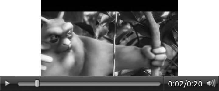
You can see an example of subtitles in the file video-subtitles.html and in Figure 9-3. If your browser’s native video UI supports it, try changing the language of the subtitles.

Different browsers accept different types of files for subtitles and captions, but the emerging standard is known as WebVTT. This format is simple, displaying captions from a start time to an end time. Here’s an example:
WEBVTT
1
00:00:00.500 --> 00:00:04.000
Hello to all readers
2
00:00:06.000 --> 00:00:10.000
Thanks for reading this book
The first caption appears on screen after half a second and is shown until the fourth second; the second caption appears in the sixth second and is shown until the tenth second. Although extra configuration options are available, the core has been kept very simple.
Encoding
You have many different variables to consider when encoding video for the Web; for example, my experience is that some files encoded for iOS may not play on Android, and vice versa. If you’re happy using the command line, then FFmpeg is your best bet; it’s a free and open source encoder that’s extremely configurable. You need to give it the path to the source video, a series of (optional) encoding parameters, and then a path to the output file. Here’s a simple example, converting from AVI to MP4:
ffmpeg -i foo.avi foo.mp4
If you prefer a GUI, there are many video-encoding tools available, but I rely on two that are easy to use and free. Miro Video Converter is a Mac or Windows program handy for quick conversions; you simply drag a file into the app, choose an output mode from a list that includes MP4, Ogg Theora, and WebM, and the tool outputs the converted file for you. If you prefer to have more options to control your conversions, HandBrake is probably the easiest and most powerful tool, although it outputs only MP4 so you may need to convert to Miro anyway. Both these tools are graphical shells for FFmpeg.