Table of Contents for
The Modern Web
 The Modern Web
Published by
No Starch Press, 2013
The Modern Web
Published by
No Starch Press, 2013
- The Modern Web
- Cover
- The Modern Web
- Advance Praise for
- Praise for Peter Gasston’s
- Dedication
- About the Author
- About the Technical Reviewer
- Acknowledgments
- Introduction
- The Device Landscape
- The Multi-screen World
- Context: What We Don’t Know
- What You’ll Learn
- A. Further Reading
- 1. The Web Platform
- A Quick Note About Terminology
- Who You Are and What You Need to Know
- Getting Our Terms Straight
- The Real HTML5
- CSS3 and Beyond
- Browser Support
- Test and Test and Test Some More
- Summary
- B. Further Reading
- 2. Structure and Semantics
- New Elements in HTML5
- WAI-ARIA
- The Importance of Semantic Markup
- Microformats
- RDFa
- Microdata
- Data Attributes
- Web Components: The Future of Markup?
- Summary
- C. Further Reading
- 3. Device-Responsive CSS
- Media Queries
- Media Queries in JavaScript
- Adaptive vs. Responsive Web Design
- Viewport-Relative Length Units
- Responsive Design and Replaced Objects
- Summary
- D. Further Reading
- 4. New Approaches to CSS Layouts
- Multi-columns
- Flexbox
- Grid Layout
- The Further Future
- Summary
- E. Further Reading
- 5. Modern JavaScript
- New in JavaScript
- JavaScript Libraries
- Polyfills and Shims
- Testing and Debugging
- Summary
- F. Further Reading
- 6. Device Apis
- Geolocation
- Orientation
- Fullscreen
- Vibration
- Battery Status
- Network Information
- Camera and Microphone
- Web Storage
- Drag and Drop
- Interacting with Files
- Mozilla’s Firefox OS and WebAPIs
- PhoneGap and Native Wrappers
- Summary
- G. Further Reading
- 7. Images and Graphics
- Comparing Vectors and Bitmaps
- Scalable Vector Graphics
- The canvas Element
- When to Choose SVG or Canvas
- Summary
- H. Further Reading
- 8. New Forms
- New Input Types
- New Attributes
- Datalists
- On-Screen Controls and Widgets
- Displaying Information to the User
- Client-side Form Validation
- The Constraint Validation API
- Forms and CSS
- Summary
- I. Further Reading
- 9. Multimedia
- The Media Elements
- Media Fragments
- The Media API
- Media Events
- Advanced Media Interaction
- Summary
- J. Further Reading
- 10. Web Apps
- Web Apps
- Hybrid Apps
- TV Apps
- Webinos
- Application Cache
- Summary
- K. Further Reading
- 11. The Future
- Web Components
- The Future of CSS
- Summary
- L. Further Reading
- M. Browser Support as of March 2013
- The Browsers in Question
- Enabling Experimental Features
- Chapter 1: The Web Platform
- Chapter 2: Structure and Semantics
- Chapter 3: Device-Responsive CSS
- Chapter 4: New Approaches to CSS Layouts
- Chapter 5: Modern JavaScript
- Chapter 6: Device APIs
- Chapter 7: Images and Graphics
- Chapter 8: New Forms
- Chapter 9: Multimedia
- Chapter 10: Web Apps
- Chapter 11: The Future
- N. Further Reading
- Introduction
- Chapter 1: The Web Platform
- Chapter 2: Structure and Semantics
- Chapter 3: Device-Responsive CSS
- Chapter 4: New Approaches to CSS Layouts
- Chapter 5: Modern JavaScript
- Chapter 6: Device APIs
- Chapter 7: Images and Graphics
- Chapter 8: New Forms
- Chapter 9: Multimedia
- Chapter 10: Web Apps
- Chapter 11: The Future
- Index
- About the Author
- Copyright
Media Queries
In my opinion, media queries are the biggest agent of change in website design for many years—probably since CSS itself became mainstream. The widespread adoption of CSS allowed you to leave behind the rigid limitations of table-based websites, and media queries take that a step further, letting you style pages in a way that’s sympathetic to the specifications of each device your sites are displayed on.
A media query is a logical statement: If the logic is true, the style rules within the statement are applied; if the logic is false, the rules are skipped. The parameters of the statements are known as media features, and the most commonly used today concern the dimensions of the device or the viewport. But before discussing media features in detail, let’s see how they’re used.
Media queries extend the media types syntax used in CSS 2.1 and HTML 4.01—remember, that’s the syntax that lets you call media-dependent styles, such as when linking to an external stylesheet:
<link rel="stylesheet" href="foo.css" media="screen">
This code calls the external stylesheet foo.css only when the viewing device is a screen—in other words, not a different media type such as print. You extend this syntax by simply adding the word and and including the query itself in parentheses:
<link rel="stylesheet" href="foo.css" media="screen and (query)">
This modified code has two conditions: The media type should be a screen, and the logic of the media query should be true. If both of these conditions are met, foo.css is applied.
You can also use media queries to include external stylesheets from within other stylesheets, using the @import at-rule. The following code has the same logic as the previous code block, but it can be used within style tags or an external stylesheet:
@import url('foo.css') screen and (query);Warning
Performance issues can occur when using @import in this way, so proceed with caution. For more details, see Steve Souders’s blog post, “Don’t Use @import” (http://www.stevesouders.com/blog/2009/04/09/dont-use-import/).
Finally, you can use media queries inline, which is handy when you want to apply blocks of rules for specific cases rather than calling external stylesheets:
@media screen and (query) { … }
So now that you know how media queries work and how to include them in your pages, let’s move on to explore the media features themselves—starting with the most common, those that use the dimensions of your device or browser viewport.
Media Features Based on Dimensions
Media queries are most commonly used today for detecting the dimensions of the agent being used to view your content and then serving up the appropriate rules for display on that agent: large text and images for big monitors, small text and a single-column layout for smartphones, that kind of thing. Of course, there’s more to media queries than those simple contexts, but you get the general idea.
You need to consider two sets of dimensions: first, those of the device itself, and second, those of the agent’s viewport (for most people that is a web browser, but the viewport could also be an app window) on that device. A person may visit your site using an enormous wide-screen television, but that’s of little concern to you if the app the person is using to view your site only occupies a quarter of the screen. On certain devices, the two sets of dimensions are the same—on most smartphones and tablets, for example, the browser’s width is the same as the device’s width.
Note
The viewport itself is subject to change on some devices; see Device Adaptation for more details.
The viewport’s dimensions are probably the most important and the ones that you’ll use the most, and the media features that are relevant to these are height and width. The viewport dimension features take as an argument a single length value that the logic is tested against; if the dimension in question is equal to the supplied length value, the logic is true and the rules are applied. In the following query, the rule inside the curly brackets is applied to the body element of the viewport when it is exactly 480px wide:
@media screen and (width: 480px) {
  body { background-color: #00f; }
}
Note
Working with width is much more common so I’m using width in the examples in this section, but the same techniques apply to height also.
I’ve used a px value in this example, but any length unit is permitted. Regardless of which unit you use, an exact value is likely too specific for most purposes. A pair of extensions to the feature makes it more flexible, however.
Many media features, including width, allow the prefixes max- and min- before the feature name. These stand for maximum and minimum respectively, which you probably don’t need me to explain, and in practice mean “no more than” and “no less than.” For example, using max-width you can apply style rules to any browser that is no more than 480px wide, and using min-width, to any that is no less than 480px wide:
@media screen and (max-width: 480px) { … }
@media screen and (min-width: 480px) { … }
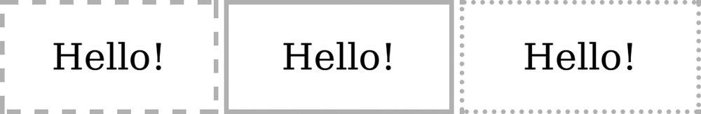
In the example file mq-width.html, you can see a simple demonstration of these prefixes in use. The page has three iframe elements with widths of 190px, 200px, and 210px respectively, and with a unique id value for your reference:
<iframe src="mq-hello.html" width="190" id="a"></iframe>
<iframe src="mq-hello.html" width="200" id="b"></iframe>
<iframe src="mq-hello.html" width="210" id="c"></iframe>
Because an iframe creates a new viewport, you can use the width media feature to apply rules to each differently sized viewport. The page that the iframes refer to, mq-hello.html, contains an inline style block in the header that applies different border-style properties to the elements, depending on the media features that are matched. This task is performed with the following three media queries:
1 @media screen and (width: 200px) {
    h1 { border-style: solid; }
  }
2 @media screen and (min-width: 205px) {
    h1 { border-style: dotted; }
  }
3 @media screen and (max-width: 195px) {
    h1 { border-style: dashed; }
  }
The rules are applied like this: 1 applies to iframe #b, which has a width of 200px; 2 to iframe #c, as it’s at least 205px wide; and 3 to iframe #a, as it’s no wider than 195px. You can see the result in Figure 3-1.
Now, I’m sure it doesn’t take much imagination on your part to see how the width feature could be useful: You could use smaller text on smaller screens and larger text on larger screens, for example:
@media screen and (max-width: 480px) {
  h1 { font-size: 2em; }
}
@media screen and (min-width: 481px) {
  h1 { font-size: 3.6em; }
}
Note
The queries I’ve used here are just for illustration. You can approach this in a better way, which I cover in Mobile First and Content Breakpoints.
If you’re sure you want to work with the dimensions of the device, not those of the viewport, you can use the device-width and device-height features—although, as before, I think width is a more commonly used dimension than height, so I’ll concentrate on the former. The way you use the device-width feature is, for all practical purposes, the same as for the width feature—only the metric it responds to is different. As with width, device-width can be extended with max- and min- prefixes:
@media screen and (max-device-width: 799px) { … }
@media screen and (device-width: 800px) { … }
@media screen and (min-device-width: 801px) { … }
Another way to serve rules depends on the device’s or viewport’s aspect ratio. The aspect ratio is the ratio of width to height (or device-width to device-height); a 1024×768 monitor, for example, has an aspect ratio of 4/3—that is, four horizontal pixels to every three vertical pixels—which is common for older screens. Newer widescreen devices (such as the iPhone 5) tend to use a 16/9 ratio.
Note
I discuss pixels further in A Quick Digression: All About Pixels.
To target a screen with a 4/3 aspect ratio, you’d use the device-aspect-ratio feature:
@media screen and (device-aspect-ratio: 4/3) { … }
The max- and min- prefixes apply to these features as well, so to create a query where you wanted to target only viewports—not devices—which are currently in at least an 8/5 ratio, you’d use the min-aspect-ratio feature:
@media screen and (min-aspect-ratio: 8/5) { … }
A quick way to work out which aspect ratios are greater than others is to divide the first figure by the second; a 4/3 ratio works out to 1.333, whereas 8/5 works out to 1.6. The larger the result, the wider the ratio. The example shown here applies only to screens for which that number is 1.6 or more.
Probably more useful than the very precise figure of an aspect ratio is the orientation of the viewport—whether it’s in portrait mode (height is greater than width) or landscape mode (width is greater than height). You query this with the orientation feature. This feature is especially useful for handheld devices like phones and tablets that can change orientation often:
@media screen and (orientation: portrait) { … }
The max- and min- prefixes don’t apply to this feature for (hopefully) obvious reasons.
Combining and Negating Media Queries
You can add a series of logical statements by repeated use of the and keyword with extra media queries. When and is used, the rules are applied only if all of the media query logic is true; for example, to test if a viewport is both in landscape mode and at least 800em wide, you could use this code:
@media all and (orientation: landscape) and (min-width: 800em) { … }
You can actually simplify this more; the all media type is the default state, so you can leave it out of queries, also making the first instance of and unnecessary:
@media (orientation: landscape) and (min-width: 800em) { … }
You can create a series of media queries and apply the rules if any one of them is true, using the comma separator to act like an or operator. In this example, the rules are applied if either the device is in landscape mode or the width of the viewport is at least 800em:
@media (orientation: landscape), (min-width: 800em) {}
Finally, you can reverse the logic of a media query by using the not operator; added to the start of the query, this operator means the rules are applied if the logic of the query is false. In this code the rules are applied to any device that has an aspect ratio other than 8/5:
@media not all and (device-aspect-ratio: 8/5) {}
Finding the right balance of media queries for your site can be a quite complex act involving many different variables, but the end result can be extremely satisfying. I highly recommend spending time really coming to grips with how they work. Zoe Mickley Gillenwater wrote an excellent post on the topic, Essential Considerations for Crafting Quality Media Queries, in which she says:
Designing web layouts with media queries is a process. You need to keep them in mind from the very beginning and make decisions at several points about how to integrate them in ways that will make the most sense for your site. There are very few always-right or always-wrong answers.
This post is a great piece of work that deserves to be read and digested fully.
A Quick Digression: All About Pixels
As we’ve moved into the multi-device era, a point to consider beyond the dimensions of the screen is its resolution. Many new devices, especially smartphones, now ship with high-resolution screens, so if you want to provide an optimal experience for everyone, you need to consider how images and other objects will display on those screens. Before I get into that, however, I need to talk briefly about pixels.
To talk about resolution-dependent media queries, first I need to define some terms, starting with those related to pixels (I presume that readers know what a pixel is). The physical pixel count of a screen is the number of pixels contained in the width of the screen. For example, a 1280×800 screen has a physical pixel count of 1280 along its broad edge. The iPhone 3GS, in its default (portrait) position, has a physical pixel count of 320, whereas the iPhone 4 and above, using the “retina” display, has a count of 640.
The pixel density of a screen is traditionally measured in pixels per inch (PPI)—actually if you prefer the metric system, you can use pixels per centimeter (PPC) instead, but I’ll stick to imperial measure for this description. Imperial measure is sometimes known as dots per inch (DPI), even by popular desktop image-editing software, and the two terms—PPI and DPI—can be considered interchangeable. Regardless, pixel density is a measure of the number of pixels that can be placed in a line that spans one inch of the device’s screen.
For the vast majority of screens in use until recently, the PPI is 96. With the rise of smartphones, however, the PPI count has been steadily increasing; the original iPhone (and all versions up to the 3GS) has a 163 ppi resolution, whereas the iPhone 4 and above has double that, an incredible 326 ppi (despite the screen staying the same size—you’ll see why in a second).
So far, so straightforward—but that’s not the whole story. The majority of high-density screens now have an extra, virtual pixel unit: the density-independent pixel (DIP), sometimes referred to as a CSS pixel. This is a relative unit; one physical pixel is equal to any number of DIPs. This allows you to scale websites up (and down), generally to provide better usability on smaller screens.
The ratio of virtual pixels to physical pixels is known as the device pixel ratio. I’ll use the abbreviation DPR for this, although it is also known as DPPX (dots per pixel). Devices that don’t have DIPs have a DPR of 1—that is, one virtual pixel to one physical pixel. The most common high-resolution devices as I write this (such as the Samsung Galaxy S III or the iPhone 5) have a DPR of 2—two virtual pixels to one physical.
Figure 3-2 illustrates this. On the left is a 2×2 block of physical pixels; in the center, a screen with a DPR of 1.5 fits 9 DIPs into the same space; and on the right, a screen with a DPR of 2 fits 16 DIPs into the space.

You can find out the DPR of any device by using JavaScript, as most browsers now support a DOM property called devicePixelRatio on the window object. To find out the DPR of the device you’re using, just type this into your browser’s developer console:
window.devicePixelRatio;
If your browser doesn’t have a developer console, I’ve written a script in the example file mq-dpr.html that you can use instead.
This discussion has all been quite technical, and to be honest I’ve barely scratched the surface, but hopefully you understand enough about resolution and pixels to be able to get the most out of the rest of this chapter.
Screen Resolution Media Queries
As you’ve just seen, many devices now ship with very high-resolution screens. Although certainly a positive thing, these screens do have one or two drawbacks, mainly around the display of graphics. As you’re probably aware, two types of graphic exist: vector, such as SVG, is a series of coordinates used to display shapes on screen regardless of resolution (I discuss SVG in more detail in Chapter 7); and bitmap or raster, such as JPG and PNG, is a series of different colored dots that are more explicitly tied to pixels.
The practical difference between the two types is that bitmaps are saved with a PPI setting, and a bitmap graphic that looks fine on a screen with a low DPR will look pretty poor on a device with a high one. That means you will most likely want to use higher PPI bitmaps for higher-resolution screens, which is why media features exist to do just that.
In fact, two media features are available. The first, and most widely used owing to WebKit’s popularity on mobile devices, is a proprietary feature called -webkit-device-pixel-ratio. This feature—along with the related max- and min- prefixes—lets you target a device’s DPR. For example, here’s how to add a high-resolution image to devices with a DPR of at least 2:
E { background-image: url('foo.png'); }
@media screen and (-webkit-min-device-resolution: 2) {
  E { background-image: url('foo-hi-res.png'); }
}
Warning
Remember that a high-resolution device doesn’t automatically mean a good Internet connection. The user might not thank you for making him or her download a 600kB image over a low 3G connection.
All pretty straightforward, right? Wrong. -webkit-device-pixel-ratio is, as mentioned, a WebKit-proprietary CSS extension and not part of the Media Queries specification. The spec actually contains a similar query, resolution. This query immediately improves upon -webkit-device-pixel-ratio by being more flexible in the values it accepts; you can, for example, use the dpi unit. Remember, a standard monitor resolution has a DPI (or PPI) of 96; that being the case, you can target those monitors with this code:
@media screen and (resolution: 96dpi) {
  E { background-image: url('foo.png'); }
}
But you can also target higher-resolution screens by multiplying the standard count, 96, by the DPR. For example, the following query applies to devices with a DPR of 2 or above, just like in the -webkit-device-pixel-ratio example a few paragraphs ago:
@media screen and (min-resolution: 192dpi) {
  E { background-image: url('foo-hires.png'); }
}
You can do this in an even better way, however, by using the dppx unit. This unit is equivalent to the DPR, so an updated version of the previous example employs this code:
@media screen and (min-resolution: 2dppx) {
  E { background-image: url('foo-hires.png'); }
}
-webkit-device-pixel-ratio has been around since the iPhone was launched in 2006, and an awful lot of legacy devices are out there, so this extension is not going anywhere in a hurry. That being the case, you’re probably going to have to test for both by extending the media query with a little extra logic. As previously mentioned, using a comma-separated list of media queries means the rules are applied if any one of them is true:
@media screen and (min-resolution: 2dppx), screen and (-webkit-min-device-resolution: 2)  {
  E { background-image: url('foo-hires.png'); }
}
This logic tests that the device has a DPR of at least 2 but works in both legacy WebKit browsers and in ones that are compliant to the spec.
Device Adaptation
Mobile browsers are capable of scaling websites for better presentation on small screens but presume that most websites are aimed at desktop browsers. This presumption means that, by default, they show a site zoomed out/scaled down in order to accommodate the whole thing (or as much as possible) on screen. This is generally known as the layout viewport, and the drawback of the layout viewport is that the zoomed-out view can leave sites that are optimized for mobile looking very small indeed (you can see it in the “before” state in Figure 3-3).
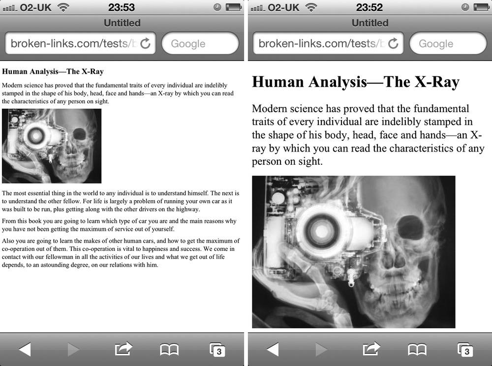
The solution that Apple came up with when they created Safari for iPhone was to ask developers to add a special tag, known as the viewport meta tag, in the head of their documents. This tag is used to control the dimensions and scaling of the browser viewport. Here’s an example:
<meta name="viewport" content="width=device-width">
You can use a number of different values in the content attribute, but the ones in this code mean: “Make the width of this document the same as the width of this device.” The difference can be clearly seen in Figure 3-3, which shows the same document before and after this tag is applied. In the before shot, the browser has automatically adjusted the main body text to better fit the screen, but the heading and image are very small; in the after shot, the heading and image are more naturally sized for the screen.
A device’s width will vary, but it is also affected by DPR. The iPhone 3GS screen is, as mentioned, 320px. But although the iPhone’s “retina” screen has a physical pixel count of 640px, as it has a DPR of 2, it only counts 320px—the DIPs—when the viewport meta tag is used with the device-width value.
Other parameters used in this tag control the initial zoom level of the page and whether the user has control over zooming it. In this example, the initial zoom level is 1.5x, and the user will not be able to change that:
<meta name="viewport" content="initial-scale=1.5,user-scalable=no">
Warning
Taking the option to zoom out of users’ hands can be extremely annoying; think carefully before applying this option.
Although the viewport meta tag fulfills its main function well, it does have a drawback: Using a meta tag means you can define only one set of parameters per page. For example, rather than using the default device width, you could specify a fixed size instead:
<meta name="viewport" content="width=480">
The problem is that all devices that recognize the viewport tag will set their zoom level at 480px, which is fine for smaller handheld devices but less useful for large tablets.
The solution is to set the viewport parameters in CSS. You do this with the @viewport at-rule. Where the viewport meta tag uses different parameters in the content attribute, @viewport uses CSS syntax to perform the same functions with a subset of specialist properties. To illustrate, I’ve repeated the previous example:
@viewport { width: 480px; }
The reason this solution is more useful is that you can combine @viewport with media queries to have different viewport parameters, depending on the viewing device. Consider this example:
@media screen and (max-width: 480px) {
  @viewport {
    width: 480px;
  }
}
@media screen and (min-width: 481px) {
  @viewport {
    width: device-width;
  }
}
For screens with a 480px width or lower, the viewport will be displayed at 480px, and on larger screens, at their natural size.
This approach is known as device adaptation and has the advantage of making sitewide changes much easier by requiring the modification of only a single CSS rule, rather than an unknown number of individual pages.
Input Mechanism Media Features
Although I’ve talked a lot about the dimensions or resolution of screens, I have to cover other key factors as well; for instance, the ways in which a user interacts with the device is just as important. The mouse and keyboard pairing has been the dominant input mechanism for many years, but the new device landscape accommodates not only that but also touch, stylus, and voice—and who knows what else in the future.
In recognition of the variety of input mechanisms, two new media features were proposed in the Media Queries Level 4 specification. These allow you to provide style rules sympathetic to the way users interact with your pages.
The first of these is the pointer feature, which has three available parameters: Of today’s most common input mechanisms, a device with keyboard or voice control has no pointer, so is classed as none; finger-based touch screens like a tablet or smartphone are most likely classed as coarse; and a mouse or stylus, which provides very close control, is classed as fine.
That being the case, here’s an example query adding extra padding to link elements on sites viewed using touch-screen (or other less precise) devices:
@media screen and (pointer: coarse) {
  a { padding: 1em; }
}
One feature unique to devices with mouse input is the hover state, which detects when an on-screen pointer is positioned above an element. Obviously, this feature doesn’t exist for touch or voice input. To address this, a hover feature is available for testing the existence of a hover state in the device. As the hover query is Boolean, no second value is required:
@media screen and (hover) {}
If you want to set rules on devices that don’t have a hover state, you could use either the 0 value or the not operator, so these rules are analogous:
@media screen and (hover:0) {}
@media not screen and (hover) {}
Further Media Features
A handful of other media features are available, many of which deal with device capabilities that will be out of the scope of most developers. A few of those features are related to color; for example, if you’re developing for ebook readers, some of which use grayscale “liquid paper,” you might want to investigate using the monochrome query and its opposite, color:
@media screen and (color) {}
@media screen and (monochrome) {}
I have to point out that in my (limited) tests, browsers on grayscale devices don’t always identify themselves as monochrome, even when these features are fully supported. As always, test on as many devices as possible.
For the remaining features in the Media Queries spec, I can do little more than repeat what’s in the documentation, as they’re largely aimed at specialist devices that I don’t have access to. I urge you to take a look at the spec for yourself and see if those features are relevant to your project.
Proposed in the draft version of the Media Queries Level 4 spec is the useful script feature, which tests whether JavaScript (or, more correctly, ECMAScript) is both supported and enabled by the browser. script is Boolean, so it requires no extra value to detect if script support is present:
@media screen and (script) {}
At the time of writing this chapter, this feature is still only a proposal and not implemented by any browser and, as such, may be removed at any time, but I felt it was worthy of inclusion based on just how useful it could be.