Table of Contents for
The Modern Web
 The Modern Web
Published by
No Starch Press, 2013
The Modern Web
Published by
No Starch Press, 2013
- The Modern Web
- Cover
- The Modern Web
- Advance Praise for
- Praise for Peter Gasston’s
- Dedication
- About the Author
- About the Technical Reviewer
- Acknowledgments
- Introduction
- The Device Landscape
- The Multi-screen World
- Context: What We Don’t Know
- What You’ll Learn
- A. Further Reading
- 1. The Web Platform
- A Quick Note About Terminology
- Who You Are and What You Need to Know
- Getting Our Terms Straight
- The Real HTML5
- CSS3 and Beyond
- Browser Support
- Test and Test and Test Some More
- Summary
- B. Further Reading
- 2. Structure and Semantics
- New Elements in HTML5
- WAI-ARIA
- The Importance of Semantic Markup
- Microformats
- RDFa
- Microdata
- Data Attributes
- Web Components: The Future of Markup?
- Summary
- C. Further Reading
- 3. Device-Responsive CSS
- Media Queries
- Media Queries in JavaScript
- Adaptive vs. Responsive Web Design
- Viewport-Relative Length Units
- Responsive Design and Replaced Objects
- Summary
- D. Further Reading
- 4. New Approaches to CSS Layouts
- Multi-columns
- Flexbox
- Grid Layout
- The Further Future
- Summary
- E. Further Reading
- 5. Modern JavaScript
- New in JavaScript
- JavaScript Libraries
- Polyfills and Shims
- Testing and Debugging
- Summary
- F. Further Reading
- 6. Device Apis
- Geolocation
- Orientation
- Fullscreen
- Vibration
- Battery Status
- Network Information
- Camera and Microphone
- Web Storage
- Drag and Drop
- Interacting with Files
- Mozilla’s Firefox OS and WebAPIs
- PhoneGap and Native Wrappers
- Summary
- G. Further Reading
- 7. Images and Graphics
- Comparing Vectors and Bitmaps
- Scalable Vector Graphics
- The canvas Element
- When to Choose SVG or Canvas
- Summary
- H. Further Reading
- 8. New Forms
- New Input Types
- New Attributes
- Datalists
- On-Screen Controls and Widgets
- Displaying Information to the User
- Client-side Form Validation
- The Constraint Validation API
- Forms and CSS
- Summary
- I. Further Reading
- 9. Multimedia
- The Media Elements
- Media Fragments
- The Media API
- Media Events
- Advanced Media Interaction
- Summary
- J. Further Reading
- 10. Web Apps
- Web Apps
- Hybrid Apps
- TV Apps
- Webinos
- Application Cache
- Summary
- K. Further Reading
- 11. The Future
- Web Components
- The Future of CSS
- Summary
- L. Further Reading
- M. Browser Support as of March 2013
- The Browsers in Question
- Enabling Experimental Features
- Chapter 1: The Web Platform
- Chapter 2: Structure and Semantics
- Chapter 3: Device-Responsive CSS
- Chapter 4: New Approaches to CSS Layouts
- Chapter 5: Modern JavaScript
- Chapter 6: Device APIs
- Chapter 7: Images and Graphics
- Chapter 8: New Forms
- Chapter 9: Multimedia
- Chapter 10: Web Apps
- Chapter 11: The Future
- N. Further Reading
- Introduction
- Chapter 1: The Web Platform
- Chapter 2: Structure and Semantics
- Chapter 3: Device-Responsive CSS
- Chapter 4: New Approaches to CSS Layouts
- Chapter 5: Modern JavaScript
- Chapter 6: Device APIs
- Chapter 7: Images and Graphics
- Chapter 8: New Forms
- Chapter 9: Multimedia
- Chapter 10: Web Apps
- Chapter 11: The Future
- Index
- About the Author
- Copyright
Multi-columns
With their roots in scientific document markup, websites have followed a pretty straightforward pattern when it comes to text: everything is based on a single, unbroken column, like a document in a word processor or text editor. This characteristic is largely because of the Web’s dynamic nature, with variable font sizes and numbers of characters making it hard to control positioning precisely. Print, with its fixable letter sizes and known character count, allows for much greater flexibility in how text is laid out on the page.
Pick up just about any printed magazine or newspaper (younger readers: ask your parents what those are) and you’re bound to find examples of text being flowed into multiple columns—often two, sometimes three or more. Columnar formats make it easy to fit more text on a page without sacrificing readability.
Until recently, replicating this columnar style on the Web hasn’t been possible without JavaScript, but the Multi-column Layout Module addresses this shortcoming. To be honest, I think this feature is often more suited for print than for screen, where scrolling up and down to read columns of text can be a pain, but for some occasions, multiple columns is definitely the better pattern to use.
Multi-column properties make flowing inline content into columns straightforward. On the parent of the elements in question, you apply the column-count property, with an integer value for the number of columns. For example, this is the code you’d use to flow the content into three columns:
E { column-count: 3; }
The inline content is now in three columns, with a 1em gap between each. If you prefer to be more prescriptive about your columns, you could instead set their width using the column-width property with a length value:
E { column-width: 120px; }
This markup would make as many columns of 120px—plus the 1em gap between each column—as would fit into the width of the parent element. For example, given a parent width of 600px, four columns of 120px would be created, plus a total gap of 3em between them, leaving some space to spare. That spare space would then be equally distributed among each column, increasing the width until the full width of the parent is filled; that is, the column-width value is treated as a minimum rather than an absolute.
Figure 4-1 shows a comparison of the two approaches. The upper example uses column-count to create three equal columns that fill the parent’s width; the lower example has a column-width value of 120px, but the actual width of the columns is slightly different as each has been resized to better fit the parent.
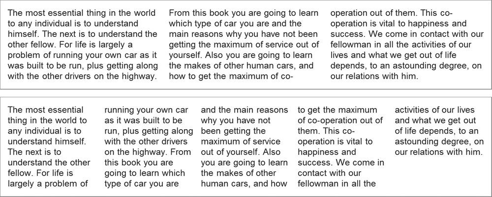
column-count (top) and
column-width properties (bottom)
You can also apply column-width and column-count to the same element. When you do, the column-count value becomes the maximum number of columns allowed. In this case, the logic is: “Make columns of 120px, up to a maximum of three columns; then resize them as necessary to fill the parent width.” You could also use the columns shorthand for this, where the two values provided are column-width and column-count, respectively:
E { columns: 120px 3; }
When inline content is flowed into columns in a parent element with no fixed height, the browser evenly distributes (as much as possible) the number of lines in each column, possibly leaving some empty space at the bottom of the parent element. But if the element has a set height, you can choose how the text will flow, using the column-fill property.
The default value for column-fill is balance, which distributes the lines evenly. The alternative behavior is for the columns to be filled sequentially, to their maximum height, more than likely leaving a final column with many fewer lines and lots of unused space. If this is your preference, you can set it with the keyword value auto.
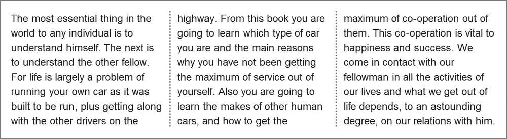
Gaps and Rules
As mentioned earlier, between each column is a default 1em gap. You can alter that gap with the column-gap property. This property accepts a single length value, and it increases the gap between each column to the specified length. Here’s an example:
E { column-gap: 2em; }
You can also add lines between each column, known as rules, with the column-rule property. The effect is essentially the same as the border property from CSS2.1, and it requires the same three values—one for width, one for style, and one for color—but it applies only to a single vertical rule, not to all four sides. So to add a dotted, gray, 2px-wide rule between each column, you’d use this code:
E { column-rule: 2px dotted gray; }
When used with column-gap, the gap width is distributed equally on either side of the rule. Using this example, you would have a 2em gap: 1em gap on each side of the 2px rule, as shown in Figure 4-2.
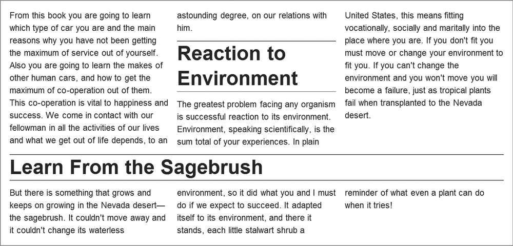
Spans and Breaks
Columns are fine when you’re flowing text and other inline content into them, but at other times you will want to use objects or block elements that don’t fit nicely into columns. A couple of related properties help in those circumstances.
The first is column-span, best for when you want to break the flow of the columns with a new element that spans all of them. This is a Boolean property—an element spans either all columns or none. As such, the permitted values are either all or none:
F { column-span: all; }
When the all value is used, the flow of the inline text stops before the element it’s applied to and continues afterward, as shown in Figure 4-3.
When you have elements within a grid, you may encounter a situation where the end of a column causes a break in the middle of that element. This isn’t ideal if you have, for example, a subheading that could be broken over two columns. To avoid this situation, a set of properties tries to control where the breaks occur. These properties—break-after, break-before, and break-inside—all work in more or less the same way.
I’ll use break-before as an illustration. The values you can apply to this property (and its siblings) set whether a column break occurs before an element. A value of column forces a break before the element (where relevant, of course). A value of avoid-column (or just plain avoid—a marker that this property is also available to other CSS features) forbids the browser to break before the element unless absolutely necessary for page flow. The default value auto lets the browser decide the best way to lay out the columns.
If this still sounds a little opaque, the example file column-breaks.html shows the column value at work. Here is the code in this example:
h2 { break-before: column; }
The results are shown in Figure 4-4. In the upper example, the default value auto means the subheadings are inline, in the middle of the columns. But using the column value means that in the second example, the column breaks always occur before the h2s, or subheadings.
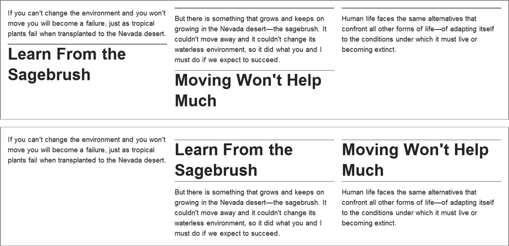
column value on the break-before property are clearly shown in the lower example.
The break-after and break-inside properties work the same way, except for the location where the break occurs. (Do you need me to tell you where that is, or would you like to guess?)