Table of Contents for
The Modern Web
 The Modern Web
Published by
No Starch Press, 2013
The Modern Web
Published by
No Starch Press, 2013
- The Modern Web
- Cover
- The Modern Web
- Advance Praise for
- Praise for Peter Gasston’s
- Dedication
- About the Author
- About the Technical Reviewer
- Acknowledgments
- Introduction
- The Device Landscape
- The Multi-screen World
- Context: What We Don’t Know
- What You’ll Learn
- A. Further Reading
- 1. The Web Platform
- A Quick Note About Terminology
- Who You Are and What You Need to Know
- Getting Our Terms Straight
- The Real HTML5
- CSS3 and Beyond
- Browser Support
- Test and Test and Test Some More
- Summary
- B. Further Reading
- 2. Structure and Semantics
- New Elements in HTML5
- WAI-ARIA
- The Importance of Semantic Markup
- Microformats
- RDFa
- Microdata
- Data Attributes
- Web Components: The Future of Markup?
- Summary
- C. Further Reading
- 3. Device-Responsive CSS
- Media Queries
- Media Queries in JavaScript
- Adaptive vs. Responsive Web Design
- Viewport-Relative Length Units
- Responsive Design and Replaced Objects
- Summary
- D. Further Reading
- 4. New Approaches to CSS Layouts
- Multi-columns
- Flexbox
- Grid Layout
- The Further Future
- Summary
- E. Further Reading
- 5. Modern JavaScript
- New in JavaScript
- JavaScript Libraries
- Polyfills and Shims
- Testing and Debugging
- Summary
- F. Further Reading
- 6. Device Apis
- Geolocation
- Orientation
- Fullscreen
- Vibration
- Battery Status
- Network Information
- Camera and Microphone
- Web Storage
- Drag and Drop
- Interacting with Files
- Mozilla’s Firefox OS and WebAPIs
- PhoneGap and Native Wrappers
- Summary
- G. Further Reading
- 7. Images and Graphics
- Comparing Vectors and Bitmaps
- Scalable Vector Graphics
- The canvas Element
- When to Choose SVG or Canvas
- Summary
- H. Further Reading
- 8. New Forms
- New Input Types
- New Attributes
- Datalists
- On-Screen Controls and Widgets
- Displaying Information to the User
- Client-side Form Validation
- The Constraint Validation API
- Forms and CSS
- Summary
- I. Further Reading
- 9. Multimedia
- The Media Elements
- Media Fragments
- The Media API
- Media Events
- Advanced Media Interaction
- Summary
- J. Further Reading
- 10. Web Apps
- Web Apps
- Hybrid Apps
- TV Apps
- Webinos
- Application Cache
- Summary
- K. Further Reading
- 11. The Future
- Web Components
- The Future of CSS
- Summary
- L. Further Reading
- M. Browser Support as of March 2013
- The Browsers in Question
- Enabling Experimental Features
- Chapter 1: The Web Platform
- Chapter 2: Structure and Semantics
- Chapter 3: Device-Responsive CSS
- Chapter 4: New Approaches to CSS Layouts
- Chapter 5: Modern JavaScript
- Chapter 6: Device APIs
- Chapter 7: Images and Graphics
- Chapter 8: New Forms
- Chapter 9: Multimedia
- Chapter 10: Web Apps
- Chapter 11: The Future
- N. Further Reading
- Introduction
- Chapter 1: The Web Platform
- Chapter 2: Structure and Semantics
- Chapter 3: Device-Responsive CSS
- Chapter 4: New Approaches to CSS Layouts
- Chapter 5: Modern JavaScript
- Chapter 6: Device APIs
- Chapter 7: Images and Graphics
- Chapter 8: New Forms
- Chapter 9: Multimedia
- Chapter 10: Web Apps
- Chapter 11: The Future
- Index
- About the Author
- Copyright
Media Queries in JavaScript
The benefit of media queries in CSS is obvious, so you shouldn’t be surprised that they have been adopted into JavaScript as well. This means you can run functions or load in more external scripts depending on device capabilities, leading to sympathetic and improved behavior as well as presentation.
The matchMedia() method is used to run the queries, which are provided in a string as an argument. Try running this in your developer console:
window.matchMedia('screen and (min-width: 800px)');
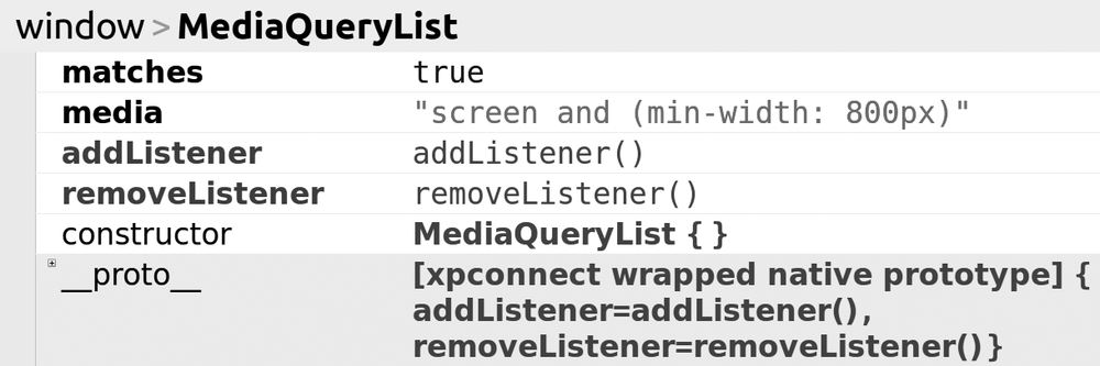
The result of this code is a MediaQueryList object, and how it appears in your console depends on the browser and tools you use; Figure 3-4 shows the result when I enter this query into Firebug.
What I want from this object is the value of the matches property, which will return true or false depending on the query logic. Using this value, you can easily build an if statement to perform actions depending on the result; in this example, if the viewport is at least 800px wide, the function foo() runs:
var mq = window.matchMedia('screen and (min-width: 800px)');
if (mq.matches) { foo(); }
else { // do something else }
In the file mq-matches.html, you can see a short script I’ve written based on this logic, which simply shows an alert that tells you whether your browser window is at least 800px wide; try resizing your browser window and refreshing the page to see different results.
Taking advantage of JavaScript’s dynamic nature, you can extend this with a listener that fires if the device’s state changes, for example, if the user resizes his or her browser window or changes the orientation of his or her device. I can extend my previous code snippet by adding a new function, widthWatch(), containing the original if-else logic, which is called whenever the viewport changes and fires the listener:
function widthWatch(mq) {
  if (mq.matches) { foo(); }
  else { // do something else }
}
var mq = window.matchMedia('screen and (min-width: 800px)');
mq.addListener(widthWatch);
widthWatch(mq);
In the example file mq-widthwatch.html, you can see the results of a script based on this; it returns the same results as in the previous example, but you won’t need to refresh the page to get a different result; just resize the window.