The Future of CSS
CSS3 has already revolutionized the Web in some ways, with its introduction of behavioral aspects such as transitions and animations and by seriously addressing the problem of layout mechanisms. But those features barely scratch the surface of what’s to come. Lots of big tech companies are betting their futures on the Web, and their involvement in shaping the future of web standards brings with it some incredible innovation.
For example, Adobe’s wholesale embrace of open standards (a pleasant surprise!) is making it a major player in browser development, and its experience with graphics and publishing is being applied to CSS. The first fruits of this labor are CSS Regions and Exclusions, which open up the possibility of major changes to the way we’ll lay out pages in the future, as dynamic web pages finally begin to catch up with what desktop publishing has been doing for years.
But the web development community is having the biggest effect on the development of CSS. Developer-built JavaScript libraries such as jQuery and Modernizr are directly influencing the language, as you’ve seen with querySelector() and querySelectorAll() (back in Chapter 5), and that influence will be felt further with the introduction of feature queries.
Additionally, the rise in popularity of CSS preprocessors such as Sass and LESS means that front-end developers are becoming accustomed to using programming principles, such as variables and functions. The demand for these to be introduced into the language is manifesting itself through cascading variables.
Regions
Back in Chapter 4, I discussed CSS columns, where inline content is divided into columns and flows through the first column and then the second, the third, and so on. Imagine that those columns are not immediately adjacent to each other; the first is on the left of the page, the second is on the right, and the third is at the bottom, but the content still flows sequentially through them. That’s the gist of a new CSS concept called Regions.
Regions work like this: An element is declared as a source, and the content of that source is flowed into another element, or series of elements, known as a region chain. What that means in practice is you can have content flowing across multiple elements in a sequence that doesn’t flow in natural DOM order.
Here’s a simple illustration that starts with three div elements: a #foo and two .bars. The first, #foo, is filled with content, and the others are empty:
<div id="foo">
  <p>…</p>
</div>
<div class="bar"></div>
<div class="bar"></div>
The next step is to get the content of #foo and put it into a named flow, kind of like storing it in a variable (or the clipboard on your computer). In CSS Regions, you create this named flow by declaring the flow-into property on the source element (#foo). The value of the property is a unique name of your choosing, so I’ll name mine myFlow. Having named my flow (or clipboard, if you’re still following the metaphor), I can flow it into other elements, which become known as the titular regions:
#foo { flow-into: myFlow; }Warning
In Internet Explorer 10, the source element must be an iframe, and the content inside the body of the linked document will become the content of the flow.
When this property is applied, the source element and all its children are no longer rendered on screen, although they are still visible and accessible in the DOM.
Next I must declare a region chain that the content will be flowed into. Each element that forms part of the region chain should have the flow-from property declared on it, the value of which is the previously defined named flow. The following code shows how to flow the content of the flow myFlow into all regions called .bar:
.bar { flow-from: myFlow; }
The content in myFlow flows through the region chain in DOM order; it starts by flowing into the first instance of .bar, and then any overflow flows into the second instance of .bar, and so on, until the end of the content. Try this out with the file regions.html, as shown in Figure 11-4.
As I mentioned at the beginning of this section, CSS Regions work like multiple columns, without the columns needing to be immediately adjacent. This new element creates some amazing opportunities for making dynamic, interesting page layouts, inspired by years of experience with the possibilities of print media.
Exclusions
CSS Exclusions can be thought of as a kind of positioned floats—indeed, an earlier concept described them as exactly that. In CSS2.1 you can float elements only to the left, where other content flows around their right side, or vice versa. But the idea of CSS Exclusions is that you can flow content around an element no matter where it’s positioned on the page.
To illustrate, consider the following markup with a container element #foo, some text content in a p, and a child element #bar:
<div id="foo">
  <p>…</p>
  <div id="bar"></div>
</div>
I want to position #bar absolutely over the content in #foo, which will require style rules somewhat like this:
#foo { position: relative; }
#bar {
  left: 20px;
  position: absolute;
}
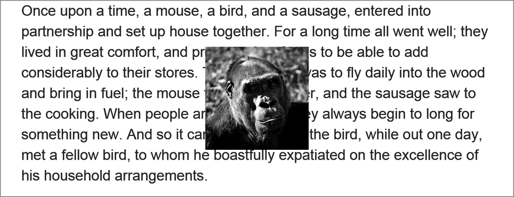
As written here, #bar sits in a layer stacked above the text content, obscuring what’s behind it, as you can see in Figure 11-5. But I want to make #bar part of the same layer and to float the text content around it. In the parlance of Exclusions, I want #bar to become an exclusion element.
I can accomplish this with the wrap-flow property, which makes the element it’s applied to an exclusion element. Any sibling content flows around it according to the keyword value of the property.
The following example uses the keyword value both to make content flow around both sides of the exclusion element:
#bar { wrap-flow: both; }
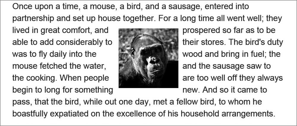
You can see the difference this makes in Figure 11-6. The elements are in the same positions as before, but because #bar has now been declared an exclusion element, the content in #foo flows around it on both sides.
wrap-flow property makes the positioned element become part of the document flow, and the content flows around it on both sides.
Alternative values for wrap-flow include:
-
startto flow the content on the left side (in left-to-right languages) of the exclusion element, but not the right -
endto do the opposite -
maximumandminimumto flow content only on the side with the most or least space (respectively) between it and its containing element -
clearto flow content only above and below the exclusion element
Figure 11-7 shows a few of the different values at work. The first example has a value of start, so the content flows to the left of the exclusion element. The next has the end value, so the content flows on the opposite side. And in the final example, the clear value makes content flow on neither side of the element.
To permit more control over the flow of inline elements around the exclusion, you have the wrap-through property. This property takes one of two keyword values: flow and none. The former, the default, makes inline content flow around the exclusion element; the latter doesn’t. This is useful if you want to enable content flow on a per-element basis.
wrap-flow.
Exclusions and Grids
For me, one of the most exciting things about CSS Exclusions is the way they interact with the Grid Layout module that I introduced in Chapter 4. Any grid item can be made into an exclusion element, which really expands grid layout possibilities. As a simple example, consider a grid with three columns and two rows:
E {
  display: grid;
  grid-columns: 1fr 1fr 1fr;
  grid-rows: 100px 1fr;
}
On that grid, I’ll place two items that have overlapping cells (they’ll overlap in row two, column two):
F, G { grid-column-span: 2; }
F {
  grid-column: 2;
  grid-row-span: 2;
}
G { grid-row: 2; }
Under the usual rules of grid placement, element G would stack over the top of element F, as it appears later in the DOM order. But by making element G the exclusion element, the inline content of element F will flow around it:
G {
  grid-row: 2;
  wrap-flow: both;
}
As you can see in the example file grid-exclusion.html (and in Figure 11-8), F now takes on a kind of inverted upside-down L shape as it flows around element G. This kind of layout is quite common in print so being able to reproduce it in web pages is really quite exciting. By making possible the kind of art direction that books and magazines have taken for granted for hundreds of years, CSS Exclusions ushers in a whole new era of laying out pages on the Web.
Shaped Exclusions
The CSS Exclusions used in the examples in this section so far are based on standard block elements, so they appear boxy. The plan in the future is that you won’t be limited to rectangular exclusions because a pair of new properties will allow you to draw geometrical exclusion shapes.
The shape-inside and shape-outside properties will accept as a value either a simple geometric shape such as a circle or ellipse, or a series of coordinates that will create a completely customized polygonal shape. Content could then be flowed around either the inside or outside of this shape (or both), opening up possibilities for the types of rich layout long possible in print but now improved with the dynamism of web content.
Even Further Future Layouts
As I write this in early 2013, a series of new rules and properties that affect layout are at various degrees of implementation—from barely there to only a proposal. My hope is that they will all be adopted and implemented because they solve different problems. With the CSS specification in a constant state of flux, however, nothing can be taken for granted; these rules and properties may be implemented, partially implemented with a different syntax, or not implemented at all.
Still, I think looking at them is worthwhile for two reasons: First, so you can see the thinking that goes on in trying to find solutions to the problems of web layout; and second, if they are implemented, you may need to use them.
Box Alignment
The idea behind the Box Alignment module is to create a syntax that’s common across many different modules, for aligning elements within their parent. Box Alignment takes the Flexbox syntax as its inspiration, using justify- properties for inline/main axis alignment and align- properties for stacking/cross-axis alignment. For example, to align an element along its main axis, you’d use the justify-self property; and to align the child elements of an element along the cross axis, you’d use align-content.
Line Grid
In addition to the well-known grid formed with rows and columns, typographers also use what’s often known as a line grid, or a vertical rhythm, a secondary grid created from the lines of text and headings on a page. When using a line grid, you try to make the vertical dimensions and alignment of objects harmonious with the text for better readability.
The Line Grid module creates a virtual vertical grid based on the font-size and line-height of text elements and lets you better align objects within that grid. It allows you to snap block elements to fixed points in that grid, overriding the default layout position created by the browser’s engine.
Paged Media
Scrolling is the de facto way to work with content that overflows its container, especially the screen, but scrolling isn’t always easy with devices such as television remote controls and liquid paper ebook readers, for example. A better approach for these devices might be to use paginated overflow instead.
You can do this easily with features proposed in the Paged Media module, which introduces the overflow-style property. A value of paged-x or paged-y automatically creates pages horizontally or vertically (respectively), while -controls (such as paged-x-controls) adds on-screen controls generated by the browser for interfaces that require them.
A further proposal, Pagination Templates, extends this even further, creating content regions that are fixed to each page for a consistent experience, allowing rich interactive magazine-style layouts.
Feature Queries
In Chapter 5 I discussed the JavaScript library Modernizr, which is used for detecting the existence of certain features in a visitor’s browser, and briefly mentioned its native adaptation into CSS through the @supports at-rule. I want to return to that now and explore it in a little more detail, as it’s extremely useful and fast making its way into browsers.
The @supports at-rule behaves like a media query: You create a logical query that, if it returns true, will apply the rules contained within the subsequent brackets. But instead of media features, the test conditions are CSS property-value pairs, known as feature queries. For example, to test whether a user’s browser supports the column-count property so you can serve appropriate styles, you could construct a query like this:
@supports (column-count: 1) { … }
As with media queries, you can build more advanced queries using logical operators. For example, the following query uses the and operator to serve styles to browsers that support both the column-count and box-sizing properties:
@supports (column-count: 1) and (box-sizing: border-box) { … }
You can also use the or operator to build queries that detect defined features, which is extremely useful when dealing with vendor-prefixed properties. Here, both the hyphens or -moz-hyphens properties are tested against, and if either is supported, the rules are applied:
@supports (-moz-hyphens: auto) or (hyphens: auto) { … }
The not operator allows you to serve styles to browsers that don’t support a given property. (Note that unlike the other operators, this one must be inside parentheses.)
@supports (not (-webkit-hyphens: auto)) { … }
Feature queries include an API that is as simple to use as the at-rule. For example, you can use the CSS.supports() method to detect a single feature by passing a property-value pair as two arguments. Here, it tests for the flex value on the display property:
var supports = CSS.supports('display','flex');
And you can pass in full queries as a single argument, quoted as a string:
var supports = CSS.supports('(column-count: 1) and (display: flex)');
The Modernizr project has already begun implementing this in its library; if native CSS.supports() implementation is present, the script will use that, and if not, it will fall back to Modernizr’s own tests.
Cascading Variables
Variables have proven their utility over the years in just about every programming language, but they have never been implemented in CSS, despite regular calls for implementation from the community. But with the surge in popularity of CSS preprocessors, a generation of coders is learning to love variables in their stylesheets, and calls to include them natively in the language can no longer be ignored.
As currently proposed, CSS variables have limited scope. A true variable permits any type of value and could be used at any point in the code—say, to assign a selector to a variable. The proposed CSS variables can be assigned only a valid CSS value and can be used only as the value of a property. For this reason, they’re distinguished with the name Cascading Variables.
Each Cascading Variable is declared using a custom property: a user-defined property name beginning with var- to which a value is assigned. Here, the color value #F00 is assigned to the custom property var-foo:
:root { var-foo: #F00; }
Notice that I’ve declared this custom property using the :root selector. (I explain why shortly.)
To use the value of the custom property, you call it using the var() function, with the user-defined name (the bit after var-) in parentheses. The value of the custom property is used as the value of the property it’s called on. For example, in the following listing, the h1 element calls the var-foo property using the var(foo) function twice: once on the border-bottom property and once on color. The color value #F00 will be applied appropriately to each property.
 h1 {
  border-bottom: 1px solid var(foo);
  color: var(foo);
}
Cascading Variables are scoped, meaning they apply only to the element on which they are declared and to any child element. My use of the :root selector to declare a custom property in the example in this section means the variable has global scope: It can be applied on any element on the page. Had I used a different selector, the value of the variable declared in the custom property would apply only to children of the matching element(s).
For example, in the following code the custom property var-foo, with a value of #F00, is declared on the :root element, but I’ll also add a different value and selector below it. In this case, the value of the variable would be #F00 for the whole document, but it will now be #00F for the .bar element and its children.
:root { var-foo: #F00; }
.bar { var-foo: #00F; }
Note
In the longer term, the preprocessor favorite mixins will also be implemented in CSS. A mixin is like an extended variable, allowing blocks of code to be reused across multiple selectors. There’s even been talk of implementing full variables, allowing replacement of property names and selectors.


