
Since our computations are done per minute, we round off the time to the nearest minute, as shown in the following code:
_time = pdata_frame['Time'] #Time column of the data frame
edited_time = []
for row in pdata_frame.rows:
            arr = _time.split(':')
            time_till_mins = str(arr[0]) + str(arr[1])
            edited_time.append(time_till_mins) # the rounded off time
source = pdata_frame['Source'] # source address
The output of the preceding code is the time rounded off to the nearest minute, that is, 2018-03-18 21:17:58 which will become 2018-03-18 21:17:00 as shown:
'2018-03-18 21:17:00'
'2018-03-18 21:18:00'
'2018-03-18 21:19:00'
'2018-03-18 21:20:00'
'2018-03-19 21:17:00'
We count the number of connections established per minute for a particular source by iterating through the time array for a given source:
connection_count = {} # dictionary that stores count of connections per minute
for s in source:
    for x in edited_time :
        if  x in connection_count :
            value = connection_count[x]
            value = value + 1
            connection_count[x] = value
        else:
            connection_count[x] = 1
new_count_df #count # date #source
The connection_count dictionary gives the number of connections. The output of the preceding code looks like:
| Time | Source | Number of Connections |
| 2018-03-18 21:17:00 | 192.168.0.2 | 5 |
| 2018-03-18 21:18:00 | 192.168.0.2 | 1 |
| 2018-03-18 21:19:00 | 192.168.0.2 | 10 |
| 2018-03-18 21:17:00 | 192.168.0.3 | 2 |
| 2018-03-18 21:20:00 | 192.168.0.2 | 3 |
| 2018-03-19 22:17:00 | 192.168.0.2 | 3 |
| 2018-03-19 22:19:00 | 192.168.0.2 | 1 |
| 2018-03-19 22:22:00 | 192.168.0.2 | 1 |
| 2018-03-19 21:17:00 | 192.168.0.3 | 20 |
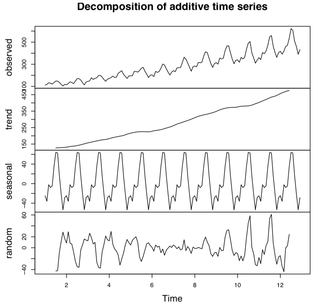
We will decompose the data with the following code to look for trends and seasonality in the data. Decomposition of the data promotes more effective detection of an anomalous behavior, a DDoS attack, as shown in the following code:
from statsmodels.tsa.seasonal import seasonal_decompose
result = seasonal_decompose(new_count_df, model='additive')
result.plot()
pyplot.show()
The data generates a graph as follows; we are able to recognize the seasonality and trend of the data in general:
Next we find the ACF function for the data to understand the autocorrelation among the variables, with the following piece of code:
from matplotlib import pyplot
from pandas.tools.plotting import autocorrelation_plot
autocorrelation_plot(new_count_df)
pyplot.show()