Table of Contents for
Node.js 8 the Right Way
 Node.js 8 the Right Way
Published by
Pragmatic Bookshelf, 2018
Node.js 8 the Right Way
Published by
Pragmatic Bookshelf, 2018
- Title Page
- Node.js 8 the Right Way
- Node.js 8 the Right Way
- Node.js 8 the Right Way
- Node.js 8 the Right Way
- Acknowledgments
- Preface
- Why Node.js the Right Way?
- What’s in This Book
- What This Book Is Not
- Code Examples and Conventions
- Online Resources
- Part I. Getting Up to Speed on Node.js 8
- 1. Getting Started
- Thinking Beyond the web
- Node.js’s Niche
- How Node.js Applications Work
- Aspects of Node.js Development
- Installing Node.js
- 2. Wrangling the File System
- Programming for the Node.js Event Loop
- Spawning a Child Process
- Capturing Data from an EventEmitter
- Reading and Writing Files Asynchronously
- The Two Phases of a Node.js Program
- Wrapping Up
- 3. Networking with Sockets
- Listening for Socket Connections
- Implementing a Messaging Protocol
- Creating Socket Client Connections
- Testing Network Application Functionality
- Extending Core Classes in Custom Modules
- Developing Unit Tests with Mocha
- Wrapping Up
- 4. Connecting Robust Microservices
- Installing ØMQ
- Publishing and Subscribing to Messages
- Responding to Requests
- Routing and Dealing Messages
- Clustering Node.js Processes
- Pushing and Pulling Messages
- Wrapping Up
- Node.js 8 the Right Way
- Part II. Working with Data
- 5. Transforming Data and Testing Continuously
- Procuring External Data
- Behavior-Driven Development with Mocha and Chai
- Extracting Data from XML with Cheerio
- Processing Data Files Sequentially
- Debugging Tests with Chrome DevTools
- Wrapping Up
- 6. Commanding Databases
- Introducing Elasticsearch
- Creating a Command-Line Program in Node.js with Commander
- Using request to Fetch JSON over HTTP
- Shaping JSON with jq
- Inserting Elasticsearch Documents in Bulk
- Implementing an Elasticsearch Query Command
- Wrapping Up
- Node.js 8 the Right Way
- Part III. Creating an Application from the Ground Up
- 7. Developing RESTful Web Services
- Advantages of Express
- Serving APIs with Express
- Writing Modular Express Services
- Keeping Services Running with nodemon
- Adding Search APIs
- Simplifying Code Flows with Promises
- Manipulating Documents RESTfully
- Emulating Synchronous Style with async and await
- Providing an Async Handler Function to Express
- Wrapping Up
- 8. Creating a Beautiful User Experience
- Getting Started with webpack
- Generating Your First webpack Bundle
- Sprucing Up Your UI with Bootstrap
- Bringing in Bootstrap JavaScript and jQuery
- Transpiling with TypeScript
- Templating HTML with Handlebars
- Implementing hashChange Navigation
- Listing Objects in a View
- Saving Data with a Form
- Wrapping Up
- 9. Fortifying Your Application
- Setting Up the Initial Project
- Managing User Sessions in Express
- Adding Authentication UI Elements
- Setting Up Passport
- Authenticating with Facebook, Twitter, and Google
- Composing an Express Router
- Bringing in the Book Bundle UI
- Serving in Production
- Wrapping Up
- Node.js 8 the Right Way
- 10. BONUS: Developing Flows with Node-RED
- Setting Up Node-RED
- Securing Node-RED
- Developing a Node-RED Flow
- Creating HTTP APIs with Node-RED
- Handling Errors in Node-RED Flows
- Wrapping Up
- A1. Setting Up Angular
- A2. Setting Up React
- Node.js 8 the Right Way
Sprucing Up Your UI with Bootstrap
Bootstrap, by Twitter, is a framework for developing beautiful, mobile-first web UIs.[71] Rather than designing every aspect of the UI and then writing CSS rules by hand, we’ll use Bootstrap to provide a good, basic design.
Before we pull in Bootstrap, though, we’ll need some dependency plugins. For webpack to work with CSS generally, we need the style-loader and css-loader plugins. In addition, to load other static assets that CSS files might reference, like images and fonts, we’ll need the url-loader plugin and its peer dependency the file-loader plugin.
Use npm to install all of those:
| | $ npm install --save-dev --save-exact \ |
| | style-loader@0.19.0 \ |
| | css-loader@0.28.7 \ |
| | url-loader@0.6.2 \ |
| | file-loader@1.1.5 |
For webpack to use those plugins, we need to add them to the config and explain which files should be handled by which plugins. Open your webpack.config.js and add the following module section to the exported webpack config object.
| | module: { |
| | rules: [{ |
| | test: /\.css$/, |
| | use: [ 'style-loader', 'css-loader' ] |
| | },{ |
| | test: /\.(png|woff|woff2|eot|ttf|svg)$/, |
| | loader: 'url-loader?limit=100000', |
| | }], |
| | }, |
First, this tells webpack that files ending in css should be handled using the css-loader and the style-loader. The css-loader plugin reads CSS files and resolves any @import and url() statements using webpack’s require toolchain. But after resolving the dependencies, css-loader doesn’t do anything with the resulting CSS. For that, you need the style-loader plugin, which injects a <style> tag into the page containing the CSS content.
Order matters here! The plugins listed in the use list of a module rule are processed in reverse order. If you switch these around, webpack will emit an ugly error when attempting to build—try it if you’re curious.
The second module rule tells webpack that a variety of files should be loaded with the url-loader. This pulls in the remote file and inlines it directly. For example, if a CSS rule uses a background image, it’ll be turned into a data URI.[72]
The url-loader’s limit parameter specifies the maximum file size in bytes that can be inlined. If a file is larger than this limit, then url-loader defers to file-loader, which emits the file to the output directory instead. There’s no one-size-fits-all rule to determine this limit—it’s a classic tradeoff between loading many small files vs. a smaller number of larger files.
Once you’ve saved your webpack.config.js file, it’s time to bring in Bootstrap. Open your terminal and run this command:
| | $ npm install --save-dev --save-exact bootstrap@3.3.7 |
Now the last thing to do is make use of Bootstrap in the entry.js. Open that file and replace its contents with this:
| | 'use strict'; |
| | import './node_modules/bootstrap/dist/css/bootstrap.min.css'; |
| | |
| | document.body.innerHTML = ` |
| | <div class="container"> |
| | <h1>B4 - Book Bundler</h1> |
| | <div class="b4-alerts"></div> |
| | <div class="b4-main"></div> |
| | </div> |
| | `; |
At the top of this file, we use the import keyword to pull in the minified Bootstrap CSS. The import keyword is part of the ECMAScript 2015 module specification, but is not yet available in Node.js. We can use it here, though, because webpack, not Node.js, is responsible for resolving these dependencies. We’ll use import throughout this chapter for bringing in dependencies.
For now, consider this import line to be the same as calling require with the same argument. When webpack encounters this dependency at build time, it matches the filename against the module.rules we added earlier in webpack.config.js. Seeing that the file ends in css, webpack invokes the css-loader plugin to grab Bootstrap’s CSS content.
After establishing the dependency on Bootstrap, we update the document.body.innerHTML to create the basic architecture of the page. The CSS class container on the outermost <div> tells Bootstrap to constrain its width if the window size is too large. Inside the container, we set up an area for alerts to notify the user, and a main content area that will dynamically change based on the application state. CSS classes that begin with the b4- prefix are specific to this application—all other CSS classes you see are part of Bootstrap.
Next, add this code to the end of the file, after setting document.body.innerHTML:
| | const mainElement = document.body.querySelector('.b4-main'); |
| | |
| | mainElement.innerHTML = ` |
| | <div class="jumbotron"> |
| | <h1>Welcome!</h1> |
| | <p>B4 is an application for creating book bundles.</p> |
| | </div> |
| | `; |
| | |
| | const alertsElement = document.body.querySelector('.b4-alerts'); |
| | |
| | alertsElement.innerHTML = ` |
| | <div class="alert alert-success alert-dismissible fade in" role="alert"> |
| | <button class="close" data-dismiss="alert" aria-label="Close"> |
| | <span aria-hidden="true">×</span> |
| | </button> |
| | <strong>Success!</strong> Bootstrap is working. |
| | </div> |
| | `; |
In this part, we grab a reference to the main content <div> by passing a CSS selector to the querySelector method. Using this element, we insert a big welcome message styled by Bootstrap’s jumbotron class.
Lastly, again using querySelector, we get the alerts content <div> and insert an example. The CSS classes and other attributes on the various elements that compose this alert are all meaningful to Bootstrap, enabling it to layer in additional functionality post hoc. In short, this is how you create a green (success) dismissable alert box. You can read more about how to stylize alerts on Bootstrap’s components page.[73]
Let’s try this all out. Since you’ve made changes to webpack.config.js, you’ll probably have to restart your webpack dev server. The webpack dev server is capable of automatically picking up changes to your content files, but not the configuration file itself.
Run npm start from your terminal. Once it starts up, navigate to localhost:60800 in your browser. It should look something like this:
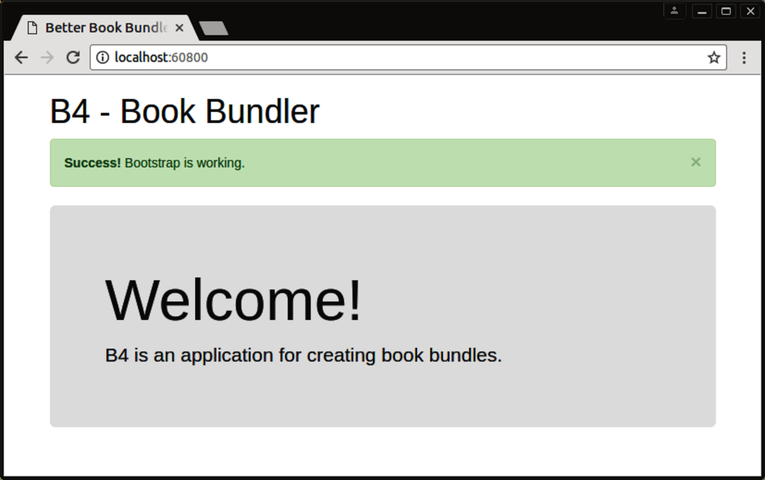
If it does, great! Bootstrap is styling the page as intended.
Now try to close the alert by clicking the X (close) button. It doesn’t work! This is because although we brought in the Bootstrap CSS, we’ve yet to bring in the accompanying Bootstrap JavaScript that adds dynamic functionality. Let’s do that next.