Table of Contents for
Web Design Blueprints
 Web Design Blueprints
Published by
Packt Publishing, 2016
Web Design Blueprints
Published by
Packt Publishing, 2016
- Cover
- Table of Contents
- Web Design Blueprints
- Web Design Blueprints
- Credits
- About the Author
- About the Reviewer
- www.PacktPub.com
- Preface
- What you need for this book
- Who this book is for
- Conventions
- Reader feedback
- Customer support
- 1. Responsive Web Design
- Getting familiar with the basics
- Using media queries for responsive design
- Working with responsive media
- Building responsive layouts
- Summary
- 2. Flat UI
- Flat UI color
- Creating a flat UI layout
- Summary
- 3. Parallax Scrolling
- Color classes
- Using SVG font icons
- Getting the fonts
- That's no moon!
- OMG, it's full of stars!
- Clouds, birds, and airplanes
- The rocket
- Terra firma
- Next up, the CSS
- Styling the objects with CSS
- Styling the ground objects
- Writing the JavaScript effects
- Setting the row height
- Spreading the objects
- Spreading the clouds
- Loading the page functions
- Smoothening the scroll
- Updating elements on the scroller
- Collecting the moving elements
- Creating functions for the element types
- Setting the left positions
- Creating the rocket's movement function
- Finally, moving the earth
- Summary
- 4. Single Page Applications
- Getting to work
- Getting the old files
- Object and function conventions
- Creating utility functions
- Working with the home structure
- Setting up other sections
- Performing housekeeping
- Creating a callBack function for the API
- Summary
- 5. The Death Star Chapter
- Dropping in the parallax game
- Loading elements from JSON
- What can be done in the shared levels service
- Editing the home JavaScript
- Creating the other pages – credits and leaderboard
- Creating the second level
- Summary
- Index
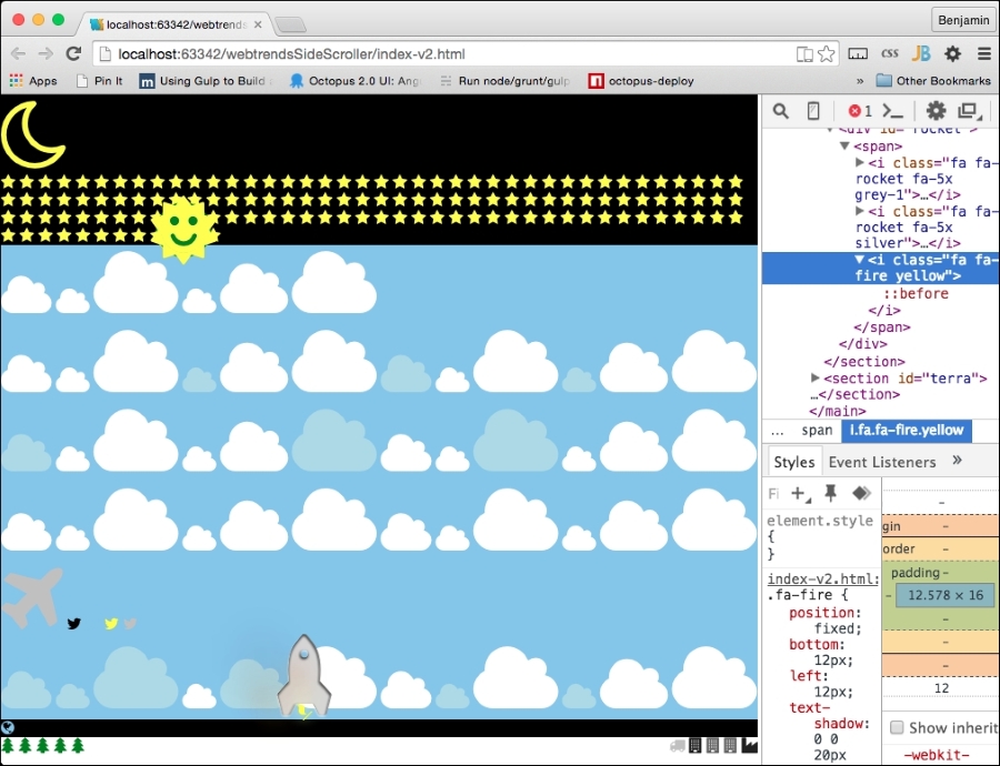
Next, let's work on building our rocket. The Font Awesome rocket is cockeyed, so we need to transform it with a rotate(315deg) attribute, fix its position on the screen, and start it 40% from the left. The rocket element has two child fa-rocket I elements inside it and an fa-fire I element.
Style the first child with a fixed position, starting at 3% from the bottom and 40% from the left, and give it a text-shadow value of 1px 1px #666 (for a 3D effect). The rocket's second child will also have a fixed position, 3.2% from the bottom and 39.8% from the left.
Here, we also want to add a 3D effect with a grey background color of #333, a background-clip attribute on the text, and a text shadow of rgb(255,255,255,0.8) at -1px 1px 3px blur. Finally, fa-fire, which is the rocket's flame, should also be at a fixed position 12px from the bottom and 12px from the left. Also give it a text shadow to make it look more fiery. I'll put the code in the example and skip describing it. Take a look:
#rocket > span{
-ms-transform: rotate(315deg);
-webkit-transform: rotate(315deg);
transform: rotate(315deg);
position: fixed;
left: 40%;
}
#rocket > span > i:first-child{
position: fixed;
bottom: 3%;
left: 40%;
text-shadow: 1px 1px #666;
}
#rocket > span > i:nth-child(2) {
position: fixed;
bottom: 3.2%;
left: 39.8%;
background-color: #333;
-webkit-background-clip: text;
-moz-background-clip: text;
background-clip: text;
color: transparent;
text-shadow: rgba(255,255,255,0.8)
–1px 1px 3px;
}
.fa-fire {
position: fixed;
bottom: 12px;
left: 12px;
text-shadow: 0 0 20px #fefcc9,
10px -10px 30px #feec85,
-20px -20px 40px #ffae34,
20px -30px 35px #ec760c,
-20px -40px 40px #cd4606,
0 -50px 65px #973716,
10px -70px 70px #451b0e;
}
Next, let's style the fa-plane icon. Add a selector for fa-plane and give it the attributes in the following code sample. It needs to be transformed by rotating it 315 degrees, and let's give it some text shadow and a text background-clip attribute so it blurs in the background.
.fa-plane{
-ms-transform: rotate(30deg);
-webkit-transform: rotate(30deg);
transform: rotate(30deg);
background-color: #999;
-webkit-background-clip: text;
-moz-background-clip: text;
background-clip: text;
color: transparent;
text-shadow: rgba(255,255,255,0.8)
-1px 1px 3px;
}
Let's pause for a moment and look at what we have so far. So, save the HTML and refresh your browser. It's actually starting to look interesting: