Table of Contents for
Web Design Blueprints
 Web Design Blueprints
Published by
Packt Publishing, 2016
Web Design Blueprints
Published by
Packt Publishing, 2016
- Cover
- Table of Contents
- Web Design Blueprints
- Web Design Blueprints
- Credits
- About the Author
- About the Reviewer
- www.PacktPub.com
- Preface
- What you need for this book
- Who this book is for
- Conventions
- Reader feedback
- Customer support
- 1. Responsive Web Design
- Getting familiar with the basics
- Using media queries for responsive design
- Working with responsive media
- Building responsive layouts
- Summary
- 2. Flat UI
- Flat UI color
- Creating a flat UI layout
- Summary
- 3. Parallax Scrolling
- Color classes
- Using SVG font icons
- Getting the fonts
- That's no moon!
- OMG, it's full of stars!
- Clouds, birds, and airplanes
- The rocket
- Terra firma
- Next up, the CSS
- Styling the objects with CSS
- Styling the ground objects
- Writing the JavaScript effects
- Setting the row height
- Spreading the objects
- Spreading the clouds
- Loading the page functions
- Smoothening the scroll
- Updating elements on the scroller
- Collecting the moving elements
- Creating functions for the element types
- Setting the left positions
- Creating the rocket's movement function
- Finally, moving the earth
- Summary
- 4. Single Page Applications
- Getting to work
- Getting the old files
- Object and function conventions
- Creating utility functions
- Working with the home structure
- Setting up other sections
- Performing housekeeping
- Creating a callBack function for the API
- Summary
- 5. The Death Star Chapter
- Dropping in the parallax game
- Loading elements from JSON
- What can be done in the shared levels service
- Editing the home JavaScript
- Creating the other pages – credits and leaderboard
- Creating the second level
- Summary
- Index
Before we jump headfirst right into the icy cold waters of layout design, let's talk briefly about what we are making, as it wouldn't be useful to just start laying out a grid without a purpose. In our work, we want to make content or data useful. Often in application development, someone asks for a high-level view of some data set—the ubiquitous dashboard or executive view. So let's make this our practice today: to make a layout for a useful application that gives a decision-maker an at-a-glance view of a daily capacity-utilization metric. See what I did there? I said a lot of things that an executive would like to hear, without saying too much.
Without further ado, let's make this dashboard!
Get your code editor spun up, and let's create this dashboard. Since this is a data visualization tool, we want the audience to focus on the data being presented; therefore, we will use the monochromatic blue color scheme we selected in the previous section.
But first, be sure to create your viewport meta, or this will all be for naught! We can do this using the following code:
<meta name="viewport" content="width=device-width, initial-scale=1">
In the project we created in the previous section, we should have a style section in our header for our monochromatic color scheme:
<style>
    .peter-river{
    background-color:#3498DB; /* r=52, g=152, b=219, 76% */
    }
    .wet-asphalt{
    background-color:#34495E; /* r=52, g=73, b=94, 45% */
    }
    .color-1 {
    background-color: #85C4ED; /* r=133, g=196, b=237, 44% */
    }
    .color-2 {
    background-color: #58ADE3; /* r=88, g=173, b=227, 61% */
    }
    .color-3 {
    background-color: #0F85D1; /* r=15, g=133, b=209, 93% */
    }
    .color-4 {
    background-color: #0665A2; /* r=6, g=101, b=162, 96% */
    }
</style>
To add to the color setup we already have, we will need to define our layout areas. This is a web application, but it will be a mobile-first responsive web application. Therefore, we want to define different layout displays for portrait versus landscape. Next, in your CSS, add the media queries for portrait versus landscape:
@media (orientation:portrait){

}
@media (orientation:landscape){

}
That's a good start; next, let's create some of the actual layout elements, and then we will come back to style them. We will want out app to have two responsive sections, each with two div elements for dynamic at-a-glance content, a footer, and finally, inside each of the next two div elements, we want to split them in half by adding two subordinate div elements:
<body>
<section>
<div>FOO</div>
<div>
<div>FOO</div>
<div>FOO</div>
</div>
</section>
<section>
<div>FOO</div>
<div>
<div>FOO</div>
<div>FOO</div>
</div>
</section>
<footer>FOOTER</footer>
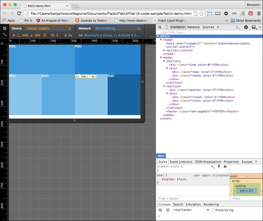
</body>That's the simple form of the layout. It's lovable in its simplicity. Take a good look at it because it will only grow in complexity from here. First give the body some color; give it the class color-4. We next want to add some class attributes to the div elements for color and to identify the sections later. The first div element is for a clock, and we want it to be the color-0 color as identified in the flat UI color section. The next div is a parent element for two div elements, so leave it blank, but give its first child div element the class name news and color-1 and the last child div element the class tasks and color-2. Jump inside the next section, and assign to the first DIV element the class weather and color-3. The following class is a parent, and like before, we will assign attributes to its children. The first child will have the class travel and color-1, and the last child will have the class stock and color-4. In the text, I am referring to the second child as the last child because this is how we will select them later in CSS. Finally, for footer, let's give it the class for the wet-asphalt color. Your layout with the classes will now look like this:
<body class="color-4">
    <section>
        <div class="time color-0">FOO</div>
        <div>
            <div class="news color-1" >FOO</div>
            <div class="tasks color-2" >FOO</div>
        </div>
    </section>
    <section>
        <div class="weather color-3">FOO</div>
        <div>
            <div class="travel color-1">FOO</div>
            <div class="stock color-4">FOO</div>
        </div>
    </section>
    <footer class="wet-asphalt">FOOTER</footer>
</body>
Briefly, let's calculate our element dimensions using the golden ratio. Start with our first number 1, add 1 to it to get 2, and then add the previous to it to get 3. Then add to it the previous number to get 5. Follow this pattern until we have a series that looks like this:
1, 1, 2, 3, 5, 8, 13, 21, 34, 55, 89, 144, 233, …
These numbers, and combinations of them, will be used to define the heights of our areas.
Now back to our CSS: we will make our markup look beautiful. Let's append to our style a body selector and a footer selector. In your body selector, set the padding to 0 and the font color to white. In the footer selector, set the height to 34px. Also, set the footer selector to clear both left and right. The code should look like this:
body{
    margin:0;
    color:white;
}
footer{
    height:34px;
    clear:both;
}
Working with our elements, we will use the pseudoselectors first-of-type and last-of-type to select these, as shown in the following code. These will go inside our media queries, so don't put them in just yet:
div:first-of-type{
}
div:last-of-type{
}
section:first-of-type{
}
section:last-of-type{
}
And we will also select the div elements using the parent selector >. This will prevent confusion as we add complexity later in the chapter. Again, do not add these yet:
section > div {
}
div > div {
}
Next, let's get to work inside our media queries and define the responsive layout for the sections. First, let's work on the simpler portrait mode. The sections should be 100% of the width of the viewport. When viewed in landscape, the sections should each be only 50% of the width. Additionally, set the first of the selectors to float to the left and the second to float to the right. Now, we can add the following code:
@media (orientation:portrait){
    section{
        width:100%;
    }
}
@media (orientation:landscape){
    section{
        width:50%;
    }
    section:first-of-type{
        float:left;
    }
    section:last-of-type{
        float:right;
    }
}
Now for the div elements. In portrait mode, the div elements that are children of the section parents need their heights defined. Give the first a height of 110px (89 + 21) and give the same height to the div elements that have parent div elements, like this:
@media (orientation:portrait){
    section{
        width:100%;
    }
    section > div:first-of-type{
        height:110px;
    }
    div > div{
        height:110px;
    }
}
The landscape mode is more complicated, as its layout has divided subsections. Assign a height of 144px to the first div with a section parent. To the div elements with div element parents, give a 50% width and a height of 199px (144 + 55 from our Fibonacci sequence above). Finally, float the first and last div elements that are children of div elements left and right. You should have this:
@media (orientation:landscape){
    section{
        width:50%;
    }
    section:first-of-type{
        float:left;
    }
    section:last-of-type{
        float:right;
    }
    section > div:first-of-type{
        height:144px;
    }
    div > div{
        width:50%;
        height:199px;
    }
    div > div:first-of-type{
        float:left;
    }
    div > div:last-of-type{
        float:right;
    }
}
Now, aside from applying our selected color palette, our layout is complete. Before we look, let's apply some color to our page. Since we have already created the CSS color palette, we can simply add the CSS classes to our elements in the HTML document. Add the color-0 class to the first div element, color-1 to the second, and so on for the other div elements, as per your liking. Then assign the wet-asphalt class to the footer.
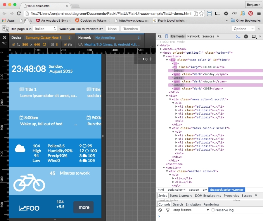
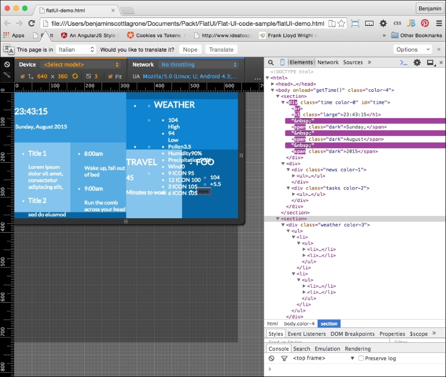
Now, refresh the project in your browser and, now that the simple layout has been laid, you will see our flat UI starting to take shape. This is what it should look like at this point:
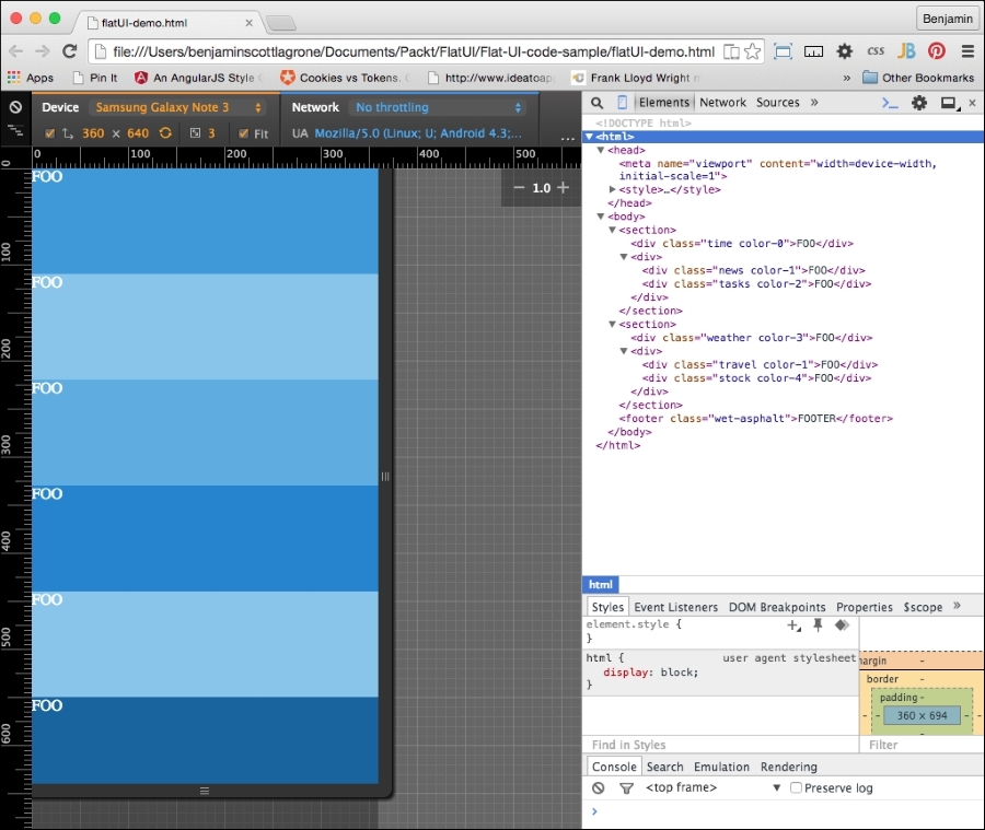
And here it is in landscape mode:
In our flat UI design, our focus should be on the content and how it is used. The application we are designing needs to be able to present the most useful information on this at-a-glance screen. Our world is such that we need filters to filter out the rattle and hum of useless data from our newsfeeds. We need an app that gives us the most useful information without any extra clutter.
The content of our executive view is the central aspect of our design. This is why we are studying the Flat UI, so we can focus on being able to display the most import data, without letting design clutter get in the way.
Let's create an app that will display the most useful things you need to see while waking up and getting ready for work, sort of a good morning app. It will display the time and date, important news, upcoming events from your calendar, the weather, stocks, and tasks. This is similar to, but not as sophisticated as, the Cards function of Google.
Like the Swiss style I mentioned earlier, our design should be information-oriented, logical, and concerned with the presentation of information. So, let's create some extremely useful fake content for our heads-up display.
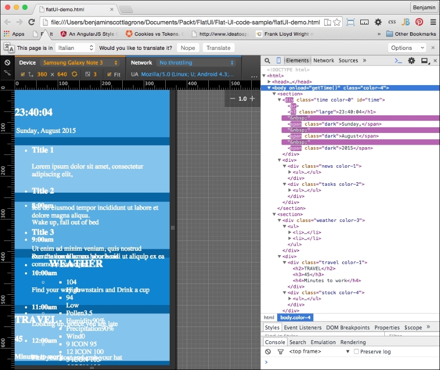
Open up your flat UI project; let's add some fake content. First, let's take an inventory of the spaces we have. There is a first main content area, with two sub areas, and a second main content area, also with two sub content areas. And then there is a footer area. For this project, we will use the areas to display our most useful information, which we described earlier. Let's go through them one by one and adjust our markup as needed.
The first large section will display the time and date. We want this to be the largest item and the most visible. For fun, let's make it a working clock. If you don't care to go through this JavaScript code, you can just make your clock a static text like the following, by inserting this inside the div element. But you will miss out on the fun.
<span>7:45</span> <span>Tuesday</span> <span>August</span> <span>5</span> <span>2015</span>
If you want to join in the fun, back in your IDE, add a <script> tag in your header and add some code. Start with a new function called getTime(). We will be working with the JavaScript Date object. Because the Date object does not return the word values for the day of the week, or the month, we will need to create an array for both to match up against the numerical value. Next, create a new variable, today, which will equal new Date():
var dayArray = ["Sunday","Monday","Tuesday","Wednesday","Thursday","Friday", "Saturday"];
var monthArray = ["January","February","March","April","May","June", "July","August","September","October","November","December"];

function getTime() {
    var today=new Date();
};
Next, we will build our custom nice date text. We'll need to get each part of the date from the today date object. Create new variables h, m, s, d, mo, and y. Each of them will access a part of the date object, as listed. The new Date() method has a number of methods; we will use getHours(), getMinutes(), getSeconds(), getDay(), getMonth(), and getFullYear(). We will use the numerical values returned by the getDay() and getMonth() methods to access their respective values from the arrays. These following lines of code show how to put it together:
    var h=today.getHours();
    var m=today.getMinutes();
    var s=today.getSeconds();
    var d=dayArray[today.getDay()];
    var mo=monthArray[today.getMonth()];
    var y=today.getFullYear();
Next, you will need to build and insert the times into your markup. The following lines of code will get an element by its ID and insert inside the innerHTML code. You will create the HTML by combining the times and some wrapping span elements into a string. We will add style to these later.
document.getElementById('time').innerHTML = "<br><h1>"+h+":"+m+":"+s+"</h1> <span>"+d+",</span> <span>"+mo+"</span> <span>"+y+"</span>";You will need to add the id attribute to the div element to make this work. In your HTML, find the first section, and it into it, the first div, and add to it the id time value. This will be found by the JavaScript, and the string containing the time and HTML markup will be added to the innerHTML code. Additionally, you will need to cause the function to execute, so inside the body tag, add a little inline script, onload="getTime()". These changes can be seen here:
<body onload="getTime()" class="color-4">
<section>
    <div class='time color-0' id="time">
This is great so far, but there are a couple of things left to do to make this functionality excellent. The clock executes using the onload function of JavaScript, which means it works once when the DOM loads. If we leave it like this, it can only be correct two times every day. We need the clock to continue to function and create new time values at set periods of time. To create this rhythmic clock, add another variable t for time, which will employ the JavaScript setTimeout() method to call getTime() at an interval of 500 seconds:
var t = setTimeout(function(){getTime()},500);The other problem, and the final step in creating the clock, is that the single-digit numbers are returned in the minimal number of digits necessary, that is, 7 is 7, when 07 is what should be displayed. To correct this, a separate function, correctDigit(), must be created to check whether the number is single-digit, and if so, add the preceding 0 as a string. Also note that the type of the value i returned will be a string.
function correctDigit(i) {
    if (i<10)  i = "0"+i;
    return i;
}
To use this function to change the second and minute values, add two lines that set the m and s variables to equal the function call with the values before the existing line that places the innerHTML portion in the DOM:
m = correctDigit(m);
s = correctDigit(s);
document.getElementById('time').innerHTML = "<br><h1>"+h+":"+m+":"+s+"</h1> <h2><span>"+d+"</span> <span>"+mo+"</span> <span>"+y+"</span></h2>";Our clock is now fully operational and should be a nice-looking feature for the site, but it's only one of the six sections. It is the most complex, I promise, but let's continue and make some more sample content for our other sections.
The next section will display important news for the viewer. This will be static text. Start with an unordered list of three-line items and in each add an h3 header element around the Title 1 text, and follow it with a short one-line paragraph of Ipsum text (go to http://www.lipsum.com/ to get some Ipsum). Repeat this three times, and the news div element will look like this:
        <div class="news color-1">
            <ul>
                <li>
                    <h3>Title 1</h3>
                    <p>Lorem ipsum dolor sit amet, consectetur adipiscing elit, </p>
                </li>
                <li>
                    <h3>Title 2</h3>
                    <p>sed do eiusmod tempor incididunt ut labore et dolore magna aliqua.</p>
                </li>
                <li>
                    <h3>Title 3</h3>
                    <p>Ut enim ad minim veniam, quis nostrud exercitation ullamco laboris nisi ut aliquip ex ea commodo consequat.</p>
                </li>
                <li>
                    <h3>Title 3</h3>
                    <p>Ut enim ad minim veniam, quis nostrud exercitation ullamco laboris nisi ut aliquip ex ea commodo consequat.</p>
                </li>
                <li>
                    <h3>Title 4</h3>
                    <p>Ut enim ad minim veniam, quis nostrud exercitation ullamco laboris nisi ut aliquip ex ea commodo consequat.</p>
                </li>
            <ul>
        </div>
The next div element will contain upcoming reminders and calendar events for the day. Create another list like the previous one. This one will be a little different. Instead of the title in the h3 element, put a time value in an h4 element, and follow it with a paragraph describing the event or task. This div element should look something like this:
        <div class="tasks color-2">
            <ul>
                <li>
                    <h4>8:00am</h4>
                    <p>Wake up, fall out of bed</p>
                </li>
                <li>
                    <h4>9:00am</h4>
                    <p>Run the comb across your head</p>
                </li>
                <li>
                    <h4>10:00am</h4>
                    <p>Find your way downstairs and Drink a cup</p>
                </li>
                <li>
                    <h4>11:00am</h4>
                    <p>Looking up, notice you are late</p>
                </li>
                <li>
                    <h4>12:00am</h4>
                    <p>Find your coat and grab your hat</p>
                </li>
            </ul>
</div>In the next section, the first div element will display weather information. This element will have an unordered list with two columns of data in unordered lists, but both will be the same single solid color. The left-hand column's list will have an h2 title, WEATHER, and following it will be an unordered list with two list items, each with an h3 element for the current temperature, and then a p element with High and Low.
The right-hand column list will have two unordered lists. The first will have the weather points Pollen, Humidity, Precipitation (or Precip), and Wind, each in an h4 element, followed by a number value in a p element. The second list will have four list items, each one with a number for the hour of the day, an icon placeholder, and the temperature for that day. This code for the entire weather div will look like this:
<div class="weather color-3">
    <ul>
        <li>
            <ul>
                <li>
                    <h2>WEATHER</h2>
                </li>
                <li>
                    <ul>
                        <li>
                            <span>104</span>
                            <br>
                            <span>High</span>
                        </li>
                        <li>
                            <span>94</span>
                            <br>
                            <span>Low</span>
                        </li>
                    </ul>
                </li>
            </ul>
        </li>
        <li>
            <ul>
                <li>
                    <ul>
                        <li>
                            <span>Pollen</span>
                            <span>3.5</span>
                        </li>
                        <li>
                            <span>Humidity</span>
                            <span>90%</span>
                        </li>
                        <li>
                            <span>Precip</span>
                            <span>90%</span>
                        </li>
                        <li>
                            <span>Wind</span>
                            <span>0</span>
                        </li>
                    </ul>
                </li>
                <li>
                    <ul>
                        <li>
                            <span>9</span>
                            ICON
                            <span>95</span>
                        </li>
                        <li>
                            <span>12</span>
                            ICON
                            <span>100</span>
                        </li>
                        <li>
                            <span>3</span>
                            ICON
                            <span>105</span>
                        </li>
                        <li>
                            <span>6</span>
                            ICON
                            <span>105</span>
                        </li>
                    </ul>
                </li>
            </ul>
        </li>
    </ul>
</div>
The last two div elements will be much simpler, as they each will only have one data point. In the first one, add the text TRAVEL in an h3 element as an icon placeholder, and then an h4 element with a time value in minutes, followed by a paragraph containing the text Minutes to work, indicating the time to drive to work. The second div element will have an h3 element with your favorite stock price, followed by an unordered list with two list items: one for the current price and the second for how much it has gone up that day. If it keeps going up, you won't need to make that long drive to work today. Keep your fingers crossed! Finally, add a list item with the text MORE inside. This block of code will look like this:
<div>
    <div class="travel color-1">
        <h2>TRAVEL</h2>
        <h3>45</h3>
        <h4>Minutes to work</h4>
    </div>
    <div class="stock color-4">
        <ul>
            <li>
                <h2>FOO</h2>
            </li>
            <li>
                <ul>
                    <li>
                        <span>104</span>
                    </li>
                    <li>
                        <span>+5.5</span>
                    </li>
                </ul>
            </li>
            <li>MORE</li>
        </ul>
    </div>
</div>
Congratulations, you have created your content. It still looks messy, but in a following section, we will style it. This is what it should look like:
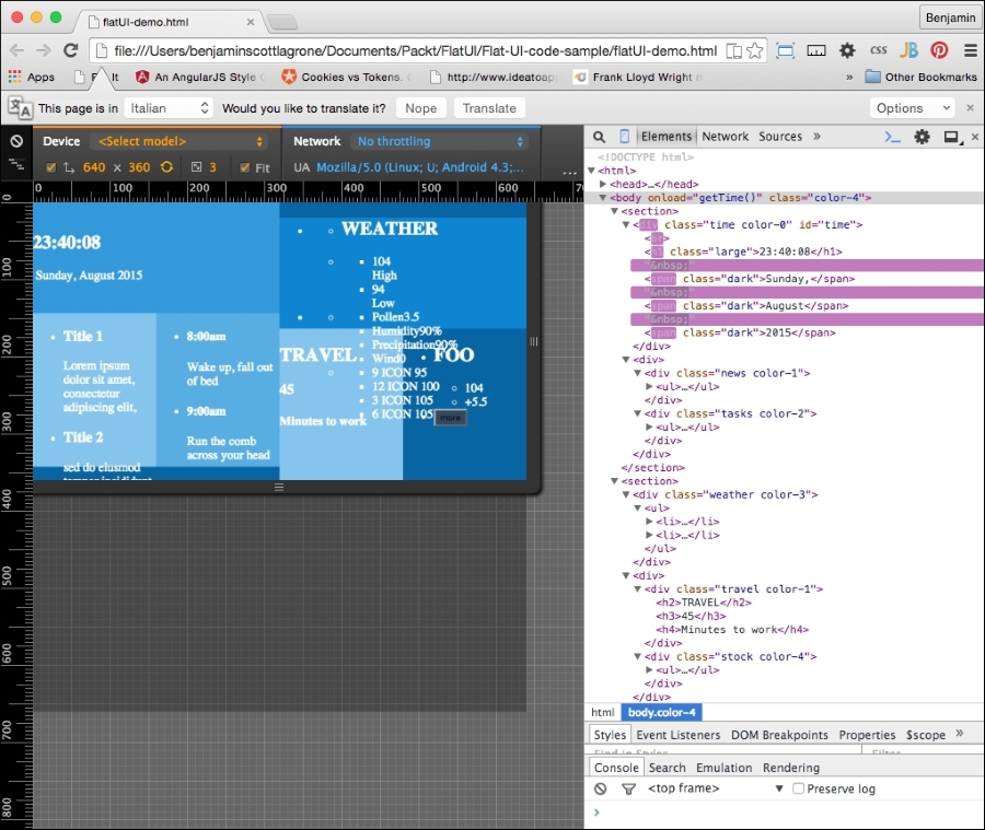
And here it is in landscape mode:
Typography is a key component of flat UI design, and choosing the right font can make or break a design. In the distant past, you were limited to your system fonts in your typography choices, and even then, it was advisable to use a font family because there was no guarantee that the font was on any particular system. Or you could have used an image of the text. No, just no.
But lo! Those days are in the past. Now you can use webfonts to make your desires a reality and ensure they are indexed by Google. So choose wisely. For a flat UI project, choose simple and minimalistic.
How do you get webfonts? Fortunately, you live in the modern era where you don't have to know how to do anything to actually do anything. You just Google it. But because I'm old school, and this is a book, I'll tell you: Google. Or, more precisely, Google Fonts is an online repository of webfonts you can quickly deploy on your project. There are other providers, such as http://www.cssfontstack.com/, but the link to their actual font is back on Google. So I'd rather go back to the source so that you know it's not going away:
<link rel="stylesheet" type="text/css" href="//fonts.googleapis.com/css?family=Abel" />
Take a look at https://www.google.com/fonts to find a font that suits your taste.
For this project, I have chosen the very popular and good-looking, minimalist webfont from Google, Lato. Lato was created in 2010 by Warsaw designer Łukasz Dziedzic and means "summer" in Polish. I also like it because it's easy to add to your project. The Google page for this font is https://www.google.com/fonts/specimen/Lato.
With that expectation set, let's easily add it to your project. Add the link provided for the webfont to your header before your CSS:
<link href='http://fonts.googleapis.com/css?family=Lato&subset=latin,latin-ext' rel='stylesheet' type='text/css'>
Next, in the body selector in your style code, add the font-family attribute Lato and sans-serif. Your body selector will now look like this:
body{
    font-family: 'Lato', sans-serif;
    margin:0;
    color:white;
}
I hope I have fulfilled the expectation that this would be easy. Now launch your project in your viewport and take a look at how your typography has transformed. We'll continue to clean this up when we get to the CSS cleanup at the end of the chapter:
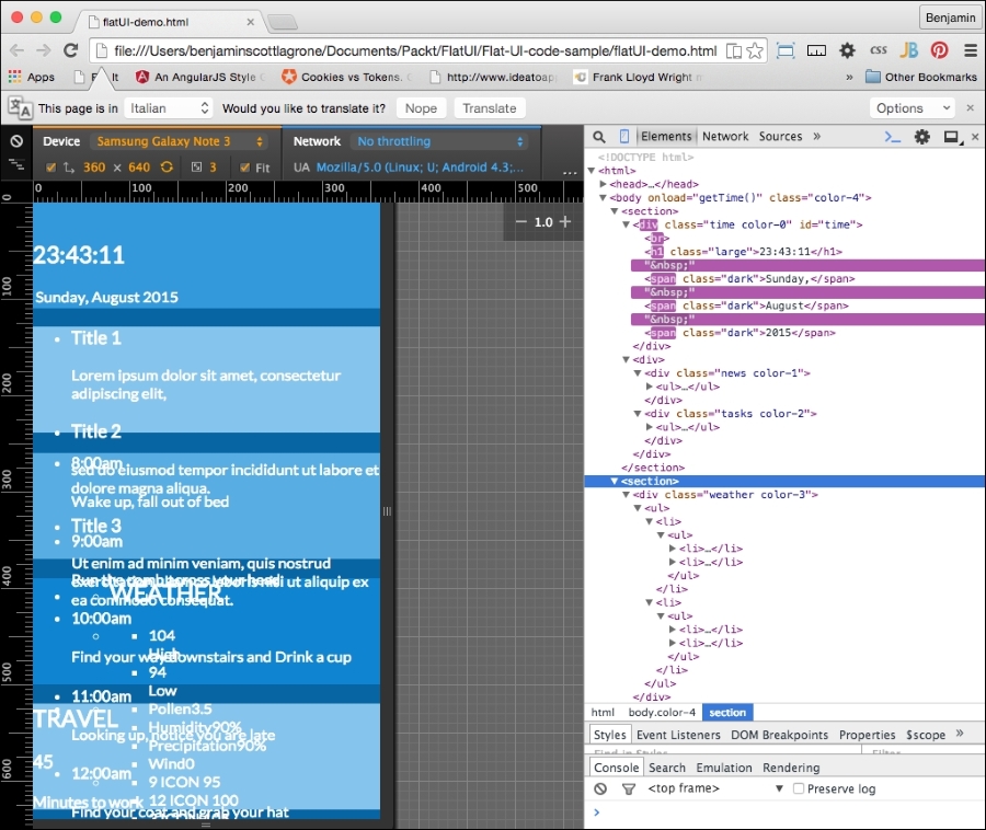
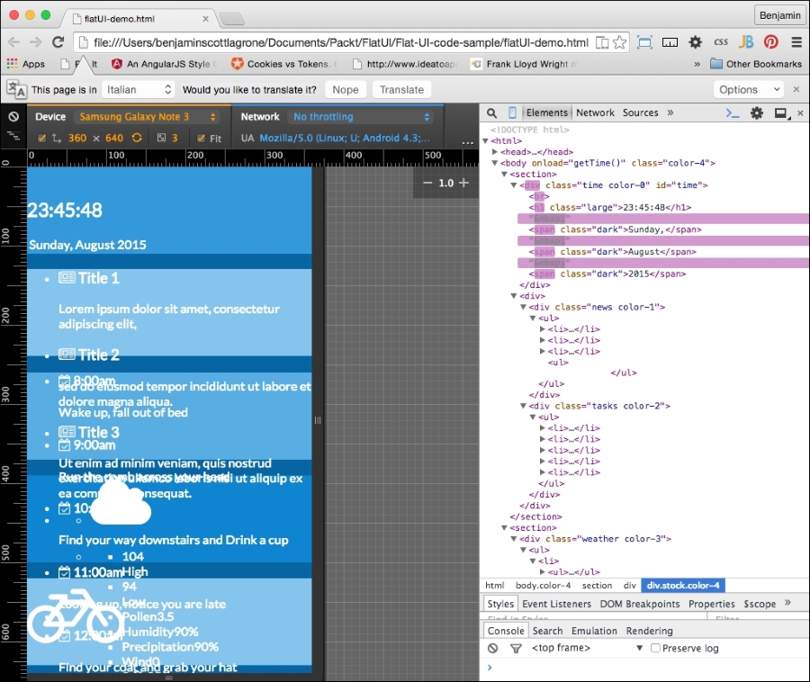
And here it is in landscape mode:
At this point, the project looks like a big mess. We'll still need to do some cleanup at the end of the project to make this app look amazing.
Let's get to the first and most simple part of the app. Let's add a button to the last div element, the stock div element. This in theory will be to launch into a browser or pull up a page with more information about the stock you are watching. We want it to be a very dark blue with a white font. So add a button with the class wet-asphalt to call up the color selector in the CSS:
<button onclick="doSomething()" class="wet-asphalt">more</button>
So far, this is simple enough and a good start. Since we iterate, fail often and early. This means the button looks bad, but we'll take care of that soon enough.
And that's it for the button, for now. Let's continue with our flat UI improvements by adding elements. The next step is much cooler than adding a button. We are going to get into SVG icons. Specifically we are going to use the web-hosted SVG font icon library, Font Awesome. These fonts are great because they are completely scalable via CSS and there is no pixelation in doing so. Also, they are easy to deploy and not technically cumbersome.
If you have not heard of Font Awesome yet, then let's fix that. Font Awesome, according to their website, gives you scalable vector icons that can instantly be customized—size, color, drop shadow, and anything that can be done with the power of CSS. Sounds awesome? Well, it is awesome. This is a great tool that can help you make great UI, not just flat UI. I don't want to get too much into what it is in theory. Let's jump straight to the how-to section.
We want to add some good-looking graphics to our flat UI. Font Awesome provides a great way to do it. Go to the Font Awesome site and take a few minutes to read the instructions. The project webpage is at http://fortawesome.github.io/Font-Awesome/. Play around and look at the example page for some ideas for variations of the fonts. Once you are ready to go into action, go to the icons page and take look at what it has to offer. This is where we will be working from.
The first order of business is to add the reference to the Font Awesome CSS in our header. After the link we added previously for the typography, add a new CSS link to the Font Awesome CDN:
<link rel="stylesheet" href="https://maxcdn.bootstrapcdn.com/font-awesome/4.4.0/css/font-awesome.min.css">
Now, Font Awesome is "installed". We can start inserting cool font icons. Let's skip the clock section and add some icons to each of the other areas. Start with the news section.
On the Font Awesome icons page, search for the word newspaper and find the newspaper-o icon. Then, right-click on it to open the inspector and look at the code for the icon. The code looks like this:
<a href="../icon/newspaper-o"><i class="fa fa-newspaper-o"></i> newspaper-o</a>
You will need to copy the i element and its class information and paste it into your code. You will paste it into the header h4 tags in your news section and follow it with a space. You could style the i element inside the h4 tag if you wanted its style to be different from the title. It would look like this:
<li>
<h4>
<i class="fa fa-newspaper-o"></i>
Title 1
</h4>
<p>
Lorem ipsum dolor sit amet, consectetur adipiscing elit...
</p>
</li>In each list item of the news section, do the same thing. You could also just copy the class information from the i element and paste into the h4 element. This will save you some space, and it would have the same style as the h4 text:
<li>
<h4 class="fa fa-newspaper-o">
Title 1
</h4>
<p>
Lorem ipsum dolor sit amet, consectetur adipiscing elit...
</p>
</li>Next, jump to the task's div element. We want to add a calendar icon to represent tasks. Search the page for a calendar, and you will find a calendar-check-o icon. Repeat the same process as before for this icon and add it to the list item headers:
<li>
<h4>
<i class="fa fa-calendar-check-o"></i>
8:00 am
</h4>
<p>Wake up, fall out of bed</p>
</li>In the section for the weather, we will add a large icon that will indicate the current weather. This icon can be changed on the client on the fly as our data source tells the application the weather has changed. Since it's hot here in Texas, I want some clouds (if only it were this easy to change the weather). Perform a search for cloud, and you will find a cloud icon. Copy it and replace the word WEATHER with the icon and its class. I want this to look bigger, so I will add a Font Awesome class to increase its font size. Add fa-3x to the i element's class. If you want it to be sunny, look for the sun icon and you will find the sun-o icon. This list item will look like this:
<li>
    <h2>
        <i class="fa fa-cloud fa-3x"></i>
    </h2>
</li>
Skip the list that has the data on pollen humidity and so on, and in the next list, which will show the temperature outlook for the day at different times, add either a cloud or a sun icon to the middle of each list item. You will set it in between the existing spans. This list will look like this:
<ul>
    <li>
        <span>9</span>
        <i class="fa fa-sun-o"></i>
        <span>95</span>
    </li>
    <li>
        <span>12</span>
        <i class="fa fa-sun-o"></i>
        <span>100</span>
    </li>
    <li>
        <span>3</span>
        <i class="fa fa-cloud"></i>
        <span>105</span>
    </li>
    <li>
        <span>6</span>
        <i class="fa fa-cloud"></i>
        <span>105</span>
    </li>
</ul>
The next section contains the travel and stock div elements. In the first header, travel, we want to add an icon to represent our transportation. I want you to look cool, so instead of a car, search the Font Awesome page for a bicycle and copy the icon code into the first header in the travel div, replacing the TRAVEL text:
<h2>
    <i class="fa fa-bicycle fa-4x"></i>
</h2>
We will simply do the same for the stock section. Find the line-chart icon and copy its code into your stock symbols header:
<h2>
<i class="fa fa-line-chart"></i>
FOO
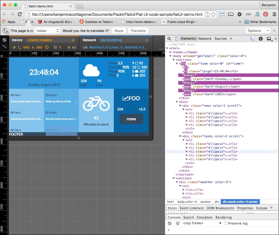
</h2>Now, let's take another look. Your flat UI is starting to shape up with our new flat font icons. Next, we need to pull it all together and get the layout sharpened up with some additional CSS. It is fairly normal that at the end of any project, we have to get the last 20 percent of the code together to make it complete. Here is the page in portrait mode:
And here it is in landscape mode:
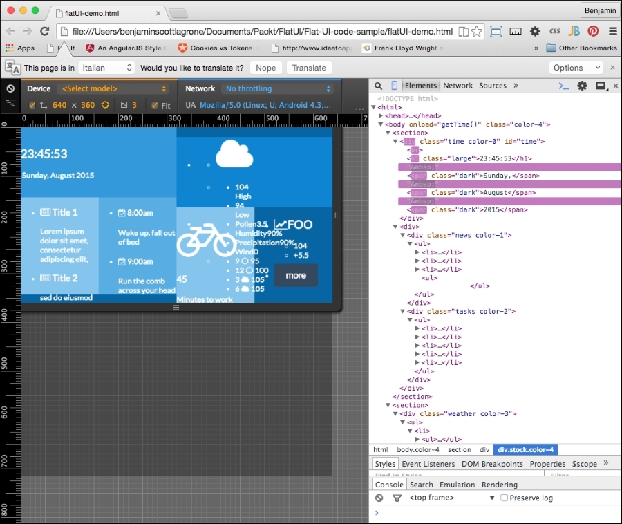
Now that we have our flat UI mostly built out, you will see that it still looks half-baked. This means we need to build out our CSS to clean up the page. As stated before, flat UI is all about simplicity, so we need to focus our styling on the clear presentation of content, not on making it look like a leather-bound notebook.
Let's start with the button. It's sticking out like a sore thumb. The style will affect all the buttons, except the color, which is assigned throughout the color classes we have defined. The style will look a lot like the Bootstrap buttons, because they work well for mobile and flat UI.
It needs padding of 13px on top and bottom and 21px on each side, a margin of 8% vertically, and auto horizontally. Set border-color to match the wet-asphalt color, font-color to white, border to none, width to 75%, font-size to 1.1REM, and finally, make the cursor a pointer. The button CSS will look like this:
button{
    padding: 13px 21px;
    margin:8% auto;
    border-radius: 5px;
    border-color: #357ebd;
    color: #fff;
    background-color: #1abc9c;
    border: none;
    width:75%;
    cursor: pointer;
    font-size:1.1REM;
}
The new button style helps, and it makes a big difference. So let's take this lesson and roll forward with it, and keep churning away at style.
Let's hit the points that will give us the most value first. These are the universal classes that we can assign to elements, similar to the way we did the colors. One of the big problems with our flat UI project is the unordered lists that are breaking out of their parent DIV elements. So, let's create a class selector that we can assign to these breakout DIV elements. In each media query, portrait and landscape, create a selector called scroll. This will apply differently to portrait and landscape modes. Inside the portrait media query, the selector will have the overflow on the X-axis scroll, and in landscape orientation, the overflow on the Y axis will scroll. Look at the following sample. The new coded is appended to the existing CSS media queries:
@media (orientation:portrait){
    ...
    .scroll{
overflow-x:scroll;
}
}

@media (orientation:landscape){
    ...
    .scroll{
overflow-y:scroll;
}
}
Now, of course, for this to have any affect, you have to add these classes to the elements you want to scroll. Add the scroll class to the DIV elements news and tasks. This solves one big ugly problem. So let's forge ahead and add more style.
The next set of styles will be even more universal classes. These will not be inside any media queries and will apply just fine to portrait or landscape. In your CSS, at the end and outside of any media queries, add a selector for paragraphs, a class called ellipsis, and a selector for pseudo elements after ellipsis. Give the paragraphs the style attributes of a 94% width, and hide the overflow. In ellipsis, add the attributes ellipsis for text-overflow, no-wrap for white-space, and hide the overflow. For the subsequent pseudo class, add "..." to content, a right float, a relative position, 24px from the bottom. This new CSS will look like the following code sample:
p {
    width:94%;
    overflow:hidden;
}
.ellipsis{
    text-overflow:ellipsis;
    white-space: nowrap;
    overflow:hidden;
}
.ellipsis::after{
    content:"...";
    float: right;
    position: relative;
    bottom: 24px;
}
Next, add the ellipsis class to every list item inside the news and tasks DIV elements. This will apply these styles to the list items. The noticeable change is that the news and tasks feed will now truncate and add the "..." to the paragraphs of text after cutting them off at the first line and taking up most of the width of the parent element. We are on the path to getting control of our white space, or blue space if we want to be technically correct.
We want to add some size to certain fonts, so let's make it easy to make it consistent across the page. This is helpful when we want to change it; we won't need to hunt for it across the page. Let's add a class to enlarge our text in some areas. In your CSS, add a selector class called large. Assign it the attribute of a 2.1REM font size:
.large{font-size:2.1REM}To use this, let's add the class large to the clock time:
document.getElementById('time').innerHTML = "<br><h1 class='large'>"+h+":"+m+":"+s+"</h1> <span class='dark'>"+d+",</span class='dark'> <span class='dark'>"+mo+"</span> <span class='dark'>"+y+"</span>";Now, as you refresh your viewport, you will see that these two elements are now larger.
Finally, for the universal CSS, let's get rid of the dots for the list styling. Add list-style-type with a value of none for all unordered lists. This should be added outside of the media queries:
ul{
list-style-type:none;
}
That's better, but it still doesn't work, and we don't want to stop here because then this flat UI will remain unconvincing as a good UI. So let's start by fixing the clock. Orient your page to portrait mode and let's start fixing the time. Tempus fugit.
The clock loads and reloads after the page is rendered, but we can still style it. So, in the portrait media query in your CSS, add the selectors for the H1 element in the time DIV element, and add one for the first of the spans (first-of-type) pseudo-class selector. Give the H1 element a top margin of 5% and side margin of 3%, 0 padding, and float it to the left. Next, give the span a block display. It should look like this:
@media (orientation:portrait){
//...other CSS...//
/* TIME */
        .time h1{
            margin:5% 3%;
            padding:0;
            float:left;
            }
        .time span:first-of-type{
display:block;
}
}
Next, in landscape mode, append code to the CSS style to simply align the text to the center, like this:
@media (orientation:landscape){
//...other CSS ...//
        /* TIME */
        .time{
text-align:center;
}
}Let's continue working down the elements of the portrait view. Next are the news and tasks DIV elements. In the portrait mode media query, only the unordered list needs attention: give it a width of 1500px and inline-block for display. The list items should float to the left, have a fixed width of 226px, and a right margin of 35px, and the rest should be 0. Give the paragraphs a 5px margin and the H4 headers a margin of 2px:
@media (orientation:portrait){
//...other CSS...//
/* TIME */
/* NEWS & TASKS */
.news ul, .tasks ul{
display:inline-block;
width:1500px;
}
.tasks ul li p, .news ul li p{
margin:5px;
}
.tasks ul li h4, .news ul li h4{
margin:2px;
}
}
In the landscape media query, the unordered lists should have a 5% padding and margin of 0. And give them a font-size value of 0.7REM.
@media (orientation:landscape){
//...other CSS...//
/* TIME */
/* NEWS & TASKS */
.news ul, .tasks ul{
padding:5%;
margin:0;
}
.news, .tasks{
font-size:0.7REM;
}
}The next section, the weather section, contains many data points in embedded unordered lists; this will take some fancy footwork to clean up. So let's get working on the portrait-mode code. We'll be using parent selectors in this part as we need to make sure we are precise in our attribute assignments.
We will first create the CSS to affect the weather DIV element in both portrait and landscape modes. In essence, it is outside of the media queries. Let's start at the top of the list and work deeper. Create a selector for the unordered list with the weather parent class, and give it the attributes 5% margin and 0 padding. Then create a selector for its first-child list item with a width of 34% and a right margin of 5%, with the rest 0. Make the last child have 60% width. Next, make the unordered list that is the child of the list item have 5% 0 padding and a margin value of 0. Be sure you use the parent selectors:
.weather > ul{
margin:0;
padding:5% 0;
}
.weather > ul > li:first-child{
width:34%;
margin:0 5% 0 0;
}
.weather > ul > li:last-child{
width:60%;
}
.weather > ul > li > ul {
padding:0;
margin:0 0 0 5%;
}
Copy the last child list item selector; .weather > ul > li:last-child, and add to it an unordered list with a child list item using the first-child pseudo selector. Give it a width of 60% and float it to the left. Add another similar selector, but for the last child pseudo selector, assign a 40% width value and float it to the left. Next, make another selector, otherwise identical except for the child pseudo, which you should replace with an unordered list child:
.weather > ul > li:last-child > ul > li:first-child{
width:60%;
float:left;
}
.weather > ul > li:last-child > ul > li:last-child{
width:40%;
float:left;
}
.weather > ul > li:last-child > ul > li > ul {
margin:0;
padding:0;
}
And finally, for the weather class outside the media queries, add a selector for H2 and give it a padding value of 10% 0 0 0, vertical margin value of 0 and auto horizontal, and align the text to the center:
.weather h2{
padding:10% 0 0 0;
margin:0 auto;
text-align:center
}
In the portrait media query, first add a selector for the LI item, and make sure to use the parent selector so it only applies to the LI descendant. Display the list items inline and floated to the left.
@media (orientation:portrait){
//...other CSS...//
/* TIME */
/* NEWS & TASKS */
/* WEATHER */
.weather > ul > li{
display:inline;
float:left;
}
}
Next, copy that selector and add to it the first-child pseudo selector, and then follow it with parent selectors for the next unordered list and list item and the first child again. Do the same again, but replace the last first-child with last-child. In the first selector, the list item should have 25% width, a left float, right-aligned text, and a 13% left margin. The second selector should occupy 60% width, float to the right, and have text center aligned. Take a look at this sample:
@media (orientation:portrait){
//...other CSS...//
/* TIME */
/* NEWS & TASKS */
/* WEATHER */
…
.weather > ul > li:first-child > ul > li:first-child{
width:25%;
float:left;
text-align:right;
margin-left:15%;
}
    .weather > ul > li:first-child > ul > li:last-child{
width:60%;
float:right;
text-align:center;
}
}
Finally, at least for portrait mode, make a selector for the weather DIV element's E2 element and give it a font-size attribute of 0.8REM:
.weather h2{
font-size:.8REM;
}Before we get into the specific CSS selectors, let's go back to the strategy of creating universal classes with attributes in the landscape orientation. This will save us some code. I want to first add a class for dark text, so let's add the class dark with the color attribute the same as the wet-asphalt color. Next, add classes for left and right floating objects. They should clear left and right also. Then, create a class called center to center the text within:
.dark{
color:#34495e;
}
.left{
float:left;
clear:left;
}
.right{
float:right;
clear:right;
}
.center {
    text-align:center;
}
To make them work, we need to add these classes to the markup. Add left and right classes to the list items containing two temperatures under the Font Awesome cloud:
<ul>
        <li>
<h2>
<i class="fa fa-cloud fa-3x"></i>
</h2>
</li>
        <li>
            <ul>
                <li class="left">
<span>104</span>
<br>
<span>High</span></li>
                <li class="right">
<span>94</span>
<br>
<span>Low</span>
</li>
            </ul>
        </li>
    </ul>
Also add the left and right classes to the two list items containing the stock information under the line chart icon from Font Awesome:
    <ul>
        <li>
<h2 class="large">
<i class="fa fa-line-chart"></i>
FOO
</h2>
</li>
        <li>
            <ul>
                <li class="left">
<span>104</span>
</li>
                <li class="right">
<span>+5.5</span>
</li>
            </ul>
        </li>
        <li>
<button onclick="doSomething()" class="wet-asphalt">more</button>
</li>
    </ul>
This helps with the left and right floats. We could pursue this more with other elements as needed, and it would save us from getting too much bloat in our CSS.
Next, let's add some contrast to our text in landscape mode. Adding dark text to the day of the week and calendar date and some of the headers will make them stand out.
First, in your JavaScript for the clock, add the dark class to the spans wrapping the d, mo, and y variables when they are written to the document:
document.getElementById('time').innerHTML = "<br><h1 class='large'>"+h+":"+m+":"+s+"</h1> <span class='dark'>"+d+",</span class='dark'> <span class='dark'>"+mo+"</span> <span class='dark'>"+y+"</span>";Next, within the news and tasks elements, add the dark class to the headers:
<div class="news color-1 scroll">
<ul>
<li class="ellipsis">
<h4 class="dark">
<i class="fa fa-newspaper-o"></i>
Title 1
</h4>
<p>
Lorem ipsum dolor sit amet, consectetur adipiscing elit,
</p>
</li>
<li class="ellipsis">
<h4 class="dark">
<i class="fa fa-newspaper-o"></i>
Title 2
</h4>
<p>
sed do eiusmod tempor incididunt ut labore et dolore magna aliqua.
</p>
</li>
<li class="ellipsis">
<h4 class="dark">
<i class="fa fa-newspaper-o"></i>
Title 3
</h4>
<p>
Ut enim ad minim veniam, quis nostrud exercitation ullamco laboris nisi ut aliquip ex ea commodo consequat.
</p>
</li>
<li class="ellipsis">
<h4 class="dark">
<i class="fa fa-newspaper-o"></i>
Title 4
</h4>
<p>
Ut enim ad minim veniam, quis nostrud exercitation ullamco laboris nisi ut aliquip ex ea commodo consequat.
</p>
</li>
<ul>
</div>
<div class="tasks color-2 scroll">
<ul>
<li class="ellipsis">
<h4 class="dark">
<i class="fa fa-calendar-check-o"></i>
8:00am
</h4>
<p>
Wake up, fall out of bed
</p>
</li>
<li class="ellipsis">
<h4 class="dark">
<i class="fa fa-calendar-check-o"></i>
9:00am
</h4>
<p>Run the comb across your head</p>
</li>
<li class="ellipsis">
<h4 class="dark">
<i class="fa fa-calendar-check-o"></i>
10:00am
</h4>
<p>Find your way downstairs and Drink a cup</p>
</li>
<li class="ellipsis">
<h4>
<i class="fa fa-calendar-check-o"></i>
11:00am
</h4>
<p>Looking up, notice you are late</p>
</li>
<li class="ellipsis">
<h4 class="dark">
<i class="fa fa-calendar-check-o"></i>
12:00am
</h4>
<p>Find your coat and grab your hat</p>
</li>
</ul>
</div>In the weather section, do the same for the SPAN elements wrapping the High and Low text under the cloud:
<ul>
<li>
<h2>
<i class="fa fa-cloud fa-3x"></i>
</h2>
</li>
<li>
<ul>
<li class="left">
<span>104</span>
<br>
<span class="dark">High</span>
</li>
            <li class="right">
<span>94</span>
<br>
<span class="dark">Low</span>
</li>
        </ul>
    </li>
</ul>
And add the class within the weather DIV to the spans wrapping the text Pollen, Humidity, Precip, and Wind:
                <li>
                    <ul>
                        <li>
<span class="dark">Pollen</span>
<span>3.5</span>
</li>
                        <li>
<span class="dark">Humidity</span>
<span>90%</span>
</li>
                        <li>
<span class="dark">Precipitation</span>
<span>90%</span>
</li>
                        <li>
<span class="dark">Wind</span>
<span>0</span>
</li>
                    </ul>
                </li>
Finally, within the travel DIV element, add the dark class to the H4 header wrapping the text Minutes to Work:
        <div class="travel color-1 center">
            <h2>
<i class="fa fa-bicycle fa-4x"></i>
</h2>
            <h3>45</h3>
            <h4 class="dark">Minutes to work</h4>
        </div>
Add the center class to the travel and stock DIV elements:
<div class="travel color-1 center">
                <h2>
<i class="fa fa-bicycle fa-4x"></i>
</h2>
                <h3>45</h3>
                <h4 class="dark">Minutes to work</h4>
            </div>
            <div class="stock color-4 center">
                <ul>
                    <li>
<h2 class="large">
<i class="fa fa-line-chart"></i>
FOO
</h2>
</li>
                    <li>
                        <ul>
                            <li class="left">
<span>104</span>
</li>
                            <li class="right">
<span>+5.5</span>
</li>
                        </ul>
                    </li>
                    <li>
<button onclick="doSomething()" class="wet-asphalt">more</button>
</li>
                </ul>
</div>That covers some good ground in the layout, so let's carry on, tallyho, to cleaning up the landscape orientation of the landscape mode. We're nearly there, I promise, so go make a cup of coffee to get you through this last stretch of CSS.
In the landscape media query, add a selector for the unordered list and child list item immediately descended from the weather class. Give them the left float and 0 margin attributes. Copy that selector and add the first child pseudo selector, and under it, add the selectors for its descendant unordered list and first child descendant list item, giving it a width of 100%. Make another selector for the last child with attributes of 100% width and text aligned to the center. Create yet another selector and add a descendant unordered list, and assign it the attributes of 100% width and 0 padding. And create a selector for the H2 headers within the weather DIV element with a font-size of 1.5 REM.
/* WEATHER */
.weather > ul > li {
float:left;
margin:0;
}
.weather > ul > li:first-child > ul > li:first-child{
width:100%;
}
.weather > ul > li:first-child > ul > li:last-child{
width:100%;
text-align:center;
}
.weather > ul > li:first-child > ul > li:last-child ul{
width:100%;
padding:0;
}
.weather h2{
font-size:1.5REM;
}
We are nearing the home stretch, so dry those eyes and do not despair. We are done with the weather div element and its children. We are now going to style the stock and travel sections.
First, back in the portrait media query, you will need some trick to easily affect all the direct descendant children of the travel div element. So create a selector including the travel class and a wildcard * as a direct descendant. The style to apply to them is a left float and a top and left margin of 5%, like this:
.travel > *{
    float: left;
    margin:5% 0 0 5%;
}The last bit of CSS in the portrait media query should be for the stock DIV element. First, create a selector for stock and give it a bottom margin of -5%. Next, we need one for the list items that are direct descendants of the stock unordered list. They will each float left, be one third of the width, have 0 padding and margin, and be displayed inline. Just like this:
    .stock > ul > li {
        float: left;
        width: 33%;
        margin: 0;
        padding: 0;
        display: inline;
    }
And finally, for the landscape view, in your landscape media query, append to the end selectors for unordered list in the stock class and the same wildcard direct descendant under the travel class. In the stock list, apply a 5% padding and 0 margin. In the travel wildcard selector, make a -10% margin.
Now we're looking good!