Table of Contents for
Web Design Blueprints
 Web Design Blueprints
Published by
Packt Publishing, 2016
Web Design Blueprints
Published by
Packt Publishing, 2016
- Cover
- Table of Contents
- Web Design Blueprints
- Web Design Blueprints
- Credits
- About the Author
- About the Reviewer
- www.PacktPub.com
- Preface
- What you need for this book
- Who this book is for
- Conventions
- Reader feedback
- Customer support
- 1. Responsive Web Design
- Getting familiar with the basics
- Using media queries for responsive design
- Working with responsive media
- Building responsive layouts
- Summary
- 2. Flat UI
- Flat UI color
- Creating a flat UI layout
- Summary
- 3. Parallax Scrolling
- Color classes
- Using SVG font icons
- Getting the fonts
- That's no moon!
- OMG, it's full of stars!
- Clouds, birds, and airplanes
- The rocket
- Terra firma
- Next up, the CSS
- Styling the objects with CSS
- Styling the ground objects
- Writing the JavaScript effects
- Setting the row height
- Spreading the objects
- Spreading the clouds
- Loading the page functions
- Smoothening the scroll
- Updating elements on the scroller
- Collecting the moving elements
- Creating functions for the element types
- Setting the left positions
- Creating the rocket's movement function
- Finally, moving the earth
- Summary
- 4. Single Page Applications
- Getting to work
- Getting the old files
- Object and function conventions
- Creating utility functions
- Working with the home structure
- Setting up other sections
- Performing housekeeping
- Creating a callBack function for the API
- Summary
- 5. The Death Star Chapter
- Dropping in the parallax game
- Loading elements from JSON
- What can be done in the shared levels service
- Editing the home JavaScript
- Creating the other pages – credits and leaderboard
- Creating the second level
- Summary
- Index
Before we start, let's go over some basic stuff. There are some trivial and not-so-trivial things that you will need to do to get your responsive site working.
The first foundational thing you should learn is using your browser's inspector to emulate different devices. There are a number of tools available in this toolset. Let's look at Chrome; first: click on the Chrome menu in the top-right corner of the browser window:
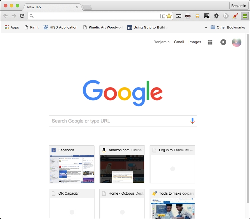
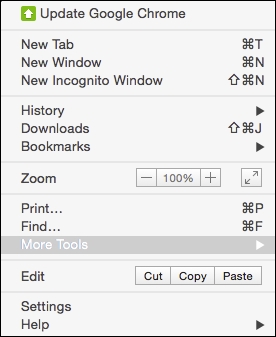
Next, select More Tools | Developer Tools. Then you can right-click on any element and select Inspect Element:
With this tool, you can inspect elements; use the JavaScript console; look at source code, network requests and responses, the timeline, and resources such as session and local storage; and even connect to a device and debug its Chrome browser.
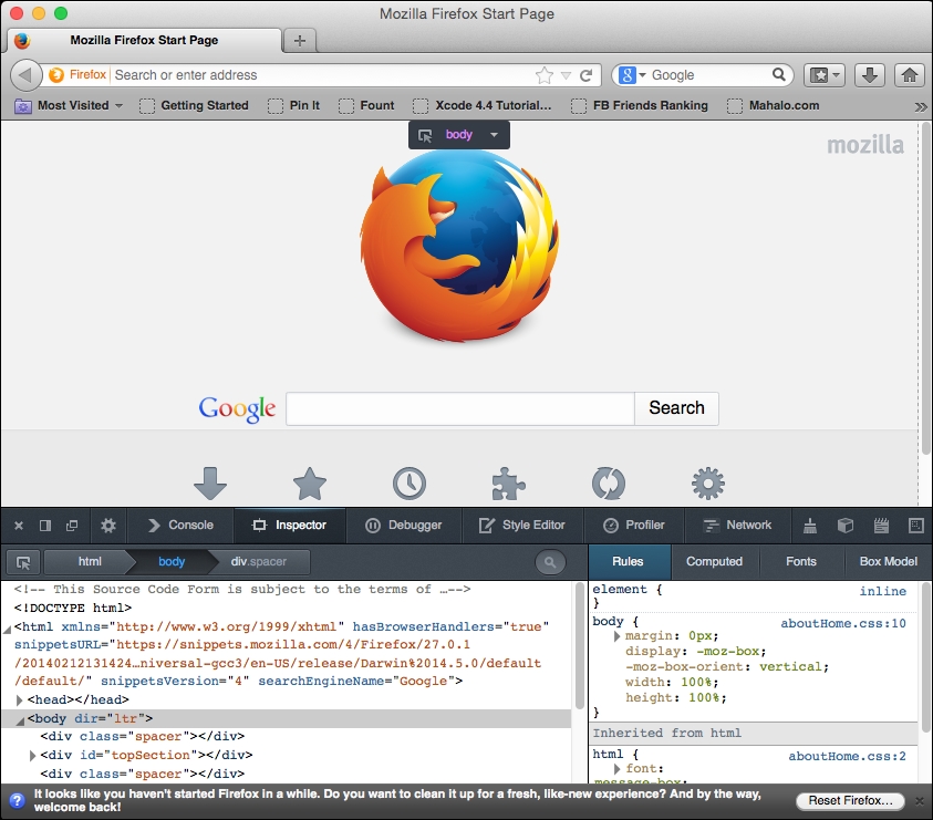
Likewise, in Firefox, select Tools from the menu bar, and then select Developer Tools. You should see this:
Now, on to our next task: creating the viewport meta tag. Every function of any responsive site you create will depend on this tag. Without it, your site won't be responsive at all!
The viewport meta tag was initially implemented only in Safari but was quickly adopted by other browsers. This clever little tag instructs your browser to render the webpage scale and size in specific ways.
It may be easier to learn about the meta tag by demonstrating what the viewport will look like without it. Without the tag, your webpage will be rendered at full width in mobile viewports. The result will be the text being so small that you will have to pinch out to expand the text to a readable size.
For the sake of proving the point, let's start with a paragraph of text (you can go generate some ipsum text from http://www.lipsum.com/) styled to have a font size of 12px, using the following code:
<!DOCTYPE html>
<html>
<head>
<title>Viewport META Tag Test</title>
<style>
    p{
        font-size:12px;
    }
</style>
</head>
<body>
    <p>
    Lorem ipsum dolor sit amet, consectetur adipiscing elit. Phasellus feugiat tempor dui, ac volutpat lacus tempus id. Suspendisse feugiat est felis, vitae ultrices neque accumsan non. Curabitur lacus erat, suscipit eget sagittis eu, tincidunt eget urna.
    </p>
</body>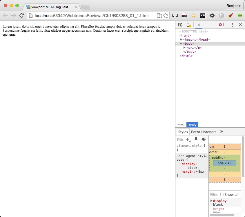
</html>Now, save the file and launch it in a browser with a good mobile emulator, such as Google Chrome, or use iOS Simulator. You will find that it is not very readable. All of the text is very tiny. This is what the world would look like without the viewport meta tag. See it illustrated in this screenshot:
Compare it to normal desktop browser rendering. There's a very big difference in the readability. The pixel density of mobile devices changes the way this is rendered, so you will need to account for this by defining the viewport's properties in the meta tag. Here's the desktop browser rendering:
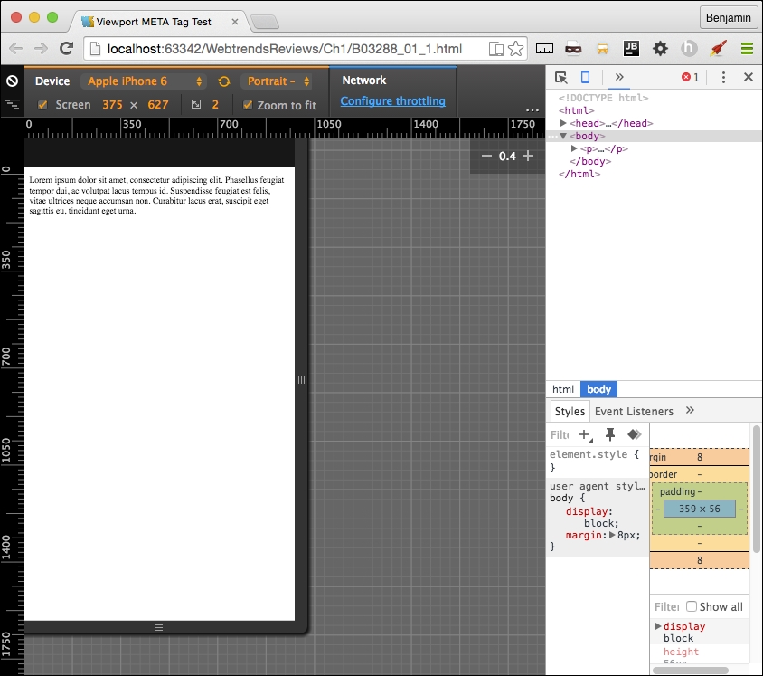
Now let's see what a wonderful world it would be with the addition of the viewport meta tag. Add a very simple version of the tag to the same code in the header, as I have in the following code sample:
<head>
    <title>Viewport META Tag Test</title>
    <meta name="viewport">
</head>
<body>
…
There are a few options for the viewport meta tag; however, only use them if you know what you are doing. These can end up causing more damage than you might anticipate. If you are not sure what you are doing, just keep it simple, Slick.
Let's look at the viewport options in detail, starting with setting the width. You can set the width to a specific number, but that's not recommended. So set the content attribute equal to the device width, as illustrated in the following sample code:
<meta name="viewport" content="width=device-width">
Next, we look at the scaling. This is when you squeeze your two fingers together and apart on the screen to zoom out and in. You can prevent this behavior in the viewport or limit it by setting the maximum-scale attribute equal to 1. You can also predetermine the scale of the webpage when it's rendered initially, by setting the initial-scale attribute. In most cases, I set both as 1; see it in this sample code:
<meta name="viewport" initial-scale=1 maximum-scale=1>
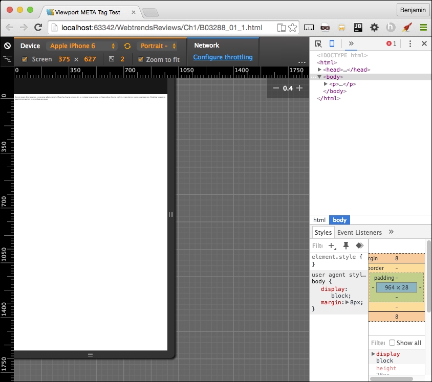
This meta tag will not affect the rendering in the viewport unless it is viewed on a mobile device or proper emulator or simulator. Now, relaunch the file, and you will see that the page behaves much better. See it in this screenshot:
Every time your audience's browser makes an HTTP request to your server to obtain a webpage, it identifies itself and reveals some things about itself to the server. This information can be used by your code to help create an optimized rendering of the site. The most important information revealed in the user agent string is the browser product name and version (such as Chrome/32.1), the layout engine and version (Gecko/1.1), and usually, the device system product name and version.
When creating your responsive website, you will most likely be working directly on your computer, not on a mobile device, and either hosting locally or deploying to a server for production. No matter whether it's local or hosted, even if you're the Nikola Tesla (https://en.wikipedia.org/wiki/Nikola_Tesla) of CSS, you can't guess everything, so you will eventually want to do some visual testing on your site.
Manipulating the user agent string is a good way of simulating what your responsive website will look like in production. There are plenty of tools available to switch the user agent. The Chrome debugger includes a device mode you can toggle in order to simulate the mobile device. In addition to changing the viewport size to match the selected device, this wonderful little tool will switch the user agent string for you, re-rendering your website on the fly (usually, however, you may need to refresh).
You can access the toggle device mode from Chrome's developer tools. There are a few ways to get here. First, from the system menu, select View, then Developer, and then Developer Tools. Or you can right-click on an element in the viewport to launch the contextual menu and can then select Inspect Element. Finally, you can use keyboard shortcuts: on a Mac, use Cmd + Opt + I, and on Windows, use F12 or Ctrl + Shift + I.
Once you have the developer tools open, you'll see in the top-left corner of the developer tools section of the viewport an icon of a magnifying glass and, next to it, an icon of a mobile phone. When you click on it, it will toggle the device mode or change the user agent. See this in the following screenshot:
Once you activate this new interface, you will see some new options. First, you may be prompted to refresh the page. Otherwise, on the top, you will see a Device select option, where you can toggle through a list of common devices. Next to it is a Network select option element. With this tool, you can throttle the download speed in order to emulate different network types and speeds to see how slower downloads will affect the rendering of your responsive webpage.
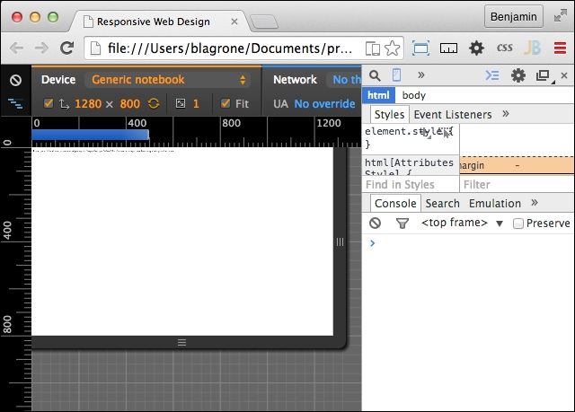
Other cool features of the inspector are the rulers on the sides that let you get precise reads on the rendering and the touch emulation so that you can see how the user will truly interact with the user interface. Once it is launched, you can keep it running and toggle between different user agents and see how your page is rendered. There are even some views that emulate notebooks. This tool will prove to be one of the most useful tools in your toolbox. You will likely use it for many of the projects following this section.