Table of Contents for
Web Design Blueprints
 Web Design Blueprints
Published by
Packt Publishing, 2016
Web Design Blueprints
Published by
Packt Publishing, 2016
- Cover
- Table of Contents
- Web Design Blueprints
- Web Design Blueprints
- Credits
- About the Author
- About the Reviewer
- www.PacktPub.com
- Preface
- What you need for this book
- Who this book is for
- Conventions
- Reader feedback
- Customer support
- 1. Responsive Web Design
- Getting familiar with the basics
- Using media queries for responsive design
- Working with responsive media
- Building responsive layouts
- Summary
- 2. Flat UI
- Flat UI color
- Creating a flat UI layout
- Summary
- 3. Parallax Scrolling
- Color classes
- Using SVG font icons
- Getting the fonts
- That's no moon!
- OMG, it's full of stars!
- Clouds, birds, and airplanes
- The rocket
- Terra firma
- Next up, the CSS
- Styling the objects with CSS
- Styling the ground objects
- Writing the JavaScript effects
- Setting the row height
- Spreading the objects
- Spreading the clouds
- Loading the page functions
- Smoothening the scroll
- Updating elements on the scroller
- Collecting the moving elements
- Creating functions for the element types
- Setting the left positions
- Creating the rocket's movement function
- Finally, moving the earth
- Summary
- 4. Single Page Applications
- Getting to work
- Getting the old files
- Object and function conventions
- Creating utility functions
- Working with the home structure
- Setting up other sections
- Performing housekeeping
- Creating a callBack function for the API
- Summary
- 5. The Death Star Chapter
- Dropping in the parallax game
- Loading elements from JSON
- What can be done in the shared levels service
- Editing the home JavaScript
- Creating the other pages – credits and leaderboard
- Creating the second level
- Summary
- Index
Flat UI brings about a dramatic change in the way color is used in web design. Since the designs are no longer skeuomorphic, designers are more reliant on color and color contrast to relay information on the screen.
Flat UI tends to use more saturated, bright colors instead of grey, white, or black. You can use many different shades, as long as the tone and depth of the colors match. Often, the more simple color palettes are used, but the primary objective is to use colors that help convey the content as opposed to using color to mimic a 3D everyday object. The key is to go for simplicity.
There are a number of online tools to help you create a flat UI color palette. You can take a look at http://flatuicolors.com for a good sample of color codes. You can also visit http://www.colorhexa.com/ for a good color-matching tool.
This section has a few sample color swatches for you to view. Each swatch has descriptions and reasons you might want to use it. Over at DesignModo, a design company and blog that focuses on flat UI design, there are more swatches like these you can look at:
http://designmodo.com/flat-design-colors/
Let's take a look at the color swatches now.
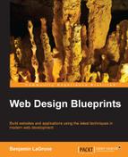
Many style guides on flat UI design recommend using vivid colors to convey simplicity and let the actual content tell the story. This is a good swatch to start with:
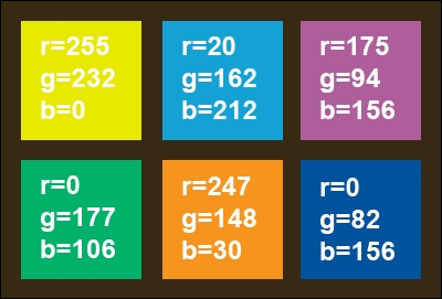
Another popular color trend that mixes well with Flat UI is using retro colors. Retro colors have less saturated hues—bright with white added to make them muted and faded. Be careful; these are not pastel, but old school. Use lots of orange, yellow, some red, and blue. It is common to see primary and secondary colors because of the toning down of color.
Retro colors are best when they are the dominant color element and are paired with images or muted colors. The most popular are orange, peach, plum, and dark blue.
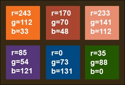
A design trend I like and is very popular, especially for app design, is monotone colors. This color scheme relies on only a single color with black and white to create a bright, distinct palette. Use a base color and two or three tints for effect. As it is regarded a soothing color, the most popular color is blue, followed by green and grey.
Sometimes, a designer will pick grey but with a pop of color, such as red, for buttons and calls to action. Another option is to use a variation of color, for instance, a primary such as blue, but add tints of green.
Monotone color schemes need to include contrast, so mix tints so that each different color is distinct from the parent color. Go from 100% to 50% to 20%.
You can also look at other online color guides for flat UI color schemes; https://flatuicolors.com/ is an excellent source for colors to use in your flat UI design project.
Finally, when you have decided on your style and created a color palette, you will next want to create a CSS style for them. Let's make it easy so you don't have to jump back and forth between your markup and style just to add colors. So, launch your IDE and create a new project for your flat UI design.
Inside the header of the HTML page you created, add a style tag. Inside it, we'll start adding some colors. Get your list of colors you have picked and list them inside the style sheet as selectors. For illustration, I'll use the colors in a code snippet. The Peter River color from https://flatuicolors.com really stands out. Let's use that to create a monochrome color palette for our flat UI project. We can also use the Wet Asphalt color for some of the darker colors. Here's the code snippet:
<style>
.peter-river{
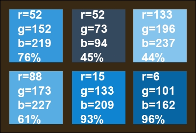
background-color:#3498DB; /* r=52, g=152, b=219, 76% */
}
.wet-asphalt{
background-color:#34495E; /* r=52, g=73, b=94, 45% */
}
</style>From here, let's create some tints for our Peter River color by modifying the tint by 10% increments.
The additional colors are as follows:
.color-1 {
    background-color: #85C4ED; /* r=133, g=196, b=237, 44% */
}
.color-2 {
    background-color: #58ADE3; /* r=88, g=173, b=227, 61% */
}
.color-3 {
    background-color: #0F85D1; /* r=15, g=133, b=209, 93% */
}
.color-4 {
    background-color: #0665A2; /* r=6, g=101, b=162, 96% */
}
The color swatch for this is as follows:
Instead of assigning a color to div through CSS, we are going to assign the colors by creating a color for the class and assigning the class to the element. You will see how this works in the next section.