Table of Contents for
Responsive Web Design Patterns
 Responsive Web Design Patterns
Published by
Packt Publishing, 2015
Responsive Web Design Patterns
Published by
Packt Publishing, 2015
- Cover
- Table of Contents
- Responsive Web Design Patterns
- Responsive Web Design Patterns
- Credits
- About the Author
- About the Reviewers
- www.PacktPub.com
- Preface
- What you need for this book
- Who this book is for
- Conventions
- Reader feedback
- Customer support
- 1. Creating a Home for Responsive Patterns
- Why and how to create a responsive site
- Breaking websites down to their patterns
- Building a home for your patterns
- Summary
- 2. The Main Stage – Building Responsive Layouts
- Most popular layout patterns
- Creating complex systems
- Summary
- 3. Make Way for Responsive Navigations
- Responsive navigation patterns
- Summary
- 4. From Static to Dynamic – Embedding Media
- Responsive image patterns
- Understanding sliders and carousels
- Implementing videos
- Summary
- 5. Gathering and Displaying Information
- Responsive table patterns
- Summary
- 6. Combining Responsive Patterns
- Continuing to look for patterns
- Your pattern library is not done yet!
- Summary
- 7. Ship It – Finalizing Your Pattern Library
- Getting ready to handoff
- Publishing your library
- Further exploration
- Summary
- Index
We have gone over a lot so far in this book. Our job is not over yet. There are still other website elements we need to consider and include in our pattern library. Responsive pattern libraries are pretty much like style guides, but with responsive patterns included. Your RPL needs to include all the elements a regular style guide would include as well.
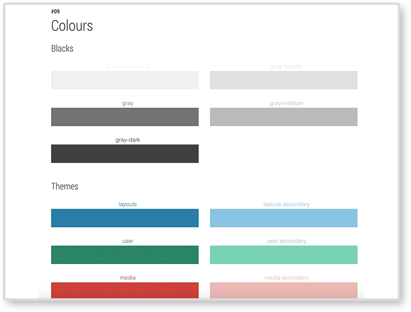
Your RPL should include swatches of the website's colors and their color value (hexadecimal, RGB, HSL, and so on). If you are using a CSS preprocesser, such as LESS or Sass, include the color's variable name as well. It is also important to know when and how to use these colors and which colors should never be paired.
Example: Google style guide (https://developers.google.com/web/fundamentals/resources/styleguide/index):
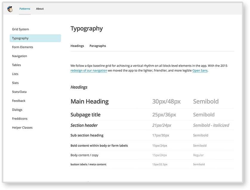
Make sure to include what font faces your website uses. As we saw in Chapter 2, The Main Stage – Building Responsive Layouts, font sizes may be changed across screen sizes to help with legibility. If they do, make sure you document these changes.
Example: MailChimp's UX style guide:
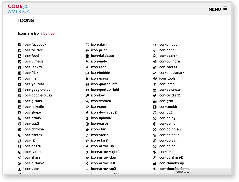
Your website may be using icons to help with navigation and/or tags. If it does, make sure to catalog what icons are being used and how to embed them in the future. Some websites use an icon font and use class names to embed the icons. Icons can also be responsive. Responsive icons are more detailed on larger screens and less on small. Check out Iconic (https://useiconic.com/) to see an example of what responsive icons can do.
Example: Code for America style guide (https://style.codeforamerica.org/):
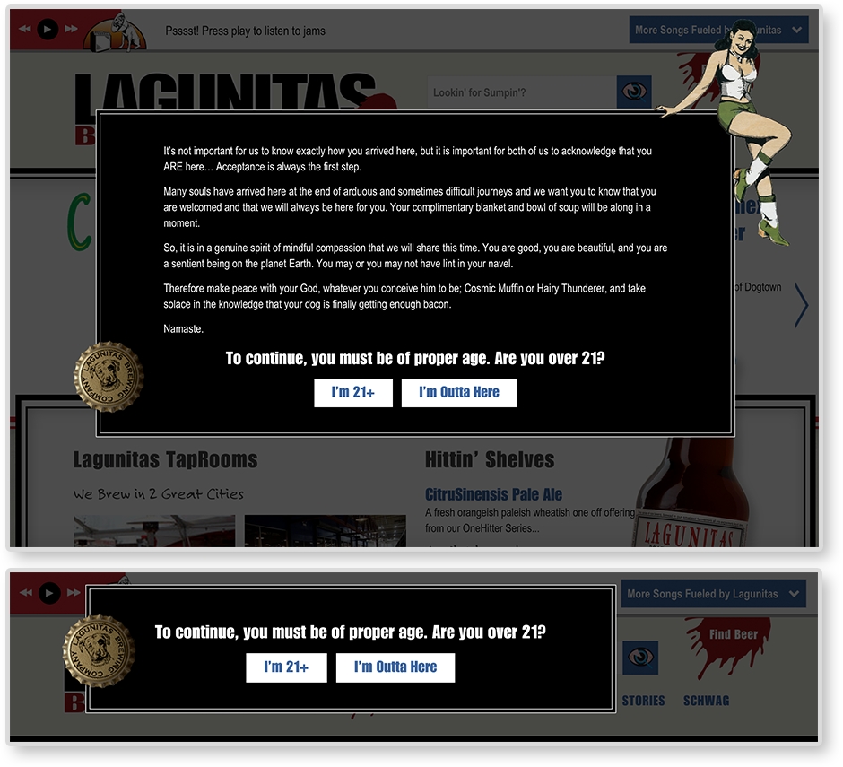
All the patterns we went over in this book have been using horizontal media queries. Vertical media queries are exactly what you think they are. They are queries that adjust on the viewport's height, not the width. They are easy to implement too. We are used to writing horizontal media queries like this:
@media screen and (min-width: 600px) {
    …CSS…
}
Vertical media queries look like this:
@media screen and (min-height: 600px) {
    …CSS…
}
Yeah, it's not that different. Lagunitas Brewing Company uses vertical media queries for the age gate (asking if the user is older than 21). On taller browsers, the age gate has a few paragraphs of text welcoming the user. But on shorter browsers, the age gate only has the prompt and buttons. Since there is less vertical space for the age gate, it condenses.