Table of Contents for
Responsive Web Design Patterns
 Responsive Web Design Patterns
Published by
Packt Publishing, 2015
Responsive Web Design Patterns
Published by
Packt Publishing, 2015
- Cover
- Table of Contents
- Responsive Web Design Patterns
- Responsive Web Design Patterns
- Credits
- About the Author
- About the Reviewers
- www.PacktPub.com
- Preface
- What you need for this book
- Who this book is for
- Conventions
- Reader feedback
- Customer support
- 1. Creating a Home for Responsive Patterns
- Why and how to create a responsive site
- Breaking websites down to their patterns
- Building a home for your patterns
- Summary
- 2. The Main Stage – Building Responsive Layouts
- Most popular layout patterns
- Creating complex systems
- Summary
- 3. Make Way for Responsive Navigations
- Responsive navigation patterns
- Summary
- 4. From Static to Dynamic – Embedding Media
- Responsive image patterns
- Understanding sliders and carousels
- Implementing videos
- Summary
- 5. Gathering and Displaying Information
- Responsive table patterns
- Summary
- 6. Combining Responsive Patterns
- Continuing to look for patterns
- Your pattern library is not done yet!
- Summary
- 7. Ship It – Finalizing Your Pattern Library
- Getting ready to handoff
- Publishing your library
- Further exploration
- Summary
- Index
Simply put, a pattern library is a home for your patterns. It acts as a point of reference for designers and developers to view the pieces that make up a design system. A good pattern library illustrates how to implement the patterns making up a website. In a responsive pattern library, every pattern should be accompanied with:
- An example: The actual pattern embedded, showing off its design and functionality on small to large screens
- The code: How the patterns can be implemented (that is, what is the HTML and CSS? Is JavaScript needed?)
- The usage: When and where should the pattern be used (that is, what templates can it appear on? Where can it not appear?)
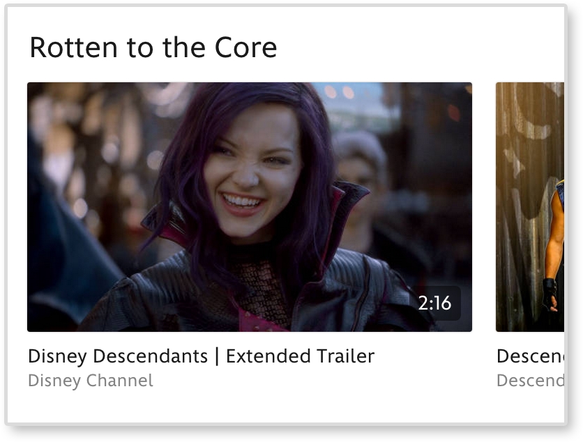
For example, if I were adding Disney's video gallery module to a pattern library, I would first embed the pattern on a page. I would then display the code necessary to build that pattern. Lastly, I would list usage guidelines explaining how and when to use it. Some example usage guidelines may be:
- Use no less than four (4) video thumbnails in each video gallery
- Video galleries must span 100% of the page
- The thumbnail image must have an aspect ratio of 16:9 with descriptions under each thumbnail if needed
These are not Disney's real rules. I just made them up as an example. But documenting patterns like this means that if I ever needed to add the video gallery pattern to another page, I would have a clear set of rules on how to do it.
A responsive pattern library focuses on how patterns change across screen sizes. For small screens, we can see that the video gallery loses the right arrow and allows thumbnails to be cropped-off screen.
Documenting these style changes is what differentiates a basic pattern library from a responsive pattern library.
Responsive pattern libraries are not just for big team projects. Let's be honest, how good is your memory? Can you remember how much padding buttons get, months after you already developed them? And if the padding decreases on smaller screens, you are doubling the amount of information you need to remember with just one design element. Personally, I have a tracking tag on my own keys. So, if I can't remember where I left my keys this frequently, I doubt I will remember month-old code.
Without a pattern library, you need to comb through pages to find where a pattern may live. Only after this hunt can you test it or use it as a reference. A pattern library lets you quickly test all patterns on different browsers and devices. There is a benefit to having all your patterns in one place instead of hiding them away in distant corners of a website. Also, whenever you add more patterns to a system, you can see if the new styles affect older patterns. In short, instead of trying to remember every element you develop, use this book to create a responsive pattern library and begin cataloging your patterns.
Tip
Style guide versus pattern library
Although these terms are often used interchangeably, there is a slight difference. A style guide is a document that contains rules for how everything should look. This can be a PDF or an interactive guide online. A pattern library contains rules for how everything should work. A pattern library will be able to show the functionality of each pattern.
Pattern libraries are becoming a common tool in the web industry. Developers are releasing premade templates to help others build their own. Large companies such as Google and MailChimp have released their internal libraries, which serve as wonderful examples for the rest of us. I highly recommend viewing these templates and examples before you start your own. Even though pattern libraries may seem similar, they should always be tailored in some way. The tool has to fit the job.
The Pattern Lab is Frost and Dave Olsen's example of a pattern library broken down using atomic design. This is not a company's pattern library, but a template for developers.
Note
You can view a demo of the library at http://demo.patternlab.io/ or download it yourself from Frost's GitHub repository at https://github.com/pattern-lab/patternlab-php.
The Pattern Lab organizes patterns by atoms, molecules, organisms, templates, and pages. The Pattern Lab also has awesome features such as the following:
- Resize each pattern without resizing the browser
- The browser width and height are always displayed on the top bar
- Use quick-select options to view the patterns at small (S), medium (M), and large (L) screen sizes
The Pattern Lab may not be the right fit for all projects and teams. The concept of atomic design can be confusing to other team members and clients. They might not understand what an "atom" means and how it should be used. If you are a more experienced web developer, you can always download the Pattern Lab repository from GitHub and make changes. You can change the language to something more approachable (that is, "Basic Elements" instead of "Atom") and scale down the library. If you don't think you have the skills to do this, don't worry; this is not your only option.
MailChimp's responsive pattern library is my favorite example.
You can view this example at http://ux.mailchimp.com/patterns/.
MailChimp breaks down each pattern by showing an example, providing the code to create it, and including notes about how to use the pattern. As seen in the following screenshot, you can also decrease and increase the width of the browser and see how each pattern reacts since all patterns are functional:
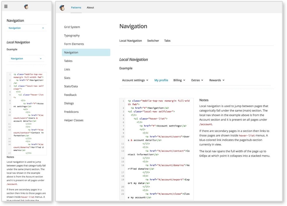
The MailChimp Pattern Library (http://ux.mailchimp.com/patterns)
Responsive Patterns is another pattern library developed by Brad Frost. That guy must love pattern libraries, am I right? Responsive Patterns (https://bradfrost.github.io/this-is-responsive/patterns.html) is a catalog of popular patterns being used across the Web. Along with showing examples of these patterns, Frost includes a CodePen (http://codepen.io/) to show the code behind each pattern. And since Frost accepts submissions, this site is always growing.
Want to look at more responsive pattern libraries? Check out the following list for some great examples:
- Starbucks (http://www.starbucks.com/static/reference/styleguide/)
- Google (https://developers.google.com/web/fundamentals/resources/styleguide/)
- A List Apart (http://patterns.alistapart.com/)
- Code for America (http://style.codeforamerica.org/)
Developing your own responsive library forces you to become a more organized developer. Creating a pattern library from scratch for the first time or trying to scale down a larger pattern library may not be the best first step. Provided with this book is a responsive pattern library template ready for you to use. Its name is simple—the responsive pattern library (RPL).
Note
You can download the starter template at https://github.com/chelmyers/RPL or view the finished library at http://chelmyers.github.io/RPL/.
Like Frost's Responsive Patterns, this library is a catalog of popular responsive patterns found all over the Web. By changing the title and content though, it can easily be used (and is meant to be) for clients or personal projects.
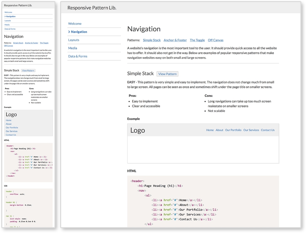
The Responsive Pattern Library (http://chelmyers.github.io/RPL/)
I developed this template with both beginners and more experienced developers in mind. These pages are static and created with HTML, CSS, and Prism.js (http://prismjs.com/). If you are a more advanced web developer, feel free to modify these templates and fit them into your current workflow. I personally use Sass and create a .scss file for each pattern. I then pull them all into one style sheet. I also use PHP to organize my markup.. The Pattern Lab uses Mustache to do this. If you don't know how to do any of this, do not worry; you don't need to. The library is good-to-go as is.
If you look at the finished site and click on the Navigation link on the side menu, you will be brought to a section's landing page. Here, you can see popular responsive solutions for navigations. At the top of the page is the section's title and a brief description about its content. Each pattern following has a working example, the code to implement the pattern, and the guidelines for the pattern's usage.
The pattern example is being displayed using the <iframe> tag. Each pattern has its own HTML file, with styles in the <head> tag, being embedded into the section's landing page.
The code is being highlighted using Lea Verou's (http://lea.verou.me/) Prism.js, a syntax highlighter.
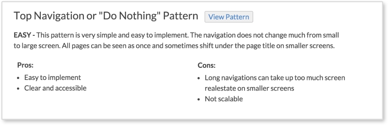
Each pattern has a View Pattern button next to its title. The View Pattern button takes you to the pattern's HTML file where you can view it alone outside the landing page. Since the point of this book it to teach you how to use these patterns and why, each pattern has:
- A level of difficulty to implement (easy, medium, or hard)
- A description of the pattern
- The pros and cons of using this pattern
These are the pattern's usage guidelines. The guidelines in the actual library are brief. Look for more information about each pattern in later chapters.
To download the pattern library, visit https://github.com/chelmyers/RPL and click the Download Zip button at the bottom of the right column. You can find an empty starter version at https://github.com/chelmyers/RPL-starter. After you have downloaded the library, unzip it. You will see a folder called RPL-master or RPL-starter-master if you are using the starter files. The following walkthrough will be using the filled library. Put this folder in a safe directory on your computer. By safe, I mean someplace you won't lose or delete it. I keep all my pattern libraries and style guides under a folder called Sites on the same level as Documents.
Inside the RPL folder is the index.html file, the assets folder, and a folder for every landing page and patterns on that page. The assets folder contains the CSS for the library, images used, a template for a pattern file, a template for a section's index page, and the Prism.js plugin.
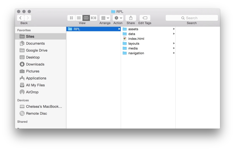
Now, let's explore how the sections are set up. Open up the navigation folder. Here you will see another index.html. This is the HTML file for the navigation section's landing page. You will also see HTML files named pat-01-simplyStacked.html. These HTML files are the individual patterns. The naming convention for the pattern files is pat-##-description.html. The pat lets me know that this is a pattern file. The number tells me what order on the page it appears. The description gives me information on what the pattern actually is in one or two words.
To add a pattern to a section, copy the pattern template file (pat-00-template.html) from the assets folder and rename it. Put the new pattern file into an already existing or new landing page folder. Next, open up the file in your text editor of choice. I recommend Sublime Text (http://www.sublimetext.com/) or Atom (https://atom.io/). Or you can copy the pattern template code from the following:
<!DOCTYPE html>
<html lang="en">
<head>
  <meta charset="utf-8">

  <title>Responsive Pattern Library</title>
  <meta name="viewport" content="width=device-width, initial-scale=1">

  <!-- Load in template styles -->
  <link rel="stylesheet" href="../assets/css/pattern-style.css">

  <!-- Load in Google Font: Lato -->
  <link href='http://fonts.googleapis.com/css?family=Lato:400,700' rel='stylesheet' type='text/css'>

  <!--[if lt IE 9]>
  <script src="http://html5shiv.googlecode.com/svn/trunk/html5.js"></script>
  <![endif]-->

  <style>
    /*Pattern ## - Description*/
    /*Insert CSS here*/
  </style>
</head>

<body>
  <!-- Insert pattern markup here -->
</body>
</html>
The preceding highlighted code is where we will be adding the styles and markup for each pattern. Nothing will show up just yet though. Let's go over how to set up a section's index page and add a pattern to it.
To create a section, make a new folder in the main folder (RPL-master or whatever you renamed it to) and give it a descriptive name. Duplicate index-template.html from the assets folder, place it in the new section folder, and rename it index.html. To fill out the section page, complete the following:
- Add a new list item to the navigation under
<ul class="menu">so that your new section is included. Unfortunately, you will have to update the other pages as well since these templates are only HTML and CSS. Look for the comment<!-- Include new section page -->to see where to add the new list item. - Add in the section's title in
<h2 class="page-title">Section Title</h2>. - Add a section description at
<p>Section description.</p>.
Now, we can start adding patterns to the page. Use the following code for each pattern you want to add. This can be seen in index-template.html as well:
<div class="pattern"> <h3>Pattern Title<span class="btn"><a href="pat-00-template.html">View Pattern</a></span></h3> <p><span class="difficulty">Level</span> Pattern description.</p> <ul class="list-compare"> <li><h4>Pros:</h4></li> <li>Item 1</li> <li>Item 2</li> </ul> <ul class="list-compare"> <li><h4>Cons:</h4></li> <li>Item 1</li> <li>Item 2</li> </ul> <h4>Example</h4> <iframe src="pat-00-template.html" frameborder="0" height="100"></iframe> <h4>HTML</h4> <pre> <code class="language-markup"> <!-- Markup goes here. --> </code> </pre> <h4>CSS</h4> <pre> <code class="language-css"> /*Styles go here*/ </code> </pre> </div><!--end pattern-->
The highlighted code is the information we will be changing. Follow these steps to do this correctly:
- Add in a pattern title, pattern difficulty level, pattern description, and the pattern's pros and cons. If you are using this library for a personal project or a client project, insert the pattern's usage guidelines here.
- Replace all instances of
pat-00-template.htmlwith the name of the pattern file. The actual pattern file should be in the same folder as the section landing file you are working on. - Set the height of the iframe (for example,
height="100") to fit the pattern. It is set to 100px by default. - Replace
<!-- Markup goes here. -->with the markup (HTML) of the pattern. Replace all less-than characters,<, with its HTML entity,<, to stop the tags from rendering in the browser. - And finally, replace
/*Styles go here*/with the CSS styles for the pattern.
The library itself is already responsive and has some basic styles applied. The library's styles can be found in assets/css/lib-style.css. In the filled-out version on the pattern library, the patterns have some global styles. These styles can be found in assets/css/pattern-style.css. This file is empty in the starter version. After you have your RPL setup, feel free to jump right in and start poking around. The filled-out version has all the patterns we will be reviewing in this book. You can always download the starter files and make each pattern from scratch as we go along.