Table of Contents for
Responsive Web Design Patterns
 Responsive Web Design Patterns
Published by
Packt Publishing, 2015
Responsive Web Design Patterns
Published by
Packt Publishing, 2015
- Cover
- Table of Contents
- Responsive Web Design Patterns
- Responsive Web Design Patterns
- Credits
- About the Author
- About the Reviewers
- www.PacktPub.com
- Preface
- What you need for this book
- Who this book is for
- Conventions
- Reader feedback
- Customer support
- 1. Creating a Home for Responsive Patterns
- Why and how to create a responsive site
- Breaking websites down to their patterns
- Building a home for your patterns
- Summary
- 2. The Main Stage – Building Responsive Layouts
- Most popular layout patterns
- Creating complex systems
- Summary
- 3. Make Way for Responsive Navigations
- Responsive navigation patterns
- Summary
- 4. From Static to Dynamic – Embedding Media
- Responsive image patterns
- Understanding sliders and carousels
- Implementing videos
- Summary
- 5. Gathering and Displaying Information
- Responsive table patterns
- Summary
- 6. Combining Responsive Patterns
- Continuing to look for patterns
- Your pattern library is not done yet!
- Summary
- 7. Ship It – Finalizing Your Pattern Library
- Getting ready to handoff
- Publishing your library
- Further exploration
- Summary
- Index
Now that we have covered how to optimize the images you want to put on your website, let's look at ways you can lay them out. As mentioned, a trend right now is having a huge image span full width of the page with some text (usually the company's name and tagline) shown on top of it. Why don't we start with doing that then?
Websites using this pattern typically have big beautiful images displaying their work or company. For the sake of this example, I grabbed a pattern from Subtle Patterns (http://subtlepatterns.com/) and created two images: banner-2000.png and banner-1400.png. As we saw earlier in this chapter, these big hero images normally have text overlaid on top of them. As you can see in the following image, we are doing just that:
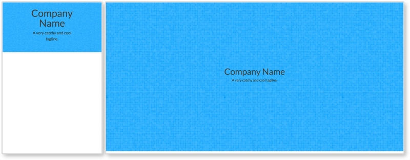
Right now, there is not much going on with this pattern. This is on purpose. There is a lot you can do with big hero images. You can overlay other images, navigation, and more text. But this pattern right here shows you the basics.
HTML
<header>
  <img class="banner-img" src="i/banner-1400.png" srcset="i/banner-2000.png 2x"  sizes="100vw" alt="Banner Image"/>

  <div class="banner-overlay">
    <h1>Company Name</h1>
    <p>A very catchy and cool tagline.</p>
  </div>
</header>
The markup in this pattern consists of a header tag containing the image to go full span and the text. The image has a class of banner-img that we will use in the CSS. There is a div element with a class of banner-overlay containing h1 and p tags.
We are also using the srcset attribute here. It looks a little different though. This time we added the sizes attribute to the image tag. This gives the browser information about how much space the image will take up. Setting sizes to 100vw is saying that the image will take up 100% of the page's width. The unit vw stands for viewport width. One unit of vw is 1% of the containing element. Since the header tag spans the full width of the page already, sizes="100vw" is saying take up 100% of that space too. This is just giving the browser more information to help pick the best image to display.
CSS
header {
  position: relative;
}

.banner-img {
  width: 100%;
}

.banner-overlay {
  position: absolute;
  text-align: center;
  top:50%;
  left:50%;
  transform: translate(-50%, -50%);
}
First, we set the header's position to relative. We do this because we want to position one of its children, .banner-overlay, relative to it. We then set the image's width to 100% since spanning the full width of the page is the whole point of this example.
For .banner-overlay, we are setting position to absolute since we will be moving it on top of the image. Since header is relative, .banner-overlay will move relative to it instead of to the browser's window. We are then centering the overlay in two different ways. First, text-align: center is centering the text while the last three lines are centering the overlay in the middle of the header element. We went over this centering technique in Chapter 3, Make Way for Responsive Navigations, for the overlay navigation pattern. If you are interested in using another centering technique, flexbox has its own solution. To use this, apply these settings to the parent of the item you wish to center:
display:flex;
justify-content:center;
align-items:center;
If the child you are trying to center is text, the only other thing you need to do is apply text-align:center to that child so the text is centered too
Note
View this example live at http://chelmyers.github.io/RPL/media/index.html#full-span.
Let's have a look at the pros and cons of this pattern:
Pros:
Cons:
Don't just use this pattern because it is trendy. Every one of your designs and websites should be catered to the user, the content, and the client. Just because this pattern is widely used does not mean it is the best option for you. It can make a really stunning website, but if the user needs to get to content fast, then these large images just get in the way.
- BrightByte (http://brightbyte.co.uk/)
- Andrew Elsass (http://andrewelsass.com/)
- Mikiya Kobayashi (http://www.mikiyakobayashi.com/)
Whether it is a search results page or an image gallery, at some time in your career, you will need to create an image grid. Just like we arranged multiple columns and rows of articles in Chapter 2, The Main Stage – Building Responsive Layouts, we can create a grid of images. This can be as simple or complex as you like. This biggest question here is, How many images will appear per row? And how will this number change on different screen sizes? In our example here, one row is going to be comprised of 1, 2, 4, and 6 images per row from small to large screens. You may need more or fewer steps in between the smallest and largest screen sizes for your site, though.
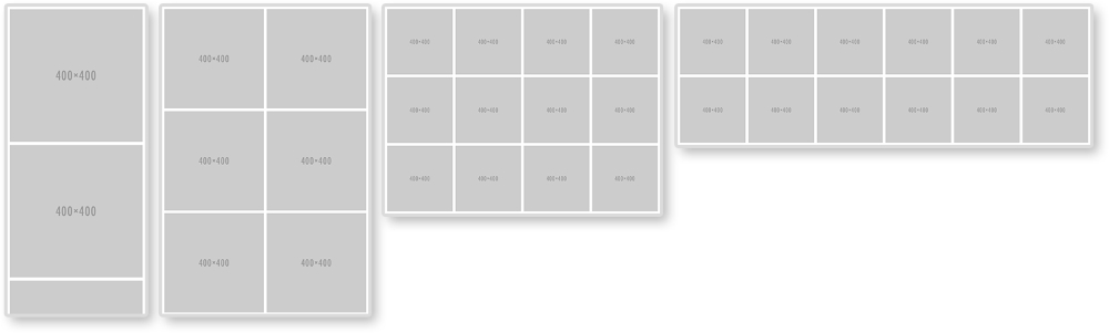
To make this happen, we will style for the smallest first; one image per row. That's pretty easy. Then, we will be using media queries to add more images per row.
HTML
<ul class="img-grid">
  <li><img src="http://placehold.it/400" alt="Thumbnail" /></li>
  <li><img src="http://placehold.it/400" alt="Thumbnail" /></li>
  <li><img src="http://placehold.it/400" alt="Thumbnail" /></li>
  <li><img src="http://placehold.it/400" alt="Thumbnail" /></li>
  <li><img src="http://placehold.it/400" alt="Thumbnail" /></li>
  <li><img src="http://placehold.it/400" alt="Thumbnail" /></li>
  <li><img src="http://placehold.it/400" alt="Thumbnail" /></li>
  <li><img src="http://placehold.it/400" alt="Thumbnail" /></li>
  <li><img src="http://placehold.it/400" alt="Thumbnail" /></li>
  <li><img src="http://placehold.it/400" alt="Thumbnail" /></li>
  <li><img src="http://placehold.it/400" alt="Thumbnail" /></li>
  <li><img src="http://placehold.it/400" alt="Thumbnail" /></li>
</ul>
For the HTML, there is nothing special here. We have an unordered list with a class of img-grid and 12 list items. Each list item holds an image that will appear in our grid.
CSS
.img-grid {
  padding:0.15em;
  margin:0;
}

.img-grid li{
  list-style: none;
  padding: 0.30em;
}

.img-grid img {
  max-width: 100%;
  height: auto;
  vertical-align: bottom;
}
The CSS is controlling everything here. We are first setting the padding on the <ul> and taking off any margins. The padding is set to 0.15em because this is half of what the padding on each <li> will be. On the <li> elements, we will set list-style to none to get rid of the bullets and then giving each one padding.
For the images, we are setting them to scale with max-width: 100% and height: auto. The last declaration sets vertical-align to bottom. If we didn't do this, there would be a 4px gap under each image. Images are inline elements and sit on the baseline like text would. This gap underneath the images is actually room for a descender (like that found in the lowercase "j" or "g"). Setting vertical-align: bottom gets rid of this extra space.
/*2 in a row*/
@media screen and (min-width: 600px) {
  .img-grid {
    display: flex;
    flex-direction: row;
    flex-wrap: wrap;
  }

  .img-grid li {
    width: 50%;
  }
}

/*4 in a row*/
@media screen and (min-width: 800px) {
  .img-grid li {
    width: 25%;
  }
}

/*6 in a row*/
@media screen and (min-width: 1200px) {
  .img-grid li {
    width: 16.66%;
  }
}
Now, we start to get into the media queries. Without them, we would have one column of images. In the first media query, we apply flexbox styles and set them each to be 50% wide. For flexbox to work the way we want, we will set flex-direction to row and flex-wrap to wrap. This is saying that we want our flexbox items, <li>, to be organized in rows going left to right. Other flex-direction properties are row-reverse, column, and column-reverse. Flexbox will also naturally try to put everything on one line. Setting flex-wrap:wrap stops this. Other properties for flex-wrap are nowrap and wrap-reverse. From here, we only have to change the width of each <li>. If we want four images per row, we will set their widths to 25%. If we want 6, each is 16.667%.
Flexbox is not supported by IE9 and earlier. If you need to support these browsers, you can use float instead of flexbox. This solution can be found commented out in the style section of this pattern on the RPL.
Note
View this example live at http://chelmyers.github.io/RPL/media/index.html#grids.
Let's have a look at the pros and cons of this pattern:
Pros:
- Great way to show off a collection
- Easy to create
Cons:
There aren't many negatives for this pattern. It does need extra attention though because the images can easily scale up or down too much. Another issue is that, if you stick everything in a grid like this, and call it a day, it can be boring. You can always add captions, hover effects, and lightboxes to spice up this pattern though.
Note
Lightbox
Not sure what a lightbox is? Don't worry. Have you ever clicked an image and seen a larger version of that image pop up? That's a lightbox. It's named after a super popular JavaScript plugin called, Lightbox by Lokesh Dhakar. You can see the most recent version here at http://lokeshdhakar.com/projects/lightbox2/.
- Daniel Hellmann (http://davidhellmann.com/work/)
- Pop Chart Lab (http://popchartlab.com/collections/housewares)
- The Beast is Back (http://www.thebeastisback.com/)