Table of Contents for
Responsive Web Design Patterns
 Responsive Web Design Patterns
Published by
Packt Publishing, 2015
Responsive Web Design Patterns
Published by
Packt Publishing, 2015
- Cover
- Table of Contents
- Responsive Web Design Patterns
- Responsive Web Design Patterns
- Credits
- About the Author
- About the Reviewers
- www.PacktPub.com
- Preface
- What you need for this book
- Who this book is for
- Conventions
- Reader feedback
- Customer support
- 1. Creating a Home for Responsive Patterns
- Why and how to create a responsive site
- Breaking websites down to their patterns
- Building a home for your patterns
- Summary
- 2. The Main Stage – Building Responsive Layouts
- Most popular layout patterns
- Creating complex systems
- Summary
- 3. Make Way for Responsive Navigations
- Responsive navigation patterns
- Summary
- 4. From Static to Dynamic – Embedding Media
- Responsive image patterns
- Understanding sliders and carousels
- Implementing videos
- Summary
- 5. Gathering and Displaying Information
- Responsive table patterns
- Summary
- 6. Combining Responsive Patterns
- Continuing to look for patterns
- Your pattern library is not done yet!
- Summary
- 7. Ship It – Finalizing Your Pattern Library
- Getting ready to handoff
- Publishing your library
- Further exploration
- Summary
- Index
If you think about it, websites would be boring without images. A photo says a thousand words because, let's be honest, we don't feel like reading a thousand words. We are starting to talk in images too. Just look at how we use Emojis and GIFs. These are images that we send along when we don't feel like spelling it out. That's why media is great. Photo, icons, and videos can convey so much more information in a split second than a paragraph of text.
We can run into some obstacles though when including images on responsive websites. Images and videos can take some time to load because they are larger files. How many times have you exited a website, on a desktop or smartphone, because its content took too long to load? This probably happens on your smartphone. Even though the screen is smaller, scaling an image or video down with CSS for mobile devices doesn't make the file size any smaller. The full-sized file is still being downloaded. When dealing with responsive media, we have to make sure we are optimizing our content and preparing for it to scale from smartphone to desktop. In this chapter, we will be going over:
- How to make images and videos scale
- Tactics for optimizing responsive images;
pictureversussrcset - Developing popular responsive media patterns
Believe it or not, we have already started implementing responsive images in Chapter 2, The Main Stage – Building Responsive Layouts. Remember the mostly fluid layout (http://chelmyers.github.io/RPL/layouts/index.html#mostly-fluid). In this pattern, we added a featured image to an article snippet. The image stays at one size until the screen's width gets too small and it starts to scale down. But doing only this to images, and nothing more, can leave your website poorly optimized. Images make up the bulk of websites in terms of size. We don't wait for text to load, do we? It happens so fast it is hardly noticeable. Scaling down large images to 300px for a small mobile device seems inefficient. To learn how to optimize responsive images though, we first have to start with the basics.
In the mostly fluid pattern from Chapter 2, The Main Stage – Building Responsive Layouts, the first section contained an image that had a fixed width but then scaled down on smaller screens. This is the most basic approach to adding images to a responsive page. You have to make sure they scale, but not past their original sizes or risk pixelated images. If they aren't scaling but instead jump between sizes, they are adaptive and not responsive. We also went over the difference between adaptive and responsive design in Chapter 2, The Main Stage – Building Responsive Layouts. An adaptive design jumps from layout to layout at breakpoints. A responsive design scales between these breakpoints, and can have its layout change too. We can scale our images by giving them max-width and height properties such as the following code:
img {
  max-width: 100%;
  height: auto;
}
Applying a max-width property of 100% on the image insures that it will never get larger than its true size but will still scale down. Setting height: auto makes sure the image's aspect ratio is not changed. We wouldn't want an image with a width of 800px to be stretched out to 1500px. Then, we risk having a website filled with fuzzy pixelated images.
This code snippet is not really a media pattern. It is more of a building block for designing with images in your project. In this chapter, we will be using this technique to create more complex patterns.
Setting just max-width and height properties on your images, and doing only this, can potentially slow down your website and cause longer loading times. In this example, we scaled down an 800px wide image to fit on a small screen. Even though on a small screen it appears to be only 300 pixels wide, an 800px image is still being downloaded. The difference between 800px and 300px doesn't seem like a lot, but when you have multiple images on your page it starts to add up. Today, a lot of company websites use HUGE full-width scaling images in their designs. Just take a peak at AWWWard's Site of the Day collection and see how prevalent this trend is.
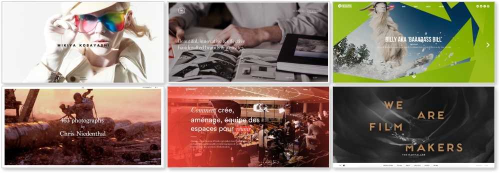
All the websites shown in the preceding image are responsive as well. The images being used range from 1400px to 2000px with sizes as big at 1.2 MB. Loading a 2000px 1 MB photo for a 300px-sized screen doesn't make much sense. Luckily, there are ways to fix this issue.
There's a debate going on in the RWD community and it's all about responsive image solutions. Currently, there are two native solutions for responsive images on modern browsers (minus Internet Explorer 11): the picture element and the srcset attribute. Both have limited browser support, but developers are picking sides and rallying for one, or even both, to have full-browser implementation. So, what's the difference?
Both picture and srcset swap out images depending on the viewport's size. The main difference is picture gives full control to the developer to set exactly when images swap and srcset lets the developer make suggestions while the browser does the rest of the work. Let's look at the HTML for these to see what this means.
For these examples, I made three images that I will be swapping in and out: 1920.png, 1000.png, and 500.png. As you may have guessed, these images are named after their width. Each image has the same aspect ratio as well.
Note
If you want, you can see a live example of the picture element here http://chelmyers.github.io/RPL/media/index.html#picture.
<picture>
    <source media="(min-width: 1000px)" srcset="i/1920.png"/>
    <source media="(min-width: 500px)" srcset="i/1000.png"/>
    <img src="i/500.png" alt="Featured Image"/>
</picture>
The actual picture tag doesn't do much except allow the source element to work its magic. You may already be using the source tag to embed videos. If not, we will go over this later. Here, we are using two source tags and one img tag. Each one pulls in a different image at a specific viewport size.
The media attribute is setting the widths to change the image being shown. The srcset attribute sets what image to then pull in. For the first source tag, on viewports wider than 1000px wide, the image 1920.png will load. For the second, viewports wider than 500px will load 1000.png. And finally, the img tag acts like the fallback image if picture is not supported. It also displays 500.png when the viewport is smaller than 500px wide.
In the picture element example, we can already see the srcset attribute being used. We will be using the same images from the picture instance for this example too.
Note
You can see this example live at http://chelmyers.github.io/RPL/media/index.html#srcset.
<img src="i/1000.png" srcset="i/1920.png 2x" alt="Featured Image"/>
For this srcset example, we are just using two images, 1000.png and 1920.png. By default, 1000.png will load. Within the srcset attribute, the 2x loads in the higher resolution image on screens with double the normal pixel density (such as retina screens). This example doesn't change as you scale the page. Instead, the browser is determining what image to serve up.
For proof that this works, I brought up the example on my retina 2013 MacBook, iPhone 6, and my 2012 first generation iPad Mini and took a photo, as seen in the following image:
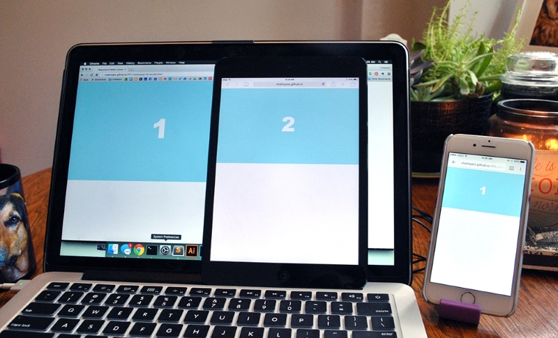
As we can see, the retina devices (the laptop and iPhone) show the higher resolution image. These devices need the high-res image to avoid pixilation. The older iPad Mini however doesn't need the larger image since its pixel density is lower and shows the smaller option.
Right now, the debate over picture and srcset is subsiding as people are recognizing that these two solutions have certain strengths. The common opinion now is that picture should be used for art direction and srcset for resolution swapping. If you need to finely control what sized image appears at different screen sizes, and even the content of those images, you are creating more of an artistic experiences than optimizing your images. For this, use picture and maintain your artistic direction. If you are just trying to make sure that a 2000px image doesn't load on a smartphone when a 600px will suffice, use srcset. If you are just swapping image resolutions, the short img tag with the srcset attribute will suffice.
Remember though the picture and srcset elements have limited browser support. The srcset solution has a little bit more coverage. Safari and iOS Safari does not support the picture element at all. However, Safari and iOS Safari 9 fully supports srcset with limited support in versions 8 and 8.4. This means srcset works on all up-to-date Apple devices where picture does not. Both work on Android's browser and Android's Chrome browser. The biggest upset is, you guessed it, Internet Explorer. Even IE 11 does not support either solution.
Since we shouldn't ignore our users no matter their browser choice, we have to come up with a backup plan. The picture element and srcset have fallbacks included, so we can just let the default image set show in the IE browsers. And this should be acceptable unless your users really need quickly loading images and must use IE (and this does happen). The following is a list of more complex solutions using other languages, such as JavaScript and PHP, to achieve responsive images. Take a look at them if you find you need a more powerful, bulletproof solution.
- Picturefill 3.0 (http://scottjehl.github.io/picturefill/)
- Smashing Magazine's custom solution (http://www.smashingmagazine.com/2014/02/one-solution-to-responsive-images/)
- Retina.js (http://imulus.github.io/retinajs/)
- HiSRC (https://github.com/teleject/hisrc)
Note
Optimizing the actual images
Photography and detailed bitmap images can still easily become megabyte-sized files without optimizing the actual image. Using Photoshop's "Save for Web" feature and applications such as ImageOptim (https://imageoptim.com/) will allow you to squeeze out extra unnecessary data and get smaller file sizes. Make sure your image file sizes are as small as they can be whether your images are responsive or not.