Table of Contents for
Responsive Web Design Patterns
 Responsive Web Design Patterns
Published by
Packt Publishing, 2015
Responsive Web Design Patterns
Published by
Packt Publishing, 2015
- Cover
- Table of Contents
- Responsive Web Design Patterns
- Responsive Web Design Patterns
- Credits
- About the Author
- About the Reviewers
- www.PacktPub.com
- Preface
- What you need for this book
- Who this book is for
- Conventions
- Reader feedback
- Customer support
- 1. Creating a Home for Responsive Patterns
- Why and how to create a responsive site
- Breaking websites down to their patterns
- Building a home for your patterns
- Summary
- 2. The Main Stage – Building Responsive Layouts
- Most popular layout patterns
- Creating complex systems
- Summary
- 3. Make Way for Responsive Navigations
- Responsive navigation patterns
- Summary
- 4. From Static to Dynamic – Embedding Media
- Responsive image patterns
- Understanding sliders and carousels
- Implementing videos
- Summary
- 5. Gathering and Displaying Information
- Responsive table patterns
- Summary
- 6. Combining Responsive Patterns
- Continuing to look for patterns
- Your pattern library is not done yet!
- Summary
- 7. Ship It – Finalizing Your Pattern Library
- Getting ready to handoff
- Publishing your library
- Further exploration
- Summary
- Index
Fixed, fluid, adaptive, and responsive are the four main categories of layouts for websites. Responsive layouts can be categorized even further. In 2012, Luke Wroblewski released an article titled Multi-Device Layout Patterns (http://www.lukew.com/ff/entry.asp?1514). Here, Luke categorizes responsive layouts under 5 labels; tiny tweaks, mostly fluid, column drop, layout shifter, and off canvas. His categorizations caught on and are now commonly used when talking about RWD layout patterns. Together, we will review these patterns and see how they are made.
Note
You can view all these patterns live at http://chelmyers.github.io/RPL/layouts/.
Let's start by looking at the easiest layout pattern. This pattern doesn't require much effort. The layout is similar to the example reviewed under a past section, The Web is naturally responsive. It is typically a single-column web page.
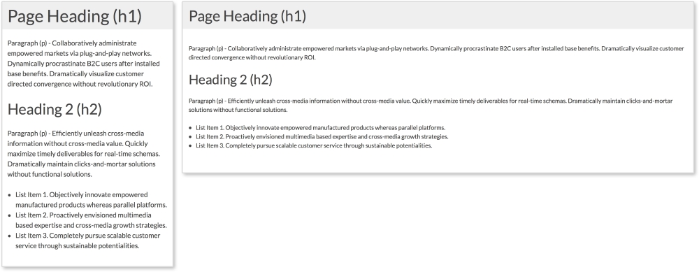
Our layout has a header and a section containing the site's content. Since these elements automatically stretch and scale to the browser's width, only some minor changes are needed to make it more mobile-friendly.
HTML
<header>
  <h1>Page Heading (h1)</h1>
</header>

<section>
  <p>Paragraph (p) - Collaboratively administrate empowered...<p>

  <h2>Heading 2 (h2)</h2>

  <p>Paragraph (p) - Efficiently unleash cross-media...</p>

  <ul>
    <li>List Item 1. Objectively innovate empowered...</li>
    <li>List Item 2. Proactively envisioned multimedia..</li>
    <li>List Item 3. Completely pursue scalable customer...</li>
  </ul>
</section>
The header section contains an h1 tag while a section tag contains the rest of the page's content. Inside the section tag, we have a second heading, paragraphs, and an unordered list.
CSS
body {
  font-size: 1em;
}

header, section {
  padding:0.75em;
}

@media screen and (min-width: 600px) {
  body {
    font-size: 0.875em;
  }

  header, section {
    padding:1em;
    margin-bottom:1em;
  }
}
Here, we have the styles for this layout with the media query highlighted. Now, remember we are styling these patterns mobile first; meaning the smallest screen-size styles are applied first and built on top of. This layout already scales width-wise the way we want it to, so we don't have to do much. All we are doing with CSS here is changing the font and padding sizes to make reading easier on smaller screens. I am setting font-size: 1em initially for the body and then decreasing it to font-size: 0.875em on screens larger than 600px. I am also setting the padding of the page (using the header and section tags) to a smaller value at first and increasing it on larger screens. This way there is more space for the content on smaller screens.
Since I am using ems instead of pixels for these examples, changing the font-size property on the body tag scales everything being styled with ems. Now, my whole typography system shifts by changing only one property. The padding and margin are scaling as well. That's why using ems in responsive design is so helpful!
Note
You can view this pattern live at http://chelmyers.github.io/RPL/layouts/index.html#tiny-tweaks.
Let's have a look at the pros and cons of this pattern:
Pros:
Cons:
If you want to start creating responsive websites, this is the place to start. The main issue with this layout is that it cannot hold a lot of content and stay organized. Since the layout is so simple, all the page elements are stacked on top of each other. Our example only has a few things on the page. What happens though when I want a big navigation, an image gallery, and some more text? Creating a more complex layout would accommodate these elements better. This is why seeing a "tiny tweaks" layout is rare, especially as the home page for larger organizations. They are typically used as landing pages where more content lies in a different part of the site.
- Sang Han (http://www.sanghan.co/)
- Trent Walton (http://trentwalton.com/)
- Deren Kesin (http://www.deren.me/)
Like the tiny tweaks layout, mostly fluid layouts are simple to implement as well. As seen in the following example, the layout is based on a fluid grid system that shifts depending on the viewport's size. Usually, the layout is comprised of columns that stack on smaller screens. The mostly fluid layout is the most popular of the ones presented in this chapter.
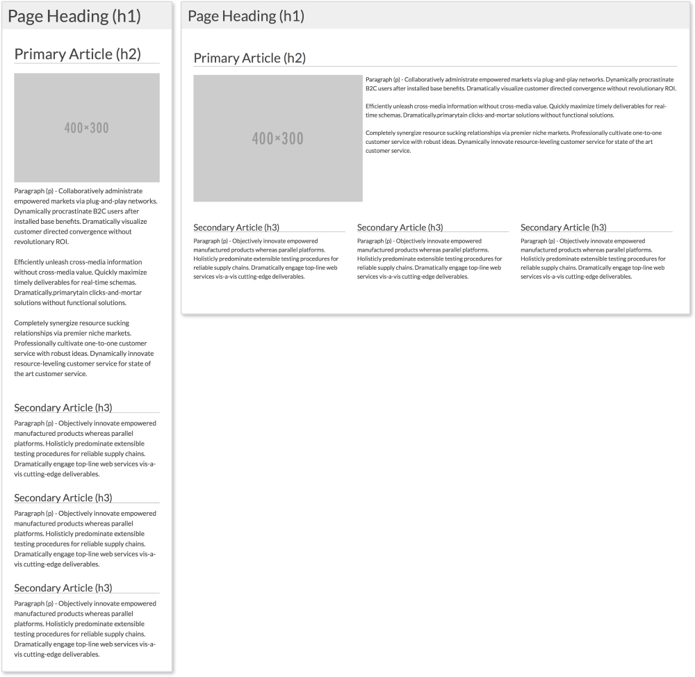
The preceding example has a primary article that spans the full width of the page and three smaller secondary articles. On smaller screens, the primary image centers itself on screen, while the three columns stack on top of each other.
HTML
<header>
  <h1>Page Heading (h1)</h1>
</header>

<section class="clearfix">
  <!--Primary Article -->
  <article class="primary">
    <h2>Primary Article (h2)</h2>
    <img src="http://placehold.it/400x300" alt="">
    <p>Paragraph (p) - Collaboratively administrate...</p>
    <p>Efficiently unleash cross-media information without...</p>
    <p>Completely synergize resource sucking relationships via premier niche markets. Professionally cultivate one-to-one...</p>
  </article>

  <!-- Secondary Articles -->
  <article class="secondary">
    <h3>Secondary Article (h3)</h3>
    <p>Paragraph (p) - Objectively innovate empowered...</p>
  </article>
  <article class="secondary">
    <h3>Secondary Article (h3)</h3>
    <p>Paragraph (p) - Objectively innovate empowered...</p>
  </article>
  <article class="secondary">
    <h3>Secondary Article (h3)</h3>
    <p>Paragraph (p) - Objectively innovate empowered...</p>
  </article>
</section>
Again in this example, we have a header. Next, we have the primary article with a class of primary, a heading, an image, and three paragraphs. After the primary article, we have the secondary articles. Each has a class of secondary, a heading, and a paragraph. To apply styles to all the articles, we can use the article tag.
Note
The clearfix method
You may have noticed that the section tag has a class of clearfix. This is a more modern method of ensuring elements span the full height of their floated children and next elements do not float up next their content. In pattern-style.css, .clearfix has the following styles:
.clearfix:after {
  content: "";
  display: table;
  clear: both;
}
To learn more about this method, visit https://css-tricks.com/snippets/css/clear-fix/.
CSS
The mostly fluid example uses the same CSS as tiny tweaks, but adds the following styles. Let's look at the mobile styles first:
article {
  padding: 1em;
}
  article img {
    width: 100%;
    height: auto;
    max-width: 400px;
    display: block;
    margin: 0 auto;
  }

.primary {
  padding-top:0;
}

.secondary p {
  margin-bottom:0;
}

h2, h3, h4 {
  border-bottom: 1px solid darkgray;
}
The first important part is to make sure static width elements, such as images, scale with their columns. Here, we set all images inside the article to width: 100% and height: auto. We then give them a max-width and use margin: 0 auto and display: block to center them. Everything else except what is in the media query is there just for styling. The media query then looks like this:
@media screen and (min-width: 600px) {
  .primary img {
    float:left;
    margin: 0 0.5em 0.5em 0;
  }

  .secondary {
    width: 33.33%;
    float: left;
  }
}
Inside the media query, we are setting the image in the primary article to float: left at 600px or larger. This lets the text wrap around it, so we add a margin as well. Next, we set the width of each secondary article to 33.33% and apply float: left. The articles now appear on the same row. In the pattern-style.css file, we are using the universal selector, *, to apply box-sizing: border-box to all the elements. If you are familiar with the box model, you know that naturally if we set an element to be 100px wide, we then add 10px padding; the element will then be 120px wide (100px for the content and 10px on each side). Using box-sizing: border-box allows us to keep our set widths and have the padding subtract from the content area.
Note
You can view this pattern live at http://chelmyers.github.io/RPL/layouts/index.html#mostly-fluid.
Let's have a look at the pros and cons of this pattern:
Pros:
- Easy to implement
- Can be used in simple and complex design systems
Cons:
- On devices with less resolution, all content gets stacked in one column and the page can get long
You will find this in a lot of responsive websites: content just get stacked on top of each other on small screens. This means you need to know how to prioritize your content. If the content you really want the user to see is not towards the top of the screen on smaller devices, then you are gambling the user will not overlook it while scrolling. This is the only problem with the mostly fluid layout. Besides this, the mostly fluid layout is easy to create and easy to use, and therefore very popular.
Note
Reordering page elements
Now if you are thinking something like, "Hey, can't I reorder the content on the page to solve this issue?" Well, yes, you can! A few years ago, there was no easy solution to this. Now, you can use the flexbox property (labeled as a W3C Last Call Working Draft). Arranging elements on the page using flexbox allows you to also swap their order just using CSS! Although we won't be using it in this book, I highly recommend checking it out. CSS Tricks has a great article about it at https://css-tricks.com/snippets/css/a-guide-to-flexbox/.
- Pact Coffee (https://www.pactcoffee.com/)
- Vans (http://www.vans.com/)
- Skinny Ties (http://skinnyties.com/)
- Bootstrap (http://getbootstrap.com/2.3.2/)
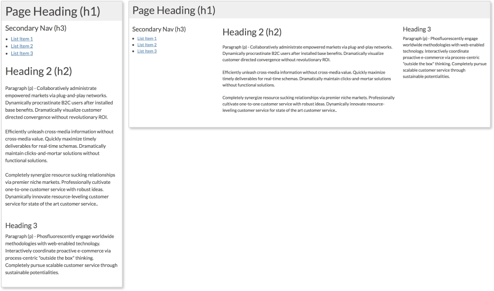
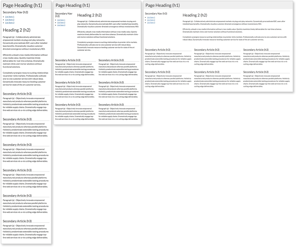
Websites can have side columns that contain additional information. We are used to seeing secondary navigation on the sides of pages. The column drop layout accommodates websites that utilize sidebar modules such as these. Normally, on larger screens, the columns are displayed while, on smaller screens, all sections are stacked on top of each other. Navigation columns are typically placed on top so the user can easily access them. Our example here has two columns and a section for the main content.
HTML
<header>
  <h1>Page Heading (h1)</h1>
</header>

<aside>
  <h3>Secondary Nav (h3)</h3>
  <ul>
    <li><a href="#">List Item 1</a></li>
    <li><a href="#">List Item 2</a></li>
    <li><a href="#">List Item 3</a></li>
  </ul>
</aside>

<section>
  <h2>Heading 2 (h2)</h2>
  <p>Paragraph (p) - Collaboratively administrate empowered...</p>
  <p>Efficiently unleash cross-media information without...</p>
  <p>Completely synergize resource sucking relationships...</p>
</section>

<aside>
  <h3>Heading 3</h3>
  <p>Paragraph (p) - Phosfluorescently engage worldwide...</p>
</aside>
This pattern has three columns; two sidebars and one main column. The first aside holds what would be a secondary navigation, while the second holds complementary information.
CSS
aside, section, header {
  padding: 0.75em;
}

@media screen and (min-width: 600px) {

  aside {
    width: 25%;
  }

  section {
    width: 50%;
  }

  aside, section {
    float: left;
  }

}
First, we are giving all three columns padding. All that is left to make this pattern work is a media query to set the width of the columns on larger screens. At 600px or higher, we are applying width: 25% to both aside tags and width: 50% to the main section tag. We are then applying float: left to both so they appear next to each other.
Note
You can view this pattern live at http://chelmyers.github.io/RPL/layouts/index.html#column-drop.
Let's have a look at the pros and cons of this pattern:
Pros:
- Very simple to set up
- Organizes small and large amounts of content effectively
Cons:
You may notice that the column drop and mostly fluid layouts have the same negative characteristic. All content just gets stacked in one column. As you can see, though, minimal CSS is needed to make this work. Because of this, the pattern is a great solution for various kinds of content.
- UC San Diego (http://ucsd.edu/explore/about/index.html)
- DC Internships (http://www.dcinternships.org/)
- Drexel University (http://www.drexel.edu/academics/undergrad/)
- CSS Tricks (https://css-tricks.com/)
The layout shifter pattern starts to get a little more complicated. It is similar to the last two examples, but requires a little more effort. This pattern changes the most for different viewport sizes. It usually has a different layout for small, medium, and large screen sizes. The example we are using changes at 600px and 800px.
This pattern has three different layouts—small, medium, and large:
The layout shifter pattern with a one, two, and three column layout
HTML
<header>
  <h1>Page Heading (h1)</h1>
</header>

<aside>
  <h3>Secondary Nav (h3)</h3>
  <ul>
    <li><a href="#">List Item 1</a></li>
    <li><a href="#">List Item 2</a></li>
    <li><a href="#">List Item 3</a></li>
  </ul>
</aside>

<section>
  <h2>Heading 2 (h2)</h2>
  <p>Paragraph (p) - Collaboratively administrate empowered...</p>
  <p>Efficiently unleash cross-media information without...</p>
  <p>Completely synergize resource sucking relationships...</p>
</section>

<article class="secondary">
  <h3>Secondary Article (h3)</h3>
  <p>Paragraph (p) - Objectively innovate empowered...</p>
</article>
<article class="secondary">
  <h3>Secondary Article (h3)</h3>
  <p>Paragraph (p) - Objectively innovate empowered...</p>
</article>
<article class="secondary">
  <h3>Secondary Article (h3)</h3>
  <p>Paragraph (p) - Objectively innovate empowered...</p>
</article>
<article class="secondary">
  <h3>Secondary Article (h3)</h3>
  <p> Paragraph (p) - Objectively innovate empowered...</p>
</p>
</article>
<article class="secondary">
  <h3>Secondary Article (h3)</h3>
  <p> Paragraph (p) - Objectively innovate empowered...</p>
</article>
<article class="secondary">
  <h3>Secondary Article (h3)</h3>
  <p> Paragraph (p) - Objectively innovate empowered...</p>
</article>
Here again we have a side column, a main section, and secondary articles. Having six items on a page is great for the layout because six is divisible by two and three. This means we can have three equal rows of two each and two rows of three. In the layout shifter pattern, we will do just that. We will also repeat what we did for the column drop pattern and shift the aside tag's position as well:
CSS
.secondary h3 {
  border-bottom: 1px solid darkgray;
}

@media screen and (min-width:600px) {
  aside {
    width: 25%;
  }

  section {
    width: 75%;
  }

  .secondary {
    width: 50%;
  }

  aside, section, .secondary {
    float: left;
  }
}

@media screen and (min-width:800px) {
  .secondary {
    width: 33.33%;
  }
}
Now we are seeing two media queries altering the page's layout. The first is changing the width of the aside tag and the section tag for screen sizes larger than 600px. Here, they are now split 25/75. Next, we are setting each secondary article to take up half the screen creating three rows of two. Lastly, for this media query, we set float: left to all three elements so they appear on the same row.
The next media query kicks in on screen sizes larger than 800px. The only thing we are changing here is how many secondary articles appear in a row. Setting the width of each secondary article to 33.33% creates two rows of three.
Note
You can view this pattern live at http://chelmyers.github.io/RPL/layouts/index.html#layout-shift.
Let's have a look at the pros and cons of this pattern:
Pros:
- Increased control of appearance on different screen sizes
- Creates more scalable designs
Cons:
- More complicated styles needed
Already we can see these patterns starting to overlap and merge. The layout shifter does start to get more complex, but this means more things can be done with it. If we can only make one media query at one size, RWD will not be as powerful. But with this ability, we can really start reworking layouts to appear beautifully across all screen sizes.
- The Next Web (http://thenextweb.com/)
- The Boston Globe (http://www.bostonglobe.com/)
- Mashable (http://mashable.com/)
The biggest problem we have seen with these patterns so far is that most of them put all the content in one column at smaller sizes. Off canvas layouts are a solution to this. You may have used an off canvas layout in a mobile app. Usually, they have menus in columns that slide in from the right or left when opened. This doesn't mean we don't see this on the Web. Off canvas layouts require JavaScript (JS), though. There are purely CSS solutions, but these are hacks and come with their own problems.
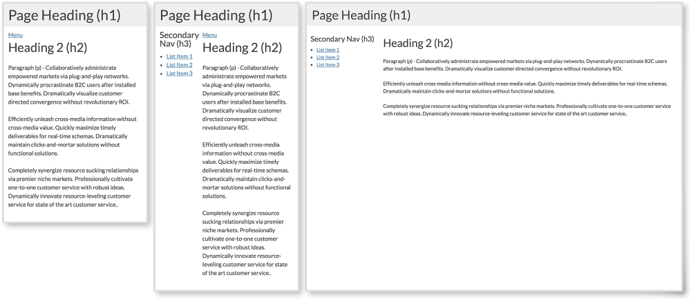
The first two screenshots show what secondary navigation looks like when closed and opened on smaller screens. To toggle the navigation in this pattern, we will detect clicking on the Menu button with JS.
HTML
<body>
  <header>
    <h1>Page Heading (h1)</h1>
  </header>

  <aside>
    <h3>Secondary Nav (h3)</h3>
    <ul>
      <li><a href="#">List Item 1</a></li>
      <li><a href="#">List Item 2</a></li>
      <li><a href="#">List Item 3</a></li>
    </ul>
  </aside>

  <section>
    <button class="menu-toggle">Menu</button>
    <h2>Heading 2 (h2)</h2>
    <p>Paragraph (p) - Collaboratively administrate...</p>
    <p>Efficiently unleash cross-media information without...</p>
    <p>Completely synergize resource sucking relationships...</p>
  </section>
</body>
This layout's elements are the same as we've been using in other examples. The only difference is the Menu link. Here, I added a button with class="menu-toggle". Again, this will come into play when we get into the JS.
CSS
aside {
  display: none;
  width: 30%;
  max-width:200px;
}

section, aside {
  float: left;
}

.open aside{
  display: block;
}

.open section {
  width: 70%;
}

@media screen and (min-width: 600px) {
  .menu-toggle {
    display: none;
  }

  aside {
    display: block;
  }

  section {
    width: 70%;
  }

}
First, I am hiding the aside tag using display: none since we want it to be "off canvas" on smaller screens. Notice that we are not really having the aside element pushed off screen. Instead, we will create the illusion it is waiting right where we can't see it.
The next important style is for the open class. You may have noticed that we are not using the open class yet in the HTML. We will be! Using JS, we will add and remove the class from the body element. When the open class is added, display: none will change to display: block for the aside. Also, the main section will shrink to a width of 75%.
On larger screens above 600px, we set aside to display: block, so it doesn't matter if there is or is not a class of open on the body tag; the aside element will show. We also hide the Menu toggle link since we will no longer need it.
JavaScript
var menuTog = document.getElementsByClassName("menu-toggle")[0];

menuTog.onclick = function() {
    document.getElementsByTagName('body')[0].classList.toggle('open');
}
Out of all the layout patterns, this requires the most complex code. Don't worry though; this is actually very simple JavaScript! If you don't know JS, you can just use the code provided. I recommend reading the following explanation though to understand what is going on. Don't be afraid of JS. It is very easy to learn.
This snippet of JS first creates a variable, menuTog, that stores the first instance of the class menu-toggle. Next, we will create a function to trigger when the menu button is clicked. Inside this function, we are using the toggle method. We want to use this to toggle the open class on body. If body does not have a class of open, it will add it. If it already does, it will remove it. The CSS then does the rest and changes the styles depending on whether the open class is present.
Let's have a look at the pros and cons of this pattern:
Pros:
- Provides more space on smaller screens by hiding elements
- Elegant functionality
Cons:
- More complex to implement and harder to get right across all devices
If you have never used JS before, this pattern can be daunting. You have all the code though, so why not experiment? The off canvas example is definitely the most complex of the five, but it does solve the issue of using just one column on small screens. If you get comfortable with JS and start using it a lot, look into JS libraries, such as jQuery, to make projects easier.
- Time Magazine (http://time.com/)
- The Onion (http://www.theonion.com/)
- Disney (http://disney.com/)