Table of Contents for
Responsive Web Design Patterns
 Responsive Web Design Patterns
Published by
Packt Publishing, 2015
Responsive Web Design Patterns
Published by
Packt Publishing, 2015
- Cover
- Table of Contents
- Responsive Web Design Patterns
- Responsive Web Design Patterns
- Credits
- About the Author
- About the Reviewers
- www.PacktPub.com
- Preface
- What you need for this book
- Who this book is for
- Conventions
- Reader feedback
- Customer support
- 1. Creating a Home for Responsive Patterns
- Why and how to create a responsive site
- Breaking websites down to their patterns
- Building a home for your patterns
- Summary
- 2. The Main Stage – Building Responsive Layouts
- Most popular layout patterns
- Creating complex systems
- Summary
- 3. Make Way for Responsive Navigations
- Responsive navigation patterns
- Summary
- 4. From Static to Dynamic – Embedding Media
- Responsive image patterns
- Understanding sliders and carousels
- Implementing videos
- Summary
- 5. Gathering and Displaying Information
- Responsive table patterns
- Summary
- 6. Combining Responsive Patterns
- Continuing to look for patterns
- Your pattern library is not done yet!
- Summary
- 7. Ship It – Finalizing Your Pattern Library
- Getting ready to handoff
- Publishing your library
- Further exploration
- Summary
- Index
When looking for information, rarely do we open up a website and land exactly on the page we were looking for. Maybe if we are lucky, whatever we are trying to find is featured on the home page. But if we are looking for contact information, operation hours, or a specific article, our luck runs out. When we are searching for information, we typically use a website's navigation to traverse through the pages.
Main navigations can range from just a few links to a collection of all the pages you can access on a site. How small or large they are depends on the size of the site. Websites such as NASA have a wealth of information available to the public and need an extensive navigation to help users find what they are looking for. Smaller websites, such as personal portfolio sites, have smaller navigations with maybe three to six links. To develop for this wide range of navigation sizes, there are several responsive navigation patterns that we can use. In this chapter, we will review:
- The most popular responsive navigation patterns
- What size navigation they can comfortably hold
When creating a responsive website, you do not have the freedom to jam as many links in the main navigation as you please. Even if you did have the luxury of screen space guaranteed, you still should never do that. Great navigation considers what content the user needs to get to and provides them with an easy path to get to it. Navigations are a manifestation of a website's information architecture (IA). Main navigations are a high-level summary of a website's organization. Each project's IA will be different. Larger projects can even have a person completely dedicated to IA and content strategy.
Unfortunately, we don't always have an information architect on our team or we are working alone. This does not mean we should skip IA though. RWD adds another constraint when planning out the IA of a project. When you are developing a navigation for your responsive website, first think of what the navigation will look like on smaller screens. Like a page's layout on small screens, one strategy for navigation is to stack their items on top of each other. As mentioned in the previous chapter, though, just stacking items of top of each other makes for one long skinny page that can potentially push important content down. To avoid a long navigation on smaller devices, prioritize what is actually included. This small screen constraint can jump-start your IA planning. Make sure that every item included in the navigation is important to the types of users who visit the website. Unnecessary items in the navigation will clutter it and obscure the crucial content of the site. Of course, sometimes long navigations cannot be avoided. Every project you work on will probably be a different size. This chapter will equip you with solutions for developing navigations of any size.
Before we get into navigation patterns, I want to take a moment to talk about a controversial but widely used tool for responsive navigations—the hamburger icon. By now, you either have at least seen it online or used it in your own web designs. Looking at the following image, you can see different versions of this icon. Just because it is so widely used though doesn't mean it should be our go-to solution for responsive navigations.
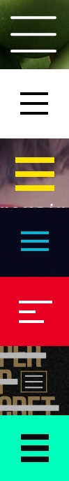
The hamburger icon is not new; it has been around for over 30 years. It's called the hamburger icon because those three little bars look like a hamburger's top bun, patty, and bottom bun. This meat-themed UI element is actually the list icon. Each bar doesn't represent a piece of food, but instead a list item. Typically, clicking this icon toggles the navigation's visibility.
Our pattern examples will not be using the hamburger icon. Personally, I don't hate the hamburger icon. Are there better solutions though? Of course! If you asked a non-tech-savvy member of your family (looking at you, Grandma) what those three lines meant on a website, I would say there is less than a 50% chance that she would know what it is. The web publication, Exis (http://exisweb.net/), looked into the hamburger icon to see if users actually understood it. The director, James Foster, did a simple AB test measuring the engagement of two navigation icon variations. The first was the hamburger icon and the second just the word "Menu" with a border around it. After gathering data from over 240,000 Android visitors, Foster found that there was a 20% increase in engagement with the second variation. The engagement with the hamburger icon was still high enough though that Foster concluded it could be ubiquitous. So either way, the hamburger icon or just text, users were finding the navigation. Another solution is to use the hamburger icon, but keep the label "Menu" underneath it. This is kind of the best of both worlds, if you have the screen space for it.
Note
To read more about this study, visit http://exisweb.net/menu-eats-hamburger.
Whether you use the hamburger icon in your projects or not, that is up to you. Some designers and developers argue that, since it is so widely used, people are learning what it means. And yes, Exis and Foster found that this might be true. But if there is another way that our users could understand better, why not explore it?