Table of Contents for
Responsive Web Design Patterns
 Responsive Web Design Patterns
Published by
Packt Publishing, 2015
Responsive Web Design Patterns
Published by
Packt Publishing, 2015
- Cover
- Table of Contents
- Responsive Web Design Patterns
- Responsive Web Design Patterns
- Credits
- About the Author
- About the Reviewers
- www.PacktPub.com
- Preface
- What you need for this book
- Who this book is for
- Conventions
- Reader feedback
- Customer support
- 1. Creating a Home for Responsive Patterns
- Why and how to create a responsive site
- Breaking websites down to their patterns
- Building a home for your patterns
- Summary
- 2. The Main Stage – Building Responsive Layouts
- Most popular layout patterns
- Creating complex systems
- Summary
- 3. Make Way for Responsive Navigations
- Responsive navigation patterns
- Summary
- 4. From Static to Dynamic – Embedding Media
- Responsive image patterns
- Understanding sliders and carousels
- Implementing videos
- Summary
- 5. Gathering and Displaying Information
- Responsive table patterns
- Summary
- 6. Combining Responsive Patterns
- Continuing to look for patterns
- Your pattern library is not done yet!
- Summary
- 7. Ship It – Finalizing Your Pattern Library
- Getting ready to handoff
- Publishing your library
- Further exploration
- Summary
- Index
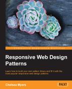
With HTML5, videos are a lot easier to implement into our websites. Video services such as Vimeo and YouTube even provide ways for us to embed videos into our site. Less and less are we seeing people hosting their own video. Why would we do that when YouTube will host it, convert it into every format we need, and then give us the one line of HTML we need to put in on my site? Regardless of how you choose to host your videos, you still need to make them scale on your responsive website. The following examples aren't exactly patterns, but instead treatments. Just like you were shown how to scale images, we will review how to scale videos and iframes.
As mentioned, you can host your videos yourself or through a third party. Both can be responsive, but using the HTML5 video element makes it a lot easier. For my example, I am using a video of an animated series I worked on. If you don't have your own video, feel free to practice with these (for example, http://chelmyers.github.io/RPL/media/v/cbmd.mp4). In the following screenshot, you can see this video scaling along with the browser:
HTML
<video controls>
  <source src="http://chelmyers.github.io/RPL/media/v/cbmd.mp4 " type="video/mp4"/>
  <source src="http://chelmyers.github.io/RPL/media/v/cbmd.webm" type="video/webm"/>
  <source src="http://chelmyers.github.io/RPL/media/v/cbmd.ogv" type="video/ogv"/>
  Your browser does not support the HTML5 video tag.
</video>
We are just using the basic HTML5 video element here. I have one video in three different formats so it appears on every browser. I even have a message in case the browser does not support the video tag.
CSS
video {
  max-width: 100%;
  height: auto;
}
Yup, that's it. You can scale videos the same way you scale images. The max-width makes sure the video doesn't scale past its actual size and height:auto helps keep its aspect ratio. What were you hoping for, something more difficult?
Note
View this example live at http://chelmyers.github.io/RPL/media/index.html#video.
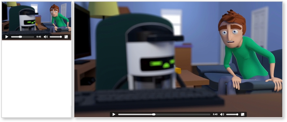
I wish I could say that scaling iframes are just as easy as video elements, but sadly I cannot. The iframe takes a little bit more work. However, as you can see in the following image, it is still possible:
HTML
<div class="video-wrap">
  <iframe width="560" height="315"
    src="https://www.youtube.com/embed/l9uqeTHrD9U"
    frameborder="0" allowfullscreen></iframe>
</div>
To get iframes working, we must wrap them in a container. With CSS, we will then make the container the size we wish the iframe to be. We will then stretch the iframe to fit this container. So, when the container scales up or down, the iframe will too.
CSS
.video-wrap {
  position: relative;
  height: 0;
  padding-bottom: 56.25%; /* % of element's width. Ex. 9/16 = 0.5624 */
  padding-top: 32px; /*height of controls*/
}

.video-wrap iframe {
  position: absolute;

  top: 0;
  left: 0;
  width: 100%;
  height: 100%;
}
For the iframe's container, or .video-wrap, we are setting position to relative so that we can position the iframe relative to it. We are setting the height to 0 because padding-bottom will be giving us the height we need. Setting the padding-bottom to 56.25% will make .video-wrap height 56.25% of its width. So, if our video has a 16:9 resolution, to figure out what the padding-bottom value should be, we divide 9 by 16 (that's 0.5625) and multiple it by 100. The padding-top value is making space for the videos controls. The second part, for .video-wrap iframe, is stretching the iframe to fit this new container.
Note
View this example live at http://chelmyers.github.io/RPL/media/index.html#iframe.
It takes a little bit more work, but it is still easy to set up. Whether you use the HTML5 video elements or keep your videos on YouTube, there's no reason why they shouldn't scale as well.