Table of Contents for
Responsive Web Design Patterns
 Responsive Web Design Patterns
Published by
Packt Publishing, 2015
Responsive Web Design Patterns
Published by
Packt Publishing, 2015
- Cover
- Table of Contents
- Responsive Web Design Patterns
- Responsive Web Design Patterns
- Credits
- About the Author
- About the Reviewers
- www.PacktPub.com
- Preface
- What you need for this book
- Who this book is for
- Conventions
- Reader feedback
- Customer support
- 1. Creating a Home for Responsive Patterns
- Why and how to create a responsive site
- Breaking websites down to their patterns
- Building a home for your patterns
- Summary
- 2. The Main Stage – Building Responsive Layouts
- Most popular layout patterns
- Creating complex systems
- Summary
- 3. Make Way for Responsive Navigations
- Responsive navigation patterns
- Summary
- 4. From Static to Dynamic – Embedding Media
- Responsive image patterns
- Understanding sliders and carousels
- Implementing videos
- Summary
- 5. Gathering and Displaying Information
- Responsive table patterns
- Summary
- 6. Combining Responsive Patterns
- Continuing to look for patterns
- Your pattern library is not done yet!
- Summary
- 7. Ship It – Finalizing Your Pattern Library
- Getting ready to handoff
- Publishing your library
- Further exploration
- Summary
- Index
HTML is naturally responsive, but for years web developers were taught to force sites to remain fixed at one size. In 2010, Ethan Marcotte brought to our attention the fact that people are no longer accessing the Internet through only desktops and laptops. With the launch of the iPhone came hundreds of other devices that put the Internet on small screens and in our pockets. But the Web wasn't ready to be viewed on such small devices. Marcotte's article, Responsive Web Design (http://alistapart.com/article/responsive-web-design) acted like a wake up call ushering us into a new realm of web design.
If web design is new to you, you may not be familiar with what RWD is. RWD is creating one website that responds to the size of the viewport. The same website renders on both smartphone and desktop devices. It is the same markup, but with CSS media queries changing styles depending on the browser's resolution. A delightful example is UK web design agency, Stuff & Nonsense's website (http://www.stuffandnonsense.co.uk/).
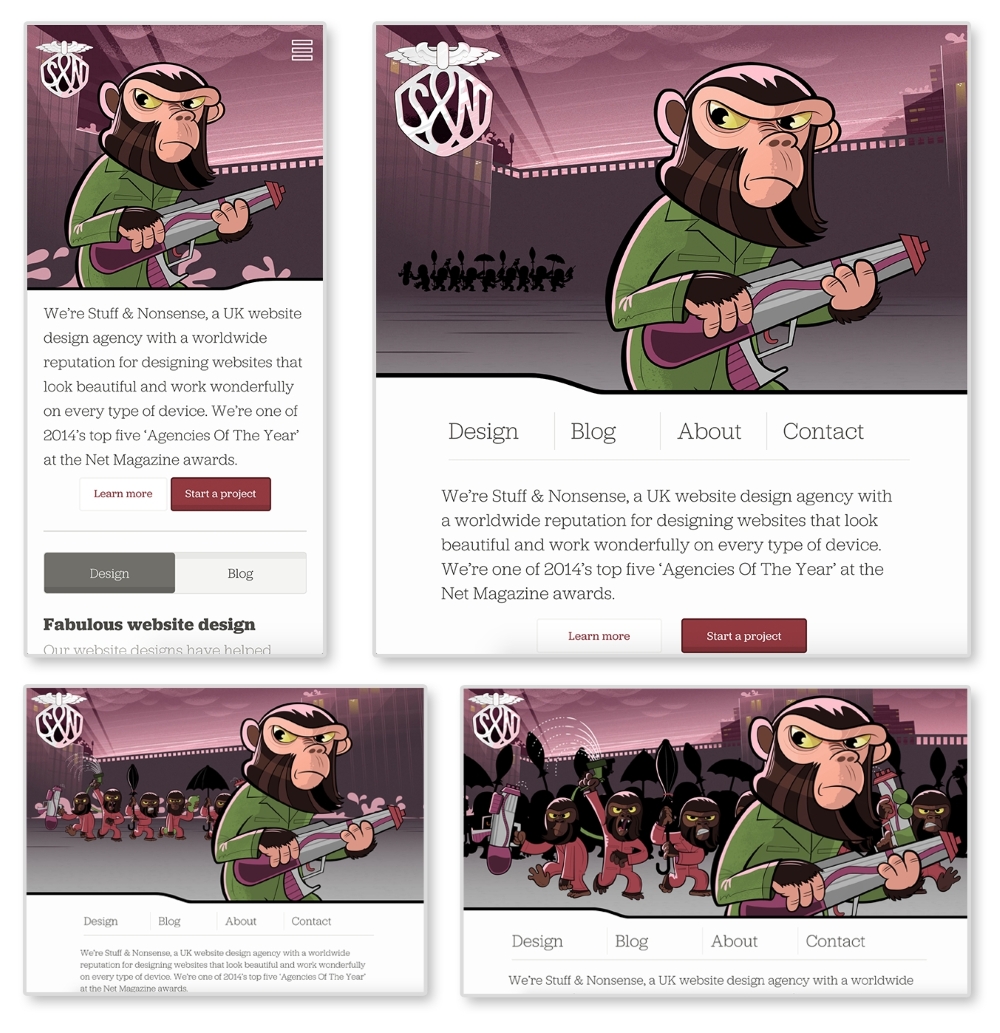
The preceding images are of Stuff & Nonsense's website at 400px, 800px, 1100px, and 1400px wide, respectively. The same site is served on both my smartphone and my laptop. The biggest difference between each screen size is the imagery in the header. Yes, the navigation, font sizes, and layout of the page are changing between each size as well. But the best part of this site is the advancing monkey army in the background as your browser size changes.
This is what RWD is doing technically. As developers, we are changing how the site appears depending on the viewport. As designers, we are rethinking the content that appears on smaller screens to make sure our users are receiving the information they need quickly and efficiently. Stuff & Nonsense's design requires some more advanced techniques, but can serve as an inspiration for what RWD can do.
Media queries were introduced with the debut of CSS3. They allow web developers to control what CSS styles are applied depending on variables such as the device width, height, aspect ratio, resolution, and orientation. The following is an example of a standard media query:
@media screen and (max-width: 500px) {
  body {
    color: red;
  }
}
The first part, screen, indicates what media type the media query applies to. In this case, screen refers to computer, mobile, and tablet screens. Another commonly used media type is print. The @media print annotation will apply only when the page is being printed.
Next and (max-width: 500px) is setting the
media feature. Instead of max-width, we can also use features such as min-width, orientation, and resolution. Right now, this media query will only apply the CSS style, body{color: red;}, when the site is being viewed on a screen when the viewport is less than 500px wide. When both of these requirements are met, the site's font color will be red.
Note
Check out the W3C's (http://dev.w3.org/csswg/mediaqueries-4/) specifications on media queries to see what other media types and media features there are.
To use media queries, you first must place them in your style sheet. Throughout my time working on responsive websites, I have found two methods commonly used for organizing media queries. I have listed the methods in the following steps and shown a version of each with the media queries highlighted:
- Grouping styles by pattern (header, navigation, footer, and so on) and writing a new media query for each:
/*HEADER*/
header {
  background-color: blue;
}
@media screen and (min-width: 800px) {
  header {
    background-color: red;
  }
}

/*NAVIGATION*/
nav li {
  display: block;
}
@media screen and (min-width: 800px) {
  nav li {
    display: inline-block
  }
}
This method works better if you are working on a larger website and using a CSS precompile such as Sass. Sass allows you to nest your CSS, meaning you can nest media queries within a rule. I personally use this method on my projects. It works best when you break up your CSS into separate files and keep your CSS modular.
- Grouping styles by media query and writing pattern styles under each:
/*Base Styles*/
header {
  background-color: blue;
}

nav li {
  display: block;
}

/* Width 800px and up */
@media screen and (min-width: 800px) {
  header {
    background-color: red;
  }
  nav li {
    display: inline-block
  }
}
Tip
Downloading the example code
You can download the example code files from your account at http://www.packtpub.com for all the Packt Publishing books you have purchased. If you purchased this book elsewhere, you can visit http://www.packtpub.com/support and register to have the files e-mailed directly to you.
Grouping the CSS rules together under one media query works better on smaller websites where the CSS is not as extensive. We will be using this method for our pattern library because the design system is very simplistic. If the CSS gets larger, this method can become cumbersome. Right now, the rules are close together in their file because there are not many of them. But as a CSS file grows, there can be a lot of distance between a rule that dictates styles on mobile and the media query that changes it on a larger viewport. This means there is a lot of scrolling back and forth to make tweaks.
Note
Custom media queries
A potential solution to this problem could be on the horizon. The W3C's Media Queries Level 4 specifications include a concept for custom media queries (http://dev.w3.org/csswg/mediaqueries-4/#custom-mq). It will allow aliases for media queries to be declared with @custom-media and reused throughout the site.
Both of these examples are using mobile first design. Here, we write the styles for the smallest screen size first and work our way up. Google Product Director, Luke Wroblewski, popularized the mobile first concept in his book, Mobile First (http://abookapart.com/products/mobile-first). Designing mobile first means designing the mobile experience before the rest of the site. Working within mobile constraints from the beginning forces designers and clients to prioritize and focus their content. It is easier to work your way up to a complex desktop website than squish a desktop site onto a small screen. If you start adding media queries and find one style sheet is getting too big, you can use @import to break out each pattern or media query into its own file and import it into one main style sheet. Whatever method you choose, just make sure that you keep your code organized and well commented.
If you start adding media queries to your CSS file without setting the proper meta tag in your HTML file, you'll find your website looking no different when it loads on a mobile device. Most mobile devices automatically zoom out and increase the browser's size to fit the website. Setting a responsive meta tags forces the device's browser to be the same width as the device's screen:
<meta name="viewport" content="width=device-width, initial-scale=1">
Put this meta tag in the <head> of your HTML files to overcome the device's zooming. This meta tag sets the browser width to the width of the device (width=device-width). The second part, initial-scale=1, makes sure that no automatic zooming occurs by setting the browser's scale to 1.