Table of Contents for
Responsive Web Design Patterns
 Responsive Web Design Patterns
Published by
Packt Publishing, 2015
Responsive Web Design Patterns
Published by
Packt Publishing, 2015
- Cover
- Table of Contents
- Responsive Web Design Patterns
- Responsive Web Design Patterns
- Credits
- About the Author
- About the Reviewers
- www.PacktPub.com
- Preface
- What you need for this book
- Who this book is for
- Conventions
- Reader feedback
- Customer support
- 1. Creating a Home for Responsive Patterns
- Why and how to create a responsive site
- Breaking websites down to their patterns
- Building a home for your patterns
- Summary
- 2. The Main Stage – Building Responsive Layouts
- Most popular layout patterns
- Creating complex systems
- Summary
- 3. Make Way for Responsive Navigations
- Responsive navigation patterns
- Summary
- 4. From Static to Dynamic – Embedding Media
- Responsive image patterns
- Understanding sliders and carousels
- Implementing videos
- Summary
- 5. Gathering and Displaying Information
- Responsive table patterns
- Summary
- 6. Combining Responsive Patterns
- Continuing to look for patterns
- Your pattern library is not done yet!
- Summary
- 7. Ship It – Finalizing Your Pattern Library
- Getting ready to handoff
- Publishing your library
- Further exploration
- Summary
- Index
A website's navigation is the most important tool for the user. It should provide quick access to all that the website has to offer. It should also never get in the way. Next, we will review examples of popular responsive patterns that make navigating websites easy on both small and large screens. There is a large range of navigational patterns found on responsive websites today. In this chapter, we will look at the five most commonly found patterns and why they are so widely used.
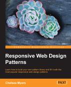
As mentioned, a common method for creating a responsive navigation is to let it simply stack up on smaller screens. This is why we'll call it the simple stack pattern. For small navigations, this pattern can do the trick. It is typically where newcomers to RWD start when building smaller websites. As seen here, the navigation floats to the right on large screens, but stacks on small ones.
Small sites can grow over time and navigation needs to be updated. Just like stacking content on small screens for layouts, stacking navigational items inhibits a website's navigation from growing. When a stacked navigation grows, it will get longer and take up more vertical space. A mobile user might visit the website, and only see the navigation.
HTML
<header class="clearfix">
  <div class="header-inner">
    <h1>Page Heading (h1)</h1>
    <nav>
      <ul>
        <li><a href="#">Home</a></li>
        <li><a href="#">About</a></li>
        <li><a href="#">Our Portfolio</a></li>
        <li><a href="#">Our Services</a></li>
        <li><a href="#">Contact Us</a></li>
      </ul>
    </nav>
  </div>
</header>
The markup for this pattern is fairly straightforward. We have a header tag containing our h1 page heading and a nav tag containing an unordered list. The unordered list has a list item, li, for every navigation item we want.
CSS
header h1 {
  margin-bottom: 0.25em;

}

nav li {
 list-style: none;
 padding: 0.25em 0.5em 0 0;
}
 nav li a {
  text-decoration: none;
 }

@media only screen and (min-width: 750px){
  header h1 {
    float: left;
    margin:0;
  }

  nav {
    float: right;
  }
   nav li {
    display: inline-block;
   }
}
First off, we are using the clearfix class again so the header accounts for its floated children. Pretty much everything else outside the media query is for style, not functionality.
Unordered lists naturally stack. In the media query, we are breaking this. At a 750px width, we set the h1 tag to float: left and the nav tag to float: right. We then style the navigation to appear on one row by setting the list items, li, to display: inline-block. No longer will each item take up its own row. They will appear inline with each other.
Note
View this example live at http://chelmyers.github.io/RPL/navigation/index.html#simply-stacked.
Let's have a look at the pros and cons of this pattern:
Pros:
- This requires very little code
- This is great for smaller websites with fewer navigation items
Cons:
The simple stack pattern is, well, simple. If the website you are creating only has a few pages users need direct access to, this is a good solution. If this is not the case, though, you are going to need something a little more robust.
Tip
Navigation's magic number
I've heard of different "safe" numbers for capping how many items you allow in a simply stacked navigation. Some believe that, if you have more than six, you should use a different solution. Others cap it as low as three items. Instead of just arbitrarily picking a number and going with that, I would suggest prototyping it. You can use this pattern from the RPL and modify it. By creating this HTML and CSS mockup of the menu, you can test it on the smallest device your website needs to support. From this, you can quickly gauge how many navigation items would be too many.
- Hirondelle USA (http://hirondelleusa.org/)
- Steven Caver (http://stephencaver.com/)
- 3200 Tigres (http://3200tigres.wwf.fr/)
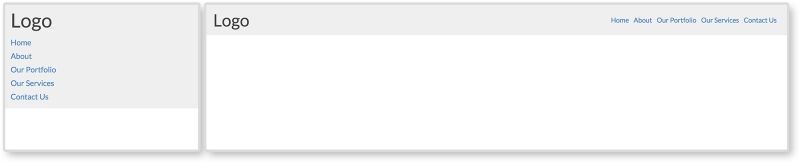
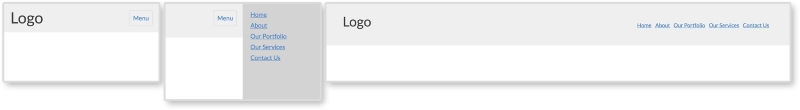
If the simple stack pattern had an evil twin, it would be the anchor and footer pattern. To be honest, this isn't fair to say. The anchor and footer pattern is not evil or bad, it is just the same pattern but at the opposite position on the page. This pattern typically looks the same as the simple stack pattern on larger screens. On smaller screens, though, the navigation can be found in the footer of the site. As seen in the following screenshot, instead of a menu in the header, there is a link that jumps to the footer when clicked:
HTML
<header class="clearfix">
  <h1>Logo</h1>
  <a class="menu-btn" href="#menu">Menu</a>
</header>

<div class="content">
  <p>Content goes here.</p>
</div>

<footer>
  <div class="footer-inner">
    <h3>Footer</h3>

    <nav id="menu">
      <ul>
        <li><a href="#">Home</a></li>
        <li><a href="#">About</a></li>
        <li><a href="#">Our Portfolio</a></li>
        <li><a href="#">Our Services</a></li>
        <li><a href="#">Contact Us</a></li>
      </ul>
    </nav>
  </div>
</footer>
For this example, we almost have the full HTML structure for a whole page. We have a header, some content, and a footer. The navigation lives in the footer of the markup though. We will be using CSS to reposition it on larger screens. The anchor tag with a class of .menu-btn in the header is a jump link set to jump to the element with an ID of "menu." We can see that the nav tag in the footer has this ID. This means when we click the menu button in the header, we will jump to the footer.
CSS
.menu-btn {
  float:right;
}

header h1 {
  float: left;
}

nav li {
  list-style: none;
  padding: 0.50em;
}
  nav li a {
   text-decoration: none;
 }

footer {
  padding: 0.75em;
}

@media screen and (min-width: 750px) {
  .menu-btn {
    display: none;
  }

  nav {
    position: absolute;
    top:0.75em;
    right:0.75em;
  }
   nav li {
    display: inline-block;
   }
}
On small screens, we have only a heading and a jump link. We float the menu link to the right and apply some styling to the header, navigation, and footer. For larger screens, we hide the jump link with display: none and reposition the navigation in the media query. Remember, the navigation will appear naturally in the footer because that is where it lives in the markup. To get it to the top of the page, we use position: absolute and position the navigation 0.75em from the top and right of the page. This means that, on screens larger than 750px wide, the navigation leaves the footer and appears at the top right of the website.
Tip
Absolute positioning
Positioning elements on a page can get tricky with CSS. Sometimes, it seems like the elements have their own mind and go wherever they please. The biggest tip I can offer with using position: absolute, is that absolutely positioned elements are relative to the closest parent element with a position of relative, absolute, or fixed being applied. If no parent element has one of these styles, the element will be positioned relative to the viewport.
View this example live at http://chelmyers.github.io/RPL/navigation/index.html#anchor.
Let's have a look at the pros and cons of this pattern:
Pros:
- Content is not pushed down even further by longer navigations
- Can accommodate for medium navigations (+-8 links) since it is only taking up space at the bottom of the page
- Very easy to implement
Cons:
Although the anchor and footer pattern solves the big issue with stacking navigation items, it creates its own problems. Anchor and footer patterns can be jarring to the user since they jump from the top of the page to the bottom. This can be disorienting. The navigation can even be missed since it is in an unconventional spot. But this pattern does a fantastic job in saving screen space by having the navigation at the bottom of the page on smaller screens. Its problems can be reduced too. The jarring jump can be replaced with a smooth scroll to the footer with the help of JavaScript. And designing the menu button in a way so it cannot be missed will help make sure the footer menu is not missed either. The anchor and footer pattern is a great pattern that accommodates small- and medium-sized navigation systems. It's a step up from the simple stack method in terms of capacity.
- Contents Magazine (http://contentsmagazine.com/)
- Thibaut Sailly (http://bureau.tsailly.net/)
- Mobilism 2011 (http://mobilism.nl/2011)
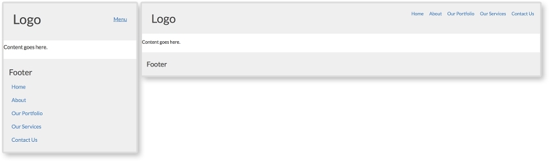
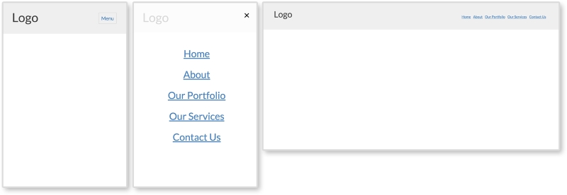
The next two patterns are the most common RWD navigational patterns and will need JS. The toggle is a navigation that is hidden in a drawer on small devices. The drawer can then be toggled open and shut using JS. In the RPL example, as seen here, we are using the same navigation as before but giving it a different background color so that we can see this drawer effect more clearly. Look at the first two images to see the drawer closed and then opened. On large screens, the navigation is always visible.
HTML
<body>
  <header>
    <div class="header-inner">
      <h1>Logo</h1>
      <button class="menu-toggle">Menu</button>
    </div>

    <nav>
      <ul>
        <li><a href="#">Home</a></li>
        <li><a href="#">About</a></li>
        <li><a href="#">Our Portfolio</a></li>
        <li><a href="#">Our Services</a></li>
        <li><a href="#">Contact Us</a></li>
      </ul>
    </nav>
  </header>
</body>
The main difference between this pattern's markup and the past two is a new div tag wrapped around the page heading and the menu button. This helps separate the top section from the navigation on smaller screens. And just like the off canvas layout pattern in Chapter 2, The Main Stage – Building Responsive Layouts, we will be using JS here to toggle a class on the body tag.
CSS
header {
  padding:0;
}

header h1 {
  float: left;
}

nav {
  padding: 0.75em;
  background: lightgray;
  display: none;
}

  nav li {
    padding: 0.25em 0 0 0.5em;
  }
    nav a {
      display: block;
    }

.menu-toggle {
  float: right;
  text-decoration: none;
  padding: 0.5em;
  border: 1px solid lightgray;
  border-radius: 3px;
}
  .menu-toggle:hover {
    background-color: lightgray;
  }

.open nav {
  display: block;
}


@media screen and (min-width: 750px) {
  .menu-toggle {
    display: none;
  }

  nav {
overflow: auto;
display: block;
}
  nav ul {
    float: right;
  }
    nav li {
      display: inline-block;
    }

}
Most of the preceding CSS is just styling the pattern. We are giving the navigation a different background color and styling the menu button and its hover state. Just like in the previous chapter, we are using the .open class to show and hide the navigation. Using JS, we will apply a class of open to the body and style elements on the page with that class. Here, we will set the navigation to display: block when the open class is applied. Using a media query, we will then make sure that the menu button is hidden and the navigation is always shown (by using display: block).
JavaScript
var menuTog = document.getElementsByClassName("menu-toggle")[0];

menuTog.onclick = function() {
  document.getElementsByTagName('body')[0].classList.toggle('open');
}
The JS for this pattern is the same as the off canvas layout pattern in Chapter 2, The Main Stage – Building Responsive Layouts. For a more in-depth overview of what this JS is doing, please refer to the off canvas pattern in that particular chapter. The JS again is toggling the class open on the body tag when the menu button is clicked. This allows us to toggle the CSS styles that show and hide the navigation on smaller screens.
Note
View this example live at http://chelmyers.github.io/RPL/navigation/index.html#toggled.
Let's have a look at the pros and cons of this pattern:
Pros:
- This pattern can hold larger navigation systems
- This takes up zero pixels when closed
Cons:
The toggle and anchor and footer patterns can hold the same amount of content. Both are invisible until you click a link or button to activate them. The toggle pattern is very popular. It takes up no space on the page until opened. This means the content on the page is not pushed down until after the user decides to open the menu.
- Temple University (http://www.temple.edu/)
- Sparkbox (http://seesparkbox.com/)
- Black Hills Energy (https://www.blackhillsenergy.com/)
We have essentially covered the off canvas pattern in Chapter 2, The Main Stage – Building Responsive Layouts. Both the off canvas layout pattern and the off canvas navigation pattern work the same way. The content is hidden off screen until the menu button is clicked. The page then moves to the side, making the off canvas section appear to be shifted back on stage. It uses the same JS as the last pattern as well. View the following example to see the similarities:
HTML
<body>
  <div class="on-canvas">
    <header>
      <div class="header-inner">
        <h1>Logo</h1>

        <button href="#" class="menu-toggle">Menu</button>

        <nav>
          <ul>
            <li><a href="#">Home</a></li>
            <li><a href="#">About</a></li>
            <li><a href="#">Our Portfolio</a></li>
            <li><a href="#">Our Services</a></li>
            <li><a href="#">Contact Us</a></li>
          </ul>
        </nav>
      </div>
    </header>
  </div>

  <nav class="off-canvas">
    <ul>
      <li><a href="#">Home</a></li>
      <li><a href="#">About</a></li>
      <li><a href="#">Our Portfolio</a></li>
      <li><a href="#">Our Services</a></li>
      <li><a href="#">Contact Us</a></li>
    </ul>
  </nav>
</body>
The biggest difference with the off canvas pattern is that the navigation markup needs to be in two places. Here, we have two main sections, "on canvas" and "off canvas". All of the page's content is within the "on canvas" section, including the navigation we see on larger screens. The "off canvas" section contains the mobile navigation that will push all the on canvas content over. There are more advanced methods to get this pattern to work that don't require duplicating the navigation, but they require about three times the amount of CSS. For now, this approach is widely used and perfectly acceptable.
CSS
The styles for the header and navigation are the same as in the past examples. Since this requires a little more CSS, though, let's look at it piece by piece. To view all the CSS used, visit the live RPL.
.on-canvas nav {
  display: none;
}

.off-canvas {
  display: none;
  width: 200px;
  position: absolute;
  right:0;
  top:0;
  bottom:0;
  background: lightgray;
}
First, we are styling the off canvas navigation. We are hiding it with display:none, but are also setting its location when it does show by positioning it to the top-right corner of the page.
.open .off-canvas {
  display: block;
}

.open .on-canvas {
  width: 100%;
  position: absolute;
  left: -200px;
}
Next we are setting the styles for when the navigation is open. We set the off canvas section to display:block and then shift over the on canvas section by -200px. This offset is not a random number. The -200px gives the off canvas section 200px of screen space. And this is exactly the width of the navigation.
@media screen and (min-width: 750px) {
  nav li {
    display: inline-block;
  }

  .menu-toggle {
    display: none;
  }

  .open .on-canvas {
    position: static;
  }

  .open .off-canvas {
    display: inline-block;
    float:right;
  }

  .open .off-canvas, .off-canvas {
    display: none;
  }
}
Finally, we have the media query. For screens larger than 750px, we hide the menu button and the off canvas navigation. We are then showing the first navigation that is actually in the header, floating it to the right, and styling it to display on one row.
JavaScript
The JS for this is the same as the last pattern. We are just using it to toggle the open class on the body tag again. Isn't it amazing how versatile JS can be? We have used this one JS snippet three times so far!
Note
View this example live at http://chelmyers.github.io/RPL/navigation/index.html#offcanvas.
Let's have a look at the pros and cons of this pattern:
Pros:
- This pattern can accommodate larger navigations
- This navigation does not take up screen real estate when closed
- This is an elegant solution
Cons:
It seems today that most websites are using this pattern for their sites. Check out the Awwwards's Site of the Day winners (http://www.awwwards.com/awards-of-the-day/). Just by visiting these sites, you can see how popular this pattern is. This pattern can hold a large range of navigations. The JavaScript makes it an elegant and sophisticated interaction as well. This does not mean all websites should use this pattern though. The off canvas pattern is a great solution, but it should be reserved for larger navigations. Keep it simple. If you do not need all the space the off canvas pattern provides, then do not use it.
- Esquire (http://www.esquire.co.uk/)
- Lookout (https://www.lookout.com/)
- Treehouse (https://teamtreehouse.com/)
A navigation pattern that has recently popped up is what I call the overlay menu. On larger screen sizes, it looks the same as the last few patterns we have reviewed. As you can see here, even on small screens, it looks the same. When the navigation is open on smaller screens, though, it looks completely different. The navigation takes up the whole screen and covers the page. The menu is then centered on top of a usually slightly transparent background. The whole navigation is an overlay on top of the page; hence the name.
HTML
<header>
  <div class="header-inner">
  <h1>Logo</h1>
  <button href="#" class="menu-toggle">Menu</button>
  <nav>
    <button class="close">×</button>
    <ul>
      <li><a href="#">Home</a></li>
      <li><a href="#">About</a></li>
      <li><a href="#">Our Portfolio</a></li>
      <li><a href="#">Our Services</a></li>
      <li><a href="#">Contact Us</a></li>
    </ul>
  </nav>
  </div>
</header>
The HTML for this pattern contains less than the previous ones. The menu does not need to repeat in the markup. No on or off canvas sections are needed either. We will simply be making the navigation appear fullscreen with CSS on smaller screens. The only real addition is the button with a class of close in the nav tag. This button contains an HTML entity for the multiplication symbol (×). As you can see in the example, this is the "x" that pops up when the navigation is open. We will be using JS to close the navigation when that "x" is clicked.
CSS
A little more CSS is needed to get this pattern up-and-running. Most of it is the same as the previous patterns. Let's go through what is new and unique to this pattern:
nav {
    display: none;
    position: absolute;
    top: 0; right: 0; bottom: 0; left: 0;
    background: rgba(255,255,255, 0.8);
    text-align: center;
}
Since we are developing mobile first, the overlay styles are first applied to the nav element. To make the nav element go fullscreen, we will use position: absolute and set each corner to zero. We are also giving the nav element a slightly transparent white background and setting text-align: center. We are then centering the ul containing the navigation items.
nav ul {
    position: absolute;
    top:  50%;
    left: 50%;
    transform: translate(-50%, -50%);
}

nav a {
    font-size: 2em;
    margin: 0.5em 0;
    line-height: 1;
}
Setting position: absolute and top and left to 50% centers the top-left corner of the ul element. Then, transform: translate(-50%, -50%) moves the element 50% of its own height up and 50% of its own width to the left. Now, the center of the ul element is 50% from the top and left of the nav element instead of its top-left corner. Then, we are adding some styles to the menu links to make them less crowded.
.close {
    border:0;
    background: transparent;
    font-size: 2em;
    color: black;
    position: absolute;
    right:0;
}

.open nav {
    display: block;
}

.open .menu-toggle {
    display: none;
}
Next, we are styling the close button and positioning it in the top-right corner. We are also making sure that the navigation shows and the menu button is hidden when the open class is applied.
@media screen and (min-width: 750px) {
  nav {
    display: block;
    position: static;
    background: transparent;
    text-align: left;
    float: right;
  }

  nav ul {
    position: static;
    transform: translate(0,0);
  }

  nav ul {
    position: static;
    transform: translate(0,0);
  }
    nav li {
      display: inline-block;
    }
      nav a {
        font-size: 1em;
      }

  .menu-toggle, .close {
    display: none;
  }
}
Finally, for larger screens, we are reverting the fullscreen styles for the navigation and hiding the close button.
JavaScript
var menuTog = document.getElementsByClassName("menu-toggle")[0];
var closeTog = document.getElementsByClassName("close")[0];
var body = document.getElementsByTagName("body")[0];

menuTog.onclick = function() {
    body.classList.toggle('open');
}

closeTog.onclick = function() {
    body.classList.toggle('open');
}
The JS for this pattern is almost identical to the other patterns. The only addition is a function to toggle the open class when the close button is clicked. This function works the same as the first, but is just detecting a click on a different element.
Let's have a look at the pros and cons of this pattern:
Pros:
- This pattern allows the user to focus on the navigation since it is taking up the whole screen
Cons:
Some big-name companies such as Apple and Spotify are using this overlay pattern. If you visit those websites, you can see their versions of the pattern incorporate animations and fading. This pattern still cannot hold a lot of navigational items since it spans only the size of the screen (and sometimes the screen is small). However, sites such as Spotify allow the user to scroll in this overlay and include more navigation items.
- Apple (http://www.apple.com/)
- Spotify (https://www.spotify.com/us/)
- Young & Hungry (http://youngandhungry.co/)
Note
View an example on this live at http://chelmyers.github.io/RPL/navigation/index.html#overlay.