Table of Contents for
Responsive Web Design Patterns
 Responsive Web Design Patterns
Published by
Packt Publishing, 2015
Responsive Web Design Patterns
Published by
Packt Publishing, 2015
- Cover
- Table of Contents
- Responsive Web Design Patterns
- Responsive Web Design Patterns
- Credits
- About the Author
- About the Reviewers
- www.PacktPub.com
- Preface
- What you need for this book
- Who this book is for
- Conventions
- Reader feedback
- Customer support
- 1. Creating a Home for Responsive Patterns
- Why and how to create a responsive site
- Breaking websites down to their patterns
- Building a home for your patterns
- Summary
- 2. The Main Stage – Building Responsive Layouts
- Most popular layout patterns
- Creating complex systems
- Summary
- 3. Make Way for Responsive Navigations
- Responsive navigation patterns
- Summary
- 4. From Static to Dynamic – Embedding Media
- Responsive image patterns
- Understanding sliders and carousels
- Implementing videos
- Summary
- 5. Gathering and Displaying Information
- Responsive table patterns
- Summary
- 6. Combining Responsive Patterns
- Continuing to look for patterns
- Your pattern library is not done yet!
- Summary
- 7. Ship It – Finalizing Your Pattern Library
- Getting ready to handoff
- Publishing your library
- Further exploration
- Summary
- Index
The Internet is not just cat GIFs and Emojis, even though it sometimes feels like it. Often we find ourselves needing to present or collect information. When things get technical for the user, it is our job as designers and developers to make everything go as smoothly as possible. Tables with rows and rows of data still need to be optimized for viewing. Forms for newsletter sign ups or surveys need to be approachable and easy to complete. Designing these elements to be responsive isn't an easy job either.
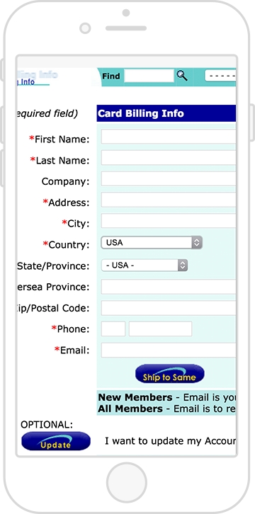
Forms and tables aren't just for technical or scientific websites. Blogs and online magazines have popups that ask you to subscribe to their newsletter within 3 seconds of accessing the site. This popup is a very tiny (and annoying) form. On the other hand, checking out on an ecommerce site can be seen as just one long form to fill out. Have you ever tried ordering something on a nonresponsive website from your smartphone?
It may look something like the following image, which does not look fun:
And tables cannot just be squished horizontally on small screens. We can make them shine no matter the screen size. With this chapter, you will become equipped with the patterns you need to style forms and data for a responsive website. We will cover the following topics:
- Designing forms for a responsive website
- Responsive patterns for tables
Online forms are already modular. Because of this, they aren't hard to scale down for smaller screens. The little boxes and labels can naturally shift around between different screen sizes since they are all individual elements. However, form elements are naturally tiny and very close together. Small elements that you are supposed to click and fill in, whether on a desktop or mobile device, pose obstacles for the user.
If you developed a form for your website, you more than likely want people to fill it out and submit it. Maybe the form is a survey, a sign up for a newsletter, or a contact form. Regardless of the type of form, online forms have a purpose; get people to fill them out! Getting people to do this can be difficult at any screen size. However, when users are accessing your site through a tiny screen, they face even more challenges. As designers and developers, it is our job to make this process as easy and accessible as possible. Here are some guidelines to follow when creating a responsive form:
- Give all inputs breathing room.
- Use proper values for input's type attribute.
- Increase the hit states for all your inputs.
- Stack radio inputs and checkboxes on small screens.
Together, we will go over each of these guidelines and see how to apply them.
Before we get started, let's look at the markup for the form we will be using. We want to include a sample of the different input options we can have. Our form will be very basic and requires simple information from the user such as their name, e-mail, age, favorite color, and favorite animal.
HTML
<form>
<!—- text input -->
<label class="form-title" for="name">Name:</label>
<input type="text" name="name" id="name" />
<!—- email input -->
<label class="form-title" for="email">Email:</label>
<input type="email" name="email" id="email" />
<!—- radio boxes -->
<label class="form-title">Favorite Color</label>
<input type="radio" name="radio" id="red" value="Red" /> <label>Red</label>
<input type="radio" name="radio" id="blue" value="Blue" /><label>Blue</label>
<input type="radio" name="radio" id="green" value="Green" /><label>Green</label>
<!—- checkboxes -->
<label class="form-title" for="checkbox">Favorite Animal</label>
<input type="checkbox" name="checkbox" id="dog" value="Dog" /><label>Dog</label>
<input type="checkbox" name="checkbox" id="cat" value="Cat" /><label>Cat</label>
<input type="checkbox" name="checkbox" id="other" value="Other" /><label>Other</label>
<!—- drop down selection -->
<label class="form-title" for="select">Age:</label>
<select name="select" id="select">
<option value="age-group-1">1-17</option>
<option value="age-group-2">18-50</option>
<option value="age-group-3">>50</option>
</select>
<!—- textarea-->
<label class="form-title" for="textarea">Tell us more:</label>
<textarea cols="50" rows="8" name="textarea" id="textarea"></textarea>
<!—- submit button -->
<input type="submit" value="Submit" />
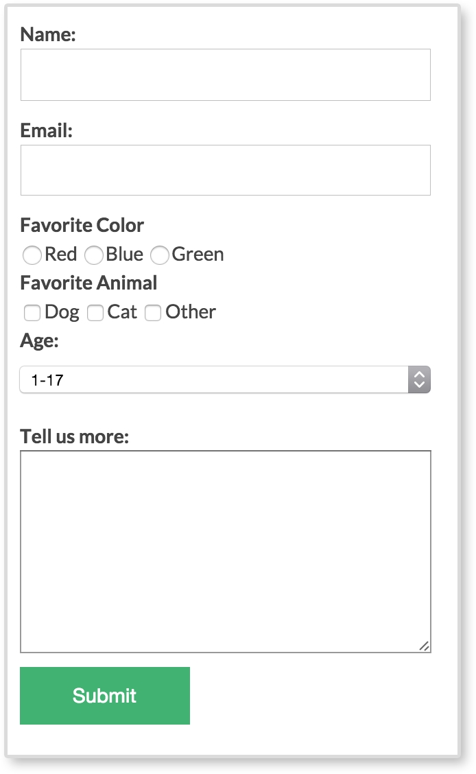
</form>With no styles applied, our form looks like the following screenshot:
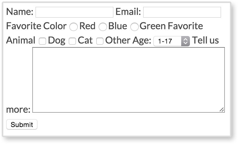
Several of the form elements are next to each other, making the form hard to read and almost impossible to fill out. Everything seems tiny and squished together. We can do better than this. We want our forms to be legible and easy to fill out. Let's go through the guidelines and make this eyesore of a form more approachable.
In the preceding screenshot, we can't see when one form element ends and the other begins. They are showing up as inline, and therefore displaying on the same line. We don't want this though. We want to give all our form elements their own line to live on and not share any space to the right of each type of element. To do this, we add display: block to all our inputs, selects, and text areas. We also apply display:block to our form labels using the class .form-title. We will be going over why the title labels have their own class later.
CSS
input[type="text"],
input[type="email"],
textarea,
select {
      display: block;
      margin-bottom: 10px;
}

.form-title {
      display:block;
      font-weight: bold;
}
As mentioned, we are applying display:block to text and e-mail inputs. We are also applying it to textarea and select elements. Just having our form elements display on their own line is not enough. We also give everything a margin-bottom of 10px to give the elements some breathing space between one another. Next, we apply display:block to all the form titles and make them bold to add more visual separation.
Technically, if you are collecting a password from a user, you are just asking for text. E-mails, search queries, and even phone numbers are just text too. So why would we use anything other than <input type="text"…/>? You may not notice the difference on your desktop computer between these form elements, but the change is at its biggest on mobile devices. To show you, we have two screenshots of what the keyboard looks like on an iPhone while filling out the text input and the e-mail input.
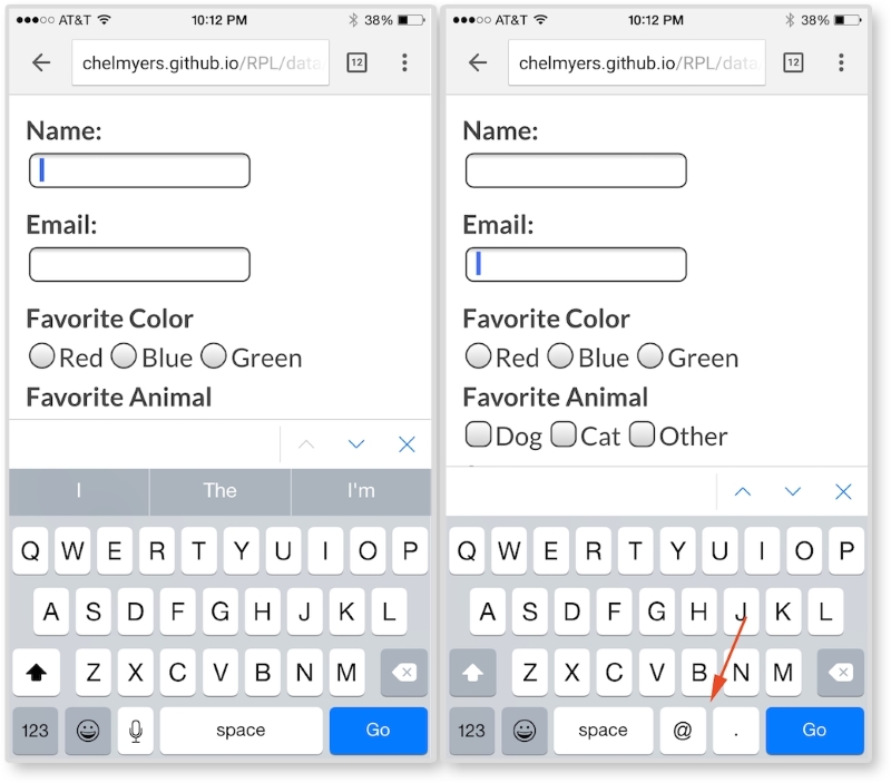
In the left image, we are focused on the text input for entering your name. The keyboard here is normal and nothing special. In the right image, we are focused on the e-mail input and can see the difference on the keyboard. As the red arrow points out, the @ key and the . key are now present when typing in the e-mail input. We need both of those to enter in a valid e-mail, so the device brings up a special keyboard with those characters. We are not doing anything special other than making sure the input has type="email" for this to happen. This works because type="email" is a new HTML5 attribute. HTML5 will also validate that the text entered is a correct e-mail format (which used to be done with JavaScript).
Here are some other HTML5 type attribute values from the W3C's third HTML 5.1 Editor's Draft (http://www.w3.org/html/wg/drafts/html/master/semantics.html#attr-input-type-keywords):
colordatedatetimeemailmonthnumberrangesearchteltimeurlweek
It would be really frustrating for the user if they could not easily select an option or click a text input to enter information. Making users struggle isn't going to increase your chance of getting them to actually complete the form. The form elements are naturally very small and not large enough for our fingers to easily tap. Because of this, we should increase the size of our form inputs. Having form inputs at least 44 x 44 px large is a standard right now in our industry. This is not a random number either. Apple suggests this size to be the minimum in their iOS Human Interface Guidelines, as seen in the following quote:
"Make it easy for people to interact with content and controls by giving each interactive element ample spacing. Give tappable controls a hit target of about 44 x 44 points."
As you can see, this does not solely apply to form elements. Apple's suggestion is for all clickable items.
Now, this number may change along with our devices' resolutions in the future. Maybe it will go up or down depending on the size and precision of our future technology. For now though, it is a good place to start. We need to make sure that our inputs are big enough to tap with a finger. In the future, you can always test your form inputs on a touch screen to make sure they are large enough. For our form, we can apply this minimum size by increasing the height and/or padding of our inputs.
CSS
input[type="text"],
input[type="email"],
textarea,
select {
  display: block;
  margin-bottom: 10px;
  font-size: 1em;
  padding:5px;
  min-height: 2.75em;
  width: 100%;
  max-width: 300px;
}
The first two styles are from the first guideline. After this, we are increasing the font-size attribute of the inputs, giving the inputs more padding, and setting a min-height attribute for each input. Finally, we are making the inputs wider by setting the width to 100%, but also applying a max-width attribute so the inputs do not get unnecessarily wide.
We want to increase the size of our Submit button as well. We definitely don't want our users to miss clicking this:
input[type="submit"] {
  min-height: 3em;
  padding: 0 2.75em;
  font-size: 1em;
  border: none;
  background: mediumseagreen;
  color: white;
}
Here, we are also giving the Submit button a min-height attribute, some padding, and increasing the font-size attribute. We are striping the browser's native border style on the button with border:none. We also want to make this button very obvious, so we apply a mediumseagreen color as the background and a white text color.
If you view the form so far in the browser, or look at the following screenshot, you will see all the form elements are bigger now except for the radio inputs and checkboxes. These elements are still squished together.
To make our radio and checkboxes bigger in our example, we will make the option text bigger. Doesn't it make sense that if you want to select red as your favorite color, you should be able to click on the word "red" too, and not just the box next to the word?
In the HTML for the radio inputs and the checkboxes, we have markup that looks like this:
<input type="radio" name="radio" id="red" value="Red" /><label>Red</label>

<input type="checkbox" name="checkbox" id="dog" value="Dog" /><label>Dog</label>
To make the option text clickable, all we have to do is set the for attribute on the label to match the id attribute of the input. Or we can put the radio and checkbox inputs inside of their labels. We will be doing the second version so we can easily stack them for guideline #4. We will also give the labels a class of choice to help style them:
<label class="choice" ><input type="radio" name="radio" value="Red" />Red</label>

<label class="choice" ><input type="checkbox" name="checkbox" value="Dog" />Dog</label>
Now, the option text and the actual input are both clickable. With this done, we can apply some more styles to make selecting a radio or checkbox option even easier:
label input {
  margin-left: 10px;
}

.choice {
  margin-right: 15px;
  padding: 5px 0;
}

.choice + .form-title {
  margin-top: 10px;
}
With label input, we are giving the input and the label text a little more space between each other. Then, using the .choice class, we are spreading out each option with margin-right: 15px and making the hit states bigger with padding: 5px 0. Finally, with .choice + .form-title, we are giving any .form-title element that comes after an element with a class of .choice more breathing room. This is going back to responsive form guideline #1; give all inputs breathing room.
There is one last thing we need to do. On small screens, we want to stack the radio and checkbox inputs. On large screens, we want to keep them inline. To do this, we will add display:block to the .choice class. We will then use a media query to change it back:
@media screen and (min-width: 600px){
      .choice {
        display: inline;
      }
}
With each input on its own line for smaller screens, they are easier to select. But we don't need to take up all that vertical space on wider screens. With this, our form is done. You can see our finished form, as shown in the following screenshot:
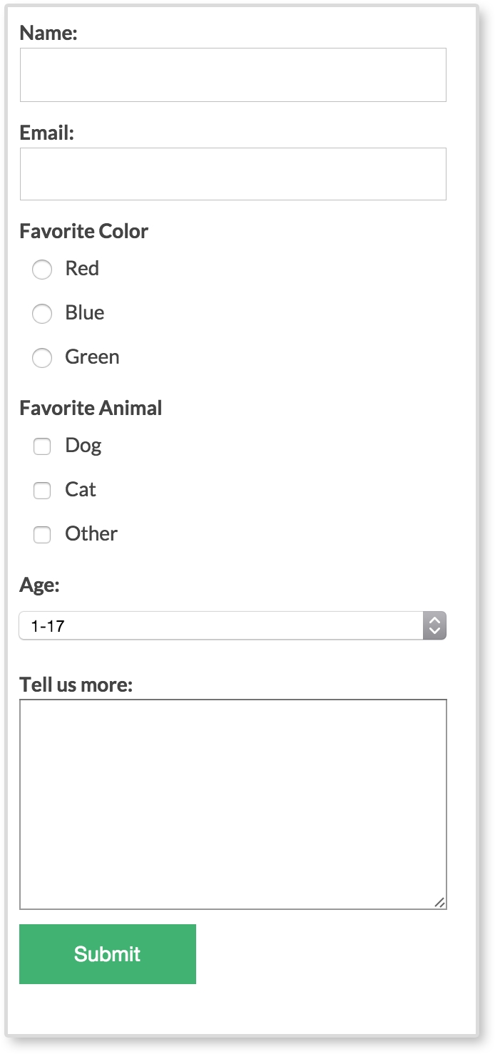
Much better, wouldn't you say? No longer are all the inputs tiny and squashed together. It is easy to read, tap, and begin entering information in the form. Filling in forms is not considered a fun thing to do, especially on a tiny screen with big thumbs. But there are ways we can make the experience easier and a little more visually pleasing.