Table of Contents for
Responsive Web Design Patterns
 Responsive Web Design Patterns
Published by
Packt Publishing, 2015
Responsive Web Design Patterns
Published by
Packt Publishing, 2015
- Cover
- Table of Contents
- Responsive Web Design Patterns
- Responsive Web Design Patterns
- Credits
- About the Author
- About the Reviewers
- www.PacktPub.com
- Preface
- What you need for this book
- Who this book is for
- Conventions
- Reader feedback
- Customer support
- 1. Creating a Home for Responsive Patterns
- Why and how to create a responsive site
- Breaking websites down to their patterns
- Building a home for your patterns
- Summary
- 2. The Main Stage – Building Responsive Layouts
- Most popular layout patterns
- Creating complex systems
- Summary
- 3. Make Way for Responsive Navigations
- Responsive navigation patterns
- Summary
- 4. From Static to Dynamic – Embedding Media
- Responsive image patterns
- Understanding sliders and carousels
- Implementing videos
- Summary
- 5. Gathering and Displaying Information
- Responsive table patterns
- Summary
- 6. Combining Responsive Patterns
- Continuing to look for patterns
- Your pattern library is not done yet!
- Summary
- 7. Ship It – Finalizing Your Pattern Library
- Getting ready to handoff
- Publishing your library
- Further exploration
- Summary
- Index
A decade ago, tables ruled web design by being the most common way to lay out a website. Tables were powerful and the backbone of many websites. Today, creating a website's layout by using a table is absolutely not acceptable. It is considered downright shameful. Tables are for tabular data, not for web layouts. And now that the reign of tables is over, let's look into how to use them properly, with a responsive twist.
The biggest issue tables pose is their uncertain width. Long tables with lots of rows are no problem. Our web page can be as long as a table needs. However, a table that is very wide, with lots of columns, starts to break our beautiful responsive websites. As our website scales down, we will have a table busting out of its container. We can scale down images and videos, but how can we scale down tables? We cannot just scale down the font-size attribute. It may become too tiny to read. We just can't decrease the padding. The table's cell would cramp. This solution uses a horizontal scroll to fix this issue, and a fade to the right like the following screenshot:
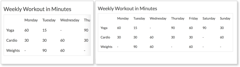
On smaller screens, shown on the left of the screenshot, the table starts to scale down and fit the browser's width. When the table is too wide, columns appear off stage and the user can scroll to the right to see them. The right fade is present to tell the user that there is more data to be seen. A visible scrollbar can also do this, but some browsers (such as Chrome and Safari) hide theirs by default. Another option can be to take out the fade, and force the browser to also show the scrollbar. This is totally acceptable, but to me, not as elegant.
HTML
<h3>Weekly Workout in Minutes</h3>

<table class="table-overflow">
<thead>
  <th></th>
  <th>Monday</th>
  <th>Tuesday</th>
  <th>Wednesday</th>
  <th>Thursday</th>
  <th>Friday</th>
  <th>Saturday</th>
  <th>Sunday</th>
</thead>
<tbody>
  <tr>
    <td>Yoga</td>
    <td>60</td>
    <td>15</td>
    <td>-</td>
    <td>90</td>
    <td>60</td>
    <td>90</td>
    <td>30</td>
 </tr>
</tbody>
...
</table>
The preceding code is a shortened version of the markup. The only thing special about this table is it has a class of table-overflow. Some tables may be small enough that they do not need special treatment. In such cases, we can add our responsive styles to this class and only apply it to tables that need it.
CSS
td, th {
  padding: 10px;
}

table {
  border: 2px solid #eee;
  border-collapse: collapse;
  border-spacing: 0;
}

@media screen and (max-width: 600px) {
  .table-overflow {
    display:block;
    overflow-x: scroll;

    -webkit-box-shadow: inset -28px 0px 40px -30px #ddd;
    -moz-box-shadow: inset -28px 0px 40px -30px #ddd;
    box-shadow: inset -28px 0px 40px -30px #ddd;
  }
}
Pretty much everything here is for styling the table except for what's inside the media query. Inside the media query, we are setting the table to be display:block when the viewport is under 600px wide. We then set overflow-x: scroll so the table can scroll horizontally. After this, we will use the box-shadow property to create a gradient, or fade, on the right of the table. When using the box-shadow property here, make sure you are creating an inset shadow that appears inside the table. The values here may seem a little large (such as 40px), but these values make sure the shadow only appears to the right of the box and not on the other edges. You can use a custom-made transparent image or CSS3 gradients for the fade, but I find using box-shadow to be the simplest way so far.
Note
View live at http://chelmyers.github.io/RPL/data/index.html#tableScroll.
Let's have a look at the pros and cons of this pattern:
Pros:
- Accommodates small to medium tables
- The fade is a neat touch
Cons:
If you have small- to medium-sized tables, this pattern does a good job scaling tables down and is easy to implement. But if you have a table that is very wide, it is hard to visually match up the row headers (such as Yoga and Cardio in our pattern) with their data. Here, we have seven columns and three rows. We can remember that the first row is yoga, the second cardio, and the third weights. But what if we have a 15 x 20-sized table? The next example would suit these sized tables better. Also, with this pattern the fade does not go away when you reach the right end of the table. This is possible with JavaScript, but I purposely left it out for the sake of simplicity.
The only problem with the previous pattern is that users can forget what the rows represented when scrolling too far to the right. Stacked tables look the same as fading tables on desktop, but take on a whole different layout on small screens. As shown in the following screenshot, the stacked table doesn't even look like a table on smaller screens:
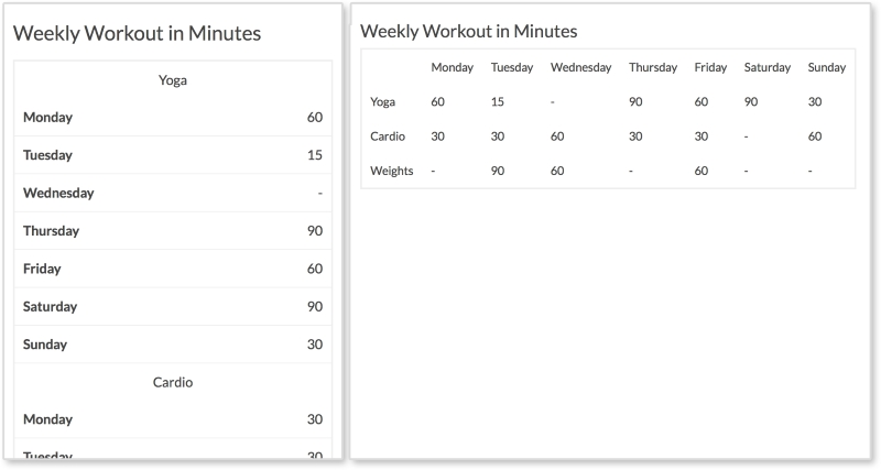
Every row has its own section with the column headings being repeated for each. This pattern takes up more vertical space, but we have more of that on smaller portrait-oriented screens.
HTML
<h3>Weekly Workout in Minutes</h3>

<table class="table-overflow">
  <thead>
    <th></th>
    <th>Monday</th>
    <th>Tuesday</th>
    <th>Wednesday</th>
    <th>Thursday</th>
    <th>Friday</th>
    <th>Saturday</th>
    <th>Sunday</th>
  </thead>
  <tbody>
    <tr>
      <td>Yoga</td>
      <td data-label="Monday">60</td>
      <td data-label="Tuesday">15</td>
      <td data-label="Wednesday">-</td>
      <td data-label="Thursday">90</td>
      <td data-label="Friday">60</td>
      <td data-label="Saturday">90</td>
      <td data-label="Sunday">30</td>
   </tr>
   ...
  </tbody>
</table>
The HTML is the same as the previous example except we are using a data attribute on every td in the rows. This is what allows the table on small screens to show the column heading to the left of the data.
CSS
td, th {
    padding: 10px;
}

table {
  border: 2px solid #eee;
  border-collapse: collapse;
  border-spacing: 0;
}

@media screen and (max-width: 600px) {
  table, th, td, tr {
    display: inline-block;
  }

  thead {
    position: absolute;
    top: -9999px;
    left: -9999px;
  }

  td {
    text-align: center;
    width: 100%;
  }

  td[data-label] {
    text-align: right;
    border-bottom: 1px solid #eee;
  }

  td[data-label]:before {
    content: attr(data-label);
    float: left;
    font-weight: bold;
  }
}
Again, the CSS here is just styling the table until we get into the media query. On browsers smaller than 600px, we are setting all table elements to display:inline-block to stop having the table look like, well, a table. This way everything starts on its own line. Then, we hide the table heading, the thead tag, by making them position: absolute and setting their top and left values to -9999px.
Next, we set each td to be centered and take up 100% of the table's width. This is why the section headings (such as Yoga) are centered. With td[data-label], we style the actual data with a data-label attribute to be right aligned and have a bottom border. Finally, we use td[data-label]:before to extract the contents of the data-label attribute, and put them before the data. We then float this to the left and make it bold. These final styles insert Monday, Tuesday, Wednesday, and so on next to the data on smaller screens.
Note
View live at http://chelmyers.github.io/RPL/data/index.html#tableStacked.
Let's have a look at the pros and cons of this pattern:
Pros:
- This pattern accommodates very wide tables
- This works well on mobile devices
Cons:
Tables are great because they allow you to compare data and make trends. While this pattern utilizes vertical space, stacking tabular data can make it harder to scan. On smaller screens, users may have a more difficult time seeing trends but the table overall is easier to read. However, this table is very easy to read and the information is nicely organized.