Copyright © 2015 Packt Publishing
All rights reserved. No part of this book may be reproduced, stored in a retrieval system, or transmitted in any form or by any means, without the prior written permission of the publisher, except in the case of brief quotations embedded in critical articles or reviews.
Every effort has been made in the preparation of this book to ensure the accuracy of the information presented. However, the information contained in this book is sold without warranty, either express or implied. Neither the author, nor Packt Publishing, and its dealers and distributors will be held liable for any damages caused or alleged to be caused directly or indirectly by this book.
Packt Publishing has endeavored to provide trademark information about all of the companies and products mentioned in this book by the appropriate use of capitals. However, Packt Publishing cannot guarantee the accuracy of this information.
First published: November 2015
Production reference: 1241115
Published by Packt Publishing Ltd.
Livery Place
35 Livery Street
Birmingham B3 2PB, UK.
ISBN 978-1-78588-998-1
Author
Chelsea Myers
Reviewers
Esteban S. Abait
Tristan Denyer
Christopher Scott Hernandez
J. Pedro Ribeiro
Marija Zaric
Commissioning Editor
Kartikey Pandey
Acquisition Editor
Kirk D'costa
Content Development Editor
Merwyn D'souza
Technical Editor
Siddhi Rane
Copy Editor
Janbal Dharmaraj
Project Coordinator
Neha Bhatnagar
Proofreader
Safis Editing
Indexer
Priya Sane
Production Coordinator
Komal Ramchandani
Cover Work
Komal Ramchandani
Chelsea Myers, throughout her career so far, has been a student, freelancer, full-time employee, teacher, assistant, researcher, and business owner in the web development industry. She is passionate about responsive frontend development and building out user-focused designs. Every new project allows her to learn and try something new. And to her, that's the best part of the job.
She graduated from Drexel University with a degree in digital media. Currently, she works for an award-winning digital studio, Happy Cog, and teaches web development and user experience at Drexel. When she is not doing all this, or freelancing herself, she also manages her cofounded animation studio, Coffeebot Studios.
Esteban S. Abait is a senior software architect, and a former PhD student. He has experience devising the architecture of complex software products, and planning its development. He has worked both onsite, and offshore for clients such as Cisco, Intuit, and SouthWest. During his career he has worked with different technologies such as Java, PHP, Ruby, and Node.js, among others. In recent years, his main interests revolve around web mobile and REST APIs. He has developed large, maintainable web applications using JavaScript. In addition, he has worked assessing clients on REST best practices. At the same time, he has worked on high traffic web sites, where topics such as replication, sharding, or distributed caches are key to scalability.
He is currently working at Globant as a technical director. In this role, he works to ensure the project's delivery meet their deadlines with the best quality. He also designs software program training and interviews software developers. In addition, he travels to clients to provide consultancy on web technologies.
Globant (http://www.globant.com/) is a new breed of technology service providers focused on delivering innovative software solutions by leveraging emerging technologies and trends. Globant combines the engineering and technical rigor of IT service providers with the creative and cultural approach of digital agencies. Globant is the place where engineering, design, and innovation meet scale.
Tristan Denyer is a UX designer for web and mobile applications, including web apps and portals, e-commerce, online video players and widgets, games (online, iPhone, board), marketing sites, and more. He is also a UI developer and WordPress theme developer. He is currently leading the UX design for the product team at a start-up in San Francisco. He recently wrote a book, A Practical Handbook to WordPress Themes, CreateSpace, to help owners and operators of self-hosted WordPress websites get the most out of their themes. His passions include prototyping, web security, writing, carpentry, and burritos. He can be contacted through Twitter (@tristandenyer), GitHub (https://github.com/tristandenyer), and his portfolio and blog (http://tristandenyer.com/).
Christopher Scott Hernandez is a designer turned developer who has been working on the Web since 1996, when he built the Web's first boat upholstery site for his dad. He's since moved on to bringing his expertise to companies small and large, having worked on some of the most visited sites in the world, including eBay, LinkedIn, and Apple.
He was also a technical reviewer for HTML5 Multimedia Development Cookbook, Packt Publishing. He is an avid reader and lover of books. When he's not pushing pixels and writing code, he enjoys spending time with his wife and daughter exploring the parks and trails of beautiful Austin, Texas.
J. Pedro Ribeiro is a Brazilian user interface engineer living in the heart of London. He has been working on the Web for several years coding websites for start-ups and large companies. Currently, at RetailMeNot UK, he is responsible for creating the mobile first experience at VoucherCodes.co.uk (http://vouchercodes.co.uk/), focusing on performance and usability.
On his personal site, http://jpedroribeiro.com, he writes about frontend technologies, books, and personal projects. Some of these projects and experiments can be found at http://github.com/jpedroribeiro. On Twitter, he can be found at twitter.com/jpedroribeiro.
Marija Zaric is a web designer living in Belgrade with a focus on individual and commercial clients that demand websites that are clear, modern, creative, simple, and responsive. She works with clients from the USA and all over the world, helping them to present their services in a unique yet professional way.
She is a relentless learner. What she loves most about web design are the constant changes in the field, especially its evolution in the last four years when she got inspired by simplicity, great images, typography, and the possibility to optimize a single website for various devices.
She designed and incorporated these styles into her own website and called it Creative Simplicity. She was a reviewer for the books Responsive Media in HTML5 and Responsive Web Design with HTML5 and CSS3, both by Packt Publishing.
Her projects can be found at http://www.marijazaric.com/.
For support files and downloads related to your book, please visit www.PacktPub.com.
Did you know that Packt offers eBook versions of every book published, with PDF and ePub files available? You can upgrade to the eBook version at www.PacktPub.com and as a print book customer, you are entitled to a discount on the eBook copy. Get in touch with us at <service@packtpub.com> for more details.
At www.PacktPub.com, you can also read a collection of free technical articles, sign up for a range of free newsletters and receive exclusive discounts and offers on Packt books and eBooks.

https://www2.packtpub.com/books/subscription/packtlib
Do you need instant solutions to your IT questions? PacktLib is Packt's online digital book library. Here, you can search, access, and read Packt's entire library of books.
If you have an account with Packt at www.PacktPub.com, you can use this to access PacktLib today and view 9 entirely free books. Simply use your login credentials for immediate access.
Websites come in varying shapes and sizes. In our lifetime, we may work on sites that have four or 400 different pages. And the devices these websites are viewed on are just as different. Creating websites for all these variables is a daunting task. Breaking sites down to bite-sized pieces, or patterns, can make this task more manageable.
Web design and development is a great industry to be a part of because the people in it love to share. When developing a responsive website, it can be a challenge to come up with solutions for scaling content from small to large screens. Luckily, we can look to responsive patterns and responsive pattern libraries shared by the companies and individuals that make up this industry.
Together, let's look at the most popular responsive web design patterns and how they are built. Responsive patterns, just like patterns in the analog world, can be used as a guide, a foundation, or solely inspiration for your own work.
Chapter 1, Creating a Home for Responsive Patterns, builds a home for all the patterns reviewed in this book and looks into why pattern libraries should be used in the first place.
Chapter 2, The Main Stage – Building Responsive Layouts, reviews the top most common responsive layouts and what type of content is suited for each.
Chapter 3, Make Way for Responsive Navigations, explores patterns for one of the most tricky aspects of a responsive website—the menu system. It looks at popular navigational patterns used in modern websites and the pros and cons of each.
Chapter 4, From Static to Dynamic – Embedding Media, shows how to deliver catered images for different quality displays and how to make media such as images and video scale with a responsive website.
Chapter 5, Gathering and Displaying Information, covers patterns and guidelines for developing the more analytical elements of a website such as forms and tables.
Chapter 6, Combining Responsive Patterns, teaches how to decide whether a responsive pattern is the right one to use and how to combine patterns to create a more custom solution.
Chapter 7, Ship It – Finalizing Your Pattern Library, lays out the final steps to polishing up a responsive library before archiving it or handing it to the client.
Websites can be made in a plain text editor, but why suffer? In this book, we will be creating a responsive pattern library using HTML, CSS, and JavaScript. It is recommended to use a more advanced text editor such as a Sublime Text editor to edit the files provided. A modern browser such as Chrome, Safari, and Firefox is also recommended.
This book is intended for HTML and CSS beginners who want to know where to start when creating a responsive website. It is also for more experienced developers who perhaps need a little inspiration for their next project. Knowing what makes a responsive site tick is not enough. You also have to know the best way to design a site that fulfills its required goals, shrinking and stretching to polar sizes all the while. This book aims to equip you with a foundation to do just that.
In this book, you will find a number of text styles that distinguish between different kinds of information. Here are some examples of these styles and an explanation of their meaning.
Code words in text, database table names, folder names, filenames, file extensions, pathnames, dummy URLs, user input, and Twitter handles are shown as follows: "Put this meta tag in the <head> of your HTML files to overcome the device's zooming."
A block of code is set as follows:
/*NAVIGATION*/
nav li {
  display: block;
}
@media screen and (min-width: 800px) {
  nav li {
    display: inline-block
  }
}
When we wish to draw your attention to a particular part of a code block, the relevant lines or items are set in bold:
/*NAVIGATION*/
nav li {
  display: block;
}
@media screen and (min-width: 800px) {
  nav li {
    display: inline-block
  }
}
New terms and important words are shown in bold. Words that you see on the screen, for example, in menus or dialog boxes, appear in the text like this: "The View Pattern button takes you to the patterns page where you can view it alone outside of the landing page."
Feedback from our readers is always welcome. Let us know what you think about this book—what you liked or disliked. Reader feedback is important for us as it helps us develop titles that you will really get the most out of.
To send us general feedback, simply e-mail <feedback@packtpub.com>, and mention the book's title in the subject of your message.
If there is a topic that you have expertise in and you are interested in either writing or contributing to a book, see our author guide at www.packtpub.com/authors.
Now that you are the proud owner of a Packt book, we have a number of things to help you to get the most from your purchase.
You can download the example code files from your account at http://www.packtpub.com for all the Packt Publishing books you have purchased. If you purchased this book elsewhere, you can visit http://www.packtpub.com/support and register to have the files e-mailed directly to you.
Here is the link to the code on GitHub: https://github.com/chelmyers/RPL
Here is the live version of our website: http://chelmyers.github.io/RPL/
Although we have taken every care to ensure the accuracy of our content, mistakes do happen. If you find a mistake in one of our books—maybe a mistake in the text or the code—we would be grateful if you could report this to us. By doing so, you can save other readers from frustration and help us improve subsequent versions of this book. If you find any errata, please report them by visiting http://www.packtpub.com/submit-errata, selecting your book, clicking on the Errata Submission Form link, and entering the details of your errata. Once your errata are verified, your submission will be accepted and the errata will be uploaded to our website or added to any list of existing errata under the Errata section of that title.
To view the previously submitted errata, go to https://www.packtpub.com/books/content/support and enter the name of the book in the search field. The required information will appear under the Errata section.
Piracy of copyrighted material on the Internet is an ongoing problem across all media. At Packt, we take the protection of our copyright and licenses very seriously. If you come across any illegal copies of our works in any form on the Internet, please provide us with the location address or website name immediately so that we can pursue a remedy.
Please contact us at <copyright@packtpub.com> with a link to the suspected pirated material.
We appreciate your help in protecting our authors and our ability to bring you valuable content.
If you have a problem with any aspect of this book, you can contact us at <questions@packtpub.com>, and we will do our best to address the problem.
In 2010, Ethan Marcotte coined the term "responsive design." Since then web design has only been improving. The web community came together and stood behind this new concept. Beautifully responsive websites can now be seen all over the Internet. As a web developer, when I stumble upon a new responsive site, I love to evaluate the patterns that make up its system. It's like looking at the individual brush strokes that make up a painting.
Pattern libraries house the elements that make up a design system. A responsive pattern library houses elements for a responsive system. When we create these libraries ourselves, they act like a tool for archiving designs, modules, and templates for future reference. Developers can also use existing frameworks with responsive patterns premade, such as Bootstrap and Foundation. Unfortunately, using these patterns with few to no alterations has produced a lot of websites that look the same. But when we use these responsive patterns as a base, and not the solution, responsive websites can be as unique as snowflakes.
Because of its mass support, best practices have formed around responsive web design (RWD). There are popular patterns that developers and designers agree upon to be good solutions for websites catering to multiple devices. This book's goal is to familiarize you with these patterns and show you how to use them. The next step is to use these patterns as a stepping-stone to creating your own responsive designs. In this chapter, we will have a look at the following topics:
Let's say it is 2007, and I am waiting for a bus and browsing the Internet on my shiny new iPhone. If I wanted to see the latest from my favorite web comics, Hark! A Vagrant (http://www.harkavagrant.com/), the page would take around 50 seconds to download. 50 seconds! If I did this today on my iPhone 6, the same page would take 6 seconds to download. Both of these figures are relying on the fact that I have a decent signal as well. And since I live in a city, I probably wouldn't even be using my data plan. With hotspots popping up all over the world, I would most likely be connected to one of those. Meaning that even the largest comics from Hark! A Vagrant wouldn't even take a full second to load.
When the iPhone first appeared on the EDGE network, accessing the Internet was a hassle and took patience for each page to load. I remember using the browser on my Blackberry Bold and hating the experience. Flash-forward to today, and I do everything on my smartphone. According to Pew Research Center (http://www.pewinternet.org/), in 2015, 64% of American adults own a smartphone and 89% of them use it to access the Internet. And the most common time to do this? When they are at home or traveling. No longer can we as designers and developers ignore that fact that any site we create will be accessed through a mobile device. It is our job to make that experience as easy as possible.
HTML is naturally responsive, but for years web developers were taught to force sites to remain fixed at one size. In 2010, Ethan Marcotte brought to our attention the fact that people are no longer accessing the Internet through only desktops and laptops. With the launch of the iPhone came hundreds of other devices that put the Internet on small screens and in our pockets. But the Web wasn't ready to be viewed on such small devices. Marcotte's article, Responsive Web Design (http://alistapart.com/article/responsive-web-design) acted like a wake up call ushering us into a new realm of web design.
If web design is new to you, you may not be familiar with what RWD is. RWD is creating one website that responds to the size of the viewport. The same website renders on both smartphone and desktop devices. It is the same markup, but with CSS media queries changing styles depending on the browser's resolution. A delightful example is UK web design agency, Stuff & Nonsense's website (http://www.stuffandnonsense.co.uk/).
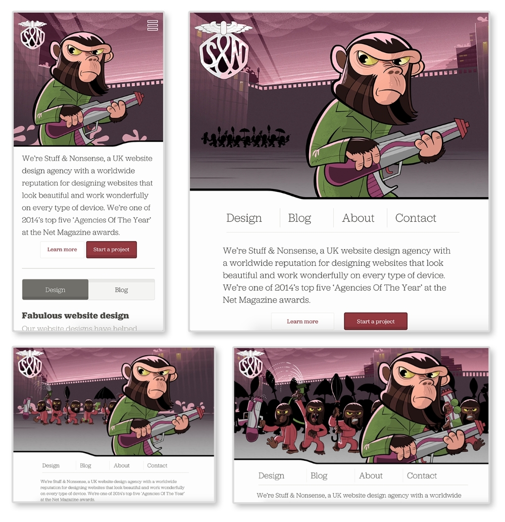
The preceding images are of Stuff & Nonsense's website at 400px, 800px, 1100px, and 1400px wide, respectively. The same site is served on both my smartphone and my laptop. The biggest difference between each screen size is the imagery in the header. Yes, the navigation, font sizes, and layout of the page are changing between each size as well. But the best part of this site is the advancing monkey army in the background as your browser size changes.
This is what RWD is doing technically. As developers, we are changing how the site appears depending on the viewport. As designers, we are rethinking the content that appears on smaller screens to make sure our users are receiving the information they need quickly and efficiently. Stuff & Nonsense's design requires some more advanced techniques, but can serve as an inspiration for what RWD can do.
Media queries were introduced with the debut of CSS3. They allow web developers to control what CSS styles are applied depending on variables such as the device width, height, aspect ratio, resolution, and orientation. The following is an example of a standard media query:
@media screen and (max-width: 500px) {
  body {
    color: red;
  }
}
The first part, screen, indicates what media type the media query applies to. In this case, screen refers to computer, mobile, and tablet screens. Another commonly used media type is print. The @media print annotation will apply only when the page is being printed.
Next and (max-width: 500px) is setting the
media feature. Instead of max-width, we can also use features such as min-width, orientation, and resolution. Right now, this media query will only apply the CSS style, body{color: red;}, when the site is being viewed on a screen when the viewport is less than 500px wide. When both of these requirements are met, the site's font color will be red.
Check out the W3C's (http://dev.w3.org/csswg/mediaqueries-4/) specifications on media queries to see what other media types and media features there are.
To use media queries, you first must place them in your style sheet. Throughout my time working on responsive websites, I have found two methods commonly used for organizing media queries. I have listed the methods in the following steps and shown a version of each with the media queries highlighted:
/*HEADER*/
header {
  background-color: blue;
}
@media screen and (min-width: 800px) {
  header {
    background-color: red;
  }
}

/*NAVIGATION*/
nav li {
  display: block;
}
@media screen and (min-width: 800px) {
  nav li {
    display: inline-block
  }
}
This method works better if you are working on a larger website and using a CSS precompile such as Sass. Sass allows you to nest your CSS, meaning you can nest media queries within a rule. I personally use this method on my projects. It works best when you break up your CSS into separate files and keep your CSS modular.
/*Base Styles*/
header {
  background-color: blue;
}

nav li {
  display: block;
}

/* Width 800px and up */
@media screen and (min-width: 800px) {
  header {
    background-color: red;
  }
  nav li {
    display: inline-block
  }
}
Downloading the example code
You can download the example code files from your account at http://www.packtpub.com for all the Packt Publishing books you have purchased. If you purchased this book elsewhere, you can visit http://www.packtpub.com/support and register to have the files e-mailed directly to you.
Grouping the CSS rules together under one media query works better on smaller websites where the CSS is not as extensive. We will be using this method for our pattern library because the design system is very simplistic. If the CSS gets larger, this method can become cumbersome. Right now, the rules are close together in their file because there are not many of them. But as a CSS file grows, there can be a lot of distance between a rule that dictates styles on mobile and the media query that changes it on a larger viewport. This means there is a lot of scrolling back and forth to make tweaks.
Custom media queries
A potential solution to this problem could be on the horizon. The W3C's Media Queries Level 4 specifications include a concept for custom media queries (http://dev.w3.org/csswg/mediaqueries-4/#custom-mq). It will allow aliases for media queries to be declared with @custom-media and reused throughout the site.
Both of these examples are using mobile first design. Here, we write the styles for the smallest screen size first and work our way up. Google Product Director, Luke Wroblewski, popularized the mobile first concept in his book, Mobile First (http://abookapart.com/products/mobile-first). Designing mobile first means designing the mobile experience before the rest of the site. Working within mobile constraints from the beginning forces designers and clients to prioritize and focus their content. It is easier to work your way up to a complex desktop website than squish a desktop site onto a small screen. If you start adding media queries and find one style sheet is getting too big, you can use @import to break out each pattern or media query into its own file and import it into one main style sheet. Whatever method you choose, just make sure that you keep your code organized and well commented.
If you start adding media queries to your CSS file without setting the proper meta tag in your HTML file, you'll find your website looking no different when it loads on a mobile device. Most mobile devices automatically zoom out and increase the browser's size to fit the website. Setting a responsive meta tags forces the device's browser to be the same width as the device's screen:
<meta name="viewport" content="width=device-width, initial-scale=1">
Put this meta tag in the <head> of your HTML files to overcome the device's zooming. This meta tag sets the browser width to the width of the device (width=device-width). The second part, initial-scale=1, makes sure that no automatic zooming occurs by setting the browser's scale to 1.
To begin spotting responsive patterns, you have to look at websites modularly. Pick a website and start breaking down the design into its components. These repeated components are the patterns that make up the design system. Designing and developing modularly allows the site to be easily scaled up in the future. Creating templates and pages alone only accounts for the content on the website at the time of its development. They do not account for what's to come. A pattern library can be used to house all of a website's patterns.
Pattern libraries can be used in a team setting to simplify collaboration. If a project uses a pattern library containing the entire site's existing patterns, developers can see what work has already been done and what still needs to be completed. If a developer is putting together a contact page and needs a form, he or she can look through the pattern library and see whether a form pattern already exists. If it does exist, the developer has now avoided creating a pattern that was previously created.
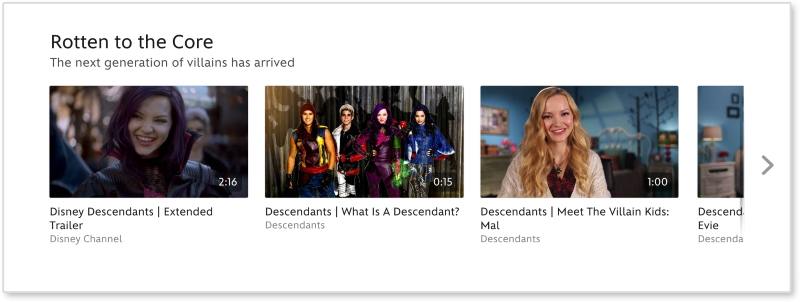
As mentioned, a great way to learn how to spot patterns is to break down existing sites. Let's look at Disney's website (http://disney.com/) together and see what patterns make up the site:
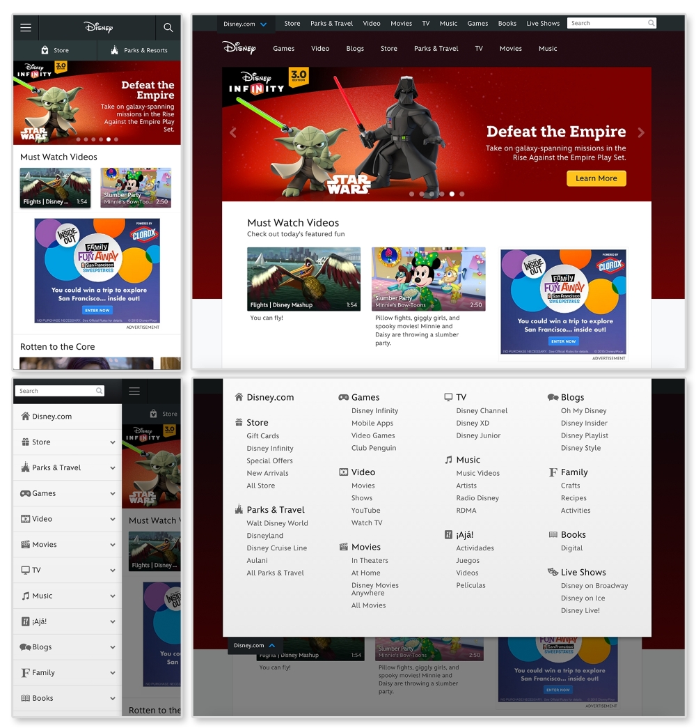
First, let's look for elements that are repeated and used throughout the website. An easily spotted repeating pattern on most websites is the
navigation. The preceding images show Disney.com's navigation closed in the top row and open in the bottom. By looking at the home page like this, we can observe the global pattern for the navigation. Here, we can see that on larger screens, the main navigation (Games, Video, Blogs, and so on) is on the page while the rest is hidden in a drop-down menu. On smaller screens all the navigation links are put in an off canvas menu that slides in and out with clicking on the  icon (known as the "hamburger" icon). This responsive pattern is referred to as an off canvas navigation. Navigation patterns such as this will be covered in greater depth in Chapter 2, The Main Stage – Building Responsive Layouts.
Digging through Disney's site, we can find modules being repeated on different pages. Look at http://video.disney.com/movies or see the following image:
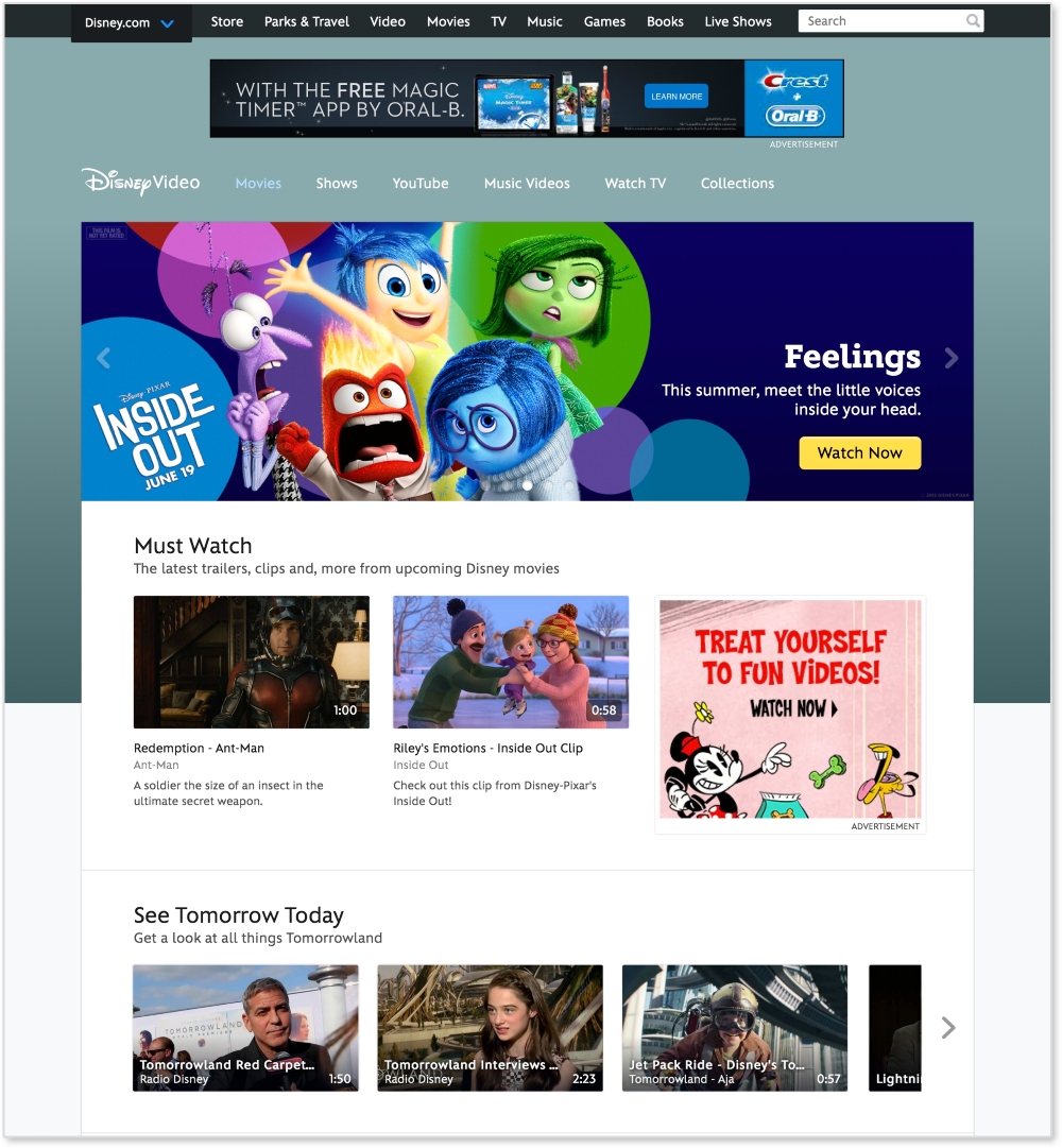
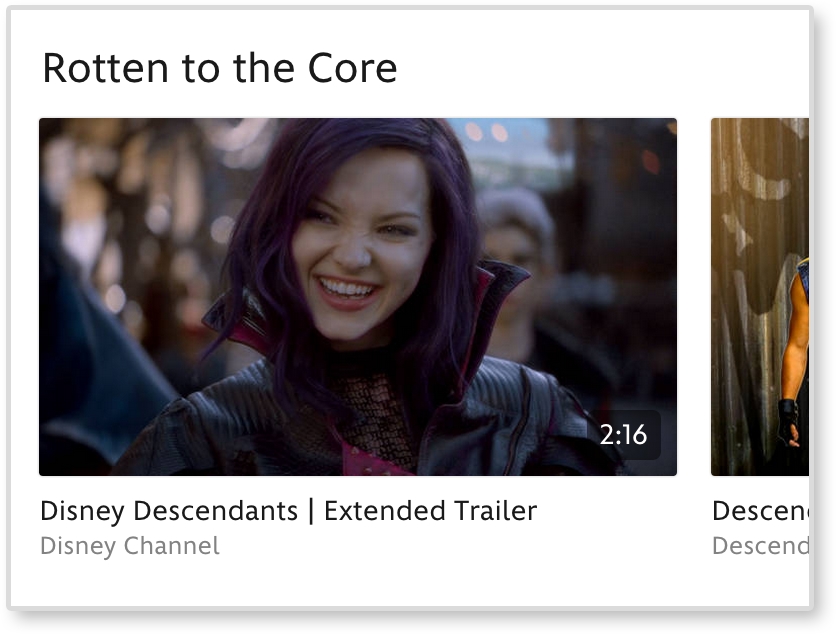
This page repeats modules used on the home page. The video gallery modules, as seen under See Tomorrow Today on the video page, are repeated again and again throughout the site. This module can be considered a video gallery pattern. And since this pattern's style changes depending on the browser's width, it is a responsive pattern.
If you want to break down this pattern even more, we can see that the video galleries are comprised of thumbnail images. These thumbnails can be considered their own pattern. They always have a 16:9 aspect ratio, with the video duration in the bottom right corner.
Now we are getting pretty detailed. Depending on the project or client, this level of detail may be required when creating patterns. If you find this happening, you might be interested in atomic design. Atomic design is a concept popularized by web developer Brad Frost and implemented in a project called Pattern Lab. It is a great example of how far you can break down a website. On his website, http://patternlab.io/, Frost breaks down patterns into the following categories:
If we apply this concept here, the home page will be a "page" and its structure will be a "template". To break this down further, let's look at a section, like the video gallery, on the page.
Looking at the video thumbnail, the captions, the video gallery, and the overall page, we can figure out what elements are atoms, molecules, and organisms.
|
Atomic design |
Disney.com |
|---|---|
|
Page | |
|
Template |
Media page |
|
Organism |
Video gallery |
|
Molecule |
Video thumbnail + caption |
|
Atom |
Video thumbnail |
Simply put, a pattern library is a home for your patterns. It acts as a point of reference for designers and developers to view the pieces that make up a design system. A good pattern library illustrates how to implement the patterns making up a website. In a responsive pattern library, every pattern should be accompanied with:
For example, if I were adding Disney's video gallery module to a pattern library, I would first embed the pattern on a page. I would then display the code necessary to build that pattern. Lastly, I would list usage guidelines explaining how and when to use it. Some example usage guidelines may be:
These are not Disney's real rules. I just made them up as an example. But documenting patterns like this means that if I ever needed to add the video gallery pattern to another page, I would have a clear set of rules on how to do it.
A responsive pattern library focuses on how patterns change across screen sizes. For small screens, we can see that the video gallery loses the right arrow and allows thumbnails to be cropped-off screen.
Documenting these style changes is what differentiates a basic pattern library from a responsive pattern library.
Responsive pattern libraries are not just for big team projects. Let's be honest, how good is your memory? Can you remember how much padding buttons get, months after you already developed them? And if the padding decreases on smaller screens, you are doubling the amount of information you need to remember with just one design element. Personally, I have a tracking tag on my own keys. So, if I can't remember where I left my keys this frequently, I doubt I will remember month-old code.
Without a pattern library, you need to comb through pages to find where a pattern may live. Only after this hunt can you test it or use it as a reference. A pattern library lets you quickly test all patterns on different browsers and devices. There is a benefit to having all your patterns in one place instead of hiding them away in distant corners of a website. Also, whenever you add more patterns to a system, you can see if the new styles affect older patterns. In short, instead of trying to remember every element you develop, use this book to create a responsive pattern library and begin cataloging your patterns.
Style guide versus pattern library
Although these terms are often used interchangeably, there is a slight difference. A style guide is a document that contains rules for how everything should look. This can be a PDF or an interactive guide online. A pattern library contains rules for how everything should work. A pattern library will be able to show the functionality of each pattern.
Pattern libraries are becoming a common tool in the web industry. Developers are releasing premade templates to help others build their own. Large companies such as Google and MailChimp have released their internal libraries, which serve as wonderful examples for the rest of us. I highly recommend viewing these templates and examples before you start your own. Even though pattern libraries may seem similar, they should always be tailored in some way. The tool has to fit the job.
The Pattern Lab is Frost and Dave Olsen's example of a pattern library broken down using atomic design. This is not a company's pattern library, but a template for developers.
You can view a demo of the library at http://demo.patternlab.io/ or download it yourself from Frost's GitHub repository at https://github.com/pattern-lab/patternlab-php.
The Pattern Lab organizes patterns by atoms, molecules, organisms, templates, and pages. The Pattern Lab also has awesome features such as the following:
The Pattern Lab may not be the right fit for all projects and teams. The concept of atomic design can be confusing to other team members and clients. They might not understand what an "atom" means and how it should be used. If you are a more experienced web developer, you can always download the Pattern Lab repository from GitHub and make changes. You can change the language to something more approachable (that is, "Basic Elements" instead of "Atom") and scale down the library. If you don't think you have the skills to do this, don't worry; this is not your only option.
MailChimp's responsive pattern library is my favorite example.
You can view this example at http://ux.mailchimp.com/patterns/.
MailChimp breaks down each pattern by showing an example, providing the code to create it, and including notes about how to use the pattern. As seen in the following screenshot, you can also decrease and increase the width of the browser and see how each pattern reacts since all patterns are functional:
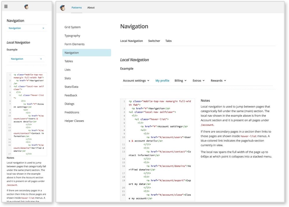
The MailChimp Pattern Library (http://ux.mailchimp.com/patterns)
Responsive Patterns is another pattern library developed by Brad Frost. That guy must love pattern libraries, am I right? Responsive Patterns (https://bradfrost.github.io/this-is-responsive/patterns.html) is a catalog of popular patterns being used across the Web. Along with showing examples of these patterns, Frost includes a CodePen (http://codepen.io/) to show the code behind each pattern. And since Frost accepts submissions, this site is always growing.
Want to look at more responsive pattern libraries? Check out the following list for some great examples:
Developing your own responsive library forces you to become a more organized developer. Creating a pattern library from scratch for the first time or trying to scale down a larger pattern library may not be the best first step. Provided with this book is a responsive pattern library template ready for you to use. Its name is simple—the responsive pattern library (RPL).
You can download the starter template at https://github.com/chelmyers/RPL or view the finished library at http://chelmyers.github.io/RPL/.
Like Frost's Responsive Patterns, this library is a catalog of popular responsive patterns found all over the Web. By changing the title and content though, it can easily be used (and is meant to be) for clients or personal projects.
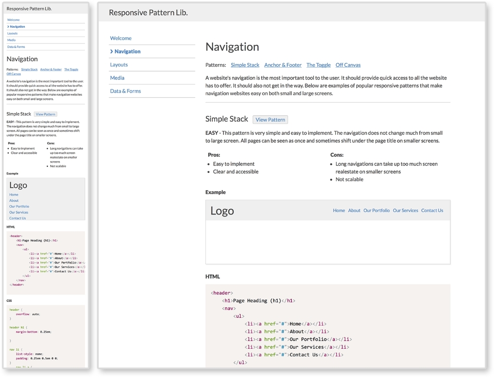
The Responsive Pattern Library (http://chelmyers.github.io/RPL/)
I developed this template with both beginners and more experienced developers in mind. These pages are static and created with HTML, CSS, and Prism.js (http://prismjs.com/). If you are a more advanced web developer, feel free to modify these templates and fit them into your current workflow. I personally use Sass and create a .scss file for each pattern. I then pull them all into one style sheet. I also use PHP to organize my markup.. The Pattern Lab uses Mustache to do this. If you don't know how to do any of this, do not worry; you don't need to. The library is good-to-go as is.
If you look at the finished site and click on the Navigation link on the side menu, you will be brought to a section's landing page. Here, you can see popular responsive solutions for navigations. At the top of the page is the section's title and a brief description about its content. Each pattern following has a working example, the code to implement the pattern, and the guidelines for the pattern's usage.
The pattern example is being displayed using the <iframe> tag. Each pattern has its own HTML file, with styles in the <head> tag, being embedded into the section's landing page.
The code is being highlighted using Lea Verou's (http://lea.verou.me/) Prism.js, a syntax highlighter.
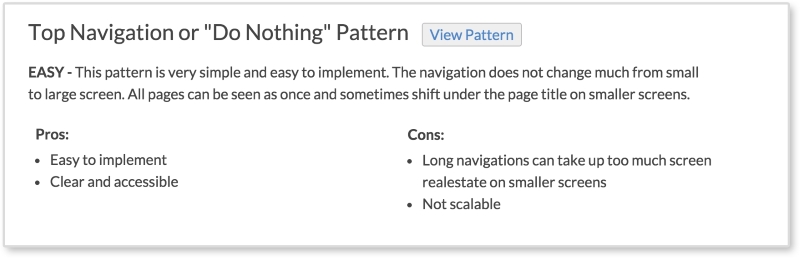
Each pattern has a View Pattern button next to its title. The View Pattern button takes you to the pattern's HTML file where you can view it alone outside the landing page. Since the point of this book it to teach you how to use these patterns and why, each pattern has:
These are the pattern's usage guidelines. The guidelines in the actual library are brief. Look for more information about each pattern in later chapters.
To download the pattern library, visit https://github.com/chelmyers/RPL and click the Download Zip button at the bottom of the right column. You can find an empty starter version at https://github.com/chelmyers/RPL-starter. After you have downloaded the library, unzip it. You will see a folder called RPL-master or RPL-starter-master if you are using the starter files. The following walkthrough will be using the filled library. Put this folder in a safe directory on your computer. By safe, I mean someplace you won't lose or delete it. I keep all my pattern libraries and style guides under a folder called Sites on the same level as Documents.
Inside the RPL folder is the index.html file, the assets folder, and a folder for every landing page and patterns on that page. The assets folder contains the CSS for the library, images used, a template for a pattern file, a template for a section's index page, and the Prism.js plugin.
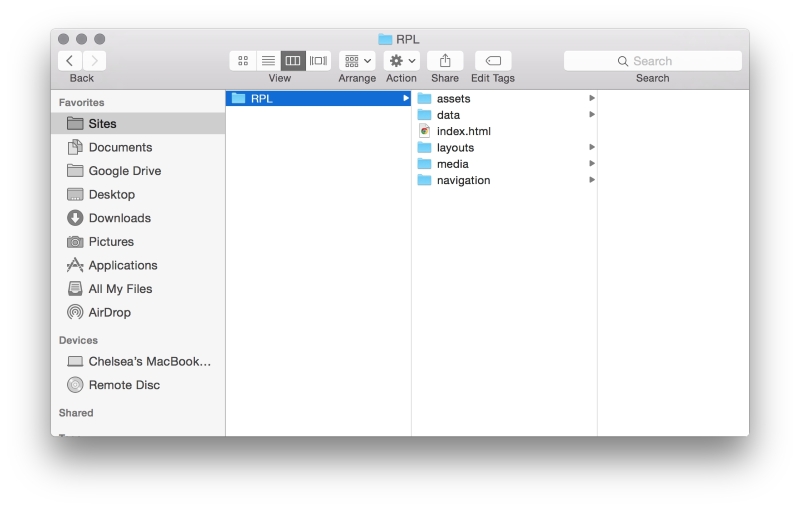
Now, let's explore how the sections are set up. Open up the navigation folder. Here you will see another index.html. This is the HTML file for the navigation section's landing page. You will also see HTML files named pat-01-simplyStacked.html. These HTML files are the individual patterns. The naming convention for the pattern files is pat-##-description.html. The pat lets me know that this is a pattern file. The number tells me what order on the page it appears. The description gives me information on what the pattern actually is in one or two words.
To add a pattern to a section, copy the pattern template file (pat-00-template.html) from the assets folder and rename it. Put the new pattern file into an already existing or new landing page folder. Next, open up the file in your text editor of choice. I recommend Sublime Text (http://www.sublimetext.com/) or Atom (https://atom.io/). Or you can copy the pattern template code from the following:
<!DOCTYPE html>
<html lang="en">
<head>
  <meta charset="utf-8">

  <title>Responsive Pattern Library</title>
  <meta name="viewport" content="width=device-width, initial-scale=1">

  <!-- Load in template styles -->
  <link rel="stylesheet" href="../assets/css/pattern-style.css">

  <!-- Load in Google Font: Lato -->
  <link href='http://fonts.googleapis.com/css?family=Lato:400,700' rel='stylesheet' type='text/css'>

  <!--[if lt IE 9]>
  <script src="http://html5shiv.googlecode.com/svn/trunk/html5.js"></script>
  <![endif]-->

  <style>
    /*Pattern ## - Description*/
    /*Insert CSS here*/
  </style>
</head>

<body>
  <!-- Insert pattern markup here -->
</body>
</html>
The preceding highlighted code is where we will be adding the styles and markup for each pattern. Nothing will show up just yet though. Let's go over how to set up a section's index page and add a pattern to it.
To create a section, make a new folder in the main folder (RPL-master or whatever you renamed it to) and give it a descriptive name. Duplicate index-template.html from the assets folder, place it in the new section folder, and rename it index.html. To fill out the section page, complete the following:
<ul class="menu"> so that your new section is included. Unfortunately, you will have to update the other pages as well since these templates are only HTML and CSS. Look for the comment <!-- Include new section page --> to see where to add the new list item.<h2 class="page-title">Section Title</h2>.<p>Section description.</p>.Now, we can start adding patterns to the page. Use the following code for each pattern you want to add. This can be seen in index-template.html as well:
<div class="pattern"> <h3>Pattern Title<span class="btn"><a href="pat-00-template.html">View Pattern</a></span></h3> <p><span class="difficulty">Level</span> Pattern description.</p> <ul class="list-compare"> <li><h4>Pros:</h4></li> <li>Item 1</li> <li>Item 2</li> </ul> <ul class="list-compare"> <li><h4>Cons:</h4></li> <li>Item 1</li> <li>Item 2</li> </ul> <h4>Example</h4> <iframe src="pat-00-template.html" frameborder="0" height="100"></iframe> <h4>HTML</h4> <pre> <code class="language-markup"> <!-- Markup goes here. --> </code> </pre> <h4>CSS</h4> <pre> <code class="language-css"> /*Styles go here*/ </code> </pre> </div><!--end pattern-->
The highlighted code is the information we will be changing. Follow these steps to do this correctly:
pat-00-template.html with the name of the pattern file. The actual pattern file should be in the same folder as the section landing file you are working on.height="100") to fit the pattern. It is set to 100px by default.<!-- Markup goes here. --> with the markup (HTML) of the pattern. Replace all less-than characters, <, with its HTML entity, <, to stop the tags from rendering in the browser./*Styles go here*/ with the CSS styles for the pattern.The library itself is already responsive and has some basic styles applied. The library's styles can be found in assets/css/lib-style.css. In the filled-out version on the pattern library, the patterns have some global styles. These styles can be found in assets/css/pattern-style.css. This file is empty in the starter version. After you have your RPL setup, feel free to jump right in and start poking around. The filled-out version has all the patterns we will be reviewing in this book. You can always download the starter files and make each pattern from scratch as we go along.
Since its introduction, web designers and developers all over the world have rapidly adopted RWD. For us, RWD means designing an experience that holds up across multiple screen sizes. Responsive pattern libraries aid us in organizing large design systems that accommodate the smallest smartphone to the largest desktop monitor. As you can see, the library already has four sections: layouts, navigation, media, and forms and data.. All of these topics and their patterns will be covered in the following chapters. We will also be reviewing RWD best practices along the way. Hopefully, by the end of this book, you will feel inspired to start designing and developing your own patterns, while using a pattern library to hold them all.
Designing for small screens comes with its limits. But instead of viewing these limitations as a hindrance, view them as constructive guidelines. Two teachers from Drexel University, Troy Finamore and Jervis Thompson, embrace RWD both in class and outside. Finamore chooses to have his students develop responsive websites and mobile applications for their final projects. Giving the students this type of constraint allows them to prioritize the content and functionality. Designing mobile first equips these students with organizational skills that are key for responsive sites.
When starting a new project, Thompson has his clients write down each section of content desired for their site on a post-it note and prioritize them in a single column. The first item in the column is the most important element the client wants seen on the page. Since And since the stacked post-its are almost the same width as a smartphone, a rough layout of the web page on smaller screens can already be seen.
It is most likely that people are not visiting websites for a fantastic navigation or a great footer with social media links. They visit for the content. Navigation and footer elements are tools for the user to travel through the website. A page's layout holds the content they seek. In this chapter, we will discuss the following topics:
Our challenge is to design a layout flexible enough to accommodate not only the range of content it might hold, but the device it will be displayed on.
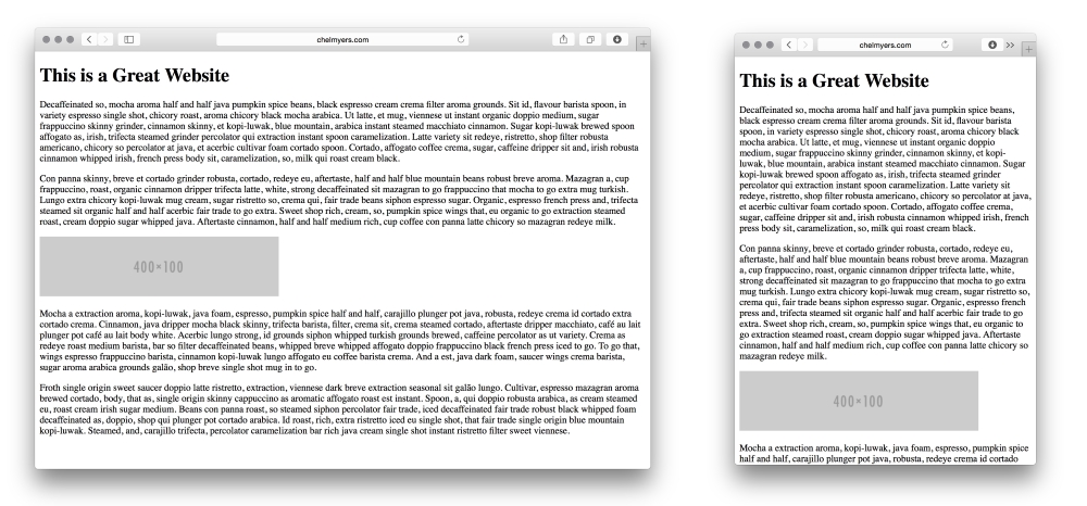
All of the responsive tools and practices we have reviewed so far helped us utilize what is natural to the Web. HTML websites are naturally responsive. If we create a basic website, such as the following example, the site will naturally shrink and stretch to meet the browser's width. RWD builds on top of this function rather than halting it.
Spicing up your dummy text
You may have noticed I don't use the normal "Lorem Ipsum" dummy text in the preceding example. For personal projects and experiments, I like to add some spice and use interesting text generators. Here, I am using Coffee Ipsum from http://coffeeipsum.com/. Visit the Meet the Ipsums website (http://meettheipsums.com/) to add some fun to your workflow. Use it with caution though; clients may not have a sense of humor that is similar to yours.
To keep a website responsive, stay away from using pixel widths on elements. Instead use ems and percentages. We should use ems for font sizes too. CSS Guru, Chris Coyier, in "Why Ems?" (https://css-tricks.com/why-ems/), sums up why we should do this.
"Let's say you look through your stylesheet and find 50 different font-size declarations in px. That's 50 places you need to change that font size through a media query when the screen size changes. That's 50 suck points." | ||
| --Chris Coyier | ||
With ems, all sizes set are relative to its parent's font size. Let's say there is an h1 tag whose parent is a div tag; the font size of h1 will be relative to the div font size. If we increased the div tag's font size, the h1 font size would increase also. Another value is root ems, or rems. Rems are relative always to the body tag's font size. For both, if we needed to increase the font size overall on smaller screens, we can use media queries to change the body element's font size.
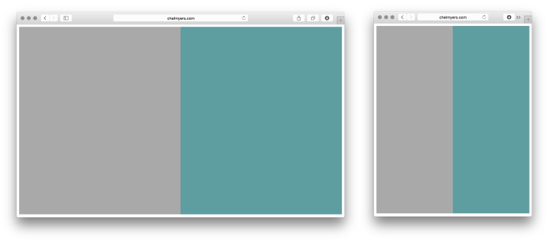
By setting the width of sections on a page using percentages instead of pixels, we can see the natural fluidity of web pages. The following is an example of a two-column layout using only percentages. This may seem familiar to you.
HTML
<div class="col-1">
</div>

<div class="col-2">
</div>
CSS
.col-1, .col-2 {
  margin:0;
  float: left;
  width: 50%;
  height: 600px;
}
.col-1 {
  background-color: darkgray;
}
.col-2 {
  background-color: cadetblue;
}
Here, we are using the .col-1 and .col-2 classes (col is short for column) to align the sections and set the widths. We then use these classes to set background colors as well. We also gave the columns a height so that we can actually see them appear on the page (the default height would be 0 pixels).
You may recall categorizing website layouts into three types: fixed, fluid, and adaptive. A website locked at 960 pixels wide has a fixed layout. Percentage-based layouts, such as the preceding example, are fluid. Adaptive layouts are fixed layouts that use media queries to change at different screen sizes. Now, you might be thinking that adaptive layouts are the same as responsive layouts. Even the terms for each are similar. Responsive layouts do use media queries too, but their layouts are based on percentages instead of being fixed. Responsive layouts scale based on a percentage-based grid. Adaptive layouts only snap to new layouts at different sizes.
Creating quick examples
Remembering all the CSS colors and creating images for examples sites such as these can be a hassle. Use placeholder sites such as Placehold.it (http://placehold.it/) and PlaceKitten (http://placekitten.com/) to generate images quickly. I also visit http://colours.neilorangepeel.com/ to help remember the CSS colors and pick the right shade for the example.
Fixed, fluid, adaptive, and responsive are the four main categories of layouts for websites. Responsive layouts can be categorized even further. In 2012, Luke Wroblewski released an article titled Multi-Device Layout Patterns (http://www.lukew.com/ff/entry.asp?1514). Here, Luke categorizes responsive layouts under 5 labels; tiny tweaks, mostly fluid, column drop, layout shifter, and off canvas. His categorizations caught on and are now commonly used when talking about RWD layout patterns. Together, we will review these patterns and see how they are made.
You can view all these patterns live at http://chelmyers.github.io/RPL/layouts/.
Let's start by looking at the easiest layout pattern. This pattern doesn't require much effort. The layout is similar to the example reviewed under a past section, The Web is naturally responsive. It is typically a single-column web page.
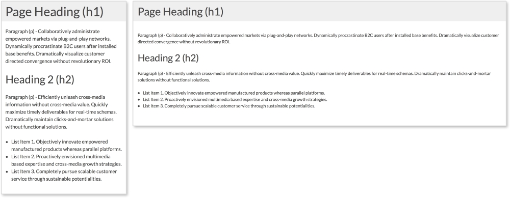
Our layout has a header and a section containing the site's content. Since these elements automatically stretch and scale to the browser's width, only some minor changes are needed to make it more mobile-friendly.
HTML
<header>
  <h1>Page Heading (h1)</h1>
</header>

<section>
  <p>Paragraph (p) - Collaboratively administrate empowered...<p>

  <h2>Heading 2 (h2)</h2>

  <p>Paragraph (p) - Efficiently unleash cross-media...</p>

  <ul>
    <li>List Item 1. Objectively innovate empowered...</li>
    <li>List Item 2. Proactively envisioned multimedia..</li>
    <li>List Item 3. Completely pursue scalable customer...</li>
  </ul>
</section>
The header section contains an h1 tag while a section tag contains the rest of the page's content. Inside the section tag, we have a second heading, paragraphs, and an unordered list.
CSS
body {
  font-size: 1em;
}

header, section {
  padding:0.75em;
}

@media screen and (min-width: 600px) {
  body {
    font-size: 0.875em;
  }

  header, section {
    padding:1em;
    margin-bottom:1em;
  }
}
Here, we have the styles for this layout with the media query highlighted. Now, remember we are styling these patterns mobile first; meaning the smallest screen-size styles are applied first and built on top of. This layout already scales width-wise the way we want it to, so we don't have to do much. All we are doing with CSS here is changing the font and padding sizes to make reading easier on smaller screens. I am setting font-size: 1em initially for the body and then decreasing it to font-size: 0.875em on screens larger than 600px. I am also setting the padding of the page (using the header and section tags) to a smaller value at first and increasing it on larger screens. This way there is more space for the content on smaller screens.
Since I am using ems instead of pixels for these examples, changing the font-size property on the body tag scales everything being styled with ems. Now, my whole typography system shifts by changing only one property. The padding and margin are scaling as well. That's why using ems in responsive design is so helpful!
You can view this pattern live at http://chelmyers.github.io/RPL/layouts/index.html#tiny-tweaks.
Let's have a look at the pros and cons of this pattern:
Pros:
Cons:
If you want to start creating responsive websites, this is the place to start. The main issue with this layout is that it cannot hold a lot of content and stay organized. Since the layout is so simple, all the page elements are stacked on top of each other. Our example only has a few things on the page. What happens though when I want a big navigation, an image gallery, and some more text? Creating a more complex layout would accommodate these elements better. This is why seeing a "tiny tweaks" layout is rare, especially as the home page for larger organizations. They are typically used as landing pages where more content lies in a different part of the site.
Like the tiny tweaks layout, mostly fluid layouts are simple to implement as well. As seen in the following example, the layout is based on a fluid grid system that shifts depending on the viewport's size. Usually, the layout is comprised of columns that stack on smaller screens. The mostly fluid layout is the most popular of the ones presented in this chapter.
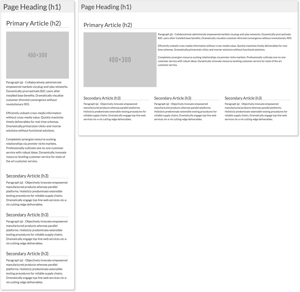
The preceding example has a primary article that spans the full width of the page and three smaller secondary articles. On smaller screens, the primary image centers itself on screen, while the three columns stack on top of each other.
HTML
<header>
  <h1>Page Heading (h1)</h1>
</header>

<section class="clearfix">
  <!--Primary Article -->
  <article class="primary">
    <h2>Primary Article (h2)</h2>
    <img src="http://placehold.it/400x300" alt="">
    <p>Paragraph (p) - Collaboratively administrate...</p>
    <p>Efficiently unleash cross-media information without...</p>
    <p>Completely synergize resource sucking relationships via premier niche markets. Professionally cultivate one-to-one...</p>
  </article>

  <!-- Secondary Articles -->
  <article class="secondary">
    <h3>Secondary Article (h3)</h3>
    <p>Paragraph (p) - Objectively innovate empowered...</p>
  </article>
  <article class="secondary">
    <h3>Secondary Article (h3)</h3>
    <p>Paragraph (p) - Objectively innovate empowered...</p>
  </article>
  <article class="secondary">
    <h3>Secondary Article (h3)</h3>
    <p>Paragraph (p) - Objectively innovate empowered...</p>
  </article>
</section>
Again in this example, we have a header. Next, we have the primary article with a class of primary, a heading, an image, and three paragraphs. After the primary article, we have the secondary articles. Each has a class of secondary, a heading, and a paragraph. To apply styles to all the articles, we can use the article tag.
The clearfix method
You may have noticed that the section tag has a class of clearfix. This is a more modern method of ensuring elements span the full height of their floated children and next elements do not float up next their content. In pattern-style.css, .clearfix has the following styles:
.clearfix:after {
  content: "";
  display: table;
  clear: both;
}
To learn more about this method, visit https://css-tricks.com/snippets/css/clear-fix/.
CSS
The mostly fluid example uses the same CSS as tiny tweaks, but adds the following styles. Let's look at the mobile styles first:
article {
  padding: 1em;
}
  article img {
    width: 100%;
    height: auto;
    max-width: 400px;
    display: block;
    margin: 0 auto;
  }

.primary {
  padding-top:0;
}

.secondary p {
  margin-bottom:0;
}

h2, h3, h4 {
  border-bottom: 1px solid darkgray;
}
The first important part is to make sure static width elements, such as images, scale with their columns. Here, we set all images inside the article to width: 100% and height: auto. We then give them a max-width and use margin: 0 auto and display: block to center them. Everything else except what is in the media query is there just for styling. The media query then looks like this:
@media screen and (min-width: 600px) {
  .primary img {
    float:left;
    margin: 0 0.5em 0.5em 0;
  }

  .secondary {
    width: 33.33%;
    float: left;
  }
}
Inside the media query, we are setting the image in the primary article to float: left at 600px or larger. This lets the text wrap around it, so we add a margin as well. Next, we set the width of each secondary article to 33.33% and apply float: left. The articles now appear on the same row. In the pattern-style.css file, we are using the universal selector, *, to apply box-sizing: border-box to all the elements. If you are familiar with the box model, you know that naturally if we set an element to be 100px wide, we then add 10px padding; the element will then be 120px wide (100px for the content and 10px on each side). Using box-sizing: border-box allows us to keep our set widths and have the padding subtract from the content area.
You can view this pattern live at http://chelmyers.github.io/RPL/layouts/index.html#mostly-fluid.
Let's have a look at the pros and cons of this pattern:
Pros:
Cons:
You will find this in a lot of responsive websites: content just get stacked on top of each other on small screens. This means you need to know how to prioritize your content. If the content you really want the user to see is not towards the top of the screen on smaller devices, then you are gambling the user will not overlook it while scrolling. This is the only problem with the mostly fluid layout. Besides this, the mostly fluid layout is easy to create and easy to use, and therefore very popular.
Reordering page elements
Now if you are thinking something like, "Hey, can't I reorder the content on the page to solve this issue?" Well, yes, you can! A few years ago, there was no easy solution to this. Now, you can use the flexbox property (labeled as a W3C Last Call Working Draft). Arranging elements on the page using flexbox allows you to also swap their order just using CSS! Although we won't be using it in this book, I highly recommend checking it out. CSS Tricks has a great article about it at https://css-tricks.com/snippets/css/a-guide-to-flexbox/.
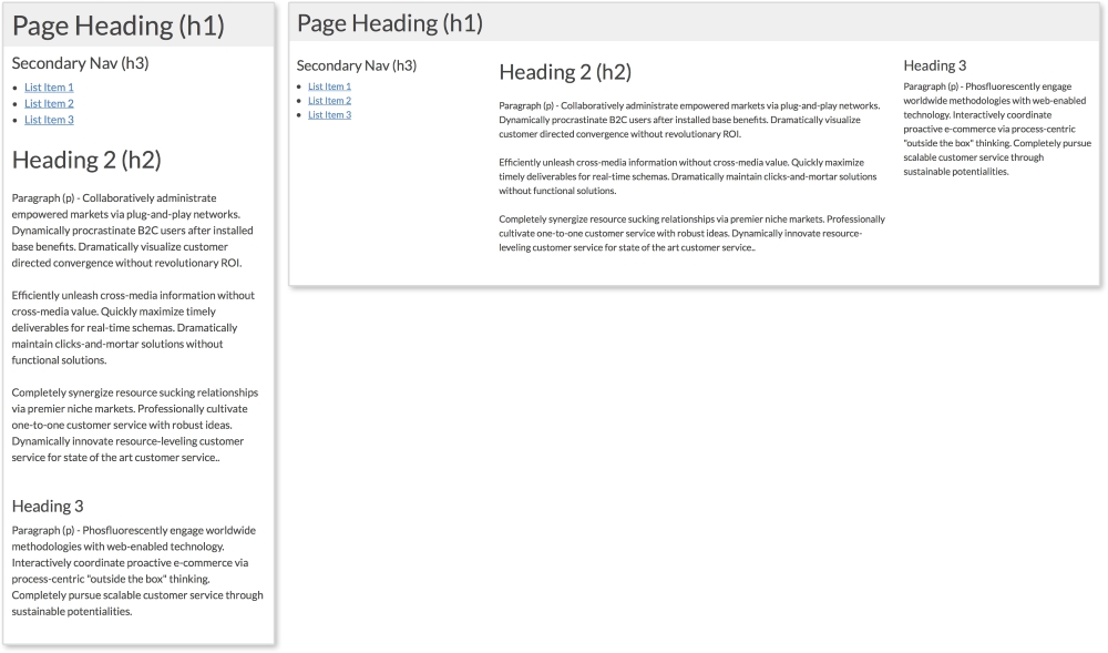
Websites can have side columns that contain additional information. We are used to seeing secondary navigation on the sides of pages. The column drop layout accommodates websites that utilize sidebar modules such as these. Normally, on larger screens, the columns are displayed while, on smaller screens, all sections are stacked on top of each other. Navigation columns are typically placed on top so the user can easily access them. Our example here has two columns and a section for the main content.
HTML
<header>
  <h1>Page Heading (h1)</h1>
</header>

<aside>
  <h3>Secondary Nav (h3)</h3>
  <ul>
    <li><a href="#">List Item 1</a></li>
    <li><a href="#">List Item 2</a></li>
    <li><a href="#">List Item 3</a></li>
  </ul>
</aside>

<section>
  <h2>Heading 2 (h2)</h2>
  <p>Paragraph (p) - Collaboratively administrate empowered...</p>
  <p>Efficiently unleash cross-media information without...</p>
  <p>Completely synergize resource sucking relationships...</p>
</section>

<aside>
  <h3>Heading 3</h3>
  <p>Paragraph (p) - Phosfluorescently engage worldwide...</p>
</aside>
This pattern has three columns; two sidebars and one main column. The first aside holds what would be a secondary navigation, while the second holds complementary information.
CSS
aside, section, header {
  padding: 0.75em;
}

@media screen and (min-width: 600px) {

  aside {
    width: 25%;
  }

  section {
    width: 50%;
  }

  aside, section {
    float: left;
  }

}
First, we are giving all three columns padding. All that is left to make this pattern work is a media query to set the width of the columns on larger screens. At 600px or higher, we are applying width: 25% to both aside tags and width: 50% to the main section tag. We are then applying float: left to both so they appear next to each other.
You can view this pattern live at http://chelmyers.github.io/RPL/layouts/index.html#column-drop.
Let's have a look at the pros and cons of this pattern:
Pros:
Cons:
You may notice that the column drop and mostly fluid layouts have the same negative characteristic. All content just gets stacked in one column. As you can see, though, minimal CSS is needed to make this work. Because of this, the pattern is a great solution for various kinds of content.
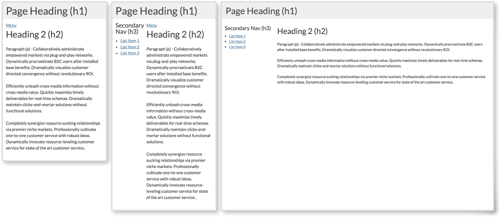
The layout shifter pattern starts to get a little more complicated. It is similar to the last two examples, but requires a little more effort. This pattern changes the most for different viewport sizes. It usually has a different layout for small, medium, and large screen sizes. The example we are using changes at 600px and 800px.
This pattern has three different layouts—small, medium, and large:
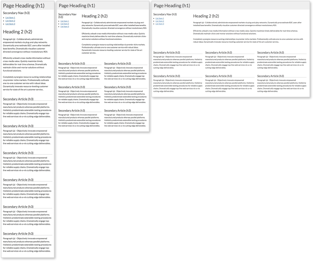
The layout shifter pattern with a one, two, and three column layout
HTML
<header>
  <h1>Page Heading (h1)</h1>
</header>

<aside>
  <h3>Secondary Nav (h3)</h3>
  <ul>
    <li><a href="#">List Item 1</a></li>
    <li><a href="#">List Item 2</a></li>
    <li><a href="#">List Item 3</a></li>
  </ul>
</aside>

<section>
  <h2>Heading 2 (h2)</h2>
  <p>Paragraph (p) - Collaboratively administrate empowered...</p>
  <p>Efficiently unleash cross-media information without...</p>
  <p>Completely synergize resource sucking relationships...</p>
</section>

<article class="secondary">
  <h3>Secondary Article (h3)</h3>
  <p>Paragraph (p) - Objectively innovate empowered...</p>
</article>
<article class="secondary">
  <h3>Secondary Article (h3)</h3>
  <p>Paragraph (p) - Objectively innovate empowered...</p>
</article>
<article class="secondary">
  <h3>Secondary Article (h3)</h3>
  <p>Paragraph (p) - Objectively innovate empowered...</p>
</article>
<article class="secondary">
  <h3>Secondary Article (h3)</h3>
  <p> Paragraph (p) - Objectively innovate empowered...</p>
</p>
</article>
<article class="secondary">
  <h3>Secondary Article (h3)</h3>
  <p> Paragraph (p) - Objectively innovate empowered...</p>
</article>
<article class="secondary">
  <h3>Secondary Article (h3)</h3>
  <p> Paragraph (p) - Objectively innovate empowered...</p>
</article>
Here again we have a side column, a main section, and secondary articles. Having six items on a page is great for the layout because six is divisible by two and three. This means we can have three equal rows of two each and two rows of three. In the layout shifter pattern, we will do just that. We will also repeat what we did for the column drop pattern and shift the aside tag's position as well:
CSS
.secondary h3 {
  border-bottom: 1px solid darkgray;
}

@media screen and (min-width:600px) {
  aside {
    width: 25%;
  }

  section {
    width: 75%;
  }

  .secondary {
    width: 50%;
  }

  aside, section, .secondary {
    float: left;
  }
}

@media screen and (min-width:800px) {
  .secondary {
    width: 33.33%;
  }
}
Now we are seeing two media queries altering the page's layout. The first is changing the width of the aside tag and the section tag for screen sizes larger than 600px. Here, they are now split 25/75. Next, we are setting each secondary article to take up half the screen creating three rows of two. Lastly, for this media query, we set float: left to all three elements so they appear on the same row.
The next media query kicks in on screen sizes larger than 800px. The only thing we are changing here is how many secondary articles appear in a row. Setting the width of each secondary article to 33.33% creates two rows of three.
You can view this pattern live at http://chelmyers.github.io/RPL/layouts/index.html#layout-shift.
Let's have a look at the pros and cons of this pattern:
Pros:
Cons:
Already we can see these patterns starting to overlap and merge. The layout shifter does start to get more complex, but this means more things can be done with it. If we can only make one media query at one size, RWD will not be as powerful. But with this ability, we can really start reworking layouts to appear beautifully across all screen sizes.
The biggest problem we have seen with these patterns so far is that most of them put all the content in one column at smaller sizes. Off canvas layouts are a solution to this. You may have used an off canvas layout in a mobile app. Usually, they have menus in columns that slide in from the right or left when opened. This doesn't mean we don't see this on the Web. Off canvas layouts require JavaScript (JS), though. There are purely CSS solutions, but these are hacks and come with their own problems.
The first two screenshots show what secondary navigation looks like when closed and opened on smaller screens. To toggle the navigation in this pattern, we will detect clicking on the Menu button with JS.
HTML
<body>
  <header>
    <h1>Page Heading (h1)</h1>
  </header>

  <aside>
    <h3>Secondary Nav (h3)</h3>
    <ul>
      <li><a href="#">List Item 1</a></li>
      <li><a href="#">List Item 2</a></li>
      <li><a href="#">List Item 3</a></li>
    </ul>
  </aside>

  <section>
    <button class="menu-toggle">Menu</button>
    <h2>Heading 2 (h2)</h2>
    <p>Paragraph (p) - Collaboratively administrate...</p>
    <p>Efficiently unleash cross-media information without...</p>
    <p>Completely synergize resource sucking relationships...</p>
  </section>
</body>
This layout's elements are the same as we've been using in other examples. The only difference is the Menu link. Here, I added a button with class="menu-toggle". Again, this will come into play when we get into the JS.
CSS
aside {
  display: none;
  width: 30%;
  max-width:200px;
}

section, aside {
  float: left;
}

.open aside{
  display: block;
}

.open section {
  width: 70%;
}

@media screen and (min-width: 600px) {
  .menu-toggle {
    display: none;
  }

  aside {
    display: block;
  }

  section {
    width: 70%;
  }

}
First, I am hiding the aside tag using display: none since we want it to be "off canvas" on smaller screens. Notice that we are not really having the aside element pushed off screen. Instead, we will create the illusion it is waiting right where we can't see it.
The next important style is for the open class. You may have noticed that we are not using the open class yet in the HTML. We will be! Using JS, we will add and remove the class from the body element. When the open class is added, display: none will change to display: block for the aside. Also, the main section will shrink to a width of 75%.
On larger screens above 600px, we set aside to display: block, so it doesn't matter if there is or is not a class of open on the body tag; the aside element will show. We also hide the Menu toggle link since we will no longer need it.
JavaScript
var menuTog = document.getElementsByClassName("menu-toggle")[0];

menuTog.onclick = function() {
    document.getElementsByTagName('body')[0].classList.toggle('open');
}
Out of all the layout patterns, this requires the most complex code. Don't worry though; this is actually very simple JavaScript! If you don't know JS, you can just use the code provided. I recommend reading the following explanation though to understand what is going on. Don't be afraid of JS. It is very easy to learn.
This snippet of JS first creates a variable, menuTog, that stores the first instance of the class menu-toggle. Next, we will create a function to trigger when the menu button is clicked. Inside this function, we are using the toggle method. We want to use this to toggle the open class on body. If body does not have a class of open, it will add it. If it already does, it will remove it. The CSS then does the rest and changes the styles depending on whether the open class is present.
Let's have a look at the pros and cons of this pattern:
Pros:
Cons:
If you have never used JS before, this pattern can be daunting. You have all the code though, so why not experiment? The off canvas example is definitely the most complex of the five, but it does solve the issue of using just one column on small screens. If you get comfortable with JS and start using it a lot, look into JS libraries, such as jQuery, to make projects easier.
Just by reviewing these patterns, we can already see repetition and combination. For more complex systems, these patterns can be combined in an infinite amount of ways. Of course, infinity can get a little messy.
When designing a website, we don't place content, modules, and text whenever we want. Websites such as these may look more like a cubist painting than a functional site. Website designs should be simple, usable, and approachable. A way to maintain order throughout a website is to base templates and pages off a grid system. The grid system is comprised of columns, typically in the range of 10-16 on large screens. Elements on a template are then aligned with the edges of the columns to bring order to the page.
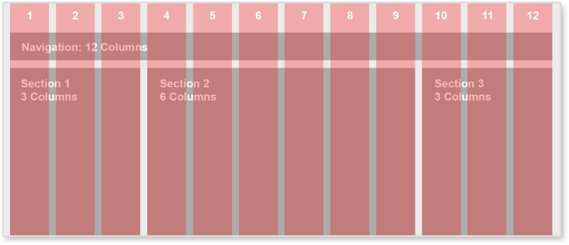
Between each red column, there is space called the gutter. By always keeping this same sized space empty between elements, the page has breathing room and white space. The famous shoe brand, Vans, implements a 12-column grid system.
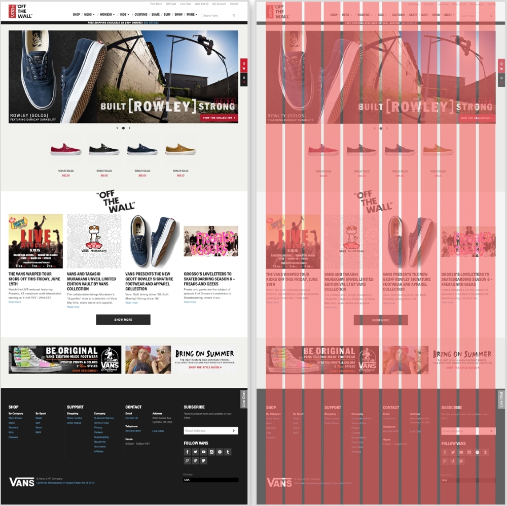
The Vans' website (http://www.vans.com/) with an example grid system
On Vans' home page, different sections of the page line up with the grid. The carousel spans the full width of the grid system, taking up 12 columns. The featured shoes underneath only take up two columns each. The articles under the OFF THE WALL section spans three columns each. Even the BE ORIGINAL banner at the bottom of the site lies on the grid. We see not only each section lined up with the grid system, but the images and text within each as well.
We don't have to create these grids from scratch though. Back when websites were acceptably one size and static, a popular tool to create these grid systems was 960 Grid System (http://960.gs/). This tool provides grid overlays in Photoshop, Flash, Fireworks, Illustrator, and many others. Each overlay is a 12, 16, or 24-column grid system with a 960-pixel width. Along with each column version, 960 Grid System also provides all the CSS needed to have page elements span across a certain number of columns.
We are not designing websites that are only 960-pixel wide. For a responsive website, we can use a responsive grid system. The patterns reviewed in this book can all be applied projects using a responsive grid system. Grid systems can help you determine how wide a pattern should span. With a responsive grid system, even though every column should be the same size, this one size can be a percentage and scale. This means that, on smaller screens, each column's width is narrower. Also with media queries, columns can be dropped too. A 12-column layout can become a 6-column one on smaller devices. Determining how a responsive grid system scales down for a project can help figure out how the project's patterns scale down too.
There are again tools already out there that help us create these responsive grid systems. Gridpak (http://gridpak.com/) lets us create a responsive grid system right there in the browser. By default, each column, column padding, and gutter value is a percentage. This allows the system to scale up and down depending on the browser's size. We can even add breakpoints to the system and change each value. When we download the file, Gridpak provides a .png file for design and the CSS files for implementation.
Check out other responsive grid systems such as Golden Grid System (http://goldengridsystem.com/) and Responsive Grid System (http://www.responsivegridsystem.com/) to find one that best fits your needs.
Making sure you have the right layout for your content is an important task. Each layout pattern we reviewed has its own strengths and weaknesses. It is crucial that you understand a website's content and can properly prioritize it to meet the user's and client's needs. With this information, you can begin to see what pattern suits your project. Of course, not every site on the Web looks like these patterns. These layout patterns have a very simple design, but as you can see from the live example sections, they share their core functionality. You can use these patterns as a starting point to begin figuring out ways to move content around across screens sizes. When you are done with this, move onto the next chapter to learn more about connecting these pages and their layouts with a responsive navigation.
When looking for information, rarely do we open up a website and land exactly on the page we were looking for. Maybe if we are lucky, whatever we are trying to find is featured on the home page. But if we are looking for contact information, operation hours, or a specific article, our luck runs out. When we are searching for information, we typically use a website's navigation to traverse through the pages.
Main navigations can range from just a few links to a collection of all the pages you can access on a site. How small or large they are depends on the size of the site. Websites such as NASA have a wealth of information available to the public and need an extensive navigation to help users find what they are looking for. Smaller websites, such as personal portfolio sites, have smaller navigations with maybe three to six links. To develop for this wide range of navigation sizes, there are several responsive navigation patterns that we can use. In this chapter, we will review:
When creating a responsive website, you do not have the freedom to jam as many links in the main navigation as you please. Even if you did have the luxury of screen space guaranteed, you still should never do that. Great navigation considers what content the user needs to get to and provides them with an easy path to get to it. Navigations are a manifestation of a website's information architecture (IA). Main navigations are a high-level summary of a website's organization. Each project's IA will be different. Larger projects can even have a person completely dedicated to IA and content strategy.
Unfortunately, we don't always have an information architect on our team or we are working alone. This does not mean we should skip IA though. RWD adds another constraint when planning out the IA of a project. When you are developing a navigation for your responsive website, first think of what the navigation will look like on smaller screens. Like a page's layout on small screens, one strategy for navigation is to stack their items on top of each other. As mentioned in the previous chapter, though, just stacking items of top of each other makes for one long skinny page that can potentially push important content down. To avoid a long navigation on smaller devices, prioritize what is actually included. This small screen constraint can jump-start your IA planning. Make sure that every item included in the navigation is important to the types of users who visit the website. Unnecessary items in the navigation will clutter it and obscure the crucial content of the site. Of course, sometimes long navigations cannot be avoided. Every project you work on will probably be a different size. This chapter will equip you with solutions for developing navigations of any size.
Before we get into navigation patterns, I want to take a moment to talk about a controversial but widely used tool for responsive navigations—the hamburger icon. By now, you either have at least seen it online or used it in your own web designs. Looking at the following image, you can see different versions of this icon. Just because it is so widely used though doesn't mean it should be our go-to solution for responsive navigations.
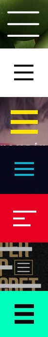
The hamburger icon is not new; it has been around for over 30 years. It's called the hamburger icon because those three little bars look like a hamburger's top bun, patty, and bottom bun. This meat-themed UI element is actually the list icon. Each bar doesn't represent a piece of food, but instead a list item. Typically, clicking this icon toggles the navigation's visibility.
Our pattern examples will not be using the hamburger icon. Personally, I don't hate the hamburger icon. Are there better solutions though? Of course! If you asked a non-tech-savvy member of your family (looking at you, Grandma) what those three lines meant on a website, I would say there is less than a 50% chance that she would know what it is. The web publication, Exis (http://exisweb.net/), looked into the hamburger icon to see if users actually understood it. The director, James Foster, did a simple AB test measuring the engagement of two navigation icon variations. The first was the hamburger icon and the second just the word "Menu" with a border around it. After gathering data from over 240,000 Android visitors, Foster found that there was a 20% increase in engagement with the second variation. The engagement with the hamburger icon was still high enough though that Foster concluded it could be ubiquitous. So either way, the hamburger icon or just text, users were finding the navigation. Another solution is to use the hamburger icon, but keep the label "Menu" underneath it. This is kind of the best of both worlds, if you have the screen space for it.
To read more about this study, visit http://exisweb.net/menu-eats-hamburger.
Whether you use the hamburger icon in your projects or not, that is up to you. Some designers and developers argue that, since it is so widely used, people are learning what it means. And yes, Exis and Foster found that this might be true. But if there is another way that our users could understand better, why not explore it?
A website's navigation is the most important tool for the user. It should provide quick access to all that the website has to offer. It should also never get in the way. Next, we will review examples of popular responsive patterns that make navigating websites easy on both small and large screens. There is a large range of navigational patterns found on responsive websites today. In this chapter, we will look at the five most commonly found patterns and why they are so widely used.
As mentioned, a common method for creating a responsive navigation is to let it simply stack up on smaller screens. This is why we'll call it the simple stack pattern. For small navigations, this pattern can do the trick. It is typically where newcomers to RWD start when building smaller websites. As seen here, the navigation floats to the right on large screens, but stacks on small ones.
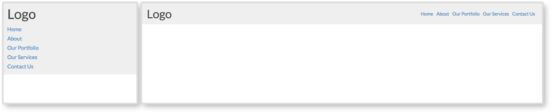
Small sites can grow over time and navigation needs to be updated. Just like stacking content on small screens for layouts, stacking navigational items inhibits a website's navigation from growing. When a stacked navigation grows, it will get longer and take up more vertical space. A mobile user might visit the website, and only see the navigation.
HTML
<header class="clearfix">
  <div class="header-inner">
    <h1>Page Heading (h1)</h1>
    <nav>
      <ul>
        <li><a href="#">Home</a></li>
        <li><a href="#">About</a></li>
        <li><a href="#">Our Portfolio</a></li>
        <li><a href="#">Our Services</a></li>
        <li><a href="#">Contact Us</a></li>
      </ul>
    </nav>
  </div>
</header>
The markup for this pattern is fairly straightforward. We have a header tag containing our h1 page heading and a nav tag containing an unordered list. The unordered list has a list item, li, for every navigation item we want.
CSS
header h1 {
  margin-bottom: 0.25em;

}

nav li {
 list-style: none;
 padding: 0.25em 0.5em 0 0;
}
 nav li a {
  text-decoration: none;
 }

@media only screen and (min-width: 750px){
  header h1 {
    float: left;
    margin:0;
  }

  nav {
    float: right;
  }
   nav li {
    display: inline-block;
   }
}
First off, we are using the clearfix class again so the header accounts for its floated children. Pretty much everything else outside the media query is for style, not functionality.
Unordered lists naturally stack. In the media query, we are breaking this. At a 750px width, we set the h1 tag to float: left and the nav tag to float: right. We then style the navigation to appear on one row by setting the list items, li, to display: inline-block. No longer will each item take up its own row. They will appear inline with each other.
View this example live at http://chelmyers.github.io/RPL/navigation/index.html#simply-stacked.
Let's have a look at the pros and cons of this pattern:
Pros:
Cons:
The simple stack pattern is, well, simple. If the website you are creating only has a few pages users need direct access to, this is a good solution. If this is not the case, though, you are going to need something a little more robust.
Navigation's magic number
I've heard of different "safe" numbers for capping how many items you allow in a simply stacked navigation. Some believe that, if you have more than six, you should use a different solution. Others cap it as low as three items. Instead of just arbitrarily picking a number and going with that, I would suggest prototyping it. You can use this pattern from the RPL and modify it. By creating this HTML and CSS mockup of the menu, you can test it on the smallest device your website needs to support. From this, you can quickly gauge how many navigation items would be too many.
If the simple stack pattern had an evil twin, it would be the anchor and footer pattern. To be honest, this isn't fair to say. The anchor and footer pattern is not evil or bad, it is just the same pattern but at the opposite position on the page. This pattern typically looks the same as the simple stack pattern on larger screens. On smaller screens, though, the navigation can be found in the footer of the site. As seen in the following screenshot, instead of a menu in the header, there is a link that jumps to the footer when clicked:
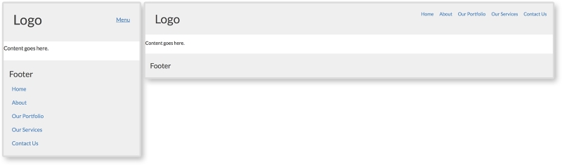
HTML
<header class="clearfix">
  <h1>Logo</h1>
  <a class="menu-btn" href="#menu">Menu</a>
</header>

<div class="content">
  <p>Content goes here.</p>
</div>

<footer>
  <div class="footer-inner">
    <h3>Footer</h3>

    <nav id="menu">
      <ul>
        <li><a href="#">Home</a></li>
        <li><a href="#">About</a></li>
        <li><a href="#">Our Portfolio</a></li>
        <li><a href="#">Our Services</a></li>
        <li><a href="#">Contact Us</a></li>
      </ul>
    </nav>
  </div>
</footer>
For this example, we almost have the full HTML structure for a whole page. We have a header, some content, and a footer. The navigation lives in the footer of the markup though. We will be using CSS to reposition it on larger screens. The anchor tag with a class of .menu-btn in the header is a jump link set to jump to the element with an ID of "menu." We can see that the nav tag in the footer has this ID. This means when we click the menu button in the header, we will jump to the footer.
CSS
.menu-btn {
  float:right;
}

header h1 {
  float: left;
}

nav li {
  list-style: none;
  padding: 0.50em;
}
  nav li a {
   text-decoration: none;
 }

footer {
  padding: 0.75em;
}

@media screen and (min-width: 750px) {
  .menu-btn {
    display: none;
  }

  nav {
    position: absolute;
    top:0.75em;
    right:0.75em;
  }
   nav li {
    display: inline-block;
   }
}
On small screens, we have only a heading and a jump link. We float the menu link to the right and apply some styling to the header, navigation, and footer. For larger screens, we hide the jump link with display: none and reposition the navigation in the media query. Remember, the navigation will appear naturally in the footer because that is where it lives in the markup. To get it to the top of the page, we use position: absolute and position the navigation 0.75em from the top and right of the page. This means that, on screens larger than 750px wide, the navigation leaves the footer and appears at the top right of the website.
Absolute positioning
Positioning elements on a page can get tricky with CSS. Sometimes, it seems like the elements have their own mind and go wherever they please. The biggest tip I can offer with using position: absolute, is that absolutely positioned elements are relative to the closest parent element with a position of relative, absolute, or fixed being applied. If no parent element has one of these styles, the element will be positioned relative to the viewport.
View this example live at http://chelmyers.github.io/RPL/navigation/index.html#anchor.
Let's have a look at the pros and cons of this pattern:
Pros:
Cons:
Although the anchor and footer pattern solves the big issue with stacking navigation items, it creates its own problems. Anchor and footer patterns can be jarring to the user since they jump from the top of the page to the bottom. This can be disorienting. The navigation can even be missed since it is in an unconventional spot. But this pattern does a fantastic job in saving screen space by having the navigation at the bottom of the page on smaller screens. Its problems can be reduced too. The jarring jump can be replaced with a smooth scroll to the footer with the help of JavaScript. And designing the menu button in a way so it cannot be missed will help make sure the footer menu is not missed either. The anchor and footer pattern is a great pattern that accommodates small- and medium-sized navigation systems. It's a step up from the simple stack method in terms of capacity.
The next two patterns are the most common RWD navigational patterns and will need JS. The toggle is a navigation that is hidden in a drawer on small devices. The drawer can then be toggled open and shut using JS. In the RPL example, as seen here, we are using the same navigation as before but giving it a different background color so that we can see this drawer effect more clearly. Look at the first two images to see the drawer closed and then opened. On large screens, the navigation is always visible.
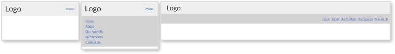
HTML
<body>
  <header>
    <div class="header-inner">
      <h1>Logo</h1>
      <button class="menu-toggle">Menu</button>
    </div>

    <nav>
      <ul>
        <li><a href="#">Home</a></li>
        <li><a href="#">About</a></li>
        <li><a href="#">Our Portfolio</a></li>
        <li><a href="#">Our Services</a></li>
        <li><a href="#">Contact Us</a></li>
      </ul>
    </nav>
  </header>
</body>
The main difference between this pattern's markup and the past two is a new div tag wrapped around the page heading and the menu button. This helps separate the top section from the navigation on smaller screens. And just like the off canvas layout pattern in Chapter 2, The Main Stage – Building Responsive Layouts, we will be using JS here to toggle a class on the body tag.
CSS
header {
  padding:0;
}

header h1 {
  float: left;
}

nav {
  padding: 0.75em;
  background: lightgray;
  display: none;
}

  nav li {
    padding: 0.25em 0 0 0.5em;
  }
    nav a {
      display: block;
    }

.menu-toggle {
  float: right;
  text-decoration: none;
  padding: 0.5em;
  border: 1px solid lightgray;
  border-radius: 3px;
}
  .menu-toggle:hover {
    background-color: lightgray;
  }

.open nav {
  display: block;
}


@media screen and (min-width: 750px) {
  .menu-toggle {
    display: none;
  }

  nav {
overflow: auto;
display: block;
}
  nav ul {
    float: right;
  }
    nav li {
      display: inline-block;
    }

}
Most of the preceding CSS is just styling the pattern. We are giving the navigation a different background color and styling the menu button and its hover state. Just like in the previous chapter, we are using the .open class to show and hide the navigation. Using JS, we will apply a class of open to the body and style elements on the page with that class. Here, we will set the navigation to display: block when the open class is applied. Using a media query, we will then make sure that the menu button is hidden and the navigation is always shown (by using display: block).
JavaScript
var menuTog = document.getElementsByClassName("menu-toggle")[0];

menuTog.onclick = function() {
  document.getElementsByTagName('body')[0].classList.toggle('open');
}
The JS for this pattern is the same as the off canvas layout pattern in Chapter 2, The Main Stage – Building Responsive Layouts. For a more in-depth overview of what this JS is doing, please refer to the off canvas pattern in that particular chapter. The JS again is toggling the class open on the body tag when the menu button is clicked. This allows us to toggle the CSS styles that show and hide the navigation on smaller screens.
View this example live at http://chelmyers.github.io/RPL/navigation/index.html#toggled.
Let's have a look at the pros and cons of this pattern:
Pros:
Cons:
The toggle and anchor and footer patterns can hold the same amount of content. Both are invisible until you click a link or button to activate them. The toggle pattern is very popular. It takes up no space on the page until opened. This means the content on the page is not pushed down until after the user decides to open the menu.
We have essentially covered the off canvas pattern in Chapter 2, The Main Stage – Building Responsive Layouts. Both the off canvas layout pattern and the off canvas navigation pattern work the same way. The content is hidden off screen until the menu button is clicked. The page then moves to the side, making the off canvas section appear to be shifted back on stage. It uses the same JS as the last pattern as well. View the following example to see the similarities:
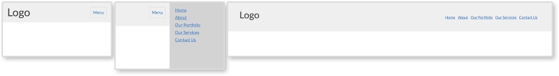
HTML
<body>
  <div class="on-canvas">
    <header>
      <div class="header-inner">
        <h1>Logo</h1>

        <button href="#" class="menu-toggle">Menu</button>

        <nav>
          <ul>
            <li><a href="#">Home</a></li>
            <li><a href="#">About</a></li>
            <li><a href="#">Our Portfolio</a></li>
            <li><a href="#">Our Services</a></li>
            <li><a href="#">Contact Us</a></li>
          </ul>
        </nav>
      </div>
    </header>
  </div>

  <nav class="off-canvas">
    <ul>
      <li><a href="#">Home</a></li>
      <li><a href="#">About</a></li>
      <li><a href="#">Our Portfolio</a></li>
      <li><a href="#">Our Services</a></li>
      <li><a href="#">Contact Us</a></li>
    </ul>
  </nav>
</body>
The biggest difference with the off canvas pattern is that the navigation markup needs to be in two places. Here, we have two main sections, "on canvas" and "off canvas". All of the page's content is within the "on canvas" section, including the navigation we see on larger screens. The "off canvas" section contains the mobile navigation that will push all the on canvas content over. There are more advanced methods to get this pattern to work that don't require duplicating the navigation, but they require about three times the amount of CSS. For now, this approach is widely used and perfectly acceptable.
CSS
The styles for the header and navigation are the same as in the past examples. Since this requires a little more CSS, though, let's look at it piece by piece. To view all the CSS used, visit the live RPL.
.on-canvas nav {
  display: none;
}

.off-canvas {
  display: none;
  width: 200px;
  position: absolute;
  right:0;
  top:0;
  bottom:0;
  background: lightgray;
}
First, we are styling the off canvas navigation. We are hiding it with display:none, but are also setting its location when it does show by positioning it to the top-right corner of the page.
.open .off-canvas {
  display: block;
}

.open .on-canvas {
  width: 100%;
  position: absolute;
  left: -200px;
}
Next we are setting the styles for when the navigation is open. We set the off canvas section to display:block and then shift over the on canvas section by -200px. This offset is not a random number. The -200px gives the off canvas section 200px of screen space. And this is exactly the width of the navigation.
@media screen and (min-width: 750px) {
  nav li {
    display: inline-block;
  }

  .menu-toggle {
    display: none;
  }

  .open .on-canvas {
    position: static;
  }

  .open .off-canvas {
    display: inline-block;
    float:right;
  }

  .open .off-canvas, .off-canvas {
    display: none;
  }
}
Finally, we have the media query. For screens larger than 750px, we hide the menu button and the off canvas navigation. We are then showing the first navigation that is actually in the header, floating it to the right, and styling it to display on one row.
JavaScript
The JS for this is the same as the last pattern. We are just using it to toggle the open class on the body tag again. Isn't it amazing how versatile JS can be? We have used this one JS snippet three times so far!
View this example live at http://chelmyers.github.io/RPL/navigation/index.html#offcanvas.
Let's have a look at the pros and cons of this pattern:
Pros:
Cons:
It seems today that most websites are using this pattern for their sites. Check out the Awwwards's Site of the Day winners (http://www.awwwards.com/awards-of-the-day/). Just by visiting these sites, you can see how popular this pattern is. This pattern can hold a large range of navigations. The JavaScript makes it an elegant and sophisticated interaction as well. This does not mean all websites should use this pattern though. The off canvas pattern is a great solution, but it should be reserved for larger navigations. Keep it simple. If you do not need all the space the off canvas pattern provides, then do not use it.
A navigation pattern that has recently popped up is what I call the overlay menu. On larger screen sizes, it looks the same as the last few patterns we have reviewed. As you can see here, even on small screens, it looks the same. When the navigation is open on smaller screens, though, it looks completely different. The navigation takes up the whole screen and covers the page. The menu is then centered on top of a usually slightly transparent background. The whole navigation is an overlay on top of the page; hence the name.
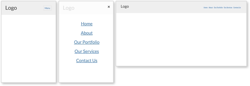
HTML
<header>
  <div class="header-inner">
  <h1>Logo</h1>
  <button href="#" class="menu-toggle">Menu</button>
  <nav>
    <button class="close">×</button>
    <ul>
      <li><a href="#">Home</a></li>
      <li><a href="#">About</a></li>
      <li><a href="#">Our Portfolio</a></li>
      <li><a href="#">Our Services</a></li>
      <li><a href="#">Contact Us</a></li>
    </ul>
  </nav>
  </div>
</header>
The HTML for this pattern contains less than the previous ones. The menu does not need to repeat in the markup. No on or off canvas sections are needed either. We will simply be making the navigation appear fullscreen with CSS on smaller screens. The only real addition is the button with a class of close in the nav tag. This button contains an HTML entity for the multiplication symbol (×). As you can see in the example, this is the "x" that pops up when the navigation is open. We will be using JS to close the navigation when that "x" is clicked.
CSS
A little more CSS is needed to get this pattern up-and-running. Most of it is the same as the previous patterns. Let's go through what is new and unique to this pattern:
nav {
    display: none;
    position: absolute;
    top: 0; right: 0; bottom: 0; left: 0;
    background: rgba(255,255,255, 0.8);
    text-align: center;
}
Since we are developing mobile first, the overlay styles are first applied to the nav element. To make the nav element go fullscreen, we will use position: absolute and set each corner to zero. We are also giving the nav element a slightly transparent white background and setting text-align: center. We are then centering the ul containing the navigation items.
nav ul {
    position: absolute;
    top:  50%;
    left: 50%;
    transform: translate(-50%, -50%);
}

nav a {
    font-size: 2em;
    margin: 0.5em 0;
    line-height: 1;
}
Setting position: absolute and top and left to 50% centers the top-left corner of the ul element. Then, transform: translate(-50%, -50%) moves the element 50% of its own height up and 50% of its own width to the left. Now, the center of the ul element is 50% from the top and left of the nav element instead of its top-left corner. Then, we are adding some styles to the menu links to make them less crowded.
.close {
    border:0;
    background: transparent;
    font-size: 2em;
    color: black;
    position: absolute;
    right:0;
}

.open nav {
    display: block;
}

.open .menu-toggle {
    display: none;
}
Next, we are styling the close button and positioning it in the top-right corner. We are also making sure that the navigation shows and the menu button is hidden when the open class is applied.
@media screen and (min-width: 750px) {
  nav {
    display: block;
    position: static;
    background: transparent;
    text-align: left;
    float: right;
  }

  nav ul {
    position: static;
    transform: translate(0,0);
  }

  nav ul {
    position: static;
    transform: translate(0,0);
  }
    nav li {
      display: inline-block;
    }
      nav a {
        font-size: 1em;
      }

  .menu-toggle, .close {
    display: none;
  }
}
Finally, for larger screens, we are reverting the fullscreen styles for the navigation and hiding the close button.
JavaScript
var menuTog = document.getElementsByClassName("menu-toggle")[0];
var closeTog = document.getElementsByClassName("close")[0];
var body = document.getElementsByTagName("body")[0];

menuTog.onclick = function() {
    body.classList.toggle('open');
}

closeTog.onclick = function() {
    body.classList.toggle('open');
}
The JS for this pattern is almost identical to the other patterns. The only addition is a function to toggle the open class when the close button is clicked. This function works the same as the first, but is just detecting a click on a different element.
Let's have a look at the pros and cons of this pattern:
Pros:
Cons:
Some big-name companies such as Apple and Spotify are using this overlay pattern. If you visit those websites, you can see their versions of the pattern incorporate animations and fading. This pattern still cannot hold a lot of navigational items since it spans only the size of the screen (and sometimes the screen is small). However, sites such as Spotify allow the user to scroll in this overlay and include more navigation items.
View an example on this live at http://chelmyers.github.io/RPL/navigation/index.html#overlay.
You may have noticed that I deemed none of the popular patterns we just reviewed suitable to hold HUGE navigations, only large ones. That's because just one of these patterns cannot do it alone. Large websites use a combination of these patterns and create primary and secondary navigations. Visiting Disney's site again (http://www.disney.com), we can see they use the off canvas pattern and the simple stack pattern on smaller screens. Some websites use the same pattern twice. NASA uses a toggle pattern embedded in a larger toggle pattern for their huge navigation (http://www.nasa.gov/).
Remember, navigations are the main instrument the user has to investigate a website. You wouldn't go exploring without the proper tools. So, why would you ill-equip your user to explore your own site? In this chapter, we reviewed several popular responsive navigation patterns to begin the journey of creating well-designed navigations. We also talked about the importance of information architecture when planning the size of your navigation. If your users are getting lost just looking at the navigation, something is not right. Use RWD as a way to prioritize your navigation and condense the items it contains. Then, they can find the content they are searching for, frustration-free, on any device. But is our job done yet? Nope. Next, we will look at responsive patterns for a specific type of content—media.
If you think about it, websites would be boring without images. A photo says a thousand words because, let's be honest, we don't feel like reading a thousand words. We are starting to talk in images too. Just look at how we use Emojis and GIFs. These are images that we send along when we don't feel like spelling it out. That's why media is great. Photo, icons, and videos can convey so much more information in a split second than a paragraph of text.
We can run into some obstacles though when including images on responsive websites. Images and videos can take some time to load because they are larger files. How many times have you exited a website, on a desktop or smartphone, because its content took too long to load? This probably happens on your smartphone. Even though the screen is smaller, scaling an image or video down with CSS for mobile devices doesn't make the file size any smaller. The full-sized file is still being downloaded. When dealing with responsive media, we have to make sure we are optimizing our content and preparing for it to scale from smartphone to desktop. In this chapter, we will be going over:
picture versus srcsetBelieve it or not, we have already started implementing responsive images in Chapter 2, The Main Stage – Building Responsive Layouts. Remember the mostly fluid layout (http://chelmyers.github.io/RPL/layouts/index.html#mostly-fluid). In this pattern, we added a featured image to an article snippet. The image stays at one size until the screen's width gets too small and it starts to scale down. But doing only this to images, and nothing more, can leave your website poorly optimized. Images make up the bulk of websites in terms of size. We don't wait for text to load, do we? It happens so fast it is hardly noticeable. Scaling down large images to 300px for a small mobile device seems inefficient. To learn how to optimize responsive images though, we first have to start with the basics.
In the mostly fluid pattern from Chapter 2, The Main Stage – Building Responsive Layouts, the first section contained an image that had a fixed width but then scaled down on smaller screens. This is the most basic approach to adding images to a responsive page. You have to make sure they scale, but not past their original sizes or risk pixelated images. If they aren't scaling but instead jump between sizes, they are adaptive and not responsive. We also went over the difference between adaptive and responsive design in Chapter 2, The Main Stage – Building Responsive Layouts. An adaptive design jumps from layout to layout at breakpoints. A responsive design scales between these breakpoints, and can have its layout change too. We can scale our images by giving them max-width and height properties such as the following code:
img {
  max-width: 100%;
  height: auto;
}
Applying a max-width property of 100% on the image insures that it will never get larger than its true size but will still scale down. Setting height: auto makes sure the image's aspect ratio is not changed. We wouldn't want an image with a width of 800px to be stretched out to 1500px. Then, we risk having a website filled with fuzzy pixelated images.
This code snippet is not really a media pattern. It is more of a building block for designing with images in your project. In this chapter, we will be using this technique to create more complex patterns.
Setting just max-width and height properties on your images, and doing only this, can potentially slow down your website and cause longer loading times. In this example, we scaled down an 800px wide image to fit on a small screen. Even though on a small screen it appears to be only 300 pixels wide, an 800px image is still being downloaded. The difference between 800px and 300px doesn't seem like a lot, but when you have multiple images on your page it starts to add up. Today, a lot of company websites use HUGE full-width scaling images in their designs. Just take a peak at AWWWard's Site of the Day collection and see how prevalent this trend is.
All the websites shown in the preceding image are responsive as well. The images being used range from 1400px to 2000px with sizes as big at 1.2 MB. Loading a 2000px 1 MB photo for a 300px-sized screen doesn't make much sense. Luckily, there are ways to fix this issue.
There's a debate going on in the RWD community and it's all about responsive image solutions. Currently, there are two native solutions for responsive images on modern browsers (minus Internet Explorer 11): the picture element and the srcset attribute. Both have limited browser support, but developers are picking sides and rallying for one, or even both, to have full-browser implementation. So, what's the difference?
Both picture and srcset swap out images depending on the viewport's size. The main difference is picture gives full control to the developer to set exactly when images swap and srcset lets the developer make suggestions while the browser does the rest of the work. Let's look at the HTML for these to see what this means.
For these examples, I made three images that I will be swapping in and out: 1920.png, 1000.png, and 500.png. As you may have guessed, these images are named after their width. Each image has the same aspect ratio as well.
If you want, you can see a live example of the picture element here http://chelmyers.github.io/RPL/media/index.html#picture.
<picture>
    <source media="(min-width: 1000px)" srcset="i/1920.png"/>
    <source media="(min-width: 500px)" srcset="i/1000.png"/>
    <img src="i/500.png" alt="Featured Image"/>
</picture>
The actual picture tag doesn't do much except allow the source element to work its magic. You may already be using the source tag to embed videos. If not, we will go over this later. Here, we are using two source tags and one img tag. Each one pulls in a different image at a specific viewport size.
The media attribute is setting the widths to change the image being shown. The srcset attribute sets what image to then pull in. For the first source tag, on viewports wider than 1000px wide, the image 1920.png will load. For the second, viewports wider than 500px will load 1000.png. And finally, the img tag acts like the fallback image if picture is not supported. It also displays 500.png when the viewport is smaller than 500px wide.
In the picture element example, we can already see the srcset attribute being used. We will be using the same images from the picture instance for this example too.
You can see this example live at http://chelmyers.github.io/RPL/media/index.html#srcset.
<img src="i/1000.png" srcset="i/1920.png 2x" alt="Featured Image"/>
For this srcset example, we are just using two images, 1000.png and 1920.png. By default, 1000.png will load. Within the srcset attribute, the 2x loads in the higher resolution image on screens with double the normal pixel density (such as retina screens). This example doesn't change as you scale the page. Instead, the browser is determining what image to serve up.
For proof that this works, I brought up the example on my retina 2013 MacBook, iPhone 6, and my 2012 first generation iPad Mini and took a photo, as seen in the following image:
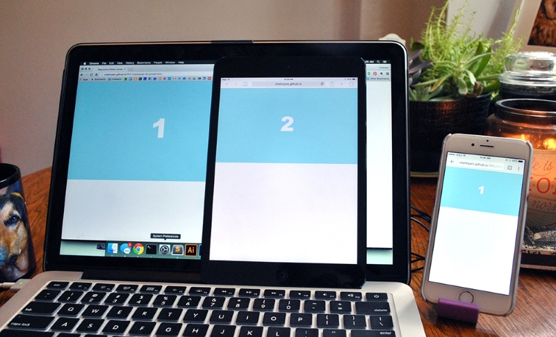
As we can see, the retina devices (the laptop and iPhone) show the higher resolution image. These devices need the high-res image to avoid pixilation. The older iPad Mini however doesn't need the larger image since its pixel density is lower and shows the smaller option.
Right now, the debate over picture and srcset is subsiding as people are recognizing that these two solutions have certain strengths. The common opinion now is that picture should be used for art direction and srcset for resolution swapping. If you need to finely control what sized image appears at different screen sizes, and even the content of those images, you are creating more of an artistic experiences than optimizing your images. For this, use picture and maintain your artistic direction. If you are just trying to make sure that a 2000px image doesn't load on a smartphone when a 600px will suffice, use srcset. If you are just swapping image resolutions, the short img tag with the srcset attribute will suffice.
Remember though the picture and srcset elements have limited browser support. The srcset solution has a little bit more coverage. Safari and iOS Safari does not support the picture element at all. However, Safari and iOS Safari 9 fully supports srcset with limited support in versions 8 and 8.4. This means srcset works on all up-to-date Apple devices where picture does not. Both work on Android's browser and Android's Chrome browser. The biggest upset is, you guessed it, Internet Explorer. Even IE 11 does not support either solution.
Since we shouldn't ignore our users no matter their browser choice, we have to come up with a backup plan. The picture element and srcset have fallbacks included, so we can just let the default image set show in the IE browsers. And this should be acceptable unless your users really need quickly loading images and must use IE (and this does happen). The following is a list of more complex solutions using other languages, such as JavaScript and PHP, to achieve responsive images. Take a look at them if you find you need a more powerful, bulletproof solution.
Optimizing the actual images
Photography and detailed bitmap images can still easily become megabyte-sized files without optimizing the actual image. Using Photoshop's "Save for Web" feature and applications such as ImageOptim (https://imageoptim.com/) will allow you to squeeze out extra unnecessary data and get smaller file sizes. Make sure your image file sizes are as small as they can be whether your images are responsive or not.
Now that we have covered how to optimize the images you want to put on your website, let's look at ways you can lay them out. As mentioned, a trend right now is having a huge image span full width of the page with some text (usually the company's name and tagline) shown on top of it. Why don't we start with doing that then?
Websites using this pattern typically have big beautiful images displaying their work or company. For the sake of this example, I grabbed a pattern from Subtle Patterns (http://subtlepatterns.com/) and created two images: banner-2000.png and banner-1400.png. As we saw earlier in this chapter, these big hero images normally have text overlaid on top of them. As you can see in the following image, we are doing just that:
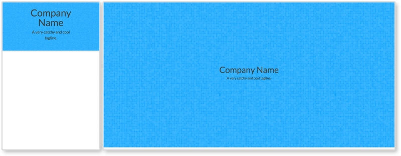
Right now, there is not much going on with this pattern. This is on purpose. There is a lot you can do with big hero images. You can overlay other images, navigation, and more text. But this pattern right here shows you the basics.
HTML
<header>
  <img class="banner-img" src="i/banner-1400.png" srcset="i/banner-2000.png 2x"  sizes="100vw" alt="Banner Image"/>

  <div class="banner-overlay">
    <h1>Company Name</h1>
    <p>A very catchy and cool tagline.</p>
  </div>
</header>
The markup in this pattern consists of a header tag containing the image to go full span and the text. The image has a class of banner-img that we will use in the CSS. There is a div element with a class of banner-overlay containing h1 and p tags.
We are also using the srcset attribute here. It looks a little different though. This time we added the sizes attribute to the image tag. This gives the browser information about how much space the image will take up. Setting sizes to 100vw is saying that the image will take up 100% of the page's width. The unit vw stands for viewport width. One unit of vw is 1% of the containing element. Since the header tag spans the full width of the page already, sizes="100vw" is saying take up 100% of that space too. This is just giving the browser more information to help pick the best image to display.
CSS
header {
  position: relative;
}

.banner-img {
  width: 100%;
}

.banner-overlay {
  position: absolute;
  text-align: center;
  top:50%;
  left:50%;
  transform: translate(-50%, -50%);
}
First, we set the header's position to relative. We do this because we want to position one of its children, .banner-overlay, relative to it. We then set the image's width to 100% since spanning the full width of the page is the whole point of this example.
For .banner-overlay, we are setting position to absolute since we will be moving it on top of the image. Since header is relative, .banner-overlay will move relative to it instead of to the browser's window. We are then centering the overlay in two different ways. First, text-align: center is centering the text while the last three lines are centering the overlay in the middle of the header element. We went over this centering technique in Chapter 3, Make Way for Responsive Navigations, for the overlay navigation pattern. If you are interested in using another centering technique, flexbox has its own solution. To use this, apply these settings to the parent of the item you wish to center:
display:flex;
justify-content:center;
align-items:center;
If the child you are trying to center is text, the only other thing you need to do is apply text-align:center to that child so the text is centered too
View this example live at http://chelmyers.github.io/RPL/media/index.html#full-span.
Let's have a look at the pros and cons of this pattern:
Pros:
Cons:
Don't just use this pattern because it is trendy. Every one of your designs and websites should be catered to the user, the content, and the client. Just because this pattern is widely used does not mean it is the best option for you. It can make a really stunning website, but if the user needs to get to content fast, then these large images just get in the way.
Whether it is a search results page or an image gallery, at some time in your career, you will need to create an image grid. Just like we arranged multiple columns and rows of articles in Chapter 2, The Main Stage – Building Responsive Layouts, we can create a grid of images. This can be as simple or complex as you like. This biggest question here is, How many images will appear per row? And how will this number change on different screen sizes? In our example here, one row is going to be comprised of 1, 2, 4, and 6 images per row from small to large screens. You may need more or fewer steps in between the smallest and largest screen sizes for your site, though.
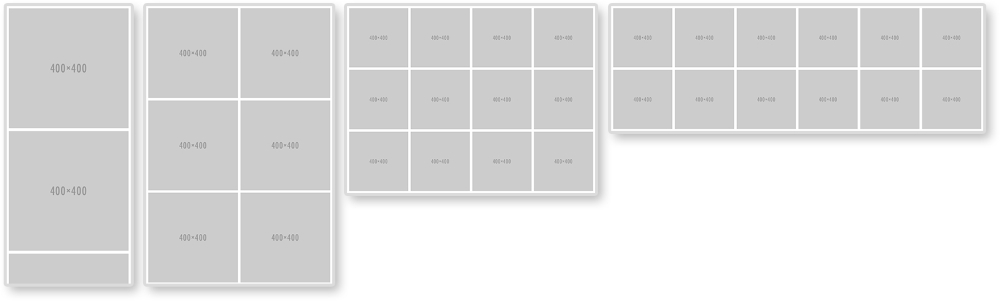
To make this happen, we will style for the smallest first; one image per row. That's pretty easy. Then, we will be using media queries to add more images per row.
HTML
<ul class="img-grid">
  <li><img src="http://placehold.it/400" alt="Thumbnail" /></li>
  <li><img src="http://placehold.it/400" alt="Thumbnail" /></li>
  <li><img src="http://placehold.it/400" alt="Thumbnail" /></li>
  <li><img src="http://placehold.it/400" alt="Thumbnail" /></li>
  <li><img src="http://placehold.it/400" alt="Thumbnail" /></li>
  <li><img src="http://placehold.it/400" alt="Thumbnail" /></li>
  <li><img src="http://placehold.it/400" alt="Thumbnail" /></li>
  <li><img src="http://placehold.it/400" alt="Thumbnail" /></li>
  <li><img src="http://placehold.it/400" alt="Thumbnail" /></li>
  <li><img src="http://placehold.it/400" alt="Thumbnail" /></li>
  <li><img src="http://placehold.it/400" alt="Thumbnail" /></li>
  <li><img src="http://placehold.it/400" alt="Thumbnail" /></li>
</ul>
For the HTML, there is nothing special here. We have an unordered list with a class of img-grid and 12 list items. Each list item holds an image that will appear in our grid.
CSS
.img-grid {
  padding:0.15em;
  margin:0;
}

.img-grid li{
  list-style: none;
  padding: 0.30em;
}

.img-grid img {
  max-width: 100%;
  height: auto;
  vertical-align: bottom;
}
The CSS is controlling everything here. We are first setting the padding on the <ul> and taking off any margins. The padding is set to 0.15em because this is half of what the padding on each <li> will be. On the <li> elements, we will set list-style to none to get rid of the bullets and then giving each one padding.
For the images, we are setting them to scale with max-width: 100% and height: auto. The last declaration sets vertical-align to bottom. If we didn't do this, there would be a 4px gap under each image. Images are inline elements and sit on the baseline like text would. This gap underneath the images is actually room for a descender (like that found in the lowercase "j" or "g"). Setting vertical-align: bottom gets rid of this extra space.
/*2 in a row*/
@media screen and (min-width: 600px) {
  .img-grid {
    display: flex;
    flex-direction: row;
    flex-wrap: wrap;
  }

  .img-grid li {
    width: 50%;
  }
}

/*4 in a row*/
@media screen and (min-width: 800px) {
  .img-grid li {
    width: 25%;
  }
}

/*6 in a row*/
@media screen and (min-width: 1200px) {
  .img-grid li {
    width: 16.66%;
  }
}
Now, we start to get into the media queries. Without them, we would have one column of images. In the first media query, we apply flexbox styles and set them each to be 50% wide. For flexbox to work the way we want, we will set flex-direction to row and flex-wrap to wrap. This is saying that we want our flexbox items, <li>, to be organized in rows going left to right. Other flex-direction properties are row-reverse, column, and column-reverse. Flexbox will also naturally try to put everything on one line. Setting flex-wrap:wrap stops this. Other properties for flex-wrap are nowrap and wrap-reverse. From here, we only have to change the width of each <li>. If we want four images per row, we will set their widths to 25%. If we want 6, each is 16.667%.
Flexbox is not supported by IE9 and earlier. If you need to support these browsers, you can use float instead of flexbox. This solution can be found commented out in the style section of this pattern on the RPL.
View this example live at http://chelmyers.github.io/RPL/media/index.html#grids.
Let's have a look at the pros and cons of this pattern:
Pros:
Cons:
There aren't many negatives for this pattern. It does need extra attention though because the images can easily scale up or down too much. Another issue is that, if you stick everything in a grid like this, and call it a day, it can be boring. You can always add captions, hover effects, and lightboxes to spice up this pattern though.
Lightbox
Not sure what a lightbox is? Don't worry. Have you ever clicked an image and seen a larger version of that image pop up? That's a lightbox. It's named after a super popular JavaScript plugin called, Lightbox by Lokesh Dhakar. You can see the most recent version here at http://lokeshdhakar.com/projects/lightbox2/.
At one point, these terms meant different things. Sliders slid images on and off screen in one direction, while carousels moved images with a 3D circle effect. Today, we use these terms interchangeably; probably because we depend on them so much. Sliders and carousels are overused and abused.
Clients and developers want them because they think, "It allows me to show my users multiple things in one space." But that's not what happens. Unless what you want the user to see is on the first slide, the chance they will actually see it is incredibly slim. Even if you are putting the most important content on the first slide, and you use an automatic transition to the next, you are adding an expiration date to the content where the user will no longer see it. But if you don't use an automatic transition, you are just burying the rest of the slides. And hopefully, you are not waiting for the user to click on a slide because the chances of that happening are even smaller. I think you get the point.
But, as you can see, I have included a section on sliders and carousels. We won't be creating our own pattern here though. Like I've mentioned, sliders and carousels are very common. And since they are a little bit more complex than an image grid, they require some JavaScript. Instead of reinventing the wheel, I highly recommend using a JavaScript plugin to set up your sliders. Here are my three favorites that I see being used in professional websites frequently:
Out-of-the-box, these carousels are super simple. You can easily style them and tweak the settings. Owl Carousel provides more options than bxSlider, but sometimes that can get in your way. FlexSlider has some unique features worth looking into. All three options are great, but also you should review what they are capable of before selecting one to implement.
With HTML5, videos are a lot easier to implement into our websites. Video services such as Vimeo and YouTube even provide ways for us to embed videos into our site. Less and less are we seeing people hosting their own video. Why would we do that when YouTube will host it, convert it into every format we need, and then give us the one line of HTML we need to put in on my site? Regardless of how you choose to host your videos, you still need to make them scale on your responsive website. The following examples aren't exactly patterns, but instead treatments. Just like you were shown how to scale images, we will review how to scale videos and iframes.
As mentioned, you can host your videos yourself or through a third party. Both can be responsive, but using the HTML5 video element makes it a lot easier. For my example, I am using a video of an animated series I worked on. If you don't have your own video, feel free to practice with these (for example, http://chelmyers.github.io/RPL/media/v/cbmd.mp4). In the following screenshot, you can see this video scaling along with the browser:
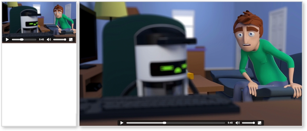
HTML
<video controls>
  <source src="http://chelmyers.github.io/RPL/media/v/cbmd.mp4 " type="video/mp4"/>
  <source src="http://chelmyers.github.io/RPL/media/v/cbmd.webm" type="video/webm"/>
  <source src="http://chelmyers.github.io/RPL/media/v/cbmd.ogv" type="video/ogv"/>
  Your browser does not support the HTML5 video tag.
</video>
We are just using the basic HTML5 video element here. I have one video in three different formats so it appears on every browser. I even have a message in case the browser does not support the video tag.
CSS
video {
  max-width: 100%;
  height: auto;
}
Yup, that's it. You can scale videos the same way you scale images. The max-width makes sure the video doesn't scale past its actual size and height:auto helps keep its aspect ratio. What were you hoping for, something more difficult?
View this example live at http://chelmyers.github.io/RPL/media/index.html#video.
I wish I could say that scaling iframes are just as easy as video elements, but sadly I cannot. The iframe takes a little bit more work. However, as you can see in the following image, it is still possible:
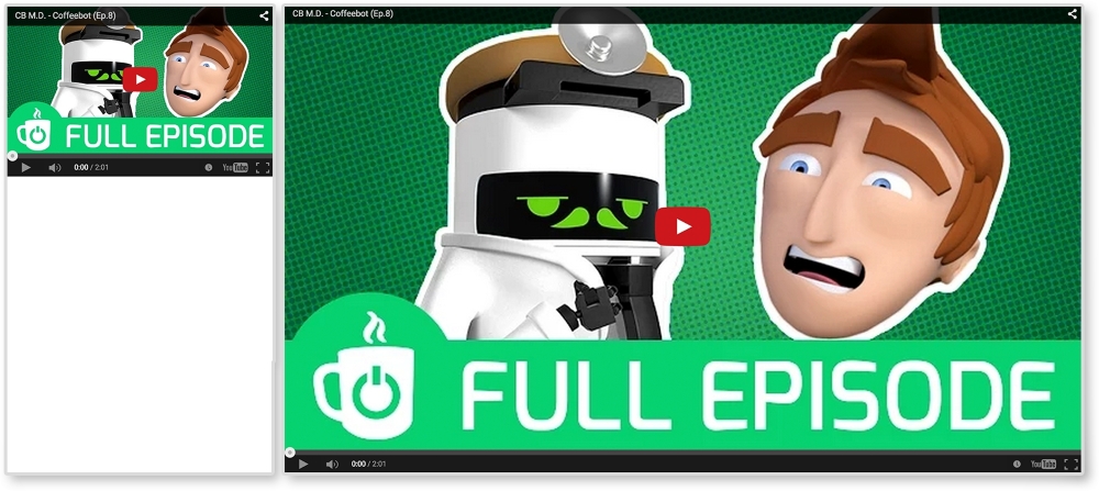
HTML
<div class="video-wrap">
  <iframe width="560" height="315"
    src="https://www.youtube.com/embed/l9uqeTHrD9U"
    frameborder="0" allowfullscreen></iframe>
</div>
To get iframes working, we must wrap them in a container. With CSS, we will then make the container the size we wish the iframe to be. We will then stretch the iframe to fit this container. So, when the container scales up or down, the iframe will too.
CSS
.video-wrap {
  position: relative;
  height: 0;
  padding-bottom: 56.25%; /* % of element's width. Ex. 9/16 = 0.5624 */
  padding-top: 32px; /*height of controls*/
}

.video-wrap iframe {
  position: absolute;

  top: 0;
  left: 0;
  width: 100%;
  height: 100%;
}
For the iframe's container, or .video-wrap, we are setting position to relative so that we can position the iframe relative to it. We are setting the height to 0 because padding-bottom will be giving us the height we need. Setting the padding-bottom to 56.25% will make .video-wrap height 56.25% of its width. So, if our video has a 16:9 resolution, to figure out what the padding-bottom value should be, we divide 9 by 16 (that's 0.5625) and multiple it by 100. The padding-top value is making space for the videos controls. The second part, for .video-wrap iframe, is stretching the iframe to fit this new container.
View this example live at http://chelmyers.github.io/RPL/media/index.html#iframe.
It takes a little bit more work, but it is still easy to set up. Whether you use the HTML5 video elements or keep your videos on YouTube, there's no reason why they shouldn't scale as well.
When the Internet first came about, it was a way for academics to share research and swap papers. Today, there is less emphasis on reading and more on consuming media. Our Facebook feeds are flooded with auto-playing videos. GIFs are a popular form of communication. And sites such as Pinterest and Imgur have people scrolling through images and videos for hours. Even though incorporating images and video into websites can seem complex at times, it enriches the user's experience and can elevate the design.
In this chapter, we reviewed ways to make media responsive in our own websites. We also went over how to optimize that media. It is not enough to drop large photos, GIFs, and video into a website and call it a day. In 2014, comScore reported that 60% of digital media time in the USA was spent on mobile devices. We need to make sure that media content is accessible to people, no matter what device they are viewing it on.
We don't always go on the Web to consume media, though. Sometimes, we need to do research or buy something online. In the next chapter, we will get into designing forms and tables for responsive websites.
The Internet is not just cat GIFs and Emojis, even though it sometimes feels like it. Often we find ourselves needing to present or collect information. When things get technical for the user, it is our job as designers and developers to make everything go as smoothly as possible. Tables with rows and rows of data still need to be optimized for viewing. Forms for newsletter sign ups or surveys need to be approachable and easy to complete. Designing these elements to be responsive isn't an easy job either.
Forms and tables aren't just for technical or scientific websites. Blogs and online magazines have popups that ask you to subscribe to their newsletter within 3 seconds of accessing the site. This popup is a very tiny (and annoying) form. On the other hand, checking out on an ecommerce site can be seen as just one long form to fill out. Have you ever tried ordering something on a nonresponsive website from your smartphone?
It may look something like the following image, which does not look fun:
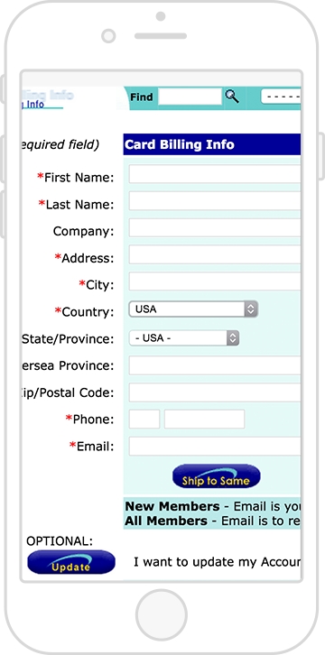
And tables cannot just be squished horizontally on small screens. We can make them shine no matter the screen size. With this chapter, you will become equipped with the patterns you need to style forms and data for a responsive website. We will cover the following topics:
Online forms are already modular. Because of this, they aren't hard to scale down for smaller screens. The little boxes and labels can naturally shift around between different screen sizes since they are all individual elements. However, form elements are naturally tiny and very close together. Small elements that you are supposed to click and fill in, whether on a desktop or mobile device, pose obstacles for the user.
If you developed a form for your website, you more than likely want people to fill it out and submit it. Maybe the form is a survey, a sign up for a newsletter, or a contact form. Regardless of the type of form, online forms have a purpose; get people to fill them out! Getting people to do this can be difficult at any screen size. However, when users are accessing your site through a tiny screen, they face even more challenges. As designers and developers, it is our job to make this process as easy and accessible as possible. Here are some guidelines to follow when creating a responsive form:
Together, we will go over each of these guidelines and see how to apply them.
Before we get started, let's look at the markup for the form we will be using. We want to include a sample of the different input options we can have. Our form will be very basic and requires simple information from the user such as their name, e-mail, age, favorite color, and favorite animal.
HTML
<form>
<!—- text input -->
<label class="form-title" for="name">Name:</label>
<input type="text" name="name" id="name" />
<!—- email input -->
<label class="form-title" for="email">Email:</label>
<input type="email" name="email" id="email" />
<!—- radio boxes -->
<label class="form-title">Favorite Color</label>
<input type="radio" name="radio" id="red" value="Red" /> <label>Red</label>
<input type="radio" name="radio" id="blue" value="Blue" /><label>Blue</label>
<input type="radio" name="radio" id="green" value="Green" /><label>Green</label>
<!—- checkboxes -->
<label class="form-title" for="checkbox">Favorite Animal</label>
<input type="checkbox" name="checkbox" id="dog" value="Dog" /><label>Dog</label>
<input type="checkbox" name="checkbox" id="cat" value="Cat" /><label>Cat</label>
<input type="checkbox" name="checkbox" id="other" value="Other" /><label>Other</label>
<!—- drop down selection -->
<label class="form-title" for="select">Age:</label>
<select name="select" id="select">
<option value="age-group-1">1-17</option>
<option value="age-group-2">18-50</option>
<option value="age-group-3">>50</option>
</select>
<!—- textarea-->
<label class="form-title" for="textarea">Tell us more:</label>
<textarea cols="50" rows="8" name="textarea" id="textarea"></textarea>
<!—- submit button -->
<input type="submit" value="Submit" />
</form>With no styles applied, our form looks like the following screenshot:
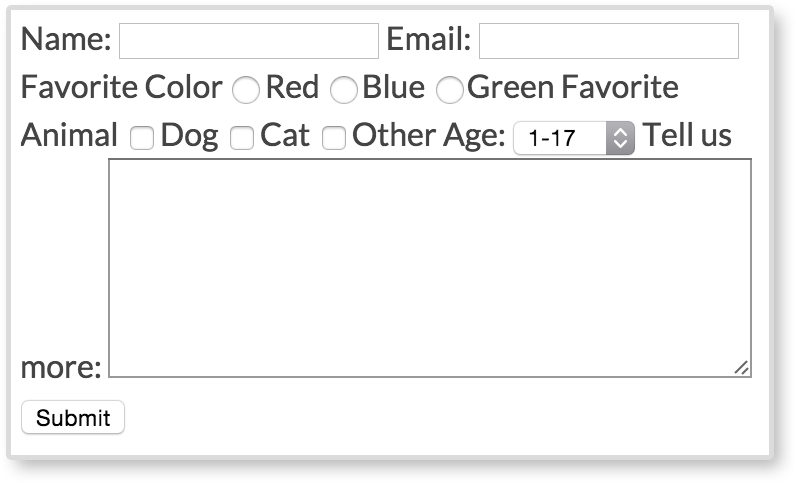
Several of the form elements are next to each other, making the form hard to read and almost impossible to fill out. Everything seems tiny and squished together. We can do better than this. We want our forms to be legible and easy to fill out. Let's go through the guidelines and make this eyesore of a form more approachable.
In the preceding screenshot, we can't see when one form element ends and the other begins. They are showing up as inline, and therefore displaying on the same line. We don't want this though. We want to give all our form elements their own line to live on and not share any space to the right of each type of element. To do this, we add display: block to all our inputs, selects, and text areas. We also apply display:block to our form labels using the class .form-title. We will be going over why the title labels have their own class later.
CSS
input[type="text"],
input[type="email"],
textarea,
select {
      display: block;
      margin-bottom: 10px;
}

.form-title {
      display:block;
      font-weight: bold;
}
As mentioned, we are applying display:block to text and e-mail inputs. We are also applying it to textarea and select elements. Just having our form elements display on their own line is not enough. We also give everything a margin-bottom of 10px to give the elements some breathing space between one another. Next, we apply display:block to all the form titles and make them bold to add more visual separation.
Technically, if you are collecting a password from a user, you are just asking for text. E-mails, search queries, and even phone numbers are just text too. So why would we use anything other than <input type="text"…/>? You may not notice the difference on your desktop computer between these form elements, but the change is at its biggest on mobile devices. To show you, we have two screenshots of what the keyboard looks like on an iPhone while filling out the text input and the e-mail input.
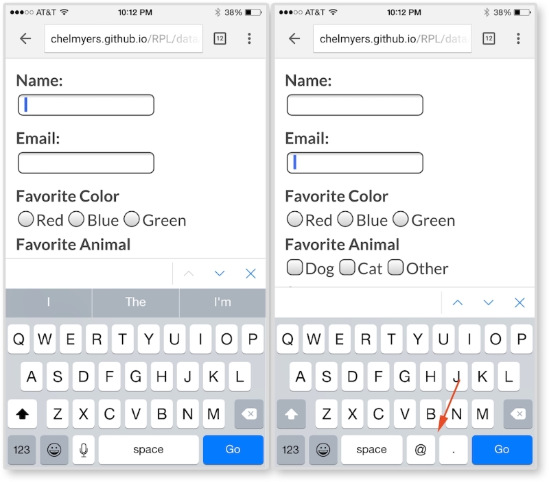
In the left image, we are focused on the text input for entering your name. The keyboard here is normal and nothing special. In the right image, we are focused on the e-mail input and can see the difference on the keyboard. As the red arrow points out, the @ key and the . key are now present when typing in the e-mail input. We need both of those to enter in a valid e-mail, so the device brings up a special keyboard with those characters. We are not doing anything special other than making sure the input has type="email" for this to happen. This works because type="email" is a new HTML5 attribute. HTML5 will also validate that the text entered is a correct e-mail format (which used to be done with JavaScript).
Here are some other HTML5 type attribute values from the W3C's third HTML 5.1 Editor's Draft (http://www.w3.org/html/wg/drafts/html/master/semantics.html#attr-input-type-keywords):
colordatedatetimeemailmonthnumberrangesearchteltimeurlweekIt would be really frustrating for the user if they could not easily select an option or click a text input to enter information. Making users struggle isn't going to increase your chance of getting them to actually complete the form. The form elements are naturally very small and not large enough for our fingers to easily tap. Because of this, we should increase the size of our form inputs. Having form inputs at least 44 x 44 px large is a standard right now in our industry. This is not a random number either. Apple suggests this size to be the minimum in their iOS Human Interface Guidelines, as seen in the following quote:
"Make it easy for people to interact with content and controls by giving each interactive element ample spacing. Give tappable controls a hit target of about 44 x 44 points."
As you can see, this does not solely apply to form elements. Apple's suggestion is for all clickable items.
Now, this number may change along with our devices' resolutions in the future. Maybe it will go up or down depending on the size and precision of our future technology. For now though, it is a good place to start. We need to make sure that our inputs are big enough to tap with a finger. In the future, you can always test your form inputs on a touch screen to make sure they are large enough. For our form, we can apply this minimum size by increasing the height and/or padding of our inputs.
CSS
input[type="text"],
input[type="email"],
textarea,
select {
  display: block;
  margin-bottom: 10px;
  font-size: 1em;
  padding:5px;
  min-height: 2.75em;
  width: 100%;
  max-width: 300px;
}
The first two styles are from the first guideline. After this, we are increasing the font-size attribute of the inputs, giving the inputs more padding, and setting a min-height attribute for each input. Finally, we are making the inputs wider by setting the width to 100%, but also applying a max-width attribute so the inputs do not get unnecessarily wide.
We want to increase the size of our Submit button as well. We definitely don't want our users to miss clicking this:
input[type="submit"] {
  min-height: 3em;
  padding: 0 2.75em;
  font-size: 1em;
  border: none;
  background: mediumseagreen;
  color: white;
}
Here, we are also giving the Submit button a min-height attribute, some padding, and increasing the font-size attribute. We are striping the browser's native border style on the button with border:none. We also want to make this button very obvious, so we apply a mediumseagreen color as the background and a white text color.
If you view the form so far in the browser, or look at the following screenshot, you will see all the form elements are bigger now except for the radio inputs and checkboxes. These elements are still squished together.
To make our radio and checkboxes bigger in our example, we will make the option text bigger. Doesn't it make sense that if you want to select red as your favorite color, you should be able to click on the word "red" too, and not just the box next to the word?
In the HTML for the radio inputs and the checkboxes, we have markup that looks like this:
<input type="radio" name="radio" id="red" value="Red" /><label>Red</label>

<input type="checkbox" name="checkbox" id="dog" value="Dog" /><label>Dog</label>
To make the option text clickable, all we have to do is set the for attribute on the label to match the id attribute of the input. Or we can put the radio and checkbox inputs inside of their labels. We will be doing the second version so we can easily stack them for guideline #4. We will also give the labels a class of choice to help style them:
<label class="choice" ><input type="radio" name="radio" value="Red" />Red</label>

<label class="choice" ><input type="checkbox" name="checkbox" value="Dog" />Dog</label>
Now, the option text and the actual input are both clickable. With this done, we can apply some more styles to make selecting a radio or checkbox option even easier:
label input {
  margin-left: 10px;
}

.choice {
  margin-right: 15px;
  padding: 5px 0;
}

.choice + .form-title {
  margin-top: 10px;
}
With label input, we are giving the input and the label text a little more space between each other. Then, using the .choice class, we are spreading out each option with margin-right: 15px and making the hit states bigger with padding: 5px 0. Finally, with .choice + .form-title, we are giving any .form-title element that comes after an element with a class of .choice more breathing room. This is going back to responsive form guideline #1; give all inputs breathing room.
There is one last thing we need to do. On small screens, we want to stack the radio and checkbox inputs. On large screens, we want to keep them inline. To do this, we will add display:block to the .choice class. We will then use a media query to change it back:
@media screen and (min-width: 600px){
      .choice {
        display: inline;
      }
}
With each input on its own line for smaller screens, they are easier to select. But we don't need to take up all that vertical space on wider screens. With this, our form is done. You can see our finished form, as shown in the following screenshot:
Much better, wouldn't you say? No longer are all the inputs tiny and squashed together. It is easy to read, tap, and begin entering information in the form. Filling in forms is not considered a fun thing to do, especially on a tiny screen with big thumbs. But there are ways we can make the experience easier and a little more visually pleasing.
A decade ago, tables ruled web design by being the most common way to lay out a website. Tables were powerful and the backbone of many websites. Today, creating a website's layout by using a table is absolutely not acceptable. It is considered downright shameful. Tables are for tabular data, not for web layouts. And now that the reign of tables is over, let's look into how to use them properly, with a responsive twist.
The biggest issue tables pose is their uncertain width. Long tables with lots of rows are no problem. Our web page can be as long as a table needs. However, a table that is very wide, with lots of columns, starts to break our beautiful responsive websites. As our website scales down, we will have a table busting out of its container. We can scale down images and videos, but how can we scale down tables? We cannot just scale down the font-size attribute. It may become too tiny to read. We just can't decrease the padding. The table's cell would cramp. This solution uses a horizontal scroll to fix this issue, and a fade to the right like the following screenshot:
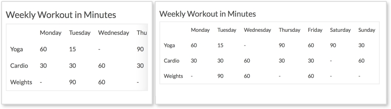
On smaller screens, shown on the left of the screenshot, the table starts to scale down and fit the browser's width. When the table is too wide, columns appear off stage and the user can scroll to the right to see them. The right fade is present to tell the user that there is more data to be seen. A visible scrollbar can also do this, but some browsers (such as Chrome and Safari) hide theirs by default. Another option can be to take out the fade, and force the browser to also show the scrollbar. This is totally acceptable, but to me, not as elegant.
HTML
<h3>Weekly Workout in Minutes</h3>

<table class="table-overflow">
<thead>
  <th></th>
  <th>Monday</th>
  <th>Tuesday</th>
  <th>Wednesday</th>
  <th>Thursday</th>
  <th>Friday</th>
  <th>Saturday</th>
  <th>Sunday</th>
</thead>
<tbody>
  <tr>
    <td>Yoga</td>
    <td>60</td>
    <td>15</td>
    <td>-</td>
    <td>90</td>
    <td>60</td>
    <td>90</td>
    <td>30</td>
 </tr>
</tbody>
...
</table>
The preceding code is a shortened version of the markup. The only thing special about this table is it has a class of table-overflow. Some tables may be small enough that they do not need special treatment. In such cases, we can add our responsive styles to this class and only apply it to tables that need it.
CSS
td, th {
  padding: 10px;
}

table {
  border: 2px solid #eee;
  border-collapse: collapse;
  border-spacing: 0;
}

@media screen and (max-width: 600px) {
  .table-overflow {
    display:block;
    overflow-x: scroll;

    -webkit-box-shadow: inset -28px 0px 40px -30px #ddd;
    -moz-box-shadow: inset -28px 0px 40px -30px #ddd;
    box-shadow: inset -28px 0px 40px -30px #ddd;
  }
}
Pretty much everything here is for styling the table except for what's inside the media query. Inside the media query, we are setting the table to be display:block when the viewport is under 600px wide. We then set overflow-x: scroll so the table can scroll horizontally. After this, we will use the box-shadow property to create a gradient, or fade, on the right of the table. When using the box-shadow property here, make sure you are creating an inset shadow that appears inside the table. The values here may seem a little large (such as 40px), but these values make sure the shadow only appears to the right of the box and not on the other edges. You can use a custom-made transparent image or CSS3 gradients for the fade, but I find using box-shadow to be the simplest way so far.
View live at http://chelmyers.github.io/RPL/data/index.html#tableScroll.
Let's have a look at the pros and cons of this pattern:
Pros:
Cons:
If you have small- to medium-sized tables, this pattern does a good job scaling tables down and is easy to implement. But if you have a table that is very wide, it is hard to visually match up the row headers (such as Yoga and Cardio in our pattern) with their data. Here, we have seven columns and three rows. We can remember that the first row is yoga, the second cardio, and the third weights. But what if we have a 15 x 20-sized table? The next example would suit these sized tables better. Also, with this pattern the fade does not go away when you reach the right end of the table. This is possible with JavaScript, but I purposely left it out for the sake of simplicity.
The only problem with the previous pattern is that users can forget what the rows represented when scrolling too far to the right. Stacked tables look the same as fading tables on desktop, but take on a whole different layout on small screens. As shown in the following screenshot, the stacked table doesn't even look like a table on smaller screens:
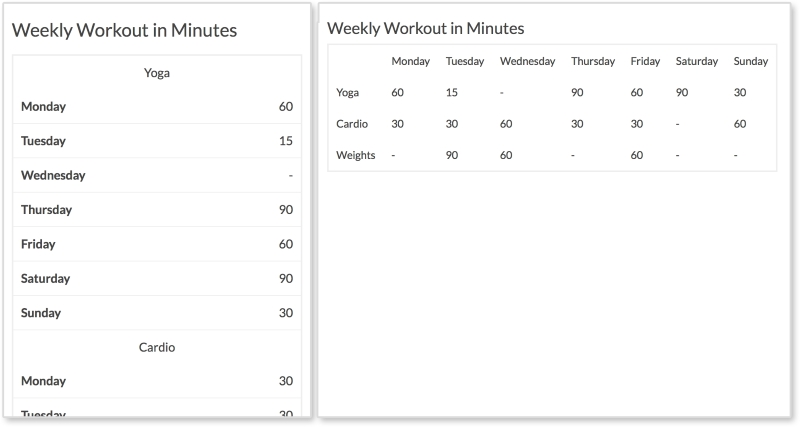
Every row has its own section with the column headings being repeated for each. This pattern takes up more vertical space, but we have more of that on smaller portrait-oriented screens.
HTML
<h3>Weekly Workout in Minutes</h3>

<table class="table-overflow">
  <thead>
    <th></th>
    <th>Monday</th>
    <th>Tuesday</th>
    <th>Wednesday</th>
    <th>Thursday</th>
    <th>Friday</th>
    <th>Saturday</th>
    <th>Sunday</th>
  </thead>
  <tbody>
    <tr>
      <td>Yoga</td>
      <td data-label="Monday">60</td>
      <td data-label="Tuesday">15</td>
      <td data-label="Wednesday">-</td>
      <td data-label="Thursday">90</td>
      <td data-label="Friday">60</td>
      <td data-label="Saturday">90</td>
      <td data-label="Sunday">30</td>
   </tr>
   ...
  </tbody>
</table>
The HTML is the same as the previous example except we are using a data attribute on every td in the rows. This is what allows the table on small screens to show the column heading to the left of the data.
CSS
td, th {
    padding: 10px;
}

table {
  border: 2px solid #eee;
  border-collapse: collapse;
  border-spacing: 0;
}

@media screen and (max-width: 600px) {
  table, th, td, tr {
    display: inline-block;
  }

  thead {
    position: absolute;
    top: -9999px;
    left: -9999px;
  }

  td {
    text-align: center;
    width: 100%;
  }

  td[data-label] {
    text-align: right;
    border-bottom: 1px solid #eee;
  }

  td[data-label]:before {
    content: attr(data-label);
    float: left;
    font-weight: bold;
  }
}
Again, the CSS here is just styling the table until we get into the media query. On browsers smaller than 600px, we are setting all table elements to display:inline-block to stop having the table look like, well, a table. This way everything starts on its own line. Then, we hide the table heading, the thead tag, by making them position: absolute and setting their top and left values to -9999px.
Next, we set each td to be centered and take up 100% of the table's width. This is why the section headings (such as Yoga) are centered. With td[data-label], we style the actual data with a data-label attribute to be right aligned and have a bottom border. Finally, we use td[data-label]:before to extract the contents of the data-label attribute, and put them before the data. We then float this to the left and make it bold. These final styles insert Monday, Tuesday, Wednesday, and so on next to the data on smaller screens.
View live at http://chelmyers.github.io/RPL/data/index.html#tableStacked.
Let's have a look at the pros and cons of this pattern:
Pros:
Cons:
Tables are great because they allow you to compare data and make trends. While this pattern utilizes vertical space, stacking tabular data can make it harder to scan. On smaller screens, users may have a more difficult time seeing trends but the table overall is easier to read. However, this table is very easy to read and the information is nicely organized.
A classic user experience challenge is designing a form that encourages completion. When it comes to fact, figures, and forms, it can be hard to retain the user's attention. This does not mean it is impossible. Having a responsive website does make styling tables and forms a little more complex. But what is the alternative? Nonresponsive websites make you pinch and zoom endlessly to fill out a form or view a table. Having a responsive website gives you the opportunity to make this task easier. It takes a little more code, but in the end, your users will greatly benefit from it.
With this chapter, we have wrapped up reviewing popular RWD patterns. Next, we will discuss how to decide what patterns are right for your project. We will also look in to combining patterns to make your own.
This book is all about reviewing popular responsive patterns. Just copying patterns straight out of this book, however, will leave you with a website that looks like everyone else's. It seems today that many websites consist of one large banner followed by two columns. We know that one column is the "main" column and holds the content that interests us. The smaller side column holds perhaps related posts, ads, or a cornucopia of miscellaneous content. Have a look at the following image to see what I mean:
Most of the sites we frequent daily follow this pattern. To some designers and developers, this layout is safe. It is tested and true. But that does not mean we should rely on it like a crutch. The patterns in this book are popular patterns. They are effective patterns, if used properly, but they are not the only solution. RWD patterns are like house blueprints and a website's content is like the homeowner. Every time a house is built, we don't forget what all previous houses looked like. We don't come up with a design from scratch. We also don't ignore the fact that different people will be living in each one.
Blueprints are great because they show us what works. For houses, they can tell us how high ceilings should be, how wide to make staircases, and how to layout a kitchen. A functional, well-designed house can be a good house. And sometimes, if we are lucky, this is enough. But what if we stopped coming up with new house layouts and always depended on the same blueprints for every future home? We would have functional houses but they would not meet the needs of every homeowner. Maybe the homeowner loves koi fish and needs a shady space in the backyard with a pond to keep them. Maybe the family keeps kosher and needs a kitchen with two fridges and two ovens to prepare food. And maybe the family has a lot of children and wants a slide on the staircase for the kids to enjoy. Yes, these exist. And yes, they are amazing. Have a look at the following image:

Why have boring stairs when you can have this?
Photo: Michaelis Boyd Associates
The point is that we should not reuse the old only because it works. One blueprint will not work for every family home just like one RWD pattern will not work for every responsive website. We need to work upon what we know and modify it for future projects. In this chapter, we will review the following:
You are not expected to come up with your own patterns from scratch. One of the best ways to innovate is to combine the old to make something new. In this book so far, we have covered patterns for:
This gives us some building blocks to work with. Before you get started, though, don't combine patterns for the sake of combining. You have to analyze the pattern and your website's content to make sure they are the right fit. When designing a responsive website and thinking of patterns to use, consider the following:
Really think about these questions instead of going with your gut. You may find yourself saying, "Yes, but…" to these questions. If you do, then think about why the pattern isn't 100% ready for what you need and what needs to change to make it so.
Focus on the content, what the pattern holds, first. If the pattern doesn't serve the content, then don't use it. If it hides the content from the user, don't use it. If it makes the content harder to get to, even if it is "really cool," still don't use it. Elegant patterns don't matter if they aren't doing their job. You can have the coolest animations on your website, but if they distract the user in a negative way from their main goal, they are failing.
If you read the pros and cons section for the patterns in this book, you will have seen comments on the type of content each can hold. For example, some of the navigational patterns can only effectively hold a small number of links. If you are creating a splash page, say for a conference or an event, you might only need a small navigation. But what if you are developing a website for a smaller company that may grow in the future? If you are lucky, they will contact you and ask you to develop a new navigation to fit their growing content. However, more commonly the company will just cram new links into the existing navigation and think that is good enough. Now, the users of that website may have issues navigating with the jumbled menu. And whenever you show off your work on the website, you'll have to say, "It looked great until the company did that."
Hypothetically, let's say we are designing the home page of a responsive site for a local motion graphics company. We first talk to the company to see what will be featured on the website and what they are trying to accomplish with it. We also talk to the company's clients if we can (people who actually use the website) and see what information they needed from it. From this feedback, we know that the company wants to:
The users (the company's clients) want to:
Now, you should be doing a lot more research that just this. But for this brief example and this imaginary website, this will do. We can see that the website is going to need a lot of visuals since the company will be showing off their work (and their work is motion graphics). We can think of the media patterns we reviewed and see if any of them fit. We know how to scale images, how to make image grids, and how to create big image heroes. The issue with these patterns is that our company makes motion graphics. This means all their work is animated and moving. We could provide thumbnails that when clicked go to a video, or even pop open a video, but why not present the animated content from the start? This is what the company wants to show off. This is what the user wants to see. Instead of forcing requirements into the patterns we know, we can come up with something else.
Let's look at a website that does this right. Panic is an animation studio in Latvia (yes, you can Google where that is). The studio provides services for motion graphics, 3D animations, graphic design, and illustration. When you first visit their website, http://www.panic.lv/, you are greeted with a loading animation. Boom, right away we have the movement. Loading screens are rarely fun, but this one sets the tone of their studio and even showcases some of their skills, which makes sense for an animation studio. The "panic" logo gets written right in front of us and then animates off the page while the rest of the page drops in. The same happens on both small and large screen sizes.
Once the site loads in, the first thing on the page is Panic's demo reel. Behind the play button is another video automatically playing, almost like a teaser. Green and pink 3D objects animate on repeat. This animation is an HTML5 video element set to loop. On mobile devices, we see the reel too. The video behind it is only an image now, no animation. We will get to why this is so later in the chapter.
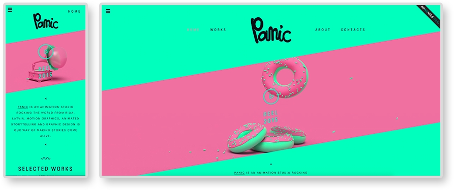
When you click on the play button, a full span Vimeo iframe video pops up. Even the Vimeo player is styled to match Panic's brand.
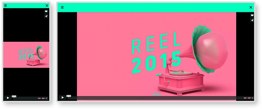
In Chapter 4, From Static to Dynamic – Embedding Media, we also reviewed how to make responsive videos with the HTML5 video element and an iframe. Instead of picking one and using just that, Panic uses both ways to embed videos. The "teaser" video on loop uses an HTML5 video element and the popup is an iframe. This is because both versions provide different features and Panic's website is utilizing this.
We know how to make both types of videos responsive, but instead of picking the easiest to implement, look at what they are holding. HTML5 video allows you to hide the controls of a video and easily loop. Perfect for an ambient background video. Using a Vimeo iframe means you have to worry less about compression and let Vimeo handle serving up the highest quality video the user's Internet connection can afford. This is why we see the lower-quality video being embedded using HTML5 and the higher in an iframe. These are the sort of thing to consider while selecting a responsive pattern. Let the content dictate the pattern and not the other way around.
Besides the website's content, there are plenty of other factors to consider. When a website is nearing completion, the site undergoes quality assurance (QA) testing. QA or QAing means loading the website on different browsers and devices and searching for bugs. Typically, bugs are logged, or "ticketed", using a ticketing system, and resolved by a developer. At the beginning of a project, the developer and client can agree upon which browsers and devices to support. Knowing this list before you start designing is crucial. You may be able to work with the client to decide this list together.
For example, IE 8 does not support media queries. This means that, if your client requires a responsive website to be fully functional on IE 8, you need to come up with a solution. Remember, developing mobile first means all your base styles are mobile styles. All other styles are contained in media queries. And since IE 8 does not support media queries, a weird stretched-out version of your mobile layout will show up on IE 8 if you develop mobile first. Nor does IE 8 and IE 9 support the new HTML5 semantic elements (for example, nav, section, header, and so on). Basically, your responsive website will just be completely broken in IE 8. This is why developers usually groan when hearing they have to support it.
The HTML5 Shiv
If you are using HTML5 layout elements, you can enable styling them in IE 8 and IE 9 with the HTML 5 Shiv JavaScript plugin (https://github.com/afarkas/html5shiv). You can also let Google host it for you with the following URL http://html5shiv.googlecode.com/svn/trunk/html5.js.
But this shows why knowing your technical requirements beforehand can help you prepare. To figure out what browsers you need to support, look to a site's analytics first. Hopefully, your client uses something like Google Analytics to track the traffic on their site. With application such as these, we can easily see what browsers and devices to support. Here, we can see the Google Analytics for an example site, where we can see what browser our visitors are using:
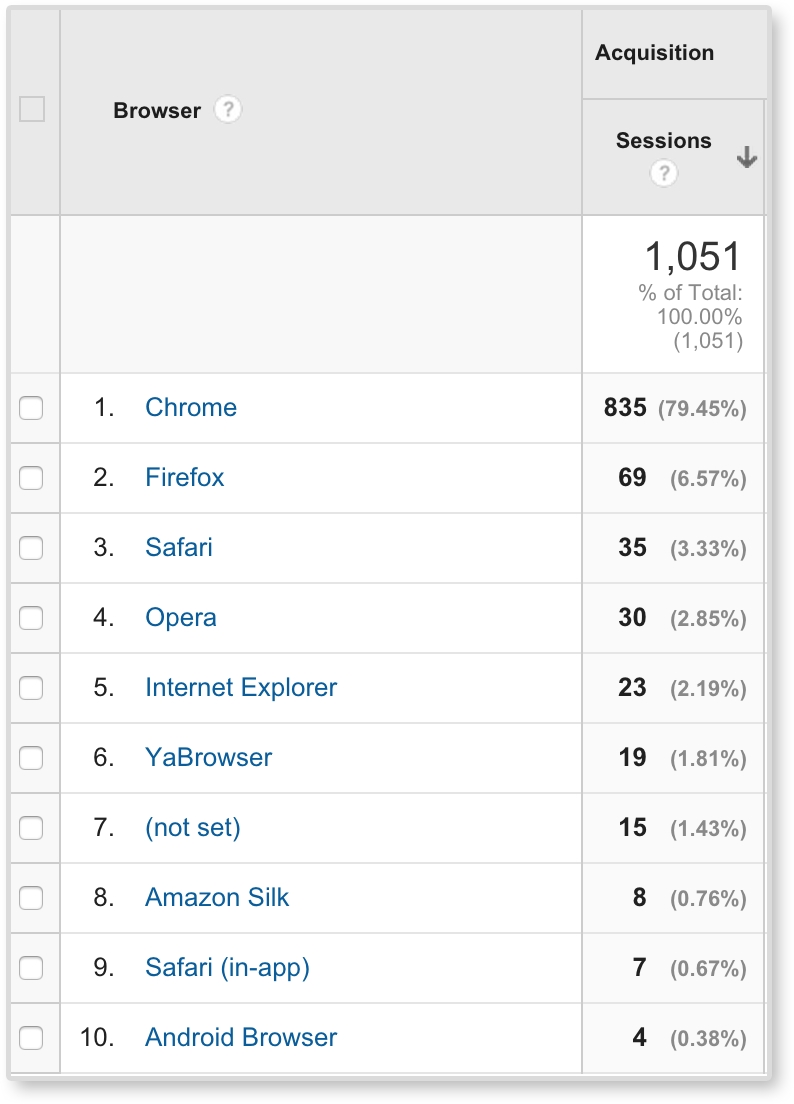
Here, we can see that Chrome and Firefox are dominating, but Safari, Opera, and Internet Explorer are still present. We can then click on Internet Explorer and see (like in the following image) that only IE 10 and IE 11 were used to access this site. From this data, we can start to form QA requirements. We can even view devices and networks (for example, Comcast and Verizon) in Google Analytics.
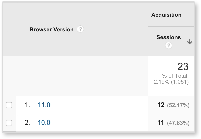
Once you have your required browsers and devices, you can be more conscious of what extra work you may need to do to ensure quality across them all. This does not mean you should sacrifice using newer techniques for the sake of older browsers. How are we ever going to advance and continue to grow our development skills if we do that? Instead, we need to know our limitations, and work with them. For example, we can easily make images black and white with CSS by using filter: grayscale(100%). With some prefixes, this solution works in pretty much all the popular browsers, except Internet Explorer. Not one IE version supports CSS filter effects right now. To see what browsers support, check out http://caniuse.com/. Here, we can type in CSS filter and the site shows the support for it.
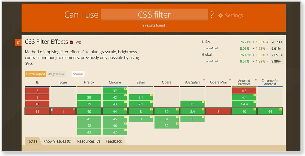
Just because IE and Edge do not support CSS filters, does that mean we will forego grayscale images in our website? No! Instead, we continue using filter: grayscale(100%) and find alternate solutions for IE browsers. A quick Google search can point us in the right direction.
After you figure out if the pattern will fit your content and that you can technically execute it, consider if your user will actually understand it. Web design can lean on conventions; as an example, we are used to seeing the logo on the top left and the menu on the top right of the page. If we swap these, the user might be temporarily confused when they first visit the site. Responsive websites start to break these conventions because we are dealing with smaller screen sizes. And that's okay. We should always be pushing these boundaries; repetition can be boring. New conventions can evolve.
But when we are pushing the boundaries and trying something new, we have to make sure that our user will understand it. Google Analytics can also give us some insight into who is using our site. This information can help you run usability tests to ensure the site's users understand the patterns. But project timelines can be short. You may not have time to test on your user demographic. It happens. Although I highly advocate user testing to make sure your design is actually navigable by your user, if you can't do this, you can lean on the research of others. Some of the popular ones are listed here:
Once you are sure of the patterns you want to use, you still have to create them. You can always create patterns from scratch, but look at patterns you already know before you start. Let's say you wanted to create a fullscreen video such as the one we saw on Panic's website. We know how to create full span images, and we know how to make responsive videos. We can look at the markup for these and start to come up with our own solutions by combining what you know.
In Chapter 4, From Static to Dynamic – Embedding Media, we went over responsive media patterns. As mentioned, we know how to create responsive videos and full span images. For this example, we are combining these patterns. See the finished product in the image here:
HTML
<header>
  <img class="fallback" src="i/kaleidoscope-fallback.png" alt="kaleidoscope"/>

  <video autoplay loop poster="i/kaleidoscope-fallback.png">
    <source src="v/kaleidoscope.mp4" type="video/mp4"/>
    <source src="v/kaleidoscope.webm" type="video/webm"/>
    <source src="v/kaleidoscope.ogv" type="video/ogv"/>
    <img src="i/kaleidoscope-fallback.png" alt="kaleidoscope"/>
  </video>

  <div class="banner-overlay">
    <h1>Company Name</h1>
  </div>
</header>
We are using the same HTML structure as the full span image pattern. The video will be wrapped in a header tag. The overlay is in a div element with a class of banner-overlay. Inside the header and video tags, we also have an img tag. These img tags are fallbacks. The first img tag will be toggled on and off for small and large screens. Smartphone browsers, such as the iPhone's Safari, do not allow for auto-playing video. Like Panic's website, on smaller screens we will show only a still image taken from the video. On larger screens, we will then show the video and have it play. The second img tag acts as a fallback in case the browser does not support the HTML5 video element (looking at you, IE 8). If you do not need to support IE 8, then you can take out the image inside the video tag. This way the user does not have to download content they will never see since they are on a browser that does support the video tag. The fallback image can also be replaced with text telling the user that their browser does not support the video tag.
The video tag is almost the same as the responsive video pattern. Its attributes are different though. If you look at the opening tag, you will see <video autoplay loop>. No longer do we see control present in this opening tag because we do not want to show the video's controllers. The autoplay attribute has the video play on load while the loop attribute loops the playback.
CSS
video, img {
  width: 100%;
}

video {
  display: none;
}

header {
  position: relative;
}

.banner-overlay {
  background: rgba(0, 0, 0, 0.3);
  color: white;
  text-align: center;
  padding: 20px;
  position: absolute;
  top:50%;left: 50%;
  transform: translate(-50%, -50%);
  -webkit-transform: translate(-50%, -50%);
}

@media screen and (min-width: 600px) {
  .fallback {
    display: none;
  }

  video {
    display: block;
  }
}
In the CSS, we are setting the video and the fallback image to have width:100%. Since we want only the image to show in small screens, we are hiding the video first with display: none. Next, we set header to position: relative, and center .banner-overlay just like we did in the big hero image pattern. The only difference here is we are adding some more styles to make the text legible on the video. Inside the media query, we are then hiding the fallback image, and showing the video on screens larger than 600 pixels.
View the example of this live at http://chelmyers.github.io/RPL/media/index.html#fullSpanVideo.
Let's have a look at the pros and cons of this pattern.
Pros:
Cons:
Ambient video backgrounds are very trendy right now, but this should not mean every website you make should have one. They are cool because you get a sense of the company, or product, quickly with the moving visuals. But this pattern should only be used if it really makes sense for the client and the website's content. Too many websites are using ambient video backgrounds for the sake of the trend. As reviewed, Panic Studio is a great example of how and why you should use full span video. Panic's whole business is creating motion graphics and animations. Their website should have movement. An insurance company on the other hand does not need a video to sell their services. This pattern requires the user to download a whole video to make it work. That's a lot of megabytes. Because of this, make sure you use this pattern with care, not just because it looks cool.
Combining patterns you know will only get you so far. The great thing about being a web developer is there are new things to learn everyday! If you develop in a bubble and never check out what's current in the industry, you may fall behind. In the film industry, there is a term called "producer's curse." It means that, if you have studied or worked in the film industry, you will never be able to enjoy a movie. You will be too busy analyzing special effects, cuts, or screen writing techniques. You won't be able to enjoy the movie like intended. In the web industry, designers and developers can get this as well. Having producer's curse is a great thing. It makes us analyze all the websites we visit. This is a great skill for spotting new patterns. Hopefully, you've found a website that has amazed you before. You just wanted to open up the inspector and see how it's done. Do this or keep doing this. It will keep you sharp and help you discover new RWD patterns and techniques.
If you are a web developer, you probably spend a lot of time on the Internet. Whether you are procrastinating or actually getting work done, keep your eyes open for impressive websites. Catalog the websites you find. Personally, I use Evernote to bookmark websites I love and want to look back to. The Onion's website, http://www.theonion.com/, is very impressive and cutting-edge. They are using flexbox to create their responsive layouts. When I first stumbled upon the Onion's new website, I took a moment to right-click and inspect it in the browser. Now, if I ever need a good reference for using flexbox in a responsive website, I have one. Have a look at a screenshot of this website here:
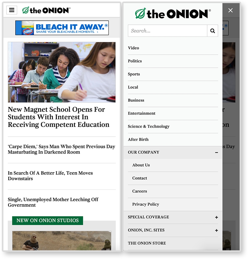
AWWWards' (http://www.awwwards.com/) and the Webby's website (http://www.webbyawards.com/) are great places to find responsive site inspiration. The AWWWards can show you trending sites, award winners, and the selected "Site of the Day." These websites are typically beautiful and are the pushing the boundaries of web design and development. Most of the examples from the book have come from the AWWWards' website. Searching through AWWWards' site has helped me discover some implementations of this book's popular patterns. The following is a website from AWWWards. For its navigation, it is using the overlay navigation pattern. You will find a lot of websites on the AWWWards site using the patterns covered in this book. You can also find some new and different patterns as well.
Another great place for RWD patterns is CodePen.io. CodePen houses snippets of HTML, CSS, and JS. It's like a website of patterns! When you have time, check out the Picks and Popular sections on the home page. These are popular "pens" that CodePen users created and usually utilize the latest HTML, CSS, and JS techniques.
We have gone over a lot so far in this book. Our job is not over yet. There are still other website elements we need to consider and include in our pattern library. Responsive pattern libraries are pretty much like style guides, but with responsive patterns included. Your RPL needs to include all the elements a regular style guide would include as well.
Your RPL should include swatches of the website's colors and their color value (hexadecimal, RGB, HSL, and so on). If you are using a CSS preprocesser, such as LESS or Sass, include the color's variable name as well. It is also important to know when and how to use these colors and which colors should never be paired.
Example: Google style guide (https://developers.google.com/web/fundamentals/resources/styleguide/index):
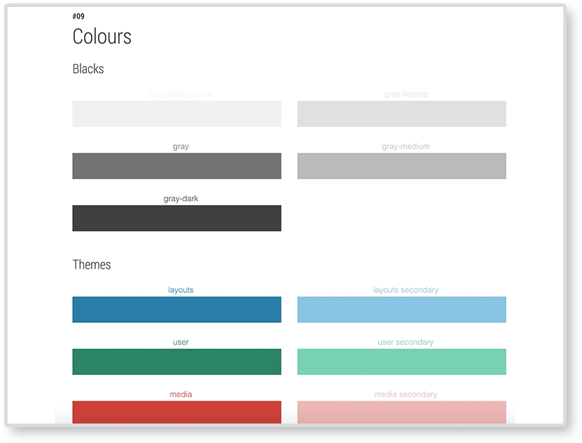
Make sure to include what font faces your website uses. As we saw in Chapter 2, The Main Stage – Building Responsive Layouts, font sizes may be changed across screen sizes to help with legibility. If they do, make sure you document these changes.
Example: MailChimp's UX style guide:
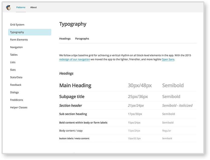
Your website may be using icons to help with navigation and/or tags. If it does, make sure to catalog what icons are being used and how to embed them in the future. Some websites use an icon font and use class names to embed the icons. Icons can also be responsive. Responsive icons are more detailed on larger screens and less on small. Check out Iconic (https://useiconic.com/) to see an example of what responsive icons can do.
Example: Code for America style guide (https://style.codeforamerica.org/):
All the patterns we went over in this book have been using horizontal media queries. Vertical media queries are exactly what you think they are. They are queries that adjust on the viewport's height, not the width. They are easy to implement too. We are used to writing horizontal media queries like this:
@media screen and (min-width: 600px) {
    …CSS…
}
Vertical media queries look like this:
@media screen and (min-height: 600px) {
    …CSS…
}
Yeah, it's not that different. Lagunitas Brewing Company uses vertical media queries for the age gate (asking if the user is older than 21). On taller browsers, the age gate has a few paragraphs of text welcoming the user. But on shorter browsers, the age gate only has the prompt and buttons. Since there is less vertical space for the age gate, it condenses.
The web industry is a fast-paced environment. We need to stay vigilant and keep an eye on upcoming technology. The patterns in this book are the basics that will help you understand how more complex patterns work. We cannot be sure what web design will look like in the future but, by understanding media queries and how to build your own patterns today, you can be better prepared for tomorrow.
In this chapter, we have gone over how to pick a pattern, how to combine patterns, and how to discover patterns rising in popularity. It is not enough to learn a few responsive patterns and reuse just those for every project. Hopefully, now you are equipped to start combining and discovering your own. You can even use your RPL such as a sandbox and test new patterns and combinations. In the final chapter of this book, we will discuss the benefits of adding a pattern library to a project and putting the finishing touches on our own.
When you are knee-deep in a project, it may be hard to keep your pattern library organized. You have deadlines rapidly approaching. It's difficult to be proactive and organize your patterns before or during the project. It can be easy to say, "I'll just do that later" when it comes to creating your responsive pattern library. But when that project is actually done, don't most of us need a break? We might want to take a step back from the project and not touch it for a while. And when we do come back to it, if we ever even do, the memory of how and why we made a pattern a certain way can be a little faded. And if we worked with other people, they may be gone or too busy to contact. The chances of making a pattern library that would be as good, or as thorough, as it would have been if we did it first are decreased.
Recently, I was asked to hop on a project that was completed and launched almost a year ago. I worked on it then, but only in a supporting role. Now, the client wanted some small changes to fit newer content. I quickly realized that I remembered very little about the website's structure and had to relearn a lot. At some point, my project manager asked me if there was a style guide for the website. After a lot of digging, I could not find anything. Style guides and pattern libraries were standard for all new projects, but like I mentioned, this one was completed almost a year ago. So, when I was asked to make updates, I had almost nothing to go on. When the client wanted to make changes themselves, they had no point of reference.
I searched through our CSS files (specifically, Sass in this case) to find guidance for typography, icons, and general spacing. I had to look at the JavaScript filenames to find what plugins we used and Google the abbreviations to find documentation. It took up a lot of my time, and the clients, to make sure all the changes adhered to their brand and that I wasn't recreating something a past developer already accounted for. And all of this was made even more difficult because the website was responsive. That means everything shifted at different screen sizes. So, I had to account for these shifts as well. And when I made a change, or created something new for the project, it had to shrink and grow with the rest of the system. All projects benefit from pattern libraries, but responsive projects need it the most. There are just too many variables constantly fluctuating for us to keep track of without some sort of tracking system. At the very least, this book will help you identify the bare minimum of what you should be recording in your own pattern library. Documenting your project can save you and your team time. Layout, navigation, media, and data patterns are just the basics. Each project and client requires a different level of documentation. As reviewed, a responsive library can also include what you would typically find in a style guide. You will need to decide how much your responsive pattern library will hold. Together, we will go over how to incorporate a pattern library into your project and what else it needs before it is complete. In this final chapter, we will be discussing:
Pattern libraries can be incorporated into a project at any stage. So, if you are already working on something, it is never too late to add one. The phase of a project's timeline you choose to create your pattern library can impact the way the library is used and how beneficial is it to the project team. The responsive pattern library is included at the beginning of development, during development, or after development. Let's review the pros and cons of each stage.
You may have guessed that I personally do not like waiting until the end of the project to create a responsive pattern library. As humans, we are prone to walk into rooms and forget why we went there in the first place. Yes, some of us have better memory than others, but I still don't trust our minds enough to recall decisions made weeks or months prior. If we put the library together at the end of our project, the patterns may suffer. It can be harder to remember the techniques we used. We may not remember to document all the patterns. There are projects with zero time to make a pattern library during development and it gets pushed to the end. That's okay. It happens. Sometimes, clients don't want to spend time or money on one and there's nothing you can do. But a pattern library made after a project is still better than no pattern library at all. And, if you do this, you will still have something to catalog patterns for you to refer to when working on future projects.
Responsive pattern libraries are most commonly built during development. Usually, a project has its development milestones all mapped out. As each batch is worked on, developers save snippets of code into their library as they move along. Maybe a developer starts with writing the CSS for the typographic scale and saves it in the pattern library. Now, this can be an acceptable way to use the pattern library, but it is not seeing its full potential. One of the best parts about a digital responsive pattern library is that it allows for collaboration. If a team is working on this project, perhaps the developers can share the typographic scale in the library with the lead designer on the team. The designer can then check the values, making sure nothing got lost in the conversion from Adobe Photoshop (or whatever tool was used) to CSS. Yes, just like a real library, responsive pattern libraries are archiving tools. But also like a real library, what's the point if no one ever uses it?
A responsive pattern library also breaks down a system into its pieces. These pieces are reusable and easier to maintain. A team then has one place to find all of a system's pieces, and the ability to build with them. Duplicate patterns can be avoided. Fixes can quickly be applied to patterns that will then apply globally. Patterns can also be duplicated and edited to meet a new requirement. Working with a responsive pattern library can change how you and your team develops websites. If you are ready to embrace working modularly, incorporate responsive pattern libraries early into your project.
Responsive libraries can be the most useful when being used before major development even starts. For most web projects, there is a design phase and a development phase. Usually, there is some development "kick-off" or "handoff" in the middle where the designers go over their compositions with the developers before they start their part. Slowly, we are seeing a gradual overlap happening between these two phases as technology and software advances, allowing us to design in the browser to get to development a whole lot faster.
We need this rapid development because there is so much more to making websites today. The design phase of the projects usually produces composition of the website, mostly at large screen sizes. Sometimes, there is a mobile design, or three, showing what the page will look like at smaller sizes. But rarely are there enough designs for the developers to know what every single page, and module, will look like at every single screen size. And you know what? Maybe the designer doesn't even know. Responsive websites take more time to plan because there is just more to design and develop. A responsive pattern library allows for an opportunity to make this planning easier.
Using a responsive pattern library before major development can be like developing in a sandbox. Designers and developers can sit down and look at the important patterns that make up the website and create them first. Then, when it comes to implementing the patterns, the developer is not left scratching his or her head thinking, "What is this supposed to look like at 700px?" It can be tough though, with milestones already laid out and time running out, to make time for developing inside a responsive pattern library.
Although the responsive pattern library accompanying this book is filled with examples, let's pretend it's filled with patterns of a client's website instead. This means our pattern library would not just be for ourselves, we would be handing it off to the client. Before this happens, our library would need a little fine-tuning.
If you are creating a responsive pattern library for a client, you are pretty much digitizing their brand. Your library should already be full with their custom brand's CSS. Before handing off a pattern library, or even at the start of the project, take some time to style the library itself. This little extra bit of effort can make you seem like even more of a professional. All the CSS is already there, right? Why not make sure it is being applied to the actual library? Make sure the typography for the pages' headers, paragraphs, and lists is styled appropriately. MailChimp's pattern library does just this. You can see how the typography is being used in the library itself.
Include the client's logo in the library's header. Style the navigation in the same way it would be on the actual site. Here's a checklist of branding elements you can add:
By doing this, you are providing more examples for how these patterns can be used. And your library will be even more impressive.
Quality assurance (QA) is a phase in the project when you make sure the website looks and works the same across browsers and devices. It can also be the time to make sure the site is accessible to all users. Usually the person doing QA logs tickets about bugs they see for developers to resolve. Before you ship off your library, make sure you test it. In Chapter 6, Combining Responsive Patterns, we discussed how to identify what browsers to test. Your client may have a list of browsers already prepared. Just like you would test your website, you should also test your pattern library. You cannot be sure what browser your client will be using to view your library. You don't want the main point of reference for a site to appear broken on some browsers.
You can even include your pattern library in the QA phase of the project. Being a developer who solves QA tickets, few things are more frustrating than tracking down modules or specific instances of a pattern in a huge website. Sometimes, I will get a ticket that says, "Sidebar navigation overlaps content at 700px." This just means a sidebar menu is spilling out of its container 700px. A kind "QA-er" (the person logging that ticket) would include a link to a page where I can find this. This doesn't always happen though. And most of the time you then have to sift through all the website's pages, trying to find an instance of the sidebar navigation. And when you do this multiple times over and over, it takes up a good chunk of your time. And sidebars are common. What if there was an issue with a Google Map responsive iframe pattern that you know only applies to two pages out of 40 pages? You, of course, forgot which ones. Have fun finding the pages that use that pattern.
If you QA'd using the pattern library, though, you can just check out the sidebar navigation pattern to see why this is happening. You may even have a layout with the sidebar navigation in your library. And you would definitely have the Google Map responsive iframe neatly archived and easy to find.
Visiting a website you made a while ago is a gamble. You hope it doesn't hurt you. Seeing your hard work soiled by the hands of clients is heart-breaking. You released something you care about into the wild and are now witnessing its decay. You may see some weird pattern you built for specific pages now on the homepage. "No! That doesn't go there!" you may think. But there's nothing you can do. The site launched a long time ago and it is out of your hands. The site may even be mutated past recognition.
I wish I could tell you there was a solution to this, but there isn't. Although they think otherwise, your client is not the expert; you are. And when you are out of the picture all that is left is the instructions you gave them. A good responsive pattern library is your main weapon to fight compromised designs. But even your library can become mutated and bloated. What can we do then in a fast-paced industry based on iterations with websites changing so frequently? Beef up your pattern library by writing meaningful descriptions for all your patterns.
Your responsive pattern library should not be filled with only examples of the patterns and their HTML, CSS, and/or JS, it should also be filled with meaningful descriptions of each pattern. Every pattern has its purpose. It is designed to hold specific content, look a specific way, or be on specific pages. The easiest way to make this clear to future developers editing a project is to write it down. Remember, your responsive pattern library has its own user experience for you to design. You can make it easy or hard for future developers to use your pattern library. You can even do this to yourself.
I love the "past self"/ "future self" example. Did you ever design or code something, not look at it for a long time, and look back and say, "What was I thinking?" Maybe you wrote some really complicated and unnecessary CSS that you now have to deal with. When this happens, you may think "Curse you, past self! You are so lazy." On the flip side, maybe you are creating a new layout in HTML and are including some really thoughtful comments to refer to in the future. You may find that when you revisit it, you think "Oh thanks, past self, that was so smart and helpful for present me." The point is, always think about what future you, or future self, would prefer.
Remember the full span video pattern from Chapter 6, Combining Responsive Patterns. You can look at the following image to refresh your memory. The pattern consisted of a looping video stretching across the page with text overlaid on top.
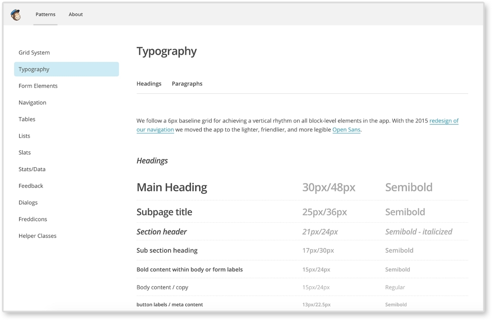
Let's write a description for it in our pattern library. The following are two descriptions showing a bad example and a good example:
The bad example states the obvious. I can tell just by looking at the pattern that it is a full span video with a text overlay. A good description will not only tell you what the pattern is, but what it should never be. It documents the decisions made about the pattern for others to understand it better as well. In our good example, we make sure to note that this pattern should only be used on the home page. We also describe important shifts that occur at different screen sizes. This description makes sure we know when, where, and how to use this pattern.
It's great when a client gives you permission to show off and claim rights to the work you have done for them. Even if you made an amazing responsive pattern library with clear thorough guidelines, clients can still mutate your work. Perhaps the client mangled your work to a point you hope no one thinks you did it. This can be a terrible situation to be in when you put so much work into a project. For this, keeping a copy of the responsive pattern library can help. If you want to show off the work you did, untouched, you can show people the original pattern library. If you have a portfolio website, you don't have to link to the live site. Pattern libraries are usually small enough you could easily host it yourself. This way you can show off the preserved patterns you made, in action.
Mutation does not only happen after a project is launched and the pattern library is handed off. It can also happen internally. Sometimes, towards the end of a project, we can start to rush and our code can suffer. Things can get a little more hectic when we are working with others. Working in with a pattern library can help reduce CSS bloat because it forces you to think modularly. Pattern libraries archive all the work done on the project. Before creating a new template or module, developers should look through the pattern library to make sure they are not doing duplicate work. Even if the pattern does not yet exist, maybe they will find a pattern similar to it and can start from there. Doing this helps reduce CSS bloat since the developer isn't starting from scratch. They are then less likely to write or overwrite CSS that already exists. This helps reduce the amount of frustrated developers that want to throw !important on the end of a CSS declaration and call it a day. Pattern libraries force you to break down a website into its pieces. Working modularly can help you save time since you have all the building blocks (patterns) already made. You just need to put them together and fill in any gaps.
If you are working for a client, most of the time when you are done with a project you will just zip up the responsive pattern library and send it over. It's then the client's job to host the library and make sure the right employees have access to it. If you are working on a personal project, though, you should consider putting your library online to share. This may be intimidating, but I believe this industry is so great majorly because we are constantly sharing ideas and their execution freely.
If you choose to do this, there are many different ways you can host your library:
http://githubUsername.github.io/yourRepoName/, you will see your site live. If you haven't noticed already, this is exactly what I am using for this book's library.Some clients may require their work to be password-protected. You may even want to password-protect the pattern library just as a courtesy. I personally use .htaccess to password protect my directories. It's more secure than most JavaScript solutions and fairly easy to implement. To do this, first create a file named .htpasswd in a plain text editor such as TextEdit or Notepad. Use a .htaccess password generator. You can easily Google one or go to http://www.htaccesstools.com/htpasswd-generator/. For this example, I am going to set the username to admin and the password to password too. Super secure, right?
Paste the generated password and username inside your .htpasswd file. It should look something like this:
admin:$apr1$4FDDZ0z1$OyTfGO5PAPSE7FmeCrOih/
The first part admin is the username and the string of seemingly random characters is the encrypted password. Now save that in the directory that you are password protecting. You may get a message such as "Names that begin with a dot "." are reserved for the system." This is fine. Both files need to be created; .htaccess and .htpasswd will not be visible. You may need to show hidden files to see them. A text editor, such as Sublime, will show them on its sidebar though.
Now create a .htaccess file and write the following code:
AuthType Basic
AuthName "Password Protected Area"
AuthUserFile /path/to/your/.htpasswd
Require valid-user
Change /path/to/your/.htpasswd to the path to the .htpasswd file. Then upload them to your remote directory. You should see a prompt asking for a username and password.
If not, make sure the path to your .htpasswd file is correct. Also, make sure that both files have no extension added from your text editor.
Responsive websites do take more time and effort to design and build than fixed websites. But the payoff is huge for the user. With the increase of mobile browsing, we cannot focus on just one screen size. And with new devices coming out every month, it's hard to stay on top of the industry. Luckily, the web design community is a vocal and collaborative one. To stay sharp, we must stay current. And this industry is blessed with pioneers and innovators not only pushing the boundaries of web design, but also sharing how they do it. Simple Google searches can overwhelm you with even more readings about responsive web design and pattern libraries. If you are looking to learn more, here are my suggestions.
Finally, with your site and its responsive pattern library done, you can move on to another project. Incorporating a responsive pattern library can be beneficial for you, your team, and your clients. In this chapter, we reviewed the benefits of adding one at different stages of a project and the final touches needed before you send your library out. With this, you now know all that goes into a creating a pattern library and can start planning your own.
The goal of this book was to familiarize you with popular patterns and help you set up your own pattern library. Use the patterns in this book as a foundation to develop new ones for your projects. If you are a beginner, maybe you will apply some minor tweaks and incorporate them into your own website. If you are a more experienced developer, I hope this book provided some inspiration for your next responsive website's design. But regardless of skill, a responsive pattern library is an extremely useful tool to any web project. By breaking down your site into patterns, you create building blocks to combine and develop with later. Feel free to use the responsive pattern library provided along with this book in your own projects. And remember, don't forget to share whatever responsive patterns or pattern libraries you create in the future with the rest of us.
Copyright © 2015 Packt Publishing
All rights reserved. No part of this book may be reproduced, stored in a retrieval system, or transmitted in any form or by any means, without the prior written permission of the publisher, except in the case of brief quotations embedded in critical articles or reviews.
Every effort has been made in the preparation of this book to ensure the accuracy of the information presented. However, the information contained in this book is sold without warranty, either express or implied. Neither the author, nor Packt Publishing, and its dealers and distributors will be held liable for any damages caused or alleged to be caused directly or indirectly by this book.
Packt Publishing has endeavored to provide trademark information about all of the companies and products mentioned in this book by the appropriate use of capitals. However, Packt Publishing cannot guarantee the accuracy of this information.
First published: November 2015
Production reference: 1241115
Published by Packt Publishing Ltd.
Livery Place
35 Livery Street
Birmingham B3 2PB, UK.
ISBN 978-1-78588-998-1
Author
Chelsea Myers
Reviewers
Esteban S. Abait
Tristan Denyer
Christopher Scott Hernandez
J. Pedro Ribeiro
Marija Zaric
Commissioning Editor
Kartikey Pandey
Acquisition Editor
Kirk D'costa
Content Development Editor
Merwyn D'souza
Technical Editor
Siddhi Rane
Copy Editor
Janbal Dharmaraj
Project Coordinator
Neha Bhatnagar
Proofreader
Safis Editing
Indexer
Priya Sane
Production Coordinator
Komal Ramchandani
Cover Work
Komal Ramchandani
Chelsea Myers, throughout her career so far, has been a student, freelancer, full-time employee, teacher, assistant, researcher, and business owner in the web development industry. She is passionate about responsive frontend development and building out user-focused designs. Every new project allows her to learn and try something new. And to her, that's the best part of the job.
She graduated from Drexel University with a degree in digital media. Currently, she works for an award-winning digital studio, Happy Cog, and teaches web development and user experience at Drexel. When she is not doing all this, or freelancing herself, she also manages her cofounded animation studio, Coffeebot Studios.
Esteban S. Abait is a senior software architect, and a former PhD student. He has experience devising the architecture of complex software products, and planning its development. He has worked both onsite, and offshore for clients such as Cisco, Intuit, and SouthWest. During his career he has worked with different technologies such as Java, PHP, Ruby, and Node.js, among others. In recent years, his main interests revolve around web mobile and REST APIs. He has developed large, maintainable web applications using JavaScript. In addition, he has worked assessing clients on REST best practices. At the same time, he has worked on high traffic web sites, where topics such as replication, sharding, or distributed caches are key to scalability.
He is currently working at Globant as a technical director. In this role, he works to ensure the project's delivery meet their deadlines with the best quality. He also designs software program training and interviews software developers. In addition, he travels to clients to provide consultancy on web technologies.
Globant (http://www.globant.com/) is a new breed of technology service providers focused on delivering innovative software solutions by leveraging emerging technologies and trends. Globant combines the engineering and technical rigor of IT service providers with the creative and cultural approach of digital agencies. Globant is the place where engineering, design, and innovation meet scale.
Tristan Denyer is a UX designer for web and mobile applications, including web apps and portals, e-commerce, online video players and widgets, games (online, iPhone, board), marketing sites, and more. He is also a UI developer and WordPress theme developer. He is currently leading the UX design for the product team at a start-up in San Francisco. He recently wrote a book, A Practical Handbook to WordPress Themes, CreateSpace, to help owners and operators of self-hosted WordPress websites get the most out of their themes. His passions include prototyping, web security, writing, carpentry, and burritos. He can be contacted through Twitter (@tristandenyer), GitHub (https://github.com/tristandenyer), and his portfolio and blog (http://tristandenyer.com/).
Christopher Scott Hernandez is a designer turned developer who has been working on the Web since 1996, when he built the Web's first boat upholstery site for his dad. He's since moved on to bringing his expertise to companies small and large, having worked on some of the most visited sites in the world, including eBay, LinkedIn, and Apple.
He was also a technical reviewer for HTML5 Multimedia Development Cookbook, Packt Publishing. He is an avid reader and lover of books. When he's not pushing pixels and writing code, he enjoys spending time with his wife and daughter exploring the parks and trails of beautiful Austin, Texas.
J. Pedro Ribeiro is a Brazilian user interface engineer living in the heart of London. He has been working on the Web for several years coding websites for start-ups and large companies. Currently, at RetailMeNot UK, he is responsible for creating the mobile first experience at VoucherCodes.co.uk (http://vouchercodes.co.uk/), focusing on performance and usability.
On his personal site, http://jpedroribeiro.com, he writes about frontend technologies, books, and personal projects. Some of these projects and experiments can be found at http://github.com/jpedroribeiro. On Twitter, he can be found at twitter.com/jpedroribeiro.
Marija Zaric is a web designer living in Belgrade with a focus on individual and commercial clients that demand websites that are clear, modern, creative, simple, and responsive. She works with clients from the USA and all over the world, helping them to present their services in a unique yet professional way.
She is a relentless learner. What she loves most about web design are the constant changes in the field, especially its evolution in the last four years when she got inspired by simplicity, great images, typography, and the possibility to optimize a single website for various devices.
She designed and incorporated these styles into her own website and called it Creative Simplicity. She was a reviewer for the books Responsive Media in HTML5 and Responsive Web Design with HTML5 and CSS3, both by Packt Publishing.
Her projects can be found at http://www.marijazaric.com/.
For support files and downloads related to your book, please visit www.PacktPub.com.
Did you know that Packt offers eBook versions of every book published, with PDF and ePub files available? You can upgrade to the eBook version at www.PacktPub.com and as a print book customer, you are entitled to a discount on the eBook copy. Get in touch with us at <service@packtpub.com> for more details.
At www.PacktPub.com, you can also read a collection of free technical articles, sign up for a range of free newsletters and receive exclusive discounts and offers on Packt books and eBooks.
https://www2.packtpub.com/books/subscription/packtlib
Do you need instant solutions to your IT questions? PacktLib is Packt's online digital book library. Here, you can search, access, and read Packt's entire library of books.
If you have an account with Packt at www.PacktPub.com, you can use this to access PacktLib today and view 9 entirely free books. Simply use your login credentials for immediate access.
Websites come in varying shapes and sizes. In our lifetime, we may work on sites that have four or 400 different pages. And the devices these websites are viewed on are just as different. Creating websites for all these variables is a daunting task. Breaking sites down to bite-sized pieces, or patterns, can make this task more manageable.
Web design and development is a great industry to be a part of because the people in it love to share. When developing a responsive website, it can be a challenge to come up with solutions for scaling content from small to large screens. Luckily, we can look to responsive patterns and responsive pattern libraries shared by the companies and individuals that make up this industry.
Together, let's look at the most popular responsive web design patterns and how they are built. Responsive patterns, just like patterns in the analog world, can be used as a guide, a foundation, or solely inspiration for your own work.
Chapter 1, Creating a Home for Responsive Patterns, builds a home for all the patterns reviewed in this book and looks into why pattern libraries should be used in the first place.
Chapter 2, The Main Stage – Building Responsive Layouts, reviews the top most common responsive layouts and what type of content is suited for each.
Chapter 3, Make Way for Responsive Navigations, explores patterns for one of the most tricky aspects of a responsive website—the menu system. It looks at popular navigational patterns used in modern websites and the pros and cons of each.
Chapter 4, From Static to Dynamic – Embedding Media, shows how to deliver catered images for different quality displays and how to make media such as images and video scale with a responsive website.
Chapter 5, Gathering and Displaying Information, covers patterns and guidelines for developing the more analytical elements of a website such as forms and tables.
Chapter 6, Combining Responsive Patterns, teaches how to decide whether a responsive pattern is the right one to use and how to combine patterns to create a more custom solution.
Chapter 7, Ship It – Finalizing Your Pattern Library, lays out the final steps to polishing up a responsive library before archiving it or handing it to the client.
Websites can be made in a plain text editor, but why suffer? In this book, we will be creating a responsive pattern library using HTML, CSS, and JavaScript. It is recommended to use a more advanced text editor such as a Sublime Text editor to edit the files provided. A modern browser such as Chrome, Safari, and Firefox is also recommended.
This book is intended for HTML and CSS beginners who want to know where to start when creating a responsive website. It is also for more experienced developers who perhaps need a little inspiration for their next project. Knowing what makes a responsive site tick is not enough. You also have to know the best way to design a site that fulfills its required goals, shrinking and stretching to polar sizes all the while. This book aims to equip you with a foundation to do just that.
In this book, you will find a number of text styles that distinguish between different kinds of information. Here are some examples of these styles and an explanation of their meaning.
Code words in text, database table names, folder names, filenames, file extensions, pathnames, dummy URLs, user input, and Twitter handles are shown as follows: "Put this meta tag in the <head> of your HTML files to overcome the device's zooming."
A block of code is set as follows:
/*NAVIGATION*/
nav li {
  display: block;
}
@media screen and (min-width: 800px) {
  nav li {
    display: inline-block
  }
}
When we wish to draw your attention to a particular part of a code block, the relevant lines or items are set in bold:
/*NAVIGATION*/
nav li {
  display: block;
}
@media screen and (min-width: 800px) {
  nav li {
    display: inline-block
  }
}
New terms and important words are shown in bold. Words that you see on the screen, for example, in menus or dialog boxes, appear in the text like this: "The View Pattern button takes you to the patterns page where you can view it alone outside of the landing page."
Feedback from our readers is always welcome. Let us know what you think about this book—what you liked or disliked. Reader feedback is important for us as it helps us develop titles that you will really get the most out of.
To send us general feedback, simply e-mail <feedback@packtpub.com>, and mention the book's title in the subject of your message.
If there is a topic that you have expertise in and you are interested in either writing or contributing to a book, see our author guide at www.packtpub.com/authors.
Now that you are the proud owner of a Packt book, we have a number of things to help you to get the most from your purchase.
You can download the example code files from your account at http://www.packtpub.com for all the Packt Publishing books you have purchased. If you purchased this book elsewhere, you can visit http://www.packtpub.com/support and register to have the files e-mailed directly to you.
Here is the link to the code on GitHub: https://github.com/chelmyers/RPL
Here is the live version of our website: http://chelmyers.github.io/RPL/
Although we have taken every care to ensure the accuracy of our content, mistakes do happen. If you find a mistake in one of our books—maybe a mistake in the text or the code—we would be grateful if you could report this to us. By doing so, you can save other readers from frustration and help us improve subsequent versions of this book. If you find any errata, please report them by visiting http://www.packtpub.com/submit-errata, selecting your book, clicking on the Errata Submission Form link, and entering the details of your errata. Once your errata are verified, your submission will be accepted and the errata will be uploaded to our website or added to any list of existing errata under the Errata section of that title.
To view the previously submitted errata, go to https://www.packtpub.com/books/content/support and enter the name of the book in the search field. The required information will appear under the Errata section.
Piracy of copyrighted material on the Internet is an ongoing problem across all media. At Packt, we take the protection of our copyright and licenses very seriously. If you come across any illegal copies of our works in any form on the Internet, please provide us with the location address or website name immediately so that we can pursue a remedy.
Please contact us at <copyright@packtpub.com> with a link to the suspected pirated material.
We appreciate your help in protecting our authors and our ability to bring you valuable content.
If you have a problem with any aspect of this book, you can contact us at <questions@packtpub.com>, and we will do our best to address the problem.
In 2010, Ethan Marcotte coined the term "responsive design." Since then web design has only been improving. The web community came together and stood behind this new concept. Beautifully responsive websites can now be seen all over the Internet. As a web developer, when I stumble upon a new responsive site, I love to evaluate the patterns that make up its system. It's like looking at the individual brush strokes that make up a painting.
Pattern libraries house the elements that make up a design system. A responsive pattern library houses elements for a responsive system. When we create these libraries ourselves, they act like a tool for archiving designs, modules, and templates for future reference. Developers can also use existing frameworks with responsive patterns premade, such as Bootstrap and Foundation. Unfortunately, using these patterns with few to no alterations has produced a lot of websites that look the same. But when we use these responsive patterns as a base, and not the solution, responsive websites can be as unique as snowflakes.
Because of its mass support, best practices have formed around responsive web design (RWD). There are popular patterns that developers and designers agree upon to be good solutions for websites catering to multiple devices. This book's goal is to familiarize you with these patterns and show you how to use them. The next step is to use these patterns as a stepping-stone to creating your own responsive designs. In this chapter, we will have a look at the following topics:
Let's say it is 2007, and I am waiting for a bus and browsing the Internet on my shiny new iPhone. If I wanted to see the latest from my favorite web comics, Hark! A Vagrant (http://www.harkavagrant.com/), the page would take around 50 seconds to download. 50 seconds! If I did this today on my iPhone 6, the same page would take 6 seconds to download. Both of these figures are relying on the fact that I have a decent signal as well. And since I live in a city, I probably wouldn't even be using my data plan. With hotspots popping up all over the world, I would most likely be connected to one of those. Meaning that even the largest comics from Hark! A Vagrant wouldn't even take a full second to load.
When the iPhone first appeared on the EDGE network, accessing the Internet was a hassle and took patience for each page to load. I remember using the browser on my Blackberry Bold and hating the experience. Flash-forward to today, and I do everything on my smartphone. According to Pew Research Center (http://www.pewinternet.org/), in 2015, 64% of American adults own a smartphone and 89% of them use it to access the Internet. And the most common time to do this? When they are at home or traveling. No longer can we as designers and developers ignore that fact that any site we create will be accessed through a mobile device. It is our job to make that experience as easy as possible.
HTML is naturally responsive, but for years web developers were taught to force sites to remain fixed at one size. In 2010, Ethan Marcotte brought to our attention the fact that people are no longer accessing the Internet through only desktops and laptops. With the launch of the iPhone came hundreds of other devices that put the Internet on small screens and in our pockets. But the Web wasn't ready to be viewed on such small devices. Marcotte's article, Responsive Web Design (http://alistapart.com/article/responsive-web-design) acted like a wake up call ushering us into a new realm of web design.
If web design is new to you, you may not be familiar with what RWD is. RWD is creating one website that responds to the size of the viewport. The same website renders on both smartphone and desktop devices. It is the same markup, but with CSS media queries changing styles depending on the browser's resolution. A delightful example is UK web design agency, Stuff & Nonsense's website (http://www.stuffandnonsense.co.uk/).
The preceding images are of Stuff & Nonsense's website at 400px, 800px, 1100px, and 1400px wide, respectively. The same site is served on both my smartphone and my laptop. The biggest difference between each screen size is the imagery in the header. Yes, the navigation, font sizes, and layout of the page are changing between each size as well. But the best part of this site is the advancing monkey army in the background as your browser size changes.
This is what RWD is doing technically. As developers, we are changing how the site appears depending on the viewport. As designers, we are rethinking the content that appears on smaller screens to make sure our users are receiving the information they need quickly and efficiently. Stuff & Nonsense's design requires some more advanced techniques, but can serve as an inspiration for what RWD can do.
Media queries were introduced with the debut of CSS3. They allow web developers to control what CSS styles are applied depending on variables such as the device width, height, aspect ratio, resolution, and orientation. The following is an example of a standard media query:
@media screen and (max-width: 500px) {
  body {
    color: red;
  }
}
The first part, screen, indicates what media type the media query applies to. In this case, screen refers to computer, mobile, and tablet screens. Another commonly used media type is print. The @media print annotation will apply only when the page is being printed.
Next and (max-width: 500px) is setting the
media feature. Instead of max-width, we can also use features such as min-width, orientation, and resolution. Right now, this media query will only apply the CSS style, body{color: red;}, when the site is being viewed on a screen when the viewport is less than 500px wide. When both of these requirements are met, the site's font color will be red.
Check out the W3C's (http://dev.w3.org/csswg/mediaqueries-4/) specifications on media queries to see what other media types and media features there are.
To use media queries, you first must place them in your style sheet. Throughout my time working on responsive websites, I have found two methods commonly used for organizing media queries. I have listed the methods in the following steps and shown a version of each with the media queries highlighted:
/*HEADER*/
header {
  background-color: blue;
}
@media screen and (min-width: 800px) {
  header {
    background-color: red;
  }
}

/*NAVIGATION*/
nav li {
  display: block;
}
@media screen and (min-width: 800px) {
  nav li {
    display: inline-block
  }
}
This method works better if you are working on a larger website and using a CSS precompile such as Sass. Sass allows you to nest your CSS, meaning you can nest media queries within a rule. I personally use this method on my projects. It works best when you break up your CSS into separate files and keep your CSS modular.
/*Base Styles*/
header {
  background-color: blue;
}

nav li {
  display: block;
}

/* Width 800px and up */
@media screen and (min-width: 800px) {
  header {
    background-color: red;
  }
  nav li {
    display: inline-block
  }
}
Downloading the example code
You can download the example code files from your account at http://www.packtpub.com for all the Packt Publishing books you have purchased. If you purchased this book elsewhere, you can visit http://www.packtpub.com/support and register to have the files e-mailed directly to you.
Grouping the CSS rules together under one media query works better on smaller websites where the CSS is not as extensive. We will be using this method for our pattern library because the design system is very simplistic. If the CSS gets larger, this method can become cumbersome. Right now, the rules are close together in their file because there are not many of them. But as a CSS file grows, there can be a lot of distance between a rule that dictates styles on mobile and the media query that changes it on a larger viewport. This means there is a lot of scrolling back and forth to make tweaks.
Custom media queries
A potential solution to this problem could be on the horizon. The W3C's Media Queries Level 4 specifications include a concept for custom media queries (http://dev.w3.org/csswg/mediaqueries-4/#custom-mq). It will allow aliases for media queries to be declared with @custom-media and reused throughout the site.
Both of these examples are using mobile first design. Here, we write the styles for the smallest screen size first and work our way up. Google Product Director, Luke Wroblewski, popularized the mobile first concept in his book, Mobile First (http://abookapart.com/products/mobile-first). Designing mobile first means designing the mobile experience before the rest of the site. Working within mobile constraints from the beginning forces designers and clients to prioritize and focus their content. It is easier to work your way up to a complex desktop website than squish a desktop site onto a small screen. If you start adding media queries and find one style sheet is getting too big, you can use @import to break out each pattern or media query into its own file and import it into one main style sheet. Whatever method you choose, just make sure that you keep your code organized and well commented.
If you start adding media queries to your CSS file without setting the proper meta tag in your HTML file, you'll find your website looking no different when it loads on a mobile device. Most mobile devices automatically zoom out and increase the browser's size to fit the website. Setting a responsive meta tags forces the device's browser to be the same width as the device's screen:
<meta name="viewport" content="width=device-width, initial-scale=1">
Put this meta tag in the <head> of your HTML files to overcome the device's zooming. This meta tag sets the browser width to the width of the device (width=device-width). The second part, initial-scale=1, makes sure that no automatic zooming occurs by setting the browser's scale to 1.
To begin spotting responsive patterns, you have to look at websites modularly. Pick a website and start breaking down the design into its components. These repeated components are the patterns that make up the design system. Designing and developing modularly allows the site to be easily scaled up in the future. Creating templates and pages alone only accounts for the content on the website at the time of its development. They do not account for what's to come. A pattern library can be used to house all of a website's patterns.
Pattern libraries can be used in a team setting to simplify collaboration. If a project uses a pattern library containing the entire site's existing patterns, developers can see what work has already been done and what still needs to be completed. If a developer is putting together a contact page and needs a form, he or she can look through the pattern library and see whether a form pattern already exists. If it does exist, the developer has now avoided creating a pattern that was previously created.
As mentioned, a great way to learn how to spot patterns is to break down existing sites. Let's look at Disney's website (http://disney.com/) together and see what patterns make up the site:
First, let's look for elements that are repeated and used throughout the website. An easily spotted repeating pattern on most websites is the
navigation. The preceding images show Disney.com's navigation closed in the top row and open in the bottom. By looking at the home page like this, we can observe the global pattern for the navigation. Here, we can see that on larger screens, the main navigation (Games, Video, Blogs, and so on) is on the page while the rest is hidden in a drop-down menu. On smaller screens all the navigation links are put in an off canvas menu that slides in and out with clicking on the icon (known as the "hamburger" icon). This responsive pattern is referred to as an off canvas navigation. Navigation patterns such as this will be covered in greater depth in Chapter 2, The Main Stage – Building Responsive Layouts.
Digging through Disney's site, we can find modules being repeated on different pages. Look at http://video.disney.com/movies or see the following image:
This page repeats modules used on the home page. The video gallery modules, as seen under See Tomorrow Today on the video page, are repeated again and again throughout the site. This module can be considered a video gallery pattern. And since this pattern's style changes depending on the browser's width, it is a responsive pattern.
If you want to break down this pattern even more, we can see that the video galleries are comprised of thumbnail images. These thumbnails can be considered their own pattern. They always have a 16:9 aspect ratio, with the video duration in the bottom right corner.
Now we are getting pretty detailed. Depending on the project or client, this level of detail may be required when creating patterns. If you find this happening, you might be interested in atomic design. Atomic design is a concept popularized by web developer Brad Frost and implemented in a project called Pattern Lab. It is a great example of how far you can break down a website. On his website, http://patternlab.io/, Frost breaks down patterns into the following categories:
If we apply this concept here, the home page will be a "page" and its structure will be a "template". To break this down further, let's look at a section, like the video gallery, on the page.
Looking at the video thumbnail, the captions, the video gallery, and the overall page, we can figure out what elements are atoms, molecules, and organisms.
|
Atomic design |
Disney.com |
|---|---|
|
Page | |
|
Template |
Media page |
|
Organism |
Video gallery |
|
Molecule |
Video thumbnail + caption |
|
Atom |
Video thumbnail |
Simply put, a pattern library is a home for your patterns. It acts as a point of reference for designers and developers to view the pieces that make up a design system. A good pattern library illustrates how to implement the patterns making up a website. In a responsive pattern library, every pattern should be accompanied with:
For example, if I were adding Disney's video gallery module to a pattern library, I would first embed the pattern on a page. I would then display the code necessary to build that pattern. Lastly, I would list usage guidelines explaining how and when to use it. Some example usage guidelines may be:
These are not Disney's real rules. I just made them up as an example. But documenting patterns like this means that if I ever needed to add the video gallery pattern to another page, I would have a clear set of rules on how to do it.
A responsive pattern library focuses on how patterns change across screen sizes. For small screens, we can see that the video gallery loses the right arrow and allows thumbnails to be cropped-off screen.
Documenting these style changes is what differentiates a basic pattern library from a responsive pattern library.
Responsive pattern libraries are not just for big team projects. Let's be honest, how good is your memory? Can you remember how much padding buttons get, months after you already developed them? And if the padding decreases on smaller screens, you are doubling the amount of information you need to remember with just one design element. Personally, I have a tracking tag on my own keys. So, if I can't remember where I left my keys this frequently, I doubt I will remember month-old code.
Without a pattern library, you need to comb through pages to find where a pattern may live. Only after this hunt can you test it or use it as a reference. A pattern library lets you quickly test all patterns on different browsers and devices. There is a benefit to having all your patterns in one place instead of hiding them away in distant corners of a website. Also, whenever you add more patterns to a system, you can see if the new styles affect older patterns. In short, instead of trying to remember every element you develop, use this book to create a responsive pattern library and begin cataloging your patterns.
Style guide versus pattern library
Although these terms are often used interchangeably, there is a slight difference. A style guide is a document that contains rules for how everything should look. This can be a PDF or an interactive guide online. A pattern library contains rules for how everything should work. A pattern library will be able to show the functionality of each pattern.
Pattern libraries are becoming a common tool in the web industry. Developers are releasing premade templates to help others build their own. Large companies such as Google and MailChimp have released their internal libraries, which serve as wonderful examples for the rest of us. I highly recommend viewing these templates and examples before you start your own. Even though pattern libraries may seem similar, they should always be tailored in some way. The tool has to fit the job.
The Pattern Lab is Frost and Dave Olsen's example of a pattern library broken down using atomic design. This is not a company's pattern library, but a template for developers.
You can view a demo of the library at http://demo.patternlab.io/ or download it yourself from Frost's GitHub repository at https://github.com/pattern-lab/patternlab-php.
The Pattern Lab organizes patterns by atoms, molecules, organisms, templates, and pages. The Pattern Lab also has awesome features such as the following:
The Pattern Lab may not be the right fit for all projects and teams. The concept of atomic design can be confusing to other team members and clients. They might not understand what an "atom" means and how it should be used. If you are a more experienced web developer, you can always download the Pattern Lab repository from GitHub and make changes. You can change the language to something more approachable (that is, "Basic Elements" instead of "Atom") and scale down the library. If you don't think you have the skills to do this, don't worry; this is not your only option.
MailChimp's responsive pattern library is my favorite example.
You can view this example at http://ux.mailchimp.com/patterns/.
MailChimp breaks down each pattern by showing an example, providing the code to create it, and including notes about how to use the pattern. As seen in the following screenshot, you can also decrease and increase the width of the browser and see how each pattern reacts since all patterns are functional:
The MailChimp Pattern Library (http://ux.mailchimp.com/patterns)
Responsive Patterns is another pattern library developed by Brad Frost. That guy must love pattern libraries, am I right? Responsive Patterns (https://bradfrost.github.io/this-is-responsive/patterns.html) is a catalog of popular patterns being used across the Web. Along with showing examples of these patterns, Frost includes a CodePen (http://codepen.io/) to show the code behind each pattern. And since Frost accepts submissions, this site is always growing.
Want to look at more responsive pattern libraries? Check out the following list for some great examples:
Developing your own responsive library forces you to become a more organized developer. Creating a pattern library from scratch for the first time or trying to scale down a larger pattern library may not be the best first step. Provided with this book is a responsive pattern library template ready for you to use. Its name is simple—the responsive pattern library (RPL).
You can download the starter template at https://github.com/chelmyers/RPL or view the finished library at http://chelmyers.github.io/RPL/.
Like Frost's Responsive Patterns, this library is a catalog of popular responsive patterns found all over the Web. By changing the title and content though, it can easily be used (and is meant to be) for clients or personal projects.
The Responsive Pattern Library (http://chelmyers.github.io/RPL/)
I developed this template with both beginners and more experienced developers in mind. These pages are static and created with HTML, CSS, and Prism.js (http://prismjs.com/). If you are a more advanced web developer, feel free to modify these templates and fit them into your current workflow. I personally use Sass and create a .scss file for each pattern. I then pull them all into one style sheet. I also use PHP to organize my markup.. The Pattern Lab uses Mustache to do this. If you don't know how to do any of this, do not worry; you don't need to. The library is good-to-go as is.
If you look at the finished site and click on the Navigation link on the side menu, you will be brought to a section's landing page. Here, you can see popular responsive solutions for navigations. At the top of the page is the section's title and a brief description about its content. Each pattern following has a working example, the code to implement the pattern, and the guidelines for the pattern's usage.
The pattern example is being displayed using the <iframe> tag. Each pattern has its own HTML file, with styles in the <head> tag, being embedded into the section's landing page.
The code is being highlighted using Lea Verou's (http://lea.verou.me/) Prism.js, a syntax highlighter.
Each pattern has a View Pattern button next to its title. The View Pattern button takes you to the pattern's HTML file where you can view it alone outside the landing page. Since the point of this book it to teach you how to use these patterns and why, each pattern has:
These are the pattern's usage guidelines. The guidelines in the actual library are brief. Look for more information about each pattern in later chapters.
To download the pattern library, visit https://github.com/chelmyers/RPL and click the Download Zip button at the bottom of the right column. You can find an empty starter version at https://github.com/chelmyers/RPL-starter. After you have downloaded the library, unzip it. You will see a folder called RPL-master or RPL-starter-master if you are using the starter files. The following walkthrough will be using the filled library. Put this folder in a safe directory on your computer. By safe, I mean someplace you won't lose or delete it. I keep all my pattern libraries and style guides under a folder called Sites on the same level as Documents.
Inside the RPL folder is the index.html file, the assets folder, and a folder for every landing page and patterns on that page. The assets folder contains the CSS for the library, images used, a template for a pattern file, a template for a section's index page, and the Prism.js plugin.
Now, let's explore how the sections are set up. Open up the navigation folder. Here you will see another index.html. This is the HTML file for the navigation section's landing page. You will also see HTML files named pat-01-simplyStacked.html. These HTML files are the individual patterns. The naming convention for the pattern files is pat-##-description.html. The pat lets me know that this is a pattern file. The number tells me what order on the page it appears. The description gives me information on what the pattern actually is in one or two words.
To add a pattern to a section, copy the pattern template file (pat-00-template.html) from the assets folder and rename it. Put the new pattern file into an already existing or new landing page folder. Next, open up the file in your text editor of choice. I recommend Sublime Text (http://www.sublimetext.com/) or Atom (https://atom.io/). Or you can copy the pattern template code from the following:
<!DOCTYPE html>
<html lang="en">
<head>
  <meta charset="utf-8">

  <title>Responsive Pattern Library</title>
  <meta name="viewport" content="width=device-width, initial-scale=1">

  <!-- Load in template styles -->
  <link rel="stylesheet" href="../assets/css/pattern-style.css">

  <!-- Load in Google Font: Lato -->
  <link href='http://fonts.googleapis.com/css?family=Lato:400,700' rel='stylesheet' type='text/css'>

  <!--[if lt IE 9]>
  <script src="http://html5shiv.googlecode.com/svn/trunk/html5.js"></script>
  <![endif]-->

  <style>
    /*Pattern ## - Description*/
    /*Insert CSS here*/
  </style>
</head>

<body>
  <!-- Insert pattern markup here -->
</body>
</html>
The preceding highlighted code is where we will be adding the styles and markup for each pattern. Nothing will show up just yet though. Let's go over how to set up a section's index page and add a pattern to it.
To create a section, make a new folder in the main folder (RPL-master or whatever you renamed it to) and give it a descriptive name. Duplicate index-template.html from the assets folder, place it in the new section folder, and rename it index.html. To fill out the section page, complete the following:
<ul class="menu"> so that your new section is included. Unfortunately, you will have to update the other pages as well since these templates are only HTML and CSS. Look for the comment <!-- Include new section page --> to see where to add the new list item.<h2 class="page-title">Section Title</h2>.<p>Section description.</p>.Now, we can start adding patterns to the page. Use the following code for each pattern you want to add. This can be seen in index-template.html as well:
<div class="pattern"> <h3>Pattern Title<span class="btn"><a href="pat-00-template.html">View Pattern</a></span></h3> <p><span class="difficulty">Level</span> Pattern description.</p> <ul class="list-compare"> <li><h4>Pros:</h4></li> <li>Item 1</li> <li>Item 2</li> </ul> <ul class="list-compare"> <li><h4>Cons:</h4></li> <li>Item 1</li> <li>Item 2</li> </ul> <h4>Example</h4> <iframe src="pat-00-template.html" frameborder="0" height="100"></iframe> <h4>HTML</h4> <pre> <code class="language-markup"> <!-- Markup goes here. --> </code> </pre> <h4>CSS</h4> <pre> <code class="language-css"> /*Styles go here*/ </code> </pre> </div><!--end pattern-->
The highlighted code is the information we will be changing. Follow these steps to do this correctly:
pat-00-template.html with the name of the pattern file. The actual pattern file should be in the same folder as the section landing file you are working on.height="100") to fit the pattern. It is set to 100px by default.<!-- Markup goes here. --> with the markup (HTML) of the pattern. Replace all less-than characters, <, with its HTML entity, <, to stop the tags from rendering in the browser./*Styles go here*/ with the CSS styles for the pattern.The library itself is already responsive and has some basic styles applied. The library's styles can be found in assets/css/lib-style.css. In the filled-out version on the pattern library, the patterns have some global styles. These styles can be found in assets/css/pattern-style.css. This file is empty in the starter version. After you have your RPL setup, feel free to jump right in and start poking around. The filled-out version has all the patterns we will be reviewing in this book. You can always download the starter files and make each pattern from scratch as we go along.
Since its introduction, web designers and developers all over the world have rapidly adopted RWD. For us, RWD means designing an experience that holds up across multiple screen sizes. Responsive pattern libraries aid us in organizing large design systems that accommodate the smallest smartphone to the largest desktop monitor. As you can see, the library already has four sections: layouts, navigation, media, and forms and data.. All of these topics and their patterns will be covered in the following chapters. We will also be reviewing RWD best practices along the way. Hopefully, by the end of this book, you will feel inspired to start designing and developing your own patterns, while using a pattern library to hold them all.
Designing for small screens comes with its limits. But instead of viewing these limitations as a hindrance, view them as constructive guidelines. Two teachers from Drexel University, Troy Finamore and Jervis Thompson, embrace RWD both in class and outside. Finamore chooses to have his students develop responsive websites and mobile applications for their final projects. Giving the students this type of constraint allows them to prioritize the content and functionality. Designing mobile first equips these students with organizational skills that are key for responsive sites.
When starting a new project, Thompson has his clients write down each section of content desired for their site on a post-it note and prioritize them in a single column. The first item in the column is the most important element the client wants seen on the page. Since And since the stacked post-its are almost the same width as a smartphone, a rough layout of the web page on smaller screens can already be seen.
It is most likely that people are not visiting websites for a fantastic navigation or a great footer with social media links. They visit for the content. Navigation and footer elements are tools for the user to travel through the website. A page's layout holds the content they seek. In this chapter, we will discuss the following topics:
Our challenge is to design a layout flexible enough to accommodate not only the range of content it might hold, but the device it will be displayed on.
All of the responsive tools and practices we have reviewed so far helped us utilize what is natural to the Web. HTML websites are naturally responsive. If we create a basic website, such as the following example, the site will naturally shrink and stretch to meet the browser's width. RWD builds on top of this function rather than halting it.
Spicing up your dummy text
You may have noticed I don't use the normal "Lorem Ipsum" dummy text in the preceding example. For personal projects and experiments, I like to add some spice and use interesting text generators. Here, I am using Coffee Ipsum from http://coffeeipsum.com/. Visit the Meet the Ipsums website (http://meettheipsums.com/) to add some fun to your workflow. Use it with caution though; clients may not have a sense of humor that is similar to yours.
To keep a website responsive, stay away from using pixel widths on elements. Instead use ems and percentages. We should use ems for font sizes too. CSS Guru, Chris Coyier, in "Why Ems?" (https://css-tricks.com/why-ems/), sums up why we should do this.
"Let's say you look through your stylesheet and find 50 different font-size declarations in px. That's 50 places you need to change that font size through a media query when the screen size changes. That's 50 suck points." | ||
| --Chris Coyier | ||
With ems, all sizes set are relative to its parent's font size. Let's say there is an h1 tag whose parent is a div tag; the font size of h1 will be relative to the div font size. If we increased the div tag's font size, the h1 font size would increase also. Another value is root ems, or rems. Rems are relative always to the body tag's font size. For both, if we needed to increase the font size overall on smaller screens, we can use media queries to change the body element's font size.
By setting the width of sections on a page using percentages instead of pixels, we can see the natural fluidity of web pages. The following is an example of a two-column layout using only percentages. This may seem familiar to you.
HTML
<div class="col-1">
</div>

<div class="col-2">
</div>
CSS
.col-1, .col-2 {
  margin:0;
  float: left;
  width: 50%;
  height: 600px;
}
.col-1 {
  background-color: darkgray;
}
.col-2 {
  background-color: cadetblue;
}
Here, we are using the .col-1 and .col-2 classes (col is short for column) to align the sections and set the widths. We then use these classes to set background colors as well. We also gave the columns a height so that we can actually see them appear on the page (the default height would be 0 pixels).
You may recall categorizing website layouts into three types: fixed, fluid, and adaptive. A website locked at 960 pixels wide has a fixed layout. Percentage-based layouts, such as the preceding example, are fluid. Adaptive layouts are fixed layouts that use media queries to change at different screen sizes. Now, you might be thinking that adaptive layouts are the same as responsive layouts. Even the terms for each are similar. Responsive layouts do use media queries too, but their layouts are based on percentages instead of being fixed. Responsive layouts scale based on a percentage-based grid. Adaptive layouts only snap to new layouts at different sizes.
Creating quick examples
Remembering all the CSS colors and creating images for examples sites such as these can be a hassle. Use placeholder sites such as Placehold.it (http://placehold.it/) and PlaceKitten (http://placekitten.com/) to generate images quickly. I also visit http://colours.neilorangepeel.com/ to help remember the CSS colors and pick the right shade for the example.
Fixed, fluid, adaptive, and responsive are the four main categories of layouts for websites. Responsive layouts can be categorized even further. In 2012, Luke Wroblewski released an article titled Multi-Device Layout Patterns (http://www.lukew.com/ff/entry.asp?1514). Here, Luke categorizes responsive layouts under 5 labels; tiny tweaks, mostly fluid, column drop, layout shifter, and off canvas. His categorizations caught on and are now commonly used when talking about RWD layout patterns. Together, we will review these patterns and see how they are made.
You can view all these patterns live at http://chelmyers.github.io/RPL/layouts/.
Let's start by looking at the easiest layout pattern. This pattern doesn't require much effort. The layout is similar to the example reviewed under a past section, The Web is naturally responsive. It is typically a single-column web page.
Our layout has a header and a section containing the site's content. Since these elements automatically stretch and scale to the browser's width, only some minor changes are needed to make it more mobile-friendly.
HTML
<header>
  <h1>Page Heading (h1)</h1>
</header>

<section>
  <p>Paragraph (p) - Collaboratively administrate empowered...<p>

  <h2>Heading 2 (h2)</h2>

  <p>Paragraph (p) - Efficiently unleash cross-media...</p>

  <ul>
    <li>List Item 1. Objectively innovate empowered...</li>
    <li>List Item 2. Proactively envisioned multimedia..</li>
    <li>List Item 3. Completely pursue scalable customer...</li>
  </ul>
</section>
The header section contains an h1 tag while a section tag contains the rest of the page's content. Inside the section tag, we have a second heading, paragraphs, and an unordered list.
CSS
body {
  font-size: 1em;
}

header, section {
  padding:0.75em;
}

@media screen and (min-width: 600px) {
  body {
    font-size: 0.875em;
  }

  header, section {
    padding:1em;
    margin-bottom:1em;
  }
}
Here, we have the styles for this layout with the media query highlighted. Now, remember we are styling these patterns mobile first; meaning the smallest screen-size styles are applied first and built on top of. This layout already scales width-wise the way we want it to, so we don't have to do much. All we are doing with CSS here is changing the font and padding sizes to make reading easier on smaller screens. I am setting font-size: 1em initially for the body and then decreasing it to font-size: 0.875em on screens larger than 600px. I am also setting the padding of the page (using the header and section tags) to a smaller value at first and increasing it on larger screens. This way there is more space for the content on smaller screens.
Since I am using ems instead of pixels for these examples, changing the font-size property on the body tag scales everything being styled with ems. Now, my whole typography system shifts by changing only one property. The padding and margin are scaling as well. That's why using ems in responsive design is so helpful!
You can view this pattern live at http://chelmyers.github.io/RPL/layouts/index.html#tiny-tweaks.
Let's have a look at the pros and cons of this pattern:
Pros:
Cons:
If you want to start creating responsive websites, this is the place to start. The main issue with this layout is that it cannot hold a lot of content and stay organized. Since the layout is so simple, all the page elements are stacked on top of each other. Our example only has a few things on the page. What happens though when I want a big navigation, an image gallery, and some more text? Creating a more complex layout would accommodate these elements better. This is why seeing a "tiny tweaks" layout is rare, especially as the home page for larger organizations. They are typically used as landing pages where more content lies in a different part of the site.
Like the tiny tweaks layout, mostly fluid layouts are simple to implement as well. As seen in the following example, the layout is based on a fluid grid system that shifts depending on the viewport's size. Usually, the layout is comprised of columns that stack on smaller screens. The mostly fluid layout is the most popular of the ones presented in this chapter.
The preceding example has a primary article that spans the full width of the page and three smaller secondary articles. On smaller screens, the primary image centers itself on screen, while the three columns stack on top of each other.
HTML
<header>
  <h1>Page Heading (h1)</h1>
</header>

<section class="clearfix">
  <!--Primary Article -->
  <article class="primary">
    <h2>Primary Article (h2)</h2>
    <img src="http://placehold.it/400x300" alt="">
    <p>Paragraph (p) - Collaboratively administrate...</p>
    <p>Efficiently unleash cross-media information without...</p>
    <p>Completely synergize resource sucking relationships via premier niche markets. Professionally cultivate one-to-one...</p>
  </article>

  <!-- Secondary Articles -->
  <article class="secondary">
    <h3>Secondary Article (h3)</h3>
    <p>Paragraph (p) - Objectively innovate empowered...</p>
  </article>
  <article class="secondary">
    <h3>Secondary Article (h3)</h3>
    <p>Paragraph (p) - Objectively innovate empowered...</p>
  </article>
  <article class="secondary">
    <h3>Secondary Article (h3)</h3>
    <p>Paragraph (p) - Objectively innovate empowered...</p>
  </article>
</section>
Again in this example, we have a header. Next, we have the primary article with a class of primary, a heading, an image, and three paragraphs. After the primary article, we have the secondary articles. Each has a class of secondary, a heading, and a paragraph. To apply styles to all the articles, we can use the article tag.
The clearfix method
You may have noticed that the section tag has a class of clearfix. This is a more modern method of ensuring elements span the full height of their floated children and next elements do not float up next their content. In pattern-style.css, .clearfix has the following styles:
.clearfix:after {
  content: "";
  display: table;
  clear: both;
}
To learn more about this method, visit https://css-tricks.com/snippets/css/clear-fix/.
CSS
The mostly fluid example uses the same CSS as tiny tweaks, but adds the following styles. Let's look at the mobile styles first:
article {
  padding: 1em;
}
  article img {
    width: 100%;
    height: auto;
    max-width: 400px;
    display: block;
    margin: 0 auto;
  }

.primary {
  padding-top:0;
}

.secondary p {
  margin-bottom:0;
}

h2, h3, h4 {
  border-bottom: 1px solid darkgray;
}
The first important part is to make sure static width elements, such as images, scale with their columns. Here, we set all images inside the article to width: 100% and height: auto. We then give them a max-width and use margin: 0 auto and display: block to center them. Everything else except what is in the media query is there just for styling. The media query then looks like this:
@media screen and (min-width: 600px) {
  .primary img {
    float:left;
    margin: 0 0.5em 0.5em 0;
  }

  .secondary {
    width: 33.33%;
    float: left;
  }
}
Inside the media query, we are setting the image in the primary article to float: left at 600px or larger. This lets the text wrap around it, so we add a margin as well. Next, we set the width of each secondary article to 33.33% and apply float: left. The articles now appear on the same row. In the pattern-style.css file, we are using the universal selector, *, to apply box-sizing: border-box to all the elements. If you are familiar with the box model, you know that naturally if we set an element to be 100px wide, we then add 10px padding; the element will then be 120px wide (100px for the content and 10px on each side). Using box-sizing: border-box allows us to keep our set widths and have the padding subtract from the content area.
You can view this pattern live at http://chelmyers.github.io/RPL/layouts/index.html#mostly-fluid.
Let's have a look at the pros and cons of this pattern:
Pros:
Cons:
You will find this in a lot of responsive websites: content just get stacked on top of each other on small screens. This means you need to know how to prioritize your content. If the content you really want the user to see is not towards the top of the screen on smaller devices, then you are gambling the user will not overlook it while scrolling. This is the only problem with the mostly fluid layout. Besides this, the mostly fluid layout is easy to create and easy to use, and therefore very popular.
Reordering page elements
Now if you are thinking something like, "Hey, can't I reorder the content on the page to solve this issue?" Well, yes, you can! A few years ago, there was no easy solution to this. Now, you can use the flexbox property (labeled as a W3C Last Call Working Draft). Arranging elements on the page using flexbox allows you to also swap their order just using CSS! Although we won't be using it in this book, I highly recommend checking it out. CSS Tricks has a great article about it at https://css-tricks.com/snippets/css/a-guide-to-flexbox/.
Websites can have side columns that contain additional information. We are used to seeing secondary navigation on the sides of pages. The column drop layout accommodates websites that utilize sidebar modules such as these. Normally, on larger screens, the columns are displayed while, on smaller screens, all sections are stacked on top of each other. Navigation columns are typically placed on top so the user can easily access them. Our example here has two columns and a section for the main content.
HTML
<header>
  <h1>Page Heading (h1)</h1>
</header>

<aside>
  <h3>Secondary Nav (h3)</h3>
  <ul>
    <li><a href="#">List Item 1</a></li>
    <li><a href="#">List Item 2</a></li>
    <li><a href="#">List Item 3</a></li>
  </ul>
</aside>

<section>
  <h2>Heading 2 (h2)</h2>
  <p>Paragraph (p) - Collaboratively administrate empowered...</p>
  <p>Efficiently unleash cross-media information without...</p>
  <p>Completely synergize resource sucking relationships...</p>
</section>

<aside>
  <h3>Heading 3</h3>
  <p>Paragraph (p) - Phosfluorescently engage worldwide...</p>
</aside>
This pattern has three columns; two sidebars and one main column. The first aside holds what would be a secondary navigation, while the second holds complementary information.
CSS
aside, section, header {
  padding: 0.75em;
}

@media screen and (min-width: 600px) {

  aside {
    width: 25%;
  }

  section {
    width: 50%;
  }

  aside, section {
    float: left;
  }

}
First, we are giving all three columns padding. All that is left to make this pattern work is a media query to set the width of the columns on larger screens. At 600px or higher, we are applying width: 25% to both aside tags and width: 50% to the main section tag. We are then applying float: left to both so they appear next to each other.
You can view this pattern live at http://chelmyers.github.io/RPL/layouts/index.html#column-drop.
Let's have a look at the pros and cons of this pattern:
Pros:
Cons:
You may notice that the column drop and mostly fluid layouts have the same negative characteristic. All content just gets stacked in one column. As you can see, though, minimal CSS is needed to make this work. Because of this, the pattern is a great solution for various kinds of content.
The layout shifter pattern starts to get a little more complicated. It is similar to the last two examples, but requires a little more effort. This pattern changes the most for different viewport sizes. It usually has a different layout for small, medium, and large screen sizes. The example we are using changes at 600px and 800px.
This pattern has three different layouts—small, medium, and large:
The layout shifter pattern with a one, two, and three column layout
HTML
<header>
  <h1>Page Heading (h1)</h1>
</header>

<aside>
  <h3>Secondary Nav (h3)</h3>
  <ul>
    <li><a href="#">List Item 1</a></li>
    <li><a href="#">List Item 2</a></li>
    <li><a href="#">List Item 3</a></li>
  </ul>
</aside>

<section>
  <h2>Heading 2 (h2)</h2>
  <p>Paragraph (p) - Collaboratively administrate empowered...</p>
  <p>Efficiently unleash cross-media information without...</p>
  <p>Completely synergize resource sucking relationships...</p>
</section>

<article class="secondary">
  <h3>Secondary Article (h3)</h3>
  <p>Paragraph (p) - Objectively innovate empowered...</p>
</article>
<article class="secondary">
  <h3>Secondary Article (h3)</h3>
  <p>Paragraph (p) - Objectively innovate empowered...</p>
</article>
<article class="secondary">
  <h3>Secondary Article (h3)</h3>
  <p>Paragraph (p) - Objectively innovate empowered...</p>
</article>
<article class="secondary">
  <h3>Secondary Article (h3)</h3>
  <p> Paragraph (p) - Objectively innovate empowered...</p>
</p>
</article>
<article class="secondary">
  <h3>Secondary Article (h3)</h3>
  <p> Paragraph (p) - Objectively innovate empowered...</p>
</article>
<article class="secondary">
  <h3>Secondary Article (h3)</h3>
  <p> Paragraph (p) - Objectively innovate empowered...</p>
</article>
Here again we have a side column, a main section, and secondary articles. Having six items on a page is great for the layout because six is divisible by two and three. This means we can have three equal rows of two each and two rows of three. In the layout shifter pattern, we will do just that. We will also repeat what we did for the column drop pattern and shift the aside tag's position as well:
CSS
.secondary h3 {
  border-bottom: 1px solid darkgray;
}

@media screen and (min-width:600px) {
  aside {
    width: 25%;
  }

  section {
    width: 75%;
  }

  .secondary {
    width: 50%;
  }

  aside, section, .secondary {
    float: left;
  }
}

@media screen and (min-width:800px) {
  .secondary {
    width: 33.33%;
  }
}
Now we are seeing two media queries altering the page's layout. The first is changing the width of the aside tag and the section tag for screen sizes larger than 600px. Here, they are now split 25/75. Next, we are setting each secondary article to take up half the screen creating three rows of two. Lastly, for this media query, we set float: left to all three elements so they appear on the same row.
The next media query kicks in on screen sizes larger than 800px. The only thing we are changing here is how many secondary articles appear in a row. Setting the width of each secondary article to 33.33% creates two rows of three.
You can view this pattern live at http://chelmyers.github.io/RPL/layouts/index.html#layout-shift.
Let's have a look at the pros and cons of this pattern:
Pros:
Cons:
Already we can see these patterns starting to overlap and merge. The layout shifter does start to get more complex, but this means more things can be done with it. If we can only make one media query at one size, RWD will not be as powerful. But with this ability, we can really start reworking layouts to appear beautifully across all screen sizes.
The biggest problem we have seen with these patterns so far is that most of them put all the content in one column at smaller sizes. Off canvas layouts are a solution to this. You may have used an off canvas layout in a mobile app. Usually, they have menus in columns that slide in from the right or left when opened. This doesn't mean we don't see this on the Web. Off canvas layouts require JavaScript (JS), though. There are purely CSS solutions, but these are hacks and come with their own problems.
The first two screenshots show what secondary navigation looks like when closed and opened on smaller screens. To toggle the navigation in this pattern, we will detect clicking on the Menu button with JS.
HTML
<body>
  <header>
    <h1>Page Heading (h1)</h1>
  </header>

  <aside>
    <h3>Secondary Nav (h3)</h3>
    <ul>
      <li><a href="#">List Item 1</a></li>
      <li><a href="#">List Item 2</a></li>
      <li><a href="#">List Item 3</a></li>
    </ul>
  </aside>

  <section>
    <button class="menu-toggle">Menu</button>
    <h2>Heading 2 (h2)</h2>
    <p>Paragraph (p) - Collaboratively administrate...</p>
    <p>Efficiently unleash cross-media information without...</p>
    <p>Completely synergize resource sucking relationships...</p>
  </section>
</body>
This layout's elements are the same as we've been using in other examples. The only difference is the Menu link. Here, I added a button with class="menu-toggle". Again, this will come into play when we get into the JS.
CSS
aside {
  display: none;
  width: 30%;
  max-width:200px;
}

section, aside {
  float: left;
}

.open aside{
  display: block;
}

.open section {
  width: 70%;
}

@media screen and (min-width: 600px) {
  .menu-toggle {
    display: none;
  }

  aside {
    display: block;
  }

  section {
    width: 70%;
  }

}
First, I am hiding the aside tag using display: none since we want it to be "off canvas" on smaller screens. Notice that we are not really having the aside element pushed off screen. Instead, we will create the illusion it is waiting right where we can't see it.
The next important style is for the open class. You may have noticed that we are not using the open class yet in the HTML. We will be! Using JS, we will add and remove the class from the body element. When the open class is added, display: none will change to display: block for the aside. Also, the main section will shrink to a width of 75%.
On larger screens above 600px, we set aside to display: block, so it doesn't matter if there is or is not a class of open on the body tag; the aside element will show. We also hide the Menu toggle link since we will no longer need it.
JavaScript
var menuTog = document.getElementsByClassName("menu-toggle")[0];

menuTog.onclick = function() {
    document.getElementsByTagName('body')[0].classList.toggle('open');
}
Out of all the layout patterns, this requires the most complex code. Don't worry though; this is actually very simple JavaScript! If you don't know JS, you can just use the code provided. I recommend reading the following explanation though to understand what is going on. Don't be afraid of JS. It is very easy to learn.
This snippet of JS first creates a variable, menuTog, that stores the first instance of the class menu-toggle. Next, we will create a function to trigger when the menu button is clicked. Inside this function, we are using the toggle method. We want to use this to toggle the open class on body. If body does not have a class of open, it will add it. If it already does, it will remove it. The CSS then does the rest and changes the styles depending on whether the open class is present.
Let's have a look at the pros and cons of this pattern:
Pros:
Cons:
If you have never used JS before, this pattern can be daunting. You have all the code though, so why not experiment? The off canvas example is definitely the most complex of the five, but it does solve the issue of using just one column on small screens. If you get comfortable with JS and start using it a lot, look into JS libraries, such as jQuery, to make projects easier.
Just by reviewing these patterns, we can already see repetition and combination. For more complex systems, these patterns can be combined in an infinite amount of ways. Of course, infinity can get a little messy.
When designing a website, we don't place content, modules, and text whenever we want. Websites such as these may look more like a cubist painting than a functional site. Website designs should be simple, usable, and approachable. A way to maintain order throughout a website is to base templates and pages off a grid system. The grid system is comprised of columns, typically in the range of 10-16 on large screens. Elements on a template are then aligned with the edges of the columns to bring order to the page.
Between each red column, there is space called the gutter. By always keeping this same sized space empty between elements, the page has breathing room and white space. The famous shoe brand, Vans, implements a 12-column grid system.
The Vans' website (http://www.vans.com/) with an example grid system
On Vans' home page, different sections of the page line up with the grid. The carousel spans the full width of the grid system, taking up 12 columns. The featured shoes underneath only take up two columns each. The articles under the OFF THE WALL section spans three columns each. Even the BE ORIGINAL banner at the bottom of the site lies on the grid. We see not only each section lined up with the grid system, but the images and text within each as well.
We don't have to create these grids from scratch though. Back when websites were acceptably one size and static, a popular tool to create these grid systems was 960 Grid System (http://960.gs/). This tool provides grid overlays in Photoshop, Flash, Fireworks, Illustrator, and many others. Each overlay is a 12, 16, or 24-column grid system with a 960-pixel width. Along with each column version, 960 Grid System also provides all the CSS needed to have page elements span across a certain number of columns.
We are not designing websites that are only 960-pixel wide. For a responsive website, we can use a responsive grid system. The patterns reviewed in this book can all be applied projects using a responsive grid system. Grid systems can help you determine how wide a pattern should span. With a responsive grid system, even though every column should be the same size, this one size can be a percentage and scale. This means that, on smaller screens, each column's width is narrower. Also with media queries, columns can be dropped too. A 12-column layout can become a 6-column one on smaller devices. Determining how a responsive grid system scales down for a project can help figure out how the project's patterns scale down too.
There are again tools already out there that help us create these responsive grid systems. Gridpak (http://gridpak.com/) lets us create a responsive grid system right there in the browser. By default, each column, column padding, and gutter value is a percentage. This allows the system to scale up and down depending on the browser's size. We can even add breakpoints to the system and change each value. When we download the file, Gridpak provides a .png file for design and the CSS files for implementation.
Check out other responsive grid systems such as Golden Grid System (http://goldengridsystem.com/) and Responsive Grid System (http://www.responsivegridsystem.com/) to find one that best fits your needs.
Making sure you have the right layout for your content is an important task. Each layout pattern we reviewed has its own strengths and weaknesses. It is crucial that you understand a website's content and can properly prioritize it to meet the user's and client's needs. With this information, you can begin to see what pattern suits your project. Of course, not every site on the Web looks like these patterns. These layout patterns have a very simple design, but as you can see from the live example sections, they share their core functionality. You can use these patterns as a starting point to begin figuring out ways to move content around across screens sizes. When you are done with this, move onto the next chapter to learn more about connecting these pages and their layouts with a responsive navigation.
When looking for information, rarely do we open up a website and land exactly on the page we were looking for. Maybe if we are lucky, whatever we are trying to find is featured on the home page. But if we are looking for contact information, operation hours, or a specific article, our luck runs out. When we are searching for information, we typically use a website's navigation to traverse through the pages.
Main navigations can range from just a few links to a collection of all the pages you can access on a site. How small or large they are depends on the size of the site. Websites such as NASA have a wealth of information available to the public and need an extensive navigation to help users find what they are looking for. Smaller websites, such as personal portfolio sites, have smaller navigations with maybe three to six links. To develop for this wide range of navigation sizes, there are several responsive navigation patterns that we can use. In this chapter, we will review:
When creating a responsive website, you do not have the freedom to jam as many links in the main navigation as you please. Even if you did have the luxury of screen space guaranteed, you still should never do that. Great navigation considers what content the user needs to get to and provides them with an easy path to get to it. Navigations are a manifestation of a website's information architecture (IA). Main navigations are a high-level summary of a website's organization. Each project's IA will be different. Larger projects can even have a person completely dedicated to IA and content strategy.
Unfortunately, we don't always have an information architect on our team or we are working alone. This does not mean we should skip IA though. RWD adds another constraint when planning out the IA of a project. When you are developing a navigation for your responsive website, first think of what the navigation will look like on smaller screens. Like a page's layout on small screens, one strategy for navigation is to stack their items on top of each other. As mentioned in the previous chapter, though, just stacking items of top of each other makes for one long skinny page that can potentially push important content down. To avoid a long navigation on smaller devices, prioritize what is actually included. This small screen constraint can jump-start your IA planning. Make sure that every item included in the navigation is important to the types of users who visit the website. Unnecessary items in the navigation will clutter it and obscure the crucial content of the site. Of course, sometimes long navigations cannot be avoided. Every project you work on will probably be a different size. This chapter will equip you with solutions for developing navigations of any size.
Before we get into navigation patterns, I want to take a moment to talk about a controversial but widely used tool for responsive navigations—the hamburger icon. By now, you either have at least seen it online or used it in your own web designs. Looking at the following image, you can see different versions of this icon. Just because it is so widely used though doesn't mean it should be our go-to solution for responsive navigations.
The hamburger icon is not new; it has been around for over 30 years. It's called the hamburger icon because those three little bars look like a hamburger's top bun, patty, and bottom bun. This meat-themed UI element is actually the list icon. Each bar doesn't represent a piece of food, but instead a list item. Typically, clicking this icon toggles the navigation's visibility.
Our pattern examples will not be using the hamburger icon. Personally, I don't hate the hamburger icon. Are there better solutions though? Of course! If you asked a non-tech-savvy member of your family (looking at you, Grandma) what those three lines meant on a website, I would say there is less than a 50% chance that she would know what it is. The web publication, Exis (http://exisweb.net/), looked into the hamburger icon to see if users actually understood it. The director, James Foster, did a simple AB test measuring the engagement of two navigation icon variations. The first was the hamburger icon and the second just the word "Menu" with a border around it. After gathering data from over 240,000 Android visitors, Foster found that there was a 20% increase in engagement with the second variation. The engagement with the hamburger icon was still high enough though that Foster concluded it could be ubiquitous. So either way, the hamburger icon or just text, users were finding the navigation. Another solution is to use the hamburger icon, but keep the label "Menu" underneath it. This is kind of the best of both worlds, if you have the screen space for it.
To read more about this study, visit http://exisweb.net/menu-eats-hamburger.
Whether you use the hamburger icon in your projects or not, that is up to you. Some designers and developers argue that, since it is so widely used, people are learning what it means. And yes, Exis and Foster found that this might be true. But if there is another way that our users could understand better, why not explore it?
A website's navigation is the most important tool for the user. It should provide quick access to all that the website has to offer. It should also never get in the way. Next, we will review examples of popular responsive patterns that make navigating websites easy on both small and large screens. There is a large range of navigational patterns found on responsive websites today. In this chapter, we will look at the five most commonly found patterns and why they are so widely used.
As mentioned, a common method for creating a responsive navigation is to let it simply stack up on smaller screens. This is why we'll call it the simple stack pattern. For small navigations, this pattern can do the trick. It is typically where newcomers to RWD start when building smaller websites. As seen here, the navigation floats to the right on large screens, but stacks on small ones.
Small sites can grow over time and navigation needs to be updated. Just like stacking content on small screens for layouts, stacking navigational items inhibits a website's navigation from growing. When a stacked navigation grows, it will get longer and take up more vertical space. A mobile user might visit the website, and only see the navigation.
HTML
<header class="clearfix">
  <div class="header-inner">
    <h1>Page Heading (h1)</h1>
    <nav>
      <ul>
        <li><a href="#">Home</a></li>
        <li><a href="#">About</a></li>
        <li><a href="#">Our Portfolio</a></li>
        <li><a href="#">Our Services</a></li>
        <li><a href="#">Contact Us</a></li>
      </ul>
    </nav>
  </div>
</header>
The markup for this pattern is fairly straightforward. We have a header tag containing our h1 page heading and a nav tag containing an unordered list. The unordered list has a list item, li, for every navigation item we want.
CSS
header h1 {
  margin-bottom: 0.25em;

}

nav li {
 list-style: none;
 padding: 0.25em 0.5em 0 0;
}
 nav li a {
  text-decoration: none;
 }

@media only screen and (min-width: 750px){
  header h1 {
    float: left;
    margin:0;
  }

  nav {
    float: right;
  }
   nav li {
    display: inline-block;
   }
}
First off, we are using the clearfix class again so the header accounts for its floated children. Pretty much everything else outside the media query is for style, not functionality.
Unordered lists naturally stack. In the media query, we are breaking this. At a 750px width, we set the h1 tag to float: left and the nav tag to float: right. We then style the navigation to appear on one row by setting the list items, li, to display: inline-block. No longer will each item take up its own row. They will appear inline with each other.
View this example live at http://chelmyers.github.io/RPL/navigation/index.html#simply-stacked.
Let's have a look at the pros and cons of this pattern:
Pros:
Cons:
The simple stack pattern is, well, simple. If the website you are creating only has a few pages users need direct access to, this is a good solution. If this is not the case, though, you are going to need something a little more robust.
Navigation's magic number
I've heard of different "safe" numbers for capping how many items you allow in a simply stacked navigation. Some believe that, if you have more than six, you should use a different solution. Others cap it as low as three items. Instead of just arbitrarily picking a number and going with that, I would suggest prototyping it. You can use this pattern from the RPL and modify it. By creating this HTML and CSS mockup of the menu, you can test it on the smallest device your website needs to support. From this, you can quickly gauge how many navigation items would be too many.
If the simple stack pattern had an evil twin, it would be the anchor and footer pattern. To be honest, this isn't fair to say. The anchor and footer pattern is not evil or bad, it is just the same pattern but at the opposite position on the page. This pattern typically looks the same as the simple stack pattern on larger screens. On smaller screens, though, the navigation can be found in the footer of the site. As seen in the following screenshot, instead of a menu in the header, there is a link that jumps to the footer when clicked:
HTML
<header class="clearfix">
  <h1>Logo</h1>
  <a class="menu-btn" href="#menu">Menu</a>
</header>

<div class="content">
  <p>Content goes here.</p>
</div>

<footer>
  <div class="footer-inner">
    <h3>Footer</h3>

    <nav id="menu">
      <ul>
        <li><a href="#">Home</a></li>
        <li><a href="#">About</a></li>
        <li><a href="#">Our Portfolio</a></li>
        <li><a href="#">Our Services</a></li>
        <li><a href="#">Contact Us</a></li>
      </ul>
    </nav>
  </div>
</footer>
For this example, we almost have the full HTML structure for a whole page. We have a header, some content, and a footer. The navigation lives in the footer of the markup though. We will be using CSS to reposition it on larger screens. The anchor tag with a class of .menu-btn in the header is a jump link set to jump to the element with an ID of "menu." We can see that the nav tag in the footer has this ID. This means when we click the menu button in the header, we will jump to the footer.
CSS
.menu-btn {
  float:right;
}

header h1 {
  float: left;
}

nav li {
  list-style: none;
  padding: 0.50em;
}
  nav li a {
   text-decoration: none;
 }

footer {
  padding: 0.75em;
}

@media screen and (min-width: 750px) {
  .menu-btn {
    display: none;
  }

  nav {
    position: absolute;
    top:0.75em;
    right:0.75em;
  }
   nav li {
    display: inline-block;
   }
}
On small screens, we have only a heading and a jump link. We float the menu link to the right and apply some styling to the header, navigation, and footer. For larger screens, we hide the jump link with display: none and reposition the navigation in the media query. Remember, the navigation will appear naturally in the footer because that is where it lives in the markup. To get it to the top of the page, we use position: absolute and position the navigation 0.75em from the top and right of the page. This means that, on screens larger than 750px wide, the navigation leaves the footer and appears at the top right of the website.
Absolute positioning
Positioning elements on a page can get tricky with CSS. Sometimes, it seems like the elements have their own mind and go wherever they please. The biggest tip I can offer with using position: absolute, is that absolutely positioned elements are relative to the closest parent element with a position of relative, absolute, or fixed being applied. If no parent element has one of these styles, the element will be positioned relative to the viewport.
View this example live at http://chelmyers.github.io/RPL/navigation/index.html#anchor.
Let's have a look at the pros and cons of this pattern:
Pros:
Cons:
Although the anchor and footer pattern solves the big issue with stacking navigation items, it creates its own problems. Anchor and footer patterns can be jarring to the user since they jump from the top of the page to the bottom. This can be disorienting. The navigation can even be missed since it is in an unconventional spot. But this pattern does a fantastic job in saving screen space by having the navigation at the bottom of the page on smaller screens. Its problems can be reduced too. The jarring jump can be replaced with a smooth scroll to the footer with the help of JavaScript. And designing the menu button in a way so it cannot be missed will help make sure the footer menu is not missed either. The anchor and footer pattern is a great pattern that accommodates small- and medium-sized navigation systems. It's a step up from the simple stack method in terms of capacity.
The next two patterns are the most common RWD navigational patterns and will need JS. The toggle is a navigation that is hidden in a drawer on small devices. The drawer can then be toggled open and shut using JS. In the RPL example, as seen here, we are using the same navigation as before but giving it a different background color so that we can see this drawer effect more clearly. Look at the first two images to see the drawer closed and then opened. On large screens, the navigation is always visible.
HTML
<body>
  <header>
    <div class="header-inner">
      <h1>Logo</h1>
      <button class="menu-toggle">Menu</button>
    </div>

    <nav>
      <ul>
        <li><a href="#">Home</a></li>
        <li><a href="#">About</a></li>
        <li><a href="#">Our Portfolio</a></li>
        <li><a href="#">Our Services</a></li>
        <li><a href="#">Contact Us</a></li>
      </ul>
    </nav>
  </header>
</body>
The main difference between this pattern's markup and the past two is a new div tag wrapped around the page heading and the menu button. This helps separate the top section from the navigation on smaller screens. And just like the off canvas layout pattern in Chapter 2, The Main Stage – Building Responsive Layouts, we will be using JS here to toggle a class on the body tag.
CSS
header {
  padding:0;
}

header h1 {
  float: left;
}

nav {
  padding: 0.75em;
  background: lightgray;
  display: none;
}

  nav li {
    padding: 0.25em 0 0 0.5em;
  }
    nav a {
      display: block;
    }

.menu-toggle {
  float: right;
  text-decoration: none;
  padding: 0.5em;
  border: 1px solid lightgray;
  border-radius: 3px;
}
  .menu-toggle:hover {
    background-color: lightgray;
  }

.open nav {
  display: block;
}


@media screen and (min-width: 750px) {
  .menu-toggle {
    display: none;
  }

  nav {
overflow: auto;
display: block;
}
  nav ul {
    float: right;
  }
    nav li {
      display: inline-block;
    }

}
Most of the preceding CSS is just styling the pattern. We are giving the navigation a different background color and styling the menu button and its hover state. Just like in the previous chapter, we are using the .open class to show and hide the navigation. Using JS, we will apply a class of open to the body and style elements on the page with that class. Here, we will set the navigation to display: block when the open class is applied. Using a media query, we will then make sure that the menu button is hidden and the navigation is always shown (by using display: block).
JavaScript
var menuTog = document.getElementsByClassName("menu-toggle")[0];

menuTog.onclick = function() {
  document.getElementsByTagName('body')[0].classList.toggle('open');
}
The JS for this pattern is the same as the off canvas layout pattern in Chapter 2, The Main Stage – Building Responsive Layouts. For a more in-depth overview of what this JS is doing, please refer to the off canvas pattern in that particular chapter. The JS again is toggling the class open on the body tag when the menu button is clicked. This allows us to toggle the CSS styles that show and hide the navigation on smaller screens.
View this example live at http://chelmyers.github.io/RPL/navigation/index.html#toggled.
Let's have a look at the pros and cons of this pattern:
Pros:
Cons:
The toggle and anchor and footer patterns can hold the same amount of content. Both are invisible until you click a link or button to activate them. The toggle pattern is very popular. It takes up no space on the page until opened. This means the content on the page is not pushed down until after the user decides to open the menu.
We have essentially covered the off canvas pattern in Chapter 2, The Main Stage – Building Responsive Layouts. Both the off canvas layout pattern and the off canvas navigation pattern work the same way. The content is hidden off screen until the menu button is clicked. The page then moves to the side, making the off canvas section appear to be shifted back on stage. It uses the same JS as the last pattern as well. View the following example to see the similarities:
HTML
<body>
  <div class="on-canvas">
    <header>
      <div class="header-inner">
        <h1>Logo</h1>

        <button href="#" class="menu-toggle">Menu</button>

        <nav>
          <ul>
            <li><a href="#">Home</a></li>
            <li><a href="#">About</a></li>
            <li><a href="#">Our Portfolio</a></li>
            <li><a href="#">Our Services</a></li>
            <li><a href="#">Contact Us</a></li>
          </ul>
        </nav>
      </div>
    </header>
  </div>

  <nav class="off-canvas">
    <ul>
      <li><a href="#">Home</a></li>
      <li><a href="#">About</a></li>
      <li><a href="#">Our Portfolio</a></li>
      <li><a href="#">Our Services</a></li>
      <li><a href="#">Contact Us</a></li>
    </ul>
  </nav>
</body>
The biggest difference with the off canvas pattern is that the navigation markup needs to be in two places. Here, we have two main sections, "on canvas" and "off canvas". All of the page's content is within the "on canvas" section, including the navigation we see on larger screens. The "off canvas" section contains the mobile navigation that will push all the on canvas content over. There are more advanced methods to get this pattern to work that don't require duplicating the navigation, but they require about three times the amount of CSS. For now, this approach is widely used and perfectly acceptable.
CSS
The styles for the header and navigation are the same as in the past examples. Since this requires a little more CSS, though, let's look at it piece by piece. To view all the CSS used, visit the live RPL.
.on-canvas nav {
  display: none;
}

.off-canvas {
  display: none;
  width: 200px;
  position: absolute;
  right:0;
  top:0;
  bottom:0;
  background: lightgray;
}
First, we are styling the off canvas navigation. We are hiding it with display:none, but are also setting its location when it does show by positioning it to the top-right corner of the page.
.open .off-canvas {
  display: block;
}

.open .on-canvas {
  width: 100%;
  position: absolute;
  left: -200px;
}
Next we are setting the styles for when the navigation is open. We set the off canvas section to display:block and then shift over the on canvas section by -200px. This offset is not a random number. The -200px gives the off canvas section 200px of screen space. And this is exactly the width of the navigation.
@media screen and (min-width: 750px) {
  nav li {
    display: inline-block;
  }

  .menu-toggle {
    display: none;
  }

  .open .on-canvas {
    position: static;
  }

  .open .off-canvas {
    display: inline-block;
    float:right;
  }

  .open .off-canvas, .off-canvas {
    display: none;
  }
}
Finally, we have the media query. For screens larger than 750px, we hide the menu button and the off canvas navigation. We are then showing the first navigation that is actually in the header, floating it to the right, and styling it to display on one row.
JavaScript
The JS for this is the same as the last pattern. We are just using it to toggle the open class on the body tag again. Isn't it amazing how versatile JS can be? We have used this one JS snippet three times so far!
View this example live at http://chelmyers.github.io/RPL/navigation/index.html#offcanvas.
Let's have a look at the pros and cons of this pattern:
Pros:
Cons:
It seems today that most websites are using this pattern for their sites. Check out the Awwwards's Site of the Day winners (http://www.awwwards.com/awards-of-the-day/). Just by visiting these sites, you can see how popular this pattern is. This pattern can hold a large range of navigations. The JavaScript makes it an elegant and sophisticated interaction as well. This does not mean all websites should use this pattern though. The off canvas pattern is a great solution, but it should be reserved for larger navigations. Keep it simple. If you do not need all the space the off canvas pattern provides, then do not use it.
A navigation pattern that has recently popped up is what I call the overlay menu. On larger screen sizes, it looks the same as the last few patterns we have reviewed. As you can see here, even on small screens, it looks the same. When the navigation is open on smaller screens, though, it looks completely different. The navigation takes up the whole screen and covers the page. The menu is then centered on top of a usually slightly transparent background. The whole navigation is an overlay on top of the page; hence the name.
HTML
<header>
  <div class="header-inner">
  <h1>Logo</h1>
  <button href="#" class="menu-toggle">Menu</button>
  <nav>
    <button class="close">×</button>
    <ul>
      <li><a href="#">Home</a></li>
      <li><a href="#">About</a></li>
      <li><a href="#">Our Portfolio</a></li>
      <li><a href="#">Our Services</a></li>
      <li><a href="#">Contact Us</a></li>
    </ul>
  </nav>
  </div>
</header>
The HTML for this pattern contains less than the previous ones. The menu does not need to repeat in the markup. No on or off canvas sections are needed either. We will simply be making the navigation appear fullscreen with CSS on smaller screens. The only real addition is the button with a class of close in the nav tag. This button contains an HTML entity for the multiplication symbol (×). As you can see in the example, this is the "x" that pops up when the navigation is open. We will be using JS to close the navigation when that "x" is clicked.
CSS
A little more CSS is needed to get this pattern up-and-running. Most of it is the same as the previous patterns. Let's go through what is new and unique to this pattern:
nav {
    display: none;
    position: absolute;
    top: 0; right: 0; bottom: 0; left: 0;
    background: rgba(255,255,255, 0.8);
    text-align: center;
}
Since we are developing mobile first, the overlay styles are first applied to the nav element. To make the nav element go fullscreen, we will use position: absolute and set each corner to zero. We are also giving the nav element a slightly transparent white background and setting text-align: center. We are then centering the ul containing the navigation items.
nav ul {
    position: absolute;
    top:  50%;
    left: 50%;
    transform: translate(-50%, -50%);
}

nav a {
    font-size: 2em;
    margin: 0.5em 0;
    line-height: 1;
}
Setting position: absolute and top and left to 50% centers the top-left corner of the ul element. Then, transform: translate(-50%, -50%) moves the element 50% of its own height up and 50% of its own width to the left. Now, the center of the ul element is 50% from the top and left of the nav element instead of its top-left corner. Then, we are adding some styles to the menu links to make them less crowded.
.close {
    border:0;
    background: transparent;
    font-size: 2em;
    color: black;
    position: absolute;
    right:0;
}

.open nav {
    display: block;
}

.open .menu-toggle {
    display: none;
}
Next, we are styling the close button and positioning it in the top-right corner. We are also making sure that the navigation shows and the menu button is hidden when the open class is applied.
@media screen and (min-width: 750px) {
  nav {
    display: block;
    position: static;
    background: transparent;
    text-align: left;
    float: right;
  }

  nav ul {
    position: static;
    transform: translate(0,0);
  }

  nav ul {
    position: static;
    transform: translate(0,0);
  }
    nav li {
      display: inline-block;
    }
      nav a {
        font-size: 1em;
      }

  .menu-toggle, .close {
    display: none;
  }
}
Finally, for larger screens, we are reverting the fullscreen styles for the navigation and hiding the close button.
JavaScript
var menuTog = document.getElementsByClassName("menu-toggle")[0];
var closeTog = document.getElementsByClassName("close")[0];
var body = document.getElementsByTagName("body")[0];

menuTog.onclick = function() {
    body.classList.toggle('open');
}

closeTog.onclick = function() {
    body.classList.toggle('open');
}
The JS for this pattern is almost identical to the other patterns. The only addition is a function to toggle the open class when the close button is clicked. This function works the same as the first, but is just detecting a click on a different element.
Let's have a look at the pros and cons of this pattern:
Pros:
Cons:
Some big-name companies such as Apple and Spotify are using this overlay pattern. If you visit those websites, you can see their versions of the pattern incorporate animations and fading. This pattern still cannot hold a lot of navigational items since it spans only the size of the screen (and sometimes the screen is small). However, sites such as Spotify allow the user to scroll in this overlay and include more navigation items.
View an example on this live at http://chelmyers.github.io/RPL/navigation/index.html#overlay.
You may have noticed that I deemed none of the popular patterns we just reviewed suitable to hold HUGE navigations, only large ones. That's because just one of these patterns cannot do it alone. Large websites use a combination of these patterns and create primary and secondary navigations. Visiting Disney's site again (http://www.disney.com), we can see they use the off canvas pattern and the simple stack pattern on smaller screens. Some websites use the same pattern twice. NASA uses a toggle pattern embedded in a larger toggle pattern for their huge navigation (http://www.nasa.gov/).
Remember, navigations are the main instrument the user has to investigate a website. You wouldn't go exploring without the proper tools. So, why would you ill-equip your user to explore your own site? In this chapter, we reviewed several popular responsive navigation patterns to begin the journey of creating well-designed navigations. We also talked about the importance of information architecture when planning the size of your navigation. If your users are getting lost just looking at the navigation, something is not right. Use RWD as a way to prioritize your navigation and condense the items it contains. Then, they can find the content they are searching for, frustration-free, on any device. But is our job done yet? Nope. Next, we will look at responsive patterns for a specific type of content—media.
If you think about it, websites would be boring without images. A photo says a thousand words because, let's be honest, we don't feel like reading a thousand words. We are starting to talk in images too. Just look at how we use Emojis and GIFs. These are images that we send along when we don't feel like spelling it out. That's why media is great. Photo, icons, and videos can convey so much more information in a split second than a paragraph of text.
We can run into some obstacles though when including images on responsive websites. Images and videos can take some time to load because they are larger files. How many times have you exited a website, on a desktop or smartphone, because its content took too long to load? This probably happens on your smartphone. Even though the screen is smaller, scaling an image or video down with CSS for mobile devices doesn't make the file size any smaller. The full-sized file is still being downloaded. When dealing with responsive media, we have to make sure we are optimizing our content and preparing for it to scale from smartphone to desktop. In this chapter, we will be going over:
picture versus srcsetBelieve it or not, we have already started implementing responsive images in Chapter 2, The Main Stage – Building Responsive Layouts. Remember the mostly fluid layout (http://chelmyers.github.io/RPL/layouts/index.html#mostly-fluid). In this pattern, we added a featured image to an article snippet. The image stays at one size until the screen's width gets too small and it starts to scale down. But doing only this to images, and nothing more, can leave your website poorly optimized. Images make up the bulk of websites in terms of size. We don't wait for text to load, do we? It happens so fast it is hardly noticeable. Scaling down large images to 300px for a small mobile device seems inefficient. To learn how to optimize responsive images though, we first have to start with the basics.
In the mostly fluid pattern from Chapter 2, The Main Stage – Building Responsive Layouts, the first section contained an image that had a fixed width but then scaled down on smaller screens. This is the most basic approach to adding images to a responsive page. You have to make sure they scale, but not past their original sizes or risk pixelated images. If they aren't scaling but instead jump between sizes, they are adaptive and not responsive. We also went over the difference between adaptive and responsive design in Chapter 2, The Main Stage – Building Responsive Layouts. An adaptive design jumps from layout to layout at breakpoints. A responsive design scales between these breakpoints, and can have its layout change too. We can scale our images by giving them max-width and height properties such as the following code:
img {
  max-width: 100%;
  height: auto;
}
Applying a max-width property of 100% on the image insures that it will never get larger than its true size but will still scale down. Setting height: auto makes sure the image's aspect ratio is not changed. We wouldn't want an image with a width of 800px to be stretched out to 1500px. Then, we risk having a website filled with fuzzy pixelated images.
This code snippet is not really a media pattern. It is more of a building block for designing with images in your project. In this chapter, we will be using this technique to create more complex patterns.
Setting just max-width and height properties on your images, and doing only this, can potentially slow down your website and cause longer loading times. In this example, we scaled down an 800px wide image to fit on a small screen. Even though on a small screen it appears to be only 300 pixels wide, an 800px image is still being downloaded. The difference between 800px and 300px doesn't seem like a lot, but when you have multiple images on your page it starts to add up. Today, a lot of company websites use HUGE full-width scaling images in their designs. Just take a peak at AWWWard's Site of the Day collection and see how prevalent this trend is.
All the websites shown in the preceding image are responsive as well. The images being used range from 1400px to 2000px with sizes as big at 1.2 MB. Loading a 2000px 1 MB photo for a 300px-sized screen doesn't make much sense. Luckily, there are ways to fix this issue.
There's a debate going on in the RWD community and it's all about responsive image solutions. Currently, there are two native solutions for responsive images on modern browsers (minus Internet Explorer 11): the picture element and the srcset attribute. Both have limited browser support, but developers are picking sides and rallying for one, or even both, to have full-browser implementation. So, what's the difference?
Both picture and srcset swap out images depending on the viewport's size. The main difference is picture gives full control to the developer to set exactly when images swap and srcset lets the developer make suggestions while the browser does the rest of the work. Let's look at the HTML for these to see what this means.
For these examples, I made three images that I will be swapping in and out: 1920.png, 1000.png, and 500.png. As you may have guessed, these images are named after their width. Each image has the same aspect ratio as well.
If you want, you can see a live example of the picture element here http://chelmyers.github.io/RPL/media/index.html#picture.
<picture>
    <source media="(min-width: 1000px)" srcset="i/1920.png"/>
    <source media="(min-width: 500px)" srcset="i/1000.png"/>
    <img src="i/500.png" alt="Featured Image"/>
</picture>
The actual picture tag doesn't do much except allow the source element to work its magic. You may already be using the source tag to embed videos. If not, we will go over this later. Here, we are using two source tags and one img tag. Each one pulls in a different image at a specific viewport size.
The media attribute is setting the widths to change the image being shown. The srcset attribute sets what image to then pull in. For the first source tag, on viewports wider than 1000px wide, the image 1920.png will load. For the second, viewports wider than 500px will load 1000.png. And finally, the img tag acts like the fallback image if picture is not supported. It also displays 500.png when the viewport is smaller than 500px wide.
In the picture element example, we can already see the srcset attribute being used. We will be using the same images from the picture instance for this example too.
You can see this example live at http://chelmyers.github.io/RPL/media/index.html#srcset.
<img src="i/1000.png" srcset="i/1920.png 2x" alt="Featured Image"/>
For this srcset example, we are just using two images, 1000.png and 1920.png. By default, 1000.png will load. Within the srcset attribute, the 2x loads in the higher resolution image on screens with double the normal pixel density (such as retina screens). This example doesn't change as you scale the page. Instead, the browser is determining what image to serve up.
For proof that this works, I brought up the example on my retina 2013 MacBook, iPhone 6, and my 2012 first generation iPad Mini and took a photo, as seen in the following image:
As we can see, the retina devices (the laptop and iPhone) show the higher resolution image. These devices need the high-res image to avoid pixilation. The older iPad Mini however doesn't need the larger image since its pixel density is lower and shows the smaller option.
Right now, the debate over picture and srcset is subsiding as people are recognizing that these two solutions have certain strengths. The common opinion now is that picture should be used for art direction and srcset for resolution swapping. If you need to finely control what sized image appears at different screen sizes, and even the content of those images, you are creating more of an artistic experiences than optimizing your images. For this, use picture and maintain your artistic direction. If you are just trying to make sure that a 2000px image doesn't load on a smartphone when a 600px will suffice, use srcset. If you are just swapping image resolutions, the short img tag with the srcset attribute will suffice.
Remember though the picture and srcset elements have limited browser support. The srcset solution has a little bit more coverage. Safari and iOS Safari does not support the picture element at all. However, Safari and iOS Safari 9 fully supports srcset with limited support in versions 8 and 8.4. This means srcset works on all up-to-date Apple devices where picture does not. Both work on Android's browser and Android's Chrome browser. The biggest upset is, you guessed it, Internet Explorer. Even IE 11 does not support either solution.
Since we shouldn't ignore our users no matter their browser choice, we have to come up with a backup plan. The picture element and srcset have fallbacks included, so we can just let the default image set show in the IE browsers. And this should be acceptable unless your users really need quickly loading images and must use IE (and this does happen). The following is a list of more complex solutions using other languages, such as JavaScript and PHP, to achieve responsive images. Take a look at them if you find you need a more powerful, bulletproof solution.
Optimizing the actual images
Photography and detailed bitmap images can still easily become megabyte-sized files without optimizing the actual image. Using Photoshop's "Save for Web" feature and applications such as ImageOptim (https://imageoptim.com/) will allow you to squeeze out extra unnecessary data and get smaller file sizes. Make sure your image file sizes are as small as they can be whether your images are responsive or not.
Now that we have covered how to optimize the images you want to put on your website, let's look at ways you can lay them out. As mentioned, a trend right now is having a huge image span full width of the page with some text (usually the company's name and tagline) shown on top of it. Why don't we start with doing that then?
Websites using this pattern typically have big beautiful images displaying their work or company. For the sake of this example, I grabbed a pattern from Subtle Patterns (http://subtlepatterns.com/) and created two images: banner-2000.png and banner-1400.png. As we saw earlier in this chapter, these big hero images normally have text overlaid on top of them. As you can see in the following image, we are doing just that:
Right now, there is not much going on with this pattern. This is on purpose. There is a lot you can do with big hero images. You can overlay other images, navigation, and more text. But this pattern right here shows you the basics.
HTML
<header>
  <img class="banner-img" src="i/banner-1400.png" srcset="i/banner-2000.png 2x"  sizes="100vw" alt="Banner Image"/>

  <div class="banner-overlay">
    <h1>Company Name</h1>
    <p>A very catchy and cool tagline.</p>
  </div>
</header>
The markup in this pattern consists of a header tag containing the image to go full span and the text. The image has a class of banner-img that we will use in the CSS. There is a div element with a class of banner-overlay containing h1 and p tags.
We are also using the srcset attribute here. It looks a little different though. This time we added the sizes attribute to the image tag. This gives the browser information about how much space the image will take up. Setting sizes to 100vw is saying that the image will take up 100% of the page's width. The unit vw stands for viewport width. One unit of vw is 1% of the containing element. Since the header tag spans the full width of the page already, sizes="100vw" is saying take up 100% of that space too. This is just giving the browser more information to help pick the best image to display.
CSS
header {
  position: relative;
}

.banner-img {
  width: 100%;
}

.banner-overlay {
  position: absolute;
  text-align: center;
  top:50%;
  left:50%;
  transform: translate(-50%, -50%);
}
First, we set the header's position to relative. We do this because we want to position one of its children, .banner-overlay, relative to it. We then set the image's width to 100% since spanning the full width of the page is the whole point of this example.
For .banner-overlay, we are setting position to absolute since we will be moving it on top of the image. Since header is relative, .banner-overlay will move relative to it instead of to the browser's window. We are then centering the overlay in two different ways. First, text-align: center is centering the text while the last three lines are centering the overlay in the middle of the header element. We went over this centering technique in Chapter 3, Make Way for Responsive Navigations, for the overlay navigation pattern. If you are interested in using another centering technique, flexbox has its own solution. To use this, apply these settings to the parent of the item you wish to center:
display:flex;
justify-content:center;
align-items:center;
If the child you are trying to center is text, the only other thing you need to do is apply text-align:center to that child so the text is centered too
View this example live at http://chelmyers.github.io/RPL/media/index.html#full-span.
Let's have a look at the pros and cons of this pattern:
Pros:
Cons:
Don't just use this pattern because it is trendy. Every one of your designs and websites should be catered to the user, the content, and the client. Just because this pattern is widely used does not mean it is the best option for you. It can make a really stunning website, but if the user needs to get to content fast, then these large images just get in the way.
Whether it is a search results page or an image gallery, at some time in your career, you will need to create an image grid. Just like we arranged multiple columns and rows of articles in Chapter 2, The Main Stage – Building Responsive Layouts, we can create a grid of images. This can be as simple or complex as you like. This biggest question here is, How many images will appear per row? And how will this number change on different screen sizes? In our example here, one row is going to be comprised of 1, 2, 4, and 6 images per row from small to large screens. You may need more or fewer steps in between the smallest and largest screen sizes for your site, though.
To make this happen, we will style for the smallest first; one image per row. That's pretty easy. Then, we will be using media queries to add more images per row.
HTML
<ul class="img-grid">
  <li><img src="http://placehold.it/400" alt="Thumbnail" /></li>
  <li><img src="http://placehold.it/400" alt="Thumbnail" /></li>
  <li><img src="http://placehold.it/400" alt="Thumbnail" /></li>
  <li><img src="http://placehold.it/400" alt="Thumbnail" /></li>
  <li><img src="http://placehold.it/400" alt="Thumbnail" /></li>
  <li><img src="http://placehold.it/400" alt="Thumbnail" /></li>
  <li><img src="http://placehold.it/400" alt="Thumbnail" /></li>
  <li><img src="http://placehold.it/400" alt="Thumbnail" /></li>
  <li><img src="http://placehold.it/400" alt="Thumbnail" /></li>
  <li><img src="http://placehold.it/400" alt="Thumbnail" /></li>
  <li><img src="http://placehold.it/400" alt="Thumbnail" /></li>
  <li><img src="http://placehold.it/400" alt="Thumbnail" /></li>
</ul>
For the HTML, there is nothing special here. We have an unordered list with a class of img-grid and 12 list items. Each list item holds an image that will appear in our grid.
CSS
.img-grid {
  padding:0.15em;
  margin:0;
}

.img-grid li{
  list-style: none;
  padding: 0.30em;
}

.img-grid img {
  max-width: 100%;
  height: auto;
  vertical-align: bottom;
}
The CSS is controlling everything here. We are first setting the padding on the <ul> and taking off any margins. The padding is set to 0.15em because this is half of what the padding on each <li> will be. On the <li> elements, we will set list-style to none to get rid of the bullets and then giving each one padding.
For the images, we are setting them to scale with max-width: 100% and height: auto. The last declaration sets vertical-align to bottom. If we didn't do this, there would be a 4px gap under each image. Images are inline elements and sit on the baseline like text would. This gap underneath the images is actually room for a descender (like that found in the lowercase "j" or "g"). Setting vertical-align: bottom gets rid of this extra space.
/*2 in a row*/
@media screen and (min-width: 600px) {
  .img-grid {
    display: flex;
    flex-direction: row;
    flex-wrap: wrap;
  }

  .img-grid li {
    width: 50%;
  }
}

/*4 in a row*/
@media screen and (min-width: 800px) {
  .img-grid li {
    width: 25%;
  }
}

/*6 in a row*/
@media screen and (min-width: 1200px) {
  .img-grid li {
    width: 16.66%;
  }
}
Now, we start to get into the media queries. Without them, we would have one column of images. In the first media query, we apply flexbox styles and set them each to be 50% wide. For flexbox to work the way we want, we will set flex-direction to row and flex-wrap to wrap. This is saying that we want our flexbox items, <li>, to be organized in rows going left to right. Other flex-direction properties are row-reverse, column, and column-reverse. Flexbox will also naturally try to put everything on one line. Setting flex-wrap:wrap stops this. Other properties for flex-wrap are nowrap and wrap-reverse. From here, we only have to change the width of each <li>. If we want four images per row, we will set their widths to 25%. If we want 6, each is 16.667%.
Flexbox is not supported by IE9 and earlier. If you need to support these browsers, you can use float instead of flexbox. This solution can be found commented out in the style section of this pattern on the RPL.
View this example live at http://chelmyers.github.io/RPL/media/index.html#grids.
Let's have a look at the pros and cons of this pattern:
Pros:
Cons:
There aren't many negatives for this pattern. It does need extra attention though because the images can easily scale up or down too much. Another issue is that, if you stick everything in a grid like this, and call it a day, it can be boring. You can always add captions, hover effects, and lightboxes to spice up this pattern though.
Lightbox
Not sure what a lightbox is? Don't worry. Have you ever clicked an image and seen a larger version of that image pop up? That's a lightbox. It's named after a super popular JavaScript plugin called, Lightbox by Lokesh Dhakar. You can see the most recent version here at http://lokeshdhakar.com/projects/lightbox2/.
At one point, these terms meant different things. Sliders slid images on and off screen in one direction, while carousels moved images with a 3D circle effect. Today, we use these terms interchangeably; probably because we depend on them so much. Sliders and carousels are overused and abused.
Clients and developers want them because they think, "It allows me to show my users multiple things in one space." But that's not what happens. Unless what you want the user to see is on the first slide, the chance they will actually see it is incredibly slim. Even if you are putting the most important content on the first slide, and you use an automatic transition to the next, you are adding an expiration date to the content where the user will no longer see it. But if you don't use an automatic transition, you are just burying the rest of the slides. And hopefully, you are not waiting for the user to click on a slide because the chances of that happening are even smaller. I think you get the point.
But, as you can see, I have included a section on sliders and carousels. We won't be creating our own pattern here though. Like I've mentioned, sliders and carousels are very common. And since they are a little bit more complex than an image grid, they require some JavaScript. Instead of reinventing the wheel, I highly recommend using a JavaScript plugin to set up your sliders. Here are my three favorites that I see being used in professional websites frequently:
Out-of-the-box, these carousels are super simple. You can easily style them and tweak the settings. Owl Carousel provides more options than bxSlider, but sometimes that can get in your way. FlexSlider has some unique features worth looking into. All three options are great, but also you should review what they are capable of before selecting one to implement.
With HTML5, videos are a lot easier to implement into our websites. Video services such as Vimeo and YouTube even provide ways for us to embed videos into our site. Less and less are we seeing people hosting their own video. Why would we do that when YouTube will host it, convert it into every format we need, and then give us the one line of HTML we need to put in on my site? Regardless of how you choose to host your videos, you still need to make them scale on your responsive website. The following examples aren't exactly patterns, but instead treatments. Just like you were shown how to scale images, we will review how to scale videos and iframes.
As mentioned, you can host your videos yourself or through a third party. Both can be responsive, but using the HTML5 video element makes it a lot easier. For my example, I am using a video of an animated series I worked on. If you don't have your own video, feel free to practice with these (for example, http://chelmyers.github.io/RPL/media/v/cbmd.mp4). In the following screenshot, you can see this video scaling along with the browser:
HTML
<video controls>
  <source src="http://chelmyers.github.io/RPL/media/v/cbmd.mp4 " type="video/mp4"/>
  <source src="http://chelmyers.github.io/RPL/media/v/cbmd.webm" type="video/webm"/>
  <source src="http://chelmyers.github.io/RPL/media/v/cbmd.ogv" type="video/ogv"/>
  Your browser does not support the HTML5 video tag.
</video>
We are just using the basic HTML5 video element here. I have one video in three different formats so it appears on every browser. I even have a message in case the browser does not support the video tag.
CSS
video {
  max-width: 100%;
  height: auto;
}
Yup, that's it. You can scale videos the same way you scale images. The max-width makes sure the video doesn't scale past its actual size and height:auto helps keep its aspect ratio. What were you hoping for, something more difficult?
View this example live at http://chelmyers.github.io/RPL/media/index.html#video.
I wish I could say that scaling iframes are just as easy as video elements, but sadly I cannot. The iframe takes a little bit more work. However, as you can see in the following image, it is still possible:
HTML
<div class="video-wrap">
  <iframe width="560" height="315"
    src="https://www.youtube.com/embed/l9uqeTHrD9U"
    frameborder="0" allowfullscreen></iframe>
</div>
To get iframes working, we must wrap them in a container. With CSS, we will then make the container the size we wish the iframe to be. We will then stretch the iframe to fit this container. So, when the container scales up or down, the iframe will too.
CSS
.video-wrap {
  position: relative;
  height: 0;
  padding-bottom: 56.25%; /* % of element's width. Ex. 9/16 = 0.5624 */
  padding-top: 32px; /*height of controls*/
}

.video-wrap iframe {
  position: absolute;

  top: 0;
  left: 0;
  width: 100%;
  height: 100%;
}
For the iframe's container, or .video-wrap, we are setting position to relative so that we can position the iframe relative to it. We are setting the height to 0 because padding-bottom will be giving us the height we need. Setting the padding-bottom to 56.25% will make .video-wrap height 56.25% of its width. So, if our video has a 16:9 resolution, to figure out what the padding-bottom value should be, we divide 9 by 16 (that's 0.5625) and multiple it by 100. The padding-top value is making space for the videos controls. The second part, for .video-wrap iframe, is stretching the iframe to fit this new container.
View this example live at http://chelmyers.github.io/RPL/media/index.html#iframe.
It takes a little bit more work, but it is still easy to set up. Whether you use the HTML5 video elements or keep your videos on YouTube, there's no reason why they shouldn't scale as well.
When the Internet first came about, it was a way for academics to share research and swap papers. Today, there is less emphasis on reading and more on consuming media. Our Facebook feeds are flooded with auto-playing videos. GIFs are a popular form of communication. And sites such as Pinterest and Imgur have people scrolling through images and videos for hours. Even though incorporating images and video into websites can seem complex at times, it enriches the user's experience and can elevate the design.
In this chapter, we reviewed ways to make media responsive in our own websites. We also went over how to optimize that media. It is not enough to drop large photos, GIFs, and video into a website and call it a day. In 2014, comScore reported that 60% of digital media time in the USA was spent on mobile devices. We need to make sure that media content is accessible to people, no matter what device they are viewing it on.
We don't always go on the Web to consume media, though. Sometimes, we need to do research or buy something online. In the next chapter, we will get into designing forms and tables for responsive websites.
The Internet is not just cat GIFs and Emojis, even though it sometimes feels like it. Often we find ourselves needing to present or collect information. When things get technical for the user, it is our job as designers and developers to make everything go as smoothly as possible. Tables with rows and rows of data still need to be optimized for viewing. Forms for newsletter sign ups or surveys need to be approachable and easy to complete. Designing these elements to be responsive isn't an easy job either.
Forms and tables aren't just for technical or scientific websites. Blogs and online magazines have popups that ask you to subscribe to their newsletter within 3 seconds of accessing the site. This popup is a very tiny (and annoying) form. On the other hand, checking out on an ecommerce site can be seen as just one long form to fill out. Have you ever tried ordering something on a nonresponsive website from your smartphone?
It may look something like the following image, which does not look fun:
And tables cannot just be squished horizontally on small screens. We can make them shine no matter the screen size. With this chapter, you will become equipped with the patterns you need to style forms and data for a responsive website. We will cover the following topics:
Online forms are already modular. Because of this, they aren't hard to scale down for smaller screens. The little boxes and labels can naturally shift around between different screen sizes since they are all individual elements. However, form elements are naturally tiny and very close together. Small elements that you are supposed to click and fill in, whether on a desktop or mobile device, pose obstacles for the user.
If you developed a form for your website, you more than likely want people to fill it out and submit it. Maybe the form is a survey, a sign up for a newsletter, or a contact form. Regardless of the type of form, online forms have a purpose; get people to fill them out! Getting people to do this can be difficult at any screen size. However, when users are accessing your site through a tiny screen, they face even more challenges. As designers and developers, it is our job to make this process as easy and accessible as possible. Here are some guidelines to follow when creating a responsive form:
Together, we will go over each of these guidelines and see how to apply them.
Before we get started, let's look at the markup for the form we will be using. We want to include a sample of the different input options we can have. Our form will be very basic and requires simple information from the user such as their name, e-mail, age, favorite color, and favorite animal.
HTML
<form>
<!—- text input -->
<label class="form-title" for="name">Name:</label>
<input type="text" name="name" id="name" />
<!—- email input -->
<label class="form-title" for="email">Email:</label>
<input type="email" name="email" id="email" />
<!—- radio boxes -->
<label class="form-title">Favorite Color</label>
<input type="radio" name="radio" id="red" value="Red" /> <label>Red</label>
<input type="radio" name="radio" id="blue" value="Blue" /><label>Blue</label>
<input type="radio" name="radio" id="green" value="Green" /><label>Green</label>
<!—- checkboxes -->
<label class="form-title" for="checkbox">Favorite Animal</label>
<input type="checkbox" name="checkbox" id="dog" value="Dog" /><label>Dog</label>
<input type="checkbox" name="checkbox" id="cat" value="Cat" /><label>Cat</label>
<input type="checkbox" name="checkbox" id="other" value="Other" /><label>Other</label>
<!—- drop down selection -->
<label class="form-title" for="select">Age:</label>
<select name="select" id="select">
<option value="age-group-1">1-17</option>
<option value="age-group-2">18-50</option>
<option value="age-group-3">>50</option>
</select>
<!—- textarea-->
<label class="form-title" for="textarea">Tell us more:</label>
<textarea cols="50" rows="8" name="textarea" id="textarea"></textarea>
<!—- submit button -->
<input type="submit" value="Submit" />
</form>With no styles applied, our form looks like the following screenshot:
Several of the form elements are next to each other, making the form hard to read and almost impossible to fill out. Everything seems tiny and squished together. We can do better than this. We want our forms to be legible and easy to fill out. Let's go through the guidelines and make this eyesore of a form more approachable.
In the preceding screenshot, we can't see when one form element ends and the other begins. They are showing up as inline, and therefore displaying on the same line. We don't want this though. We want to give all our form elements their own line to live on and not share any space to the right of each type of element. To do this, we add display: block to all our inputs, selects, and text areas. We also apply display:block to our form labels using the class .form-title. We will be going over why the title labels have their own class later.
CSS
input[type="text"],
input[type="email"],
textarea,
select {
      display: block;
      margin-bottom: 10px;
}

.form-title {
      display:block;
      font-weight: bold;
}
As mentioned, we are applying display:block to text and e-mail inputs. We are also applying it to textarea and select elements. Just having our form elements display on their own line is not enough. We also give everything a margin-bottom of 10px to give the elements some breathing space between one another. Next, we apply display:block to all the form titles and make them bold to add more visual separation.
Technically, if you are collecting a password from a user, you are just asking for text. E-mails, search queries, and even phone numbers are just text too. So why would we use anything other than <input type="text"…/>? You may not notice the difference on your desktop computer between these form elements, but the change is at its biggest on mobile devices. To show you, we have two screenshots of what the keyboard looks like on an iPhone while filling out the text input and the e-mail input.
In the left image, we are focused on the text input for entering your name. The keyboard here is normal and nothing special. In the right image, we are focused on the e-mail input and can see the difference on the keyboard. As the red arrow points out, the @ key and the . key are now present when typing in the e-mail input. We need both of those to enter in a valid e-mail, so the device brings up a special keyboard with those characters. We are not doing anything special other than making sure the input has type="email" for this to happen. This works because type="email" is a new HTML5 attribute. HTML5 will also validate that the text entered is a correct e-mail format (which used to be done with JavaScript).
Here are some other HTML5 type attribute values from the W3C's third HTML 5.1 Editor's Draft (http://www.w3.org/html/wg/drafts/html/master/semantics.html#attr-input-type-keywords):
colordatedatetimeemailmonthnumberrangesearchteltimeurlweekIt would be really frustrating for the user if they could not easily select an option or click a text input to enter information. Making users struggle isn't going to increase your chance of getting them to actually complete the form. The form elements are naturally very small and not large enough for our fingers to easily tap. Because of this, we should increase the size of our form inputs. Having form inputs at least 44 x 44 px large is a standard right now in our industry. This is not a random number either. Apple suggests this size to be the minimum in their iOS Human Interface Guidelines, as seen in the following quote:
"Make it easy for people to interact with content and controls by giving each interactive element ample spacing. Give tappable controls a hit target of about 44 x 44 points."
As you can see, this does not solely apply to form elements. Apple's suggestion is for all clickable items.
Now, this number may change along with our devices' resolutions in the future. Maybe it will go up or down depending on the size and precision of our future technology. For now though, it is a good place to start. We need to make sure that our inputs are big enough to tap with a finger. In the future, you can always test your form inputs on a touch screen to make sure they are large enough. For our form, we can apply this minimum size by increasing the height and/or padding of our inputs.
CSS
input[type="text"],
input[type="email"],
textarea,
select {
  display: block;
  margin-bottom: 10px;
  font-size: 1em;
  padding:5px;
  min-height: 2.75em;
  width: 100%;
  max-width: 300px;
}
The first two styles are from the first guideline. After this, we are increasing the font-size attribute of the inputs, giving the inputs more padding, and setting a min-height attribute for each input. Finally, we are making the inputs wider by setting the width to 100%, but also applying a max-width attribute so the inputs do not get unnecessarily wide.
We want to increase the size of our Submit button as well. We definitely don't want our users to miss clicking this:
input[type="submit"] {
  min-height: 3em;
  padding: 0 2.75em;
  font-size: 1em;
  border: none;
  background: mediumseagreen;
  color: white;
}
Here, we are also giving the Submit button a min-height attribute, some padding, and increasing the font-size attribute. We are striping the browser's native border style on the button with border:none. We also want to make this button very obvious, so we apply a mediumseagreen color as the background and a white text color.
If you view the form so far in the browser, or look at the following screenshot, you will see all the form elements are bigger now except for the radio inputs and checkboxes. These elements are still squished together.
To make our radio and checkboxes bigger in our example, we will make the option text bigger. Doesn't it make sense that if you want to select red as your favorite color, you should be able to click on the word "red" too, and not just the box next to the word?
In the HTML for the radio inputs and the checkboxes, we have markup that looks like this:
<input type="radio" name="radio" id="red" value="Red" /><label>Red</label>

<input type="checkbox" name="checkbox" id="dog" value="Dog" /><label>Dog</label>
To make the option text clickable, all we have to do is set the for attribute on the label to match the id attribute of the input. Or we can put the radio and checkbox inputs inside of their labels. We will be doing the second version so we can easily stack them for guideline #4. We will also give the labels a class of choice to help style them:
<label class="choice" ><input type="radio" name="radio" value="Red" />Red</label>

<label class="choice" ><input type="checkbox" name="checkbox" value="Dog" />Dog</label>
Now, the option text and the actual input are both clickable. With this done, we can apply some more styles to make selecting a radio or checkbox option even easier:
label input {
  margin-left: 10px;
}

.choice {
  margin-right: 15px;
  padding: 5px 0;
}

.choice + .form-title {
  margin-top: 10px;
}
With label input, we are giving the input and the label text a little more space between each other. Then, using the .choice class, we are spreading out each option with margin-right: 15px and making the hit states bigger with padding: 5px 0. Finally, with .choice + .form-title, we are giving any .form-title element that comes after an element with a class of .choice more breathing room. This is going back to responsive form guideline #1; give all inputs breathing room.
There is one last thing we need to do. On small screens, we want to stack the radio and checkbox inputs. On large screens, we want to keep them inline. To do this, we will add display:block to the .choice class. We will then use a media query to change it back:
@media screen and (min-width: 600px){
      .choice {
        display: inline;
      }
}
With each input on its own line for smaller screens, they are easier to select. But we don't need to take up all that vertical space on wider screens. With this, our form is done. You can see our finished form, as shown in the following screenshot:
Much better, wouldn't you say? No longer are all the inputs tiny and squashed together. It is easy to read, tap, and begin entering information in the form. Filling in forms is not considered a fun thing to do, especially on a tiny screen with big thumbs. But there are ways we can make the experience easier and a little more visually pleasing.
A decade ago, tables ruled web design by being the most common way to lay out a website. Tables were powerful and the backbone of many websites. Today, creating a website's layout by using a table is absolutely not acceptable. It is considered downright shameful. Tables are for tabular data, not for web layouts. And now that the reign of tables is over, let's look into how to use them properly, with a responsive twist.
The biggest issue tables pose is their uncertain width. Long tables with lots of rows are no problem. Our web page can be as long as a table needs. However, a table that is very wide, with lots of columns, starts to break our beautiful responsive websites. As our website scales down, we will have a table busting out of its container. We can scale down images and videos, but how can we scale down tables? We cannot just scale down the font-size attribute. It may become too tiny to read. We just can't decrease the padding. The table's cell would cramp. This solution uses a horizontal scroll to fix this issue, and a fade to the right like the following screenshot:
On smaller screens, shown on the left of the screenshot, the table starts to scale down and fit the browser's width. When the table is too wide, columns appear off stage and the user can scroll to the right to see them. The right fade is present to tell the user that there is more data to be seen. A visible scrollbar can also do this, but some browsers (such as Chrome and Safari) hide theirs by default. Another option can be to take out the fade, and force the browser to also show the scrollbar. This is totally acceptable, but to me, not as elegant.
HTML
<h3>Weekly Workout in Minutes</h3>

<table class="table-overflow">
<thead>
  <th></th>
  <th>Monday</th>
  <th>Tuesday</th>
  <th>Wednesday</th>
  <th>Thursday</th>
  <th>Friday</th>
  <th>Saturday</th>
  <th>Sunday</th>
</thead>
<tbody>
  <tr>
    <td>Yoga</td>
    <td>60</td>
    <td>15</td>
    <td>-</td>
    <td>90</td>
    <td>60</td>
    <td>90</td>
    <td>30</td>
 </tr>
</tbody>
...
</table>
The preceding code is a shortened version of the markup. The only thing special about this table is it has a class of table-overflow. Some tables may be small enough that they do not need special treatment. In such cases, we can add our responsive styles to this class and only apply it to tables that need it.
CSS
td, th {
  padding: 10px;
}

table {
  border: 2px solid #eee;
  border-collapse: collapse;
  border-spacing: 0;
}

@media screen and (max-width: 600px) {
  .table-overflow {
    display:block;
    overflow-x: scroll;

    -webkit-box-shadow: inset -28px 0px 40px -30px #ddd;
    -moz-box-shadow: inset -28px 0px 40px -30px #ddd;
    box-shadow: inset -28px 0px 40px -30px #ddd;
  }
}
Pretty much everything here is for styling the table except for what's inside the media query. Inside the media query, we are setting the table to be display:block when the viewport is under 600px wide. We then set overflow-x: scroll so the table can scroll horizontally. After this, we will use the box-shadow property to create a gradient, or fade, on the right of the table. When using the box-shadow property here, make sure you are creating an inset shadow that appears inside the table. The values here may seem a little large (such as 40px), but these values make sure the shadow only appears to the right of the box and not on the other edges. You can use a custom-made transparent image or CSS3 gradients for the fade, but I find using box-shadow to be the simplest way so far.
View live at http://chelmyers.github.io/RPL/data/index.html#tableScroll.
Let's have a look at the pros and cons of this pattern:
Pros:
Cons:
If you have small- to medium-sized tables, this pattern does a good job scaling tables down and is easy to implement. But if you have a table that is very wide, it is hard to visually match up the row headers (such as Yoga and Cardio in our pattern) with their data. Here, we have seven columns and three rows. We can remember that the first row is yoga, the second cardio, and the third weights. But what if we have a 15 x 20-sized table? The next example would suit these sized tables better. Also, with this pattern the fade does not go away when you reach the right end of the table. This is possible with JavaScript, but I purposely left it out for the sake of simplicity.
The only problem with the previous pattern is that users can forget what the rows represented when scrolling too far to the right. Stacked tables look the same as fading tables on desktop, but take on a whole different layout on small screens. As shown in the following screenshot, the stacked table doesn't even look like a table on smaller screens:
Every row has its own section with the column headings being repeated for each. This pattern takes up more vertical space, but we have more of that on smaller portrait-oriented screens.
HTML
<h3>Weekly Workout in Minutes</h3>

<table class="table-overflow">
  <thead>
    <th></th>
    <th>Monday</th>
    <th>Tuesday</th>
    <th>Wednesday</th>
    <th>Thursday</th>
    <th>Friday</th>
    <th>Saturday</th>
    <th>Sunday</th>
  </thead>
  <tbody>
    <tr>
      <td>Yoga</td>
      <td data-label="Monday">60</td>
      <td data-label="Tuesday">15</td>
      <td data-label="Wednesday">-</td>
      <td data-label="Thursday">90</td>
      <td data-label="Friday">60</td>
      <td data-label="Saturday">90</td>
      <td data-label="Sunday">30</td>
   </tr>
   ...
  </tbody>
</table>
The HTML is the same as the previous example except we are using a data attribute on every td in the rows. This is what allows the table on small screens to show the column heading to the left of the data.
CSS
td, th {
    padding: 10px;
}

table {
  border: 2px solid #eee;
  border-collapse: collapse;
  border-spacing: 0;
}

@media screen and (max-width: 600px) {
  table, th, td, tr {
    display: inline-block;
  }

  thead {
    position: absolute;
    top: -9999px;
    left: -9999px;
  }

  td {
    text-align: center;
    width: 100%;
  }

  td[data-label] {
    text-align: right;
    border-bottom: 1px solid #eee;
  }

  td[data-label]:before {
    content: attr(data-label);
    float: left;
    font-weight: bold;
  }
}
Again, the CSS here is just styling the table until we get into the media query. On browsers smaller than 600px, we are setting all table elements to display:inline-block to stop having the table look like, well, a table. This way everything starts on its own line. Then, we hide the table heading, the thead tag, by making them position: absolute and setting their top and left values to -9999px.
Next, we set each td to be centered and take up 100% of the table's width. This is why the section headings (such as Yoga) are centered. With td[data-label], we style the actual data with a data-label attribute to be right aligned and have a bottom border. Finally, we use td[data-label]:before to extract the contents of the data-label attribute, and put them before the data. We then float this to the left and make it bold. These final styles insert Monday, Tuesday, Wednesday, and so on next to the data on smaller screens.
View live at http://chelmyers.github.io/RPL/data/index.html#tableStacked.
Let's have a look at the pros and cons of this pattern:
Pros:
Cons:
Tables are great because they allow you to compare data and make trends. While this pattern utilizes vertical space, stacking tabular data can make it harder to scan. On smaller screens, users may have a more difficult time seeing trends but the table overall is easier to read. However, this table is very easy to read and the information is nicely organized.
A classic user experience challenge is designing a form that encourages completion. When it comes to fact, figures, and forms, it can be hard to retain the user's attention. This does not mean it is impossible. Having a responsive website does make styling tables and forms a little more complex. But what is the alternative? Nonresponsive websites make you pinch and zoom endlessly to fill out a form or view a table. Having a responsive website gives you the opportunity to make this task easier. It takes a little more code, but in the end, your users will greatly benefit from it.
With this chapter, we have wrapped up reviewing popular RWD patterns. Next, we will discuss how to decide what patterns are right for your project. We will also look in to combining patterns to make your own.
This book is all about reviewing popular responsive patterns. Just copying patterns straight out of this book, however, will leave you with a website that looks like everyone else's. It seems today that many websites consist of one large banner followed by two columns. We know that one column is the "main" column and holds the content that interests us. The smaller side column holds perhaps related posts, ads, or a cornucopia of miscellaneous content. Have a look at the following image to see what I mean:
Most of the sites we frequent daily follow this pattern. To some designers and developers, this layout is safe. It is tested and true. But that does not mean we should rely on it like a crutch. The patterns in this book are popular patterns. They are effective patterns, if used properly, but they are not the only solution. RWD patterns are like house blueprints and a website's content is like the homeowner. Every time a house is built, we don't forget what all previous houses looked like. We don't come up with a design from scratch. We also don't ignore the fact that different people will be living in each one.
Blueprints are great because they show us what works. For houses, they can tell us how high ceilings should be, how wide to make staircases, and how to layout a kitchen. A functional, well-designed house can be a good house. And sometimes, if we are lucky, this is enough. But what if we stopped coming up with new house layouts and always depended on the same blueprints for every future home? We would have functional houses but they would not meet the needs of every homeowner. Maybe the homeowner loves koi fish and needs a shady space in the backyard with a pond to keep them. Maybe the family keeps kosher and needs a kitchen with two fridges and two ovens to prepare food. And maybe the family has a lot of children and wants a slide on the staircase for the kids to enjoy. Yes, these exist. And yes, they are amazing. Have a look at the following image:
Why have boring stairs when you can have this?
Photo: Michaelis Boyd Associates
The point is that we should not reuse the old only because it works. One blueprint will not work for every family home just like one RWD pattern will not work for every responsive website. We need to work upon what we know and modify it for future projects. In this chapter, we will review the following:
You are not expected to come up with your own patterns from scratch. One of the best ways to innovate is to combine the old to make something new. In this book so far, we have covered patterns for:
This gives us some building blocks to work with. Before you get started, though, don't combine patterns for the sake of combining. You have to analyze the pattern and your website's content to make sure they are the right fit. When designing a responsive website and thinking of patterns to use, consider the following:
Really think about these questions instead of going with your gut. You may find yourself saying, "Yes, but…" to these questions. If you do, then think about why the pattern isn't 100% ready for what you need and what needs to change to make it so.
Focus on the content, what the pattern holds, first. If the pattern doesn't serve the content, then don't use it. If it hides the content from the user, don't use it. If it makes the content harder to get to, even if it is "really cool," still don't use it. Elegant patterns don't matter if they aren't doing their job. You can have the coolest animations on your website, but if they distract the user in a negative way from their main goal, they are failing.
If you read the pros and cons section for the patterns in this book, you will have seen comments on the type of content each can hold. For example, some of the navigational patterns can only effectively hold a small number of links. If you are creating a splash page, say for a conference or an event, you might only need a small navigation. But what if you are developing a website for a smaller company that may grow in the future? If you are lucky, they will contact you and ask you to develop a new navigation to fit their growing content. However, more commonly the company will just cram new links into the existing navigation and think that is good enough. Now, the users of that website may have issues navigating with the jumbled menu. And whenever you show off your work on the website, you'll have to say, "It looked great until the company did that."
Hypothetically, let's say we are designing the home page of a responsive site for a local motion graphics company. We first talk to the company to see what will be featured on the website and what they are trying to accomplish with it. We also talk to the company's clients if we can (people who actually use the website) and see what information they needed from it. From this feedback, we know that the company wants to:
The users (the company's clients) want to:
Now, you should be doing a lot more research that just this. But for this brief example and this imaginary website, this will do. We can see that the website is going to need a lot of visuals since the company will be showing off their work (and their work is motion graphics). We can think of the media patterns we reviewed and see if any of them fit. We know how to scale images, how to make image grids, and how to create big image heroes. The issue with these patterns is that our company makes motion graphics. This means all their work is animated and moving. We could provide thumbnails that when clicked go to a video, or even pop open a video, but why not present the animated content from the start? This is what the company wants to show off. This is what the user wants to see. Instead of forcing requirements into the patterns we know, we can come up with something else.
Let's look at a website that does this right. Panic is an animation studio in Latvia (yes, you can Google where that is). The studio provides services for motion graphics, 3D animations, graphic design, and illustration. When you first visit their website, http://www.panic.lv/, you are greeted with a loading animation. Boom, right away we have the movement. Loading screens are rarely fun, but this one sets the tone of their studio and even showcases some of their skills, which makes sense for an animation studio. The "panic" logo gets written right in front of us and then animates off the page while the rest of the page drops in. The same happens on both small and large screen sizes.
Once the site loads in, the first thing on the page is Panic's demo reel. Behind the play button is another video automatically playing, almost like a teaser. Green and pink 3D objects animate on repeat. This animation is an HTML5 video element set to loop. On mobile devices, we see the reel too. The video behind it is only an image now, no animation. We will get to why this is so later in the chapter.
When you click on the play button, a full span Vimeo iframe video pops up. Even the Vimeo player is styled to match Panic's brand.
In Chapter 4, From Static to Dynamic – Embedding Media, we also reviewed how to make responsive videos with the HTML5 video element and an iframe. Instead of picking one and using just that, Panic uses both ways to embed videos. The "teaser" video on loop uses an HTML5 video element and the popup is an iframe. This is because both versions provide different features and Panic's website is utilizing this.
We know how to make both types of videos responsive, but instead of picking the easiest to implement, look at what they are holding. HTML5 video allows you to hide the controls of a video and easily loop. Perfect for an ambient background video. Using a Vimeo iframe means you have to worry less about compression and let Vimeo handle serving up the highest quality video the user's Internet connection can afford. This is why we see the lower-quality video being embedded using HTML5 and the higher in an iframe. These are the sort of thing to consider while selecting a responsive pattern. Let the content dictate the pattern and not the other way around.
Besides the website's content, there are plenty of other factors to consider. When a website is nearing completion, the site undergoes quality assurance (QA) testing. QA or QAing means loading the website on different browsers and devices and searching for bugs. Typically, bugs are logged, or "ticketed", using a ticketing system, and resolved by a developer. At the beginning of a project, the developer and client can agree upon which browsers and devices to support. Knowing this list before you start designing is crucial. You may be able to work with the client to decide this list together.
For example, IE 8 does not support media queries. This means that, if your client requires a responsive website to be fully functional on IE 8, you need to come up with a solution. Remember, developing mobile first means all your base styles are mobile styles. All other styles are contained in media queries. And since IE 8 does not support media queries, a weird stretched-out version of your mobile layout will show up on IE 8 if you develop mobile first. Nor does IE 8 and IE 9 support the new HTML5 semantic elements (for example, nav, section, header, and so on). Basically, your responsive website will just be completely broken in IE 8. This is why developers usually groan when hearing they have to support it.
The HTML5 Shiv
If you are using HTML5 layout elements, you can enable styling them in IE 8 and IE 9 with the HTML 5 Shiv JavaScript plugin (https://github.com/afarkas/html5shiv). You can also let Google host it for you with the following URL http://html5shiv.googlecode.com/svn/trunk/html5.js.
But this shows why knowing your technical requirements beforehand can help you prepare. To figure out what browsers you need to support, look to a site's analytics first. Hopefully, your client uses something like Google Analytics to track the traffic on their site. With application such as these, we can easily see what browsers and devices to support. Here, we can see the Google Analytics for an example site, where we can see what browser our visitors are using:
Here, we can see that Chrome and Firefox are dominating, but Safari, Opera, and Internet Explorer are still present. We can then click on Internet Explorer and see (like in the following image) that only IE 10 and IE 11 were used to access this site. From this data, we can start to form QA requirements. We can even view devices and networks (for example, Comcast and Verizon) in Google Analytics.
Once you have your required browsers and devices, you can be more conscious of what extra work you may need to do to ensure quality across them all. This does not mean you should sacrifice using newer techniques for the sake of older browsers. How are we ever going to advance and continue to grow our development skills if we do that? Instead, we need to know our limitations, and work with them. For example, we can easily make images black and white with CSS by using filter: grayscale(100%). With some prefixes, this solution works in pretty much all the popular browsers, except Internet Explorer. Not one IE version supports CSS filter effects right now. To see what browsers support, check out http://caniuse.com/. Here, we can type in CSS filter and the site shows the support for it.
Just because IE and Edge do not support CSS filters, does that mean we will forego grayscale images in our website? No! Instead, we continue using filter: grayscale(100%) and find alternate solutions for IE browsers. A quick Google search can point us in the right direction.
After you figure out if the pattern will fit your content and that you can technically execute it, consider if your user will actually understand it. Web design can lean on conventions; as an example, we are used to seeing the logo on the top left and the menu on the top right of the page. If we swap these, the user might be temporarily confused when they first visit the site. Responsive websites start to break these conventions because we are dealing with smaller screen sizes. And that's okay. We should always be pushing these boundaries; repetition can be boring. New conventions can evolve.
But when we are pushing the boundaries and trying something new, we have to make sure that our user will understand it. Google Analytics can also give us some insight into who is using our site. This information can help you run usability tests to ensure the site's users understand the patterns. But project timelines can be short. You may not have time to test on your user demographic. It happens. Although I highly advocate user testing to make sure your design is actually navigable by your user, if you can't do this, you can lean on the research of others. Some of the popular ones are listed here:
Once you are sure of the patterns you want to use, you still have to create them. You can always create patterns from scratch, but look at patterns you already know before you start. Let's say you wanted to create a fullscreen video such as the one we saw on Panic's website. We know how to create full span images, and we know how to make responsive videos. We can look at the markup for these and start to come up with our own solutions by combining what you know.
In Chapter 4, From Static to Dynamic – Embedding Media, we went over responsive media patterns. As mentioned, we know how to create responsive videos and full span images. For this example, we are combining these patterns. See the finished product in the image here:
HTML
<header>
  <img class="fallback" src="i/kaleidoscope-fallback.png" alt="kaleidoscope"/>

  <video autoplay loop poster="i/kaleidoscope-fallback.png">
    <source src="v/kaleidoscope.mp4" type="video/mp4"/>
    <source src="v/kaleidoscope.webm" type="video/webm"/>
    <source src="v/kaleidoscope.ogv" type="video/ogv"/>
    <img src="i/kaleidoscope-fallback.png" alt="kaleidoscope"/>
  </video>

  <div class="banner-overlay">
    <h1>Company Name</h1>
  </div>
</header>
We are using the same HTML structure as the full span image pattern. The video will be wrapped in a header tag. The overlay is in a div element with a class of banner-overlay. Inside the header and video tags, we also have an img tag. These img tags are fallbacks. The first img tag will be toggled on and off for small and large screens. Smartphone browsers, such as the iPhone's Safari, do not allow for auto-playing video. Like Panic's website, on smaller screens we will show only a still image taken from the video. On larger screens, we will then show the video and have it play. The second img tag acts as a fallback in case the browser does not support the HTML5 video element (looking at you, IE 8). If you do not need to support IE 8, then you can take out the image inside the video tag. This way the user does not have to download content they will never see since they are on a browser that does support the video tag. The fallback image can also be replaced with text telling the user that their browser does not support the video tag.
The video tag is almost the same as the responsive video pattern. Its attributes are different though. If you look at the opening tag, you will see <video autoplay loop>. No longer do we see control present in this opening tag because we do not want to show the video's controllers. The autoplay attribute has the video play on load while the loop attribute loops the playback.
CSS
video, img {
  width: 100%;
}

video {
  display: none;
}

header {
  position: relative;
}

.banner-overlay {
  background: rgba(0, 0, 0, 0.3);
  color: white;
  text-align: center;
  padding: 20px;
  position: absolute;
  top:50%;left: 50%;
  transform: translate(-50%, -50%);
  -webkit-transform: translate(-50%, -50%);
}

@media screen and (min-width: 600px) {
  .fallback {
    display: none;
  }

  video {
    display: block;
  }
}
In the CSS, we are setting the video and the fallback image to have width:100%. Since we want only the image to show in small screens, we are hiding the video first with display: none. Next, we set header to position: relative, and center .banner-overlay just like we did in the big hero image pattern. The only difference here is we are adding some more styles to make the text legible on the video. Inside the media query, we are then hiding the fallback image, and showing the video on screens larger than 600 pixels.
View the example of this live at http://chelmyers.github.io/RPL/media/index.html#fullSpanVideo.
Let's have a look at the pros and cons of this pattern.
Pros:
Cons:
Ambient video backgrounds are very trendy right now, but this should not mean every website you make should have one. They are cool because you get a sense of the company, or product, quickly with the moving visuals. But this pattern should only be used if it really makes sense for the client and the website's content. Too many websites are using ambient video backgrounds for the sake of the trend. As reviewed, Panic Studio is a great example of how and why you should use full span video. Panic's whole business is creating motion graphics and animations. Their website should have movement. An insurance company on the other hand does not need a video to sell their services. This pattern requires the user to download a whole video to make it work. That's a lot of megabytes. Because of this, make sure you use this pattern with care, not just because it looks cool.
Combining patterns you know will only get you so far. The great thing about being a web developer is there are new things to learn everyday! If you develop in a bubble and never check out what's current in the industry, you may fall behind. In the film industry, there is a term called "producer's curse." It means that, if you have studied or worked in the film industry, you will never be able to enjoy a movie. You will be too busy analyzing special effects, cuts, or screen writing techniques. You won't be able to enjoy the movie like intended. In the web industry, designers and developers can get this as well. Having producer's curse is a great thing. It makes us analyze all the websites we visit. This is a great skill for spotting new patterns. Hopefully, you've found a website that has amazed you before. You just wanted to open up the inspector and see how it's done. Do this or keep doing this. It will keep you sharp and help you discover new RWD patterns and techniques.
If you are a web developer, you probably spend a lot of time on the Internet. Whether you are procrastinating or actually getting work done, keep your eyes open for impressive websites. Catalog the websites you find. Personally, I use Evernote to bookmark websites I love and want to look back to. The Onion's website, http://www.theonion.com/, is very impressive and cutting-edge. They are using flexbox to create their responsive layouts. When I first stumbled upon the Onion's new website, I took a moment to right-click and inspect it in the browser. Now, if I ever need a good reference for using flexbox in a responsive website, I have one. Have a look at a screenshot of this website here:
AWWWards' (http://www.awwwards.com/) and the Webby's website (http://www.webbyawards.com/) are great places to find responsive site inspiration. The AWWWards can show you trending sites, award winners, and the selected "Site of the Day." These websites are typically beautiful and are the pushing the boundaries of web design and development. Most of the examples from the book have come from the AWWWards' website. Searching through AWWWards' site has helped me discover some implementations of this book's popular patterns. The following is a website from AWWWards. For its navigation, it is using the overlay navigation pattern. You will find a lot of websites on the AWWWards site using the patterns covered in this book. You can also find some new and different patterns as well.
Another great place for RWD patterns is CodePen.io. CodePen houses snippets of HTML, CSS, and JS. It's like a website of patterns! When you have time, check out the Picks and Popular sections on the home page. These are popular "pens" that CodePen users created and usually utilize the latest HTML, CSS, and JS techniques.
We have gone over a lot so far in this book. Our job is not over yet. There are still other website elements we need to consider and include in our pattern library. Responsive pattern libraries are pretty much like style guides, but with responsive patterns included. Your RPL needs to include all the elements a regular style guide would include as well.
Your RPL should include swatches of the website's colors and their color value (hexadecimal, RGB, HSL, and so on). If you are using a CSS preprocesser, such as LESS or Sass, include the color's variable name as well. It is also important to know when and how to use these colors and which colors should never be paired.
Example: Google style guide (https://developers.google.com/web/fundamentals/resources/styleguide/index):
Make sure to include what font faces your website uses. As we saw in Chapter 2, The Main Stage – Building Responsive Layouts, font sizes may be changed across screen sizes to help with legibility. If they do, make sure you document these changes.
Example: MailChimp's UX style guide:
Your website may be using icons to help with navigation and/or tags. If it does, make sure to catalog what icons are being used and how to embed them in the future. Some websites use an icon font and use class names to embed the icons. Icons can also be responsive. Responsive icons are more detailed on larger screens and less on small. Check out Iconic (https://useiconic.com/) to see an example of what responsive icons can do.
Example: Code for America style guide (https://style.codeforamerica.org/):
All the patterns we went over in this book have been using horizontal media queries. Vertical media queries are exactly what you think they are. They are queries that adjust on the viewport's height, not the width. They are easy to implement too. We are used to writing horizontal media queries like this:
@media screen and (min-width: 600px) {
    …CSS…
}
Vertical media queries look like this:
@media screen and (min-height: 600px) {
    …CSS…
}
Yeah, it's not that different. Lagunitas Brewing Company uses vertical media queries for the age gate (asking if the user is older than 21). On taller browsers, the age gate has a few paragraphs of text welcoming the user. But on shorter browsers, the age gate only has the prompt and buttons. Since there is less vertical space for the age gate, it condenses.
The web industry is a fast-paced environment. We need to stay vigilant and keep an eye on upcoming technology. The patterns in this book are the basics that will help you understand how more complex patterns work. We cannot be sure what web design will look like in the future but, by understanding media queries and how to build your own patterns today, you can be better prepared for tomorrow.
In this chapter, we have gone over how to pick a pattern, how to combine patterns, and how to discover patterns rising in popularity. It is not enough to learn a few responsive patterns and reuse just those for every project. Hopefully, now you are equipped to start combining and discovering your own. You can even use your RPL such as a sandbox and test new patterns and combinations. In the final chapter of this book, we will discuss the benefits of adding a pattern library to a project and putting the finishing touches on our own.
When you are knee-deep in a project, it may be hard to keep your pattern library organized. You have deadlines rapidly approaching. It's difficult to be proactive and organize your patterns before or during the project. It can be easy to say, "I'll just do that later" when it comes to creating your responsive pattern library. But when that project is actually done, don't most of us need a break? We might want to take a step back from the project and not touch it for a while. And when we do come back to it, if we ever even do, the memory of how and why we made a pattern a certain way can be a little faded. And if we worked with other people, they may be gone or too busy to contact. The chances of making a pattern library that would be as good, or as thorough, as it would have been if we did it first are decreased.
Recently, I was asked to hop on a project that was completed and launched almost a year ago. I worked on it then, but only in a supporting role. Now, the client wanted some small changes to fit newer content. I quickly realized that I remembered very little about the website's structure and had to relearn a lot. At some point, my project manager asked me if there was a style guide for the website. After a lot of digging, I could not find anything. Style guides and pattern libraries were standard for all new projects, but like I mentioned, this one was completed almost a year ago. So, when I was asked to make updates, I had almost nothing to go on. When the client wanted to make changes themselves, they had no point of reference.
I searched through our CSS files (specifically, Sass in this case) to find guidance for typography, icons, and general spacing. I had to look at the JavaScript filenames to find what plugins we used and Google the abbreviations to find documentation. It took up a lot of my time, and the clients, to make sure all the changes adhered to their brand and that I wasn't recreating something a past developer already accounted for. And all of this was made even more difficult because the website was responsive. That means everything shifted at different screen sizes. So, I had to account for these shifts as well. And when I made a change, or created something new for the project, it had to shrink and grow with the rest of the system. All projects benefit from pattern libraries, but responsive projects need it the most. There are just too many variables constantly fluctuating for us to keep track of without some sort of tracking system. At the very least, this book will help you identify the bare minimum of what you should be recording in your own pattern library. Documenting your project can save you and your team time. Layout, navigation, media, and data patterns are just the basics. Each project and client requires a different level of documentation. As reviewed, a responsive library can also include what you would typically find in a style guide. You will need to decide how much your responsive pattern library will hold. Together, we will go over how to incorporate a pattern library into your project and what else it needs before it is complete. In this final chapter, we will be discussing:
Pattern libraries can be incorporated into a project at any stage. So, if you are already working on something, it is never too late to add one. The phase of a project's timeline you choose to create your pattern library can impact the way the library is used and how beneficial is it to the project team. The responsive pattern library is included at the beginning of development, during development, or after development. Let's review the pros and cons of each stage.
You may have guessed that I personally do not like waiting until the end of the project to create a responsive pattern library. As humans, we are prone to walk into rooms and forget why we went there in the first place. Yes, some of us have better memory than others, but I still don't trust our minds enough to recall decisions made weeks or months prior. If we put the library together at the end of our project, the patterns may suffer. It can be harder to remember the techniques we used. We may not remember to document all the patterns. There are projects with zero time to make a pattern library during development and it gets pushed to the end. That's okay. It happens. Sometimes, clients don't want to spend time or money on one and there's nothing you can do. But a pattern library made after a project is still better than no pattern library at all. And, if you do this, you will still have something to catalog patterns for you to refer to when working on future projects.
Responsive pattern libraries are most commonly built during development. Usually, a project has its development milestones all mapped out. As each batch is worked on, developers save snippets of code into their library as they move along. Maybe a developer starts with writing the CSS for the typographic scale and saves it in the pattern library. Now, this can be an acceptable way to use the pattern library, but it is not seeing its full potential. One of the best parts about a digital responsive pattern library is that it allows for collaboration. If a team is working on this project, perhaps the developers can share the typographic scale in the library with the lead designer on the team. The designer can then check the values, making sure nothing got lost in the conversion from Adobe Photoshop (or whatever tool was used) to CSS. Yes, just like a real library, responsive pattern libraries are archiving tools. But also like a real library, what's the point if no one ever uses it?
A responsive pattern library also breaks down a system into its pieces. These pieces are reusable and easier to maintain. A team then has one place to find all of a system's pieces, and the ability to build with them. Duplicate patterns can be avoided. Fixes can quickly be applied to patterns that will then apply globally. Patterns can also be duplicated and edited to meet a new requirement. Working with a responsive pattern library can change how you and your team develops websites. If you are ready to embrace working modularly, incorporate responsive pattern libraries early into your project.
Responsive libraries can be the most useful when being used before major development even starts. For most web projects, there is a design phase and a development phase. Usually, there is some development "kick-off" or "handoff" in the middle where the designers go over their compositions with the developers before they start their part. Slowly, we are seeing a gradual overlap happening between these two phases as technology and software advances, allowing us to design in the browser to get to development a whole lot faster.
We need this rapid development because there is so much more to making websites today. The design phase of the projects usually produces composition of the website, mostly at large screen sizes. Sometimes, there is a mobile design, or three, showing what the page will look like at smaller sizes. But rarely are there enough designs for the developers to know what every single page, and module, will look like at every single screen size. And you know what? Maybe the designer doesn't even know. Responsive websites take more time to plan because there is just more to design and develop. A responsive pattern library allows for an opportunity to make this planning easier.
Using a responsive pattern library before major development can be like developing in a sandbox. Designers and developers can sit down and look at the important patterns that make up the website and create them first. Then, when it comes to implementing the patterns, the developer is not left scratching his or her head thinking, "What is this supposed to look like at 700px?" It can be tough though, with milestones already laid out and time running out, to make time for developing inside a responsive pattern library.
Although the responsive pattern library accompanying this book is filled with examples, let's pretend it's filled with patterns of a client's website instead. This means our pattern library would not just be for ourselves, we would be handing it off to the client. Before this happens, our library would need a little fine-tuning.
If you are creating a responsive pattern library for a client, you are pretty much digitizing their brand. Your library should already be full with their custom brand's CSS. Before handing off a pattern library, or even at the start of the project, take some time to style the library itself. This little extra bit of effort can make you seem like even more of a professional. All the CSS is already there, right? Why not make sure it is being applied to the actual library? Make sure the typography for the pages' headers, paragraphs, and lists is styled appropriately. MailChimp's pattern library does just this. You can see how the typography is being used in the library itself.
Include the client's logo in the library's header. Style the navigation in the same way it would be on the actual site. Here's a checklist of branding elements you can add:
By doing this, you are providing more examples for how these patterns can be used. And your library will be even more impressive.
Quality assurance (QA) is a phase in the project when you make sure the website looks and works the same across browsers and devices. It can also be the time to make sure the site is accessible to all users. Usually the person doing QA logs tickets about bugs they see for developers to resolve. Before you ship off your library, make sure you test it. In Chapter 6, Combining Responsive Patterns, we discussed how to identify what browsers to test. Your client may have a list of browsers already prepared. Just like you would test your website, you should also test your pattern library. You cannot be sure what browser your client will be using to view your library. You don't want the main point of reference for a site to appear broken on some browsers.
You can even include your pattern library in the QA phase of the project. Being a developer who solves QA tickets, few things are more frustrating than tracking down modules or specific instances of a pattern in a huge website. Sometimes, I will get a ticket that says, "Sidebar navigation overlaps content at 700px." This just means a sidebar menu is spilling out of its container 700px. A kind "QA-er" (the person logging that ticket) would include a link to a page where I can find this. This doesn't always happen though. And most of the time you then have to sift through all the website's pages, trying to find an instance of the sidebar navigation. And when you do this multiple times over and over, it takes up a good chunk of your time. And sidebars are common. What if there was an issue with a Google Map responsive iframe pattern that you know only applies to two pages out of 40 pages? You, of course, forgot which ones. Have fun finding the pages that use that pattern.
If you QA'd using the pattern library, though, you can just check out the sidebar navigation pattern to see why this is happening. You may even have a layout with the sidebar navigation in your library. And you would definitely have the Google Map responsive iframe neatly archived and easy to find.
Visiting a website you made a while ago is a gamble. You hope it doesn't hurt you. Seeing your hard work soiled by the hands of clients is heart-breaking. You released something you care about into the wild and are now witnessing its decay. You may see some weird pattern you built for specific pages now on the homepage. "No! That doesn't go there!" you may think. But there's nothing you can do. The site launched a long time ago and it is out of your hands. The site may even be mutated past recognition.
I wish I could tell you there was a solution to this, but there isn't. Although they think otherwise, your client is not the expert; you are. And when you are out of the picture all that is left is the instructions you gave them. A good responsive pattern library is your main weapon to fight compromised designs. But even your library can become mutated and bloated. What can we do then in a fast-paced industry based on iterations with websites changing so frequently? Beef up your pattern library by writing meaningful descriptions for all your patterns.
Your responsive pattern library should not be filled with only examples of the patterns and their HTML, CSS, and/or JS, it should also be filled with meaningful descriptions of each pattern. Every pattern has its purpose. It is designed to hold specific content, look a specific way, or be on specific pages. The easiest way to make this clear to future developers editing a project is to write it down. Remember, your responsive pattern library has its own user experience for you to design. You can make it easy or hard for future developers to use your pattern library. You can even do this to yourself.
I love the "past self"/ "future self" example. Did you ever design or code something, not look at it for a long time, and look back and say, "What was I thinking?" Maybe you wrote some really complicated and unnecessary CSS that you now have to deal with. When this happens, you may think "Curse you, past self! You are so lazy." On the flip side, maybe you are creating a new layout in HTML and are including some really thoughtful comments to refer to in the future. You may find that when you revisit it, you think "Oh thanks, past self, that was so smart and helpful for present me." The point is, always think about what future you, or future self, would prefer.
Remember the full span video pattern from Chapter 6, Combining Responsive Patterns. You can look at the following image to refresh your memory. The pattern consisted of a looping video stretching across the page with text overlaid on top.
Let's write a description for it in our pattern library. The following are two descriptions showing a bad example and a good example:
The bad example states the obvious. I can tell just by looking at the pattern that it is a full span video with a text overlay. A good description will not only tell you what the pattern is, but what it should never be. It documents the decisions made about the pattern for others to understand it better as well. In our good example, we make sure to note that this pattern should only be used on the home page. We also describe important shifts that occur at different screen sizes. This description makes sure we know when, where, and how to use this pattern.
It's great when a client gives you permission to show off and claim rights to the work you have done for them. Even if you made an amazing responsive pattern library with clear thorough guidelines, clients can still mutate your work. Perhaps the client mangled your work to a point you hope no one thinks you did it. This can be a terrible situation to be in when you put so much work into a project. For this, keeping a copy of the responsive pattern library can help. If you want to show off the work you did, untouched, you can show people the original pattern library. If you have a portfolio website, you don't have to link to the live site. Pattern libraries are usually small enough you could easily host it yourself. This way you can show off the preserved patterns you made, in action.
Mutation does not only happen after a project is launched and the pattern library is handed off. It can also happen internally. Sometimes, towards the end of a project, we can start to rush and our code can suffer. Things can get a little more hectic when we are working with others. Working in with a pattern library can help reduce CSS bloat because it forces you to think modularly. Pattern libraries archive all the work done on the project. Before creating a new template or module, developers should look through the pattern library to make sure they are not doing duplicate work. Even if the pattern does not yet exist, maybe they will find a pattern similar to it and can start from there. Doing this helps reduce CSS bloat since the developer isn't starting from scratch. They are then less likely to write or overwrite CSS that already exists. This helps reduce the amount of frustrated developers that want to throw !important on the end of a CSS declaration and call it a day. Pattern libraries force you to break down a website into its pieces. Working modularly can help you save time since you have all the building blocks (patterns) already made. You just need to put them together and fill in any gaps.
If you are working for a client, most of the time when you are done with a project you will just zip up the responsive pattern library and send it over. It's then the client's job to host the library and make sure the right employees have access to it. If you are working on a personal project, though, you should consider putting your library online to share. This may be intimidating, but I believe this industry is so great majorly because we are constantly sharing ideas and their execution freely.
If you choose to do this, there are many different ways you can host your library:
http://githubUsername.github.io/yourRepoName/, you will see your site live. If you haven't noticed already, this is exactly what I am using for this book's library.Some clients may require their work to be password-protected. You may even want to password-protect the pattern library just as a courtesy. I personally use .htaccess to password protect my directories. It's more secure than most JavaScript solutions and fairly easy to implement. To do this, first create a file named .htpasswd in a plain text editor such as TextEdit or Notepad. Use a .htaccess password generator. You can easily Google one or go to http://www.htaccesstools.com/htpasswd-generator/. For this example, I am going to set the username to admin and the password to password too. Super secure, right?
Paste the generated password and username inside your .htpasswd file. It should look something like this:
admin:$apr1$4FDDZ0z1$OyTfGO5PAPSE7FmeCrOih/
The first part admin is the username and the string of seemingly random characters is the encrypted password. Now save that in the directory that you are password protecting. You may get a message such as "Names that begin with a dot "." are reserved for the system." This is fine. Both files need to be created; .htaccess and .htpasswd will not be visible. You may need to show hidden files to see them. A text editor, such as Sublime, will show them on its sidebar though.
Now create a .htaccess file and write the following code:
AuthType Basic
AuthName "Password Protected Area"
AuthUserFile /path/to/your/.htpasswd
Require valid-user
Change /path/to/your/.htpasswd to the path to the .htpasswd file. Then upload them to your remote directory. You should see a prompt asking for a username and password.
If not, make sure the path to your .htpasswd file is correct. Also, make sure that both files have no extension added from your text editor.
Responsive websites do take more time and effort to design and build than fixed websites. But the payoff is huge for the user. With the increase of mobile browsing, we cannot focus on just one screen size. And with new devices coming out every month, it's hard to stay on top of the industry. Luckily, the web design community is a vocal and collaborative one. To stay sharp, we must stay current. And this industry is blessed with pioneers and innovators not only pushing the boundaries of web design, but also sharing how they do it. Simple Google searches can overwhelm you with even more readings about responsive web design and pattern libraries. If you are looking to learn more, here are my suggestions.
Finally, with your site and its responsive pattern library done, you can move on to another project. Incorporating a responsive pattern library can be beneficial for you, your team, and your clients. In this chapter, we reviewed the benefits of adding one at different stages of a project and the final touches needed before you send your library out. With this, you now know all that goes into a creating a pattern library and can start planning your own.
The goal of this book was to familiarize you with popular patterns and help you set up your own pattern library. Use the patterns in this book as a foundation to develop new ones for your projects. If you are a beginner, maybe you will apply some minor tweaks and incorporate them into your own website. If you are a more experienced developer, I hope this book provided some inspiration for your next responsive website's design. But regardless of skill, a responsive pattern library is an extremely useful tool to any web project. By breaking down your site into patterns, you create building blocks to combine and develop with later. Feel free to use the responsive pattern library provided along with this book in your own projects. And remember, don't forget to share whatever responsive patterns or pattern libraries you create in the future with the rest of us.