Table of Contents for
Responsive Web Design Patterns
 Responsive Web Design Patterns
Published by
Packt Publishing, 2015
Responsive Web Design Patterns
Published by
Packt Publishing, 2015
- Cover
- Table of Contents
- Responsive Web Design Patterns
- Responsive Web Design Patterns
- Credits
- About the Author
- About the Reviewers
- www.PacktPub.com
- Preface
- What you need for this book
- Who this book is for
- Conventions
- Reader feedback
- Customer support
- 1. Creating a Home for Responsive Patterns
- Why and how to create a responsive site
- Breaking websites down to their patterns
- Building a home for your patterns
- Summary
- 2. The Main Stage – Building Responsive Layouts
- Most popular layout patterns
- Creating complex systems
- Summary
- 3. Make Way for Responsive Navigations
- Responsive navigation patterns
- Summary
- 4. From Static to Dynamic – Embedding Media
- Responsive image patterns
- Understanding sliders and carousels
- Implementing videos
- Summary
- 5. Gathering and Displaying Information
- Responsive table patterns
- Summary
- 6. Combining Responsive Patterns
- Continuing to look for patterns
- Your pattern library is not done yet!
- Summary
- 7. Ship It – Finalizing Your Pattern Library
- Getting ready to handoff
- Publishing your library
- Further exploration
- Summary
- Index
To begin spotting responsive patterns, you have to look at websites modularly. Pick a website and start breaking down the design into its components. These repeated components are the patterns that make up the design system. Designing and developing modularly allows the site to be easily scaled up in the future. Creating templates and pages alone only accounts for the content on the website at the time of its development. They do not account for what's to come. A pattern library can be used to house all of a website's patterns.
Pattern libraries can be used in a team setting to simplify collaboration. If a project uses a pattern library containing the entire site's existing patterns, developers can see what work has already been done and what still needs to be completed. If a developer is putting together a contact page and needs a form, he or she can look through the pattern library and see whether a form pattern already exists. If it does exist, the developer has now avoided creating a pattern that was previously created.
As mentioned, a great way to learn how to spot patterns is to break down existing sites. Let's look at Disney's website (http://disney.com/) together and see what patterns make up the site:
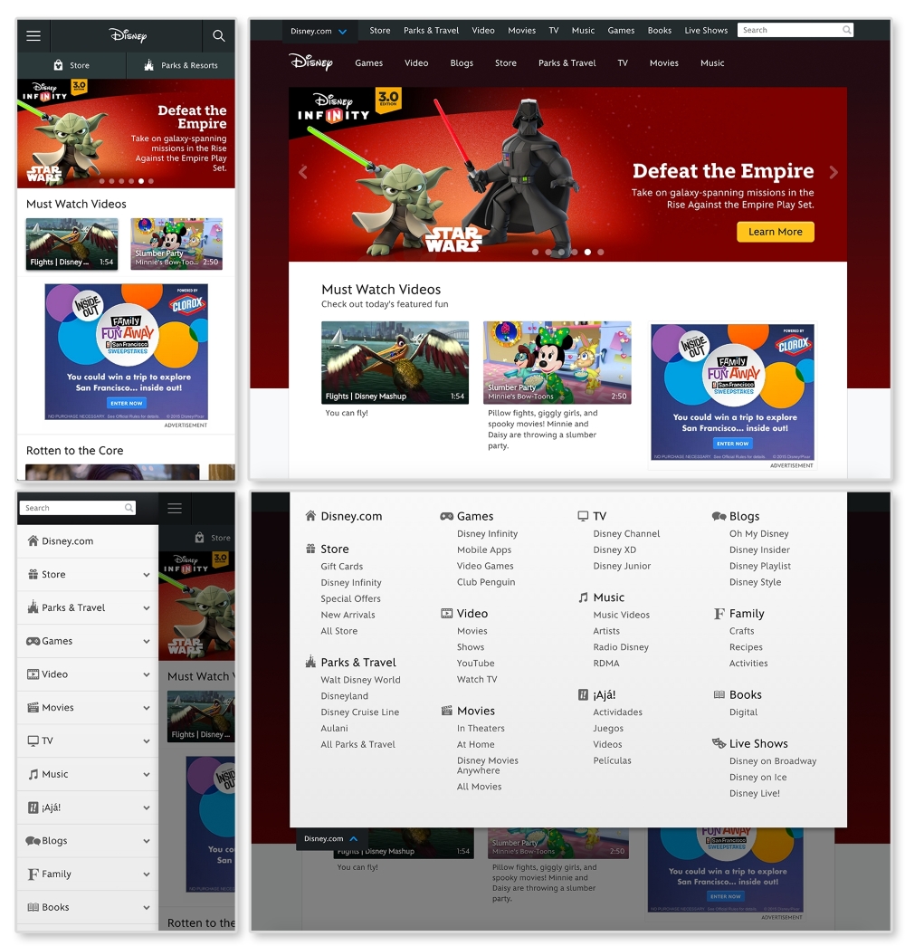
First, let's look for elements that are repeated and used throughout the website. An easily spotted repeating pattern on most websites is the
navigation. The preceding images show Disney.com's navigation closed in the top row and open in the bottom. By looking at the home page like this, we can observe the global pattern for the navigation. Here, we can see that on larger screens, the main navigation (Games, Video, Blogs, and so on) is on the page while the rest is hidden in a drop-down menu. On smaller screens all the navigation links are put in an off canvas menu that slides in and out with clicking on the  icon (known as the "hamburger" icon). This responsive pattern is referred to as an off canvas navigation. Navigation patterns such as this will be covered in greater depth in Chapter 2, The Main Stage – Building Responsive Layouts.
Digging through Disney's site, we can find modules being repeated on different pages. Look at http://video.disney.com/movies or see the following image:
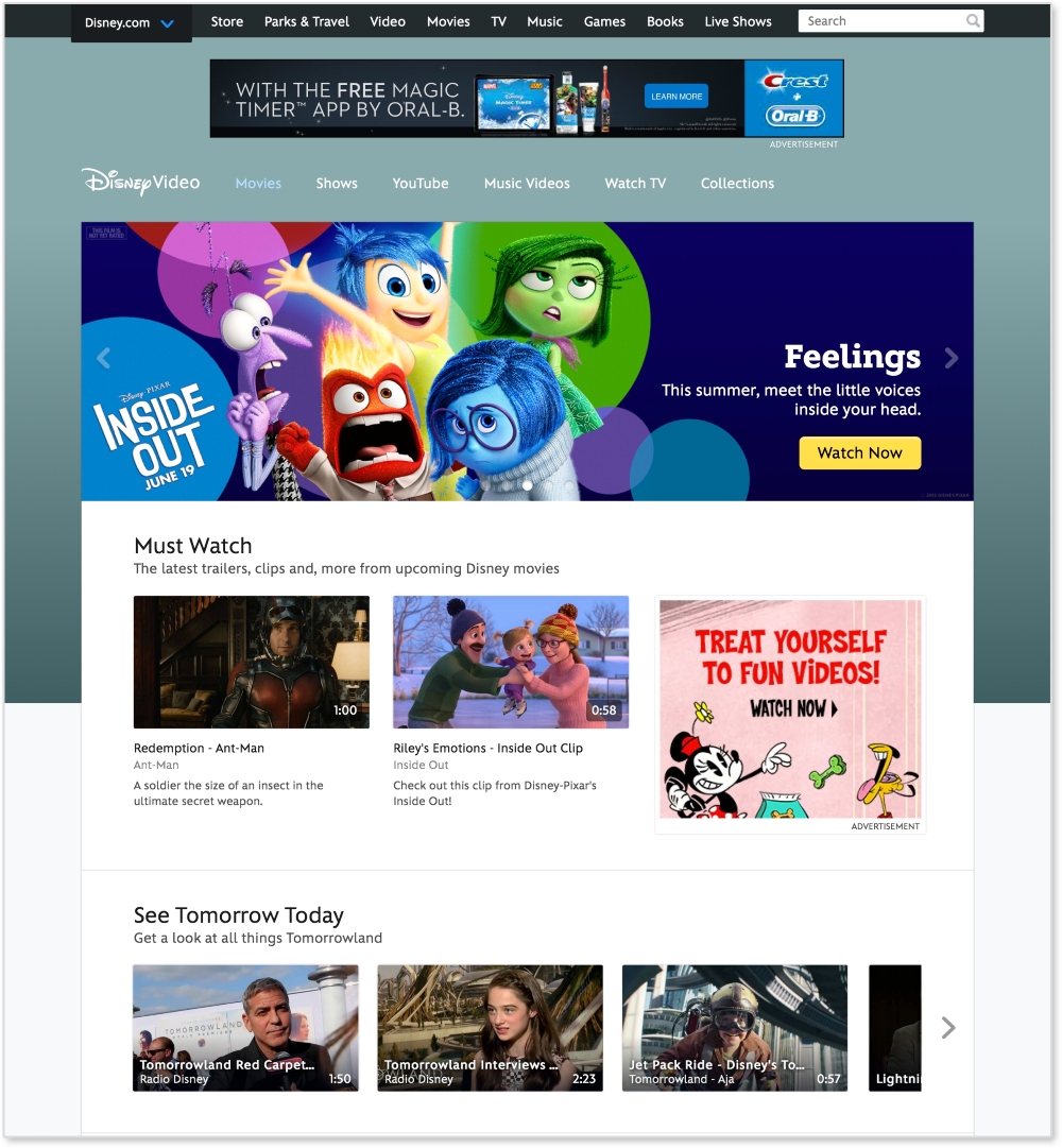
This page repeats modules used on the home page. The video gallery modules, as seen under See Tomorrow Today on the video page, are repeated again and again throughout the site. This module can be considered a video gallery pattern. And since this pattern's style changes depending on the browser's width, it is a responsive pattern.
If you want to break down this pattern even more, we can see that the video galleries are comprised of thumbnail images. These thumbnails can be considered their own pattern. They always have a 16:9 aspect ratio, with the video duration in the bottom right corner.
Now we are getting pretty detailed. Depending on the project or client, this level of detail may be required when creating patterns. If you find this happening, you might be interested in atomic design. Atomic design is a concept popularized by web developer Brad Frost and implemented in a project called Pattern Lab. It is a great example of how far you can break down a website. On his website, http://patternlab.io/, Frost breaks down patterns into the following categories:
- Atoms: The design elements that cannot be broken down any further and make up the building blocks of the design system
- Molecules: Atoms combined "that function together as a unit"
- Organisms: Combination of molecules and/or atoms that create sections of an interface
- Templates: Structured guidelines for combining organisms
- Pages: A "single instance" of a template with real content
If we apply this concept here, the home page will be a "page" and its structure will be a "template". To break this down further, let's look at a section, like the video gallery, on the page.
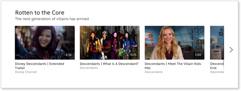
Looking at the video thumbnail, the captions, the video gallery, and the overall page, we can figure out what elements are atoms, molecules, and organisms.
|
Atomic design |
Disney.com |
|---|---|
|
Page | |
|
Template |
Media page |
|
Organism |
Video gallery |
|
Molecule |
Video thumbnail + caption |
|
Atom |
Video thumbnail |